Here are some Visual/Artist references I refer to while I was brainstorming for my ideas:
Stefan Sagmeister

Source: https://rdkreative.files.wordpress.com/2013/05/a0032944_16101578.jpg
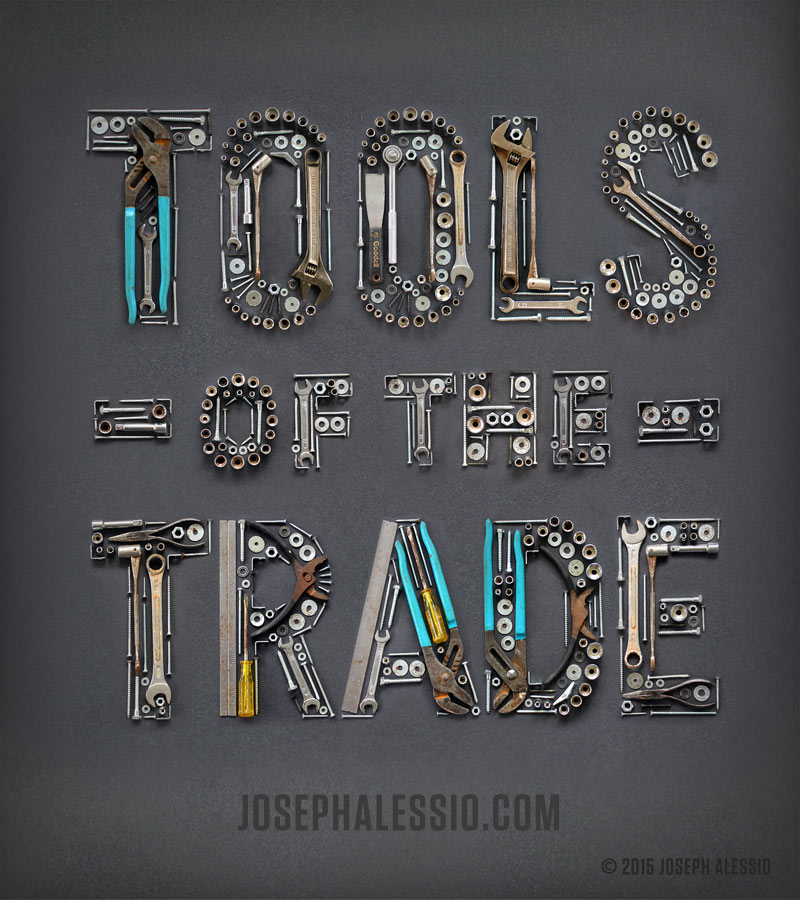
I am a huge fan of Stefan Sagmeister and when I first got the project brief, his work immediately came to my mind. He has created some of the boldest, most innovative, engaging work around, especially his type and handwriting-inspired solutions. He makes type come alive – almost literally sometimes like the one shown above.
I initially wanted to use found objects like him to create typography in this project but I started realised that it might seems too easy to just put everything together and take a photo. It’s a great idea but I feel that If I did that, I am creating stuff and not pushing myself to design stuff.
Noma Bar
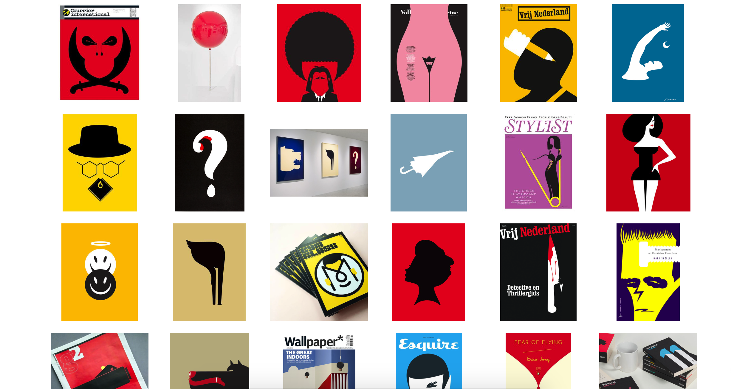
Source: http://dutchuncle.co.uk/noma-bar/
I also draw inspiration from one of my favourite graphic designer Noma Bar. He is known for using negative space and Gestalt principle to create his work. His design is usually very minimal but able to maximise visual communication. He has this famous Quote:”I am after maximum communication with minimum elements.” which have kind of inspired my style.
I tried to go for this kind of style which I kind of familiar with. I also want to use this project to improve my Adobe Illustrator skill. However, after a few consultations and brainstorming I think that I really should push myself to do something that I’ve never tried before. Nonetheless, I have drew some inspiration from him in terms of the use of colour combination.
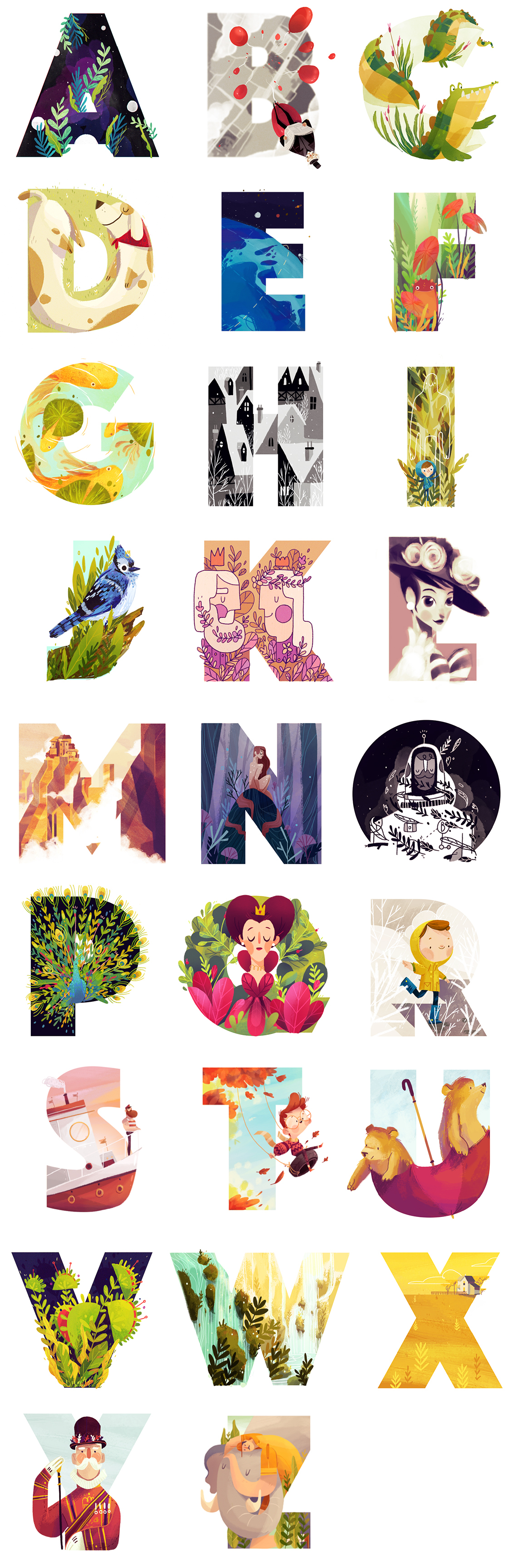
Ranganath Krishnamani

Source: https://www.behance.net/gallery/16214359/Alphabet-City-TVS
I came across Ranganath Krishnamani coincidentally on Pinterest and found his “Alphabet City” very interesting and inspiring! I have always wanted to try out a bit of 3 Dimensional design using Illustrator but I always thought it is tough to do it. So I went ahead to create 2 types using this style and I really love how it turned out!
Other References/Research – Pinterest
Pinterest is my go-to website to find inspiration. Other than the 3 artists I have mentioned above, I usually go to Pinterest while I am working on my design. So here are some visual reference I refer to:
Using Found objects to create Type:
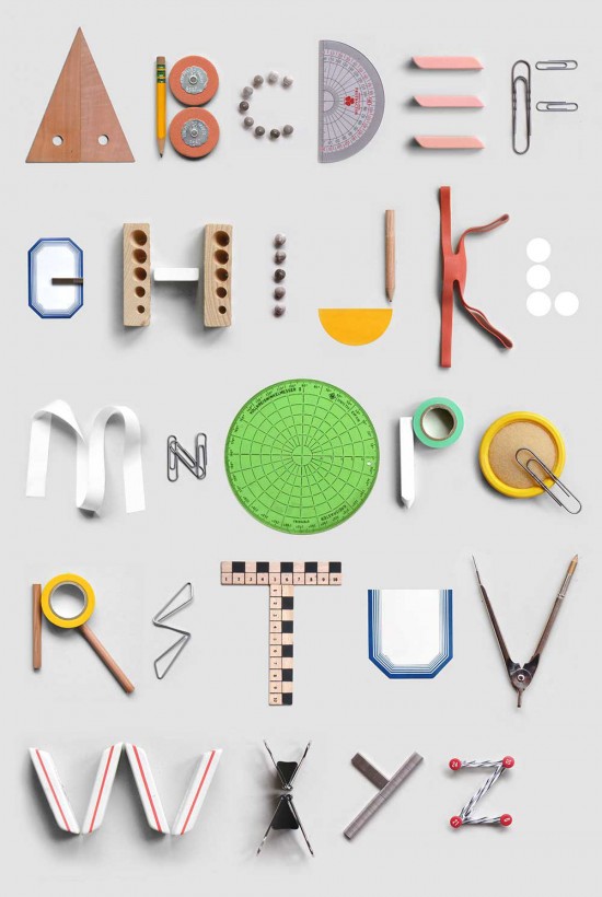
Source: http://uppercasemagazine.com/blog/2014/4/22/type-tuesday-office-supply-alphabet?utm_source=feedburner&utm_medium=feed&utm_campaign=Feed:+uppercase-blog+(UPPERCASE+blog)#.U1a4teZdUks
Source: http://typelimited.tumblr.com
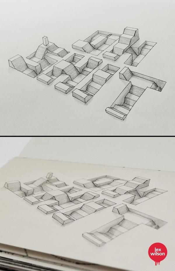
By Lex Wilson. Source: http://designontherocks.com.br/sketch-tipografico-com-efeito-tridimensional/?utm_source=feedburner&utm_medium=email&utm_campaign=Feed:+DesignOnTheRocks+(DESIGN+on+the+ROCKS)
BY Rafael Mayani Source: https://www.behance.net/gallery/25911999/36-DAYS-OF-TYPE
Check out my design process *here*! 🙂
You must be logged in to post a comment.