
The first paper cut sample I did. I was going for a floating girl with ripples effect but that didn’t work out.
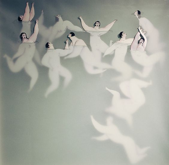
So I attempted another paper cut and attempted to make it look like the girl was floating, this time with the use of ‘weaving’ the figure through another piece of paper. 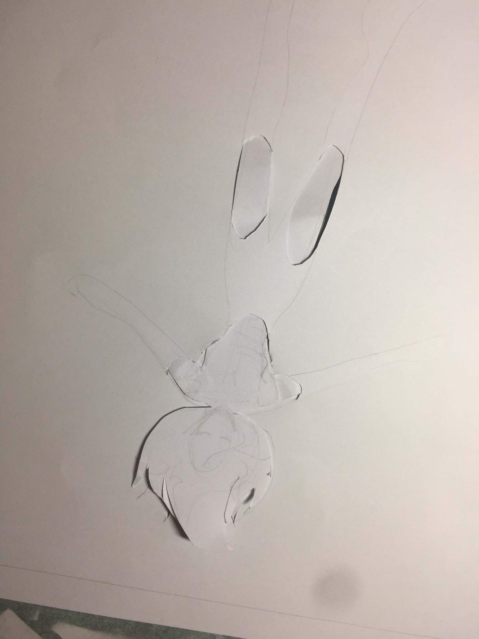 At this point, I came across this artist (Sonia Alins) reference on pinterest and really liked the effect of using a paper of different opacity.
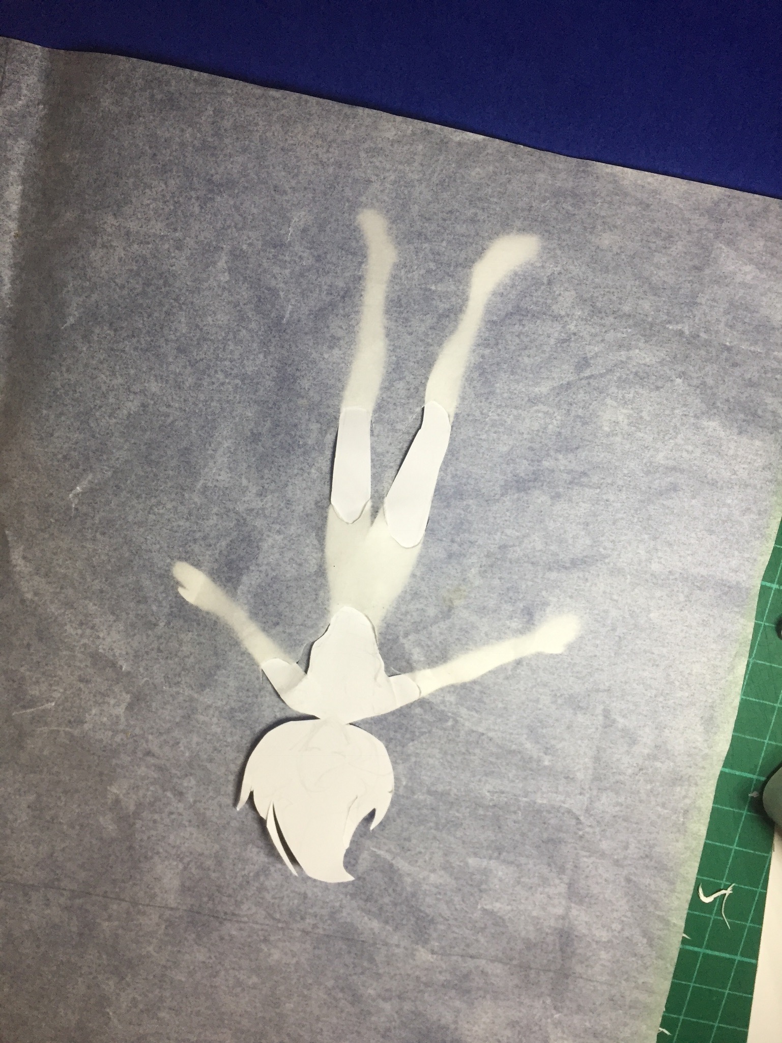
 Maybe doing something like this could help me achieve the effect I want, I thought. So with some make shift tracing paper (baking paper) I went ahead and tried it. Nah, not really… I thought to myself.
Maybe it will work if I tried to add some water-like shapes below. But nahhh.
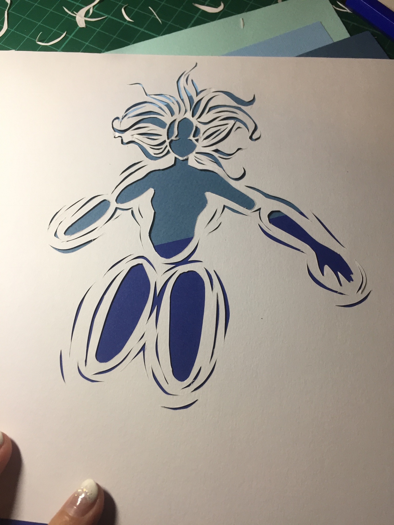
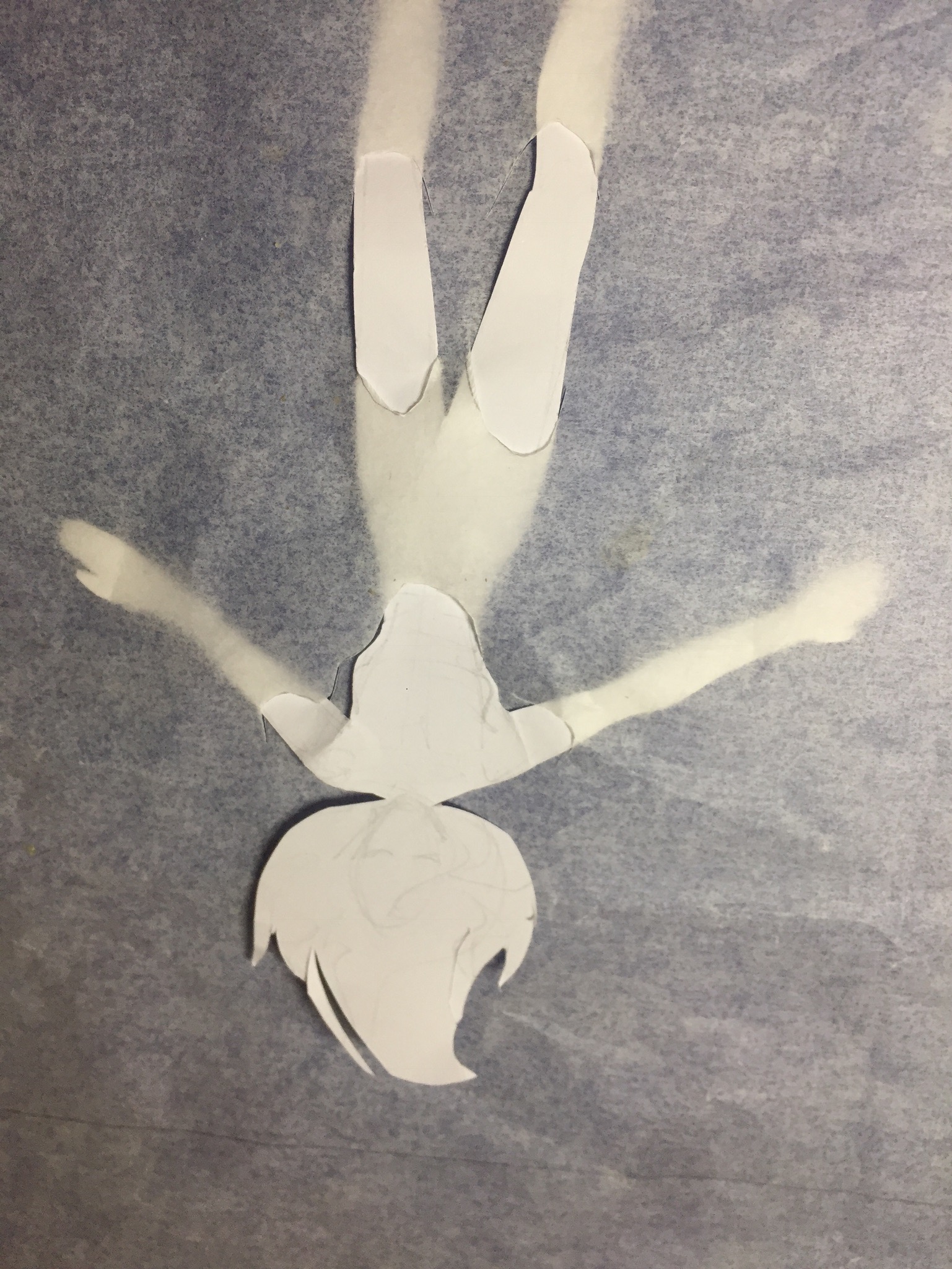
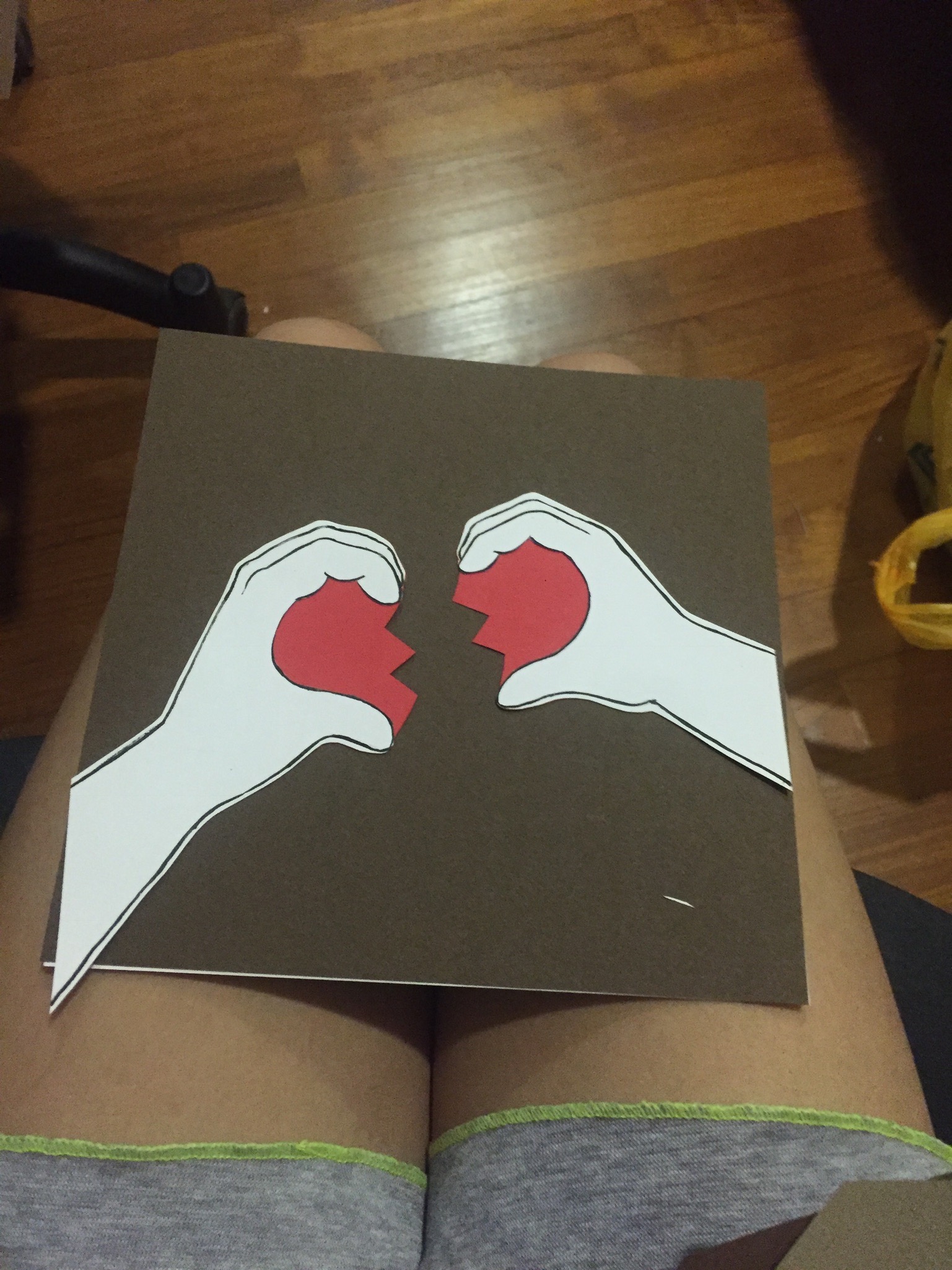
 Tried it with the acrylic piece I had, and realise it really didnt fit. Firstly, the acrylic piece’s shadow couldn’t really be seen because it’s too near to the plane. Secondly, composition is shitty. Thirdly, it’s really difficult to match with my other panels, though i really wanted to use this at the start. Oh I also tried to add some layering (note face and hair)
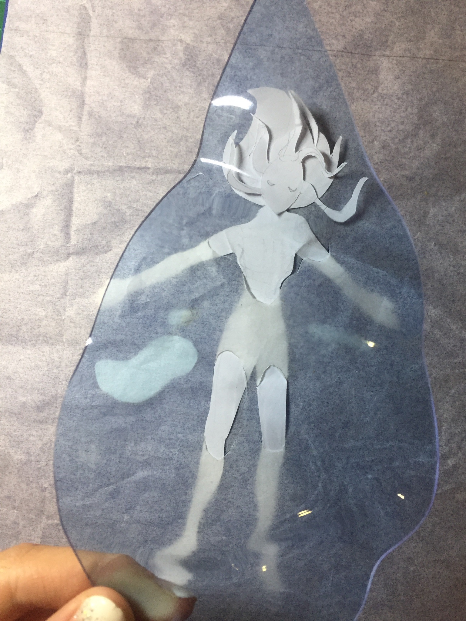
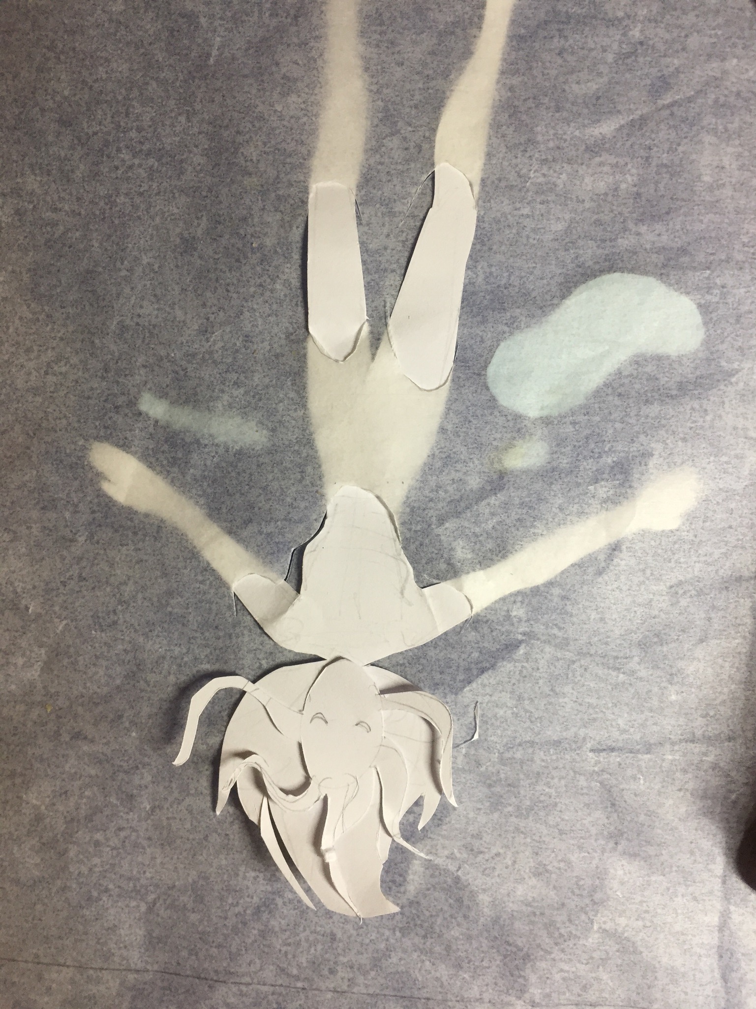
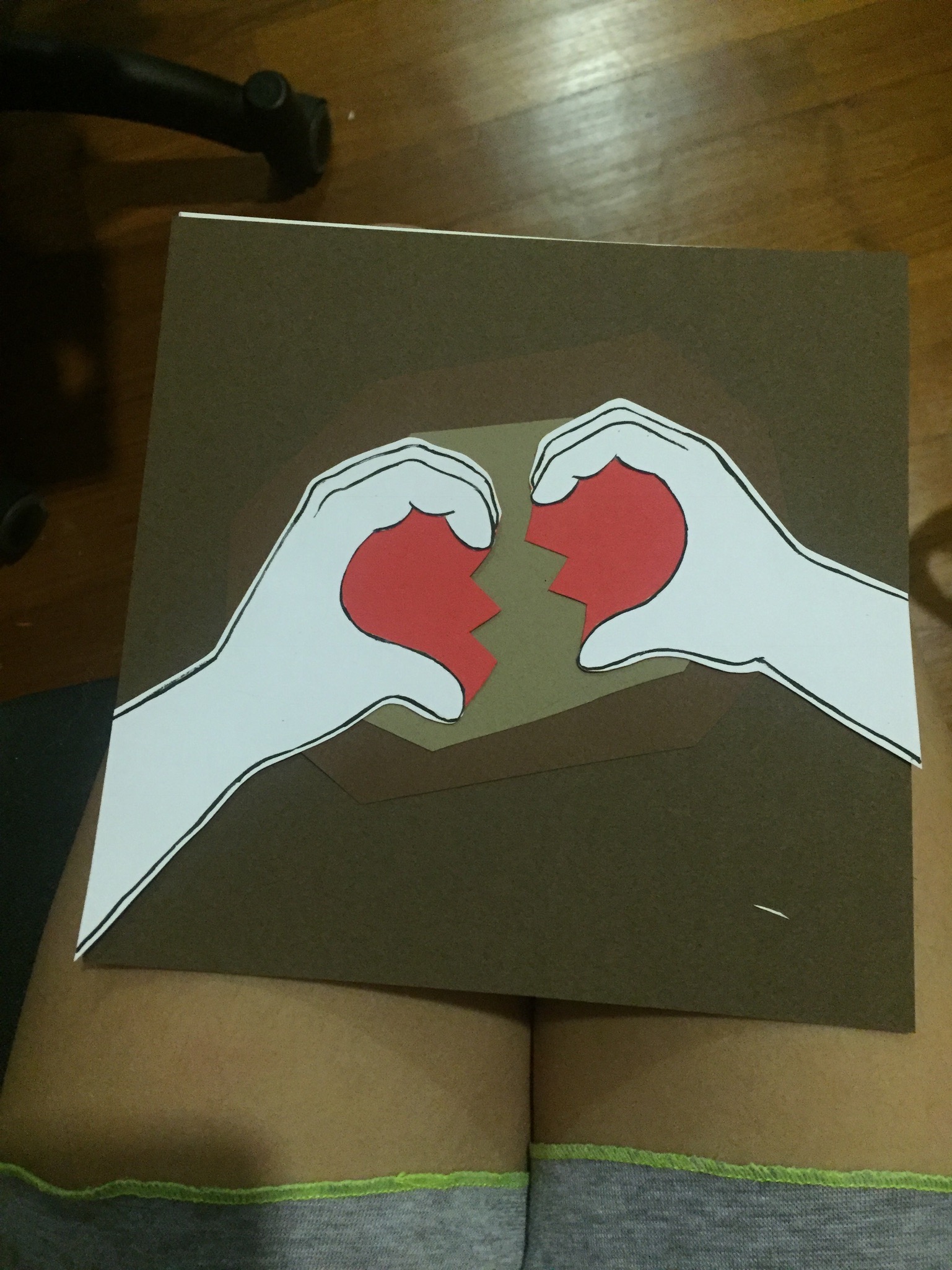
And a photo with flash on: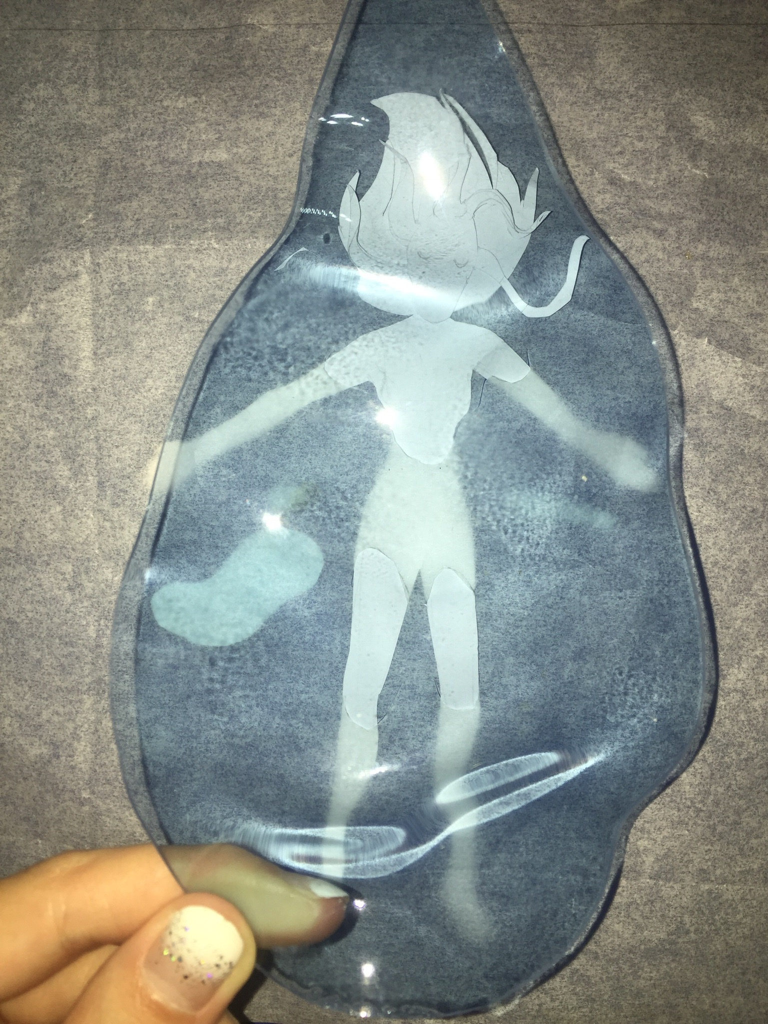 At this point, i decided that I shall go with paper cutting for most of my projects. Despite only experimenting on this one panel at the beginning, I was simultaneously developing the rest of the panels (as seen in journal) and making sure they all have some sort of continuity and style.
I came across this artist (Ceres Lau) reference: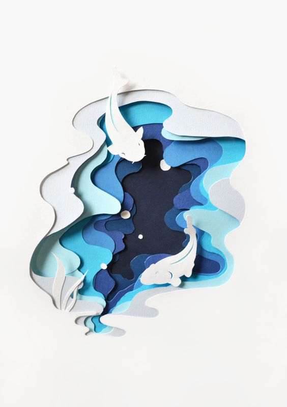
And liked how she did the water. (Ok I did it again it looks way too similar now, just like what happened for the silk screen project >: )
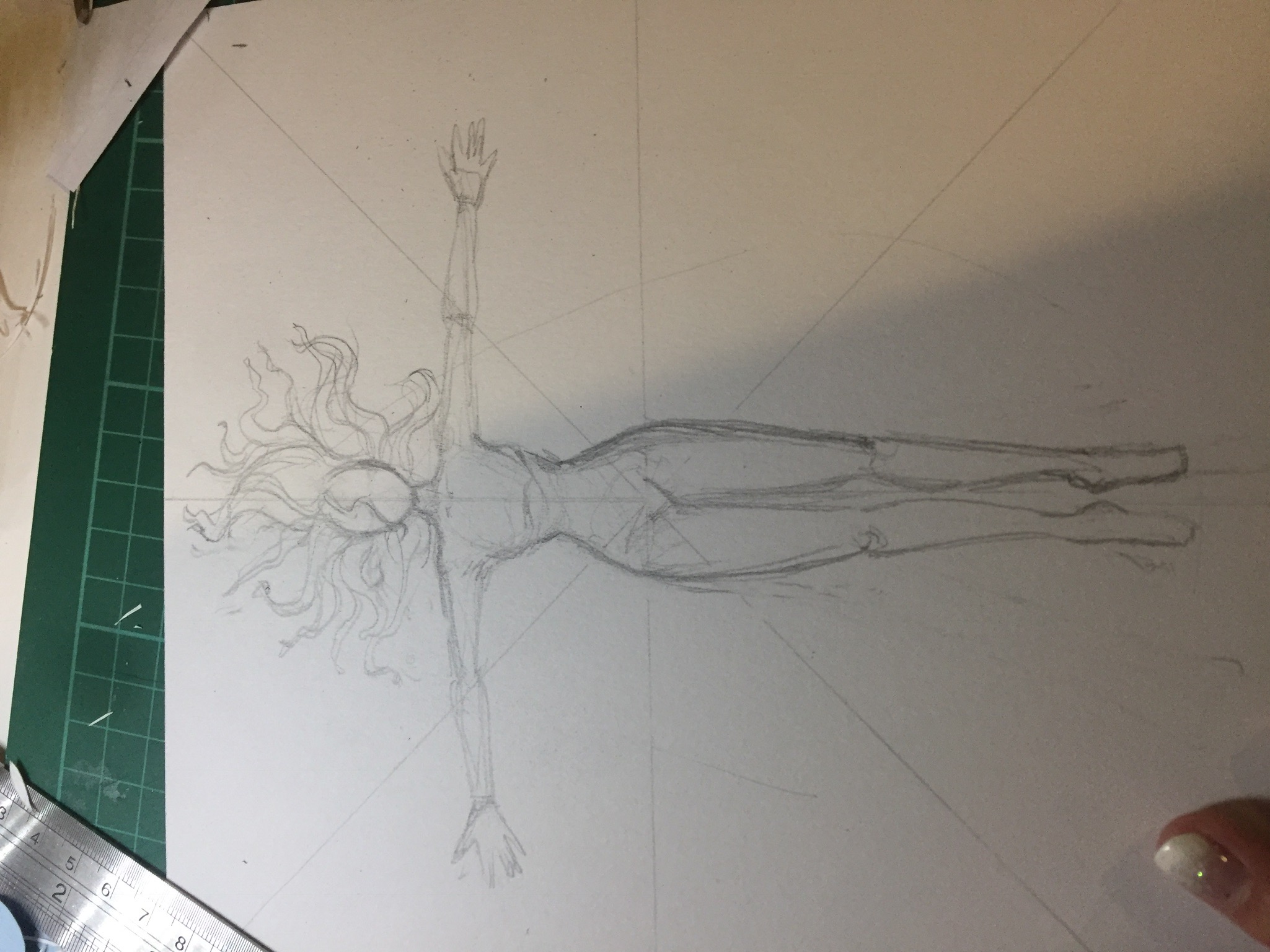
I decided to properly give it a shot to see the outcome of layering the water, especially in such a thin figure. Welllll the layering looks okay, maybe even considered quite nice. But what failed here was probably the composition. Overall, I think it’s no good. 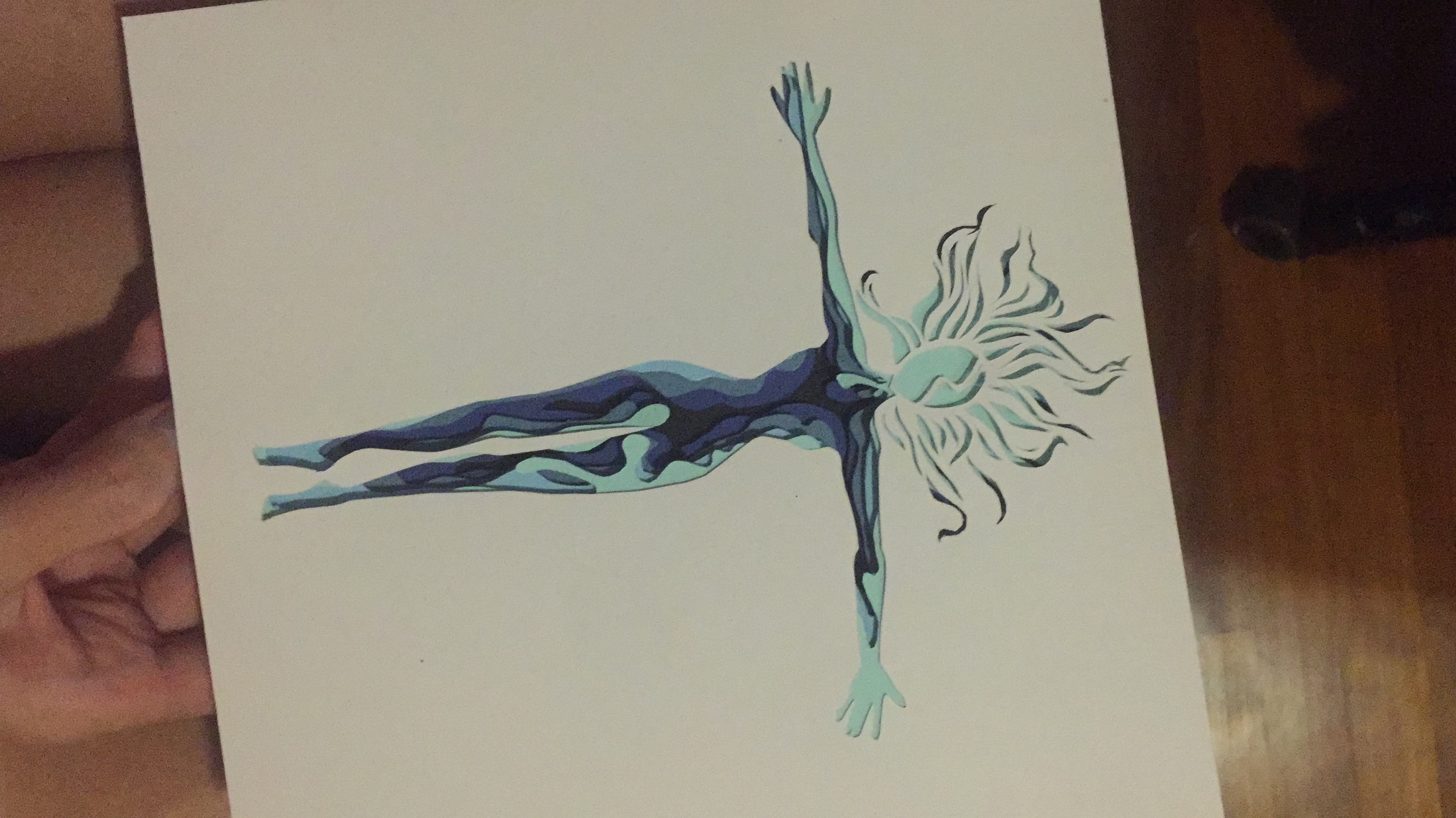
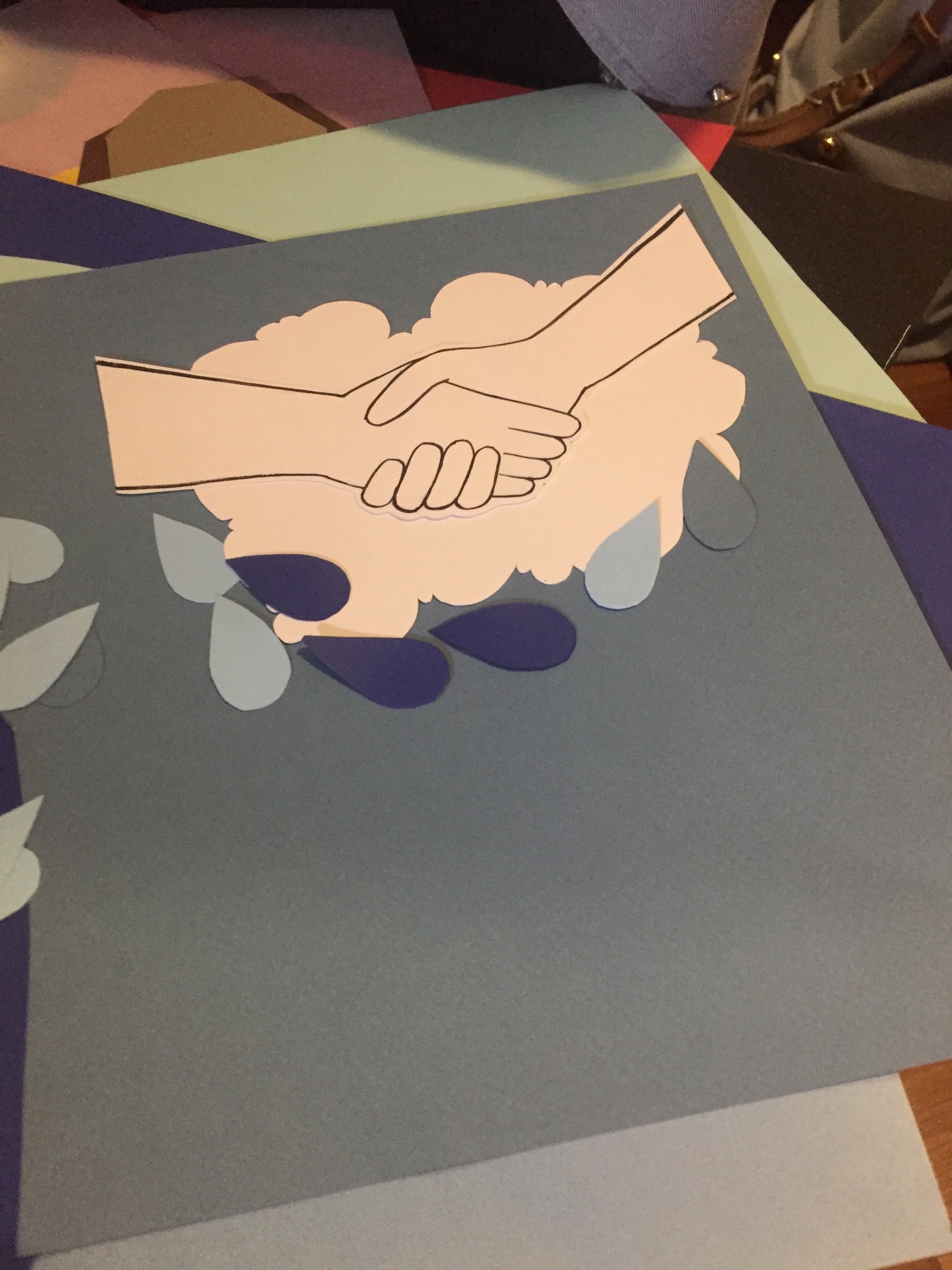
How will it look like if i had an acrylic droplet on it? Bad. 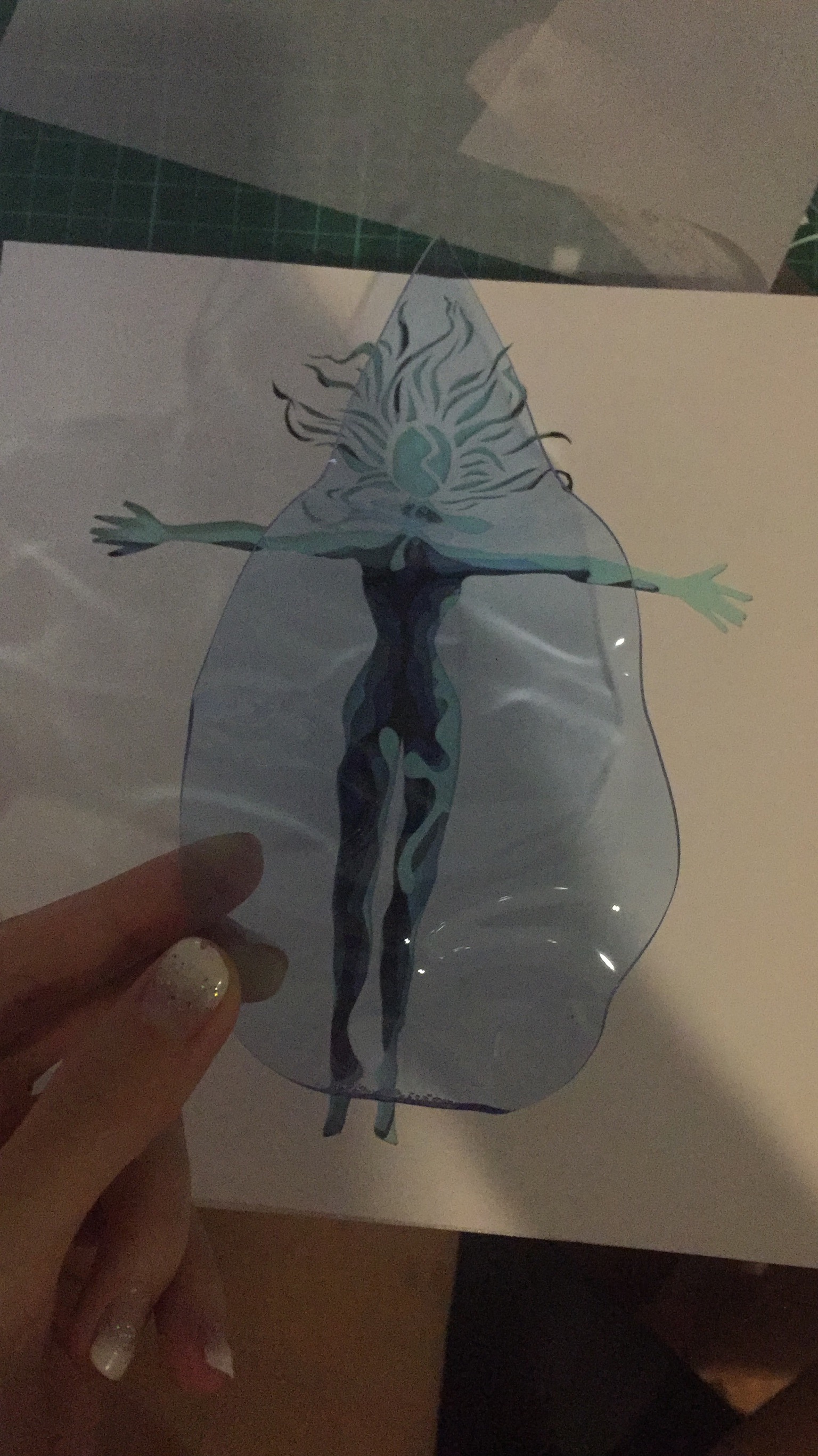
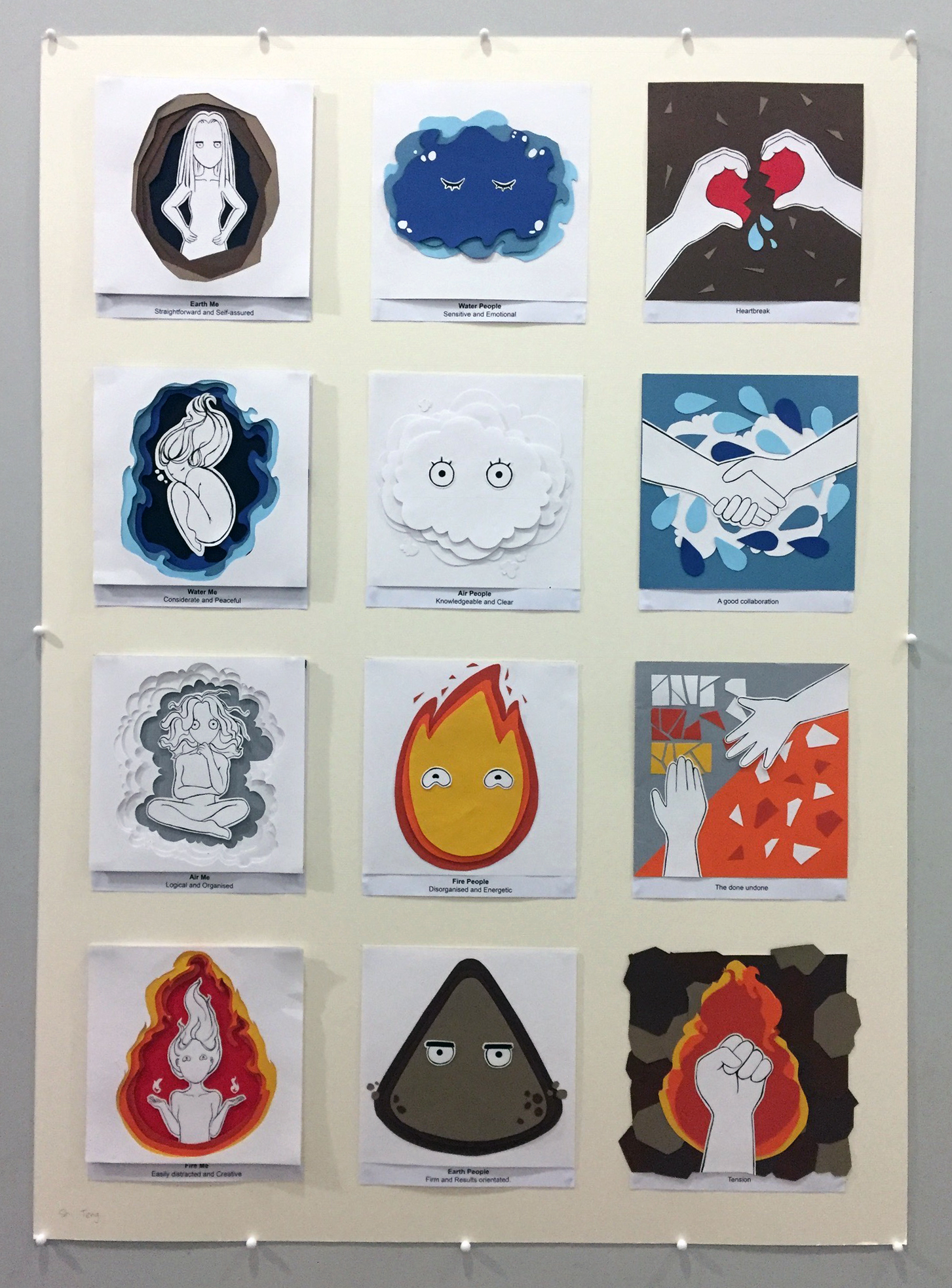
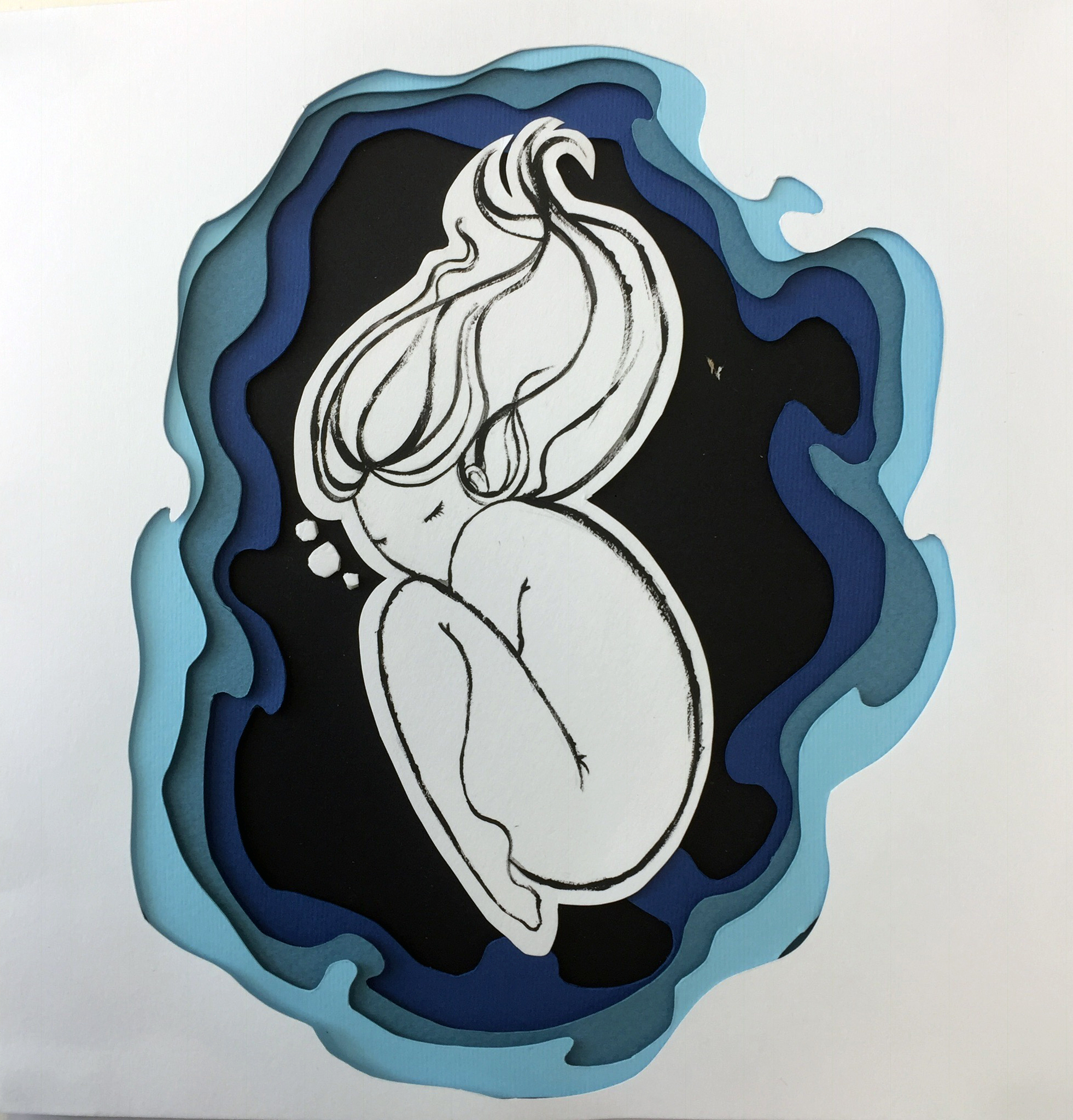
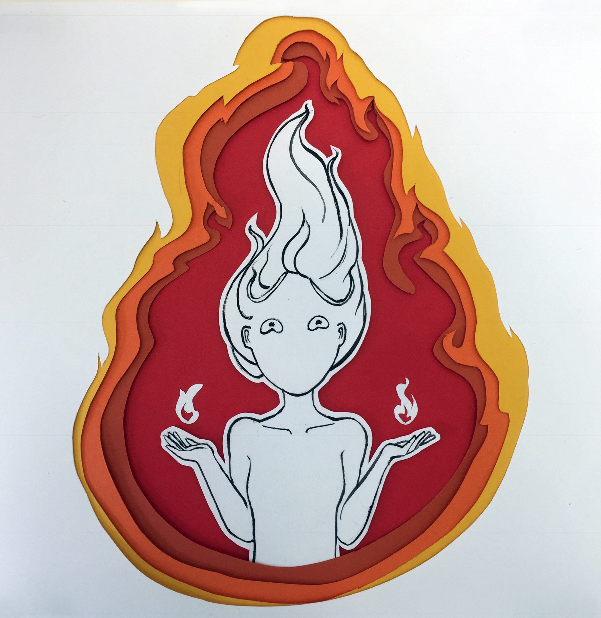
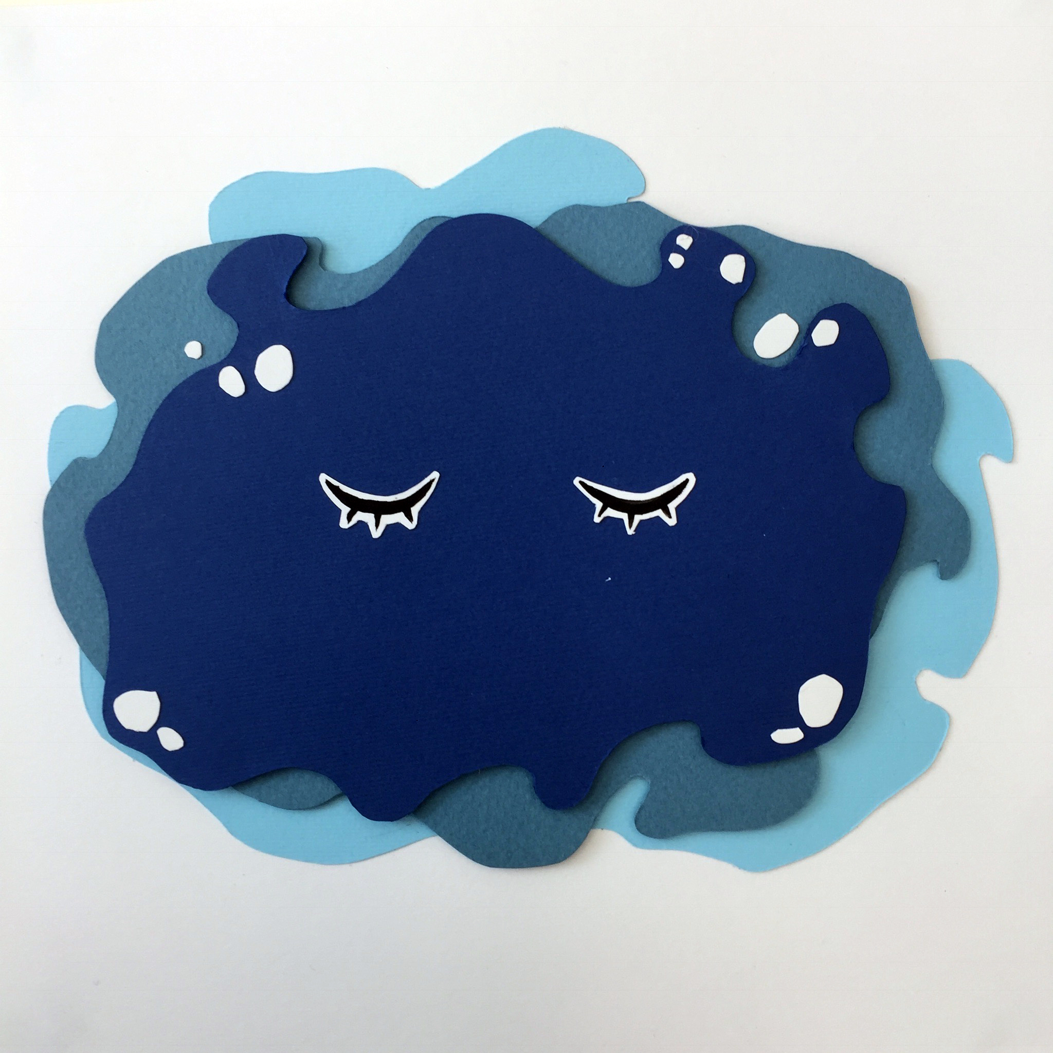
In the shower, I somehow conjured up this image in my mind. A girl cocooned in a fetus position underwater. I felt like it really gave off the vibes of the characteristics of the Water element (as in the Tetramap) – that they are emotional, peaceful, sensitive.
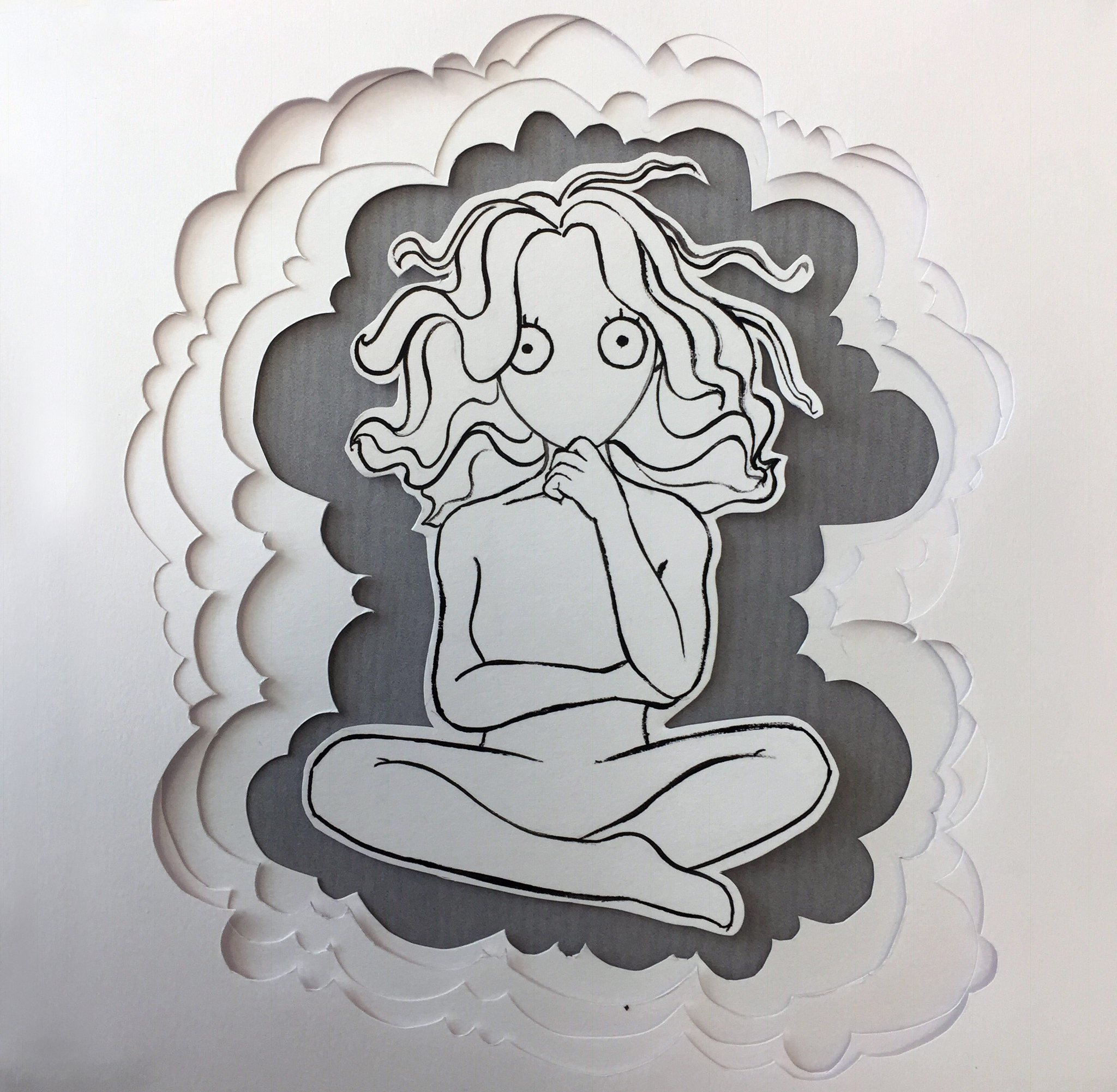
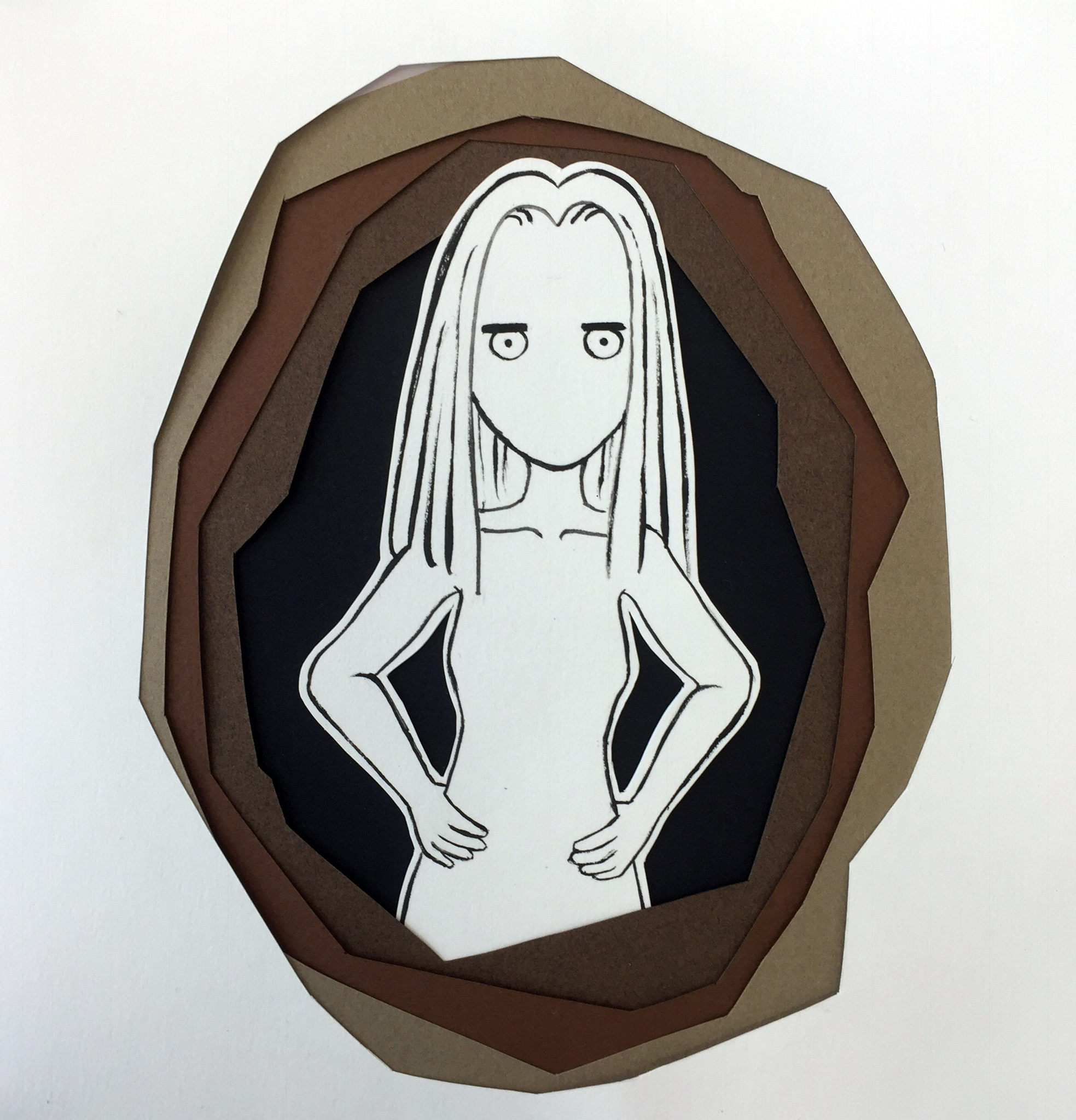
Also finally came to my senses and decided to draw something mildly cartoony/cute, as I have done before, but never in 2D. After all, this was supposed to represent me anyway. Also, the deliberate brush strokes, something I’ve always loved.
As I was assembling it together, I thought it looked good this way too. Minimalistic, black and white aesthetics.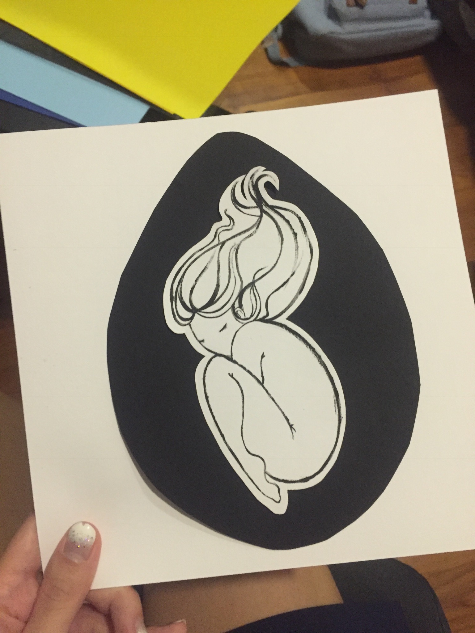
Even in a different composition, it looked good. 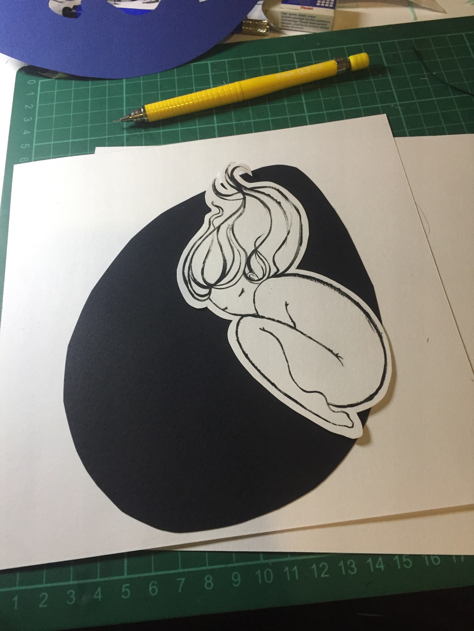
And putting it together, finally! I really liked it. This is one of my favorite panels.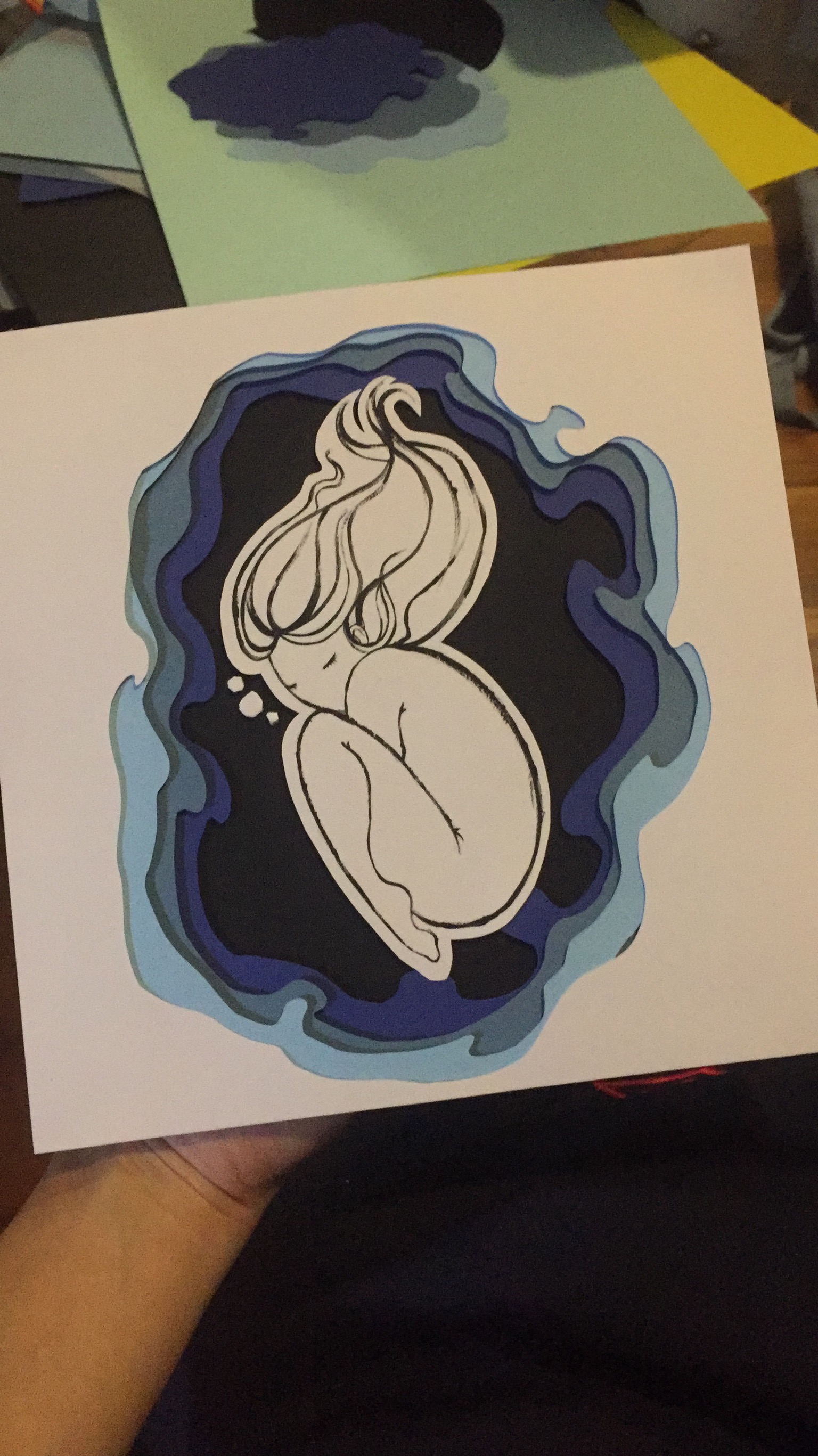
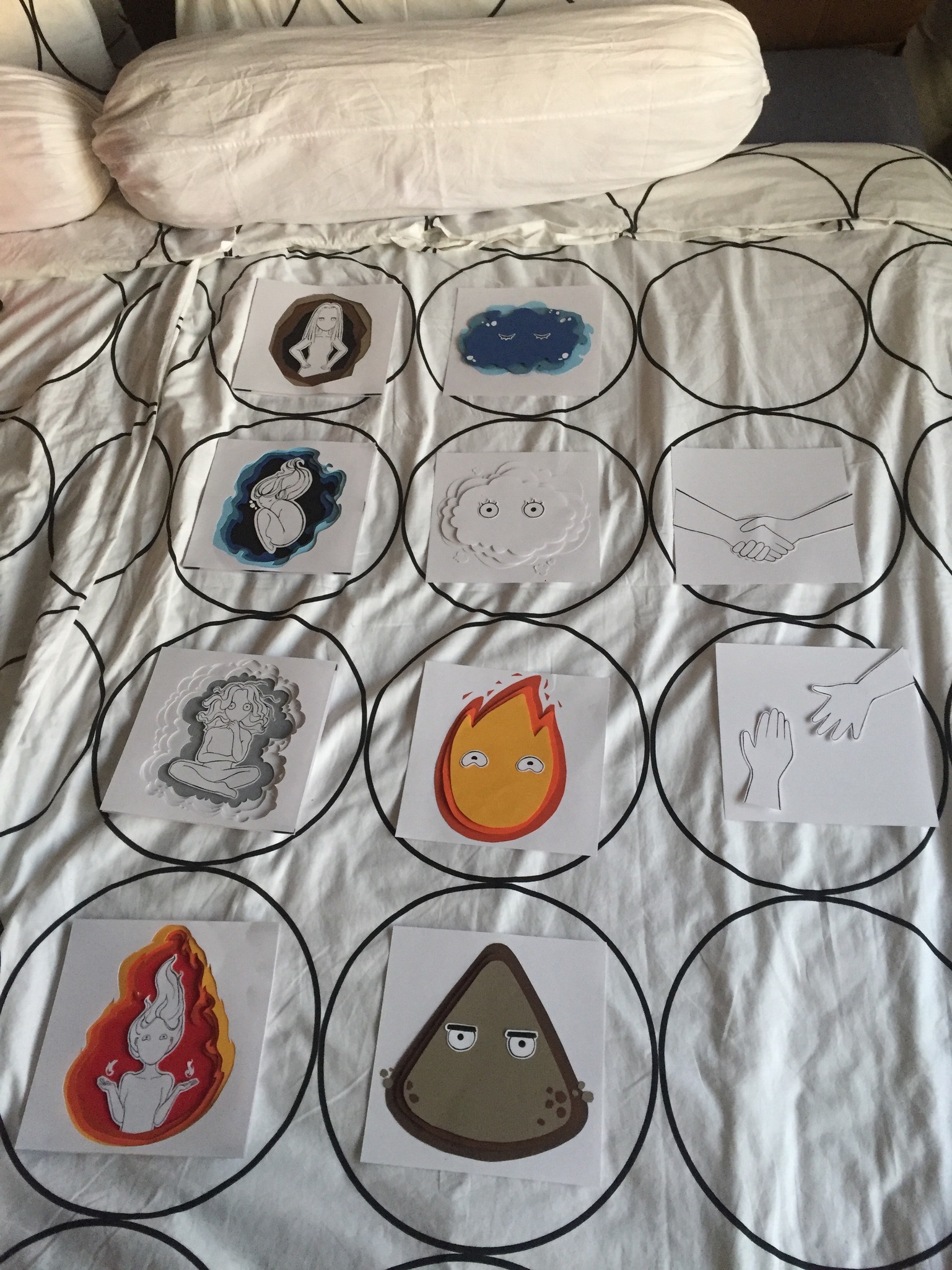
And then I saw my middle pieces lying around, they looked pretty good! And I wondered what I could make out of them. It’s always cute to add eyes into things, so I did. With the eyes carrying the traits of each of the characteristics (forgot to mention this in the journal).
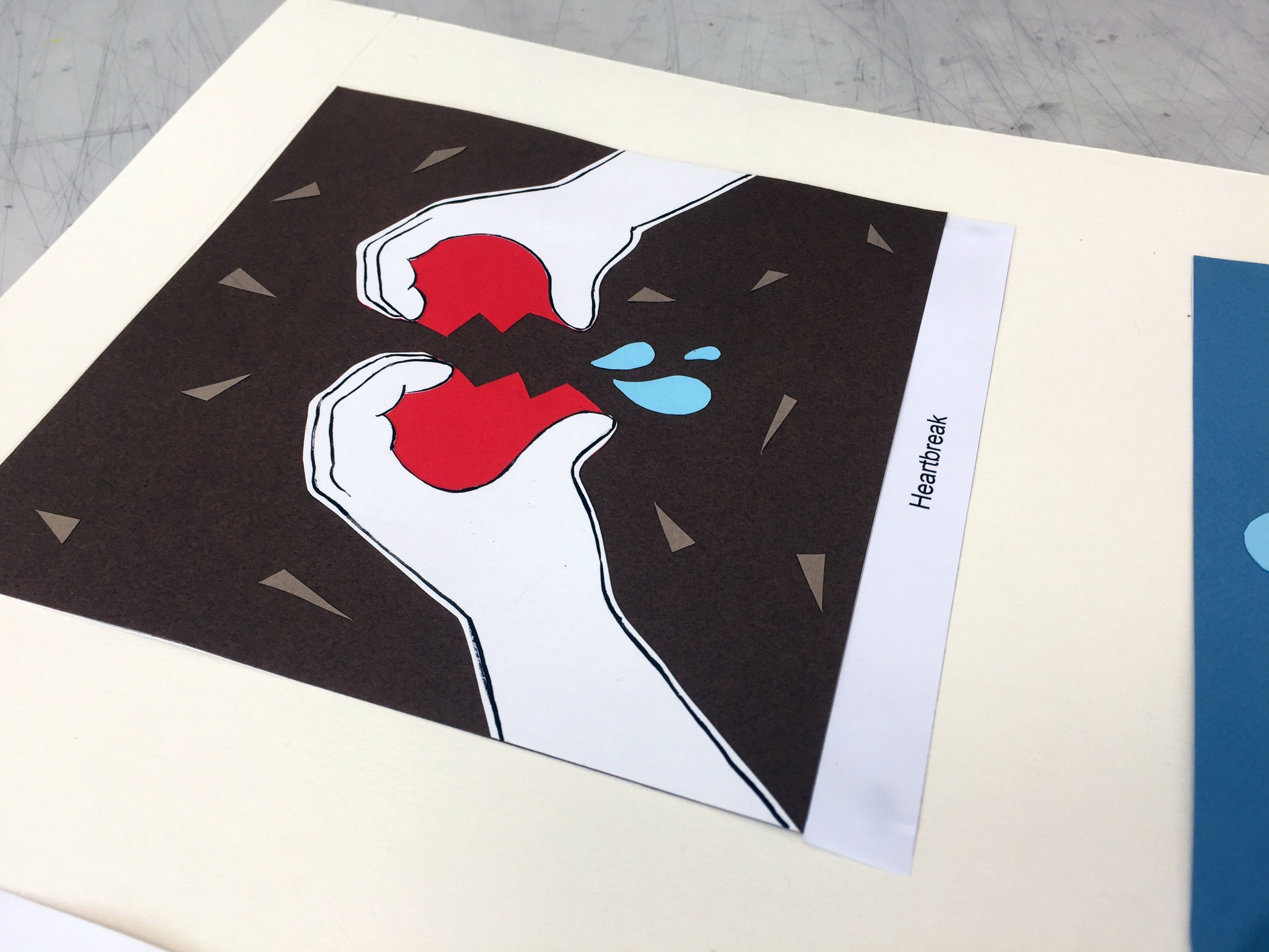
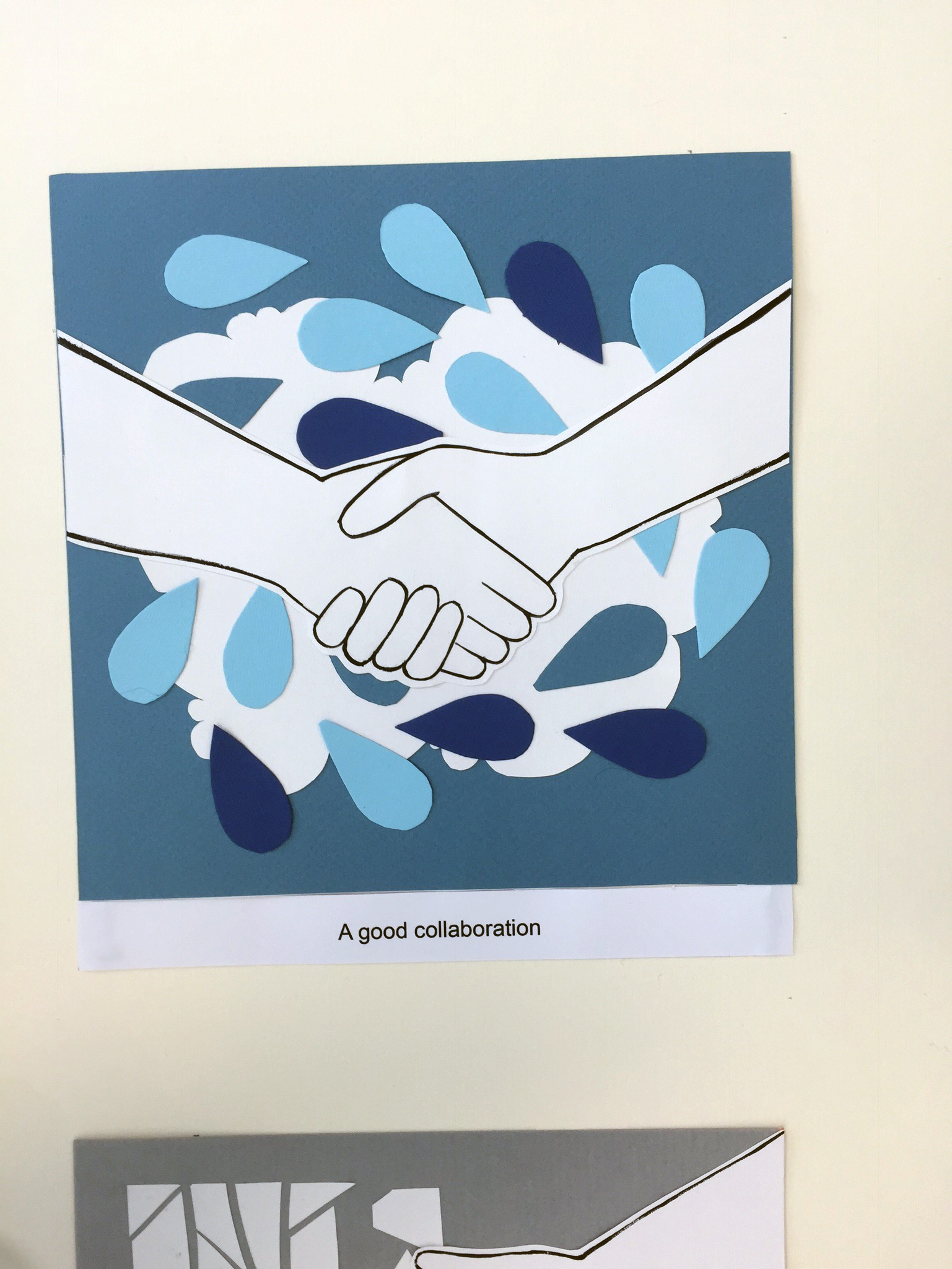
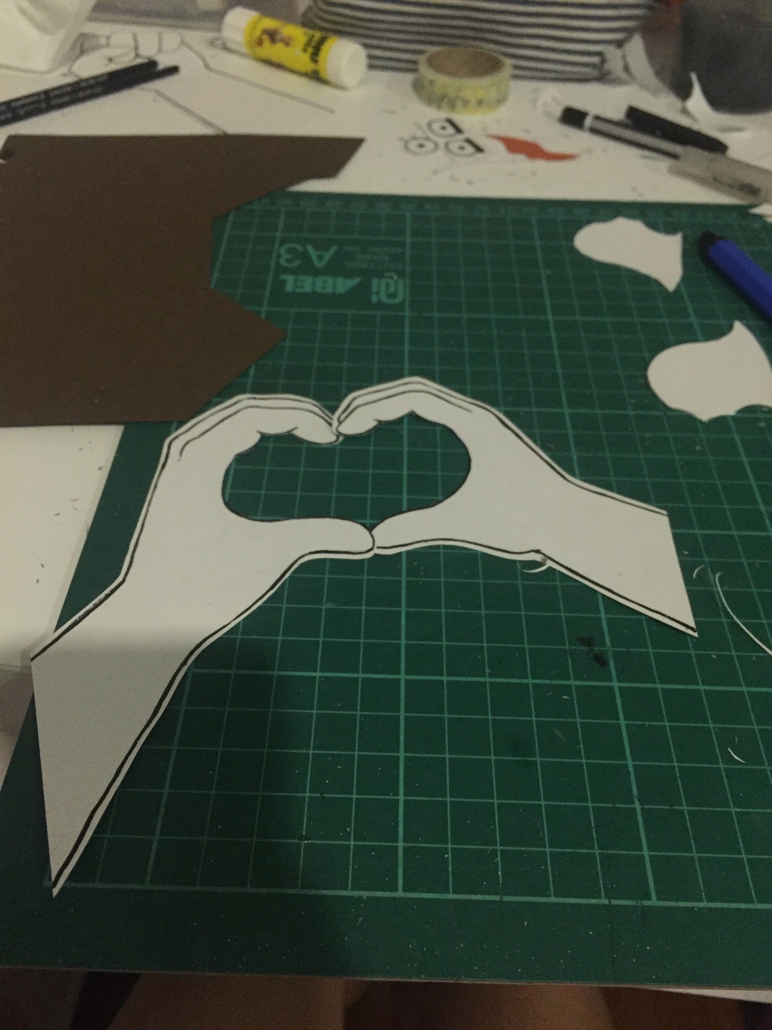
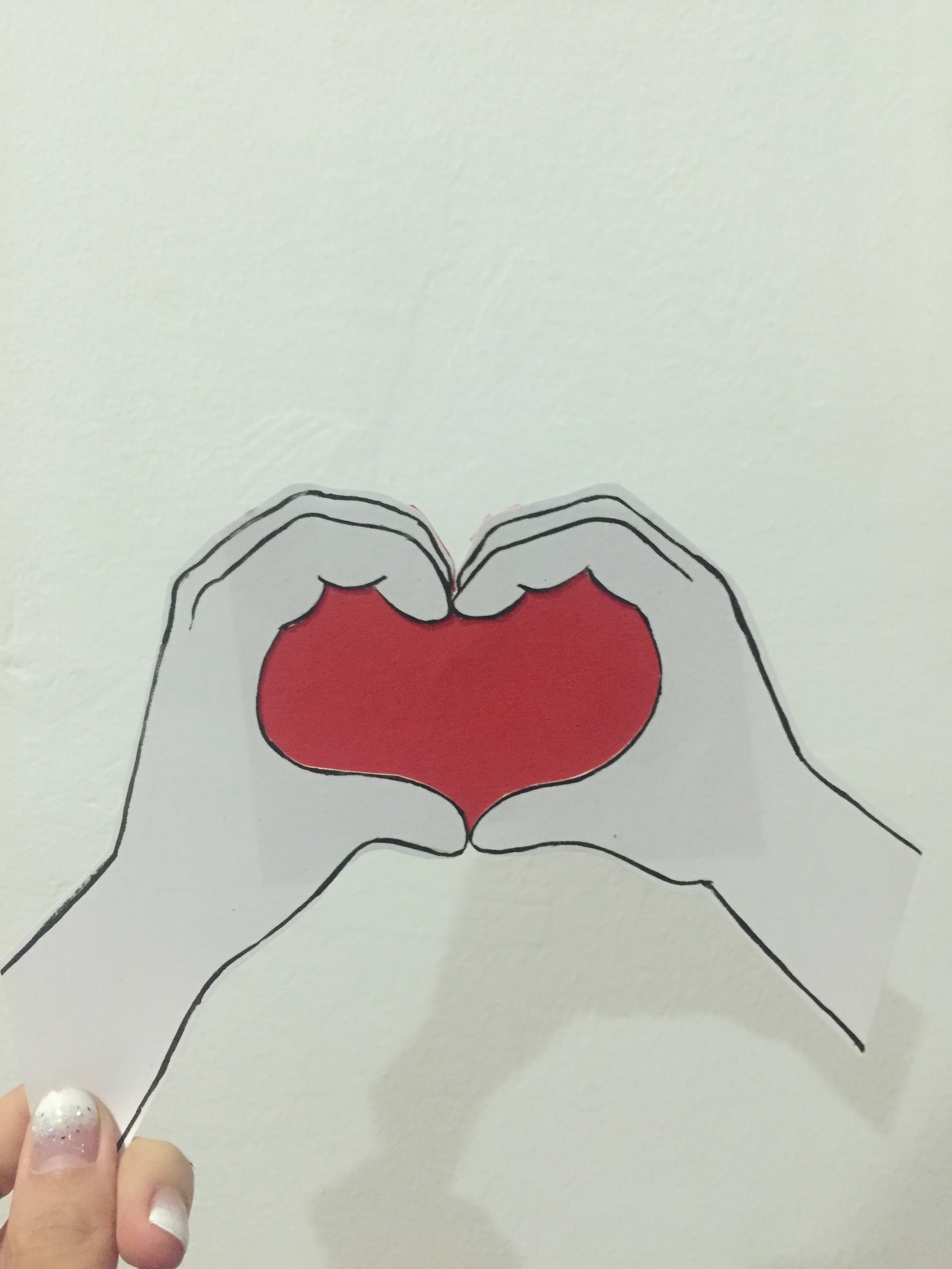
Placing everything together to see how it looked like as a whole. Then I realised the last panels of the second and third equation both had something to do with hands. So why not, I figured, to have hands in all of the last panels. It helps me generate ideas and also tell my story with simplicity and continuity.
I think this is cute, so here are a few pictures of it, the making of: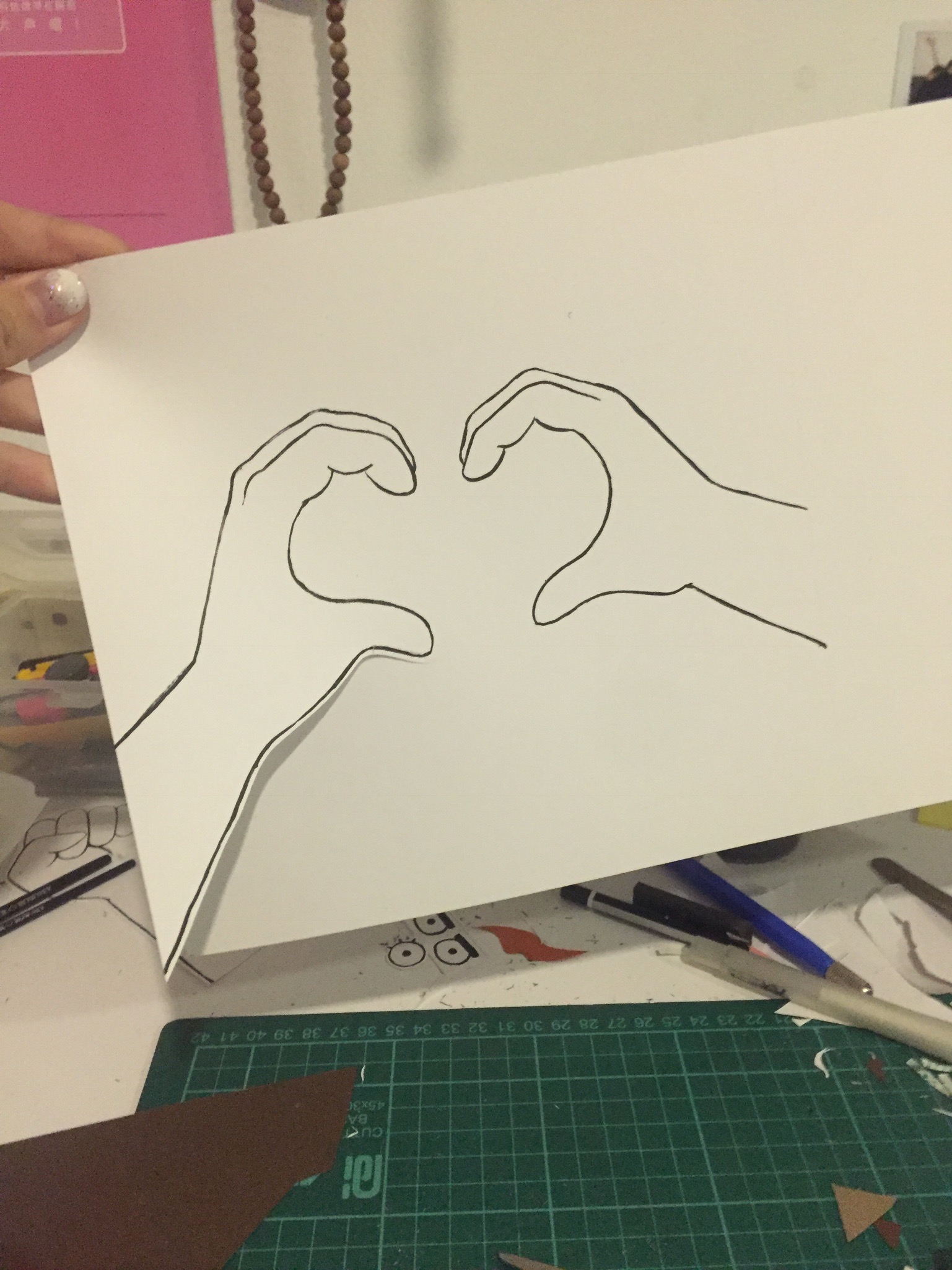
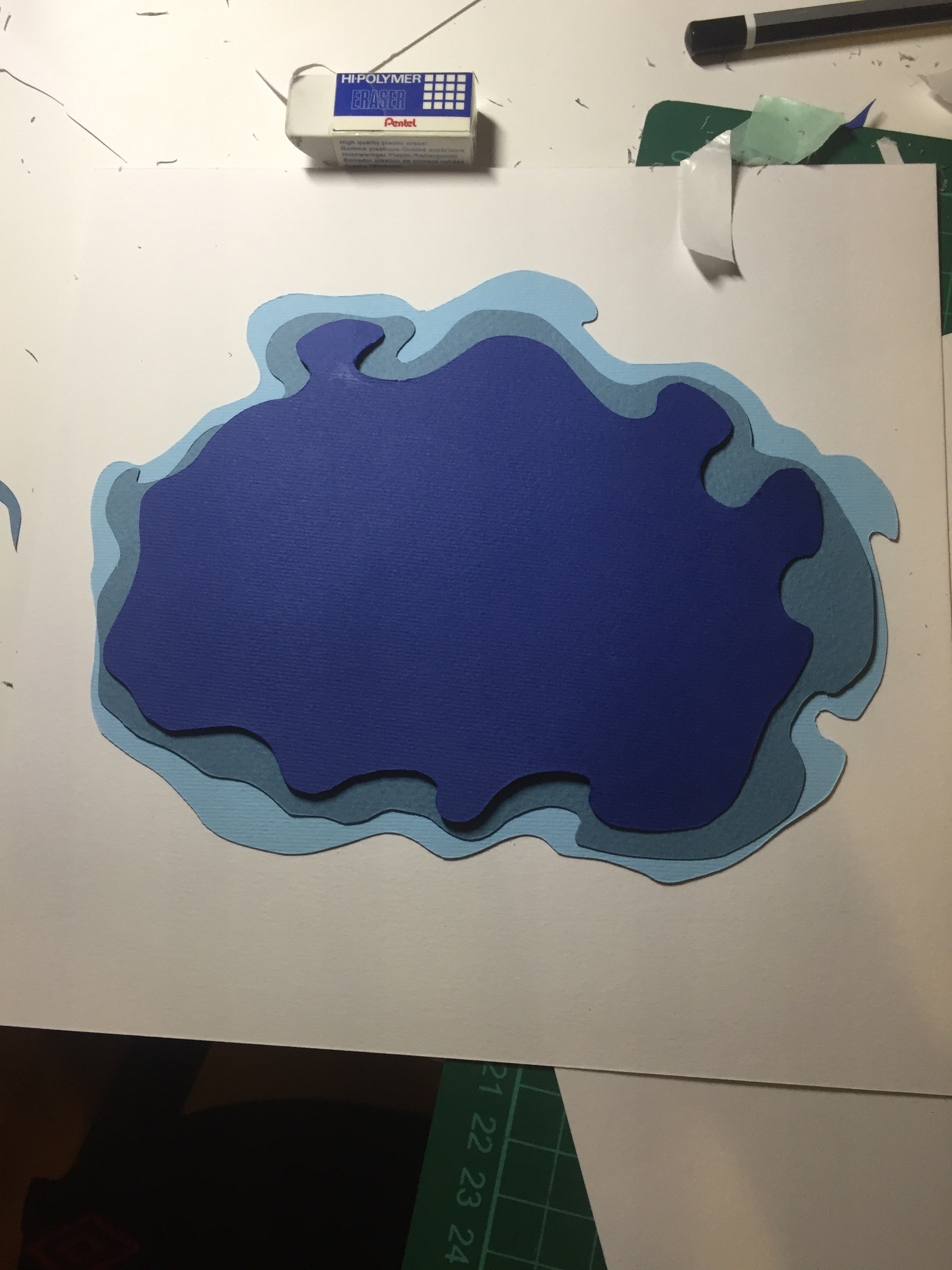
Experimented with different layouts for the background
Experimentation and comparing colors for another panel:
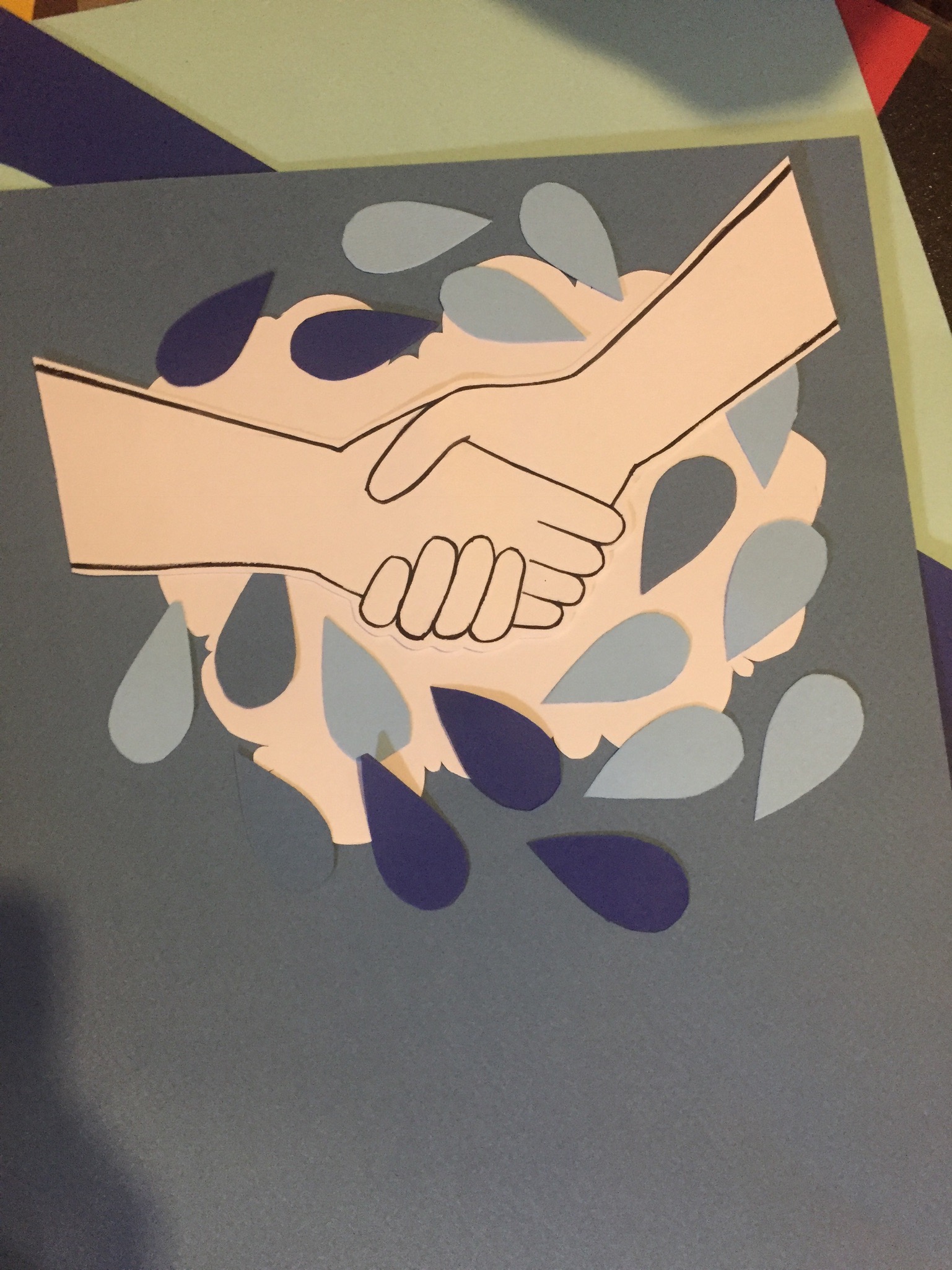
The water droplet panel, tried various ways to composite it before finally settling on the final one, with the droplets going in circles, much like the water cycle. I felt like it conveyed the message well too. 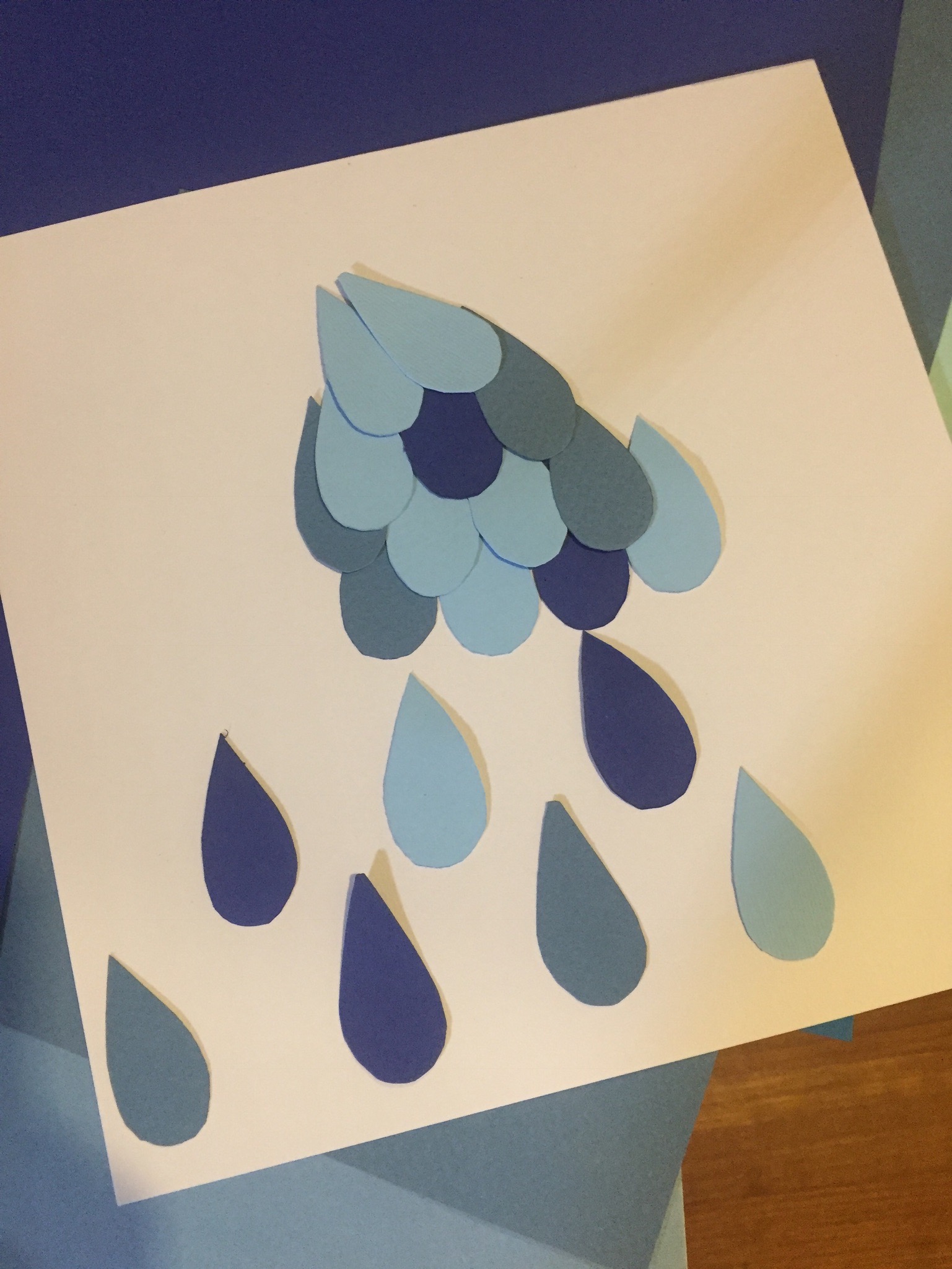
The complementary colors looked very nice when put together. I probably could have explored more of this.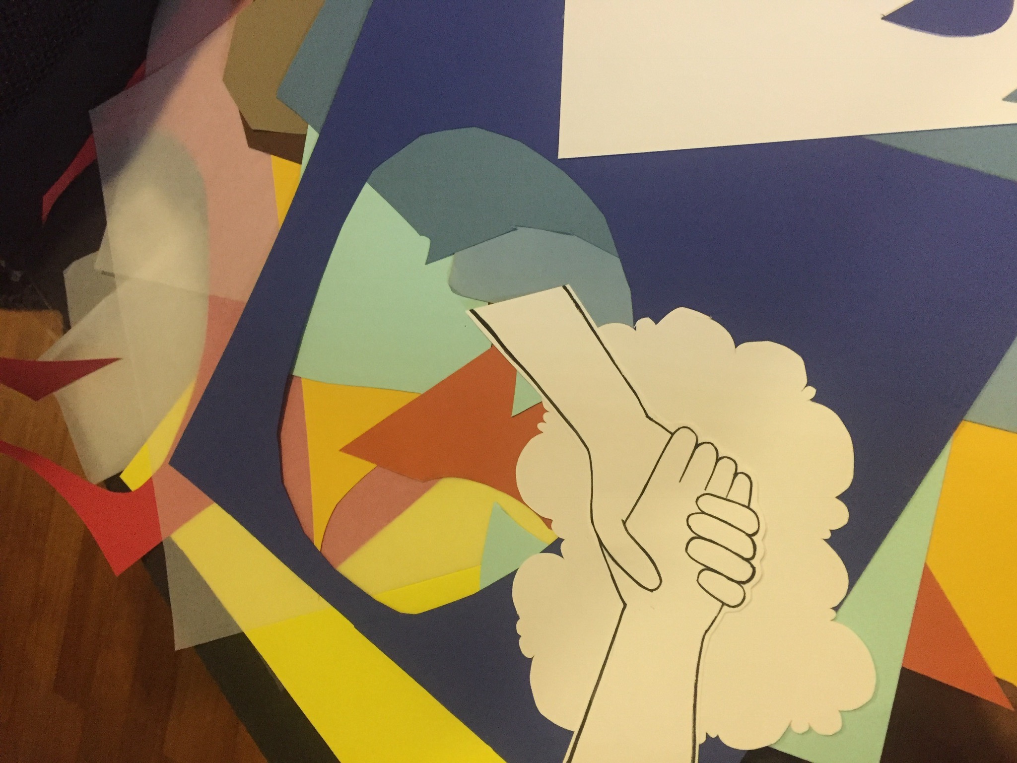
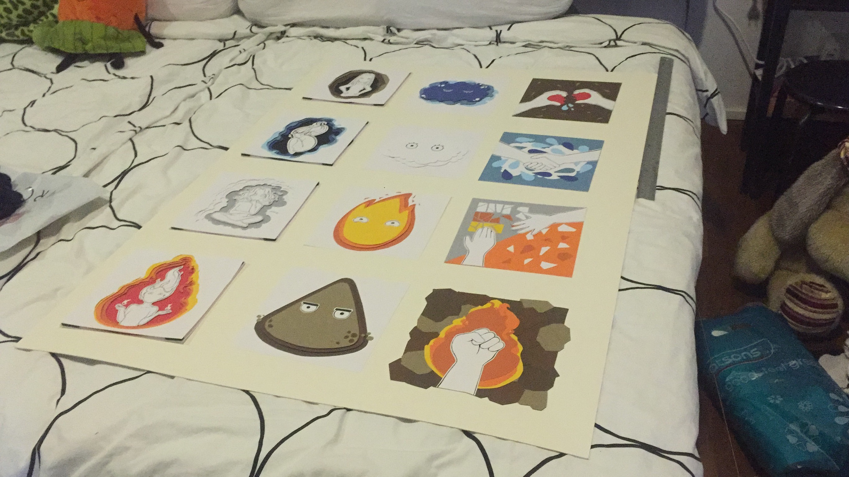
It is amazing to see how I’ve come so far after looking at how scrub my previous designs were. But I’ve finally ended up with designs that I am satisfied with.
I started off with looking for new quotes and sketching out visuals.


 Then, after I have a few that I know what I want to work on, I moved digitally and started sourcing and collaging images together. Some of the ideas/visuals slightly changed due to the limitations of images I could find.
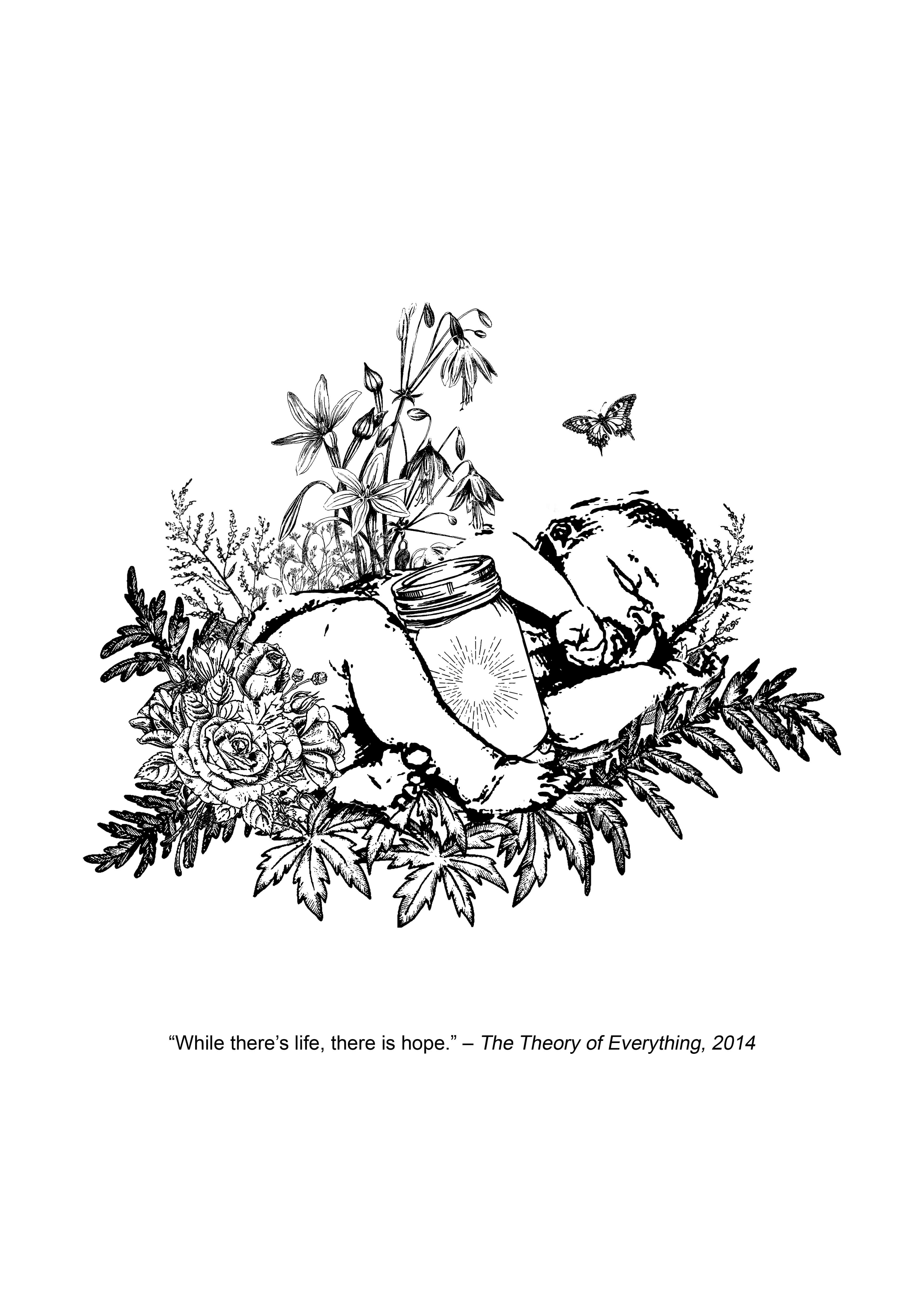
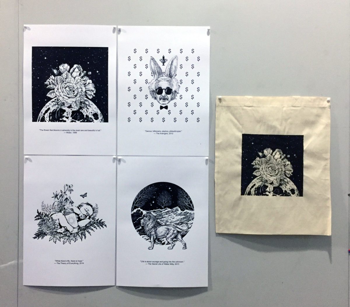
While there’s life, there is hope. – Stephen Hawking, The Theory of Everything
I started off just like my initial sketch, a chest, floral and some animals. When I think of hope, the first thing that came to mind was Pandora’s Box. I thought it was an apt representation of hope. And I visualised a lively scene of animals in the forest, resulting in this image.
Also, I read up more about the Pandora’s box and found out that there are variations where Pandora receives a jar instead of a box and I decided to give it a shot. During the process, it also came to me that babies are a good significant of life, so I put the two together.

That looked quite empty, though it is nice and minimalistic. I tried putting the first two designs together:

And I liked it! It brings more life into the visuals as compared to using a chest.
Before the next quote, I also tried doing “Dreams is full of mystery and magic” from BFG, but I wasn’t able to find good images. And I double checked and found out that this is most probably a quote from BFG’s book instead of the movie. So onwards, to the next quote.
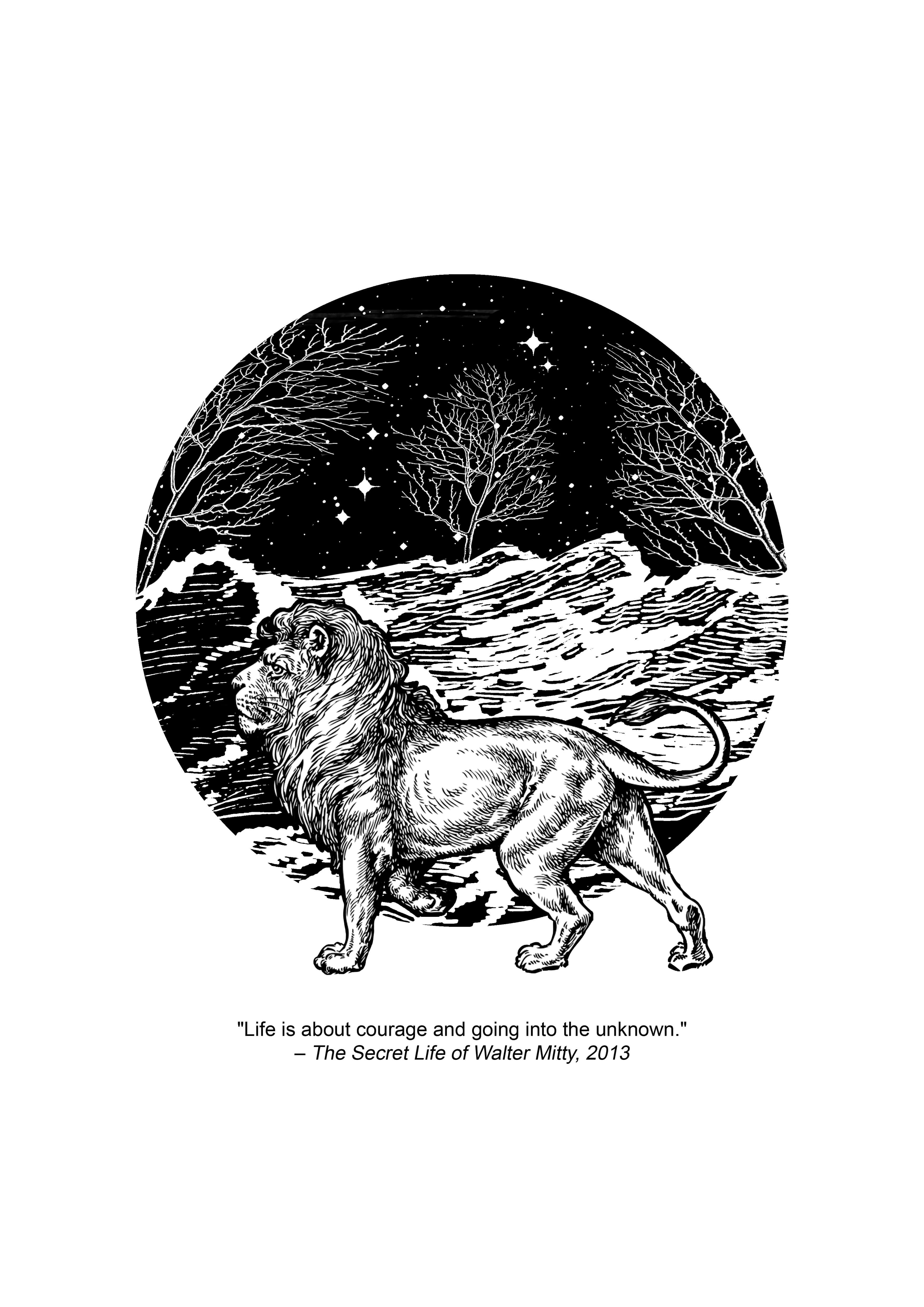
Life is about courage and going into the unknown – Walter Mitty – Cheryl, The Secret Life of Walter Mitty


My first idea was a basic back view of a man walking into a forest (or darkness). And then I had the idea to show ‘courage’, which is where the lion comes in. So it became a man sitting on a lion, going into an unknown black space (as per sketch). But it was difficult to find a suitable man to match this beautifully illustrated lion. I also had ideas to anthropomorphise the lion by giving him a human body. But after not being able to find suitable images, I decided to move on and try doing just the lion.
Before starting on this design, I happened to come across a design on Instagram that used a circle for background. “Why didn’t I think of that!”, I thought to myself. So let’s do it because I like the aesthetics, and also, because it’s a circle of life.
The waves were extracted out of a woodcut and I was choosing between two different images. I settled on this one because it was more obvious and vintage.
The background represents the unknown, the unknown seas, the unknown (and creepy, bald) forests, the unknown space / universe, all coming together to a warped image – representing one big, weird ‘unknown’. Would people walk into an ‘unknown’ so uncertain? That’s where the lion, representing courage comes in, and it is seen to be moving, going into the unknown, or walking through the unknown.
I also particularly enjoy the expression on the lion’s face.
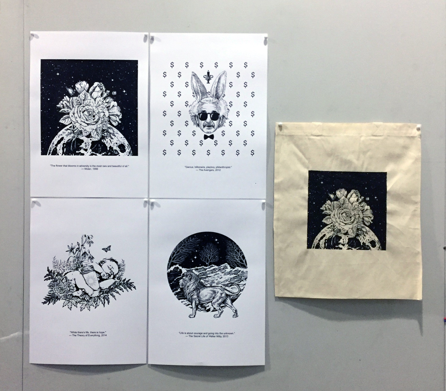
So with that, here are my four final quotes and their designs.

Meanwhile, we proceeded to do the silkscreen transfer. It was so. Cool. Coated our screens with the blue emulsion, let it dry, pasted our transparencies over, and exposed it to light. Then scrubbed the emulsion off, revealing our designs, it looked like this:

Wew! It showed up pretty well! Including the stars, speckles, details and what not. I am quite obsessed with how this looks.
And then, more fun, and more intense. Test prints on silk screens.
Here’s my first try:
 I was amazed that it looked good! Especially since my design has a block of background going on, I thought the actual printing might be difficult and details might be lost.
I gave it a few more tries, all one swift, firm swipe down.
 Some stars seem to be blurring out.


It started smudging.
 And then it finally became disgusting blobs by the fourth try.


By the last try, the screen was streaky and also the ink started smudging. Probably because the screen was clogged with ink.
And then comes the washing off, I learnt that it takes some time and a sponge to properly scrub the ink off the silk screens, clean.
Next week, it was the actual tote bag printing. I brought cloth for some test prints.
Firstly squeegee-ing the silkscreens over the cloth (without ink), the three materials (news print, my cloth, tote bag cloth) felt obviously different.
I wanted to do one test print before printing on the actual tote bag, but ended up with so many because they all turned out bad! I thought I had talent with this when I was doing it on newsprint, but apparently not.
Also, this time round, I washed the screen every time before a print to make sure ink doesn’t get clogged up like it did during the newsprint trial.

 The first few tries didn’t turn out so bad, but to my surprise, it actually took more than one swipe because somehow the bottom half of the design would get choked up halfway through. Perhaps I was using too much strength.
And the challenge with using more than one swipe: details get lost as more ink go over. If I don’t go over the whole design, it will also be quite obvious when all the leftover ink pile up in the middle of the screen.


This took one swipe, but this is the kind of choked up I am talking about.

Also a lot of imperfections, the screen wasn’t filled with ink properly.

This was trying to squeege really slowly. The ink seeps through a lot more this way, causing details to be lost.
It’d definitely be ideal to do it really quickly, with the squeegee at a right angle, and the right amount of strength. I think it really is a lot about the feel of the process. Especially it was obvious that my outcome was worse after every try probably because I was feeling very doubtful about it.
But eventually, I managed to print the design on quite a few totebags! Not every piece is perfect, but every piece is unique.
Brace yourself for a really, really, long post.
In Project 2, we were tasked to create vintage style designs based on movie quotes. However, the challenge was, we were not able to include any words or obvious representations of the characters, scenes or the quotes. Also, we were challenged to use symbols, wingdings, dingbats, and all that sorts.
In the previous post, I’ve included 5 images / gifs of my chosen quotes. And here are my draft designs. (Disclaimer: they’re quite baaaad.)
ONE
We’ve all got both light and dark inside us. What matters is the part we choose to act on… that’s who we really are. – Sirius Black, Harry Potter


TWO
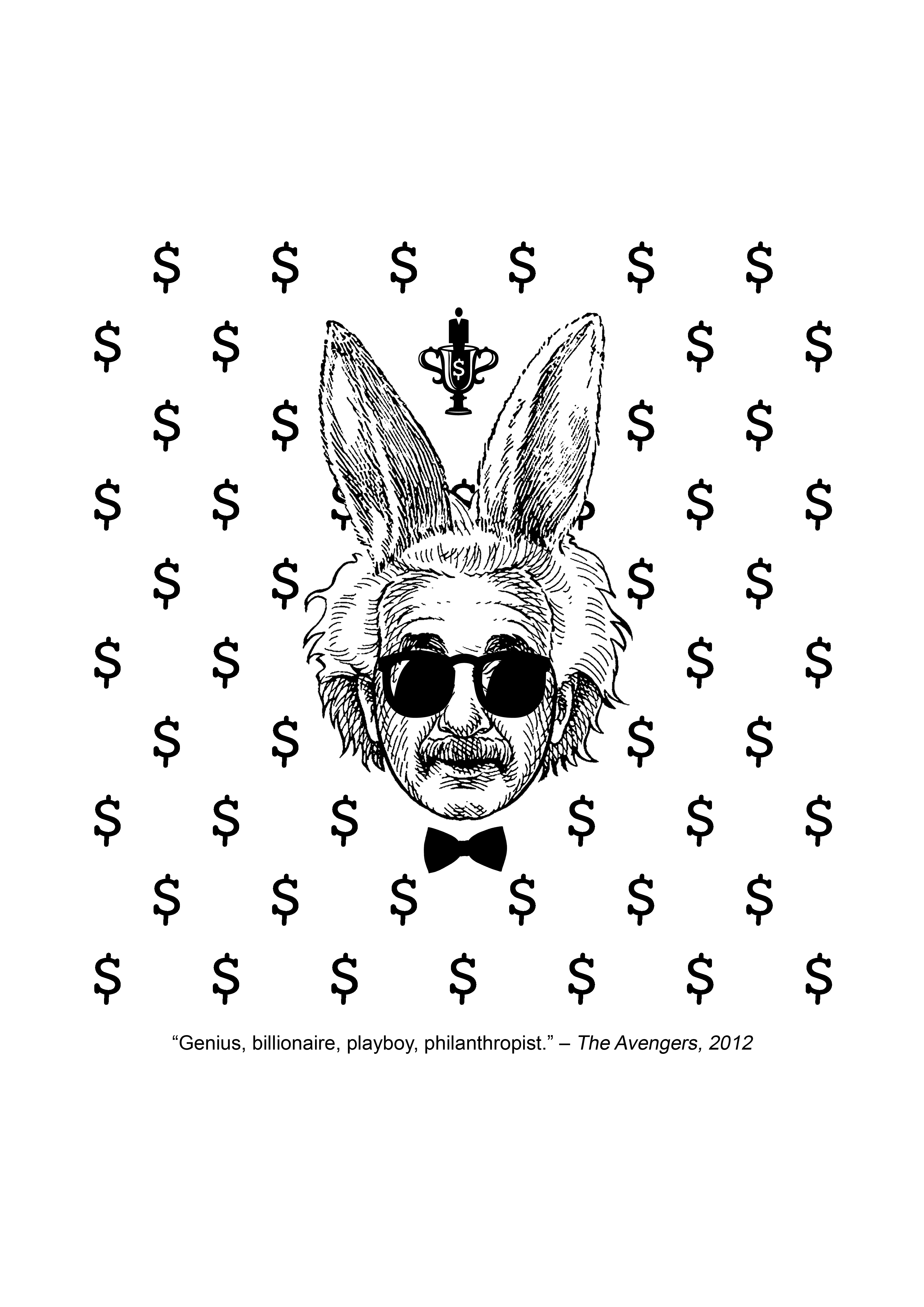
Uh, just a billionaire, playboy, philanthropist. – Iron Man, Avengers


THREE
Doth mother know you waereth her drapes? – Iron Man, Iron Man


FOUR
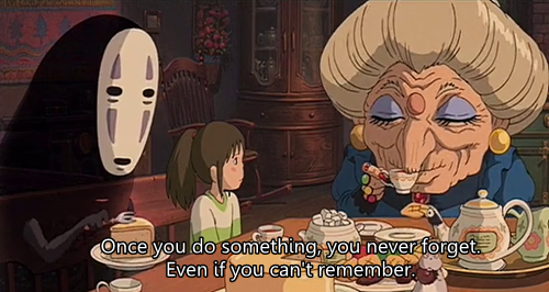
Once you do something, you never forget. Even if you can’t remember. – Zeniba, Spirited Away


 The remember finger design is slightly okay, but there’s already a design out there that this exactly like that.
Finish what you started, human! – Kamaji, Spirited Away
The first drafts really weren’t fantastic, and I wasn’t able to come up with much research initially.
I found this wood cut artist, by the name of Kent Ambler when I started off.


I quite like his work! It was like a nice blend of a rather modern expression of art in the form of woodcuts, which is a more traditional medium. I also like how he has his own specific themes, seen in the various “Everything will kill you” woodcuts. It is also obvious that he works a lot on animals and nature. He has a lot of interesting stuff, but I definitely failed to apply what I’ve garnered from him into my first drafts.
Unsatisfied with most of my above designs, I set off to look for quotes again and did more designs. In the midst of the second round of designs, I looked for a lot more artist references.
Since it was black and white themed, I started off with Dr. Woo, a tattoo artist, I’m following on Instagram.


Dr. Woo has a very distinct style, and makes use of very thin lines and a lot of geometric shapes, particularly circles and arrows and lines. I like his work, but I thought I could research for artists that were more relevant.
I found Amy Fierro, a silkscreen artist selling her prints on etsy. Here are some of her work:

I like the use of repetition, the same print, but in different colors. Through the design, your eyes are told where to look.
 As always, I love the use of negative spaces! It is very cute and the lines feel very organic and comfortable to look at.
 Oh, why didn’t I think of using silhouettes? Though there are some words here, I thought maybe, if there was a fitting quote, I could make animal-themed designs.
And then, I also remembered how I loved, and loved to design vintage logos. Perhaps I could design something like these, though many of these consists words or names, but I could work in a similar direction?


And finally, after all that creeping around on the internet, I stumbled upon a new genre of art I didn’t know about, but now love. Vintage collages. It started off with a post by Eugenia Loli.


How awesome is that. Also, they seem befitting to the theme of the current project, except the use of detailed images and colors. I was reinspired to do more designs for this project.
From Eugenia Loli, I discovered more artists involved in this style of art. They are Eugenia’s influences, and I can see why.


(I love his signature blue / turquoise color schemes!)
Other than looking for more references, I also sought to look for quotes that could more easily conjure images, instead of actions or thoughts like most of my previous quotes.
So, here is round 2 of my designs. (Disclaimer: most of them, still not fantastic)
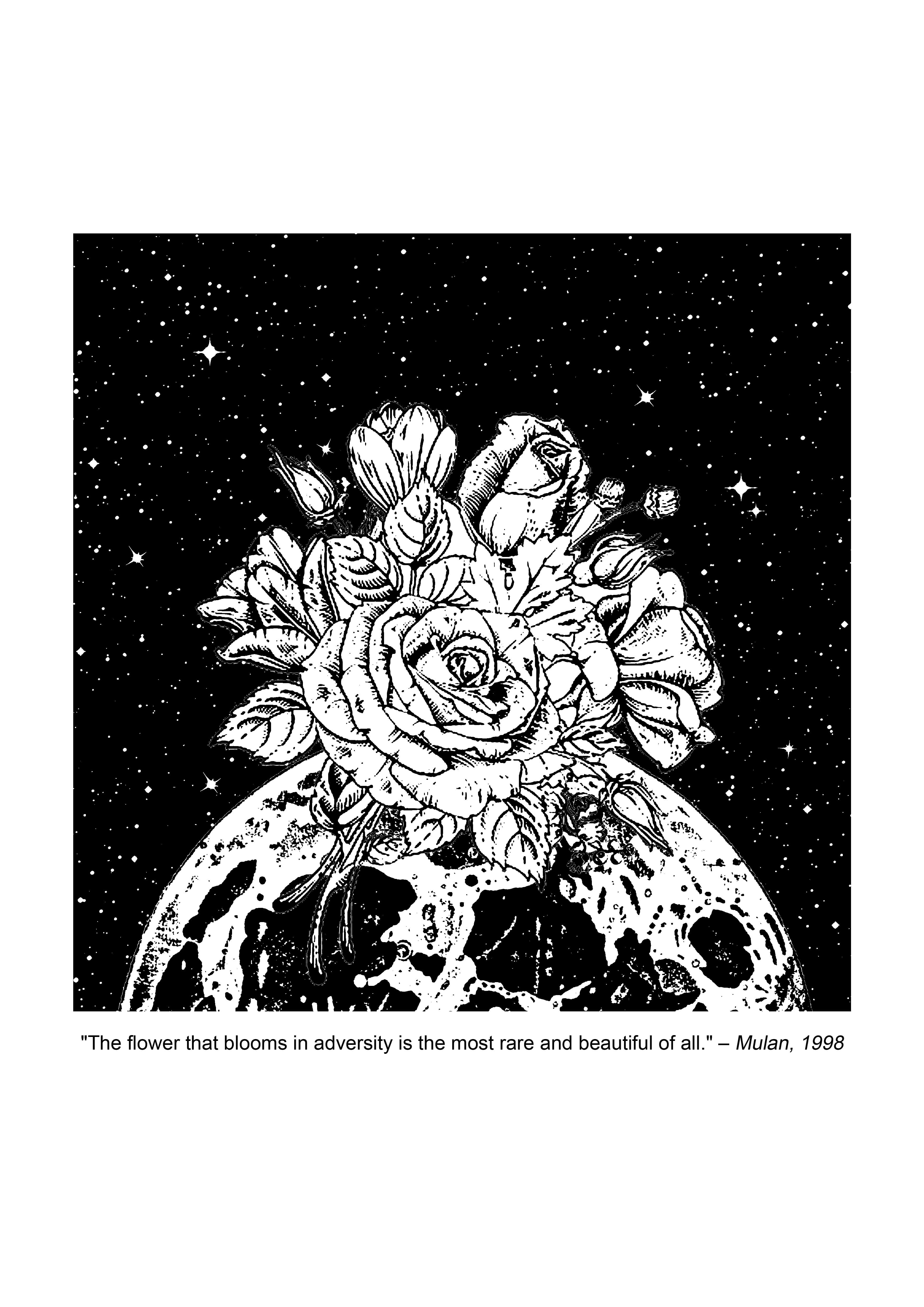
“The flower that blooms in adversity is the most rare and beautiful of all.” — The Emperor, Mulan.
I felt particularly inspired at the first quote. And hence chose one of my designs for it for print. The one which visuals I heavily borrowed from Eugenia Loli’s collage of Spring Crop at the Rosseland Crater.

Looking bad at it now, it is really a bit too similar…
When I found the Mulan quote, I was reminded of the image above. Because flowers don’t grow on the moon, and if they do, it must have been an ‘adversity’ for them to grow despite the conditions and they would indeed be really rare and beautiful flowers.
 I started off with this.
 And then played with different placements. The white stripe was accidental, but I thought it looked quite cool.
 Because vintage means sunbursts.
 And what if the background was white?
 Let’s not be too similar to the reference image. Mulan, represented by a vintage female character, dressed in a suit? She looks like she owns it.
 Instead of a suit, how about man’s ancient Chinese robes, just like in the movie? Replacing the head with a flower, to represent Mulan, the flower who grew in adversity.
Eventually, my classmates favoured this design and suggested that I should add some stars in the background, so I did.
 This is the design I chose for silkscreen printing.
Use that big brain of yours to think your way out! Look for a new angle! – Tadashi, Big Hero 6

 I attempted to use exaggeration to prove ‘big brain’, but that didn’t work out well. Also, the patterns in the background are my abstract representation of angles… Which no one got / accepted except me. (It’s okay, I get it.)
Using patterns to help convey angles. And an eye to convey ‘look for’. But evidently, for either designs, they don’t seem to be working to communicate the message.
Girls stop using YOLO as an excuse to be a hoe. – Ted, Ted

 Well, a literal hoe. And a rope, to represent bungee jumping. Extreme sport, YOLO, get it? Ok I know this one is really bad. Obviously I wasn’t inspired.

Another weird thought process. Cookies for whoever who can solve this riddle.
I still think that I could do better for the rest of my designs (it was all still scrub, except for the Mulan one), perhaps I was really boggled by the challenge of movie quotes and ‘metaphorical visuals’. At this point, it was a lot about finding a suitable movie quote and having an inspiration to make a design out of it.
In the next post, I talk about my experience with silkscreen printing before moving on to the process for my final designs!
Sooo, onward to our next project – silkscreen printing!!
This time, it’s about transforming movie quotes into vintage, olden like black and white collages. Abstract, of course.
So here are some quotes that I’ve sieved out:


Next steps – looking for artists that inspire me, and start sketching out possible concepts with the quotes! Also, researching on possible resources.
Full list of quotes considered:
SPIRITED AWAY
– Once you do something, you never forget. Even if you can’t remember.
– Finish what you started, human.
HARRY POTTER
– We’ve all got both light and dark inside us, what matters is the part we choose to act on. That’s who we really are.
– Have a biscuit, Potter.
– I solemnly swear I am up to no good.
– All was well.
– Until the very end.
– You’re just as sane as I am.
SHERLOCK HOLMES
– Tea, Mr Holmes?
– My mind rebels at stagnation.
– To a great mind, nothing is little
MEAN GIRLS
– That is so fetch!
GHOSTBUSTERS
– Don’t cross the streams.
– Okay, who brought the dog?
IRONMAN
– Genius, billionaire, playboy, philanthropist.
– Doth mother know you weareth her drapes?
Last Friday, we finally concluded My Line is Emo.
It took a total of about 4 (or was it 5?) all-nighters in school, and here’s some progress pix:
 Dismantled a bouquet and experimented with different parts of it.
 Water color droplets I tried to smack to create an explosion effect, but failed.
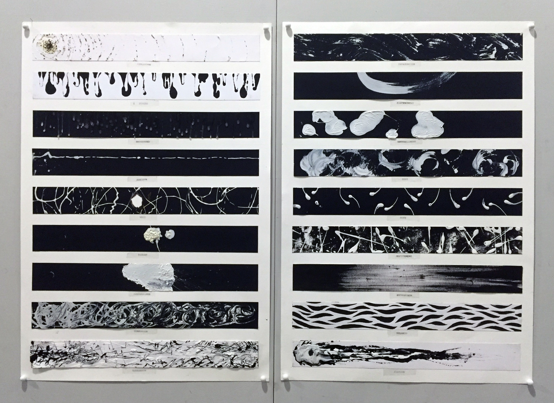
 A huge part of development included labelling my works like a crime scene.


After all that development, I learnt a hard lesson that art can’t be replicated…


Through perseverance and some encouragement, I am relieved to have finally collated 18 lines, albeit I thought the final outcomes could be better. Especially if I had collected my final pieces as I was doing my development – saving the time trying so hard to replicate, and capturing the precious, single moment, feelings and space when the piece was created.
It hasn’t been an easy or clear ride, but it’s been a first for bearing our emotions and documenting them in the form of visual art.

Farewell, my emo lines, farewell.
For last week’s class, we did memory sketches – closing our eyes, visualising a piece of memory related to the emotion given, and letting our hands take over. It wasn’t an easy exercise for me as I am accustomed to putting things behind, hahaha. And I have a gold fish memory too.


To sum it up, here are some attributes I’ve observed for each of the emotions:
Angry: Dark, bold lines, sharper, faster
Happy: Lighter lines, swirly, loops, circles
Sad: Lightest lines, downward lines, obvious pressure points
I feel for the sadness piece the most as I am more familiar with my sad memories than happy or angry ones.
It was an interesting exercise and I am looking at developing my sketches further, using different mediums and different crops.
A lot to do this week!


