Month: October 2017

Short Film : The Unspoken Suspicion

A girl,my best friend, whom I had lost in touch with ever since she transferred to another school. Her family moved to a secluded neighborhood and so she had to comply and transfer to the school within that area. This is the story that I came up with, in regards to her life journey after she has left my school…

Why did I choose this sound technique? 

It raises and built up tension, making the audience expecting something is about to happen. Exaggerated sound (eg. eating) makes the overall vibe seems unnatural and hence, creating a distorted/weird image which is intentional.

Planar construction

As I looked up for inspirations of planes sculpture, I noticed that some do not have the 3 elements of Dominant, Sub-dominant and Sub-ordinate. But I do like the overall visual composition that they produces, experimenting with different types of planes.

The types of planes that I used in making the plane structure are mostly consist of twisted, curved and bent planes.

For model #1, I tried making a void to have a “breathing space” for the overall structure. The “activity” happens around the S.O area. Hence, complimenting with the void which located opposite. The S.D is being wedged into D as well as the S.O. Also, the Dominant also are being wedged at an angle onto itself.  The rule of thirds are also being applied in order to make the structure balance and looks pleasing. (though the measurement might be a little off.)

For model #2, I tried wedging the SD onto the D to create a connection between them. The SD starts with a twisted plane(to complement with the D) and then morphed into broken plane.

Personally, I think model #2 is too clustered and looks “chaotic” due to the lack of breathing space and too much of twisted and curved planes.  Also I noticed that for model #1 the structure is from ground towards ground. Hence, I think i might create another model that based from ground towards upwards. And make it much simpler yet aesthetically pleasing.


-DN-

Design #01

Design #01 (other designs will be uploaded in next few days)

2 Days in Paris // Movie Synopsis

A European vacation was intended to repair the tattered relationship between American Jack (Adam Goldberg) and French native Marion (Julie Delpy). But, by the time they arrive in Paris to visit Marion’s family, it is clear the trip is not going well. The city brings out aspects of Marion that only alienate neurotic Jack further, from her in-your-face politics to her former boyfriends, who surface in every cafe. Thus the most romantic city in the world could mean the end of the couple’s romance.

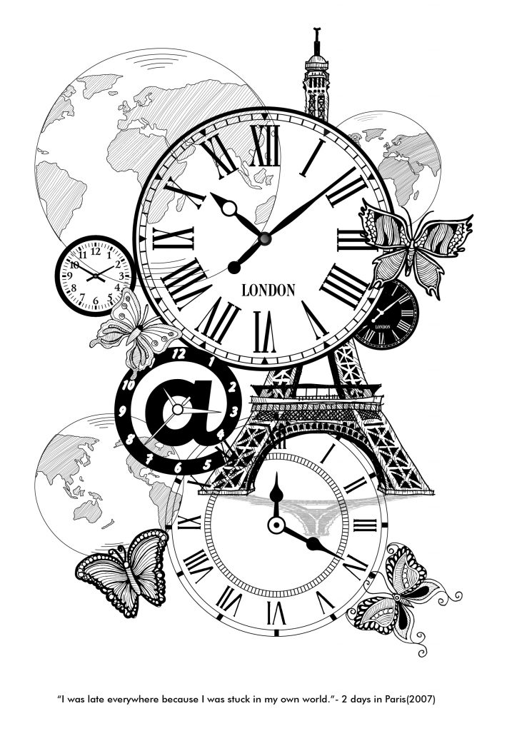
Keyword: late, everywhere, stuck in my world

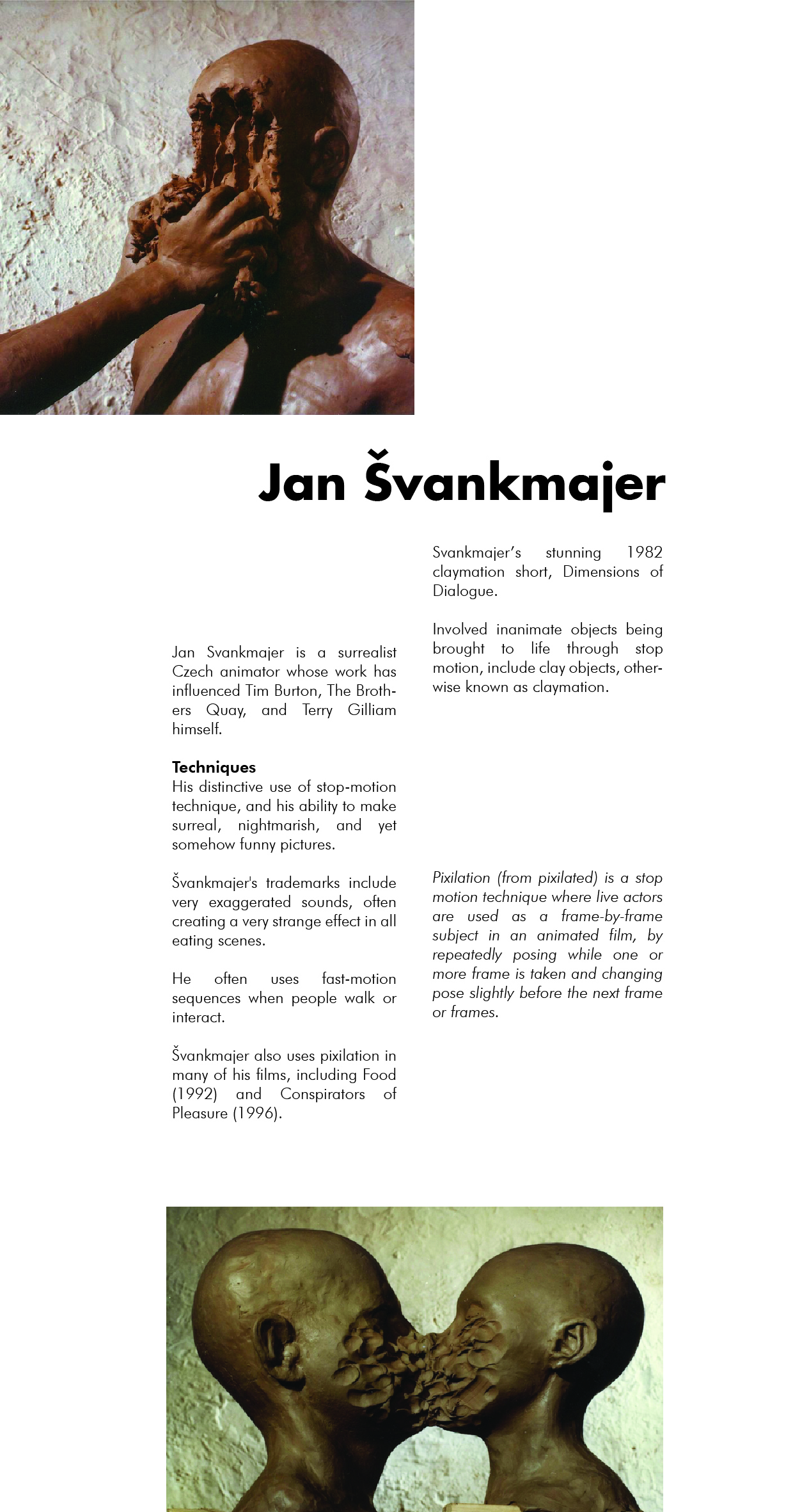
For the first draft, I make it really simple and straightforward. The idea of late is represented by the clocks. And these keywords: “everywhere”, “world” are both represented as globes.

The butterflies shown is the main character, Marion. These butterflies revolved around the globes, whereby she “was always late everywhere”. Whereas the clocks shows that the time is ticking away and waits for no one- including her. This explains why she was always late. I also had included the Paris Eiffel Tower to emphasis the title of this movie which is “2 Days in Paris”.

The main character, Marion, was involved in many complicated relationships in the past. Coincidentally, she kept meeting her exes and hence agitated her current boyfriend. She tried making up excuses along the way. This brings to my second draft of design #01. I tried complementing flowers with the Roman clock as these flowers refers to Marion. She was like a flower, attracting guys wherever she goes. Also, I inserted the Eiffel Tower, just like the movie title suggested.
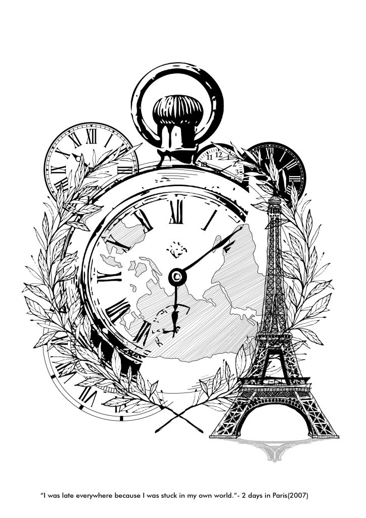
However, I am not really satisfied with the design as there is like 2 focus point in the whole composition, which are the Eiffel Tower and the Roman clock. So, for the third draft of design #02, I eliminated the Tower.

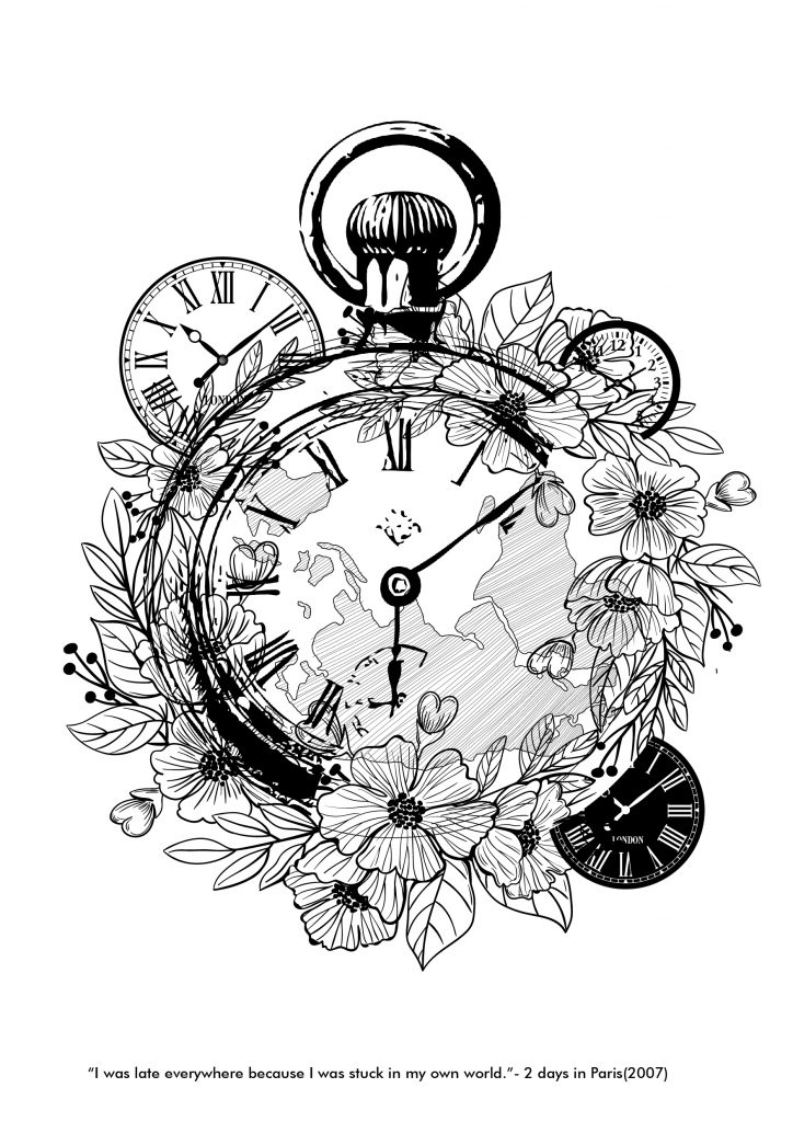
Personally, I liked this design the most, but it looks abit cluttered and packly dense. The idea of using flower here also might not be appropriate and does not really shows its hidden meaning behind it. The globe, which is inside the roman clock does not really shows and has a lack of presence. So for the fourth draft of design #01, the main focal point would be the globe.

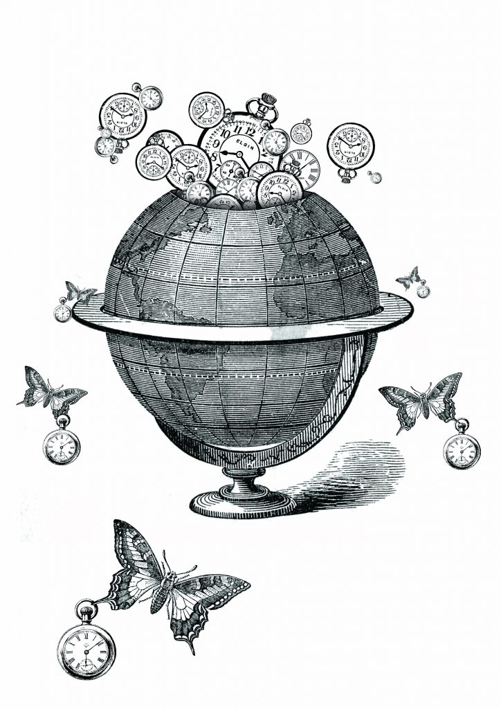
Draft #4 is my favorite of all, hence it might be included in one of selected designs.


Artist reference: Dan Hillier

Dan Hillier is well known for his black line engraving and steam-punk style in his art work. He likes to combine elements of the Victorian era and his fascination for animals in his work. His work is characterized by depictions of fantastical human/animal hybrids, spliced together with late-1800s imagery. Hillier’s beautiful, classically rooted images find their power in their unsettling effect, as they seamlessly blur distinctions normally implied by reality.

When I look through his works, I can see that he was trying to produce images that provoke humour, wonder and surreal.  He likes to sift through source material from old books and illustrations, which can be seen by those 1800s imagery. Nearly all of his work comprises totemic or iconographical combinations of human, animal, plant and mineral forms.

 He even uses the Gestalt theory of Pragnanz, using two eagle eyes to form an image of a human face. I really hoped to use the Gestalt principle in my upcoming designs, though it will be definitely difficult- to make a good one.

He bends many different elements into a cohesive whole that becomes an expression of his imagination. It is simply an enjoyable way to make pictures- which what I felt during this whole journey of printmaking assignment and editing of pictures/collages.