
DFT – differantly
An artist duo. One line minimalism,deconstruction.
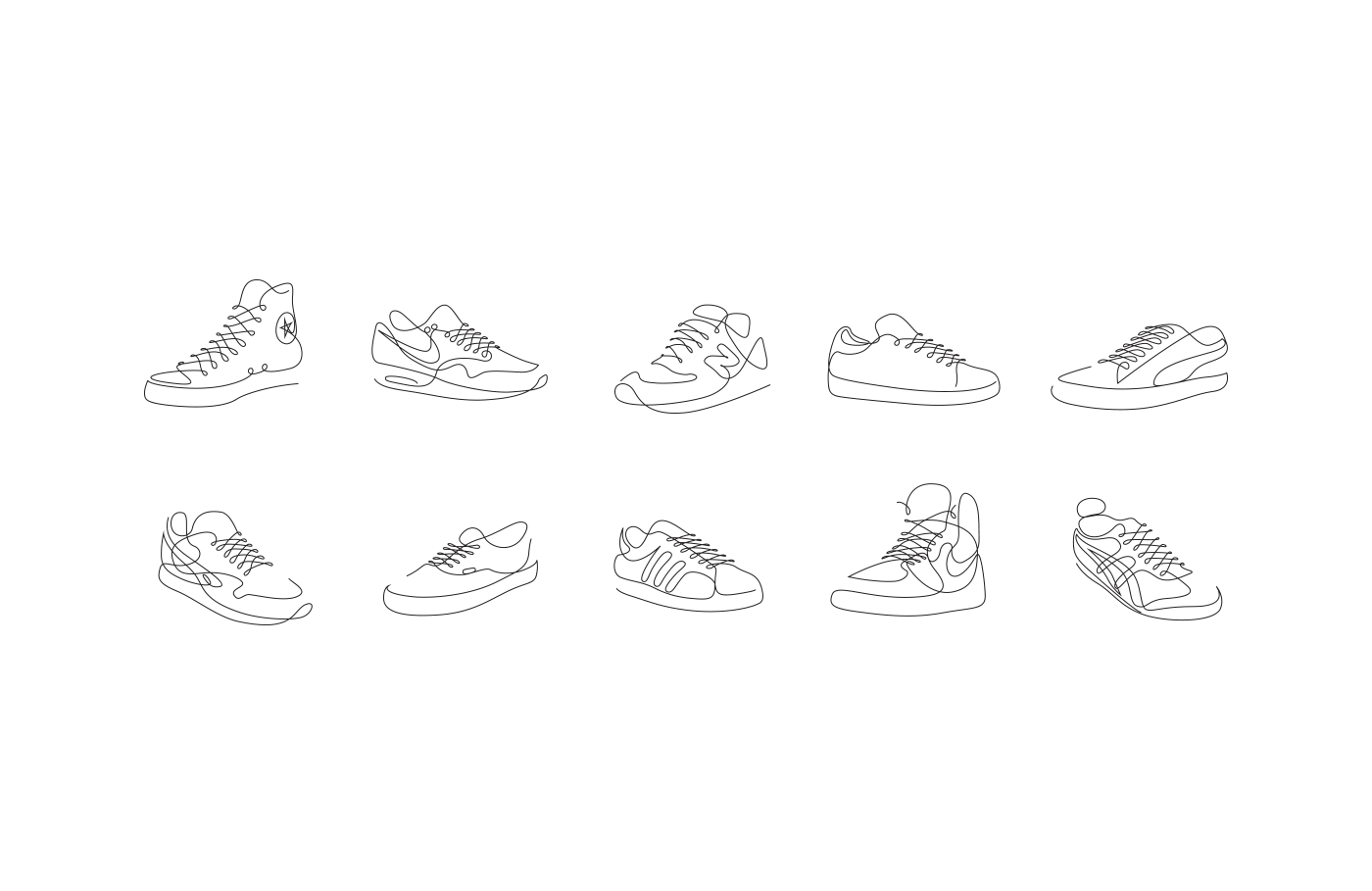
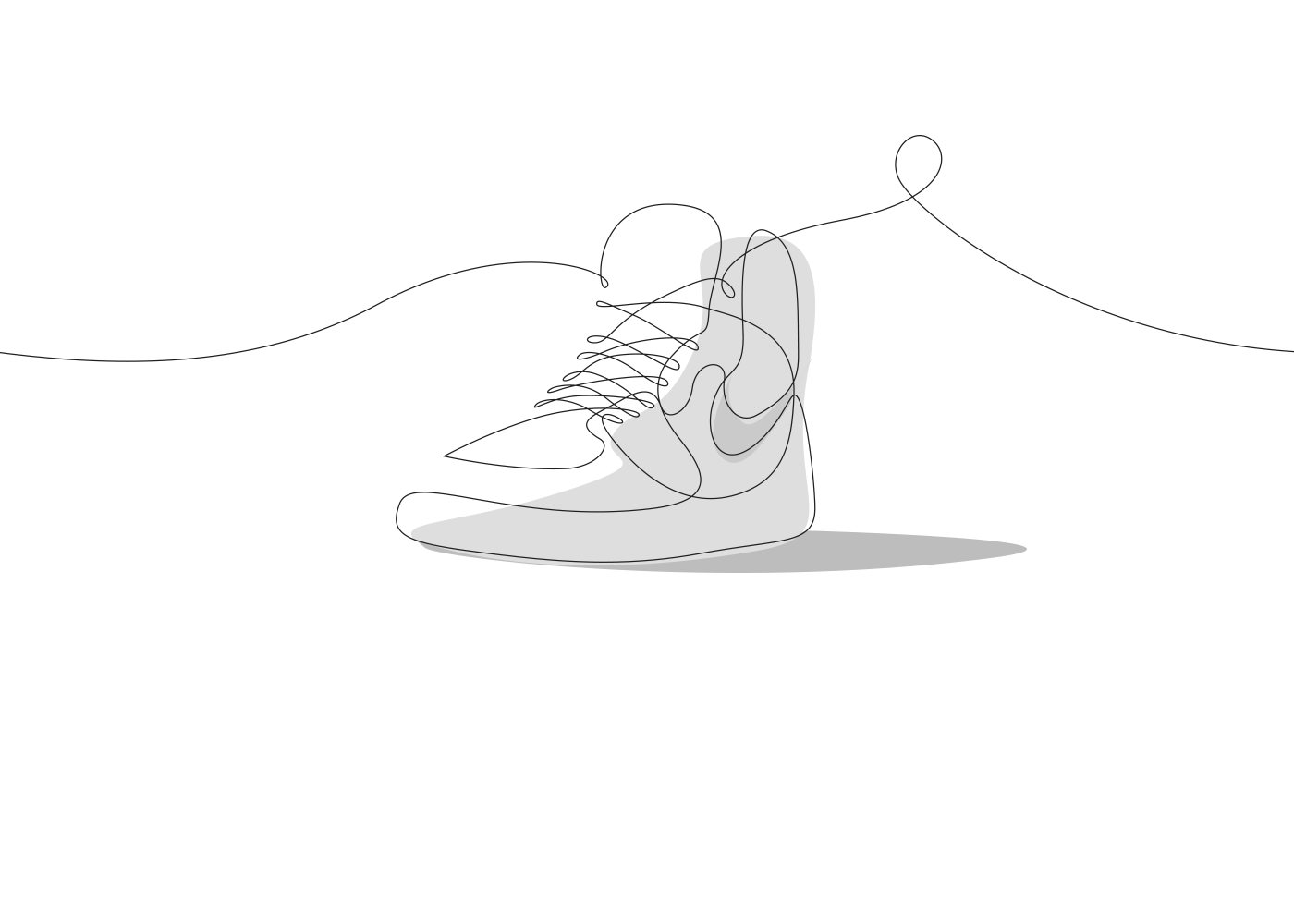
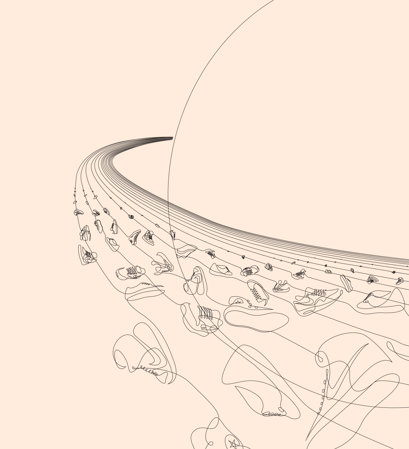
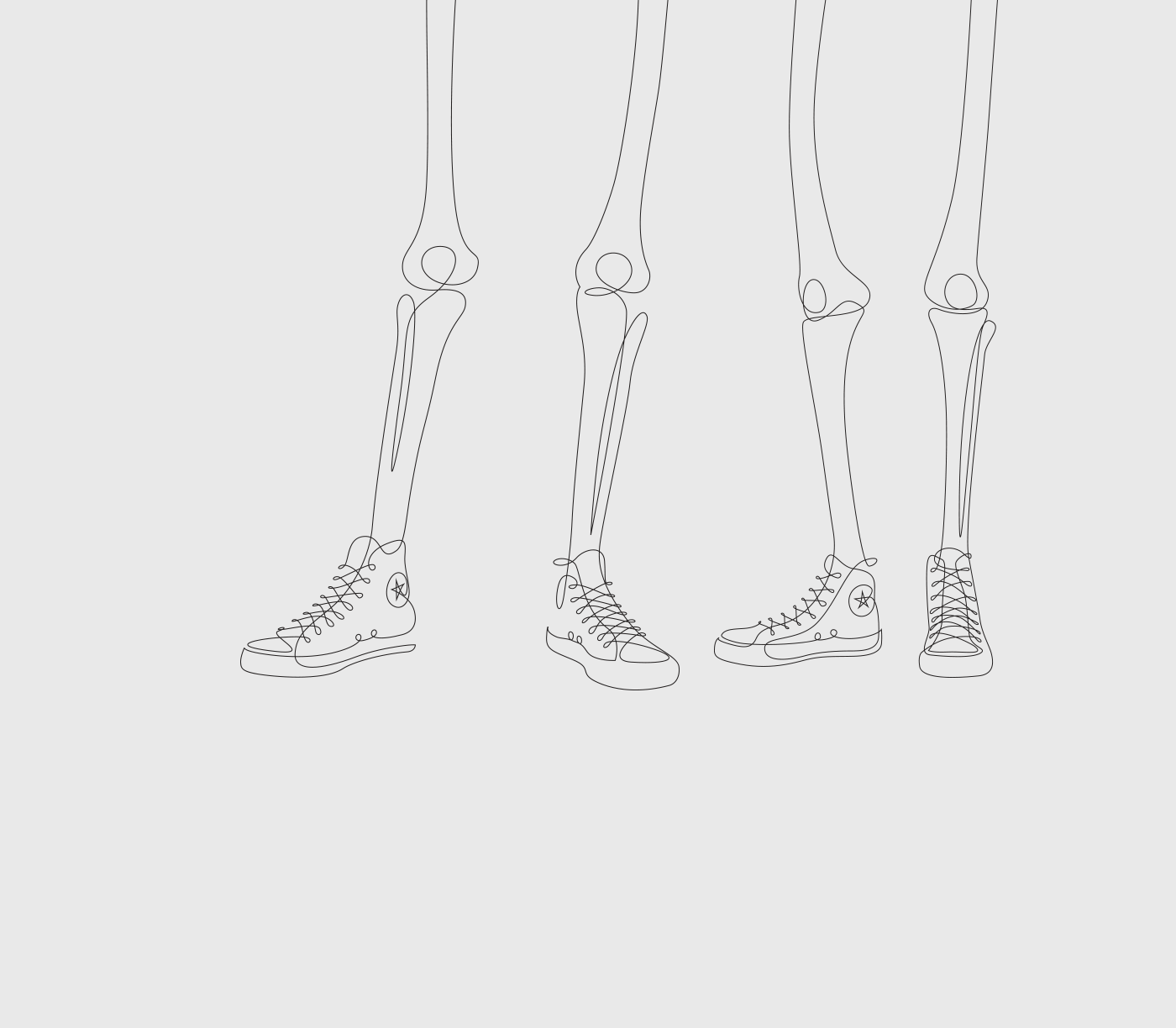


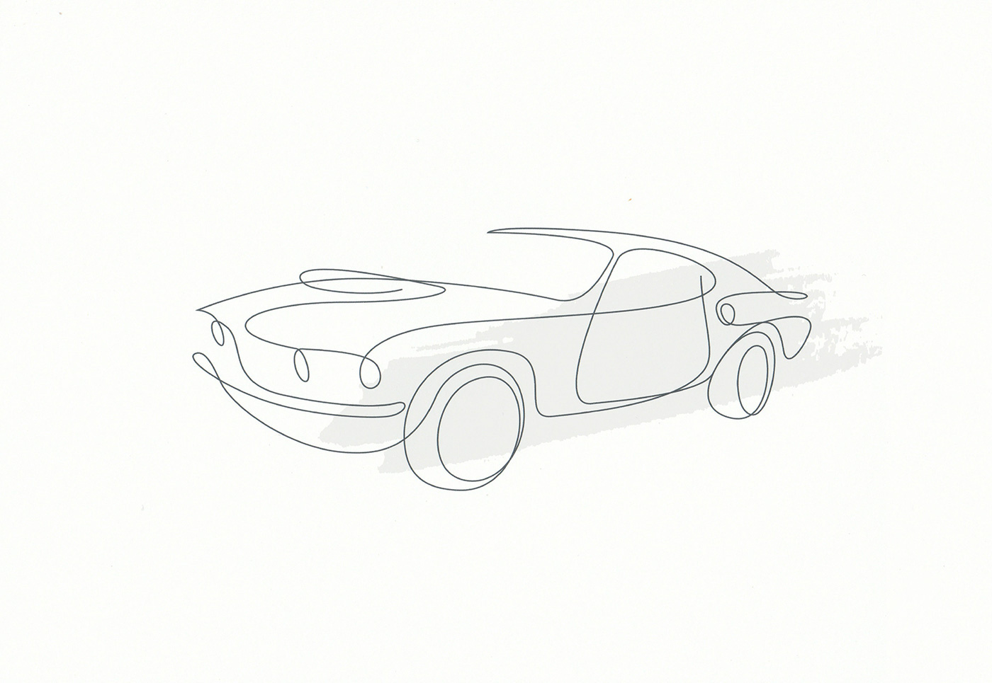
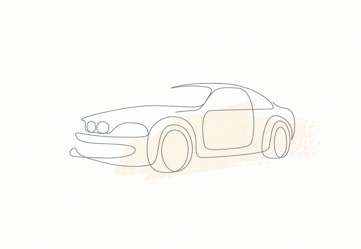
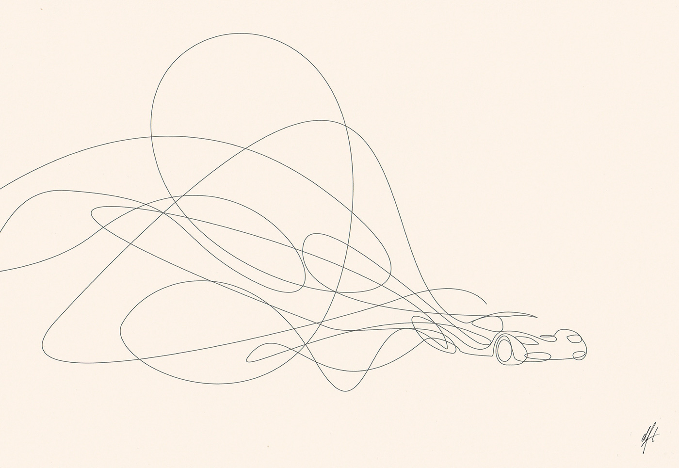

These 2 artists are known for their minimalist distinctive single line drawing. They deconstructs a complex imagery into two-dimensional minimalist art. I really liked how they could create such an impactful illustration in a form of minimalism. Their works inspires me alot but drawing a single line without stopping might be too difficult for me to achieve.
Nabilazirus
An illustrator and makes collages of herself.


Her illustrations reflects much about herself and her interests. It is a combination of collages of real images and her own doodly illustrations. Most of her works, she used varieties of colors without a fixed color scheme. I really liked her style as it looks quirky and fun!
TOMMY PARKER
he’s an illustrator in UK. Most of his works have a fixed color scheme, such as complementary color scheme or analogous color scheme, etc.


Some of his works are taken at a unique perspective (such as the previous 2 images), which I personally think that is the focus point and makes it more interesting. I really liked a view from a high perspective as it is different.


He used analogous color scheme, shades of pink, purple and a hint of orange. I intended to use this color scheme too, but of different intensity and tone.
VINCENT MAHE
A Paris-based illustrator. And his most popular award wining series is what captures my attention and inspires me alot too! The series, Neighbours, in which he illustrates the various characters he spots while watching nosily from the window of his Paris apartment. Subjects include a bewildered-looking window cleaner, a raucous-looking house party – a collection which makes me feel like as if I am in London, part of this busy happening street with much activities.
.
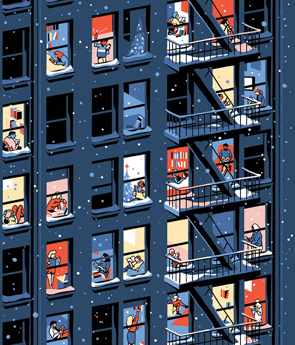


His choice of colors are amazing. I’m intrigued at how the overall composition and the whole series looks like. There is a constant theme throughout and the use of colors also creates a focus for a certain part of the illustrations. This color scheme is complementary harmony which consists of different shades/ tones of blue and orange.
Some of his works also includes outline of the drawings, which doesn’t necessarily a bad thing. It is a style that he created and makes it cartoon-ish.


](https://www.creativeboom.com/uploads/articles/53/5316ae99794fb6041c8048de148d483e96da31eb_860.png)
](https://www.creativeboom.com/uploads/articles/d3/d35f44d549cc2c0fe4cfa89a18167455f4bb0c29_860.png)
](https://www.creativeboom.com/uploads/articles/c7/c73c5b0f9482c37f8c3d7a33ddd47816a3090919_860.png)
](https://www.creativeboom.com/uploads/articles/47/470d5105235f6a2ed9be85743c582a4240903083_860.png)

Recent Comments