Design #01 (other designs will be uploaded in next few days)
2 Days in Paris // Movie Synopsis
A European vacation was intended to repair the tattered relationship between American Jack (Adam Goldberg) and French native Marion (Julie Delpy). But, by the time they arrive in Paris to visit Marion’s family, it is clear the trip is not going well. The city brings out aspects of Marion that only alienate neurotic Jack further, from her in-your-face politics to her former boyfriends, who surface in every cafe. Thus the most romantic city in the world could mean the end of the couple’s romance.
Keyword: late, everywhere, stuck in my world
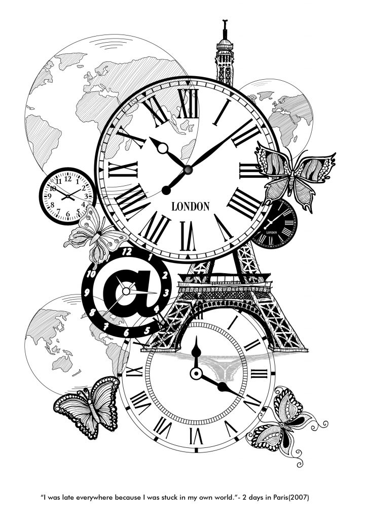
For the first draft, I make it really simple and straightforward. The idea of late is represented by the clocks. And these keywords: “everywhere”, “world” are both represented as globes.
The butterflies shown is the main character, Marion. These butterflies revolved around the globes, whereby she “was always late everywhere”. Whereas the clocks shows that the time is ticking away and waits for no one- including her. This explains why she was always late. I also had included the Paris Eiffel Tower to emphasis the title of this movie which is “2 Days in Paris”.
The main character, Marion, was involved in many complicated relationships in the past. Coincidentally, she kept meeting her exes and hence agitated her current boyfriend. She tried making up excuses along the way. This brings to my second draft of design #01. I tried complementing flowers with the Roman clock as these flowers refers to Marion. She was like a flower, attracting guys wherever she goes. Also, I inserted the Eiffel Tower, just like the movie title suggested.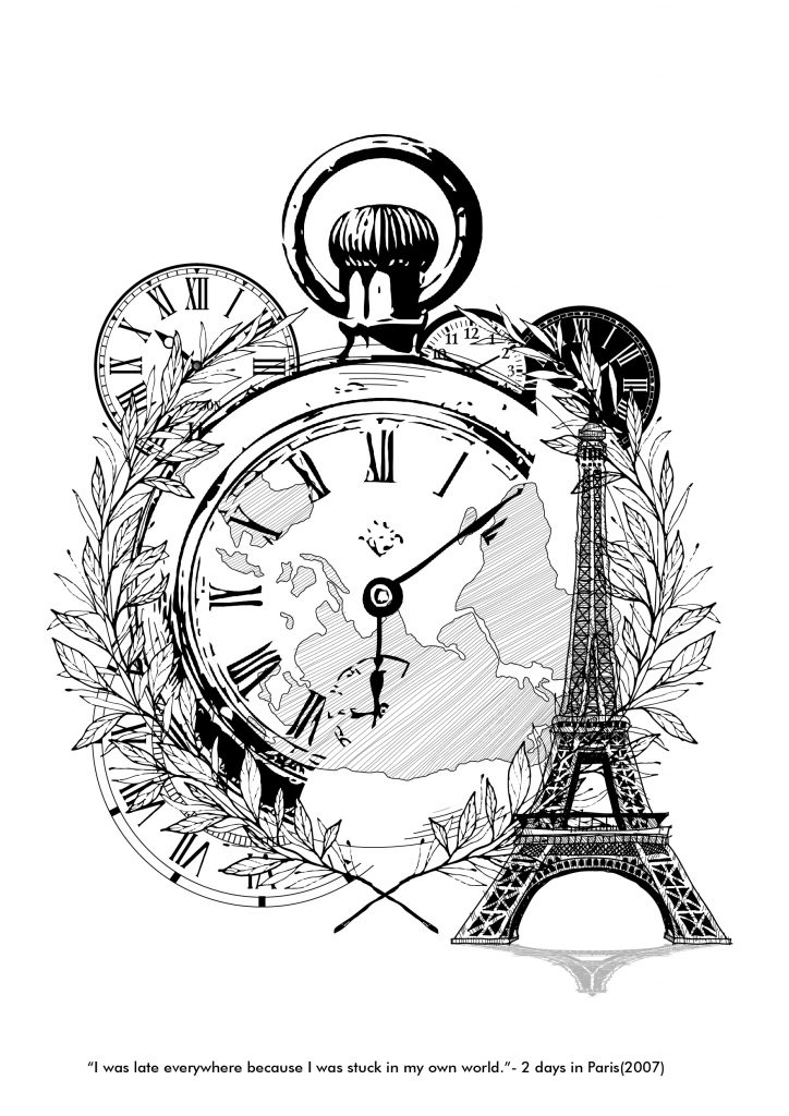 However, I am not really satisfied with the design as there is like 2 focus point in the whole composition, which are the Eiffel Tower and the Roman clock. So, for the third draft of design #02, I eliminated the Tower.
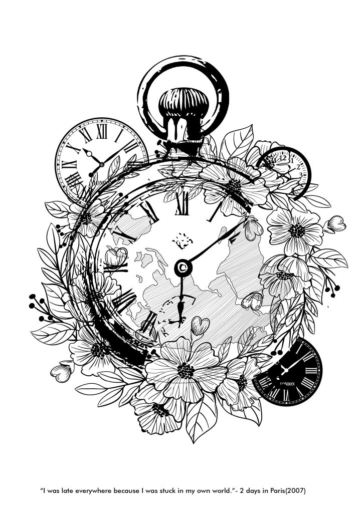
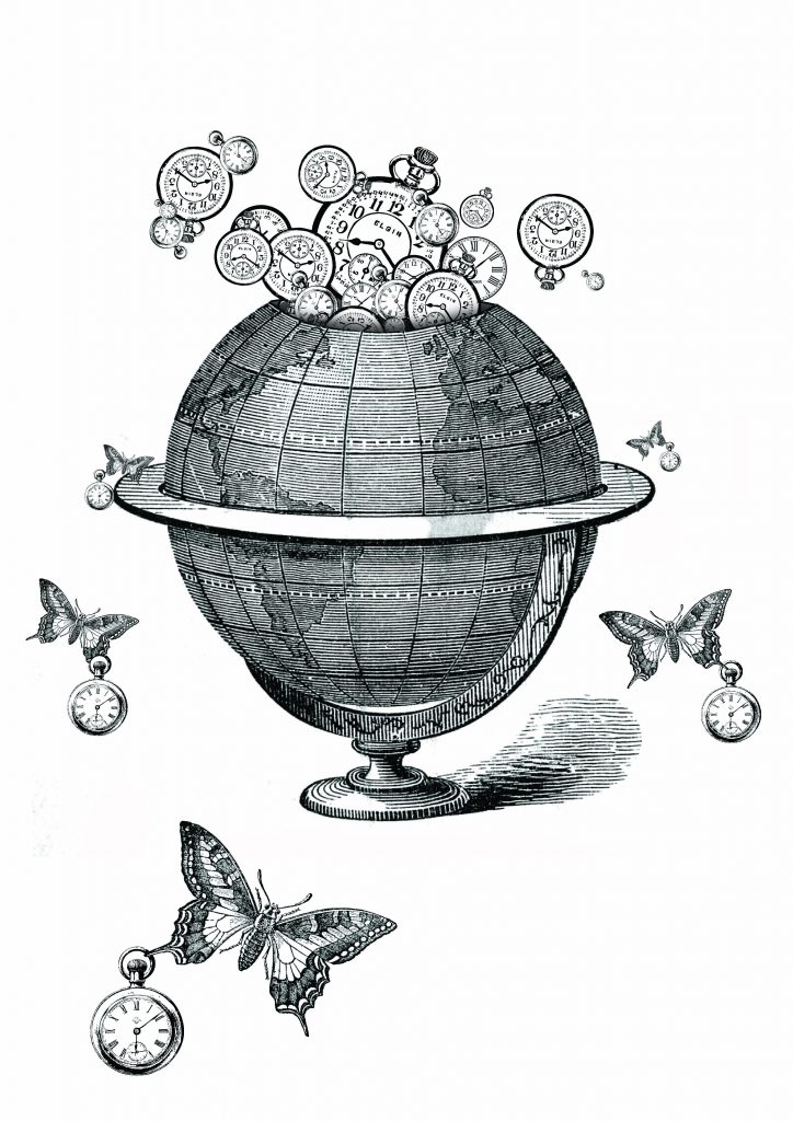
Personally, I liked this design the most, but it looks abit cluttered and packly dense. The idea of using flower here also might not be appropriate and does not really shows its hidden meaning behind it. The globe, which is inside the roman clock does not really shows and has a lack of presence. So for the fourth draft of design #01, the main focal point would be the globe.
Draft #4 is my favorite of all, hence it might be included in one of selected designs.



Recent Comments