Our Arts & Health programme aims to bring creativity into different care and community settings for therapeutic, educational, and expressive purposes. Programmes such as visual arts, performing arts, art and music therapies reduce stress, increase social engagement and offer outlets for patients and caregivers to express themselves and improve their emotional and mental recovery.
Concepts Slogan
Join Us and Have Fun
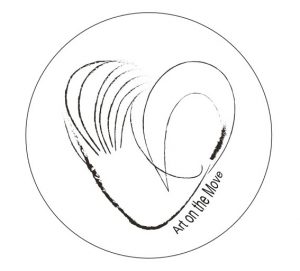
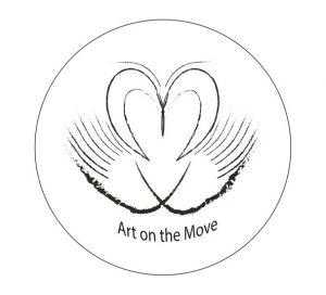
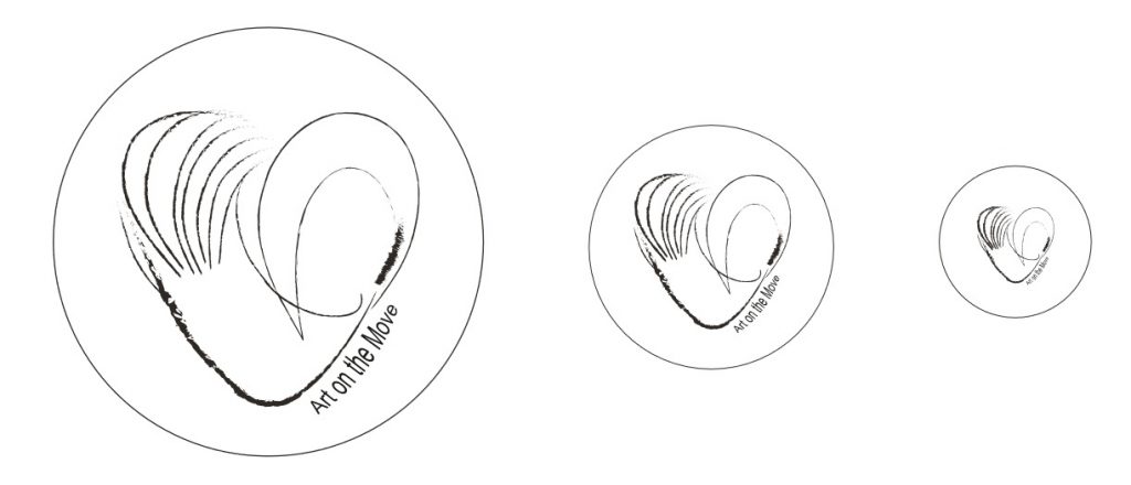
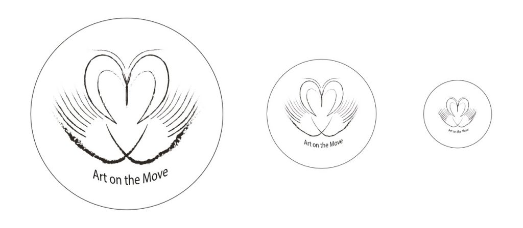
Open Your Heart to Us
Be Our Sunshine

Brainstorm Map
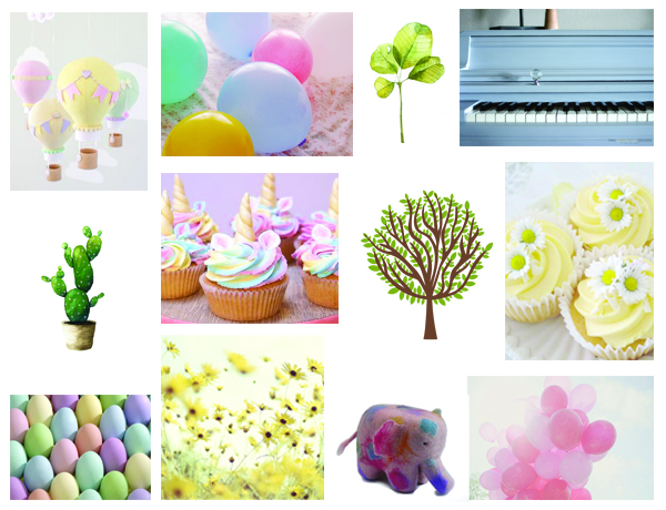
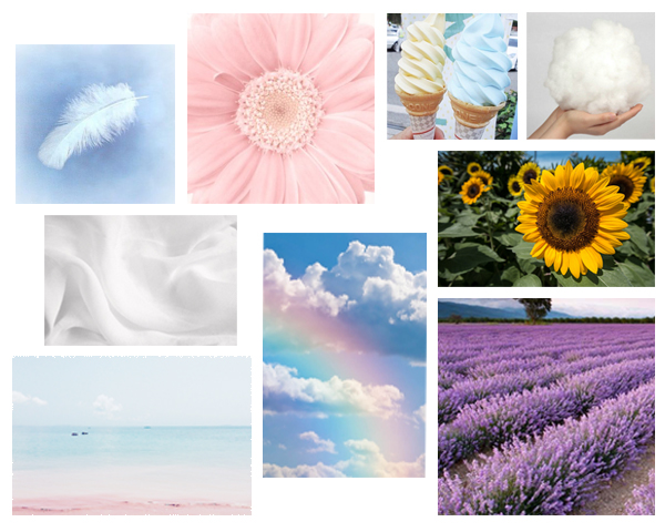
Moodboard
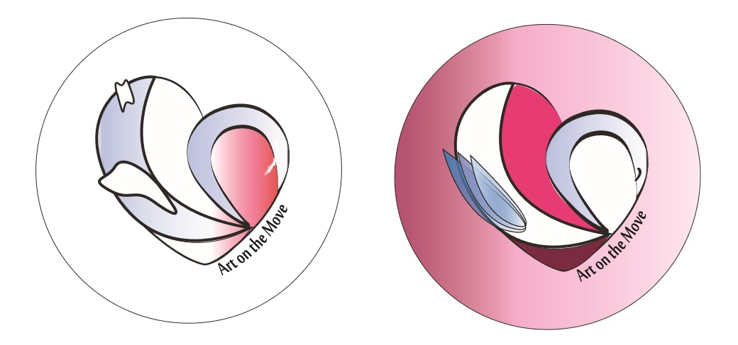
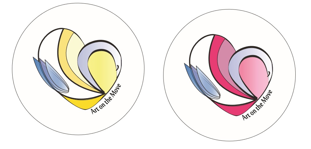
From my moodboard, we can see that there are soft colour like pastel colour. Pastel colour give a sense of gentle, soft and light. Hence, my concepts tend to friendly, good-natured and warm hearted.
For my concept 1 (Join Us and Have Fun), I might use elephant and piano. I wanna to draw a happy elephant. It brings happiness to all the patients. Besides, piano means that all the volunteers and patients are joining performance or art activities.
While for my concept 2 (Open Your Heart to Us), I might use hot air balloon on designing the poster. The hot air balloon filled with a lot of heart shape. Using hot air balloon to delivery love of volunteers to the patients.
Last but not least, concept 3 ( Be Our Sunshine), I might use lucky leaf. We all know that lucky leaf symbolize good luck. Each of leaves has their own meaning which are faith, hope, love and luck. I might use sunflower as well. It gives a sense of warmness.