Category Archives: My Work

Week One Assignment – Introduction

Tan Chloe

Chloe is an aspiring interactive designer that seeks to produce practicality in interactive media. She is currently pursuing a Degree in Fine Arts in Interactive Media at Nanyang Technological University, Art Design and Media.

Having an interest in all things art and digital design since she was young, she loved trying new things, and eventually stepped into the world of interactive media and that began her interest in exploring not only artworks but also other platforms that could promote interactivity with users.

Chloe’s other interests include illustrating, graphic designing, coding and video editing. She hopes to venture into works that can encompass all these various interests of hers.

DAILY DRINK DILEMMA 

This was a programme written using cycling74, MaxMSP to help people decide on what they should drink, based on their reactions to kind of test their level of tiredness, and also based on their body temperature.

RESUME

A WORK TO SHARE

This artwork allows anyone – with or without knowledge in music play a music piece with just these lines/surfaces and more importantly, I think I’ve always been quite fascinated by installations that are more hands-on/require you to do something rather than one that is merely immersive. I think it makes me think about my own artworks in the future, maybe – of how I would like them to be more dependent on audience participation (and would hopefully keep people occupied for a long time!)

MAX MIRROR

Back 2 OSS! And this time with MAX.

After the first week of going through MAX, we learned how to start and stop our webcams, create a full screen window (w the press of a key), as well as inverting the image shown on a separate window.

This looks kinda messy because I was just tryin’ it out with the help of the guide…

After which, we got to learn about patchers, which are kind of like pockets that help you to organize your information and path within. You just gotta connect them to the ‘main space’. Makes your entire space neater and you can do more!!

Made it simpler for myself to understand and placed the entire thing into a patcher: videoin.

Included the jit.rgb2luma in order to make the video greyscale, and cv.jit.faces to track my face!!!

Placed it into patcher p face.
jit.iter: Iterate a matrix as a series of Max lists/values – and unpack into 4 different values, x1, x2, y1, y2 (area of face detected).

p brightness
Multiplied the x and y values in order to attain the area of face detected

It really took me super long to figure out why it didn’t work and I think it had something to do with how i connected the patchers. BUT I finally got it to work!!!

Connected p brightness to display the output numver and to jit.op @op that would adjust the brightness based on the value!

So this is a short clip of me tryin’ my ‘mirror’ on MAX out! (The video is bad but this was the best I could do because it’s SUPER laggy on my computer :-()

Zine: Final

  Here is the final layout of my zine! :-)

Took a really Japanese style approach into my zine, with the use of Japanese words with English translations and also the simple structure of the zine itself.

I think this project was really beneficial for me because it was my first time using InDesign and learning about how you put together and create a zine was really interesting and fun :-)

The process of taking the pictures was also enjoyable and it was my first try at that so yay!

Zine: Process

日本

Following the subject of my zine – Hotsprings, I decided to link it to the hot springs that were related to Japan! And there is a running theme in the pictures taken for my zine, and its layout as well.

I went to visit the Sembawang Hotsprings a second time in order to take the photos needed for the zine and I brought 2 friends along to help me with it!

So according to commercial hot spring images, I tried to dress up and bring items that would resemble them.

(Unlike usual hotsprings, we had to collect the water from a tap to use ha haha)

In order to create the visual of me in a towel (which I could not really be in there because it was a public place with no toilets!!), I wore an off-shoulder top and stuffed a small towel around the elastic area. If you look closer, the top is actually not fully covered!

Okay this is the full view hahahhahahAHHAHA


Tried to use a background that had more nature feels… but I think it didn’t really work since they were all leaves and trees

And the eggs that were 3/4 cooked? :-)

LAYOUT

Since my entire theme followed the Japanese idea, I decided to make my zine that follows the Japanese style as well! I referenced from a number of Japanese books/magazines :-)

Also, for the spreads, I referenced from some minimalist/Japanese magazine layouts as well.

Inculcated this layout to the page on individual items that one can bring to the Hot Springs

And this, for the information on travelling to Sembawang Hot Springs (map!)

Ego

Final project!!!

This project focuses on ourselves and how we would react in given situations/scenarios, so I felt the first step to do was to list down my personality traits and some of the things that I like and dislike.


MINDMAP

2

And the conclusion is that…

1

So I thought of ideas that would link to an introvert’s worries

3

And also, chose digital illustration for my medium!

+ The 4 subject matters I chose that I felt best represented me (because these are some of my favourite things!)

41. BRINJAL/EGGPLANT

I believe that brinjal is my favourite vegetable hahaha and so I decided to use it.

panel-1

COLOUR: For all of my colour schemes, rather than changing the colours of objects I have, I focused more on appropriating the tone/shades :-)

I made use of translucent overlays and background to produce a suitable ambience & atmosphere for the situation, and it also helped to create a contrast, allowing the subject matter to stand out more.  (i.e. Icon 3). Across the panel, it also helped to create a gradual transition in how my character feels in the situation.

So the brinjal represents me (in the supermarket), and when I’m placed in a new environment (the fridge of whoever bought the brinjal), I feel like DEATH, that’s why the brinjal is being roasted by the other contents in the fridge :p

2. CAT

My love for cats!!!!

panel-2

p2

For this panel, I made use of the above colour scheme to produce a sort of dreamy and comfortable feeling (that’s what I typed in the search box heh!)

A constant blue colour is seen in all the 3 squares to create a link, however the difference in shades help to show the different environment that the cat is in. For example, the blue in the first panel is balanced with the other colours to create a more warm and cozy feeling, together with the shade of black, while in the last panel, the blue is brighter feels colder.

3. STARFISH

Actually, I have no feelings towards starfishes but I had to use it to create a link in the narrative… haha

panel-3

So my friends and I created an alterego for myself, called Koko.
This panel shows how the starfish (me) “evolves” from a quiet and loner starfish, to an extroverted and noisy star after being around my close friends :-)

In the case of this panel, the main focus of the use of colours would be in the last box, where I tried to match the yellow star with a violet background, since they are complementary colours, in order to create a more aesthetically pleasing outcome. Also, the use of contrast can be seen here again with the play of overlays to make the star (Koko) POP!

4. HARRY POTTER BOOK

I’m a little slow to this craze but I’ve been interested in reading Harry Potter recently, and I chose it as my subject matter because it is one of the few books that I’ve ever voluntarily read!  (Hence it will link to my narrative (below))

panel-4

So the torn and tattered HP book represents me, and I love alone time, so having my own time makes me feel like I’m being brought to another world (a.k.a my own world).

The book takes a journey to its own world on the Hogwarts Express, and on the last panel, the book is seen being as good as new, being a wizard, which is obviously impossible in the real world, but since it’s in its own world, it can! :-)

p4

As this panel is linked to a fairytale-like/magical narrative, I made use of the above colour scheme in the square with the train to express this quality!

TAKE AWAYS & DIFFICULTIES

Firstly, one of the challenging parts for me was to think of the 4 different narratives as they had to be in the viewpoint of the subject matter/character, rather than just fitting a human’s actions/reactions into the object.

NEXT, I think that my takeaways & difficulties from this project actually intercept with each other. This was the first time that I’ve tried illustrating with this many different objects and at different angles, and the play with light/contrast as my main “colour” scheme required me to get the shadows/highlights of the objects at the right angles. However NOW I’m more familiar with this and its a great takeaway!!! :-)

Also, having to rush this within a week was really stressful but I’m glad I was able to complete it. YAY :-)

Forrest Gump – Final Compositions!

I chose my four quotes from the movies above, Juno, Miracle in Cell No. 7, A Walk to Remember, and Mean Girls :-)

Through the selection of these quotes, I realize that even though some of them do not really have an intentional meaning, we’re able to interpret them according to how we would want to, and depict it using our designs!

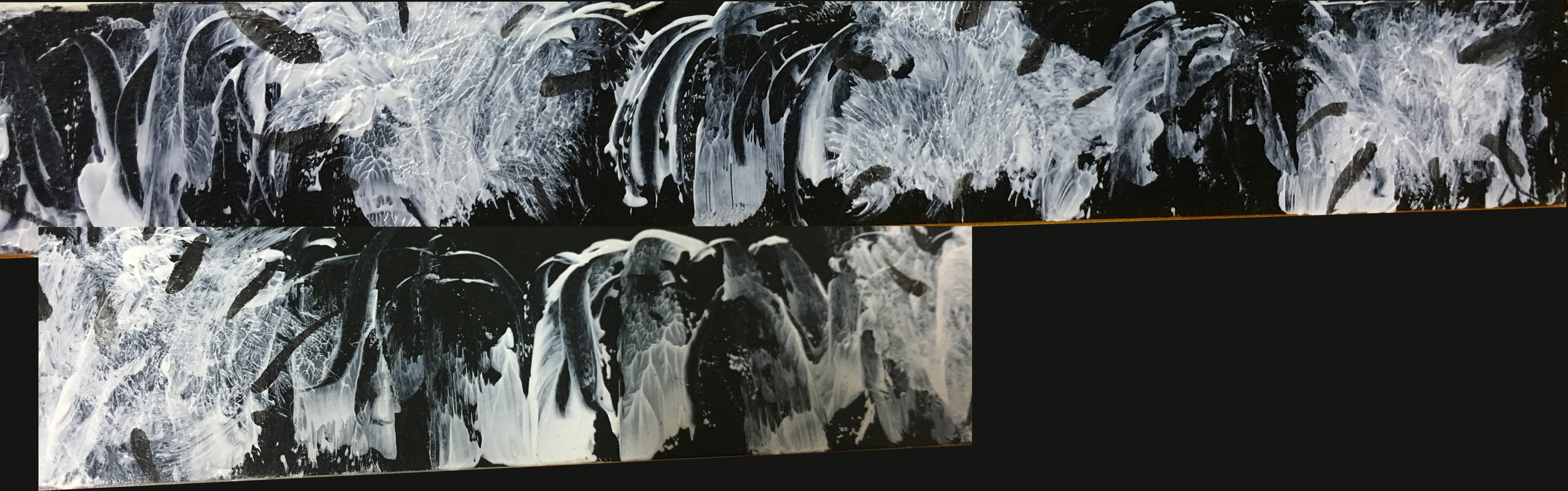
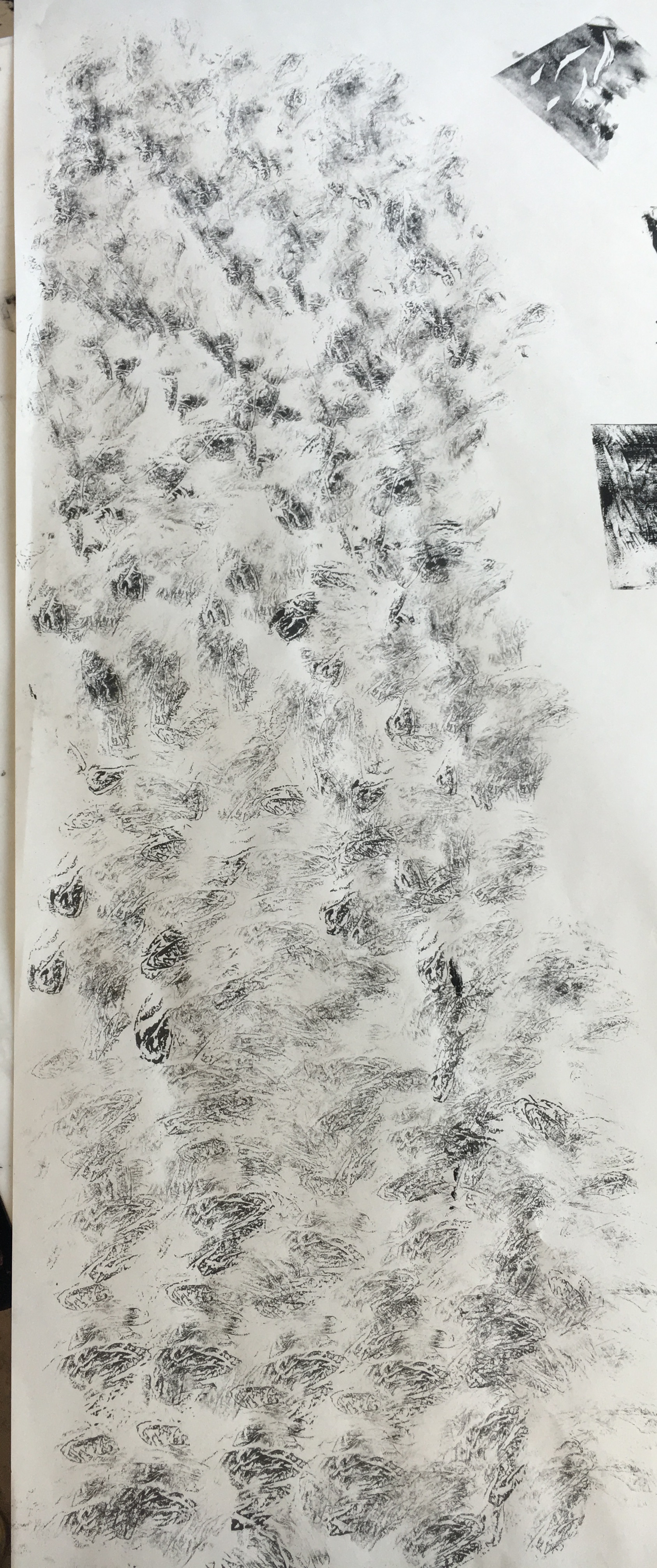
Here are my final compositions!

juno-print

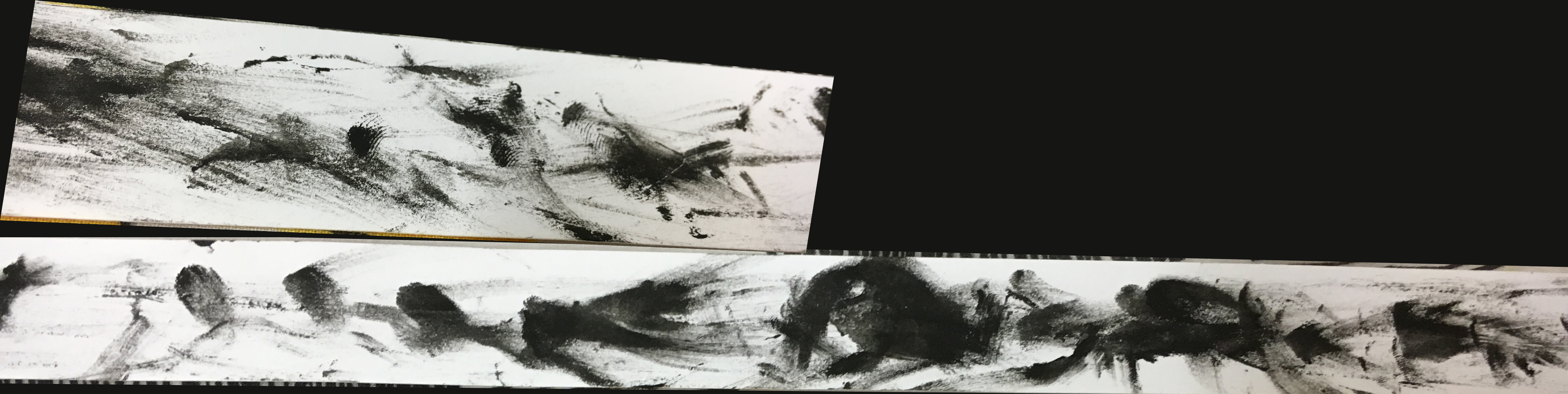
Making use of the quote, I used dolls to represent the ‘babies’, with earpieces ‘inserted’ into the babies to represent them as iPods; and guns, literally.

The circular motion of the babies was to depict how they would actually fly out if they really had been shot out of guns. Also, i decided to continue the rhythm by making the entire composition seem to follow a certain curved direction.

The splash of paint/liquid at the base is to show the impact of the gunshot, and it also serves as a ‘shadow’ for the other elements.

I tried to differentiate the intensity of the different elements, i.e. the Guns being the darkest while the splash being lighter to not only provide a contrast, but also to place the gun as a dominant factor, since everything starts from there.

miracle

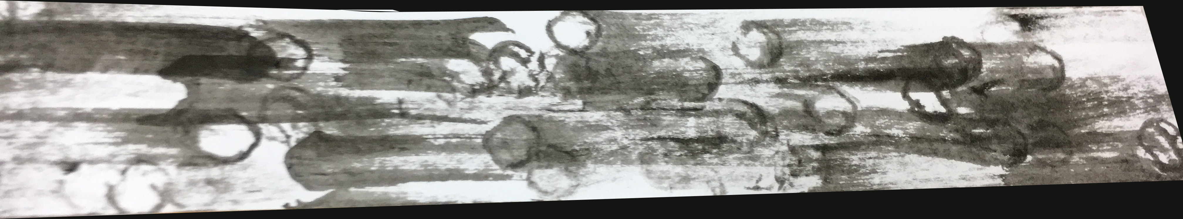
Instead of making use of ships, I tried to make depict the weight of a sunken ship using anchors, (something like a symbol of sinking), attached to numerous gold chains, as if dragging them down. The use of these chains also provides a movement towards the ear.

The idea of having interest in someone makes me think of trying to understand and listen to that someone, thus I decided to make it seem as if the anchors and chains are sinking into the ear.

The black starry background allows me to create a greater contrast between it and the subject matters, and also sets the mood for the quote, as if in one’s own world.

For this quote, I decided to put in some elements that would link to the sense of touch/feeling. i.e. the most obvious ones would be warmth/coolness, hence the waves and flames that are connected.

The reason for these two elements are also because I feel that they encompass a similar rhythm that wind would give as well. Hence, ironically, while the quote suggests of something that we cannot see, although I used the waves and fire (that can be seen), I would want the audience to focus more on the sense of feeling that they would get when they see these visuals.

I made use of a girl that has seemingly plunged into the waters to express her excitement of feeling this Love, and also the use of doves to symbolize Love itself.

mean-girls-print

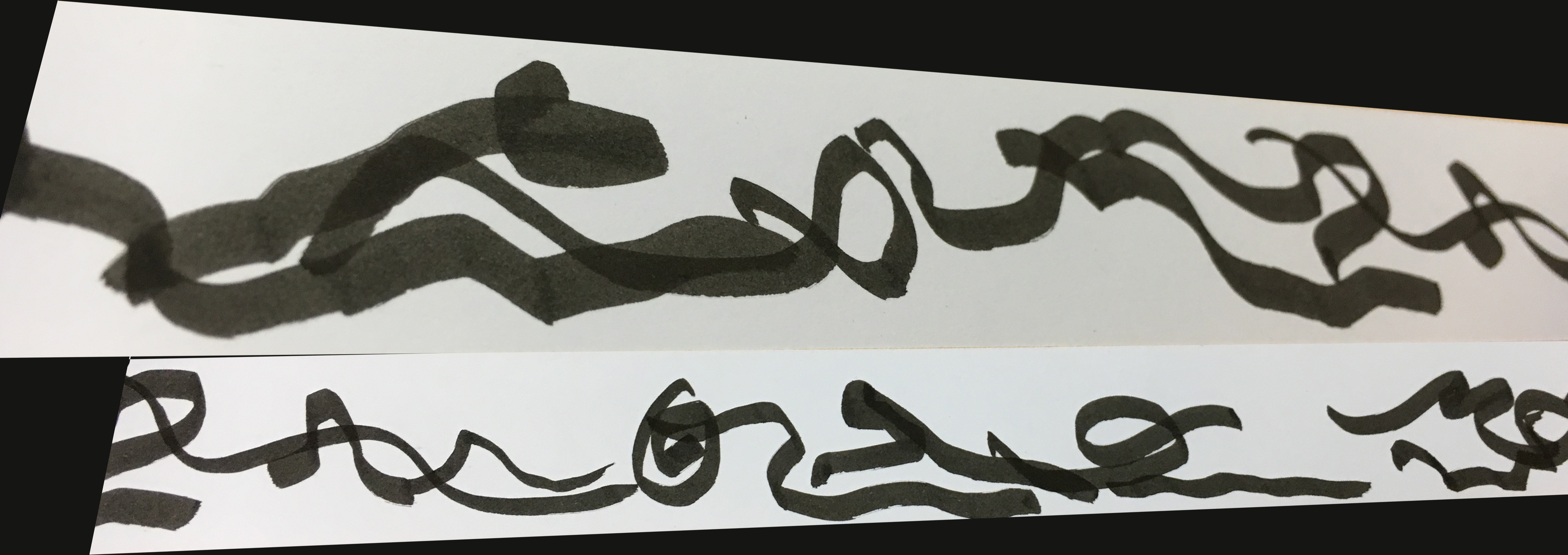
I made use of locks and chains to form an afro of a woman, as a symbol for secrets, something that should be locked away and not be told/shown to anyone.

The hair takes up a huge amount of space of the composition due to the quote itself, and I added tape around it to somewhat secure the hair in place. The tapes are made to be of a lighter shade to create a greater contrast between the hair and the tape.

Lastly, the vines at the jaw area of the woman’s face not only helps to complete the visual of her face but it also expresses the idea of one being entangled due to these  secrets. Also, i decided to make all the different elements of this composition of different effects to create different textures throughout.


Throughout this project, firstly, I’ve really learnt more about Photoshop and I’m really glad about that :-)

Also, I think that one of the main takeaways would be the thought and ideation process? I feel that one of my greatest challenge was to come up with a composition that was not literal, but could still depict what the quote meant, and could also show my own interpretation of the quote.

This project also helped me to understand more about the principles of design, on how to arrange the different elements that would, sort of provide an answer.

I also learnt that not everyone would design things the same way, and how sometimes using something aesthetically pleasing (e.g. symmetrical, or the use of very pretty images) may not serve the purpose of this assignment :-)

Silkscreen Printing!

For the past 2 Tuesdays, we have been working on our silkscreens in order to print our designs and it was a really fun experience!!! :-)

Didn’t manage to snap pictures of the initial coating and drying processes, but took some of when we actually printed our designs onto our totes :-)

img_9230My screen after drying/washing. Taped the sides to cover up the holes :-)

Attempts on newsprint!
img_9245 img_9247 img_9251 osspicture2…Which came out a little inky hahaha

Attempt on the actual tote!

Applied adhesive to a board to insert into the tote, and flattened the creases to print.

img_9293 img_9300 img_9301

Final product!

Was a little disappointed because it didn’t come out as cleanly as I’d like it to :-(
Also the half tone made the prints less obvious so some of the details were a little lighter than expected. Nevertheless it was still a fun process ^_^

My Line is Emo – Final!

We’ve come to the end of Project 1 and theeeeeese are the lines I’ve chosen for the emotions I’ve picked ^_^

2-copy1-copy

Infatuation
infatuation
I thought of infatuation as a rather short-term and sudden emotion, hence the pattern slightly humps in the middle with more intensity, and fades off at the ends.
I dabbed ink with my fingers in a rhythmic manner to symbolize heartbeats; As if one’s heart beats faster and harder when infatuated.

Longing
longing
Longing reminded me of reaching out for something almost unobtainable, hence I made the lines really airy and light, to show a faint feeling.

Caring
caring
I’d like to link care/being caring to warmth, and the use of curved lines helps to encapsulate this ‘heat’, where it also darkens in the core of the strip of paper.

Annoyed
annoyed
I translated the emotion of annoyance using the amount pressure I would put on a pen when I feel ticked off, but instead of a pen, I used a penknife, so that the scratch marks can be seen on the strip. Also, I used a thicker piece of material, and in black, to ensure that the scratches look more obvious.

Bitterness
bitterness
In the case of mark making for bitterness, I decided to focus more on the action, whereby I simply dipped a brush into diluted ink and splattered it onto the paper. This gave a mark that helped to portray a sense of dislike; as if something was thrown away in disappointment and offence.

Envy
envy
I tried to create drawings of many eye-like figures that look towards different directions; As if they were looking at one another in envy!

Glumness
glumness
Glumness links to sadness which made me think of tears!

Rejected
rejected
I tried to portray rejection as a bigger force going against a smaller one.

Suffering
suffering
Used a sharp object to create these lines, to portray lines that look like cuts, but also adding a bit of smudge to make it seem more real. This helps to show the feeling of pain which is in line with the emotion suffering!

Pride
pride
Took the emotion of Pride with a positive connotation rather than a negative one, and made the middle single pointed shape taller than the rest to show a sense of victory and achievement, while the rest are lower and the ones at the end are a little messier, with the thickness gradually increasing at the ends.

Relief
relief
Relief gives a sense of relaxation, assurance and ease. I produced wave-like patterns to depict and symbolize the rhythmic nature of waves that would help to calm us down.

Optimism
optimism
Just like grass that reach out to grow, these lines show the same idea; Also, as they pan lightly and jumpy, this depicts a positive and happy feeling.

Panic
panic
The lines are anxious and messy, moving in a direction against one another – Just like how one would feel in a state of panic.

Hysteria
hysteria
Hysteria actually makes me think of people who are trapped in an enclosed space, trying to get out – to the point that they start to struggle with themselves, and hence i decided to use my own fingers to put myself in that position, depicting an extremely anxious motion, with no specific direction.

Uneasiness
uneasiness
I automatically squirm and close myself up as I think of the word uneasiness. The feeling of uneasiness goes hand-in-hand with discomfort, so I decided to make the lines here do that too (the action and movement, that is.)

Shock
shock
The idea of shock comes as a short and sudden expression, hence I make jumps of these patches in the midst of low lying patches.

Amazement
amazement
I feel like amazement is a continuous emotion felt within the given “time”, hence the base of this line show enthusiastic and eager lines. However, it also encompasses the idea of sudden “WOW” moments, thus, I added in the extra paint lines to portray that.

Startled
startled
Although the emotion ‘startled’ is something sudden, I feel that the feeling would still linger on after the moment, hence I made use of repetitive (but gradual) pattern.

I guess I’ve learnt that there are really endless possibilities to what we can do with lines, and lines actually speak so much more than I thought. Although it’s a pity that I had not ventured as much as I wanted to, I still enjoyed this project fairly much :-)

The end!

Mark Making #2!

This was what I did during the 2nd lesson of mark making! :-)

Didn’t really experiment alot, but tried to think more towards the emotions that I chose.

IMG_8187

IMG_8185

Dripping paint downwards!

IMG_8183

‘Scratching’ out a white-line pattern onto black paint (could’ve used a thicker paper material!) (Annoyed)

IMG_8182

Left/right and Circular motions (Suffering)

IMG_8181

Using the sharp edge of the palette knife to create sharp lines, but also smudging the ‘thicker’ paint areas (Suffering)

 IMG_8179

Up/down and Left/right strokes

IMG_8176

IMG_8175

Using the base of a plastic cup (Uneasiness)

Also tried to start on thinner (although not the exact dimensions) strips to limit and narrow the space I have (for submission!)

IMG_8195

(Bitterness)

IMG_8192

(Glumness)

IMG_8191

(Caring)

IMG_8198

(Pride)

Not really satisfied with what I have now so I hope to explore and finalize more marks soon!!! cry

Mark Making Lesson 1

So we were asked to bring 2 mark making tools each for the first mark making lesson last week, and I decided on a comb and a straw. However, I realized that we could use many of our daily used items/almost anything lying around as mark making tools as well :-) The following pictures are here to document what I had done on the first lesson!

& These were all done with Chinese calligraphy ink & black paint!

IMG_7868
Using the teeth of the comb (Startled)

IMG_7848

Using the comb just as a ‘brush’

IMG_7866

Splattering of ink using the comb


IMG_7863

Blowing of ink through a straw (Startled – but to be sharper)

IMG_7860

(Annoyed)

IMG_7832
Just using the straw as a ‘brush’ (Panic)IMG_7833

Using the bendable part of the straw (Panic)

IMG_7828

Cutting up the straw into 5 parts (as if a fan)

IMG_7858

Use of fingers (Hysteria)

IMG_7846

Use of palette knife

IMG_7851

Left: Using a palette knife
Right: Finger prints (Infatuation)

IMG_7842IMG_7840
Linoprints

IMG_7836IMG_7854

Use of crushed tissue paper (Infatuation)

IMG_7831

Use of roller

IMG_7830

Making use of a strand of hair… hahahhaa
(Longing – but can have less lines)


IMG_7824

Tried Symmetry Print but did not work out as I’d like it to :-( So decided to mess it up (smudged it) a little bit after that!

Ended the lesson with that and feeling excited to try out more tools wink