Zine play – 03 – final / my inner demons

My inner demons.

For my zine, I decided to revisit 3 compositions I did for my final project last semester. The 3 compositions focused on 3 different japanese demons.  And through my zine I chose to further elaborate on these demons and how they relate to me.

Each spread of my zine corresponds to a specific demon and also a title of a japanese folklore about that demon.

1
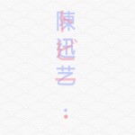
On the front cover, my Japanese and Chinese name overlay in front of me,showcasing both my Chinese heritage and also my preference for Japanese art.
2
                            天狗 - TENGU

                  天狗の隠れみの Tengu no Kakuremino 
                        
                       "Tengu's Magic Cloak"

A boy in a village was warned by his mother not to trick a Tengu, as Tengu's love to play tricks on humans but do not like having tricks played on them. The boy went against his Mum's wishes and tricked a Tengu into giving him it's magic cloak. After realizing that it had been tricked, furious, the Tengu gathered other Tengu to exact revenge on the boy to get the cloak back. 

Me: As a trickster and prankster, there are instances where I get carried away and dislike it when others do the same thing to me. There are times where i will be bitter and though i would not think of revenge like a Tengu, it is still something about myself i want to change.
3
                             おに - ONI

                 うじ‐の‐はしひめ Uji no Hashihime

                        "Woman at Uji bridge"

A woman scorned by her husband was so hell bent on revenge that she asked the gods to turn her into an Oni. Under the god's instructions, she went into the river in Uji and bathed for 21 days and separated her hair into 5 horns, turning herself into an Oni. After which, she exacted revenge on not only her husband but the husbands family. and anyone that crossed the bridge over the river where she turned into an Oni.

Me: This is the art of myself i would like to cut out. ideally i want to take out the bitter feeling of revenge.
4
                         キツネ - KITSUNE

                  いえにきつね U Chi ni Kitsune

                       "Fox in the house."

An old man moved into an old house, and realizes the house is overrun by foxes. He leaves them be and they slowly get more and more mischievous as the days go by. Till one day he cant take it no more and decides to kill them all the next day. That very night, an old fox visits him in his dreams, explaining that his family has lived there for many generations, and asks for his forgiveness.The old man agrees to spare their lives. the foxes being grateful, would in turn help the old man. And whenever something good were to happen, it would be forewarned by a sharp bark of a fox.

Me; this is what i am trying to ideally work towards. Whereby i am still mischievous and playful, but when im told my limit, i not only know how to stop, but also be devoid of revenge and do good when it is due.

zine poster 3 
                 内側の悪魔  Uchigawa no akuma

                          Inner Demons

Zine play – 02 – The Long Process.

Process.

With the examples I found from my research, I started to think which project or projects I would like to focus on. And initially decided to focus on three projects. The EGO project from semester 1
along with the typographic portrait and the Point of view project from semester 2.  All of which were heavily influenced by Japanese art.

I decided right off the bat that I did not want to just plonk the soft copy art work into indesign and play around with compositions solely on the computer. So I chose to bring the physical art work to take a photo of it to use for my zine. Much like an installation or exhibition.

I actually had to make three separate visits to the venue to take photos. Cause each time the sun would get moody and hide behind clouds, leaving me with horrible lighting. Resulting in the revisiting of the venue and a whole lot of time spent.

Photos.

This were the photos I took on my first visit:

pangolinhandoninamepov

After reviewing the photos, I felt that I didn’t quite like how the typo and pov project looked with the background of the venue. I however liked how the circle compositions gel quite well with the background, and hence I decided to go back to take photos for a second time, this time focusing only on the circles:

kitsune oni tengu

On the second visit, I was more focused and looking for areas with good lighting and composition. But my untrained eye wasn’t fast enough and the sun set before I could get all the shots I needed. Proving the need for a third visit on another day.

The third and final day:
poster 1 poster 2 poster 3 poster 4

On the third day I managed to get most of the shots I needed and it was on to editing the images. Adjusting the lighting, saturation, and overlaying the text to work with the environment.

Spreads.

Initially, I had the idea of breaking the page in the middle with the artwork in the centre of the spread.
zine spread 1.5

But that proved to be a problem as putting the art work in the centre meant that the fold would cut through the middle of the art work. Hence I decided to push the artwork more to the side.

zine spread 1.56

After consulting with Shirley, she suggested to bleed the background more to the right, following the ¾ rule. And additionally, she taught me how horizontal and vertical forces work to make the composition more interesting. I worked with those ideas and started form my 3 spreads.

wip

The hardest part about the spreads by far was getting all 3 spreads to look the same. in terms of the saturation and colour. It was something that i didn’t expect but it took me a large amount of time. I had to constantly zoom out and see if they look good as a whole zine.


Cover page.

For the cover page, i had alot of initial ideas. such as:

I wanted to portray both my Chinese name and Japanese name together in the cover page. I played around with the opacity to overlay the 2 texts on top of each other.

But after having a look at my spread, I realised this minimalistic cover page wouldn’t fit very as a whole.

hence I chose a similar back ground and overlayed the text over.  which i felt worked better as a cover page.

zine cover page small

Poster.

Lastly, I chose to work on an A2 size poster to put at the back of my zine to bring it together as a whole.  I searched for demons in traditional japanese art and juxtaposed it with a photo of me.  To portray a sense that i am battling my inner demons.

zine poster smallzine poster small1 zine poster small2 zine poster small3


Still currently in the midst of editing the final outcome. minor tweaks here and there to bring it all together.

Zine play – 01 – Inspiration/Research.

Inspirations/Research


For this semester, my first two 2D projects have all been heavily influenced by Japanese art. And through those first two projects I explored and immersed myself in Japanese art and graphic design and fell in love with it even more.

So for this final project, I wanted to continue with the momentum and explore more Japanese art, in particular Japanese graphic design. And hopefully slowly develop a distinctive style that I can bring with me after my foundation year into and my specialization.

One thing that I picked out from researching from my previous 2 projects, was that the Japanese use their text and typography in very interesting ways. In terms of overlaps, overlays and their use of colors.

In Japanese graphic design, text and typography aren’t just there to tell you something, it is not just a tittle or a body paragraph. The text is there as part of the composition. To bring the composition further like a strong supporting actor supports a main actor in a film.

With this knowledge, I researched more Japanese magazines that have clever usage of typography. And I found these examples :

tumblr_kyxdcr4LiQ1qaz1ado1_500 tumblr_mjfm190nfu1rwdpako1_1280 tumblr_nqgdcf0xiX1qaz1ado1_500 tumblr_kxqe7arPod1qaz1ado1_500 tumblr_nin47t9CQe1qaz1ado1_500

With these examples in hand, I proceeded to continue to explore how i could use typography in a similar way for my zine.

POV play – 03 – Final.

Socks.

I chose socks as my object for project 2 as to me, socks are something always overlooked, as they are such a small article of clothing. Some even consider it an accessory rather than a piece of clothing. But personally, I feel you can tell a lot from the socks a person wears. as he or she makes a conscious effort to choose this particular socks for a particular reason.

And this particular reason is the focus for my project.

hipster

delinquentsandal lover

hobo

gentlemensamurai

POV play – 02 – Process.

Phases:

i decided on my item on the very day that shirley gave the brief of project 2. i immediately thought of socks, and the ideas and lines came quite naturally so i penned them down and started doing sketches.

Phase 1: Sketches.


20160315072802
 
20160315072802 (1)
 i started sketching with little A5 sized papers thinking that i might be able to colour them with markers and submit the actual piece. but i soon realised that my lines were not the cleanest, so i chose to fill in the colours digitally and i was quite pleased with the final results.
lines  my final line work of the 6 illustrations.

Phase 2: Colouring

the hipster.

hipster1 hipster2  i searched for photo references of how hipsters dressed on the internet and followed the style that i deemed fit my illustration best.
the delinquent.

teen1  for this composition i searched for the most generic school uniform i could find. this was actually harder than i expected it to be , as it was difficult to get the right colours to make it seem like he was wearing a school uniform and not just a white shirt with blue Bermudas. i played around with the colours and felt the final outcome portrayed a uniform quite well.
 the sandal lover.

sandals1

sandals2
 for this composition, i tried many variations as to make it look both dull and interesting at the same time. dull as generically a sandal lover tends not to want to stand out and doesnt put too much effort into his or her dressing. but also interesting cause i want it to be interesting to look at.
 
 the samurai.

samurai 1  this illustration was one of the easier ones to colour match as there were many examples of samurai armor online, and all i had was to match the colours with the one i felt best matched my illustration.
the gentleman.

manners1

manners2
i had quite abit of fun with this illustration as i personally like suits and blazers, so it was quite fun to find suits that i liked to use for my illustrations. the tougher bit about this illustration was to match the skin tone and the hair colour with the suit.  
 the hobo.

hobo1  for the hobo illustration i looked up actual homeless people and used their dressing to match my illustration. through the research process i found that many homeless people tend to stick to a very dull tone in their clothes, due to the grime or age of their clothes. i tried my best to convey that dullness into my illustration.

Phase 3: Background

for the back ground, i considered leaving the background pure white. adding simple Japanese words close to the edges of the page to bring out a japanese feel that decided to go for. but as i looked at them all as a whole, they looked rather plain, Shirley had a suggestion to use the socks texture for the background, so i gave it a go and continued from there.


1.TGTH small2.TGTH 1 small3.TGTH 2 small4.TGTH 3 small 
for my backgrounds, i had 4 stages before i reached the final outcome i was satisfied with.

1. a plain white background with the texture of the socks the characters were wearing in a circle. i felt it was abit too plain.

2. to make it more interesting i added big bold typography in the back ground to fill up more of the negative space.

3. i felt the composition was still lacking, so with my course mate's advice, i added colours in the background to bring the whole composition together.

4. the colour seemed abit too jarring and bright so i lowered the opacity of the background colours with a white back ground to soften the colours to  more pastel hue. which i felt worked better. and hence decided to use those for my final submission.

i used the colour wheel given in semester 1 to play around with the colours and i learnt to play around with more colours which was one big takeaway i had from this project.

POV play – 01 – Inspirations.

Insiprations.

When I first started this project, I knew i wanted to try to do illustrations. which is a totally different realm as compared to manipulating photos in Photoshop for project 1. I follow a few illustrators on instagram and I drew inspiration from a few of them to get my ideas going.


clog two research Untitledclog_two is a illustrator and graffiti artist i follow on instagram. and his works really stuck to me as his line work is extremely clean and delicate. He does everything by hand drawing and then scans it into the computer to touch up for the final product. Likewise, i pushed myself to hand draw my illustrations first before putting them into photoshop for clean up and color. 


I also turned to pinterest to look for inspiration for illustrations. Here are some that stood out for me:


b10edb25737949cc662711fb6df79225 7f0339d01aa3a9c5c4c465f55b7b16f4 427356865c39fa2fe280c793de469ae4 i realized i really liked the look of a single character in the composition with a simple or plain faded background, with that in mind, i went ahead to do some sketches and got my whole process started.

Typo play – 03 – Final.

Final.

These are my final 4 compositions, along with their accompanying short story/explanation.

00

zmall 01A pizza is ultimately just flat bread. But it is what you put on top of the pizza that gives it its character. If you put vegetables on top, it becomes a vegetarian pizza.  Likewise if you chose to put pineapples and ham, it becomes a Hawaiian pizza. 

With that in mind, I am a pizza because I want to be as versatile as the pizza, whatever situation or "topping" I"m put in, I want to be able to adapt to it and do my best. No matter the circumstance.
zmall 02
The most expensive koi fishes fetch for a few thousand per fish or more. But what many people do not know is that when a pregnant koi fish gives birth, there are thousands of eggs, but only 1% or less actually mature enough and have the right patterns that are meticulously selected to be kept to be the top 1%.    

In the art industry and being in an art school, I do feel like a koi at times. I feel like a baby koi fish, jostling with everyone else to be that 1% that actually makes it and gets to do well in the art industry.
zmall 03Turtles and tortoises can feel when their shell is touched. they have nerve endings to let them feel contact, However, pain nerve endings are absent in the shell of turtles and tortoises, meaning they cant feel pain on their shells. This is where the terrapin differs from its close relatives. Similarly terrapins have nerve endings on their shell to enable them to feel. However, terrapins actually do feel pain if their shell is hurt. 

Personally, I would much rather have a shell that can feel pain, than a shell that can't. Ideally, I would want to be able to protect myself when I need to, but also be aware of whats hurting me on the outside.
zmall 04When sushi is mentioned, many people immediately think of it as a Japanese dish. However, surprisingly it did not originate from japan. It actually came from china, the rice was initially not meant to be eaten, but meant to preserve the fish that was inside. Once it spread to japan, with the ingenuity of the Japanese, it began to flourish and become an iconic Japanese dish recognized world wide today.

I say I am a sushi as personally I like Japanese art way more than Chinese art. So, much like the sushi, I may be chinese, but I would like to one day explore much more japanese art and culture and flourish in that area. Much like the humble sushi did when it spread to japan.

Typo play – 02 – Inspirations

Inspirations.

For my final submission for this typographic portrait assignment, I had an over arching concept of them looking good as a whole when put together in a group of 4 compositions.

I found my inspiration for these ideas from instagram. (see, social media ain’t all that bad). And those works by various artists really pushed me to emulate the same feel they portrayed with their instagram feeds.

zref 3 zref 1 zref 2

Typo play – 01 – the trails and errors.

TYPO.

When this project was briefed, I never expected it to push me as much as it did. But at the end of it, I am truly glad that it did.

Throughout this project, I had many many ideas, some were alright, while others were mediocre at best and the remaining few… lets just say they will never see the light of day.

As mentioned during my presentation, this was my first attempt at dabbling with Photoshop,  and looking back from the start of the project, I have really learnt a lot. People mention that the fastest way to learn is to get straight into it and learn as you go.  Personally it held true for this project and I really learnt a lot.  And i have this project to thank for that.

I attached a few ideas and compositions of mine that didn’t make it to the front-lines of critique day but nevertheless they helped me along the way.

So here they are, in all their unabashed glory.

suhsi tobii1
suhsi tobii2 suhsi tobii3 zushi     These were the few test runs I had before I decided on my final piece. These sushi pieces served as a launching pad for me to play around with Photoshop. It as the first idea that set of a chain reaction that inspired the other 3 pieces of my final submission.
  tobii shipping yard 1     This idea was based on the line of "I am a shipping yard" where i explored the possibility of using the shipping container of different colors to form my name.
water 2    For this composition, I played around with water and "painted" water on a piece of acrylic to form my name in an organic look. I added my pet terrapin at the corner to make the composition more interesting.
The original intended line for this was: "I am transparent."
fish     I didn't use this composition as try as i might I couldn't come up with the desired effect that I was looking for. I was trying to make the scales form a pattern naturally occurring in fishes. but in the end it just looked like someone was shinning a light on the fish to form the words. so I decided not to use the idea.
SHOE     This composition almost made it to the final critique. Actually, it could have made it to the final composition. But I was under the impression that we only could put 4 up on the wall and the rest were to be put up on OSS. If not for that, with a bit of editing and touching up this would've made it to the final critique.

    The idea of this composition was a play on the fact that I like running and sports in general, hence the use of a sports shoe. A rather direct link that might not have gelled well with the final 4 in terms of concepts,
die     This was one of the most subtle ones. which is why I chose not to use it in my final submission. I considered using a different colour for the dots on the faces of the die that had my name but it still didnt stand out that much.
1.mountain 1     This was one of my initial favorite compositions. unfortunately it did not come off too strongly in terms of concept and didn't fully fulfill the design brief. I attempted to work on the further for quite a length of time due to how much i liked this composition. But i could not come up with anything that would fit well. 
 
     The original line was: "I am and mountain"
porcelain 1
tobii 2
tobii 1     I worked quite hard on this composition and had every intention of using one for my final submission. But somewhere along the line after i did the sushi piece, i decided to go with the over arching concept of a solid colored pastel back ground. So sadly this piece was pushed back into the shelves of forgotten work. 

    The original line for this was: "I am chinese." 
With the use of chinese porcelain and painting.