
Process.
With the examples I found from my research, I started to think which project or projects I would like to focus on. And initially decided to focus on three projects. The EGO project from semester 1
along with the typographic portrait and the Point of view project from semester 2. All of which were heavily influenced by Japanese art.
I decided right off the bat that I did not want to just plonk the soft copy art work into indesign and play around with compositions solely on the computer. So I chose to bring the physical art work to take a photo of it to use for my zine. Much like an installation or exhibition.
I actually had to make three separate visits to the venue to take photos. Cause each time the sun would get moody and hide behind clouds, leaving me with horrible lighting. Resulting in the revisiting of the venue and a whole lot of time spent.
Photos.
This were the photos I took on my first visit:


After reviewing the photos, I felt that I didn’t quite like how the typo and pov project looked with the background of the venue. I however liked how the circle compositions gel quite well with the background, and hence I decided to go back to take photos for a second time, this time focusing only on the circles:


On the second visit, I was more focused and looking for areas with good lighting and composition. But my untrained eye wasn’t fast enough and the sun set before I could get all the shots I needed. Proving the need for a third visit on another day.
The third and final day:


On the third day I managed to get most of the shots I needed and it was on to editing the images. Adjusting the lighting, saturation, and overlaying the text to work with the environment.
Spreads.
Initially, I had the idea of breaking the page in the middle with the artwork in the centre of the spread.

But that proved to be a problem as putting the art work in the centre meant that the fold would cut through the middle of the art work. Hence I decided to push the artwork more to the side.

After consulting with Shirley, she suggested to bleed the background more to the right, following the ¾ rule. And additionally, she taught me how horizontal and vertical forces work to make the composition more interesting. I worked with those ideas and started form my 3 spreads.

The hardest part about the spreads by far was getting all 3 spreads to look the same. in terms of the saturation and colour. It was something that i didn’t expect but it took me a large amount of time. I had to constantly zoom out and see if they look good as a whole zine.
Cover page.
For the cover page, i had alot of initial ideas. such as:
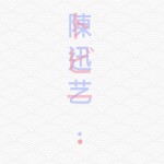


I wanted to portray both my Chinese name and Japanese name together in the cover page. I played around with the opacity to overlay the 2 texts on top of each other.
But after having a look at my spread, I realised this minimalistic cover page wouldn’t fit very as a whole.
hence I chose a similar back ground and overlayed the text over. which i felt worked better as a cover page.

Poster.
Lastly, I chose to work on an A2 size poster to put at the back of my zine to bring it together as a whole. I searched for demons in traditional japanese art and juxtaposed it with a photo of me. To portray a sense that i am battling my inner demons.


Still currently in the midst of editing the final outcome. minor tweaks here and there to bring it all together.