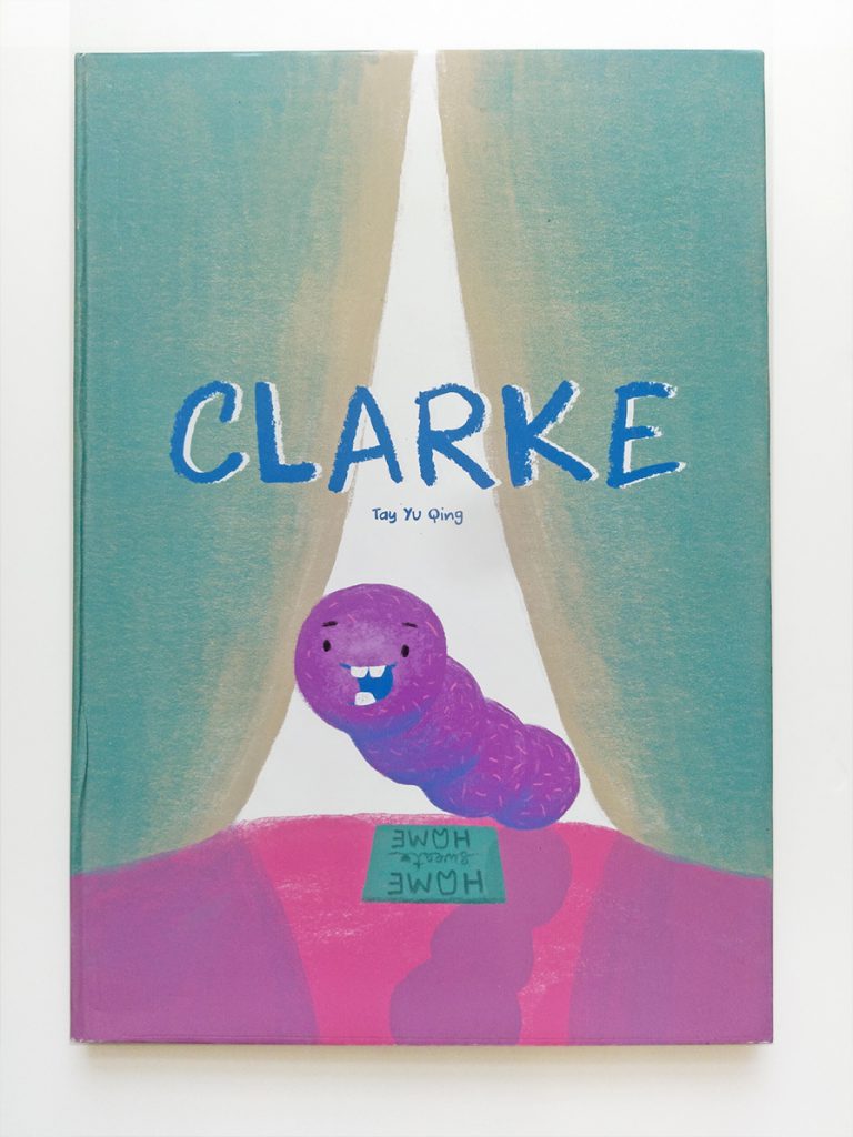
Project 1 : Hello World [Final]

Looking at my past works, I realise I tend to construct 3-dimensional projects with interactive elements.

Overview of my portfolio works

My portfolio works

The element of play is evident in my work and I wanted that to be the highlight of my portfolio. Hence, the motives and overall editorial design was chosen on the idea of ‘form + play’

Ideas for my portfolio

In the end, I choose to go with the booklet form but used lively colours to convey the idea of fun and interactivity.

Project 2 : Children’s Exhibition Guide [Final]

Closeup of the Exhibition Guide Cover

An introduction and simplified map of the exhibition

Artwork #1: Interrupted Road Surveying in Singapore 

Children learn about foregound, midground and background with the playing cards.

Artwork #2: Life by the River by Liu Kang Learning about Kampung life

Artwork #3: National Language Class by Chua Mia Tee A penmanship for the key phrase ‘siapa nama kamu’ shown in the painting itself.

Artwork #4: The Net Children weave their own version of net with the ribbon provided.

A close up of the activity sheet

Artwork 5: Horizontals Children create their own abstract work with the stickers provided 

Artwork #6: The Chair Sketch the anamorphic chair they see in the gallery

Project 2 : Children’s Exhibition Guide [Process]

Through the brainstorming exercise, I realise that I would love to design for interactive materials in the context of a museum. To scope my project, I started to look into the different areas where visual communication could be applied in the museum. Some of the areas I had explored:

  1. Information accessibility in museum
  2. Community museums/ Private museums
  3. Participatory projects in museum

I decided to delve into 1#1 Information Accessibility in Museums and consider the different possible community groups to work with.

  1. Dyslexic children – most exhibits are contextual heavy and description are often heavily reliant on texts, making it unwelcoming for dyslexic children.
  2. Dementia Elderly – this is an underserved community group in most major museums in Singapore currently.
  3. Visitors with time constraint – based on the 2017 Survey Population on the Arts, lack of time was the most common factor for not participation in arts & heritage events.

Eventually, I decided to work on designing a children’s exhibition guide for National Gallery’s DBS Singapore Gallery – Siapa Nama Kamu. This is one of the 2 permanent exhibition that covers artworks about Singapore from the 18th century to contemporary times.

Reason #1: I like designing educational materials for kids.
Reason #2: I remember guiding a Korean family with 3 young daughters for this exhibition- while the parents were fully engaged, the children were fidgety as the tour was not age-appropriate for them.

The Gallery does provide children-friendly tours/events for children to learn more about the artworks. However, I realise many of these events require parents make an extra effort to stay updated with the museum schedule and and abide to the tour timings. This is not a luxury all families have especially visitors from abroad.

Hence, I decided to do a museum guide that fits the following criteria:

  1. Only pencil can be used for the activities (museum rules)
  2. Children can use the exhibition guide without much supervision:
    1. Language is kept simple; contextual knowledge are kept concise
    2. Many visual guides to engage children
    3. Various tactile materials to keep things fresh

I had decided on the following 6 artworks as they do not require much contextual knowledge, display a variety of mediums and cover the major period of Singapore’s art development.

These are the ideation and sketches for each artwork.

Sketches for ideas

View the final work here.

And to anyone who was curious to how I created the holes for ‘The Net’ activity page – I used a Making Memories Hole Punch I found in my old stash of scrapbooking materials.

Animated GIF - Find & Share on GIPHY

Design Artefact 2

Based on my survey, a mobile application is the most effective means for parents to help children nurture good tooth-brushing habits at home. The mobile application also works as an extension from the book for continuous development of good tooth-brushing habits.

Infographic Design Process

Essential Questions I Want to Know to Better Understand my Target Audience

For parents:

  1. Do you supervise your kid when they brush their teeth?
  2. How often do you bring your child for dental check?
  3. Do you know about the effect of decayed milk tooth?

For Preschoolers:

  1. How often do you brush your teeth in a day?
  2. How do they brush their teeth?
  3. How long do they take to brush their teeth?
  4. Do they like brushing teeth with toothpaste? If no, why?
  5. Do they know the outcome of not brushing their teeth?

 During consultation, I was told to categorise my questions to have a better focus and structure my survey questions more succinctly.

 Awareness of Good Dental Habits

 Resources available

 What appeals to their children


ATTITUE

How important do you think it is to teach preschoolers about good dental habits and why?

Are you willing to supervise your child(ren) tooth brushing habit for 5min and twice daily?


UNDERSTANDING

Do you know that decayed milk tooth can stunt the growth of adult tooth?
Briefly share how do you help your child(ren) develop good brushing habits.


AESTHETIC PREFERENCE

Which platform do you think is the most effective and convenient for you to teach your child(ren) about good dental habits?

  • Storybooks
  • Animation
  • Board Game
  • Toys
  • Mobile Application
  • Others

The survey questions and results are as follow:

Survey questions and results

My first draft was too lacklustre and I decided to add more information in the next draft.

In order to create a more useful infographics, I’ve adapted from this article which shares about 10 Tips to Keep Cavities At Bay.


Project 2 Process

Storyline:


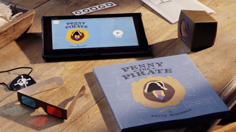
I was greatly inspired by Penny the Pirate and wanted to design a solution that could be easily distributed and extend good dental habits beyond dental clinics and in the comfort of their homes. I need my solution to stand out amongst the numerous tooth brushing apps and videos available out there.

I was reading a book which mentioned that imagination was the fundamental of concepts and beliefs. This became the starting point of my project – I needed a convincing story accompanied with impactful imageries to help preschooler visualize, understand and belief that poor tooth brushing habits has its repercussions.

I turned the process of tooth decay into a narrative and added a little playful imagination and bam- the story of ‘Clarke’ was born.


The Character:


Thinking about the story was easy but illustrating a completely imaginative character was tedious.

I spent quite some time developing the character. It had to look like a non-human creature (it’s a bacteria) yet has human-like characteristics (it has a growing family). It had to be child-friendly but not too much as it ultimately becomes the antagonist. As I was creating the character, I had to also be wary of what I was painting in the preschoolers’ mind.
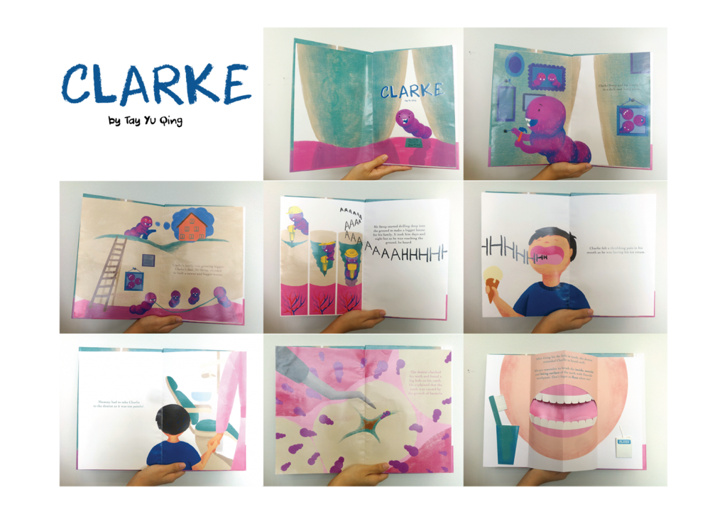
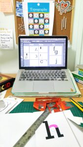
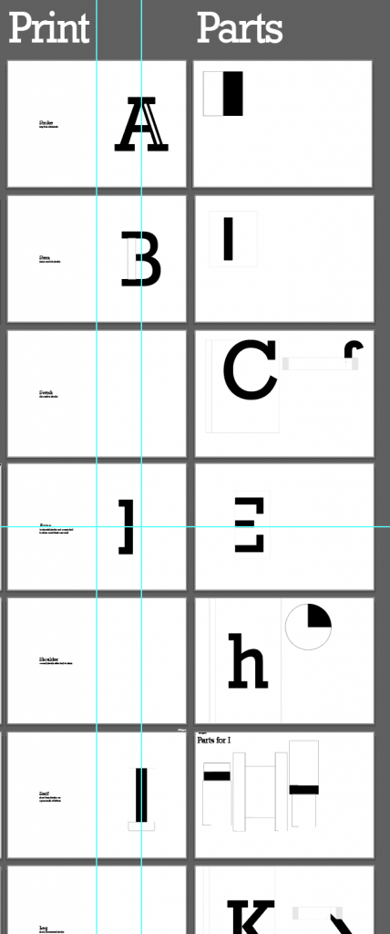
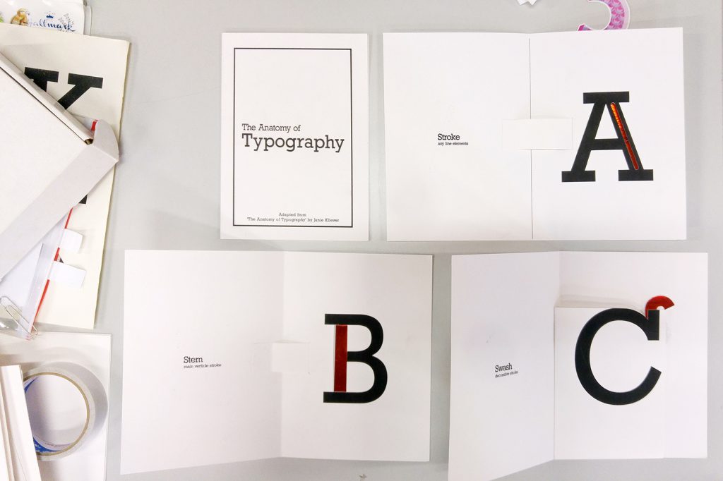
Layouts


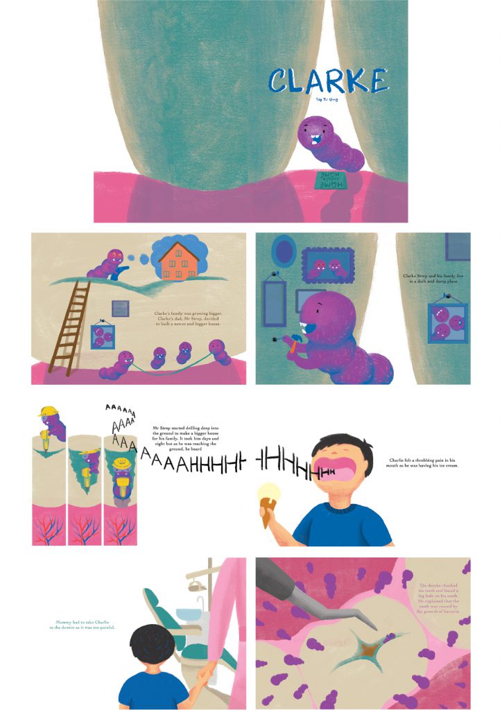
I wanted a bigger book dimension to create an immersive reading experience for the child. I have already exaggerated the process of tooth decay into a narrative and amplifying the imageries was to the only logical move to me.

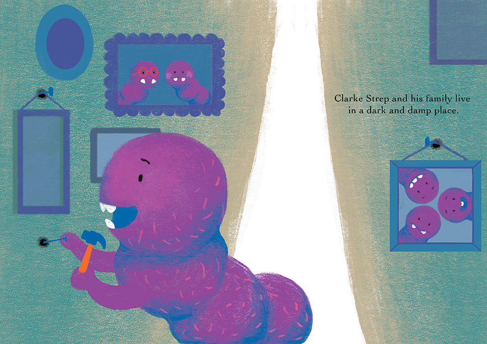
During consultations, Michael has also reminded me to add more context in my illustrations to tie in with the storyline more closely. Eg family portraits hanged around Clarke’s home rather than just a home-sweet-home floor mat.

The transition from the imaginative world of Clarke (aka inside the mouth) to the reality world of Charlie was a struggle at the start. But I soon found the use of negative spaces helpful in the differentiation.
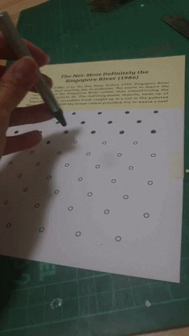
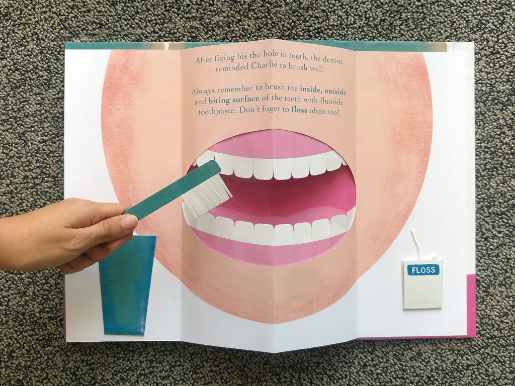
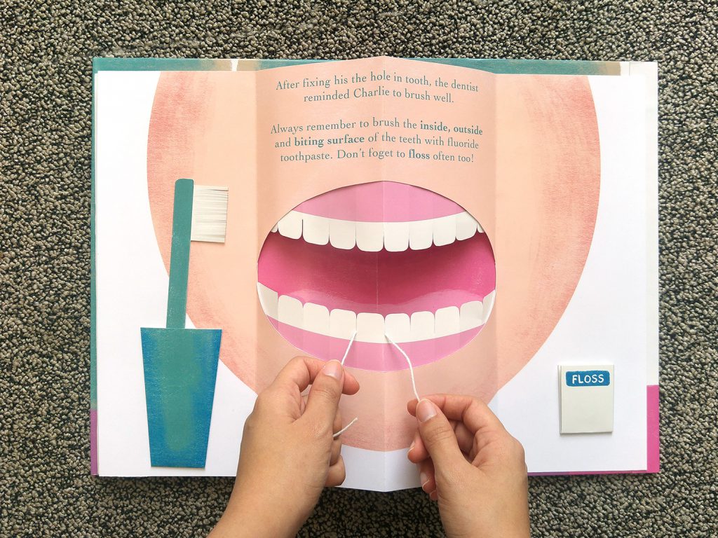
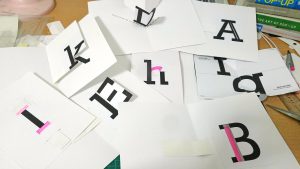
Pop-Up


I have always been fascinated with interactive books and wanted to incorporate ways to help children build their dexterity for tooth brushing. I was really really ambitious at the start and imagined how electronic paper would be really cool as it could change kinesthetic movements into sound when they brush. Or maybe thermochromic paint could be used to print the decayed tooth that changes into white when children brush it with their fingers. But I gave up after checking the price and technical skills need to use those materials. In the end, I decided to go ahead with pop-up page, something I’ve always been interested. It turned out to be waaaay better than I expected.

Designing the pop-up page was easy because it was simply layers of paper stuck upon one another and no fancy tricks. The measurements, however, was time-consuming and required trial and error.


Printing


It was so damn ex.

Probably the most expensive project I had but the quality made it worthwhile.


Binding


I done it in a rush and it was poorly binded.

But I’ve learnt from my mistake.

Lesson 1: Don’t hardbound if I’m left with less than a day to get it done

Lesson 2: It takes 2-3 prototypes to get it right. Test print with the same paper type but print it at cheaper shops first.

Lesson 3: ALIGN the spine. It’s the first and most crucial step. Then, trim the excess external margin.

Lesson 4: Spray mount should be sprayed a distance away. The glue particles should land lightly on the paper. Not create texture like a gravel wall.


In conclusion, this project was a roller coaster ride but with lots of lesson learnt. I did enjoyed this project and would like to improve it over my vacations.

Design Artefact 1 Final

I illustrated a children’s book about the need for daily tooth brushing.

It was unfortunately poorly binded so here’s the digital illustrations for view:    

The last spread is a pop up page that allows children to build their dexterity for toothbrushing and flossing.

Task 1: Defining Problem

What are some of the current issues confronting our world today? Amongst them, what is of interest and a cause of concern to you?

  1. Increasing Childhood Caries among Singapore Children: Teach Preschooler Good Tooth-Brushing Habits
    Dentists here are seeing more children with early childhood caries before the age of six, with some requiring general anaesthesia, 31 January 2013
    One in two Singapore Kids has Rotten Teeth, 14 May 2014
    Tooth Decay in Children Can’t Be Brushed Aside, 12 June 2017
    Dental Health among Pre-Primary School Children, 2017
    Despite dental efforts to promote good tooth-brushing among preschool children, at least half of the preschooler* children in Singapore has tooth decay and more than a quarter has severe early childhood tooth decay. Many parents neglect educating good brushing habits and some even delay dental check for their young children. They are unaware of the that decayed milk teeth stunts the growth of adult teeth. Many of the current programs that aim to educate good dental habits to preschooler children lacks sustainability.
    * Preschooler children refers to children age 7 and below
  2. Overconsumption in Our Society: Minimalist living- Buy wisely
    More Singaporeans Turning to Online Shopping for Better Bargain, 3 June 2016
    The Good and Bad Side of Consumerism, 11 July 2016
    The Pursuit of Less, 19 January 2018
    Overconsuming is Costing Us the Earth and Human Happiness, 21 June 2010
    Singaporeans are constantly surrounded with consumerism. With e-commerce and cashless payment on the rise, we are often coax to buy more. It’s time for Singaporeans to learn to live minimally – stop hoarding, buy wisely. After learning to live with less, I find myself being more mindful and less overwhelmed. This is exceptionally helpful to millennials and even working adults who are constantly engulfed with information, possessions and people that some are at the verge of stuff-o-cation.
    * The term ‘minimalist’ can be confusing with the art movement
  3. Increasing undergraduates’ engagement in (Singapore) Museums
    Museums Tell Teenagers: We Are Here for You, 15 March 2017
    Room to Rise Project @ Whitney Museum
    Engaging Young Adults in Museums
    There are numerous museum programs targeting different age groups and social groups but limited in targeting young adults. Many young adults (internationally and locally) perceive museums to be an all-serious and no play venue and they do not understand the works. Hence, despite schemes for free entry for tertiary students, visitorship is still low (except for arts-related majors).However, in my opinion, everyone is sure able to find a piece of art that they can relate to even without an art background. A connection needs to be made between the artwork and preconceive knowledge they have. Hence, I would like to target undergraduate students and curate art content based on their university majors.

    Final Selected Case: #1 Increasing Childhood Caries among Singapore Children: Teach Preschooler Good Tooth-Brushing Habits

  • Why is the issue important? Who does it affect and how?
    By nurturing good dental habits in young children help to prevent future dental problems when they are older which may require costly solutions such as braces, crowning and root canal. This cost would be bore by parents or the child themselves. Furthermore, Singapore has insufficient dentists and waiting list of rental services are long.

    Firstly, it will help to reduce childhood caries among preschoolers by teaching them the right brushing habits. Secondly, it saves parents from the costly dental services when they are older. Lastly, it reduces the strain on the nation’s dental services and ideally reduce the long waiting list.

  • Who do you need to communicate to, and why?
    The target audience are preschoolers age 3 to six because they are of age to learn to brush their teeth independently or under adult supervision. Ideally, they would recognize the importance of brushing their tooth through means of play and make it a habit. My secondary target audience are the parents of preschoolers as they play an important role in supervising their daily brushing habits and brining their children for bi-annual dental checks for cavities or abnormalities.
  • How has visual communication contributed to address the cause?
  1. Princess Prophy – A Tooth Fairy Pal Plush

    Lilac Paper
    Plush Toy and Print on Paper
    July 2017

    • They created a friendly tooth character to attract children’s attention
    • Checklist for children to brush their teeth independently
    • The plush toy is an effective reminder for children to brush their teeth before and after bedtime as it would be their bedside buddy.
  2. SHIT-IN-M’TEETH: Your Weapon Against Dental Damnation

    Erik Noyes
    Mirror, Acrylic and Print on Paper
    November 2014

    • They make a big deal out of food stuck in their tooth; the sarcastic tone makes it funny and catchy especially for young adults
    • It is credit card size and can be conveniently stored in wallet
  3. Penny the Pirate

    Satchi & Satchi (Australia)
    Print on Paper & Digital Platforms
    June 2014

    • Children eye test gets convenient; Children get eye checks at the comfort of their home
    • Eye test taken through form of storytelling
    • The format of a book and toolkit makes eye check interactive and convenient for children
    • Children get to role play as a pirate when reading the book
    • It provides full support – e-book and online instructions for parents


Pop-up book of the Anatomy of Typography

It’s finally final project! I wanted to create a set of teaching materials and decided to create a pop-up typography book. There’s so much to talk about typography so I narrowed to the Anatomy of Typography.

This typography poster created by Janie Kliever is a concise yet comprehensive overview of typography terminology. Hence this became my main reference for my project.

Pretty much my work desk everyday

As it is my first time doing a pop-up book, I relied on many books and youtube tutorials. One of it’s my favourite book – ABC3D by Marion Bataille. Also, a special mention to Duncan Birmingham for sharing numerous pop-up tutorials.

Great books!

To start off, I made numerous mock-ups. Firstly, to understand the mechanism. And secondly, to get a sense of how each page would be. Doing mock-ups are time-consuming but they allow me to work more efficiently when I do the final piece.

After consultation with Shirley, I need to add a highlight to the key anatomy of each alphabet to make it more interesting. I decided to try foil. Once again, it’s my first time trying foil but it was definitely way more exciting than the usual cmyk albeit the trouble.

Firstly, I had to figure out the right way to use the foil.
1. Print solid black with laser printer
2. Secure foil over intended area with masking tape
3. Put it through a laminator and the heat will do magic!

In the above image, I experimented with different paper. The one the left was a slightly glossy paper that produce an ideal shiny foil.

Next, I had to decide on the different colours. The top right one is red and has an iridescent finish. Fun fact: Iridescent will look brighter than a mirror foil because it refracts light and turn them into rainbow-like colours.

With the mock-up and material settled, I proceed to creating layout and parts on Illustrator.

While printing, I had to ensure the kind of paper it is going to be printed on. If the part was meant to be red foil, I would have to print with the laser printer. For pages on the left columns, I print them with inkjet printer on 220gsm cartridge paper for nice solid black ink.

Before binding them together