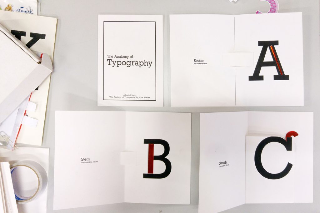
It’s finally final project! I wanted to create a set of teaching materials and decided to create a pop-up typography book. There’s so much to talk about typography so I narrowed to the Anatomy of Typography.

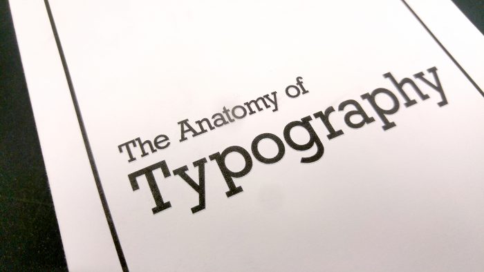
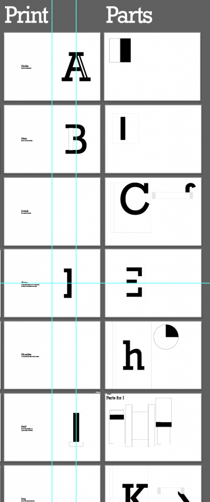
This typography poster created by Janie Kliever is a concise yet comprehensive overview of typography terminology. Hence this became my main reference for my project.
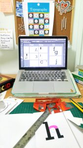
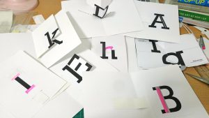
Pretty much my work desk everyday
As it is my first time doing a pop-up book, I relied on many books and youtube tutorials. One of it’s my favourite book – ABC3D by Marion Bataille. Also, a special mention to Duncan Birmingham for sharing numerous pop-up tutorials.
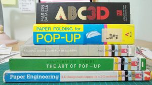
Great books!
To start off, I made numerous mock-ups. Firstly, to understand the mechanism. And secondly, to get a sense of how each page would be. Doing mock-ups are time-consuming but they allow me to work more efficiently when I do the final piece.
After consultation with Shirley, I need to add a highlight to the key anatomy of each alphabet to make it more interesting. I decided to try foil. Once again, it’s my first time trying foil but it was definitely way more exciting than the usual cmyk albeit the trouble.

Firstly, I had to figure out the right way to use the foil.
1. Print solid black with laser printer
2. Secure foil over intended area with masking tape
3. Put it through a laminator and the heat will do magic!
In the above image, I experimented with different paper. The one the left was a slightly glossy paper that produce an ideal shiny foil.
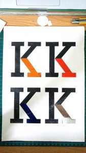
Next, I had to decide on the different colours. The top right one is red and has an iridescent finish. Fun fact: Iridescent will look brighter than a mirror foil because it refracts light and turn them into rainbow-like colours.
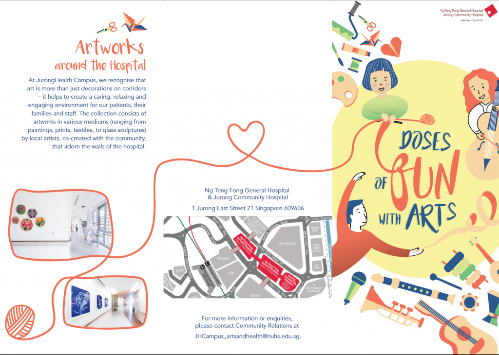
With the mock-up and material settled, I proceed to creating layout and parts on Illustrator.
While printing, I had to ensure the kind of paper it is going to be printed on. If the part was meant to be red foil, I would have to print with the laser printer. For pages on the left columns, I print them with inkjet printer on 220gsm cartridge paper for nice solid black ink.
Before binding them together


 For my final design, I adjusted the text spacing and work on some final details for the illustrations.