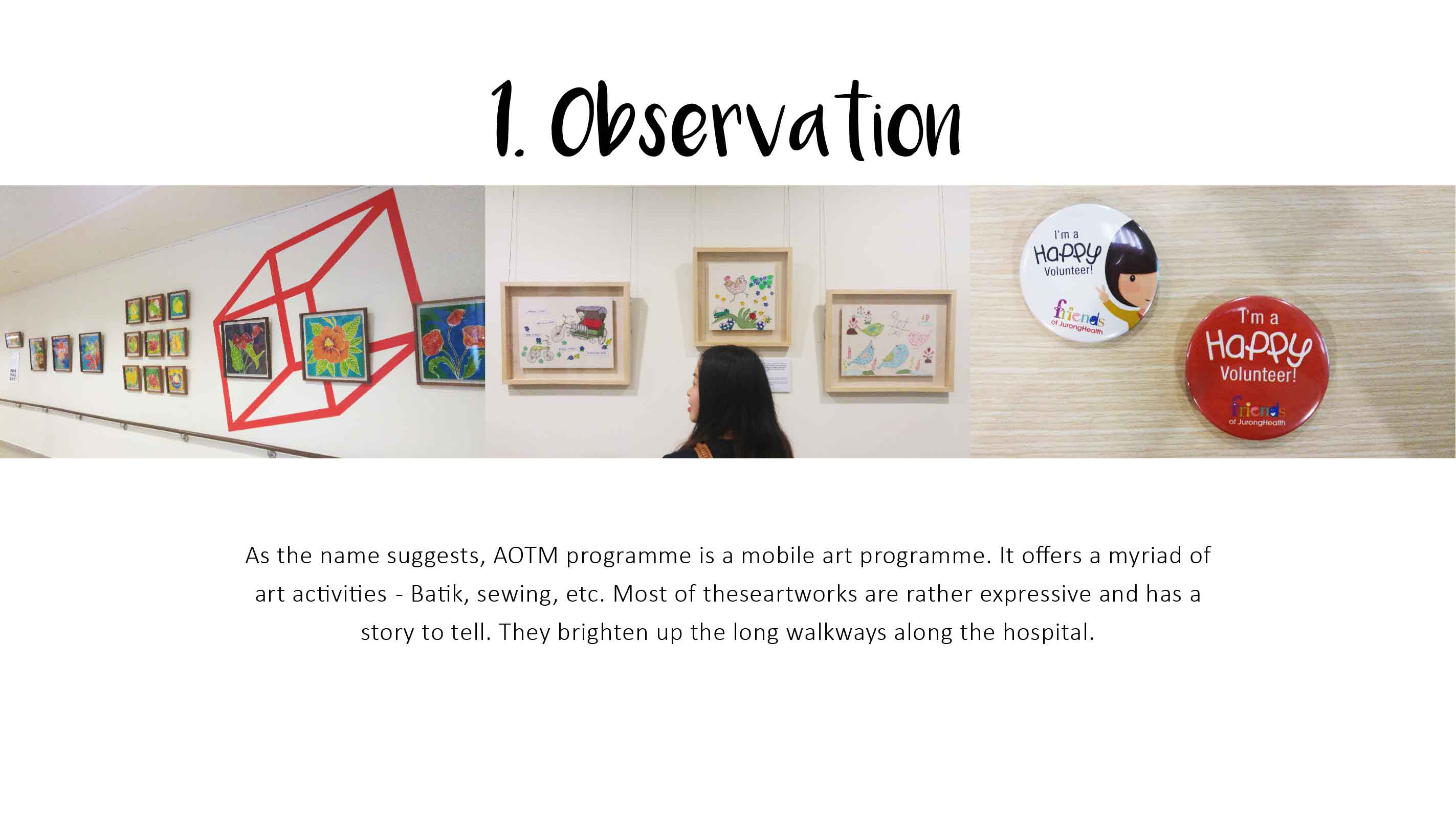
There are 8 posts filed in Visual Communication 1 – G3 (this is page 1 of 1).

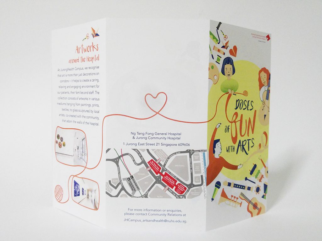
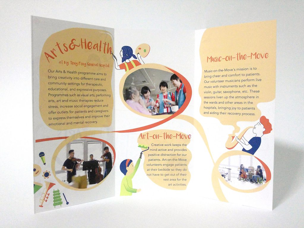
For me, this brochure works because of how the layout flows across the panels. The images are treated to merge with the texts. The teal organic shapes direct our eyes to the first panel. Then, the title lead us on.

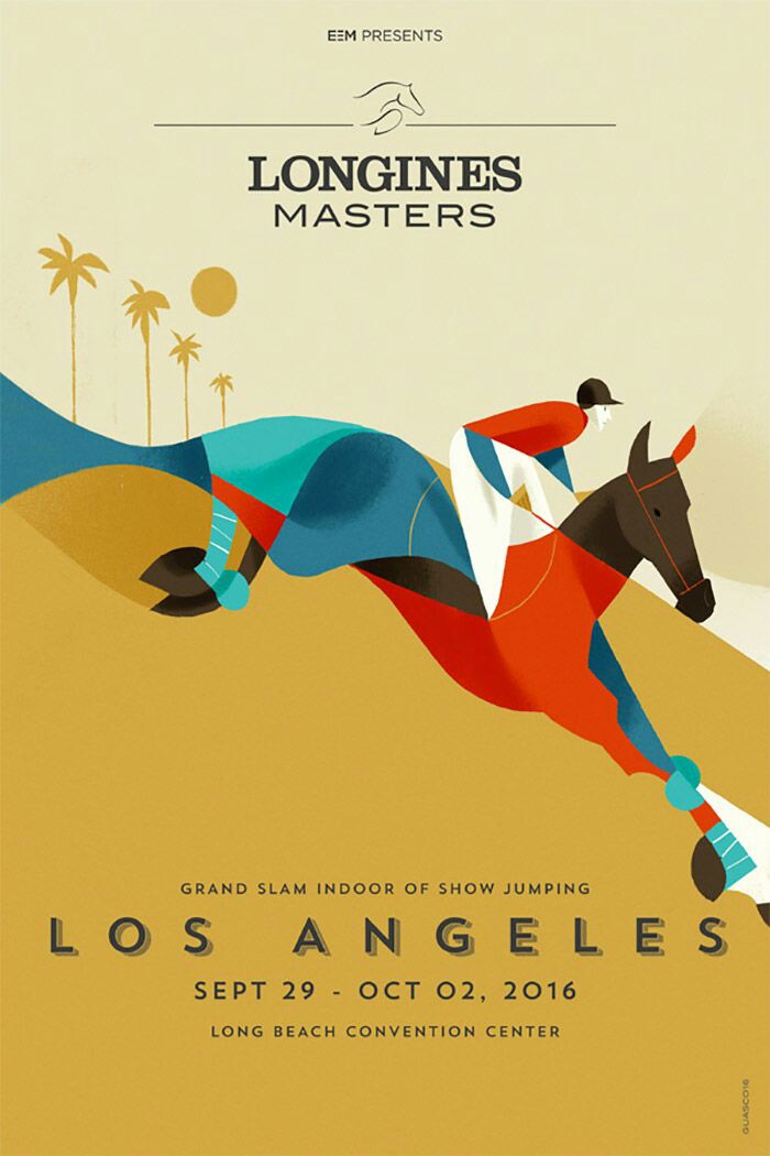
This is also an interesting poster because it uses one significant image to convey the message. I like the colours used too. However, this design might not be suited for a FUN hospital activity as it lacks energy and vibrancy.

I like this poster because of the die cut characters. I thought I could do something similar with my characters.
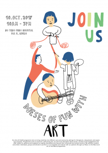
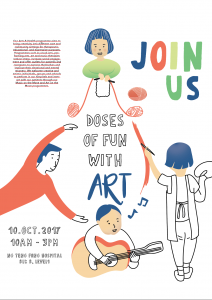
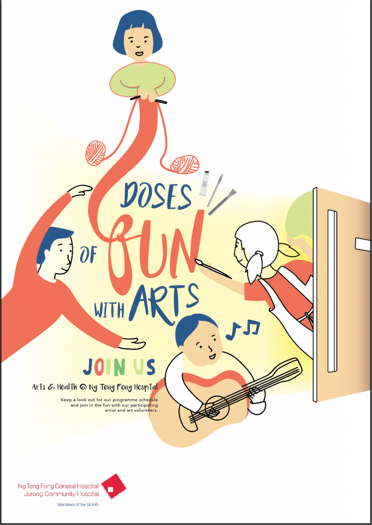
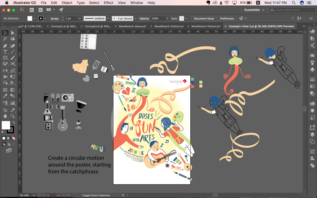 For my final design, I adjusted the text spacing and work on some final details for the illustrations.
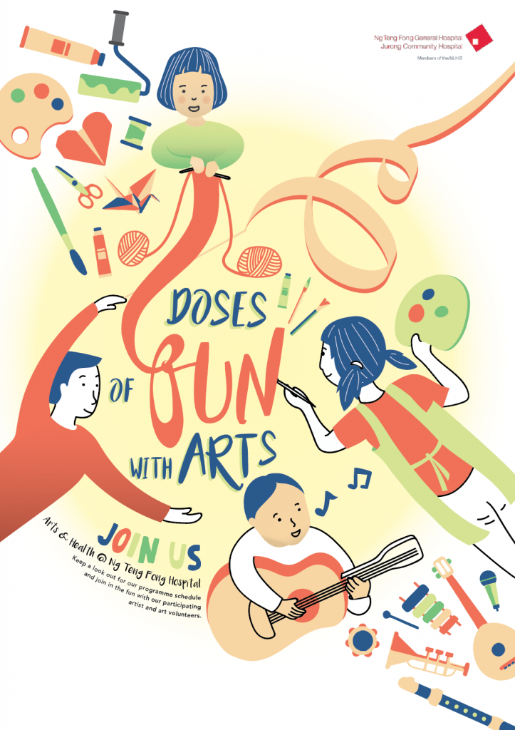
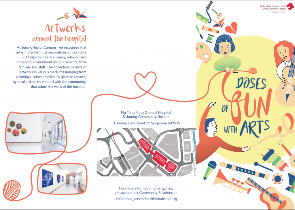
My slogan: Doses of Fun with Art (Keywords in Bold)
DOSES: I wanted to use motifs of doses to express my slogan.
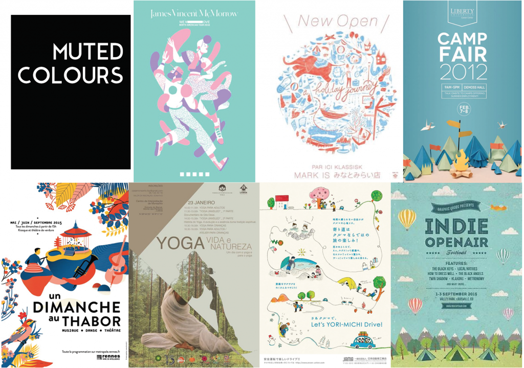
MUTED COLOURS: In consideration of the nature of programme and setting, I prefer muted colours as it is more soothing.
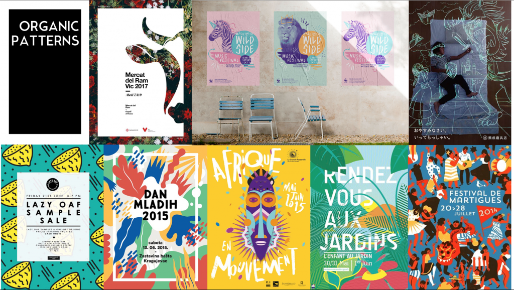
ORGANIC PATTERNS: I like the fluidity of these organic patterns. It is another way to express ‘doses’ instead of showing it literally.
The following are my initial drafts. I decided to use illustrations as I could create more organic forms.
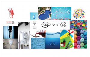
As shown here, I was very stuck with the idea of a droplet as doses. Hence, I break away from it and shift my focus to ‘fun’ instead.
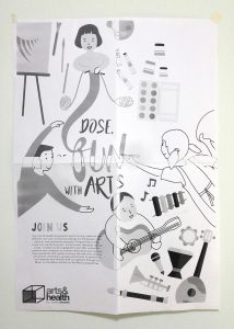
(I forgot to save the softcopy so only a B&W test print to share)
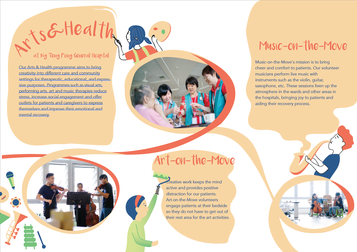
I add some art and music elements to add vibrancy to the poster.
Comments given:
Following are my drafts in chronological order.
For some reason, I thought adding a door would make it seem more magical… sort of like opening door to a whole new world. But nope.
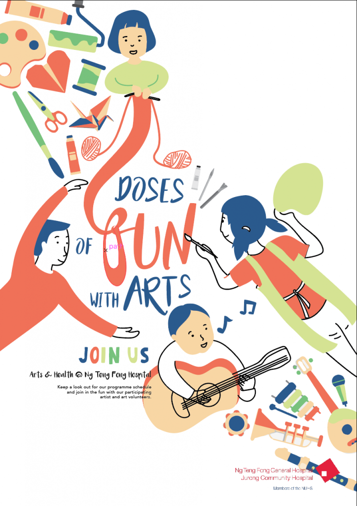
I put back the elements and repositioned them to create this flow from one corner to another. I overlap the logo with the instrument, thinking it could help to patch things together. But nope.
Finally, I treat the text to weave the illustrations and text together. I added a ribbon on the top right for a more balance composition and to also lead the eyes to the logo.
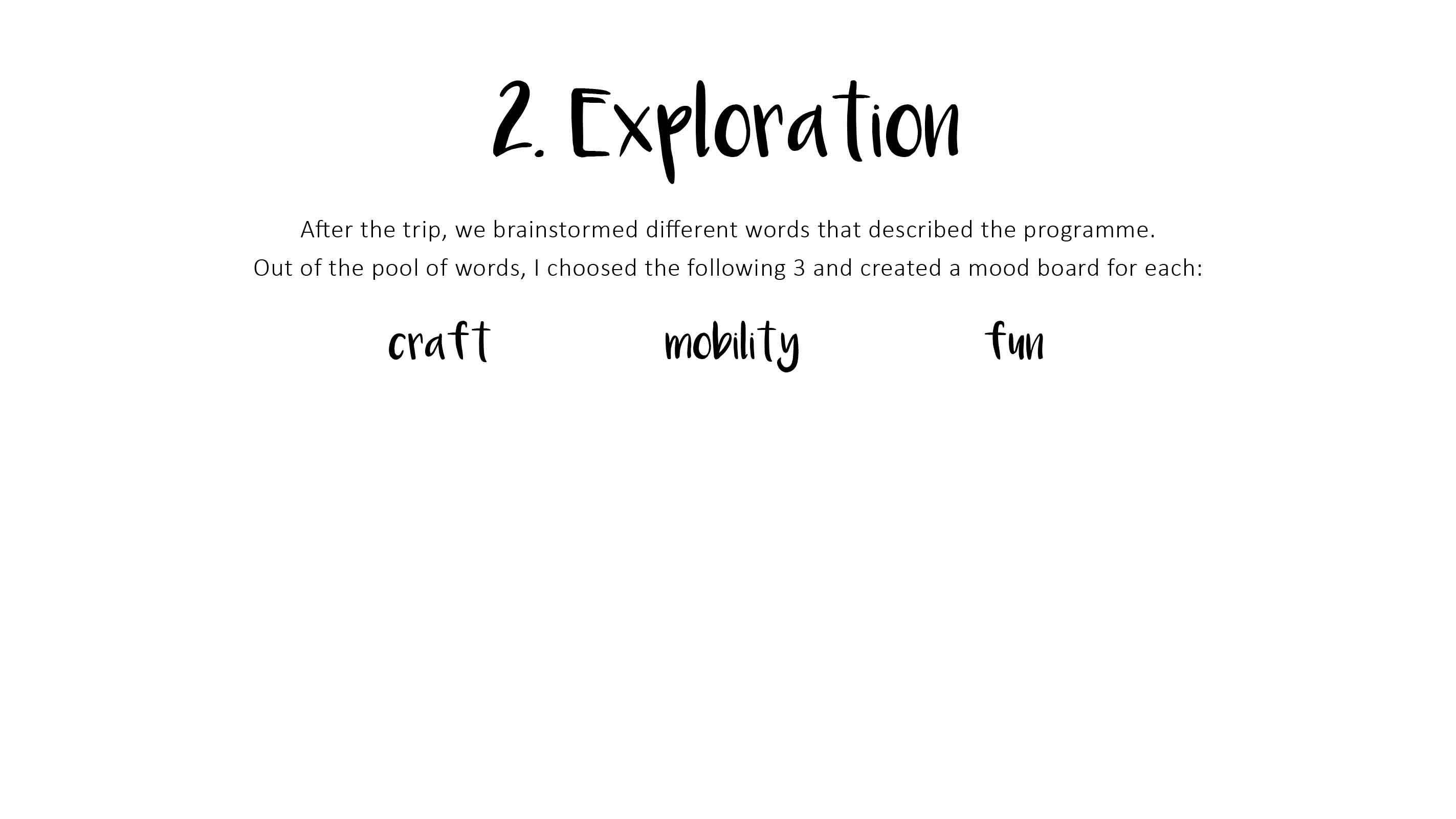
1A) VISUAL RESEARCH


Festival de Málaga
Published Oct 2011
Client: Festival de Málaga
Agency: BARFUTURA
This poster is an event for a film festival and elicit a vibrant community of people. This is one of my all-time favourite posters because the images speak very strongly. Even thought I do not understand the Spanish title, I know that this event welcomes people of all walks of life. It takes on an interesting bird’s POV perspective and used vibrant colours to depict the celebratory event. The name of event is also well-placed as a visual metaphor of the event which attract crowds. In all, this poster had effectively transcends language barriers images and clever placement.
1B) Develop Slogan and Moodboard
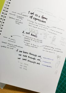
My initial mindmap of slogans
After the sharing session in class, my final slogan is ‘Doses of Fun with Art’.
It was evolved from ‘Art Heals’ –> A Dose of Art a Day Keep the Doctor Away –> Doses of Fun with Art
The keywords are ‘Doses of Fun’


Thumbnail Sketches 1
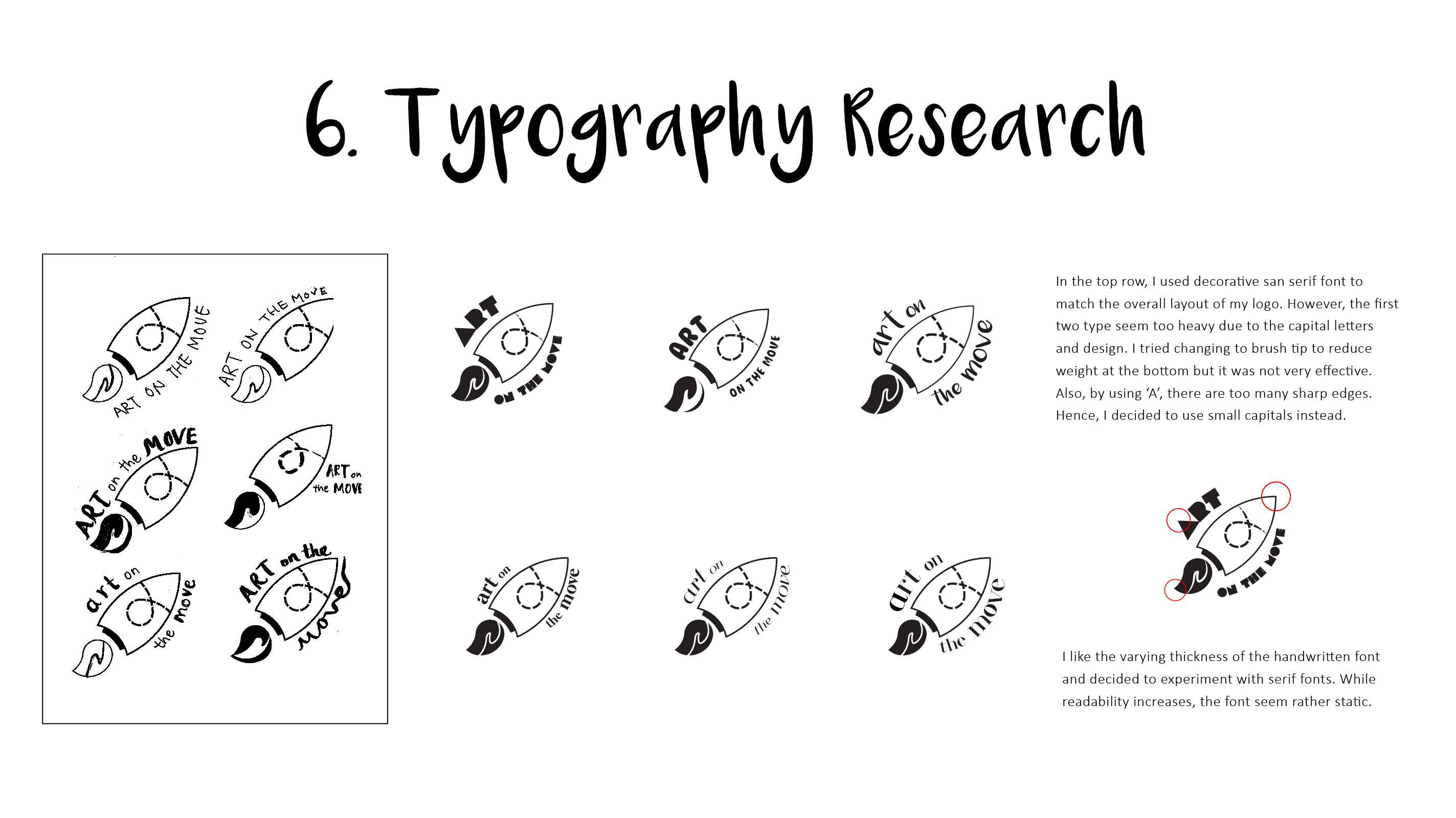
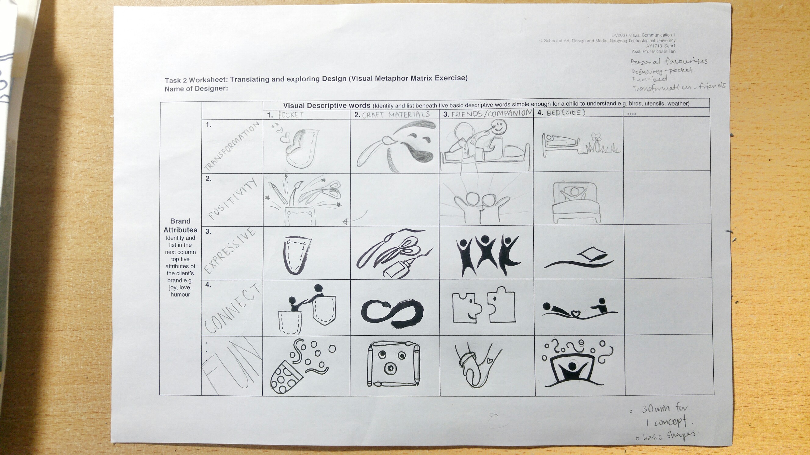
This worksheet helps to break down our design process and critically consider different types of possibility. After completing it, I narrowed down to 3 imageries that best reflects the identity of Art-on-the-Move Programme:
1. Positivity – pocket + craft material
2. Fun – bed
3. Transformation – friends/companian
While all of these sketches are supposed to reflect the identity of the programme, these 3 icons encapsulate the most important aspect of the programme.
Referring to my previous post, my choosen concept: Community Arts Programme just by your bedside!
Among my preferred icons, I work the positivity-craft material. I break down the icon into 5 different aspect and did 3-4 alternative icons for each such that I could reference them while developing my sketch.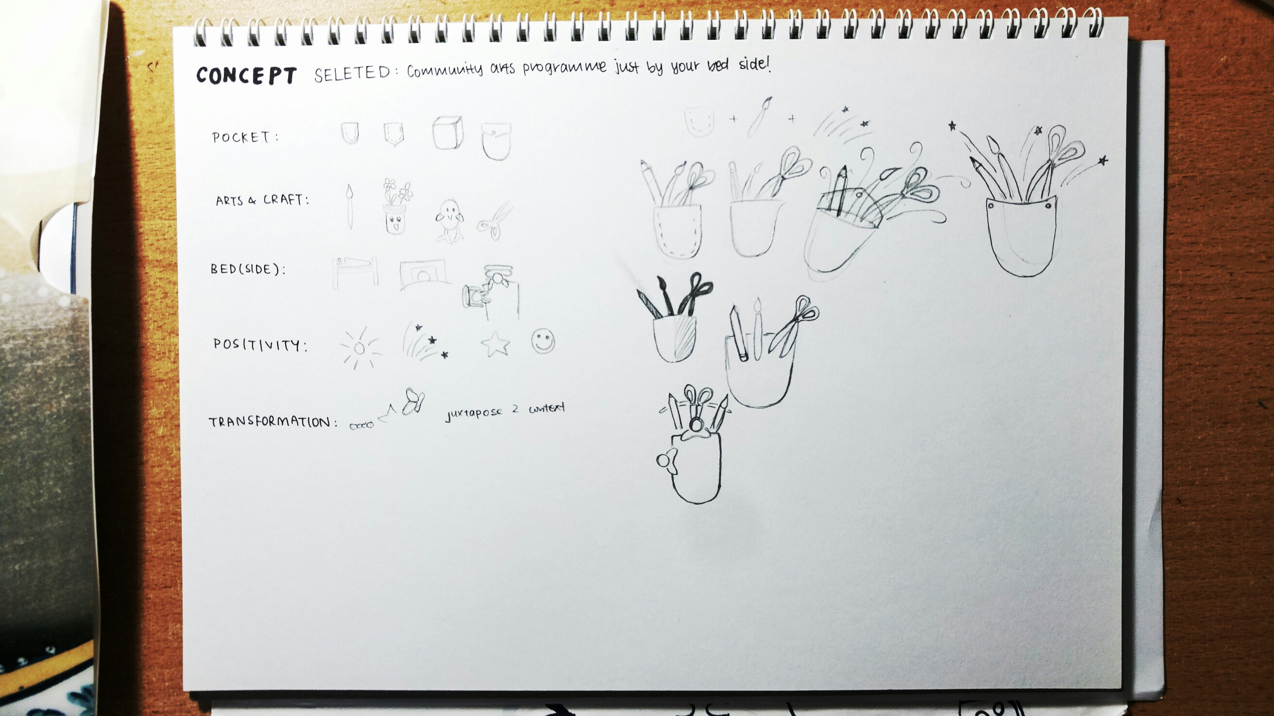
Looking at my current progress, I feel that it lacks the element of bedside/patient/hospital. I’m working on that now.
To convey the nature of art-on-the-move programme as well as the spirits evoke by the volunteers in this programme.
Community arts programme just by your bedside! – craft & convenience
Bedside crafts that connects people – convenience, craft, companionship
Craft – subject of programme
Convenience – nature of programme
Transformation – expected outcome of programme; transforms the lives of patients and volunteers
Connect – this programme brings people together
Positivity – the overall impression of the programme I would like to convey to patients as well as anyone who sees the badge.
Through class discussion, I realised that these keywords could be categorised and covers different aspect of the programme.

… that question mark will only be filled when my concept is finalised.