Through the brainstorming exercise, I realise that I would love to design for interactive materials in the context of a museum. To scope my project, I started to look into the different areas where visual communication could be applied in the museum. Some of the areas I had explored:
Information accessibility in museum
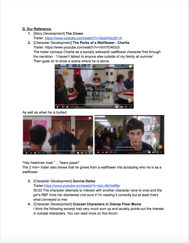
Community museums/ Private museums
Participatory projects in museum
01 Accessibility
02 Community Museums
03 Participatory Project
I decided to delve into 1#1 Information Accessibility in Museums and consider the different possible community groups to work with.
Dyslexic children – most exhibits are contextual heavy and description are often heavily reliant on texts, making it unwelcoming for dyslexic children.
Visitors with time constraint – based on the 2017 Survey Population on the Arts, lack of time was the most common factor for not participation in arts & heritage events.
Eventually, I decided to work on designing a children’s exhibition guide for National Gallery’s DBS Singapore Gallery – Siapa Nama Kamu. This is one of the 2 permanent exhibition that covers artworks about Singapore from the 18th century to contemporary times.
Reason #1: I like designing educational materials for kids.
Reason #2: I remember guiding a Korean family with 3 young daughters for this exhibition- while the parents were fully engaged, the children were fidgety as the tour was not age-appropriate for them.
The Gallery does provide children-friendly tours/events for children to learn more about the artworks. However, I realise many of these events require parents make an extra effort to stay updated with the museum schedule and and abide to the tour timings. This is not a luxury all families have especially visitors from abroad.
Hence, I decided to do a museum guide that fits the following criteria:
Only pencil can be used for the activities (museum rules)
Children can use the exhibition guide without much supervision:
Language is kept simple; contextual knowledge are kept concise
Many visual guides to engage children
Various tactile materials to keep things fresh
I had decided on the following 6 artworks as they do not require much contextual knowledge, display a variety of mediums and cover the major period of Singapore’s art development.
Heinrich Leutemann
Unterbrochene Straßenmessung auf Singapore (Interrupted Road Surveying in Singapore)
c. 1865
Wood engraving
20.8 x 29.4 cm
Collection of National Museum of Singapore
Singapore
Liu Kang
Life by the River
1975
Oil on canvas
126 x 203 cm
Gift of the artist. Collection of National Gallery Singapore.
Singapore
Chua Mia Tee National Language Class 1959 Oil on canvas 112 x 153 cm Collection of National Gallery Singapore Singapore
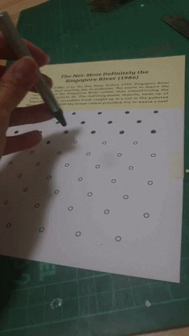
Teo Eng Seng The Net: Most Definitely The Singapore River 1986 Paperdyesculp and net Gift of the artist. Collection of National Gallery Singapore. Singapore
Choy Weng Yang. Horizontals I. 1977. Oil on canvas. Gift of the artist. Collection of National Gallery Singapore.
Matthew Ngui
Walks Through a Chair
1997 remade 2015
Mixed media, video approx. 00:03:00
Collection of National Gallery Singapore
Singapore
These are the ideation and sketches for each artwork.
And to anyone who was curious to how I created the holes for ‘The Net’ activity page – I used a Making Memories Hole Punch I found in my old stash of scrapbooking materials.
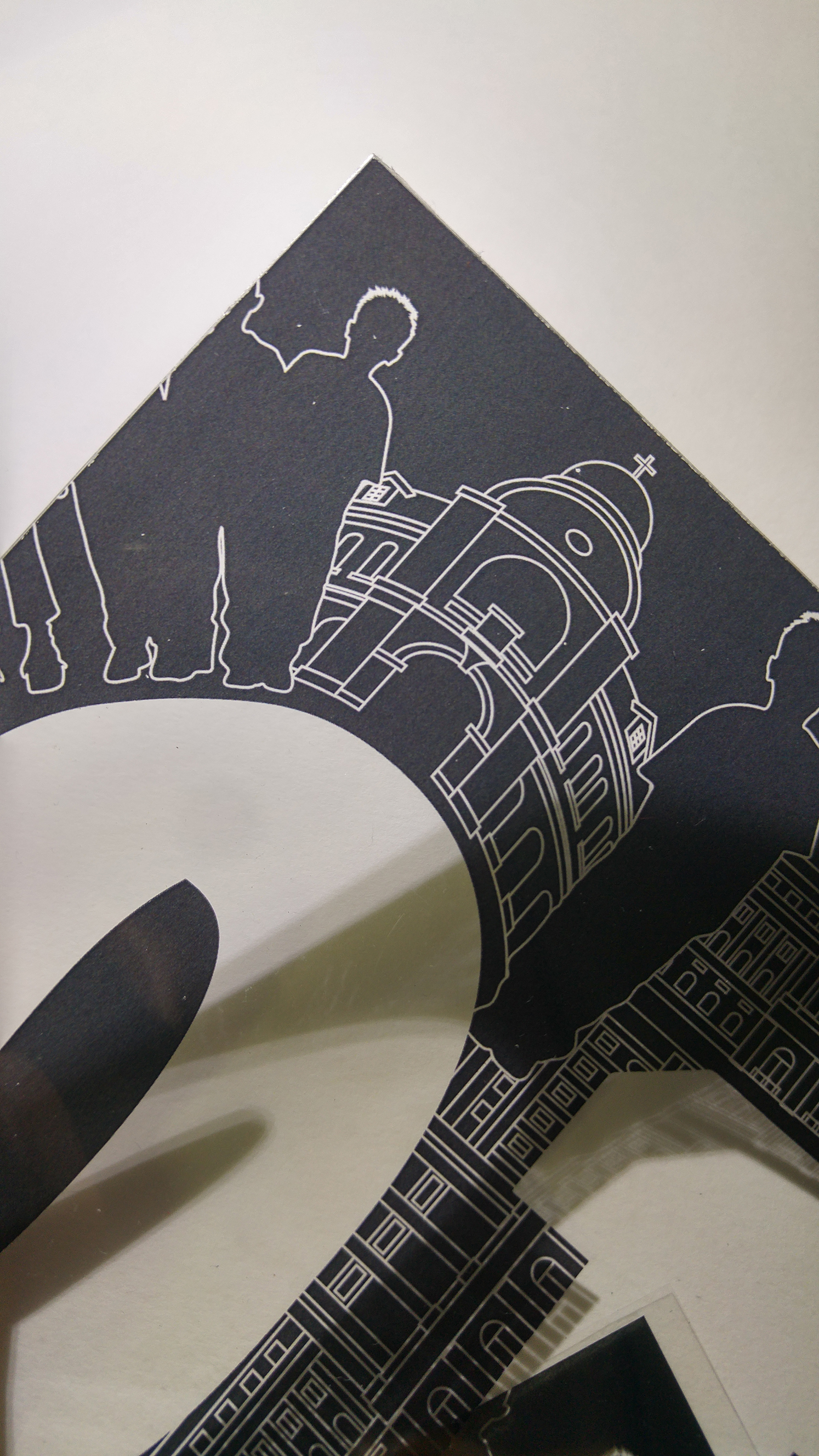
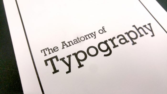
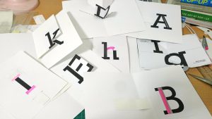
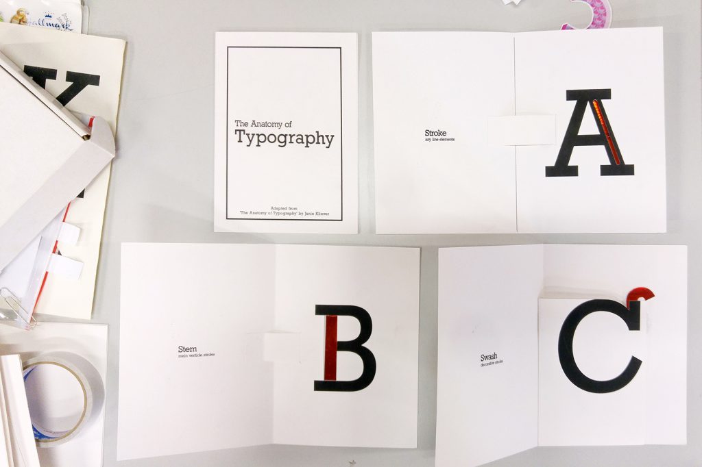
It’s finally final project! I wanted to create a set of teaching materials and decided to create a pop-up typography book. There’s so much to talk about typography so I narrowed to the Anatomy of Typography.
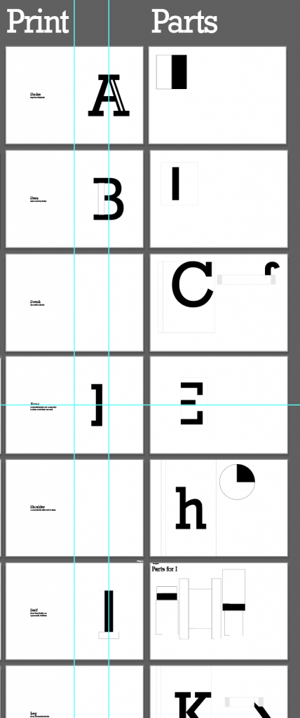
This typography poster created by Janie Kliever is a concise yet comprehensive overview of typography terminology. Hence this became my main reference for my project.
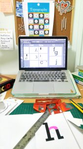
Pretty much my work desk everyday
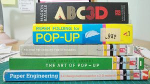
As it is my first time doing a pop-up book, I relied on many books and youtube tutorials. One of it’s my favourite book – ABC3D by Marion Bataille. Also, a special mention to Duncan Birmingham for sharing numerous pop-up tutorials.
Great books!
To start off, I made numerous mock-ups. Firstly, to understand the mechanism. And secondly, to get a sense of how each page would be. Doing mock-ups are time-consuming but they allow me to work more efficiently when I do the final piece.
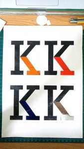
After consultation with Shirley, I need to add a highlight to the key anatomy of each alphabet to make it more interesting. I decided to try foil. Once again, it’s my first time trying foil but it was definitely way more exciting than the usual cmyk albeit the trouble.
Firstly, I had to figure out the right way to use the foil.
1. Print solid black with laser printer
2. Secure foil over intended area with masking tape
3. Put it through a laminator and the heat will do magic!
In the above image, I experimented with different paper. The one the left was a slightly glossy paper that produce an ideal shiny foil.
Next, I had to decide on the different colours. The top right one is red and has an iridescent finish. Fun fact: Iridescent will look brighter than a mirror foil because it refracts light and turn them into rainbow-like colours.
With the mock-up and material settled, I proceed to creating layout and parts on Illustrator.
While printing, I had to ensure the kind of paper it is going to be printed on. If the part was meant to be red foil, I would have to print with the laser printer. For pages on the left columns, I print them with inkjet printer on 220gsm cartridge paper for nice solid black ink.
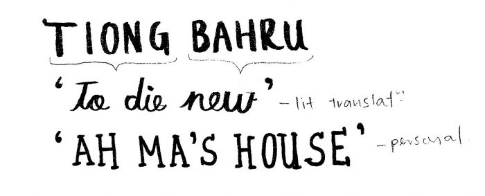
I think this assignment is a very good excuse to hand out at your favourite place. Hence, I choose Tiong Bahru.
Ideas for quotes
It’s a place I frequent almost every week because my Ah Ma stays there. To me, Tiong Bahru is synonymous to Ah Ma’s house.
While researching about the place, I found out that it literally means ‘to die new‘. ‘Tiong’ means to die in Hokkien and ‘Bahru’ means new. I felt that literal translation also accurately reflects the co-existence of old and new in Tiong Bahru. In comparison to the latter, this quote was less personal and able to be understood by most.
2. Photos
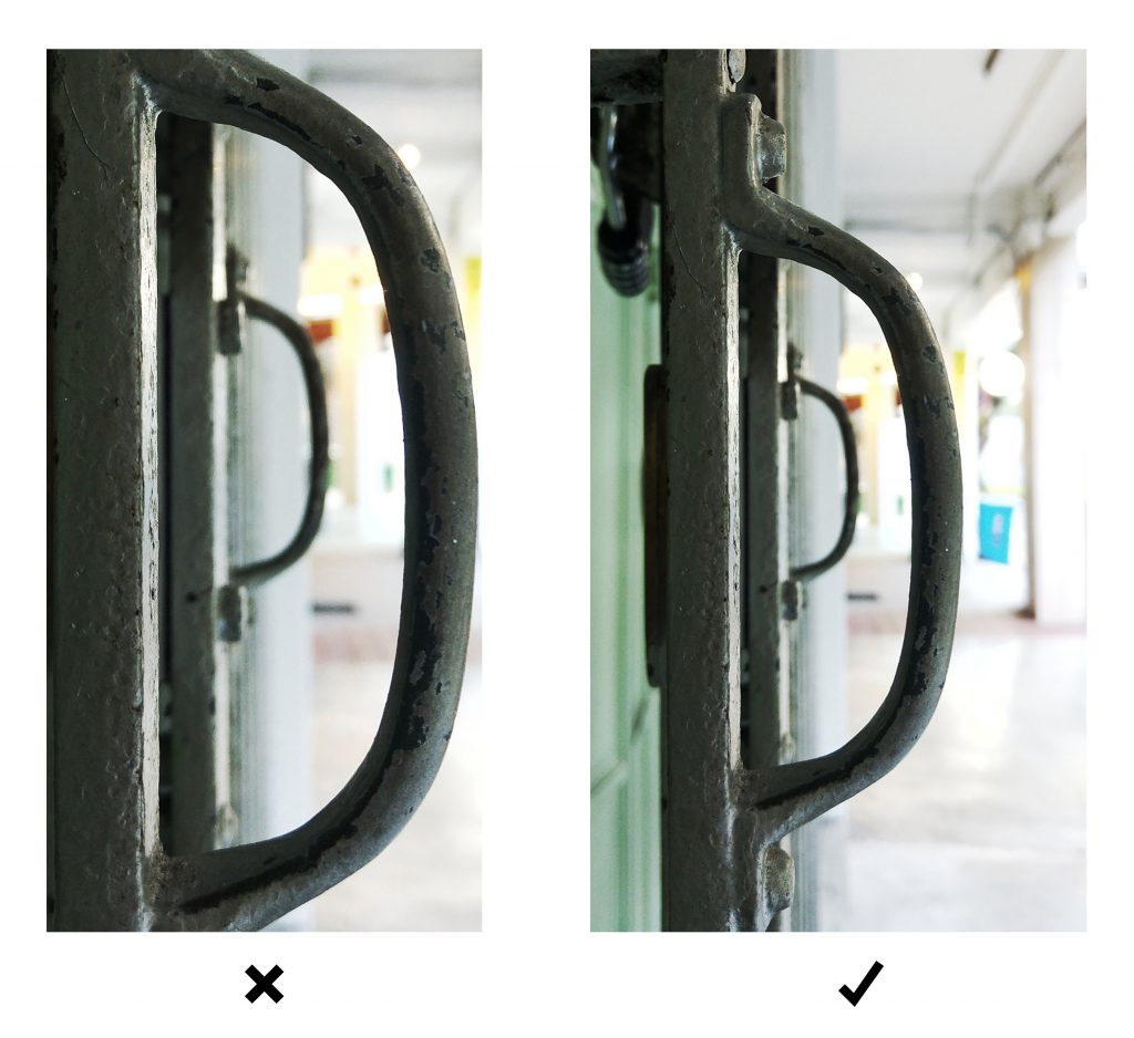
It took me 2 trips to get the right photos. I shall review the rejects first before showing what worked. During my consult with Shirley, I learnt that what didn’t worked could easily be explained with Gestalt Theory.
Left: If there is no border, it is harder to recognise it as D.
Right: However, when there is a white space around it, it helps to focus on the subject ‘D’. The border acts as a ‘closure’ for the subject ‘D’.
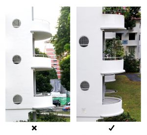
Left: the white building is bleeding into the white (overexposed) sky at the top and become a part of the subject ‘E’.
Right: The subject ‘E’ stands out when there is a clear distinction between the subject and background.
Both of these letter works. However, in different ways.
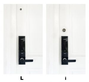
Left: We recognise ‘L’ instead of ‘i’ because due the peephole is too far to be seen as a part of the handle.
Right: Due to the proximity (and size), we can recognise an ‘i’.
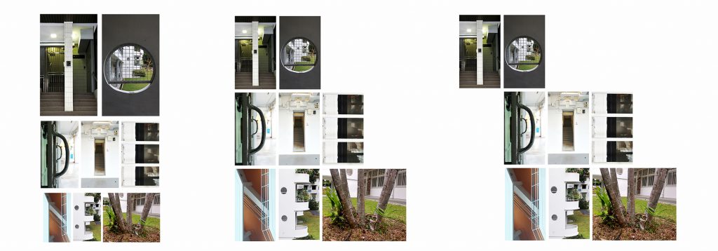
3. Layout
So, these were 3 layouts I were experimenting. While the first two are rather neat and structured, I decided to go with the last one because it resemble a flying bird could possibly symbolises the revitalisation of Tiong Bahru.
Festival de Málaga Published Oct 2011 Client: Festival de Málaga Agency: BARFUTURA
This poster is an event for a film festival and elicit a vibrant community of people. This is one of my all-time favourite posters because the images speak very strongly. Even thought I do not understand the Spanish title, I know that this event welcomes people of all walks of life. It takes on an interesting bird’s POV perspective and used vibrant colours to depict the celebratory event. The name of event is also well-placed as a visual metaphor of the event which attract crowds. In all, this poster had effectively transcends language barriers images and clever placement.
1B) Develop Slogan and Moodboard
My initial mindmap of slogans
After the sharing session in class, my final slogan is ‘Doses of Fun with Art’. It was evolved from ‘Art Heals’ –> A Dose of Art a Day Keep the Doctor Away –> Doses of Fun with Art
To convey the nature of art-on-the-move programme as well as the spirits evoke by the volunteers in this programme.
Concept of Project (Title- theme)
Community arts programme just by your bedside! – craft & convenience
Bedside crafts that connects people – convenience, craft, companionship
Keywords – rationale
Craft – subject of programme
Convenience – nature of programme
Transformation – expected outcome of programme; transforms the lives of patients and volunteers
Connect – this programme brings people together
Positivity – the overall impression of the programme I would like to convey to patients as well as anyone who sees the badge.
Mood Board
Through class discussion, I realised that these keywords could be categorised and covers different aspect of the programme.
… that question mark will only be filled when my concept is finalised.
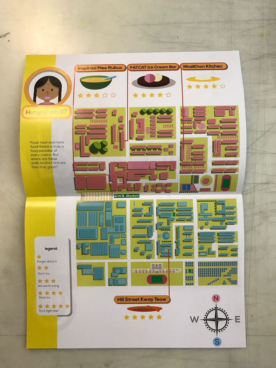
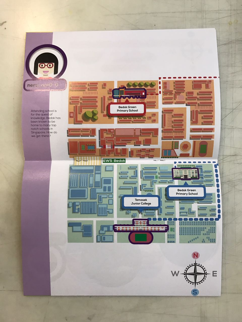
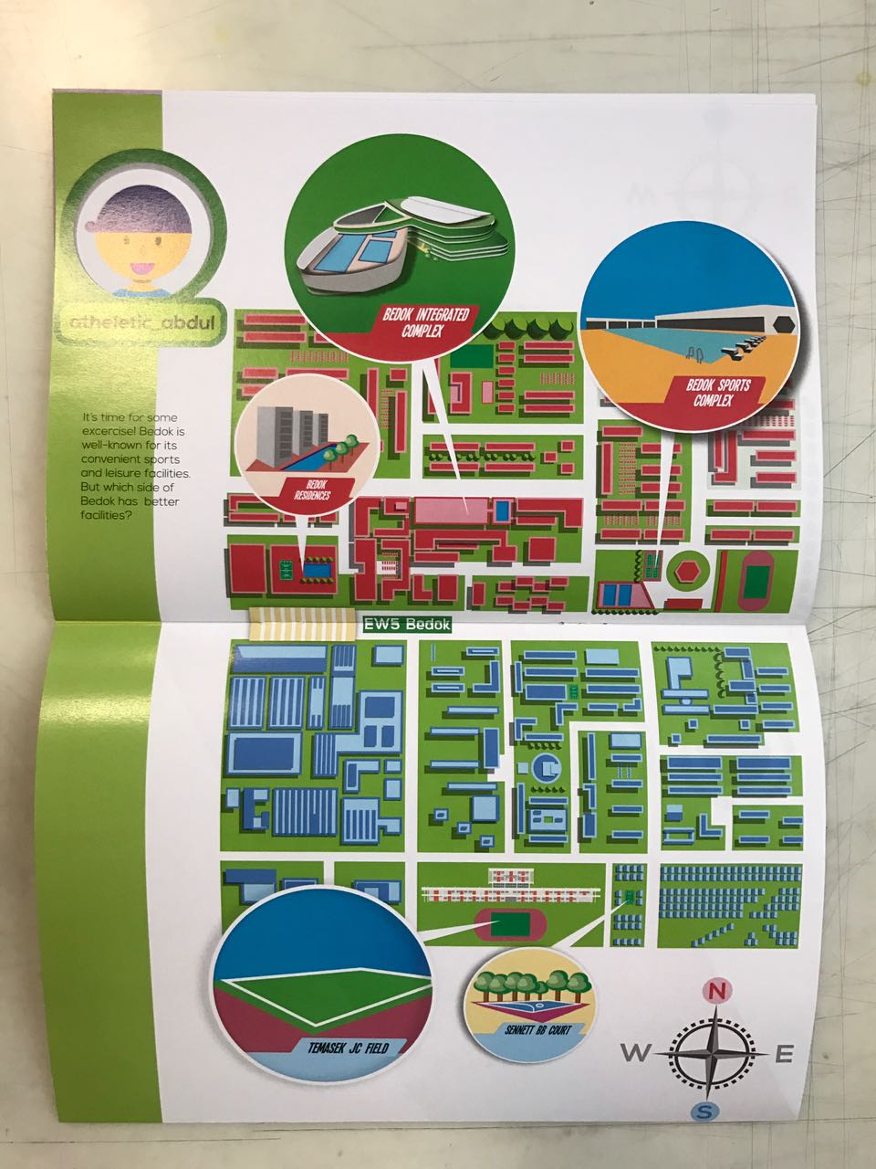
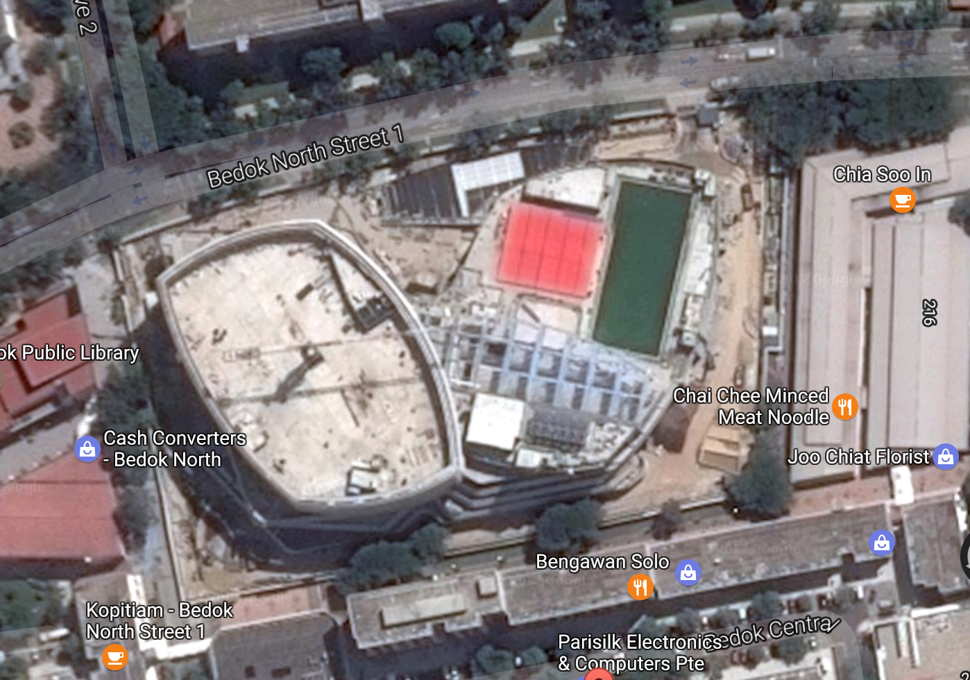
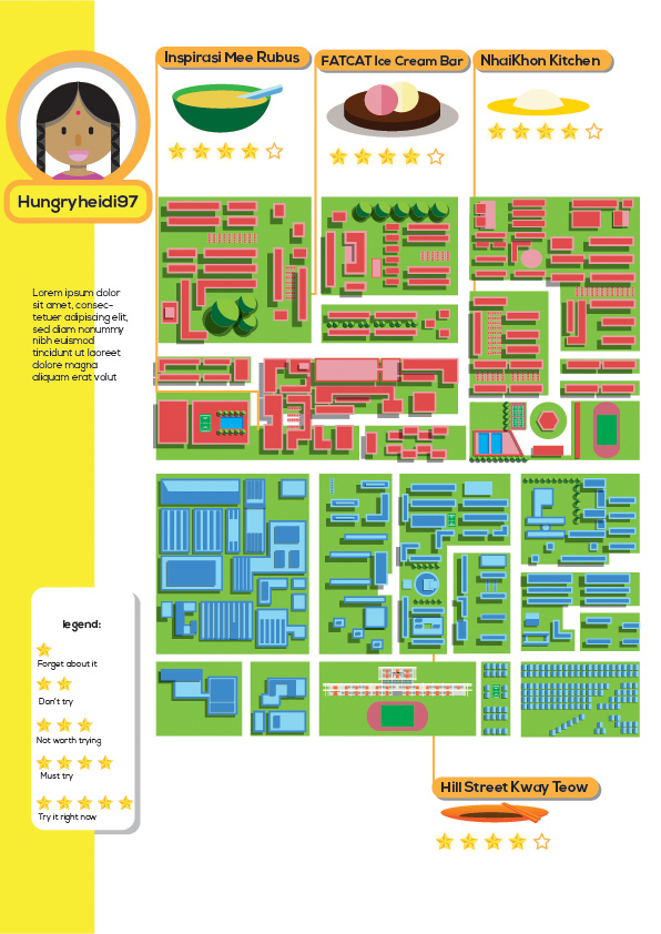
In Part 1, I created an infographic about ratings by Bedok residents of their neighbourhood. Moving on, I decided to work on the facts about Bedok. I wanted the readers to find out for themselves if the opinions of Bedok residents truly reflects the state of the neighbourhood.
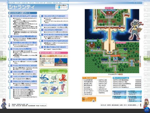
Flat Game
As an extended idea from Part 1, I decided to keep the flat game aesthetic consistent. This was to show cohesiveness for a 2-parts project. However, I narrowed the game concept to a game-guide inspired booklet for my zine. I wanted it to be like these Pokemon guides. This layout allows texts to be integrated and locations to be identified- a game-guide to Bedok.
This one has too much texts though.
The tricky part of flat graphics game is its readability. Due to the lack of interactivity and 3-dimensional graphics, my background and foreground could easily fall flat and may affect the readability of my zine. Hence, I had wandered through many many many game design pins and here are my top three favourite references.
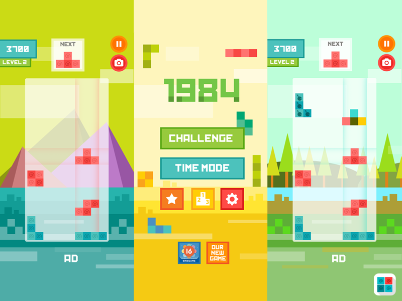
Tetris Flat IOS Game by Igor Radivojevic
Ecokids by Vola Kuzmich
Flat GUI Pack by ricimi
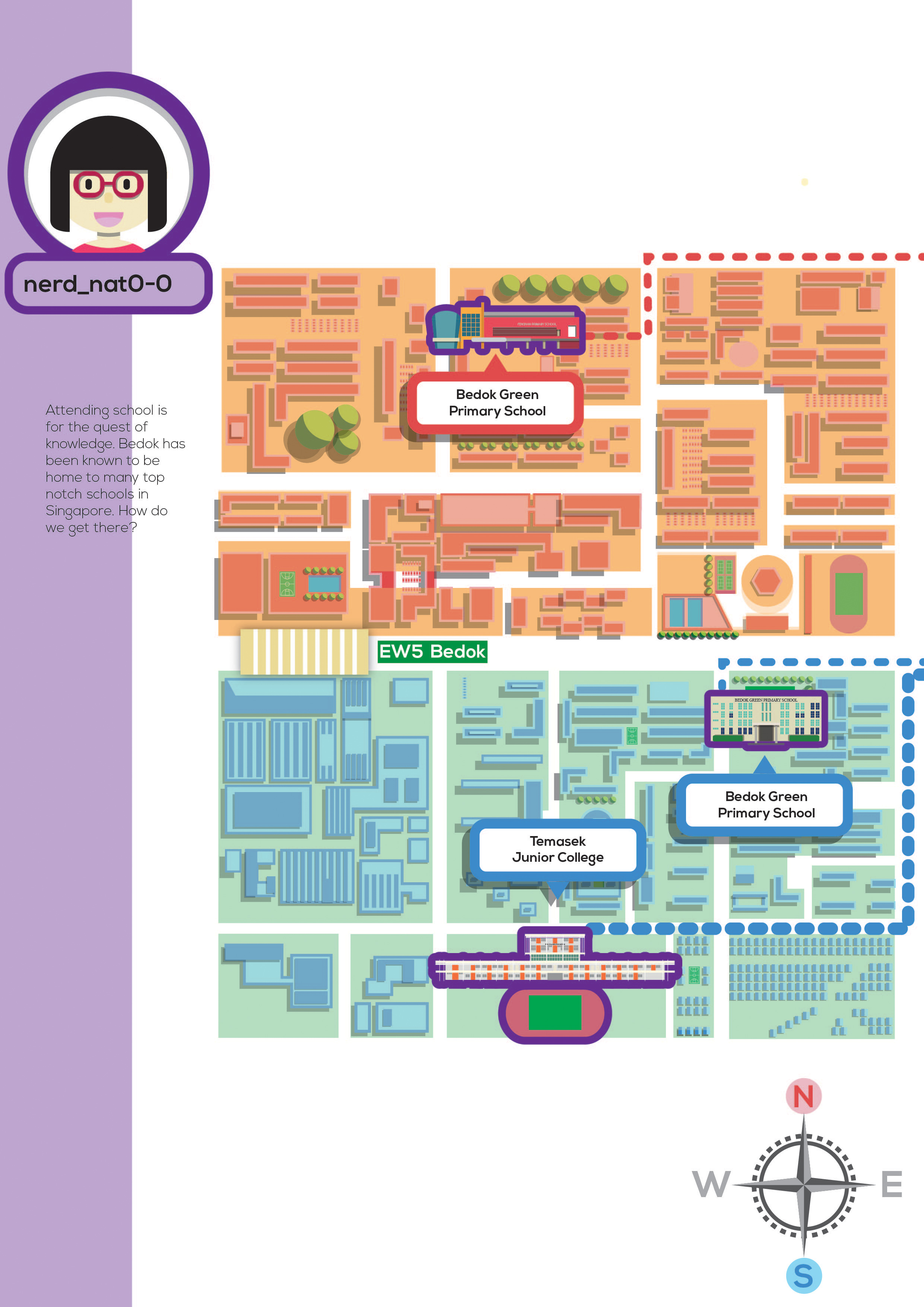
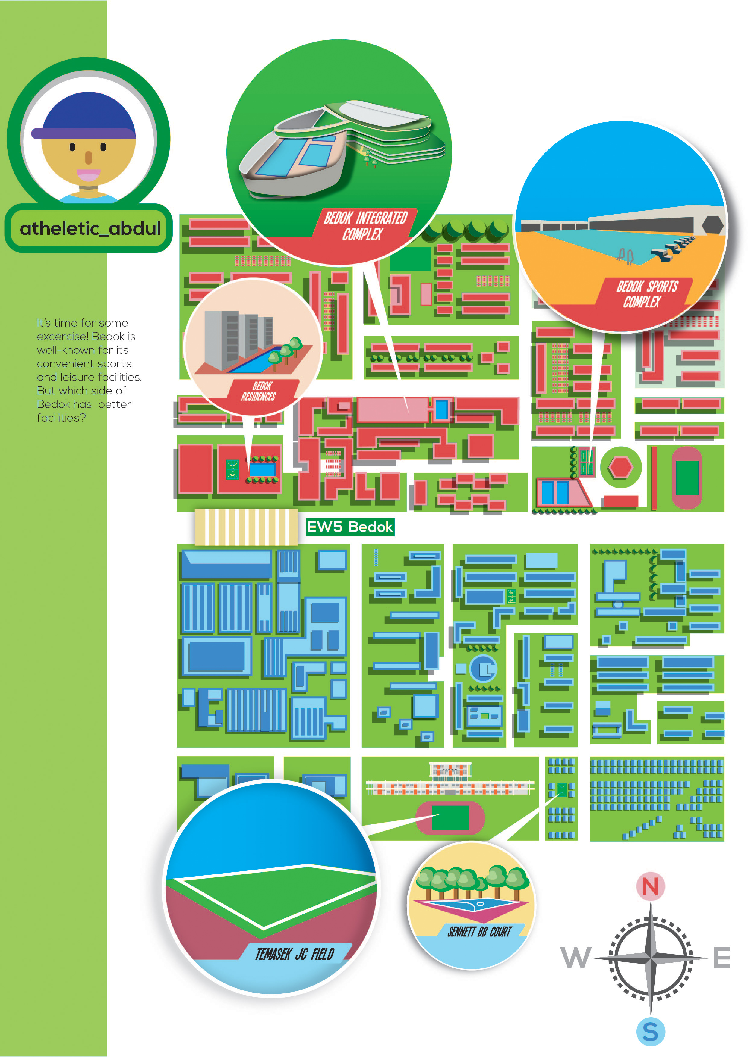
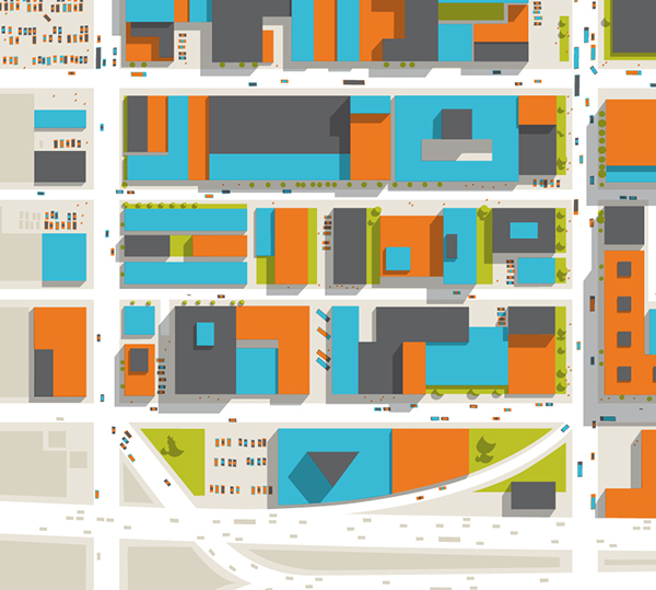
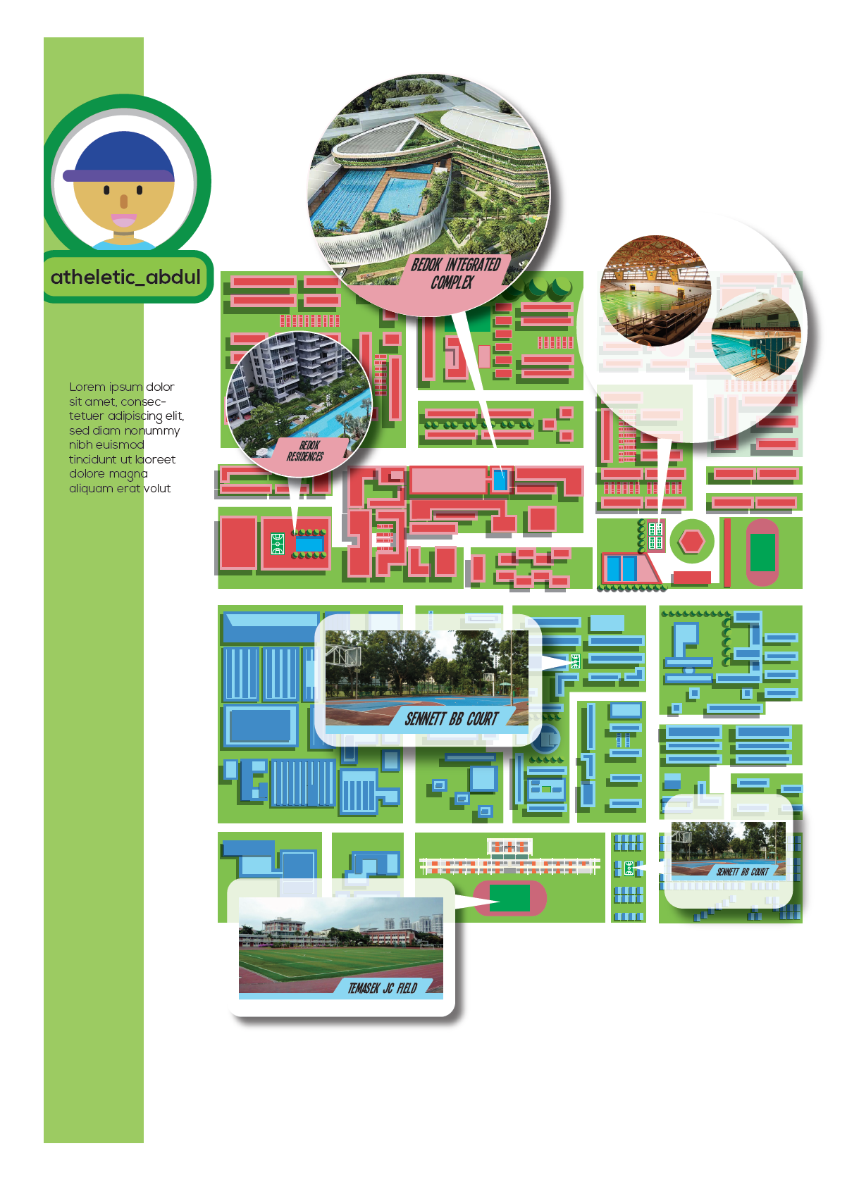
Maps takes up a large portion of my layout and is an important element of my zine. They serve as the bond for the theme of Bedok and sub-topics for each spread. The map should be visible but not too much such that it diverts attention from the specific sub-topics, which is the highlight of each page. Hence, I like these graphic maps projects by Philippe Nicolas.
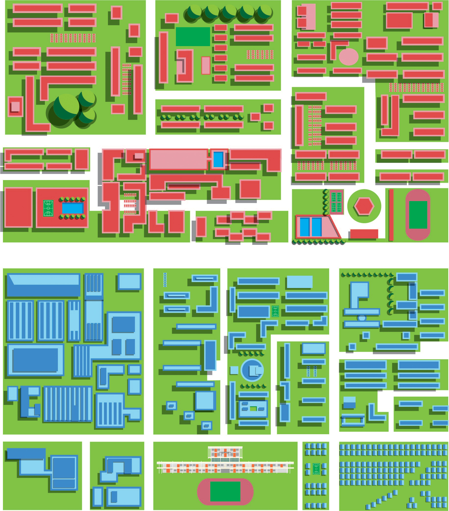
In this gridded layout, the buildings are so neatly arranged such that they formed a pattern of sort. In order to dress Bedok in this style, I needed to tweak it a bit. This was the best compromise since an accurate map of Bedok is not necessary for my zine. Afterall, some of the most famous maps were not designed to depict accuracy.
I tried to follow the original map of Bedok as much as possible.
The above map was the original colour scheme of my map. And was initially used for spread 1 (below). However, the colours are too ‘pop-ish’ that visibility was an issue.
Hence, I tried toning down the colours and Gerald taught me to use transparency to overlay as a shortcut to mute the colours of map. Works like magic.
Left: Before transparency added
Right: Transparency added
This method was eventually used for the map on spread 2.
The original colour scheme
The ‘tone-down’ colour scheme
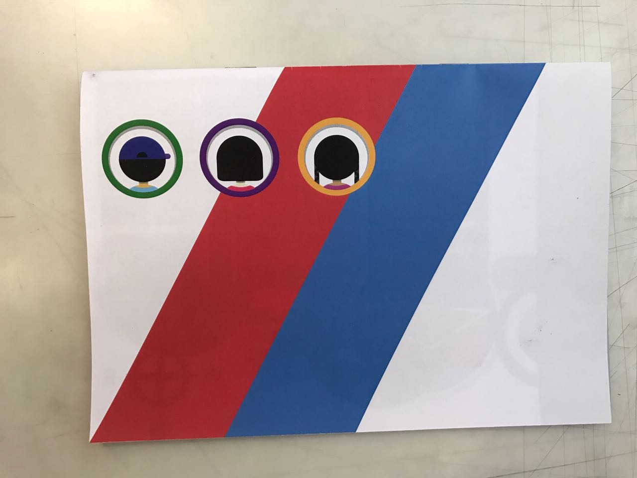
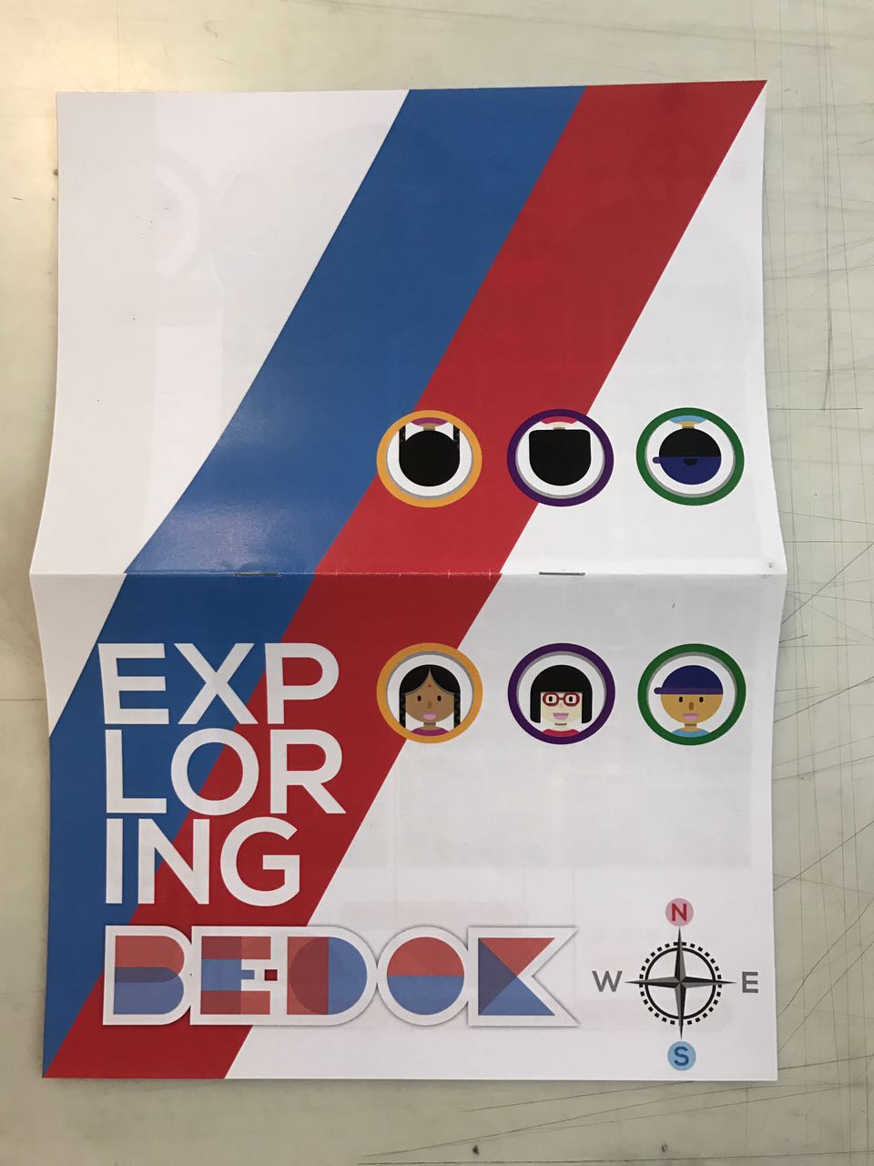
From the earlier study of game layout, I had identified the importance of avatar. Avatars are usually about the gamer themselves but I could manipulate it to introduce the topic for each spread through their usernames. The characters are also designed with the similar style of flat and geometrical graphics. I heavily referenced duolingo characters (but not too much that I stole their style). I like their simple use of geometric shapes to represent humans of different gender and race.
Indicators were a real struggle for me when designing the layout. Partly because I have poor colour sense. Furthermore, I want to vary the indicators for all three spreads to keep things interesting. The first two spreads didn’t pose much a problem but when I came to the last spread, I couldn’t come up with much interesting ways of depicting the sports area. Initially, I wanted to create a hologram effect that is used in many games .
sort of like this effect
Try-out 1
Try-out 2
However, it is hard to create a convincing hologram effect with flat graphics and minimal gradient. Furthermore, my colour scheme did not suit. Hence, I referenced this map to create the same visual effect. Firstly, enlarging the location in circles could show us details of the space. Secondly, the use of shadow highlights the specific location pointed out.
Credit: Pinterest
WIP: Testing out with different shapes and labels
The compass is another important indicator in the layout. This was added in after the last group consultation where Ayesha acutely pointed out that first-time readers like her did not know the division of Bedok. I had fallen into the pitfall of getting too comfortable with my own work and thankful that she pointed it out.
Lastly, Bedok MRT station was added after the last group consultation. As my roads were not labelled, the map seems generic. The addition of Bedok MRT station could help reader to easily identify the place and gauge the distance of each specific location.
(crappy) Photos of my printed zine. Sorry, these photos were taken in a rush so pardon the bad quality. I wanted to eat pizza.
Cover Page
Spread 1: Food
Spread 2: Schools
Spread 3: Sport & Facilites
Back Cover
Full Cover Page
Comments from Friends:
The compass is placed too low
The avatar on the last page is dangerously close to the edge.
Colours could have been better controlled.
A legend could have been added for spread 2 and spread 3
Spread 2 seems to be lacking
Header could have been added for each page
They enjoy the game concept
They like how the usernames introduces the sub-topics
Additional Comments by Lecturer:
Concept: For my project, part 1 and part 2 ties together cohesively and that’s great.
Layout: Everything ties together well except the compass which stands alone awkwardly at the bottom corner of the page.
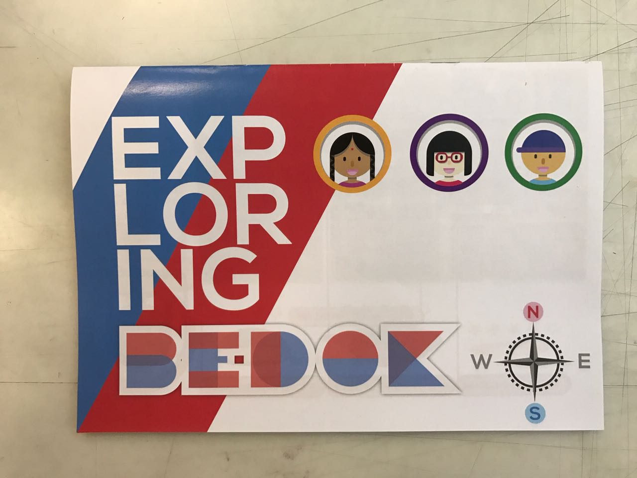
By breaking up the word ‘exploring’ into ‘EXP-LOR-ING’, it becomes misleading as the middle syllabus seem to resemble a singlish word to my target audience- Singaporeans at a first glance.
Alignment and heavy-illustration
I find this project much more manageable because the concept and ideas were largely decided in part 1. It gives me more time to focus on layouts and the graphics. There is, however, greater emphasis for technical skills in this project. I struggled a lot with alignment because I was unfamiliar with InDesign. To aggravate the situation, I left my alignment right to the last minute and rushed through it. I had underestimated the time and effort needed to get the right alignment. It was a decision I regret because it diminishes the quality of my work. Another issue I struggled with was to be too absorbed with the illustrations. As my design concept is illustration-heavy, I was too engrossed with designing each vector that I forgot to consider the overall layout of each spread- how each element and text relates to one another. This affects the readability as they may not be sufficient hints or keywords to convey the idea of each spread at the first glance. Instead, readers must spend time studying each element before the idea for each spread comes through. To improve, I could have included a header at the top or an icon at the corner so that the overview of the spread could be understood at one glance.
what i see.
what i did.
what i change it too. (Cos the bird’s eye view is too ambiguous)
what was eventually printed. (so puny!!!)
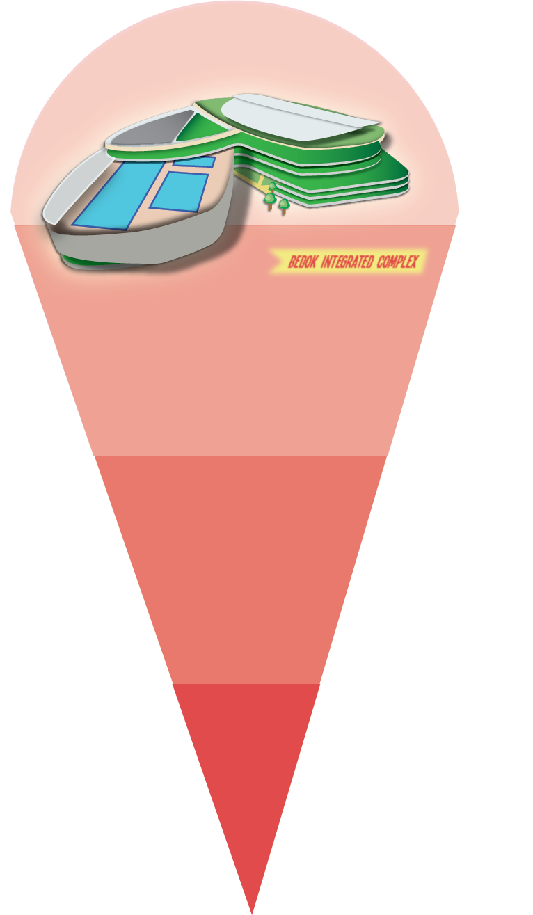
Eg. I spent A LOT of time designing the vectors of the integrated complex. But at the end, I realise the smaller details were actually not necessary. I could have just use the general shapes of the building to create an impression.
Nevertheless, this was an exciting project as we start to create ‘marketable’ work of art. Well, not exactly they can be sold for money but at least they can be published. Another interesting lesson I’ve learnt was the great difference between ‘on screen’ and ‘on print’. Even if the colours and size are correct, the physical state of the book is never the same as the spread on screen. The tactile quality makes a whole load of difference. Hence, test print is extremely important if we want to create a good zine or book. It’s pushes budget but makes it worthwhile. In all, I’m glad that the last submission of my freshman year ended on a high note.
Brain storming for ideas:
Upon receiving the project brief, I started to recall all the dream jobs I ever had. I realised that the nature of dream jobs I had since young were vastly different but the later ones were similar in nature.A list of my dream jobs in chronological order:
1. artist
2. scientist 3. stock broker
4. lawyer
5. architect
6. graphic designer
7. fine artist 8. (pseudo) shop owner 9. museum docent 10. art educator
Execution 1
To get started, I picked the 4 (bolded) jobs which I thought would be interesting to work with. The following were some of the layouts I had considered:
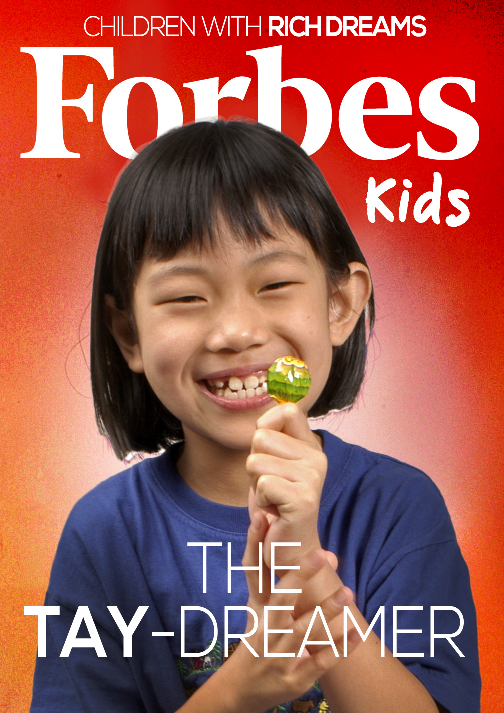
Layout #1 for ‘Stock Broker’
I wanted to be a stock broker once upon a time because it provided financial security. Back then I thought being rich was a great factor to be considered successful.
Hence, I decided to juxtapose myself onto a page cover of Forbes – a 21st century portraiture to define financial success.
As this was one of the earliest dream jobs I had, I decided to use a younger picture of me in it to signify the immaturity and naïve thinking. I added a (bad) one-liner pun to intergrate my name into the work while reflecting message about this job.
I wanted to be a museum docent because they bridges art and public. They help to make artworks come alive for visitors through their vivid explanations. While flipping through my book, I came across No. 227 The lights in the room goes on and off. Playing upon the controversy of this work when it won the Turner Prize Award.
Re-work on message of my work
My work was lacking on overarching msg and I had to reconsider the main msg as well as the message for individual jobs. The final jobs chosen were: 4. Working on visualisations
sketches of my work
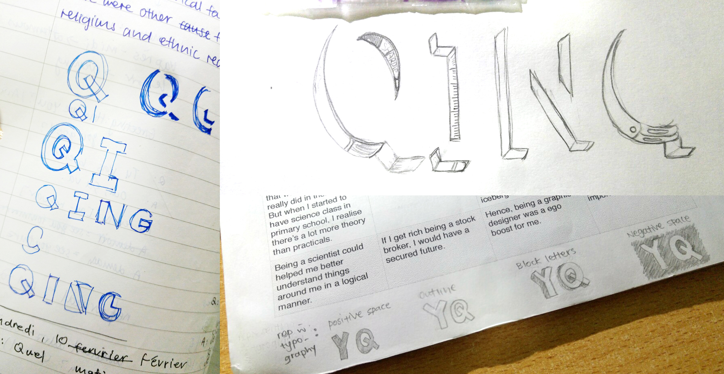
While doodling my name in bubble letters, I realised that I could try breaking down the typography elements to represent each job and convey their respective message:
[Scientist] Positive space: To show that I was still understanding about myself through science
[Stock Broker] Outline: To show that I wanted to be a stock broker because of the financial security it provided.
[Art-Related work] Shadow: To show that I wanted to be in art-related work because I was good at it and it was an ego booster for me.
[Art Educator] Negative Space: To show that I enjoyed this job because of its altruistic nature of bridging art and public.
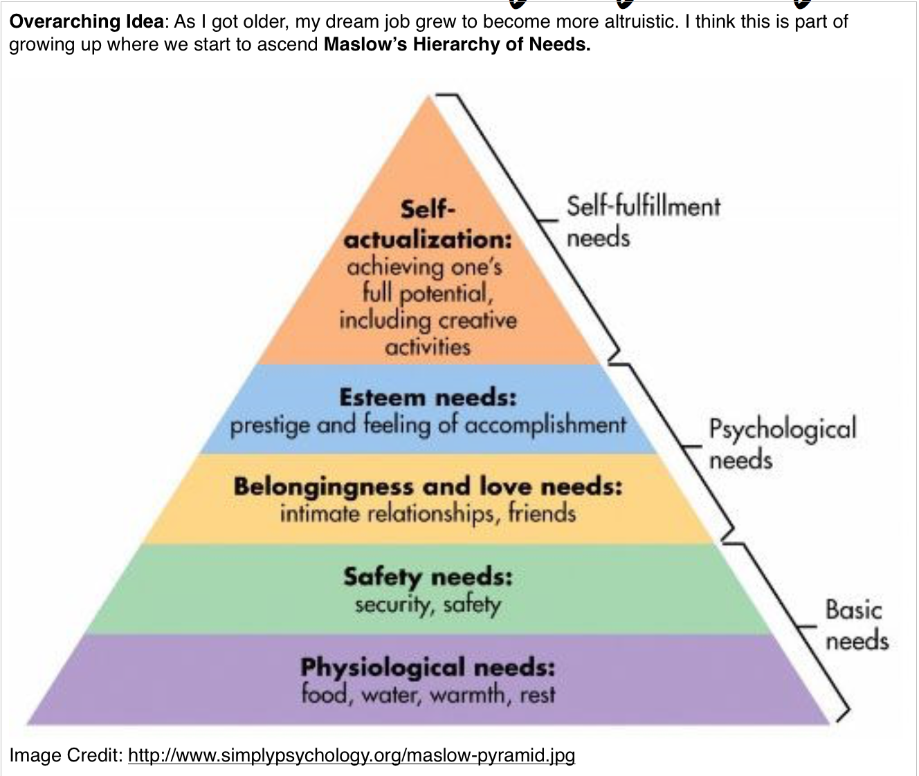
There above 4 jobs also represents the 4 main categories of the Maslow’s Hierarchy of needs -basic needs, safety, psychological needs and self-fulfilment/self-actualisation.
Most of the works were roughly sketch on paper and digitised on Illustrator
5. Execution 2
I decided to layer my work and have them printed on transparency. (I have a fetish for works on transparency) This would also cohesively bring the 4 pieces of work together and show that they all form a part of me.
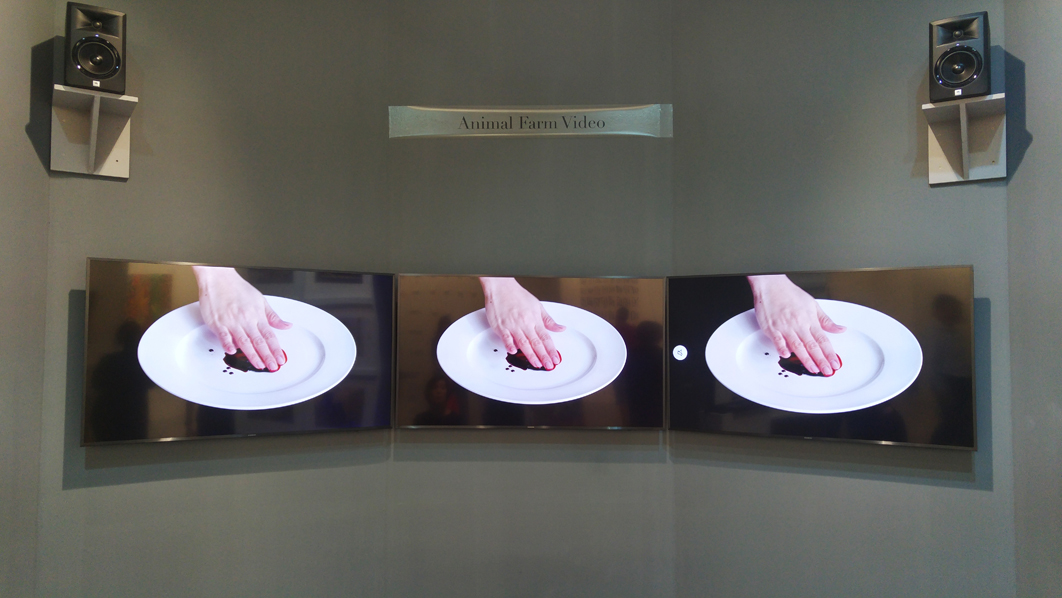
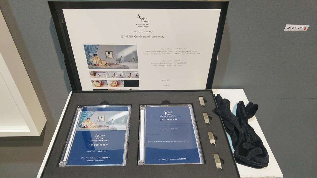
I chanced upon the ‘Animal Farm’ by Chou Ching-hui, a Taiwanese artist, at Art Stage Singapore 2017. Videos works are rare in art fairs hence, making it hard to miss especially with its three-channel video set-up.
Ching-hui Chou. Animal Farm Video No.7 8’4’’ (2015) Taken at Art Stage Singapore 2017, Chini Gallery
While this snapshot shows the three screens simultaneously playing the same scene, there are selected parts where only one screen plays a different scene and some other parts where all screens play different scenes.
Due to time constraint, I could only watch one (out of 9 films). The film started with a pristine setting where a myriad of beauty tools laid across a counter. Someone then picks up one of the tool and starts ‘beautifying’ a toy doll. Then we see a teenage girl applying makeup while looking intently into the mirror, as if almost unaware to her surroundings and the camera. There is almost no dialogue for these scenes yet a lot is conveyed through the well-curated setting and careful choice of props. The pristine setting, the deliberate placement of props and the controlled movements of the actress reiterates the notion of order throughout the film.
This ties well with the theme of the work regarding the ‘inescapable yet gradually numbing human condition in the contemporary social and cultural environment (we) lived in’. The title ‘Animal Farm’ is not an allegory for the English literature book but a rather a metaphor of the modern contemporary society. ‘Farm’ here refers to a caged environment where the living is confined within and onlookers could watch them from the outside (and past judgment). This draws parallel to our modern day society where we tend to create ‘cages’ for ourselves such as keeping up with beauty standards. (I don’t think I explain this well but s’okay)
What I really love about this work is that every single aspect of the film is carefully curate, likening every single frame to a well-composed painting. The details of the setting are all constructed, the props are carefully selected and placed and the actress has an almost perfect elegance to her movements. Mastery of light control is definitely reflected in the film and the thoughtful (slow) camera panning allows viewers to study the finer details of the work. (It’s like the technical aspect of Wes Anderson films but a totally different style!)
The artist had also created a series of photography works under the similar title – ‘Animal Farm’. The photography works are just as great as the video works in its narrative through details. I could stand there for a whole 5-10 minutes studying the 108cmx148cm photographs. To shoot the photographs in a zoo definitely adds value to the work and its meaning.
While the videos ‘can be viewed as extensions or variations of the photographic works of the series’, I personally think it is an extension as it introduces the dimension of time and creates a more immersive environment. The videos were more effect in conveying the monotony of contemporary lives.
Task
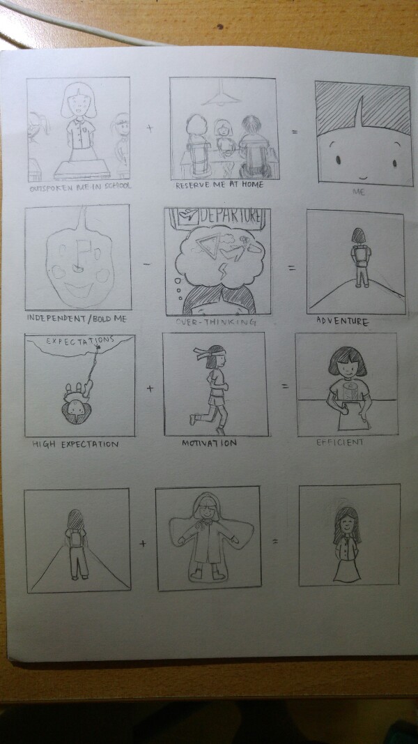
To design equations that describe about ourselves.
Ideation:
We were given a lot more room for creativity in this project as there was no restriction on type of medium.
These were some ideas I had while brainstorming:
Idea 1: was to tell a very personal side of me
Idea 2: To represent myself with animals
Idea 1: Initally, I went straight into describing myself with random details about my personality. However, I felt there wasnt a strong overarching idea that ties the 4 different equations together as a whole and decided to ditch it. (which I realise was a big mistake and very unnecessary)
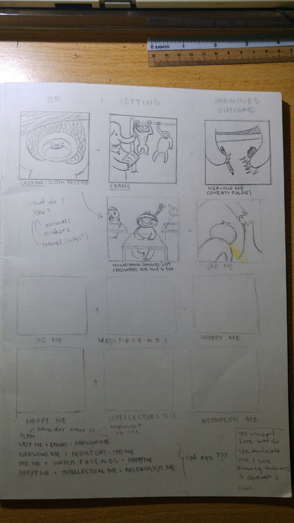
Idea 2: I decided to string the 4 equations together by listing them in a consecutive format:
Lazy me + exams = NERVOUS ME
Nervous me + Result Day =SAD ME
Sad me + Watch F.R.E.I.E.N.D.S = HAPPY ME
Happy me + Intellectual me = ACCOMPLISHED ME
|end.|
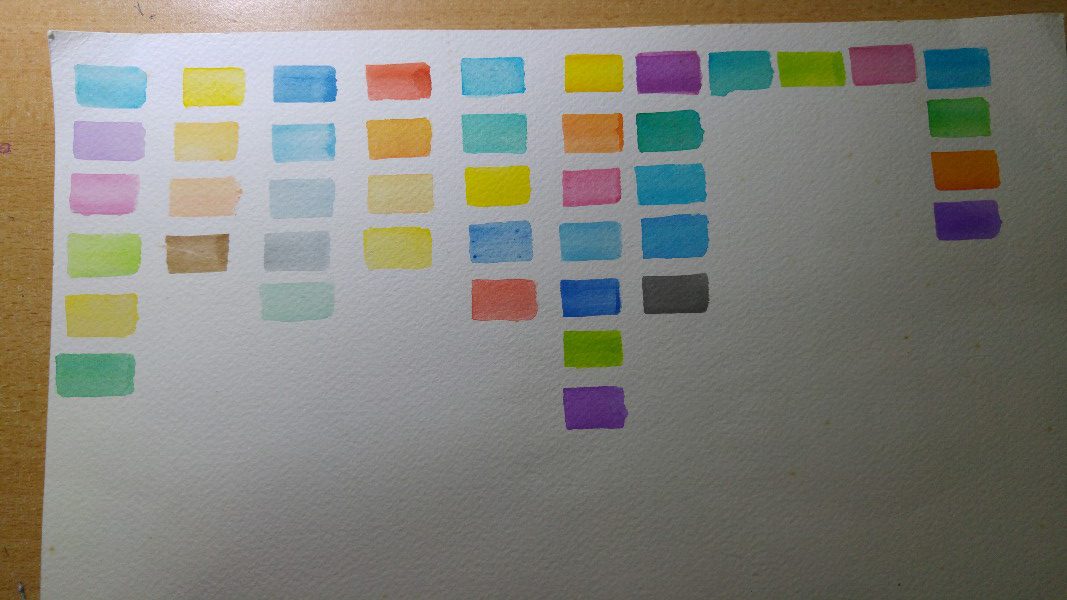
I wanted to use animals to represent myself solely because I like to illustrate animals. At this point of time, I’ve decided to try watercolour. I wasnt sure if this was a good move. But my intention was to try a different medium from the usual design projects. (usually, I would use illustrator/photoshop for design projects.) Here was a try-out for one of the image:
Draft of Colours (for final ideas)
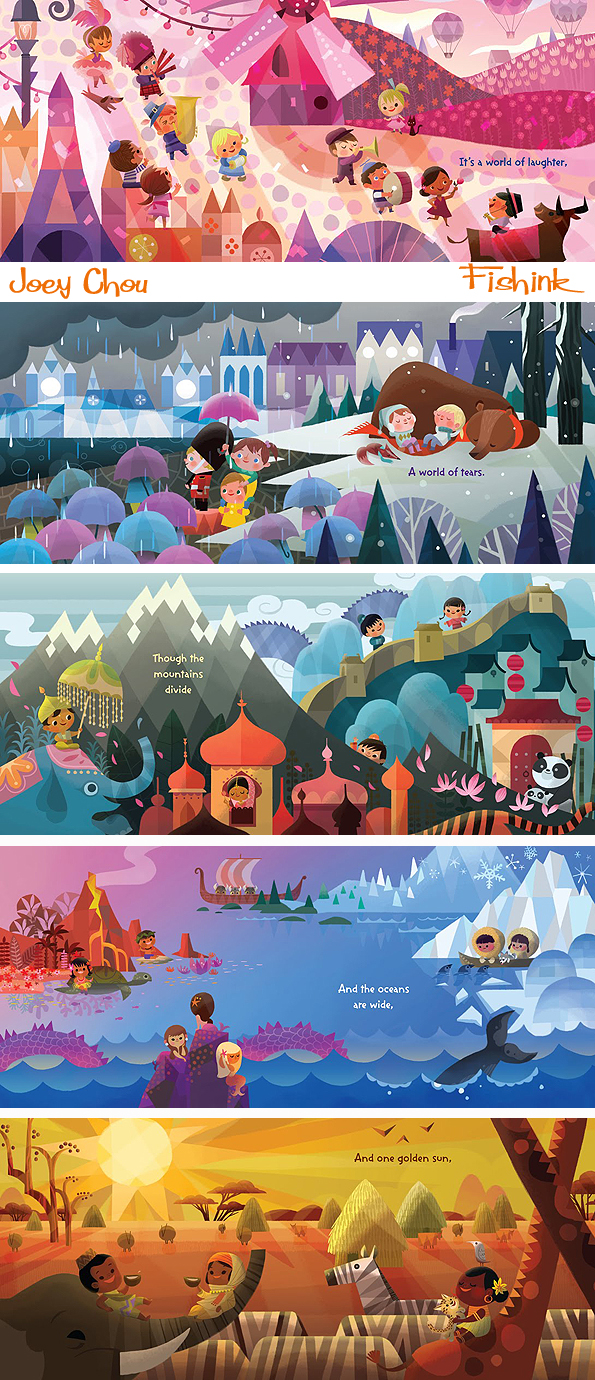
Instead of limiting myself to a fixed set of colours, I decided to use a range of similar colours in one image. Such as the graphic illustrations by Joey Chou
I decided to push it a little further in terms of my idea and use the animals to represent random stuff about my ADM/University life:
Idea 2.1
I felt that the use of University life as a shared experience with my experience. This became a problem as I felt that it lacked a personal voice. Bad move!
I ditched my ideas. AGAIN.
This time round, I decided talk to someone to discuss about it as I felt that I was too cooped up with my own ideas and self-restrictions. (I find talking with people is a very good way to generate ideas)
I talked to my mum as she knows me best. She started to recall some interesting episodes about me which describes my personality. One of it was my bad tamtrums I had while attending music class at 4 years old. Back then, my mum was the typical kiasu mum who decided to send me to music class despite me never showing interest in it. I did like drawing but she felt drawing classes were a waste of money. (like I could make money with music???) I on the other hand, would have nasty tantrums before every lessons.
While I’m no longer forced to attend classes I dislike now, I still witness such experiences in my students when I teached art to young kids on Saturdays. I would encounter students who just rebels and dont do the work given. As much as it is frustrating to handle such students, i can empathise with their frustrations.
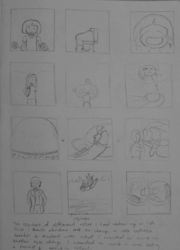
Hence I decided to tell a story on the reversed roles I had taken up in life.
1. Student – Teacher
2. Local – Tourist
Final ideas
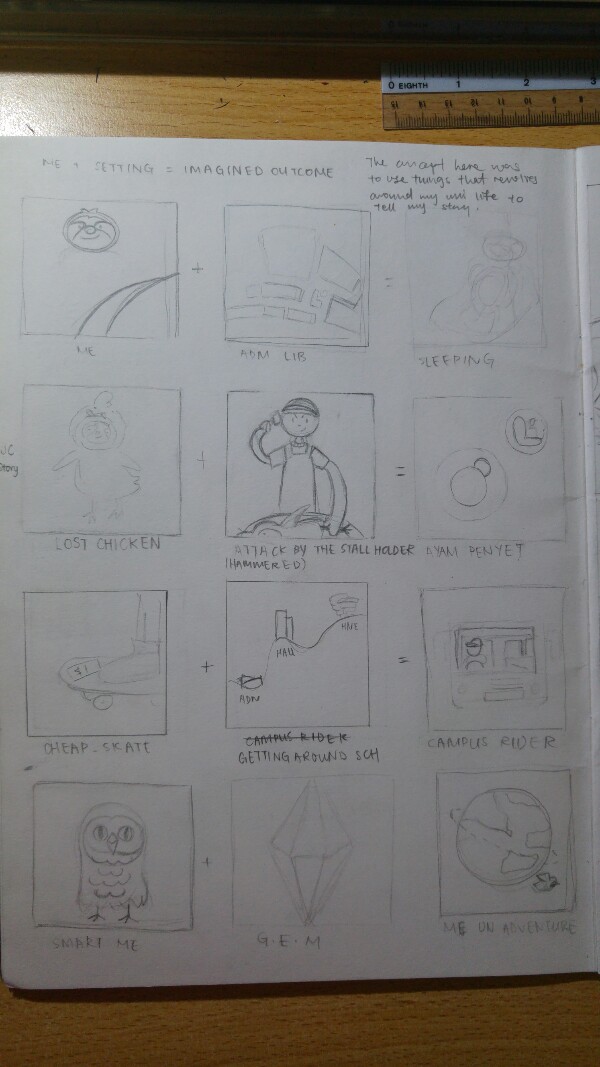
The difference of being a local and being a tourist was something I experience I had pretty recent and think about it from time to time. For 2 days in Melbourne (during recess week), I was alone exploring the city. It was my very first experience of (somewhat) ‘solo travel’ and it really made me see myself and my home country from very different perspective.
Way before when I travelled lesser, I often find Singapore really bleak and skyscrapers everywhere. I was very much caught up in my comfortable world. Hence, i decided to use bleak colour tones to represent Singapore and place myself in a ‘Singapore globe’. I include as much reference about Singapore in my design.
My second image is toying with the fact that Singapore is always known for being a 24/7 summer city to most tourist. I used more cheerful and bright colours for the image and blue to represent the ever sunny sky in Singapore. I didnt want to be bias to any nationality hence, I decided to represent them with aliens entering via UFO.
The outcome of me lacking exposure to the outside world and often leads me to share about my home country from facts I picked up from Social studies class. I decided to insert humour here and portray it as a political poster. I strongly referenced the Chinese revolutionary posters in their use of visual reference. The use of intense red represent the burning passion for one’s country and the radiating lines clearly put across the figure of idolisation. Once again, I included as much reference about Singapore such as me donned in a Kebaya (signature uniform of SIA) and holding up a Singlish book.
Moving on to the next equation, I am portrayed as a tourist. Hence, the sun hat and some architecture in the background. The pale yet bright colours was to represent the sense of ‘fresh and foreign’ when in a foreign country.
Me falling from into the waters where lies a city beneath was a reference to the metaphor ‘fish out of water’. To me, being IN the water is ‘out of water’ as I am slow in adapting to new environments. The blue was to represent the sense of strangeness I feel when I am in a foreign place for the first time.
Lastly, was the outcome of learning more about my country when overseas. When overseas, I often can’t help but start comparing it with Singapore. This was especially so about the public transport in Singapore and Melbourne. Back in Singapore, I would get frustrated when there are train delays or waiting time is more than 5min. But I realised I had taken such convenience for granted when in Melb where buses runs on timetable (which means missing a bus would result in another 30 min wait for the next one) and intervals between train service are about 15 min. Both countries are major cities yet things can still be very different. This made me cherish the convenience of travel back in Singapore a lot more. (Melb is still a beautiful place btw!)
So here is a picture of my overall work:
4 years old who loves drawing + attending music lesson I dislike = me feeling very tied up
19 year old me who do art + teach art to young kids = feel like I’m the one tying them down (esp those who dislike drawing)
comfotable me as a Singaporean + meeting foreigners in our sunny island = sharing about my country in a chauvinistic POV
me as a tourist + going new places = sees my country from a new POV
Synopsis: Nick is an ostracised freshman in school due to his sloppiness and lack of motivation in life. He tries to make friends but always ends up in rejection, leading him to be labelled as a weirdo in school. In a desperate attempt to make friends, he attended the school’s Halloween party as a vampire but turns out to be a feeble attempt when he caught his friends gossiping about him. Realising that his last ditch of effort had went a waste, Nick isolates himself in the washroom and stares at his reflection in the mirror as he questions his identity. The emotional turmoil from constant rejections starts to turn him into a psychopath as he sees himself as a real vampire. Wearing the identity of a vampire, he began to seek revenge on his friends. The revenge started as a means to display his prowess but gradually turn nasty. He starts hunting them and taking them down one by one.
Roles:
Actor: Nevin (Main)
Cameraman: Jafri and Nevin
Screenplay: Nevin and Jafri
Storywriter: YuQing and Jafri
Production Designer: Yen
Film Editor: Nevin
Logistics: YuQing
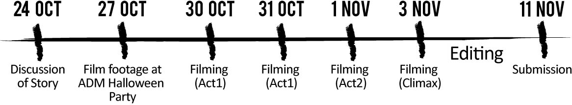
So, here’s a timeline of our work progress : 24 Oct: Storyline Discussion
Among all the genres, we decided to work on horror. Firstly, we felt that it was a genre that works to the strength of our team because Yen is well-versed in production design while Jari enjoys working with lighting. Secondly, horror allows us to experiment a lot more with visuals. And lastly, it was a genre that pushes us out of our comfort zone and work on something new to all of us. Honestly speaking, none of us were fans of horror shows except Yen. Nevertheless, we wanted to seize this production as a good learning opportunity for the team.
As a team, we had an endless flow of ideas. We were watching trailers after trailers and discussing horror stories one after another. Ideas were just floating everywhere. Hence, the storywriters had to intervene and filter the ideas and string them into a logical narrative. In the end, we decided to settle on a story that revolves around Halloween as Halloween was just around the corner at the point of discussion. We were also partly inspired by the film ‘The Clown’ – a film where the dad dress as a clown for his son’s birthday party but could not remove it afterwards. The mishap takes a bad turn as the clown costume turns out to be demonic.
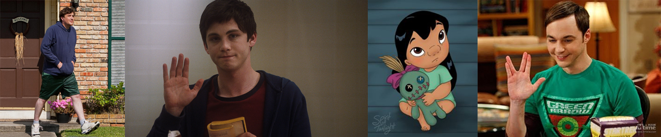
However, we decided to change the context such that it resonates with our audience – our classmates. One of the major change was the main character which we wanted him to be a misfit. This idea was from Nevin when he acutely pointed out that misfits had been interesting character archetypes in recent years eg Perks of Being a Wallflower and Big Bang Theory (nerds!). Even Disney movies work with outcasts in their shows.
Our list of reference on Google Doc:
This is the initially the (brief) story outline we had:
Nick is a very messy and unmotivated freshman who is ostracised by his schoolmates.
However, he wants to make friends (shaping force of story)
Flyer for a Halloween house party given out in school.
X is loner and not invited but picks up a flyer for the party
He’s keen to join. (he smirks at the invitation)
Go home and find an old set of costume in the attic
X tries on the costume. Costume fits him perfectly and completely covers his face.
X goes to party and no one recognises him in the costume.
Overhears a conversation where other people are gossiping about him.
X get angry and leaves the party silently.
Reaches home and want to remove costume but realises he can’t. Costume is stuck on him.
He starts hunting people.He struggles to remove the costume
This story outline gradually took on a more solid form and logical flow in narrative along the way as we film.
We planned out filming scenes in details. However, many of the scenes were not used eventually as we came up with new storyboard along the way.
24 Oct: Film Footage at Halloween Party
Since OUR school was having a Halloween party, we decided to seize the chance and film footage for our trailer. Jafri and Nevin filmed different students in their costumes and some of the footages were ultimately used in the final trailer. (In a way, we had blurred the line between fiction and reality.)
30 Oct: Act 1 filming at Jafri’s Hall In order to establish our character as messy, we decided to use Jafri’s hall to show a messy room. As Jafri’s hall was very neat, we took some effort to mess it up for our main character. It was our first shoot and our progress was pretty slow. A lot of time was spend trying to figure out how to shoot the crane shot smoothly with just Jafri’s arms. #budgetproblems
31 Oct: Act 1 filming in school
Most of the scenes film on this day did not make it into our final trailer as we thought the shots were too long and not impactful enough to establish the character. The establishing shot of our character was almost becoming a narrative for a full film. However, we got a lot more practice with panning and tracking shots on this day. Watch the video to see our progress for that day and the outtakes for the trailer.
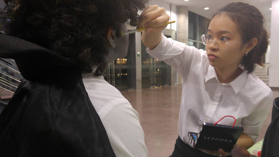
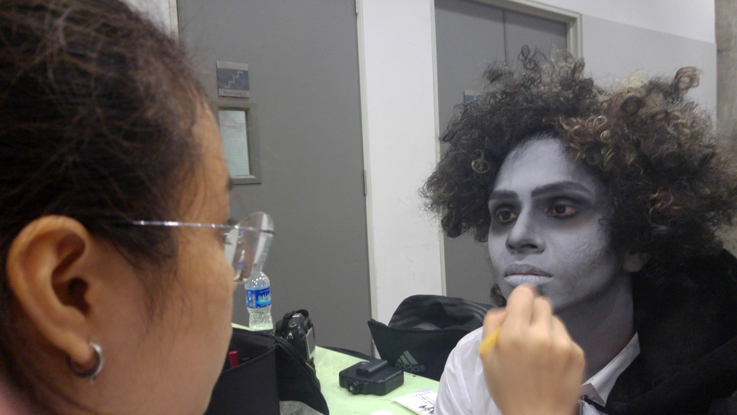
1 Nov: Act 2 filming in school This was one of the most productive shoots we had and a lot more fun. YuQing was starting to understand what’s going on in filming. Yen finally had her chance to shine. Jafri was getting better with camera movements. And most importantly, Nevin finally became a vampire on set. Woohoo!
Yen, our make-up artist
(Nevin) the vampire in making
And YuQing brought a skateboard to set that makes dollying shots a lot more productive and fun. We were able to get smoother dollying shots in the scene where the vampire stalks his victims.
Most of the scenes we shot today were for the climax and re-shoots for the character.
For the re-shoots of the character, we decided to reference ‘Friend Request‘ to show how Nick is being rejected by his friends – Nick is being shoved aside by a jerk he considered as his friend.
The scene where the victim turn around to see Nick was one of our favourite scene. This was referenced from The Conjuring trailer.
The filming started at about 6pm and ended at about 12:30 midnight. It was a productive day.
3 Nov: Climax filming at ADM, Hall 12 and NTU Running Track This was probably one of the most memorable shots for the group as we finally moved out of ADM and shot at new places. We were shooting at a lot of outdoors shots at night (ie carpark and running track) so we had to use the Caliber lights we had loan from school. They were really useful. The low lighting condition really puts our lighting skills to test as well as coordination between actors, cameraman and the grip (aka human tripod). Also, as the scenes for the climax are usually fast cuts, we less concerned about camera movement but instead focus on character movements and shoting angles. Our cameraman/director/screenwriter also tried to experiment and shoot more footages that could be useful while editing for the trailer.
An overview of our filming schedule:
Date
Scenes – Location
Props
24/10/2016
Discussion of storyline
30/10/2016
Scene 3 & 5 – Jafri’s Hall
Shabby outfit for Nick
Vampire costume
31/10/2016
Scene 1 – Classroom
Scene 2 – Locker Hallway
Scene 4 – Locker Hallway
Choco Bar
Rough Paper
Halloween Flyer
1/11/2016
Conversation outside of party – TBC
Nick’s struggling transformation from Halloween costume to full vampire – Jafri’s Hall
Full werewolf hunting down of Qing along ADM hallway
FULL vampire costume
Werewolf costume
Costume for Qing
Costume for Jafri
3/11/2016
Intense Hunting Scene:
Forest area
Carpark
Fake blood
Editing: The editing were all done by Nevin. It was a tedious process to edit fast cuts and many of our scenes were shot in low lighting which needed more processing. Thankfully, our responsible editor continues his editing even on his flight to NYC which allowed us to submit a more finished piece on final submission/presentation day 🙂
Nevin editing our trailer on his flight to NYC 🙂
We put harmony in interracial!
Just for the fun of it, we decided to include a logo for our group which encapsulate the alphabets H-A-R-M-O-N-Y. We called ourselves Harmony Production because coincidentally, our group members we all of different races- Chinese, Indian, Malay and Vietnamese. We put harmony in interracial 🙂
And, let’s end off with some bloopers and behind-the-scenes 🙂


 So, these were 3 layouts I were experimenting. While the first two are rather neat and structured, I decided to go with the last one because it resemble a flying bird could possibly symbolises the revitalisation of Tiong Bahru.
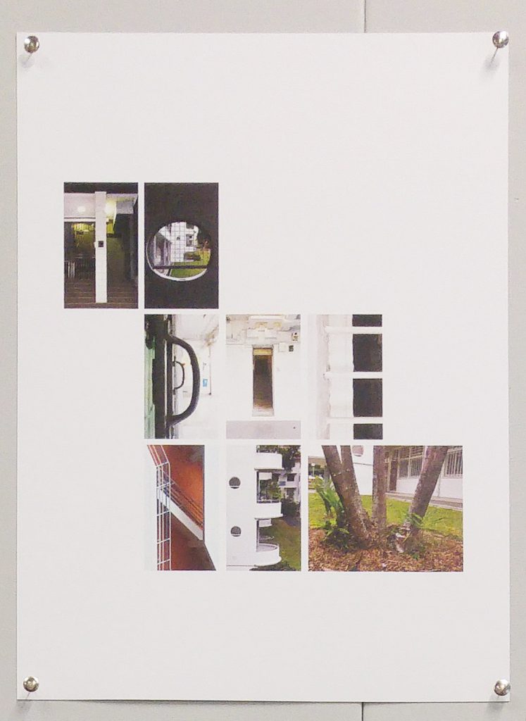


 Schools