My slogan: Doses of Fun with Art (Keywords in Bold)
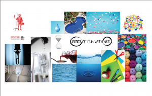
DOSES: I wanted to use motifs of doses to express my slogan.
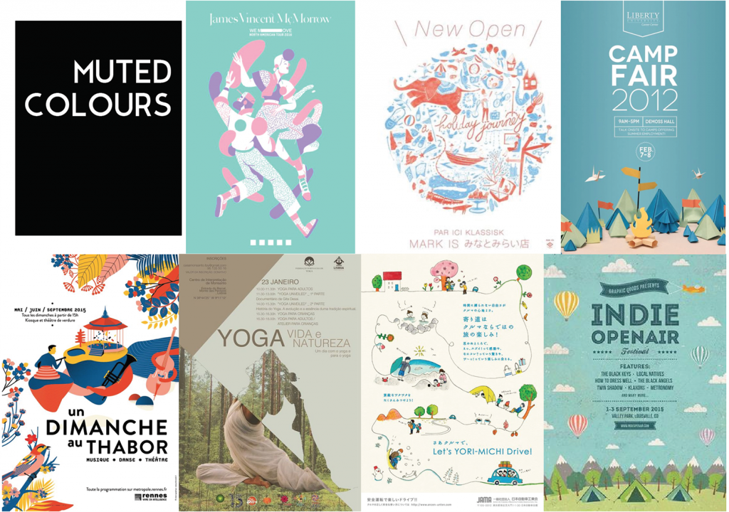
MUTED COLOURS: In consideration of the nature of programme and setting, I prefer muted colours as it is more soothing.
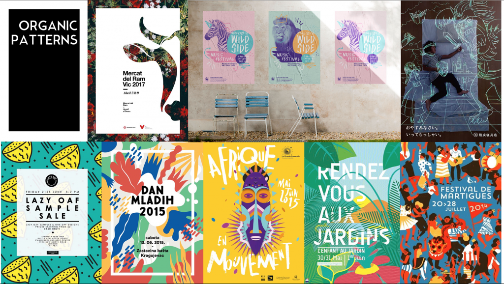
ORGANIC PATTERNS: I like the fluidity of these organic patterns. It is another way to express ‘doses’ instead of showing it literally.
The following are my initial drafts. I decided to use illustrations as I could create more organic forms.
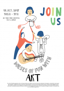
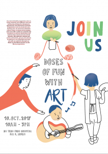
As shown here, I was very stuck with the idea of a droplet as doses. Hence, I break away from it and shift my focus to ‘fun’ instead.
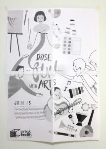
(I forgot to save the softcopy so only a B&W test print to share)
I add some art and music elements to add vibrancy to the poster.
Comments given:
- Work on the shape – create a stronger shape to build up hierarchy within the work
- Treat the text a little more as it now breaks the composition
- Interweave the logo with the images. Logo now stands alone.
- Reduce the size of the easel. To overbearing. Allow the characters to stand out.
Following are my drafts in chronological order.
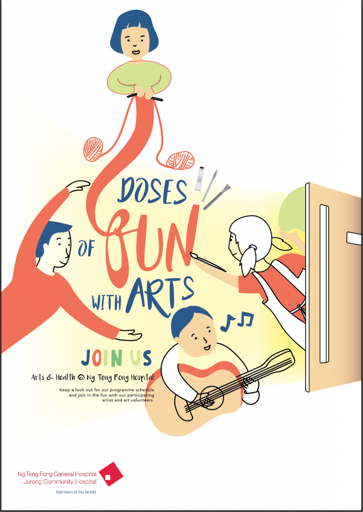
For some reason, I thought adding a door would make it seem more magical… sort of like opening door to a whole new world. But nope.
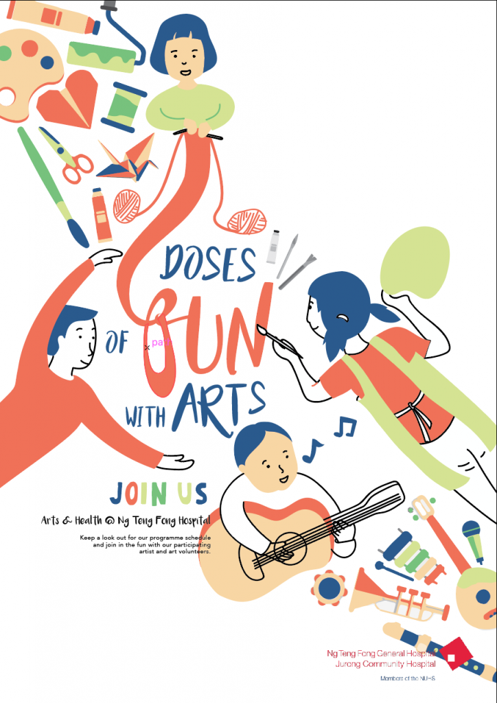
I put back the elements and repositioned them to create this flow from one corner to another. I overlap the logo with the instrument, thinking it could help to patch things together. But nope.
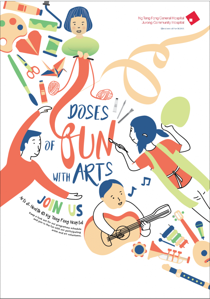
Finally, I treat the text to weave the illustrations and text together. I added a ribbon on the top right for a more balance composition and to also lead the eyes to the logo.
You must be logged in to post a comment.