Individual Composition and the respective write-ups:
- … I want to a be scientist.
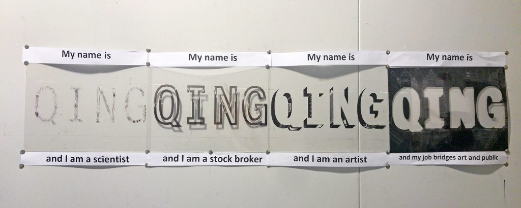
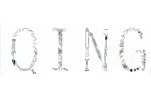
I wanted to a scientist when I was young because I enjoyed science experiments. However, when I grew up, I realise I didn’t enjoy the theory as much. My dream to be a scientist was more like a child play. Hence. I designed it with motifs of science experiments and images in a hand-drawn manner to convey the child-likeness in my dream job.
2) … I want to be a stock broker
As I got a little older, I started to realise the importance of money. I wanted to be a stock broker because I thought they earned a lot an could provide me with financial security. I decided the use the outline of the alphabets as outlines are like a barrier that builds around the fill of the alphabets – like how financial security could cordoned me off from financial woos in life.
3)…I want to an artist
I wanted to be an artist at a point of time as it was an ego boaster for me. I often received compliments for my works back in secondary school (because benchmark was SO much lower) and thought I had the potential to be one. It was made-me-feel good factor too. Hence I weaved art materials as the shadow of the alphabets that spells my name. The shadows of the alphabets elevates a flat letter into a block form, leaving the plane- similarly, art was also like a ego boaster that often made me think too highly of myself.
4) … I want to be in a job which bridges art and public
In recent years, I have dwelled upon the idea of being a museum docent/art educator- jobs that bridges art and public. I wanted to share the quality art education I had received over the years. The nature of this job was also altruistic in nature. Hence, I decided to use the negative space -space beyond my name – to convey my dream job. Vectorised museums, my school and group of people are placed alone the side of my name to convey the essence of my job.
Overall feedback from presentation:
- Composition 2&3 could have been improved; they were weak in convey the job and the message of each job. The visuals used was much less effective compared to composition 1&4.
- To be less nervous during composition
- Presentation format could have been changed instead to better convey my idea – start with the overlapping full image of all 4 compositions before explaining them individually.
- Also, instead of layering the composition 1 at the top and the composition 4 at the bottom, I could have reversed the order to better convey the pyramid of Maslow’s Hierarchy of Needs.
- Generally, the idea of translating the pyramid into a transparency is well-liked.
Reflections:
I think the biggest takeaway from this project is recognising the importance of having an overarching message as well as message for individual works. Personally, I find it hard to come up with a strong overarching message right from the start. However, it helps to keep me in check. There’s a 100 million possible way to do a work but a message helps to anchor me and keeps me from drifting away.
Unfortunately, too much time had been spent on forming the message such that I had lesser time to perfect my execution. Had I been able to plan my workflow better, this could have been a better work.
Secondly, my presentation sequence could have been done differently to better explain my work. Instead of presenting individually at the start, I could have done it as one whole composition before breaking it apart. That would have given my audience a better idea of my work right from the start and not make it seem like individual the compositions are too empty. Also, I have to be confident during my presentation regardless of my work. I was apparently nervous during my presentation (because I felt mine was so different and lacking compared to the rest) and it jeopardised my delivery of the work.
Nevertheless, this project had taught me how spending more money on quality materials would make a significant difference to the outcome of the work. Had it been the old me, I would have printed on cheap transparency that would probably warp under the heat of laser printers and seem flimsy during presentation. But I’m glad I heed Joy’s advice to print it on hard plastic. (Tip: rarely do shops print on harder plastic but after a quick hunt, this shop does!) So, definitely some well-spent money there.
In all, I’m greatly thankful for the encouragement from my peers and tutor and hope to do a better job for upcoming projects! 🙂


Hi Yu Qing, please include in the final post individual compositions (so we can see the details), description of works, as well as feedback and reflection from presentation. Thanks!
J
Hi Joy, sorry about that. I’ve just updated it with the relevant materials. However, my laptop crash ystd so I couldn’t retrieve the digital file. Instead, I scanned in my individual composition and uploaded them. Hope that will suffice for now.
Thank you.