This process post is in chronological order. It is a continuation of [Project 2.1]: Part I.
Final zine here.
On my first trip, I was pathetically scribbling my observations and data on a palm-sized post-it. While it was handy, my handwriting was scribbly and data collected was disorganised.
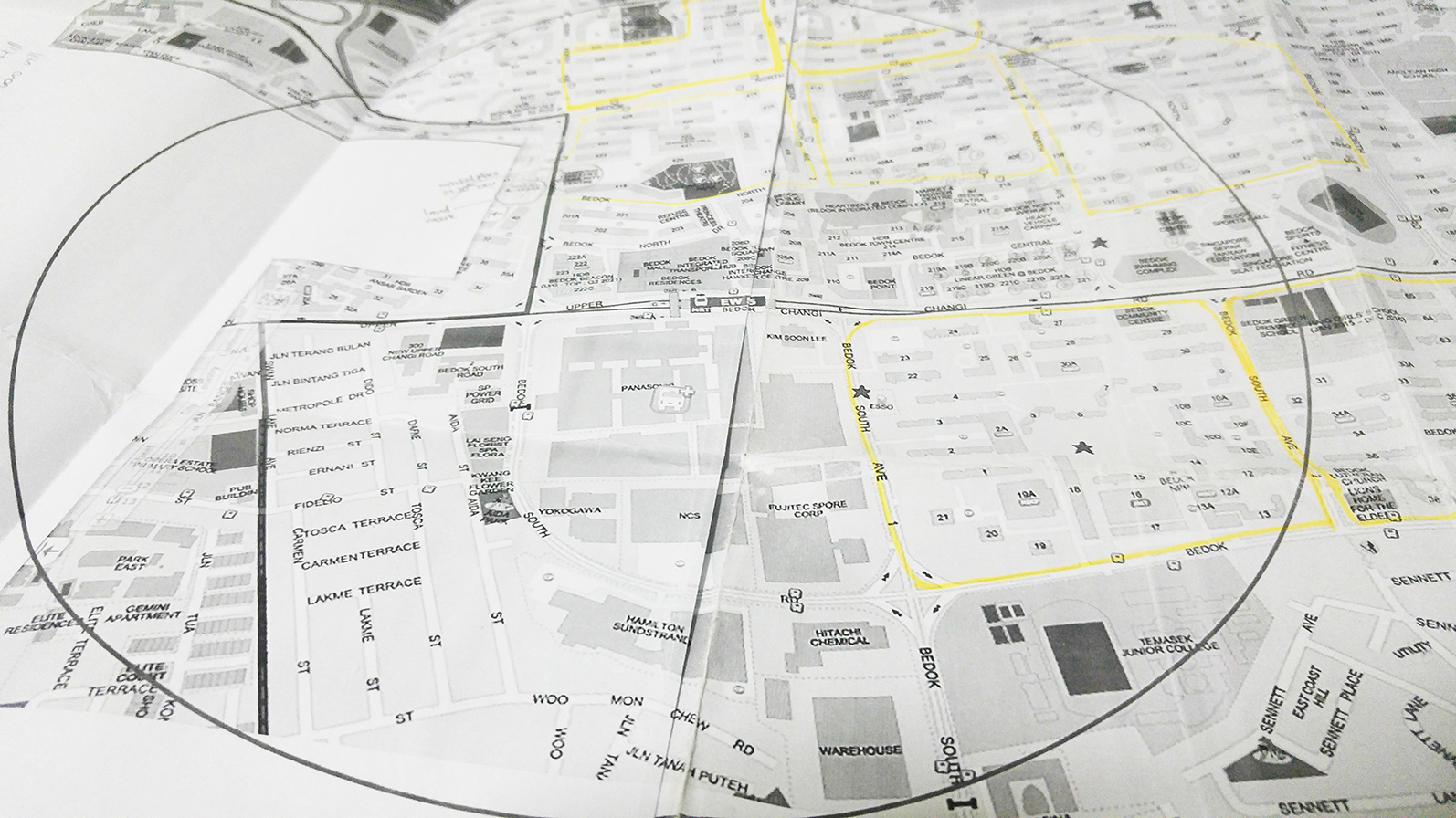
On my second trip, I printed an A3 map and marked out a 1km radius from Bedok MRT. I folded it into a handy size and now I’ve got google map in one hand that allows me to annotate with pencil conveniently.
I’m intending to collect some residence response and may use hardcopy and online survey forms soon.

During this consultation, I realised my project was heading for a dead end. Firstly, the data I had collected were largely isolated. This makes an infographic almost impossible as I will not be able to make meaningful relationships between the data collected. Secondly, the idea of surveillance would not work out as I have no access to data about the surveillance and crime rates in Bedok over the past 50 years.
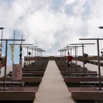
The conclusion of the group consultation was to work on the buildings of Bedok. This was a concluded based on the timeline of development in Bedok I had put together. However, I was reluctant to work on this idea as I felt the idea was very generic and could easily be obtained with a quick google search.
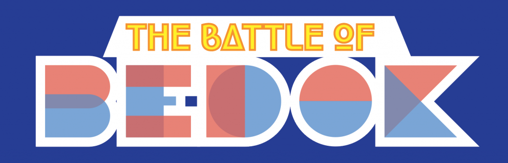
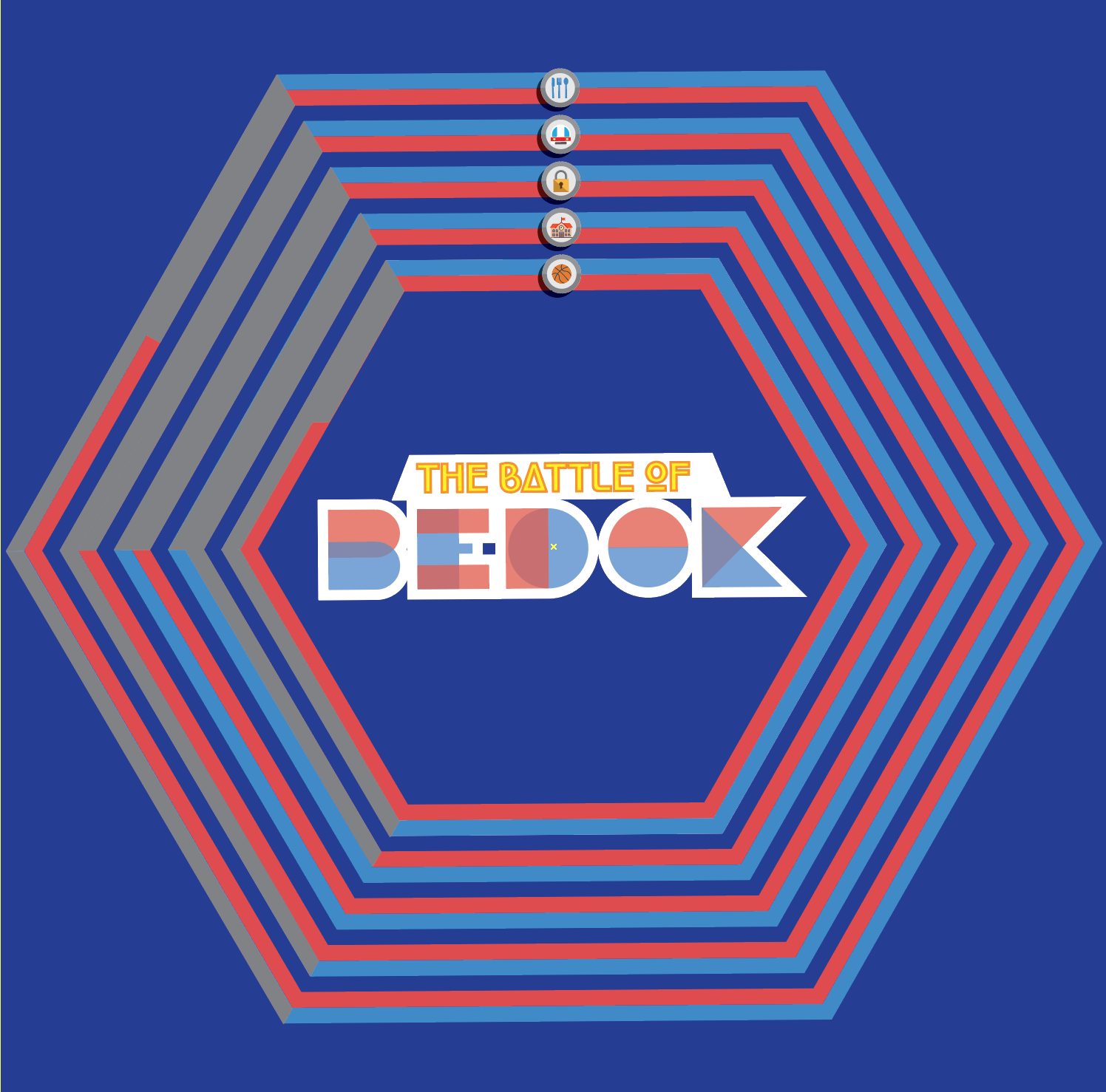
Thankfully, Joy shared with me an interesting fact that Bedok residents have a strong sense of belonging to their respective areas (ie Bedok North and Bedok South). Riding on this idea, Liyana suggested I could do a ‘game battle’ concept between North and South Bedok and compare them to decide which is better. This idea couldn’t get any better and become my driving theme of the project.


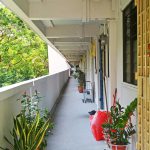
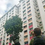
In a last ditch effort to obtained primary data, I once again head to Bedok. I decided to do a door-to-door survey in order to collect residents’ satisfaction of the neighbourhood as an indicator to compare the two areas. I also sent out an e-survey to collect as many data as possible. Here are the questions:
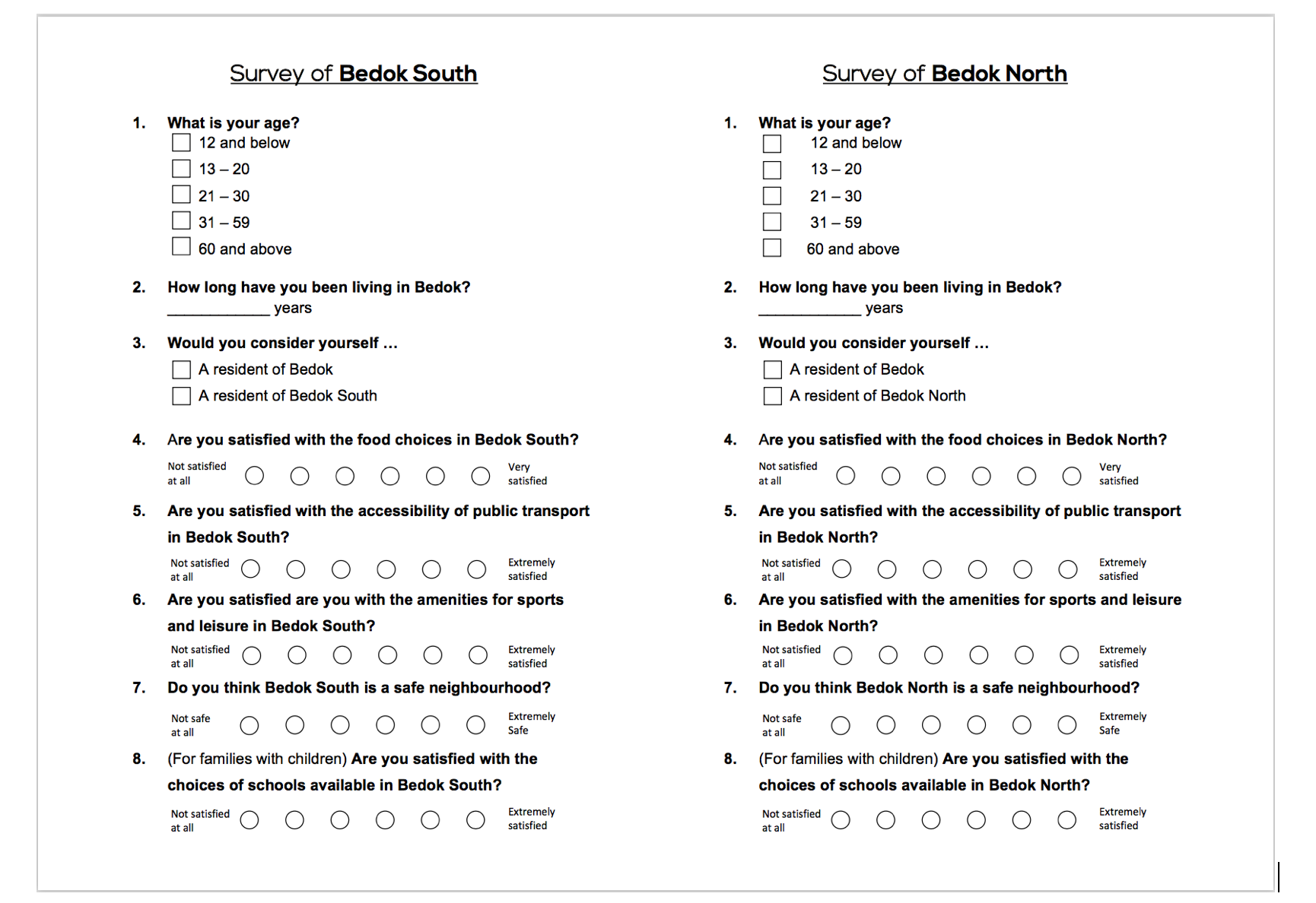
I can’t post the responses of the survey as a promise keep it confidential but the analysis of the data collected are reflected on the infographics.

#1 The Map
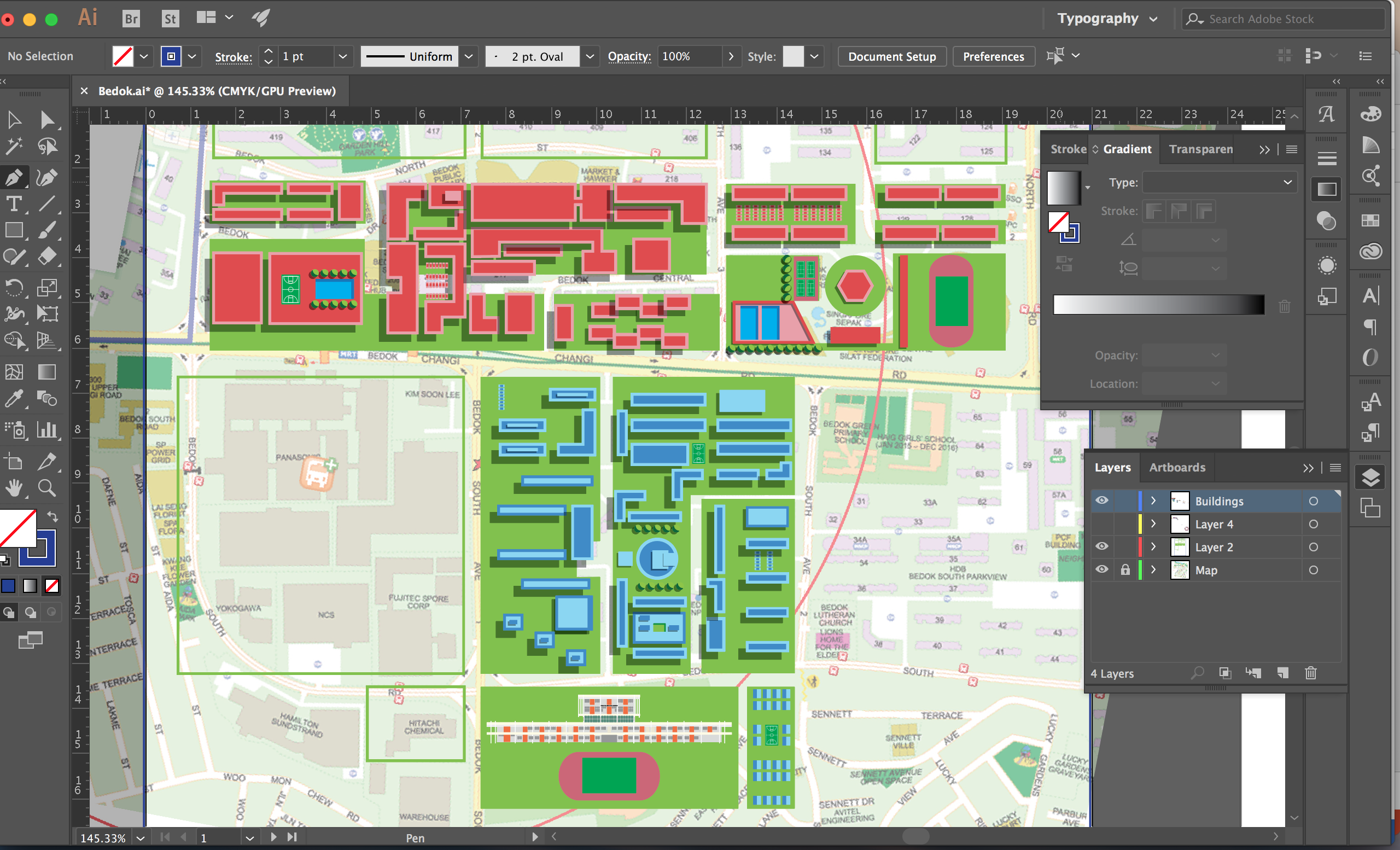
Part of my graphics were designed before the idea was finalised as I thought the visuals of a map is vital for a site-specific infographic. I had reference different kind of map on pinterest and decided to use a bird’s eye view of Bedok as it gives a good overview of the place. It allows me to use geometric shapes to reflect the structural visuals I had observed of Bedok.


#2 The Header
To me, the title of my infographic would be effective in conveying the ‘game’ theme I had in mind. Hence I reference various game titles and realise a lot of it often used organic fonts (if there’s such a term) and warp text to show its fun. Such design, however, does not go well with my geometric theme. Hence, I decided to reference geometric fonts and work my way up to design a suitable game-inspired-header.
My final title design was largely inspired by these title and fonts.


When put together, it shows:
- Duality: Depicting north and south Bedok
- Clean & Geometrical: My impression of Bedok
- A game-on-attitude: Through the use of capital letters

#3 The Indicators
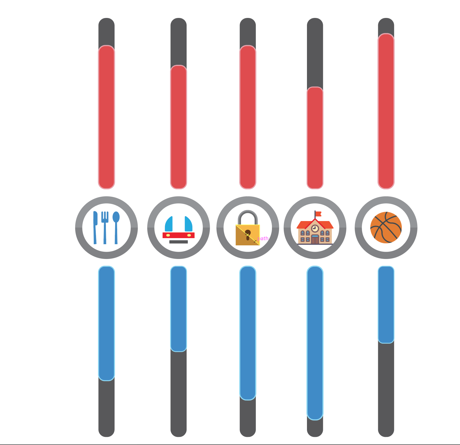
Indicator 1
My first design is straightforward in distinguishing the two opposing area of Bedok through colours and placement. It is, however, a cliché method in showing comparison between different categories and it does not visually gel the different elements of my infographics together. Hence, I decided to push it further and experiment with other ways to design my indicators (afterall it’s called infoGRAPHICS for a reason). The following are some of the designs I had experimented and why they do or don’t work.

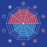
Indicator 5 – Final
My final design:


After 2 agonising weeks, I think it had paid off. I’m not fully satisfied with my work because I felt that certain important aspect of my infographics (ie colours and layout) has not been fully developed. However, I am delighted with my learning process in this project. Firstly, I think I had learnt my lesson well from my first reflections and put in more effort for my presentation this time round. Secondly, this project was unlike the previous ones which content were largely intrinsic and ‘produced’ by us. This project, however, puts our investigative skills to test. Being satistically-challenged, it was a tedious process planning –> gathering –> sorting –> analysing of data before turning them into visuals. I started off with no knowledge of Bedok (I stay in north-west) but over time, I start to love the place more and more with each trip I made. Bedok is a place that have stood the test of time with many stories to tell. This project had also put me out of my comfort zone as I did a door-to-door survey in a last ditch effort to collect primary data. Initially, the idea of doing a door-to-door survey was intimidating because I was afraid of rejections or angry residents. However, I abide to my own no-knocking-on-closed-door rule and things went pretty well! Most residents are more than willing to take the survey actually! Senior residents are also very willing to share about the place. I also enjoyed the process of turning these data into engaging visuals. In all, this project was enjoyable and I am really keen to start on the zine project 🙂
Hi Yu Qing! Lovely Infographic and wonderfully organized OSS Post. I think your use of geometric shapes and the ‘game’ theme’ is really interesting. The colors also work accordingly. It has a very ‘pacman’ vibe which is awesome haha. I feel that a few words stating the concept of the comparison between North and South Bedok, as well as words below the parameters of comparison could have increased the clarity of the concept. I thought it would be cool to experiment using the map of Bedok as an interface for a game? Like the buildings and everything look like a maze haha. But I understand that you didn’t want to steal the focus from the main parameters of comparison. Great job overall!!