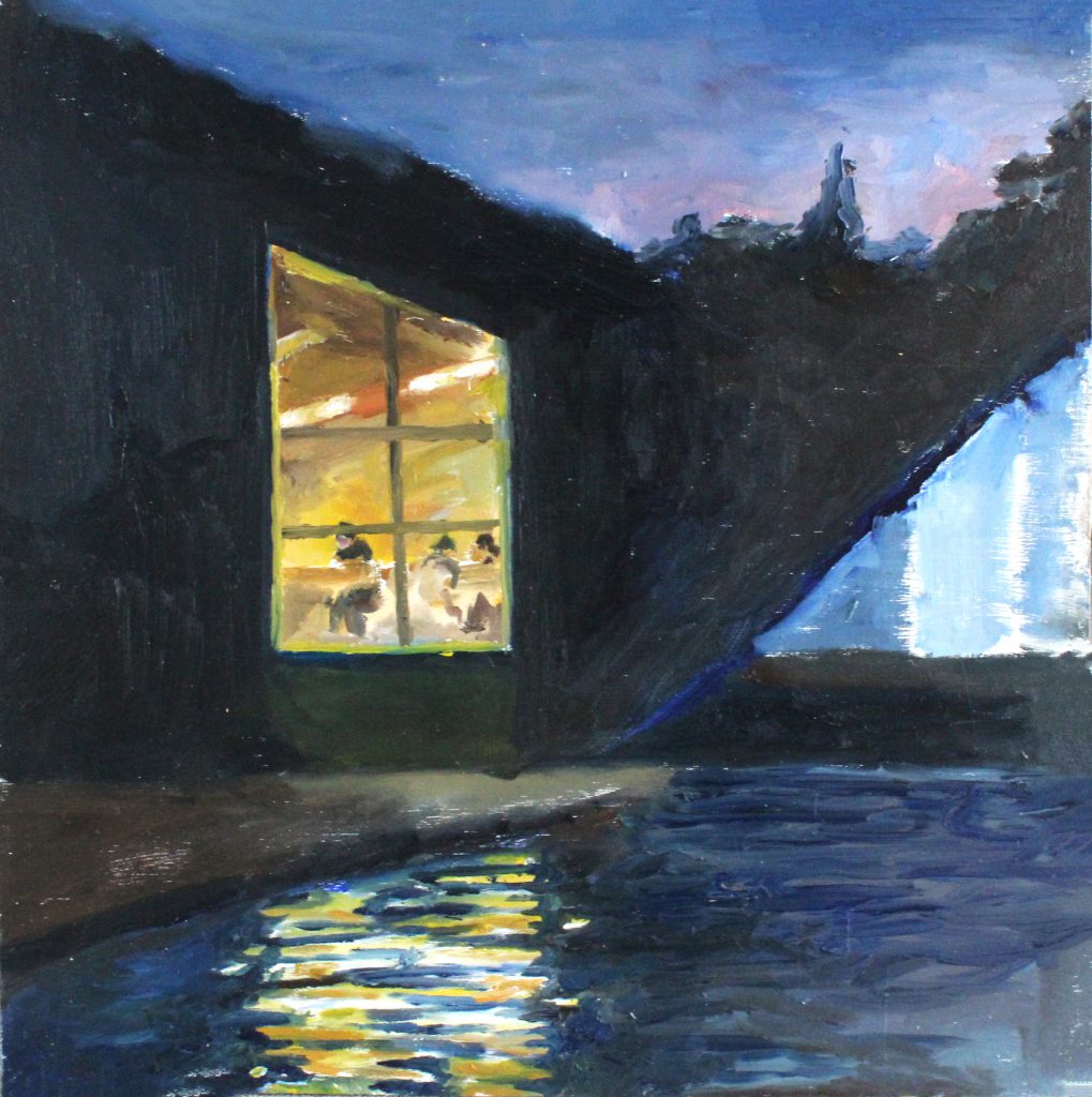
For this painting, I worked on the set-up that was done for class. I decided that I would extract my perspective from the space that I was in while inserting my own inspiration of what I felt I wanted to do with the objects that were in front of me.
I included the two models and I extracted and displaced the physical objects that were in front of me as I painted; The plant that was in front of the frame is in the background; the lamp that was facing away from me, I brought forward and enlarged; the orange drapery that the model wore on her chest I extended and let it flow all the way to the floor and off the canvas. I did these and manipulated other things in the set up because I wanted to, and I felt that that was how I wanted to react to the space in my painting.

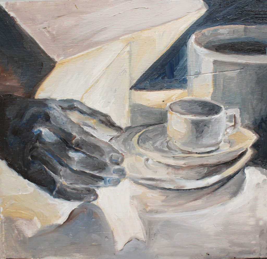
The original placement of the set-up
Weird as it sounds, this painting was half inspired by my experience in my major as a Visual Communication student. Doing layouts of texts and placing graphical digital elements for the entire semester, I felt that I needed to express it here. You may have noticed that some squares in this painting do not make sense in terms of perspective; The olive square in the bottom right corner sits on the foreground but it runs behind the stage that the models are on; The gray square behind Steve was never there but I inserted it because I wanted the three-dimensional space to stop there.
In fact, the whole painting is full of square-ish elements – some of these are the frame of cloth, the glass window behind the frame, the illogical squares around the foreground and the whole setting that is framed within another frame from the top right corner. I felt that these square-ish elements acted very well against the main perspective of the stage, creating perspective tensions that move the painting, distorting the viewer’s sense of true perspective.
Of course, these geometric manipulations weren’t just have been influenced from Viscomm. I was definitely inspired from Piet Mondrian’s philosophy of abstracted balance and how his works draw from the vertical and horizontal energies. I was also inspired from Kyle Staver’s use of strong colours and bold composition.
I also included diagonal lines that point inward and outward to keep the viewers eyes from wandering off focus. I felt that these lines broke the rigidity of the composition of squares as well. Some of these diagonal lines include the lamp that was lighting the models, the glass at the top left area, and the inserted “shadow” on the bottom right corner.
Apart from the composition of shapes, I enjoyed working with the colours of the setting as well. What stood out to me most was the orange in the set-up so I exaggerated the drapery. I wanted to make the female figure in my painting a little foxier and more goddess-like, which I felt was what the exaggeration did, coupled with the light that falls on her figure and the oblique mysterious angle of her face. I also felt that in the set up, I wanted to make the cloth behind, a little bluer than it was to create a contrast in cool and warm colours. I thought that the combination might’ve given a more romanticized expression of the female figure’s goddess-likeness since it also creates a triadic harmony with the yellow.
I really enjoyed painting and creating the gaze between the two figures. What I wanted was to create a mysterious relationship between them. To make this work, I closed the distance between the models and I reduced the details on their faces, hopefully just enough for viewers to wonder who they might be.
Overall, I really enjoyed trying something different in this painting. I usually paint realistically and I almost never manipulate the objects that I see. This, I would say, is my first time creating an impressionistic painting, not just by manipulating and using objects as compositional elements, but by creating new fictional shapes to distort a viewer’s sense of real perspective, drawing their eyes into a new dimension.