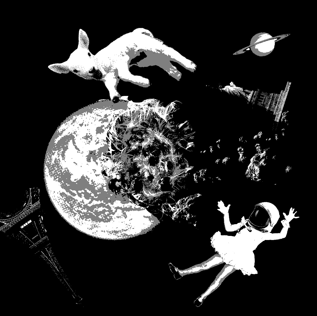
When the Ego assignment was first brought out, I knew I would at least address the duality of the realist and the idealist in me. But how I was to do that was the question. I initially started out with more literal representations of the ideal and real with the ideal of nature and the city. Where nature is ideal to me, and the real being the things that I face in human society that I find hard to agree with.

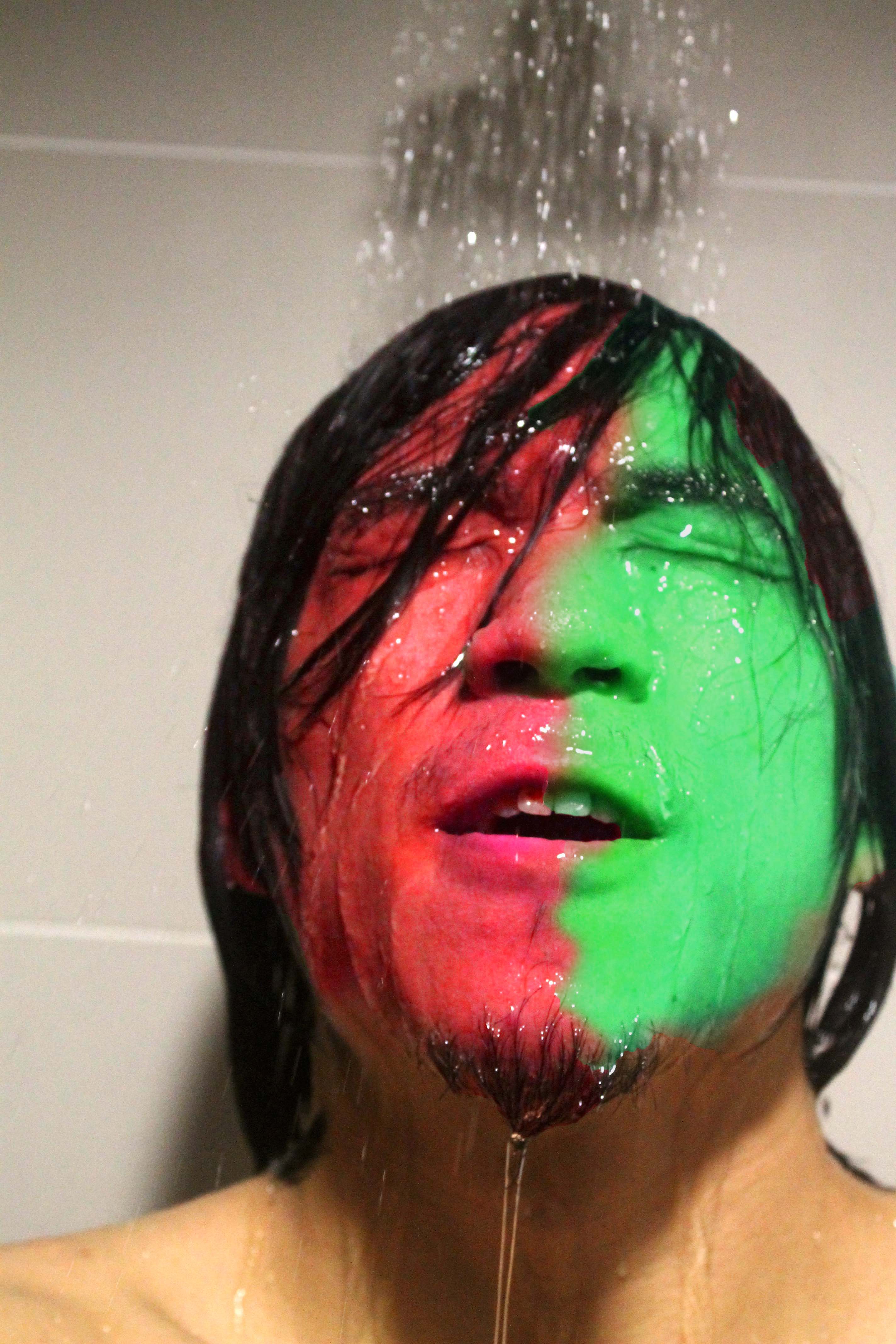
So I started looking at double exposure and attempted basic ways of mixing these together.

2D collage

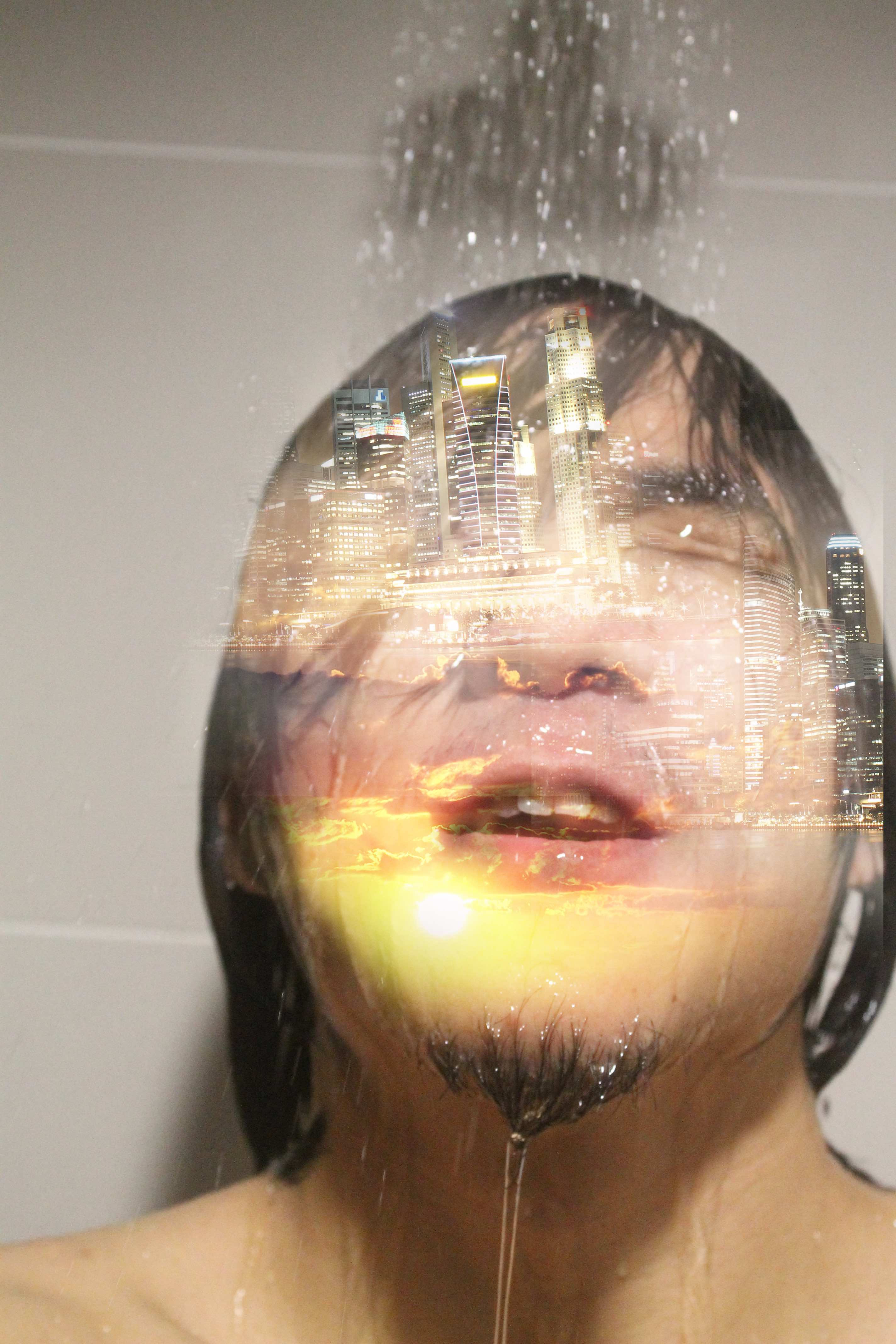
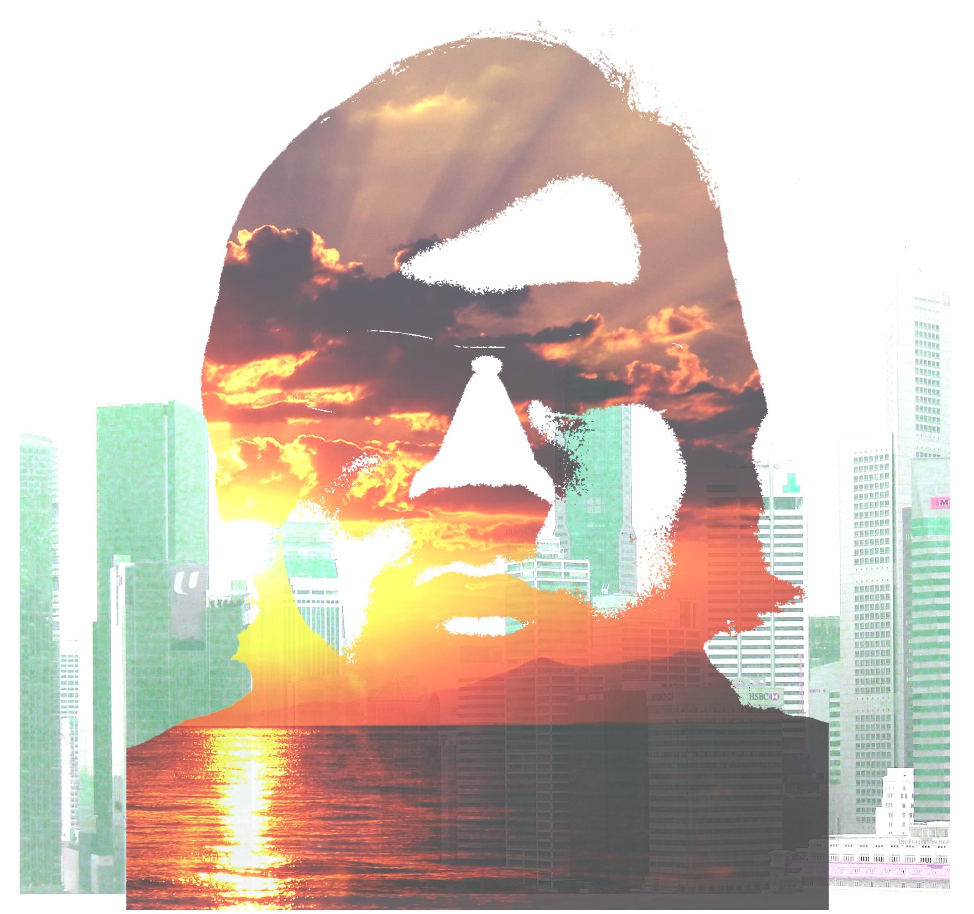
After this I felt that I didn’t quite hit the point of colour theory and decided I should take a look at these theories and internalize them more before moving on. Then from that, I decided to change my compositions and to choose complementary contrasts to represent the uneasy struggle between the real and ideal in me.


IMG_9741distortion

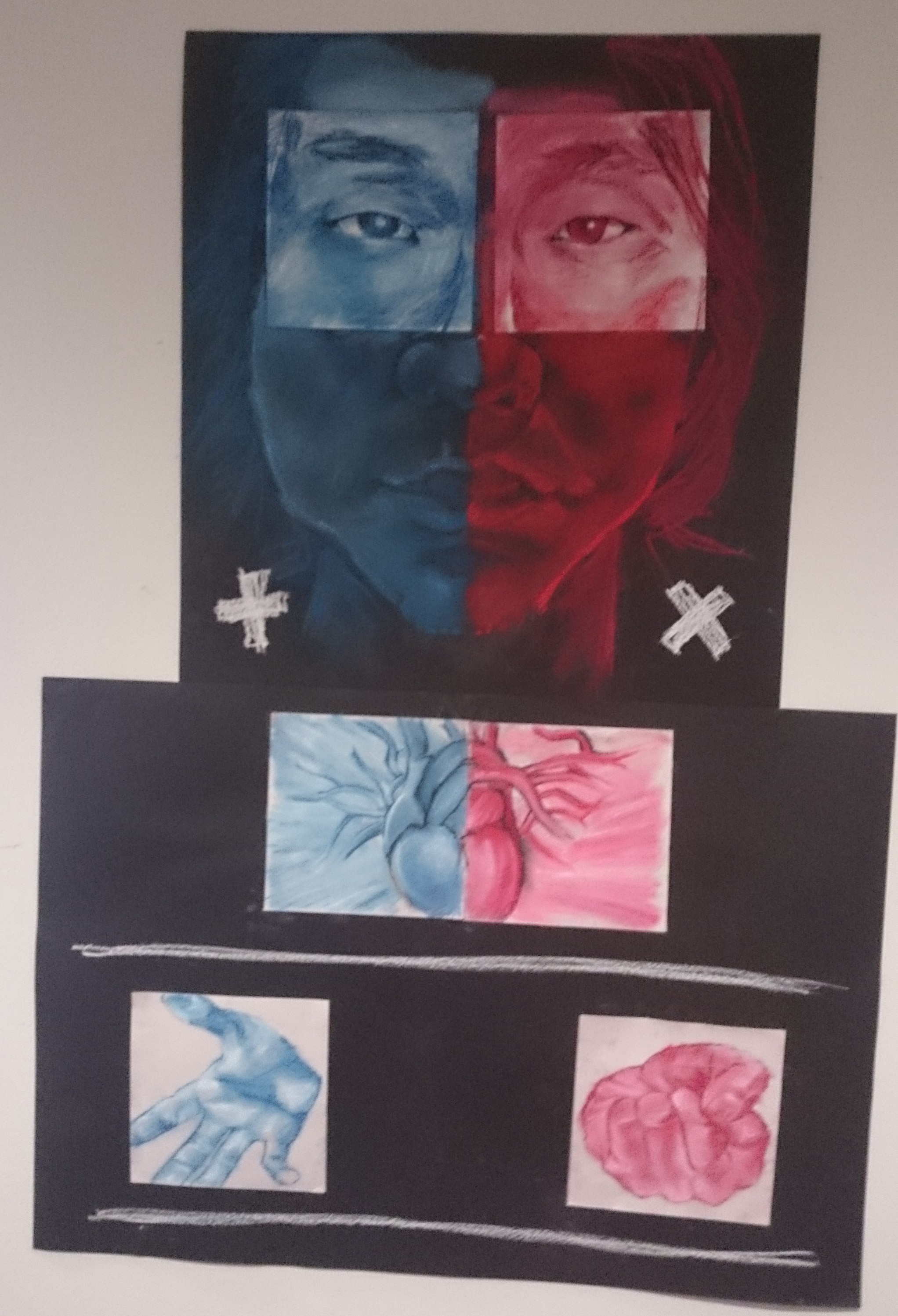
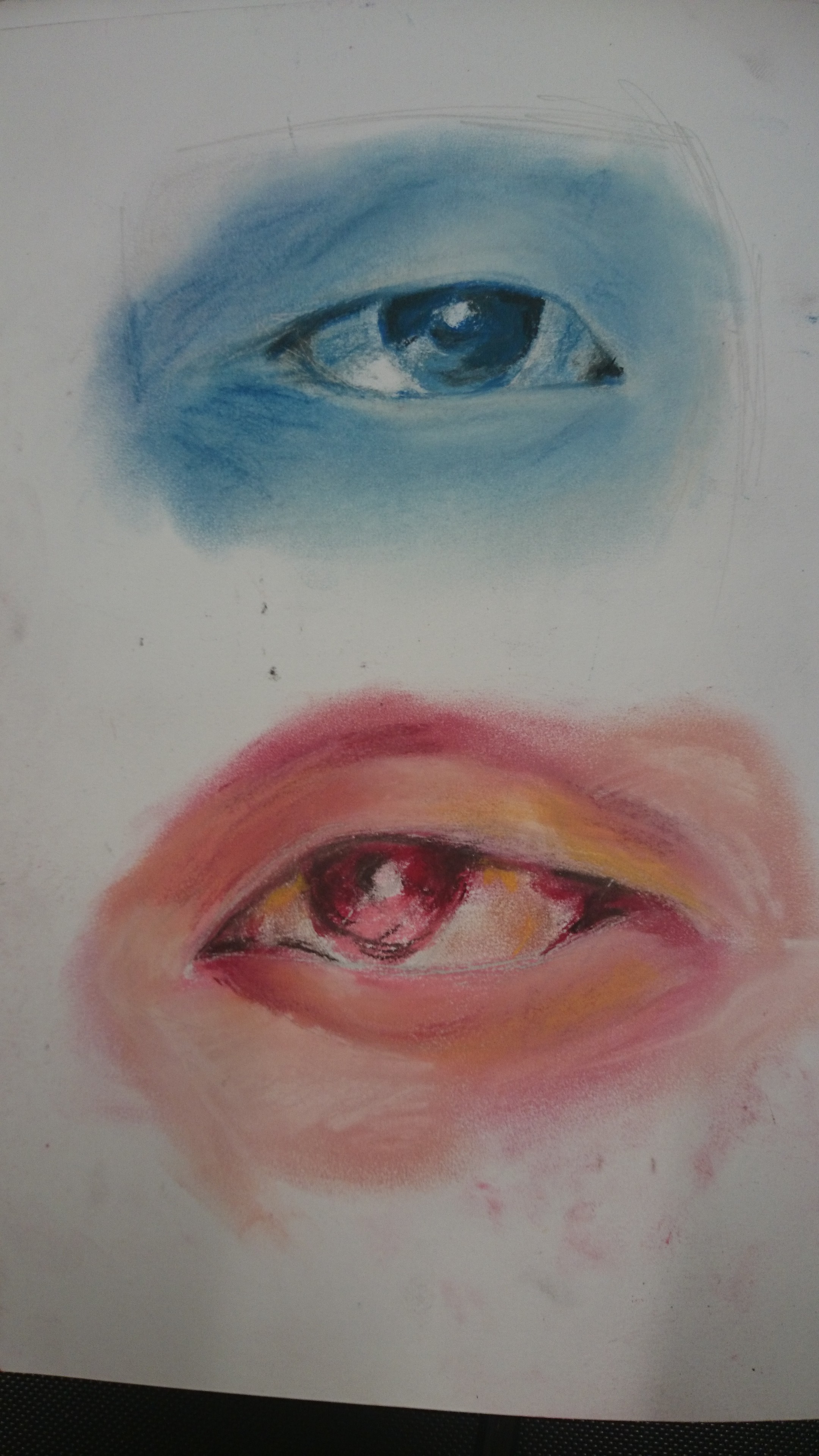
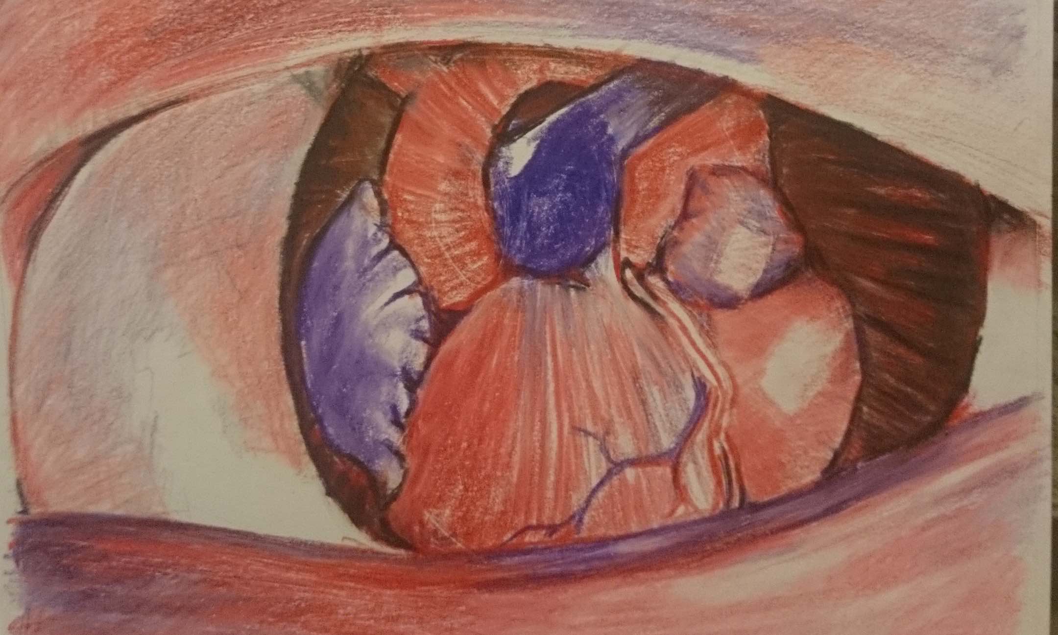
I also thought about symbols that represented the real and the ideal. So I googled images as usual… and found that one symbol of reality was the symbol of an eye which made me think about the eye being the symbol of the reality that i witness around. If you read my ego reflections you’ll understand what the symbol of the eye means.

tumblr_inline_mnvs3qdW321qz4rgp bigstock_Yin_Yang_Tree_1240661-300x300


I also found a yin and yang kind of symbol. And then it made me reflect and I realized that a part of me wishes to merge the real and ideal to create balance. So from that I knew what I desired to be, that is to be balanced between what is real and what is ideal. Hence the clenched hand on the ideal half of me

The idea of the Plus versus the Times was also developed through my reflection of merging the ideal and real. Merging, is what I desire. And desire is from a want of the ideal. So I found that the nature Plus and the Times really effectively encompass the value of an imperfect me and a unified me.

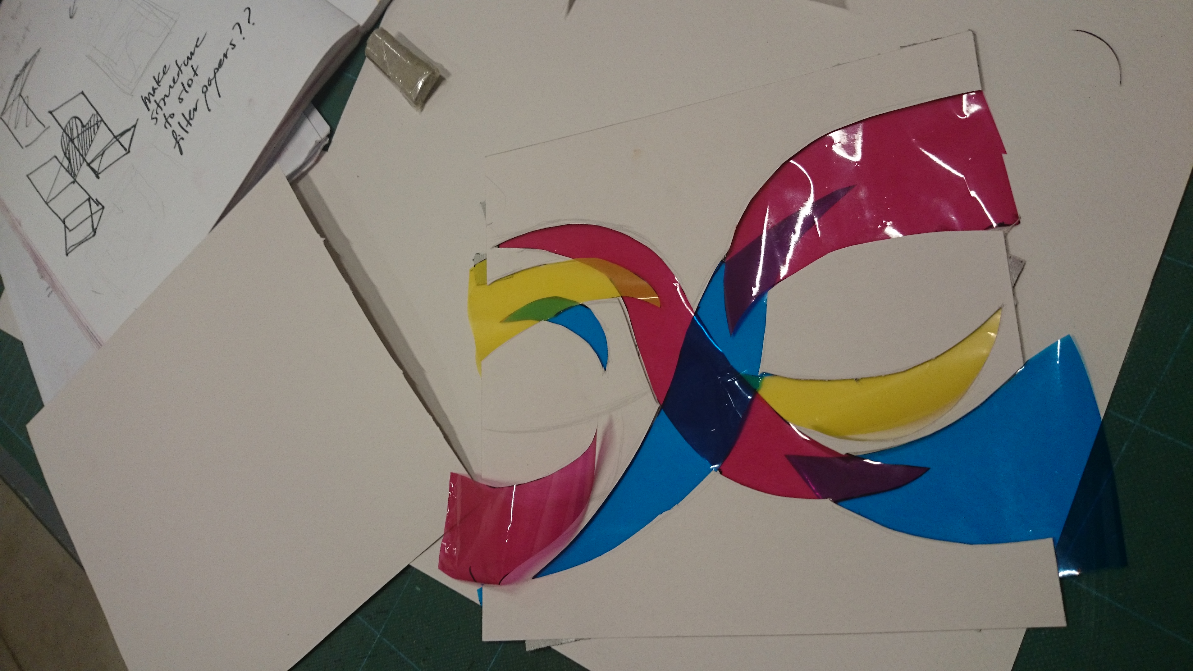
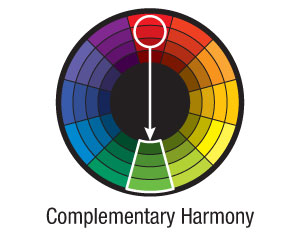
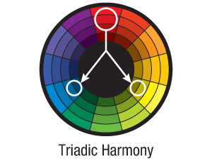
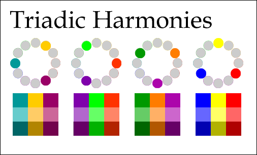
This is further expressed in my final decision of the colours red and blue after researching on Goethe who talked about warm and cool colours. This also effectively linked to triadic harmony of primary colours of red, blue and yellow. But I will come to that later. It is for the reason of leading to triadic harmony that for this panel, I used these two colours as temperature contrasts instead of using complementary contrasts.

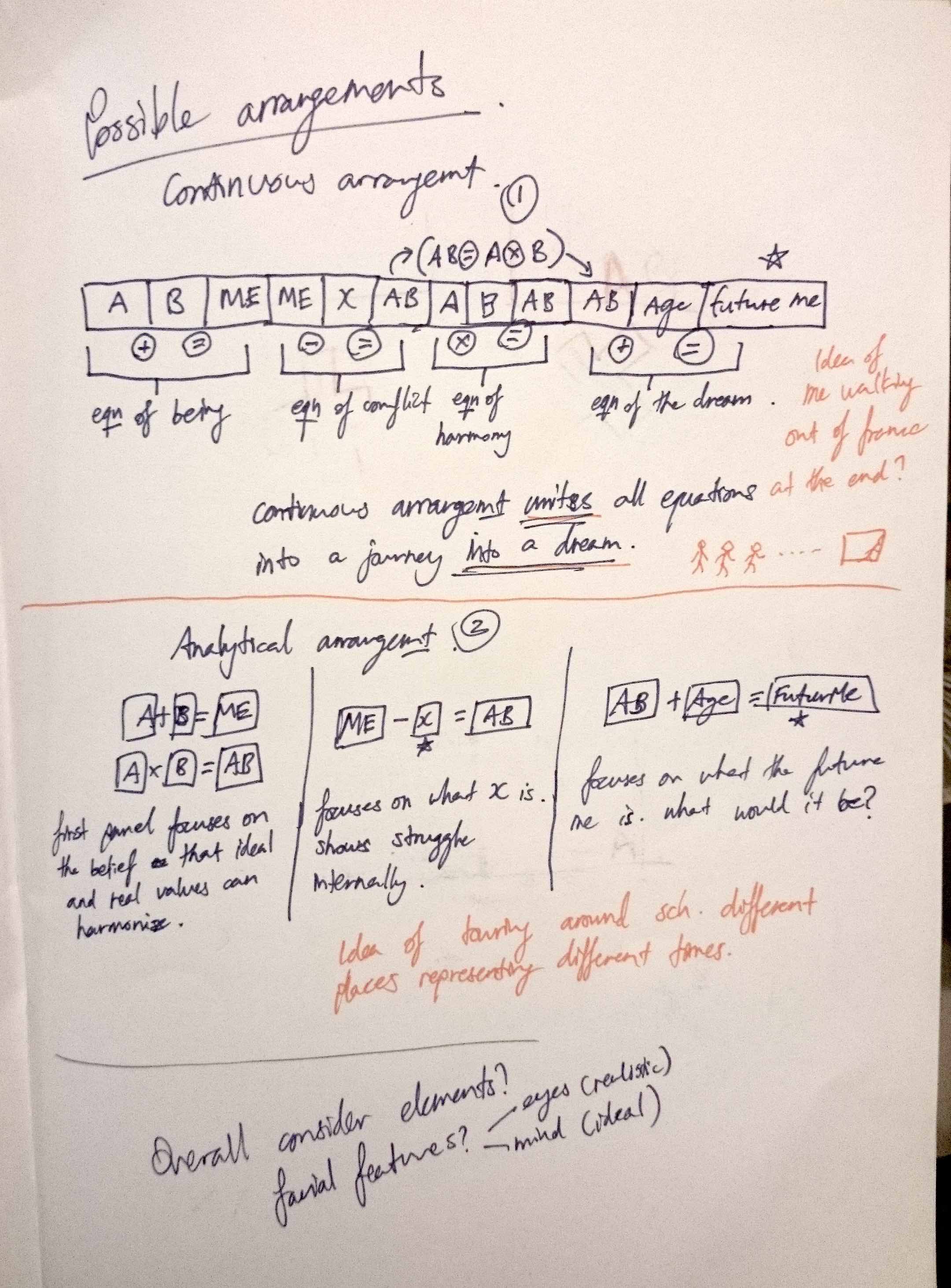
Next is the equation of a better me. [ __ – __ = a better me]. From my earlier progress posts and from my presentation, you’d know that I put in algebraic representations, making the equation

Me – X = AB(an ideal/better me)

IMG-20151119-WA0007

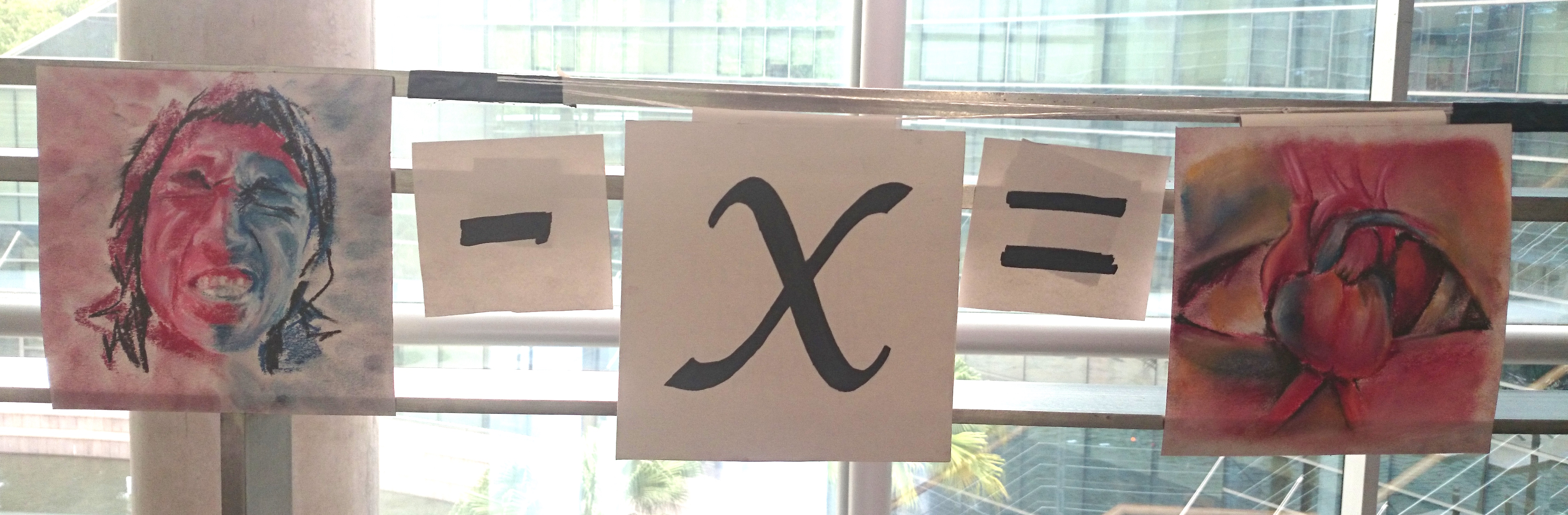
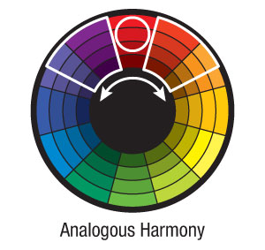
Knowing that there was this thing(X) in the way, I thought hard about what it was. Eventually I was curious to see if math could help me understand what it was. So in my presentation, you would have seen how I eventually turned the equation around to find that X is the inability to naturally unite the ideal and the real ( X = Me – AB ). Nature is what I believe in. Nature, Fate, God, whatever it is, I believe that there is something divine that sets things in place. This would lead me to my last equation. But before getting to that, I had to figure out how to visually represent AB(the ideal/better me). Initially I just put the symbols of the eye and heart together and combined the colours of red and blue to form AB in the equation. Then I found that the colours don’t come together well. So I introduced analogous harmony which blended things rather well, but it was still very warm and very obviously dominant in red because the violet that I had was closer to red than the blue that I had. It was only until a week before submission that I found William Blake.

blake_man_illum450ancient-719x1024


The Good and Evil Angels 1795/?c.1805 William Blake 1757-1827 Presented by W. Graham Robertson 1939 http://www.tate.org.uk/art/work/N05057

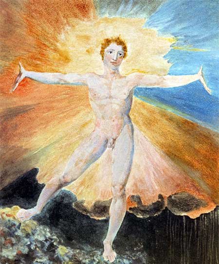
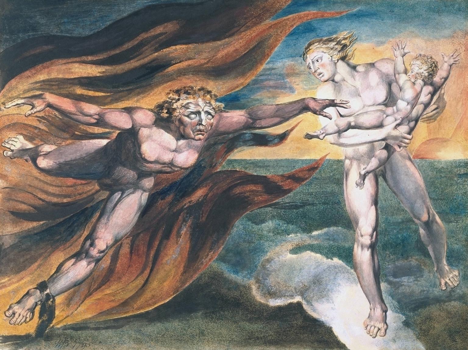
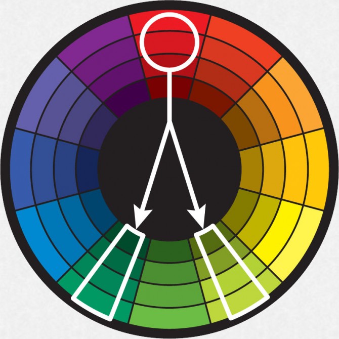
Blake’s use of triadic harmony made things look very natural. Being from the romantic period, the theme of his paintings were very much inclined to nature and were quite paganistic in his illustration of his own myths.

Los_Blake_Urizen_G_p18

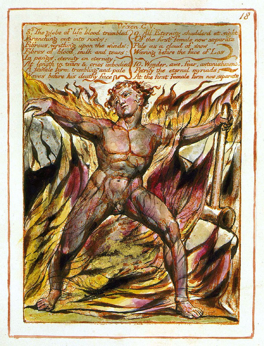
I really like one of his mythical characters that he created whose name is Los. He represents human creativity. Los is regularly described as a smith. He often carries his hammer which symbolically represents creativity as well as the beating of the human heart. When I read this, I couldn’t help but feel how connected it is to my idea of the ideal being represented as a heart! Okay but im digressing now. The main thing that I referenced from Blake is his use of triadic harmony in making his paintings look natural. So I tried adding in yellow into my compositions of AB to show how it naturally combines red and blue.

My use of triadic harmony also pushed my idea further for my last composition on the glass.

As Joy mentioned about me going further from the cut-out, i then started thinking about building a construction to be able to will light, changing light that passes through the cut-out.DSC_1702

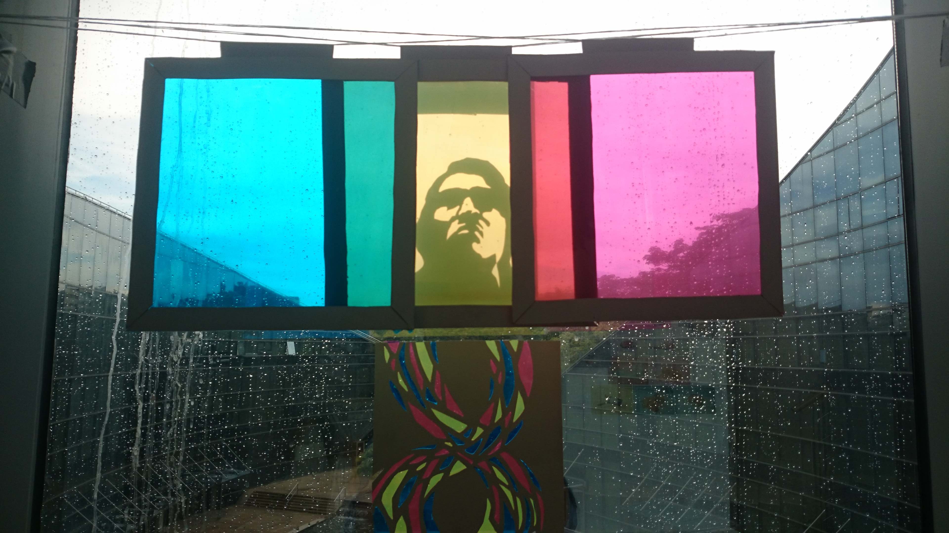
This wasn’t easy as i thought about multiple ways to do this. I had to think about composition and relevance to my idea. Initially my ideas led me to a simpler construction of moving the cut-out across the three colour filters instead. But then i felt that moving the filters would give a far deeper meaning and would tie in with the idea of the subtraction colour wheel. Settling with this idea, I tried ways to see how long the string would hold with ducktape to find the best way to tape it down.IMG-20151118-WA0004   DSC_1692


IMG-20151118-WA0006


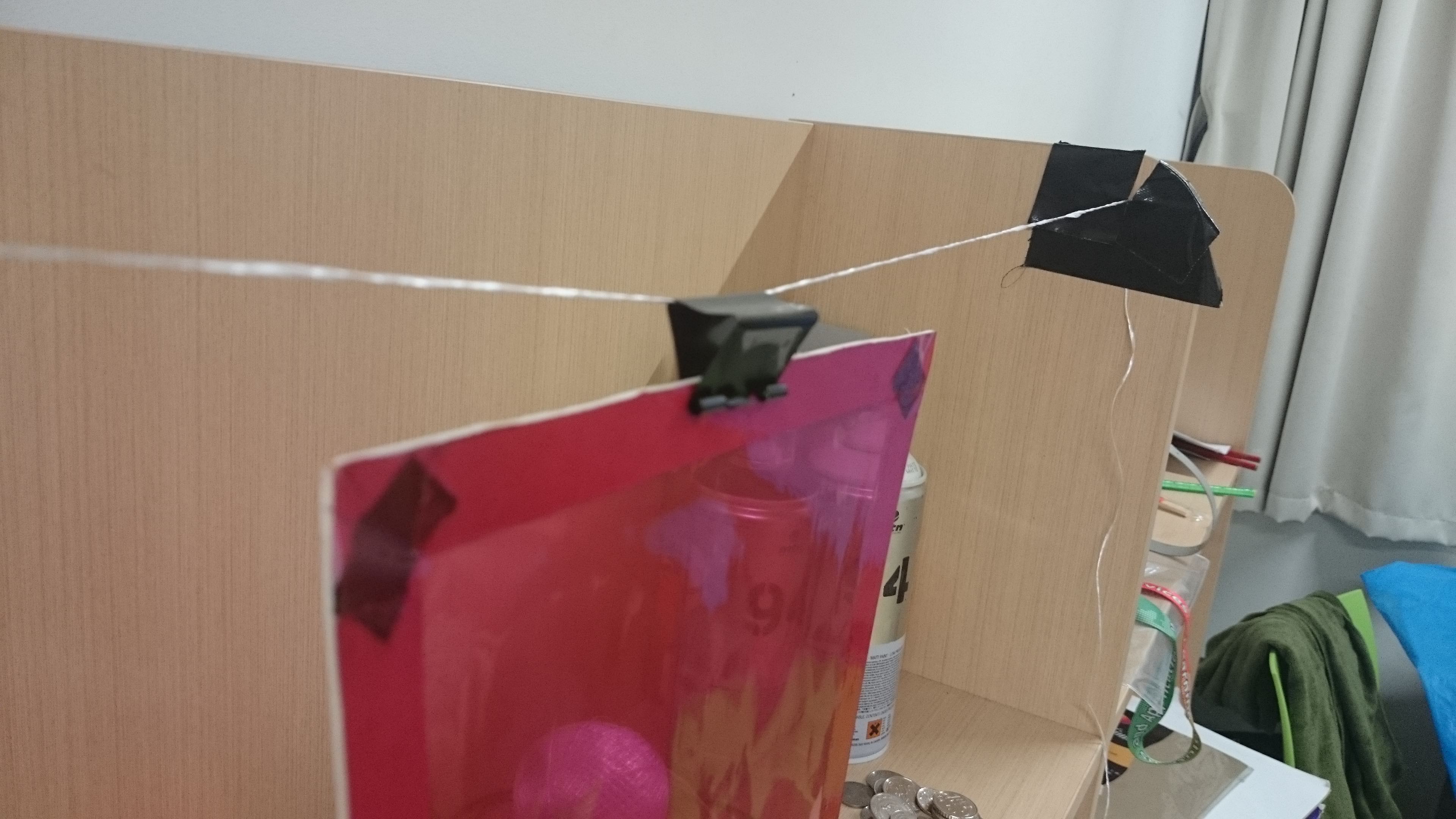
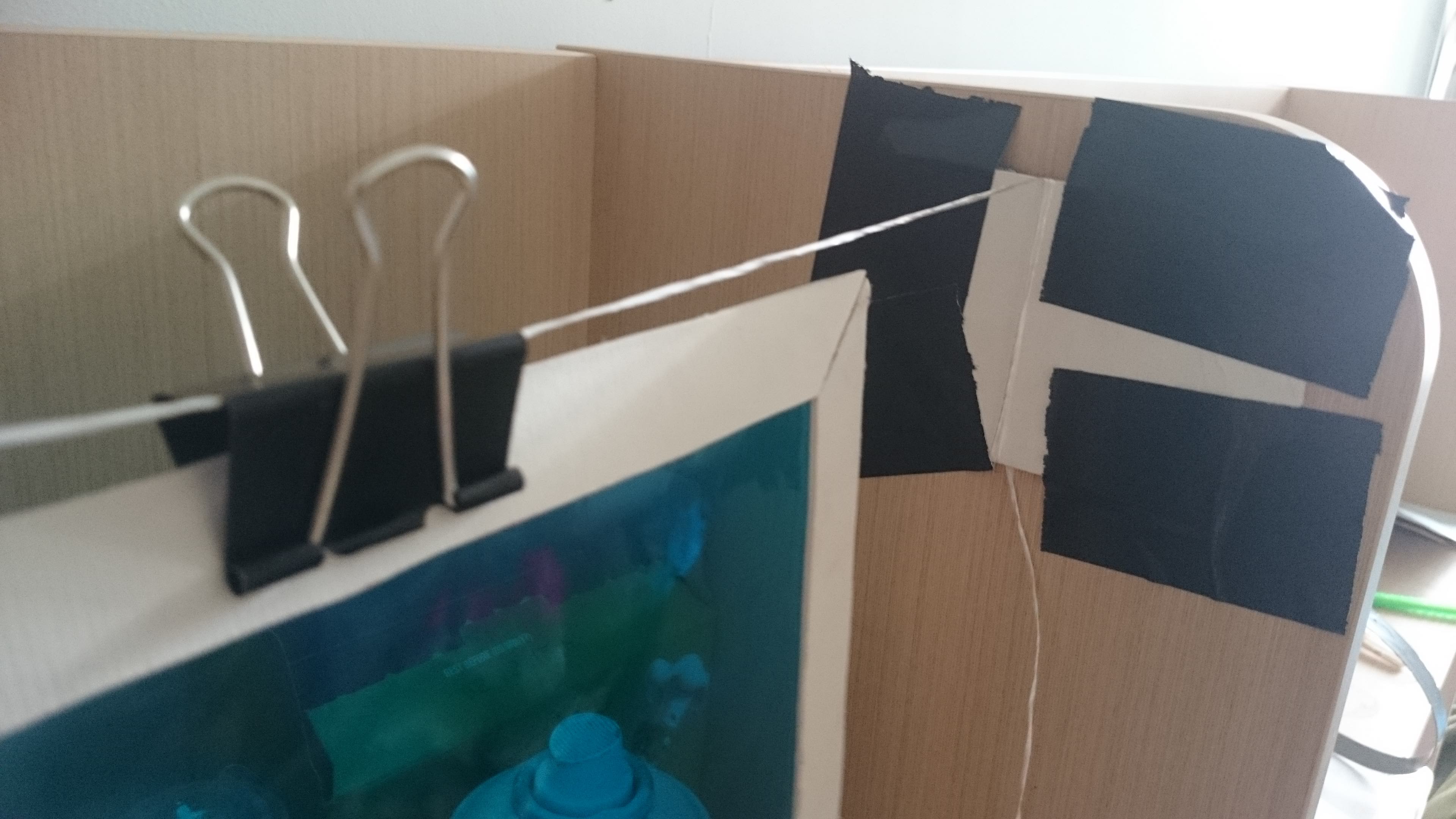
Then i had to give thought to how time should look like. Staying with the idea of symbols I went with the idea of the hourglass and the eternity symbol. However, construction the cutout for time was a real pain. i failed a couple of times before deciding that i should go with the stainglass idea.

IMG-20151117-WA0008 IMG-20151119-WA0000

These methods of taping only held well for a couple of hours before slacking. I realised that tape should be applied to the bottom of the string to hold the string up since the weight force is pulling the string down. I also changed the slider from the clip to rolls of paper to reduce the weight as well as to spread the weight of the frame to more areas on the string instead of having the weight have a focal pull on a more concentrated point as how you see in the pictures where the construction used the paper clip.


So putting the three pieces from the last equation together, I then thought that it effectively brought through the idea of the ideal me going through time to me in five years where i dont know what i’ll be. And as much as i can change the colour that i choose to be in, my light and colour depends on the light of Nature/Fate/God as well!


After the presentation, I gathered our class’s feedback and stickies and I saw how my presentation format really added good value to my ideas so I’m really glad that I chose to push my presentation boundaries for this final assignment. It is definitely something new that I’ve learnt and I’m really happy that I’m ending 2D for this semester in such a fresh way in terms of gaining new presentation concepts. I also took in the comment that Joy gave about me having my strengths in research. Its something I will heavily consider and I will aim to develop and branch out into other strengths as well.


I have some thoughts in my mind after Joy’s comment on my OSS update and would like to write it here as a record of my reflection.

After Joy’s comment on my progress, I went to read up on “divine” entities and philosophies on divine illuminations. I also looked at the theory of golden proportions. I’m a little upset that i didn’t get to this earlier because I don’t think I can change much of the presentation format that I’ve planned for my work to be in. But time is as such and I will do with what I have. I will continue reading about this to know more before using it for my works. But reading up a bit on philosophies about the divine and about light, it has given me more perspectives to my work.

Reflecting..

What is “real”, I can never see for myself. No one can see what real really is because reality just exists for us to be in it. Just as how as human beings, we cannot know everything because our senses are limited to what we are able to smell and see and hear… I can only witness what happens around me and that is my reality. Reflecting on myself, this reality that i witness does go against my heart most of the time and that is what I struggle with. And while i struggle with this, reality continues to run. Reality to me, is what Nature sets it out to be. Not that Nature has intentions and gives a fate to how things happen, but “fate” is what Nature is. I am only witnessing the happenings of Nature. Even in human systems, everything is derived from the purest form of what reality is and that is Nature.

DSC_1686 Continuing my research on how my final work will look like, I continued experimenting with how colours can work together in an image. The colours namely blue and red will act as contrasts in temperature as Goethe has mentioned in his research in the way we associate colours in our culture. However, there are still difficulties that i find working with colours although oil pastels blend pretty well. 

Seeming to be failing with more tries, i got frustrated and did an abstract symbolic composition which i thought could work with more exploration…but, I will leave that to another time because I have to be realistic and keep in time with finishing my work. I cannot explore too far from something that has a higher chance of working out.

DSC_1687

From the last consult, I am also getting colour composition ideas from William Blake who is an English poet who paints! He is from the romantic period hence most or else all of his works are related back to nature values which are addressed in my final work idea. I could not adopt his style of drawing form, but what i did pick up was the use of triadic composition. In his works, he often uses red, blue and yellow. By adding yellow in my composition, i felt that it really brings out light and hence brings out an idea of the divine: where the divine in my work relates to divine nature.

Moving away from multiple colours, I decided to see how monochrome works and work with single colours as i would work with a pencil in drawing a subject. The result was pretty good. I realise that sometimes I am so blinded by colour theory that i forget how i naturally work with tones and shades resulting in a less natural representation. So here you see the monochrome blue eye. Eventually i worked on a red eye and went to add yellow to that to see how that works. From this practice i found how colours in my work should not work as colours representing colours per se but colours should work in representing light. Thats what colours are anyway. Colours are light and colours are not colours in that sense. I tend to forget that.

DSC_1688DSC_1689

also, to spice things up, I intend to push myself on presentation format. I’ve never played with presentation format in my previous assignments and so for this final one, i thought I should definitely give it a shot. So i spent my weekend getting some simple materials  and drafting some ideas on how to present and frame my squares. I hope it doesn’t end in chaos. DSC_1685

This is what i am doing now. Working on my final squares. Symbols, colours and frame positions. I hope this final work will be a good one for all of you.

DSC_1641

Over the past assignments, i realised that i never rly played around with presentation very much. So i thought i should definitely give it a thought about how i should arrange my visuals. I came up with two arrangement ideas and choosing one of the two was quite a thought because it would totally affect the look of my work. I decided to stay with the arrangement which i call Analytical arrangement where i feel makes the work more exposed in terms of personal expression which is going to be a challenge and i am honestly slightly skeptical about it because i dont feel completely comfortable talking about myself to people.
DSC_1642

I also decided to leave behind my math tendencies for a bit. After thinking about the equations that i came up with i thought im not entirely a math person so i didnt think i should express myself entirely out of equations. its rly too much math even for me although i do love math hahah…

So instead, i decided to do something that i felt was something that was more comfortable. I decided to use symbols to express my ideas. Here, the eye representing the realistic part of me and my heart representing the idealistic part of me. And these two are forever wrestling in me.


DSC_1643 DSC_1644

I am using the colours violet and red, tending more to the play of analogous harmony and contrast to show the wrestling of these two sides of me. For now i am playing around with mediums. In these pieces i am practicing the combining of the symbols of the eye and heart to show how i try to have these entities come together to work.

DSC_1645Playing with poster colour, trying to see how these colours can blend and transit.

I am currently quite stuck on how to move forward so i decided i should at least play around a bit to get myself moving and i hope something will click and i’ll know better what to do. (idk if other assignments are clogging my creative mind but i hope that won’t be an excuse).

DSC_1646

I am also playing with natural light in one of my equations. I believe in the values of nature and i believe that these values will help me move forward towards the ideal where the real and ideal coexist. What will nature light up for me? idk. Currently i confess that my progress seems to be in broken pieces imo. But I am truly grateful that Joy was able to make the assignment extension and i hope this extension really helps me work for a better result for this final assignment. I definitely need this time to further reflect so that i feel good about what im doing for this assignment. But for now, this is what i have!

Before the class activity, I had an idea of how I wanted to take the equations on ego,

Ideal + Real = Me

Ideal – Comfortzone = Better Me

Ideal x Order = Ideal Me

Balance + Exposure = Me in 5 years

This was gathered in the class activity.DSC_1593

With the contribution of the class, its seems to me that this project should be on values and qualities that are clearest and most significant to me. My struggles of the values of the ideal and realistic seem to show in the way I think critically about things in life. From the practice I realize that my idea of the ideal and real are split in two, making up who I am (ideal + real). I also see that I am missing Order to be ideal and better.

Then, upon deeper reflection, I realized that Order is present both in the Ideal and in the Real. What the matter really is, is in balancing both Orders in life. From this reflection in class, I deduced that the Ideal Me should be [Ideal x Real], which is in contrast of [Ideal + Real]. The difference is that one sees two entities as separates while the other sees them as a whole. It is as how 1 + 1 = 2 and how 1 x 1 = 1, the latter being the holistic ideal.

Ideal + Real = Me

Ideal x Real = the Ideal Me

Then, I looked at the second equation that made up the Better Me. I realized that what I would want to actually aim for is the Ideal Me. Therefore, I equated the Better Me with the Ideal Me as I had the desire to find out what I can do to be as holistic as I can be.

(Ideal + Real) – ? = Ideal x Real

So here’s a bit of math…

Letting A be the Ideal and B be the Real, and letting X be the unknown,

(A+B) – X = AB

So what is X?

X = (A+B) – AB

This is the formula of the problem that stands in-between the current Me and the Ideal Me.

Fitting it into the equation of the Better Me,

As the Better Me is Equated to the Ideal Me, Better Me = AB

Therefore,

(A+B) – [(A+B)-AB] = AB

I asked myself if this made sense. It does mathematically, but conceptually?

Then I realized that this equation of the Better Me, talks about the struggle to be better.

As X = [(Me) – The Ideal Me], it tells me that I must put aside the mentality and the the Ideal (A) and the Real (B) are separate and that the Idealistic and the Realistic cannot go together, that they cannot be balanced and coexist. In order to achieve such an ideal, I must be extremely disciplined and ordered to will myself to unite both entities to be a better person.

As for the last equation, I am still thinking about it. While we jotted down what we want of ourselves in 5 years’ time, that itself is an ideal and it cannot be real until it happens in 5 years’ time. Therefore the equation itself, I am basing it on the Ideal Me, because that is what I dream to be.

 AB x time/age/exposure = Me is 5 years


So to summarise what I have so far, Letting the Ideal be A and the Real be B,

A + B = Me

A x B = Ideal Me

(A + B) – [(A+B) – AB] = Better Me

AB + Exposure/Time/Age = Me in 5 years


Most of the information I’m sharing here would be mostly from Richard Keye’s videos on colour theory on youtube.  You can go take a look although they are pretty long…but they’re super insightful and it’s pretty cool finding that there is a different way of seeing colour.

Monochrome Harmony is basically a composition of only one hue. Keyes talked about how a hue can be defined as all the colors in a straight line from the center of the color wheel to the the rim of the wheel. This diagram shows examples of the choice of colours in monochrome harmony, each row of a different hue.

monochrome

analogous-harmony1

Analogous Harmony consists of colours from more than a single hue, but there has to be a condition that the  hues are neighbors on the color wheel.

complementary-harmony split-wheel-670x670

Complimentary harmony, on the left, as you can see is the harmony of colours that are totally opposite of each other in the colour wheel.

Split Complementary Harmony is related to complementary harmony. The difference is in that the complements are split, probably the reason for the name “split complementary”. So like in the diagram on the right, instead of red being complimented by green, red is complemented by green-blue and green-yellow.

 I think it can be quite confusing to differentiate split complementary from complementary for me because I sometimes confuse hue with value.

DSC_1588 copy

This is a picture of a bowl of wanton mee that i had this morning.

 I am guessing that this is more of a complementary harmony than a split harmony because I cannot spot green-blue with green-yellow in it. It is also mostly warm than cool.

However, I realise that if I took the veg away, it would definitely be a warm analogous harmony. But with the green veg in there, it does compliment the red.

Therefore, I would say that the effect of a complementary harmony seems to take most effect here. Although analogous harmony is also working in there, complementary is most outstanding. I might be wrong so don’t take my word for it haha just wanted to share my attempt to apply colour harmony in everyday life. ;D

triadic-harmony

Another harmony that wasn’t mentioned in our brief was the Triadic harmony. I find this one really interesting. The harmony is created by the composition of colours that are unrelated, as seen in the diagram: The colours of red, yellow and blue form an equal triangle in the sphere. Likewise with these other colour diagrams forming equal triangles in the colour sphere.

2de00812b419b660d3df4de07dfcdfe9

An example of Triadic harmony that I had in mind was the painting of The Fighting Temeraire by J. M. W. Turner.

the-fighting-temeraire

Really love that how when Triadic harmony is used successfully, it can produce such a glorious effect. Of course in the context of this painting the message isn’t a positive one, but the effect of the colours here really leaves such a strong impression on me. Keyes mentioned in the lecture notes that Triadic harmonies are usually used to make an idea digestible. So I wonder if i can use such a harmony in the idea for my final assignment , where i want to address the ideal and realistic parts of me. I will update the draft idea of my assignment on OSS in the second part of my research.


Sorry for the late update. Wasn’t sure if there was a deadline for this since the dingbats were online already so i wasn’t sure what this post on OSS was exactly for. But after reading everyones posts, i decided I’ll share a little extra about my project here given the opportunity!


lamb heaedmarymary edit

Introducing the lamb and Mary.

I changed quite a number of my dingbats from where I initially started. However I somehow couldn’t bring myself to change the first two dingbats of the lamb’s bleating head and the dancing Mary. I found myself somehow attached to the annoying head image because it was so stupid and ridiculous and I couldn’t get it out of my head anymore. And I liked how the image of Mary dancing gave a kind of expression of Mary wandering somewhere into her world of adventure. The kind of chemistry that these two dingbats formed gave colour to my ideas of the compositions that followed as you’ll see how Mary is wandering off somewhere and the lamb follows (except of course for the last composition).


merlionScreen Shot 2015-10-22 at 9.11.28 pm

I definitely had a lot of fun doing this assignment. Not sure if you guys noticed, but there were small little details in the first composition. Had small little impulses in putting the statues in places for fun like putting the Merlion in the castle…

Screen Shot 2015-10-22 at 9.11.15 pm 

…or putting this Jesus statue dingbat beside Mary because Jesus wants to hug Mary, and now thinking about it…Mary was Jesus’s mother. so. yeap. Also how i put those Easter Island head statues peeping over the Singapore CBD buildings. Or how JunYuan’s dingbat of Michelangelo’s David statue is checking Mary out. And I liked how it was entirely okay that i could do all these kinds of impulses for this assignment since it was on ridiculousness. Fun nonsense.

Statue_of_LibertysphinxstomachastroidsOverall, I enjoyed the process of getting these dingbats because it was so light and funny. It was as if I was illustrating to myself the travel into different places, or into space and time and then into Mary’s appetite.

When I will give myself enough allowance to do such a nonsensical, fun work again, I will definitely do it without thinking thrice. 😀


Continue reading


My rhyme is on Mary had a Little Lamb, focusing on the line “Everywhere that Mary went, the Lamb was sure to go”

My compositions were generally inspired by Hannah Hoch and the idea of Dadaism. I will not put all my details here because i would rather keep it for the presentation. But i will tell you briefly about what the compositions are about.

finding lamb

The composition of monuments here is an exaggeration of “everywhere that Mary went”. And the lamb is somewhere in the composition… to show how the lamb is everywhere Mary is.
Mary evolutionThis composition inspired by one of JunYuan’s dingbats which shows how even in evolution, the lamb is following Mary… or is the lamb a part of Mary?…hmmm

world mary

And even in the destruction of the earth, the lamb is there with Mary in space.
mary eating

Finally, being so annoyed by the lamb (and being extremely hungry from travelling), Mary has a little lamb. Which gives a double meaning to how wherever that Mary went, “the lamb was sure to go”.


Overall the compositions are meant to be ridiculous to express the ridiculousness in the rhyme. Following the concept of Dadaism, they’re not meant to make solid sense. They’re meant to make you laugh so i hope you had a good one. Cheers.

the lamb was sure to go

For the English nursery rhyme, i decided to settle on Mary had a little lamb, focusing on the lines “everywhere that Mary went, the lamb was sure to go”. I chose this because the thought was hilarious in a ridiculous way. So i wanted to bring that kind of ridiculousness out in my visual.

I started off by bringing forward the image of the sun compass from my previous halftone idea because the compass symbolises direction and the sun shows that its…sunny. Then I read the rhyme and thought oh ya…the setting of the rhyme is in a school. So i decided to put two teacher figures at the sides because i thought it would be hilarious to set a contrast between the lamb and the figure of authority.

To further express the sense of ridiculousness I decided to put in a few of the seven wonders of the world to exaggerate “everywhere that Mary went” which I thought was really funny. Then to add to that ridiculousness, I enlarged the head of the lamb because I remember how from the previous assignment, I found that enlarging spontaneous images can make things look more nonsensical and i thought…lol, this is pretty retarded…which is good!

Hannah Hoch

Hannah Höch. German, 1889-1978 Cut with the Kitchen Knife through the Last Weimar Beer-Belly Cultural Epoch in Germany (Schnitt mit dem Küchenmesser durch die letzte Weimarer Bierbauchkulturepoche Deutschlands). 1919-1920 Photomontage and collage with watercolor, 44 7/8 x 35 7/16” (114 x 90 cm) Staatliche Museen zu Berlin, Nationalgalerie © 2006 Bildarchiv Preussischer Kulturbesitz, Berlin, © 2006 Hannah Höch / Artists Rights Society (ARS), New York / VG Bild-Kunst, Bonn, photo: Jörg P. Anders, Berlin

Hannah Höch. German, 1889-1978
Cut with the Kitchen Knife through the Last Weimar Beer-Belly Cultural Epoch in Germany (Schnitt mit dem Küchenmesser durch die letzte Weimarer Bierbauchkulturepoche Deutschlands). 1919-1920
Photomontage and collage with watercolor, 44 7/8 x 35 7/16” (114 x 90 cm)

There is a lot of content on this piece by Hannah Hoch but in my opinion, it is basically a representation or even an expression/statement of political issues. I think the impact of this work to me is how she has arranged her photos into a montage; the content that each photo represents is not simply put together at random, but each photo reacts to another in the way she wants it to.


Kleine Sonne (Little Sun), 1969

Kleine Sonne (Little Sun), 1969

I find this one interesting because it plays wish what I recognize forms to be. Its an image of a sun that has been changed because of additional facial features. It changes what I know the images to be.

Da-Dandy, 1919

This collage makes my eyes move around the space. I think the queer placement of the images make me think what the composition is about.

Seeing how this image affects the way I look at it, I realize how interesting it can be to put “separate” images together. They don’t have to directly interact with each other in a single image. Just by placing them side by side or up and down or in whatever way, my mind chooses to make the connection between the images. Its an effect I’d definitely consider for my own rhyme composition for the second 2D assignment.

Dadaism

Fountain

Rotative Demisphère (Optiques de précision) (Rotary Demisphere [Precision Optics]), 1924

Rotative Demisphère (Optiques de précision) (Rotary Demisphere [Precision Optics]), 1924

Both of these pieces are done by one of the founders of Dadaism, Marcel Duchamp.

I personally do not like Dadaism, at least when it first started off. It might be too avant-garde for me in the way the messages make almost no sense to public and in the way that its definitely not comfortable visually or conceptually. I do understand that this form of “anti-art” art arrived due to the first world war so many political and social issues would arrive from that and messages can be quite aggressive. The whole chaos in the early stages of dadaism is too formless for me to take on as a basis of my art.

But I would still take something away from Dadaism. One thing that intrigued me was the use of ready-mades as how Marcel Duchamp has; how ready-mades are used to create a function to an art piece to convey a message. For example, Duchamp’s Fountain. The message may not have been stated but the take away from historians and viewers is that his message was one that insulted the concept of art in that current time, that art is something you piss on.

If I could use an image in my second assignment that holds a meaning that connects with my story, it may be visually out of place but it could hold a stronger meaning or message that punches through.


My Rhyme

I hope you can read the song from the image!!

The song is from the book, The Lord of The Rings The Two Towers

It is about the story of the Ents and the Entwives. In the movie, it is mentioned by Treebeard (if you don’t know who that is its the Ent of the above image) that the Ents simply “lost them” meaning the Ents simply lost the Entwives. In the book it is explained that once, long ago, the Ents and Entwives were together. However, they preferred to live in different areas of nature: the Ents preferred the woods of the mountains and the Entwives preferred the gardens away from the mountains.
In the first age of Middle Earth, Sauron burned and destroyed the land of which the Entwives dwelled at. Upon crossing the land of Anduin to visit the Entwives, the Ents found a desert in place of the gardens and the Entwives were lost. So they searched for them for many years. The searching of the Ents inspired the Elves to write a song that was translated into common tongue.


Just had to give the rough content of the story so that everyone can appreciate it better. Hope people would enjoy reading this song.

Anyway apart from sharing the Rhyme, I wish to be able to capture or reproduce that sense of wonder and fascination from the song in this project. I am more inclined on having a more story telling composition with more content but I am still open to more abstract representations on my take of this rhyme. But whatever it is, it would have to have the tragedy and romance of the story, and/or the fascination and wonder of the story telling.