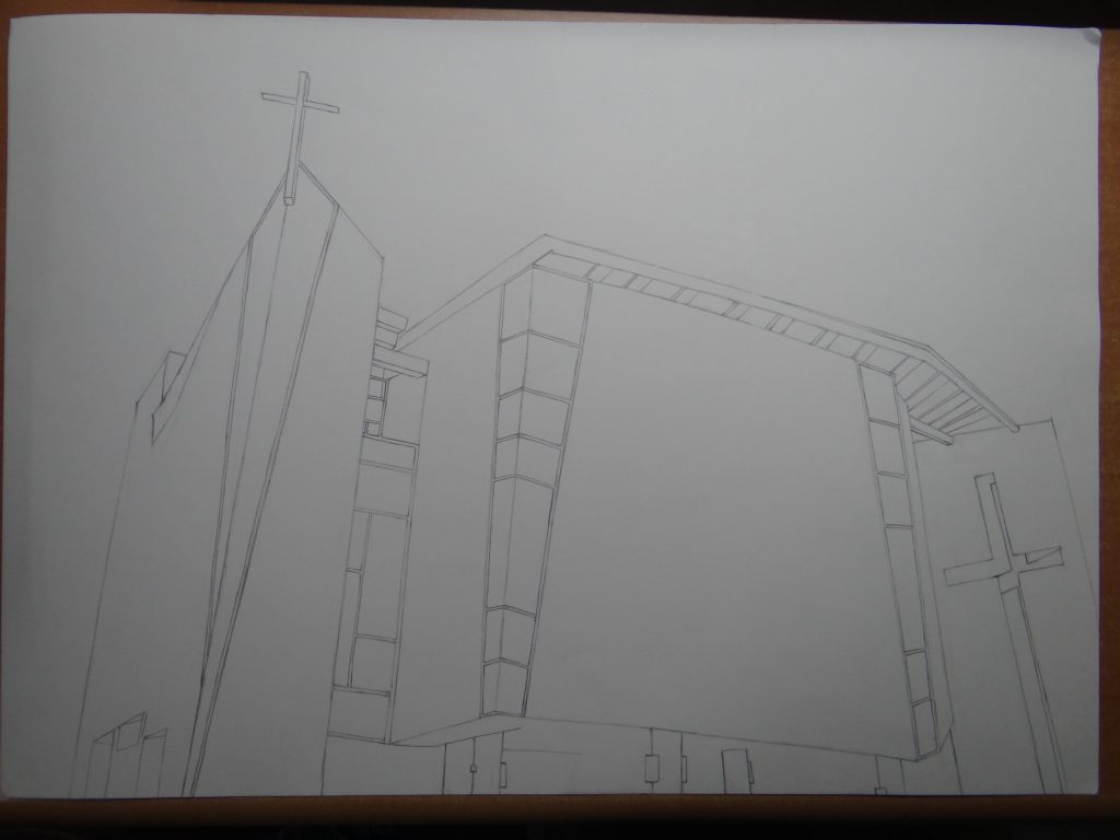
The following are my final outcomes and explanations:

Affection
I feel that affection is like a mist that’s all around us all the time, we are being loved by people. It may not always be obvious but subconsciously we know they are there always looking out for us etc. Sometimes more than others we feel the presence of love and affection hence certain areas are darker.
Lust
To me, lust is made up of two halves: the conscious desire for something, as well as the subconscious urge to fulfil that desire. In the composition, the lower portion represents an all-consuming desire, shown by strong, bold brushstrokes of dark paint. The upper portion is made up of minuscule pieces, giving rise to a sense of discomfort as the irregularity causes your skin to crawl. Although the two halves are different, they are both overwhelming in their own ways. The diagonal portrayal is not only aesthetically pleasing, but suggests at the inverse relationship of these two concepts. As one increases, the other decreases, and vice versa.
Longing
Inspired by Hannah Quinlivan
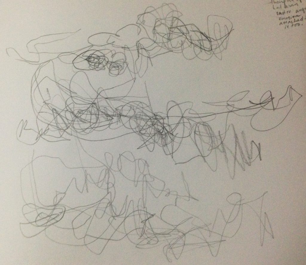
The lines are irregular, move in every direction and bend at improper angles, symbolizing a longing or need for something. The lines trail off to the edge of the paper, never finding an ending, conclusion or any form of closure. Also, I tried to illustrate longing by simplifying the the action of want (pulling, grappling for it) by making blocky trapezium shapes as fingers. I tried to create depth like how she did but instead by using different pen tip thickness(0.1 and 0.5). However, I feel that the depth element in my piece is not obvious.
Cheerfulness
This was a more of a experimental piece. When I think of cheerfulness, I associate it as being bubbly. I associate bubbles and round figures with the word bubbly. Hence in this piece I did swirls. Furthermore, I added netting with circular holes and placed them around the ink bubbles, encircling them or even rolling up the netting into a slight conical shape.
Pride
I feel that pride is a very internal feeling of happiness due to your achievements or meeting/surpassing one’s expectations. In this way, I tried to portray it in a very circular motion, as if there’s this physical manifestation rolling inside of us and emitting satisfaction and happiness.

Optimism
A tiny glimmer in the midst of darkness: that’s what optimism is to me. When all seems lost and you’re just holding onto the hope and belief that things are going to change for the better. The white lines seem to spring forth from a single point in the darkness, showing that optimism can radiate outwards and influence others around us.
Relief
To me, relief is an incredibly light feeling. The sensation that a burden has been lifted, or that a tension has been relieved. I tried to recreate this with the light, airy, brushstrokes, coupled with the light shade of the ink.
Surprise
A sudden or unexpected turn of events evokes surprise. To me, surprise is more often a positive thing, although it can be negative as well. I chose to use white pen on black paper to portray this. The short straight lines that radiate outwards in the dark are reminiscent of fireworks, which I feel are a good representation of surprise: a sudden outburst of bright colour/activity where there was nothing before.
Irritation
The vertical, irregular lines serve to create a sense of uneasiness and tension. There is also a tension in the struggle between the white and black areas of the composition. I imagine the black lines as irritation, and the white area as clarity, hence the black lines are slowly encroaching into the centre, obscuring clarity and clear-headedness.
Rage
Inspired by Mark Tobey
To me, rage is a build-up process – the level of intensity increase into finally a rage that is an uncontrollable anger that cannot be contained. It is a destructive force. There is a gradation in how solid and “filled-in” the calligraphic lines are. The strong, thick and dark lines contributes to this feeling of overly intense emotion. The curves of the lines are evocative of grass in the field bent over by the strong winds of hurricane of rage.

Disgust
When I feel queasy, I feel as if the insides of me are mushing together and churning. Instances of extreme disgust result in nausea, and extreme nausea results in vomit. The biomorphic shapes are reminiscent of bacteria, or stomach lining, both things that are associated with vomit.
Envy
Envy is when you are jealous of other people or things, and you hope for such things for yourself – partly because you’re probably not as good. These represent the steps you have to take to become the person you envy. The pencil markings symbolize the steps that you have yet to take.
Torment
To me, torment is something quite internal. I don’t like to show it outwardly, hence I used a white pen on white paper to portray the sense that it’s being hidden in plain sight. It’s full of turmoil and angst, hence the multiple jagged lines. I added a layer of white glue over to mask further the inner conflicts. This makes the white lines even harder to see.
Suffering
The blots of ink that seem to slowly bleed outwards are reminiscent of dried teardrops on a surface. Suffering causes us to feel trapped, and sometimes we feel powerless and unable to do anything except weep. The use of human hair also suggests that suffering causes our hair to drop off, or make us pull out or own hair.

Shame
To me, shame is synonymous with embarrassment. When we are embarrassed, we try to save ourselves by fleeing or by covering up. We try to protect ourselves from mockery? I depicted something like a shield that we would try to protect ourselves with. However, this “shield” will likely not be foolproof, so I depicted some gaps along the “shield”.
Neglect
Neglect has the encapsulates the idea of isolation for me. There are many kinds of neglect, neglect of one when you pay attention to everything else or neglect and the feeling of emptiness and lack of sense of belonging, of which the latter is what I’m trying to portray. It is as if everything is the same, white-washed, and you’re the ugly mark that no one likes and disapproves of and is left behind.
Sympathy
I feel that sympathy is something we don’t explicitly mention most of the time. Hence, I used white pen on white paper, to evoke that aspect. I feel that sympathy also has quite a gentle, embracing, quality which I tried to bring out with the flowing lines. Some of the lines crisscross and intersect as I feel that it’s sympathy, not empathy, hence we do not fully understand and feel what the other person is going through.
Nervousness
Taking memories of myself being nervous, for example ordering a subway, I tried to represent how I feel. It feels like a stammer-y mess. You know exactly what you want to order yet something stresses you. I tried showing some relatively static movement as if to mimic the myself playing and fiddling around with my hands to ease the little internal vibrations and conflicts.
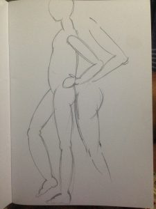
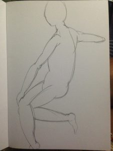
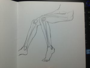
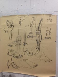 During the lesson, we were taught how to draw legs. Legs are attached to the pelvis at an angle, pointing slightly diagonally downwards. The thigh bone slants inwards towards the center. The knee joint is like the rounded cylindrical side of a mallet. This gives us our bendy knee movement. Slightly below that is a flat plate. A slightly curved bone(which gives our knees the frontal curve shape) sort of connects this two pieces together (although in actual fact it doesn’t touch the bone but is rather held up by tendons). The shin bone is relatively perpendicular to the ground, with a slight degree of bent to the center. The muscles are that the muscles on the inner thigh are lesser than that on the outer thigh, although they are almost the same volume. The muscles at the calf area are such that there is barely any muscle on top of the bone, most of the muscles are found at the back. From the front view, the back muscle closer to the center of the body is positioned lower while the back muscle closer to the side of the body is positioned higher.
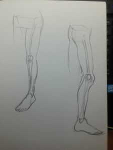
 For the hands, Prof showed us that the palm area is actually not in line with the arm bone, it is slightly lower. The thumb starts at the bottom for the palm and ends at the mid area of the first section of the index finger. The thumb is made of 3 sections with the mid section circumference smaller than the other two sections, while the other fingers sections are in descending order.
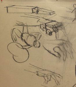
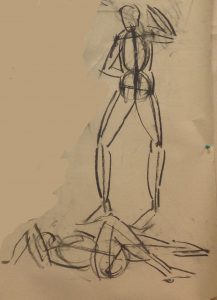 To do this, we first pinpoint and the draw the lines for the shoulders and trocanther. Use a vertical line, this need not be straight, it can curve to show movement(twist or bending of the body), to depict the torso. From the ends of the trocanther, draw the thigh bone, dot the knee and draw the shin bone. From the shoulder, draw the arm bones, similar to the way the legs are drawn. From here, add volume/muscles to finish off the stick man.
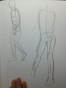 I thought that this method was quite fun. It’s a more consolidated method than the box method(which I find myself to quite like because it is easy to use and it helps me a lot). Will probably try this more often since there’s less planning of boxes(which I take veryyyy long to do).
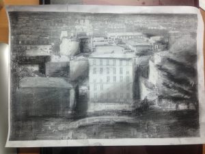 This is my sunlight-mood piece.
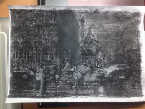 This is my rainy day mood piece. The tones are all way too similar. I was having difficulty with the white chalk, it kept giving me muddy grey tones instead of pure white. :/ I wasn’t sure how to depict light from circular bulbs along the streets so I coloured halo like circles around it too.