


We had to present our 4 quote composition designs to the class.
Gattaca
“You want to know how I did it? This is how I did it, Anton: I never saved anything for the swim back.”
Presented:
The Help
“Every morning, until you dead in the ground, you gone have to make this decision. You gone have to ask yourself, “Am I gone believe what them fools say about me today?””
Presented:
Critique:
– The sunburst is quite distracting. Maybe you can lighten it.
– The girl is very small and the owl head can barely be seen – the owl head blends into the background due to both being very dark. Make the owl-girl bigger so that it can be seen.
– Posture of girl comes off as arrogant.
– Liked the use of the tarrot card motif.
Further Edits:
Looking at the comment about the little girl having an arrogant posture instead of a subservient or neutral posture, I went to search the internet to replace it. I scrolled and scrolled till I finally found an image which I think would suit. It is of a girl crying(below). I wanted to use the picture, however, the size is small and resolution is terrible. It became very blurry after I tried to expand the size. I had to take into account that it looks very pixelated on my computer screen already.

With regards to the comment of the owl-girl being too small, I enlarged her figure so that she has more presence in the composition now.

Next, I tried to improve on 2 points. Even though the owl-girl is bigger and more visible now(so she does not blend so much into the background), I wanted to try to further make her more visible. Combining with the comment that the sunburst ray like effect seemed quite distracting and out-of-the-blue, I wanted to make the idea of why I chose to use this effect more obvious. Firstly, I originally intended it to correspond to the phrase “every morning” in the quote, to represent the sun. Anyway, I tried to make a circular white space around the owl-girl. Firstly, it makes the owl-girl more visible as she is in a white background now so she does not blend into the surroundings, and secondly, to make the idea of morning-sun more obvious by literally having a circular sun with light rays shining out.

Not quite sure how I felt about the ray lines continuing to extend to the center(despite faintly), hence I tried to clean it up some more in the next one.

I had second thoughts about the size of the circle, I then made the circle diameter bigger to surround the owl-girl fully ever so slightly.

Likewise, I’m still note sure about the faint lines leading to the center point as it feels slightly distracting. So I tried erasing it off.

It feels too abrupt though, in that the rays of light suddenly disappear into this massive white circle. I tried to decrease that “visual shock” by leaving an outer rim of faded lines before fully erasing it away.
Final design: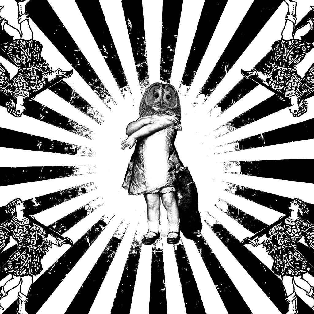
Forrest Gump
“My mama always said, ‘Life was like a box of chocolates. You never know what you’re gonna get.’”
Presented: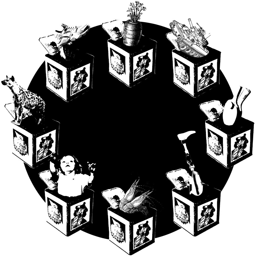
Critique:
– The chocolate idea can be more apparent. There is no show of what the choc is or where. Although (everyone) not sure how to either.
Further Edits:
I went to google on images of chocolates. These are some results of what I got.


Looking at these images, I’m still not quite sure how to best doing it without it being too literal. Some ideas I can think of is to use the the texture of the gold foil wrapper of Ferraro Rocher chocolates in the black circle.

However, I don’t really like it as it is far too much texture present – especially with the 8 boxes and their motifs, it complicates the composition too much in my opinion. I still prefer my composition I presented for class(a simple black circle to tie the composition together). I think it is so hard to incorporate chocolates as they literally come in every shape, pattern and size. There is not much of a recognizable form except for the block-y kind(last chocolate picture), which is very cliche in my opinion.
Inside Out
“Take her to the moon for me okay?”
Presented: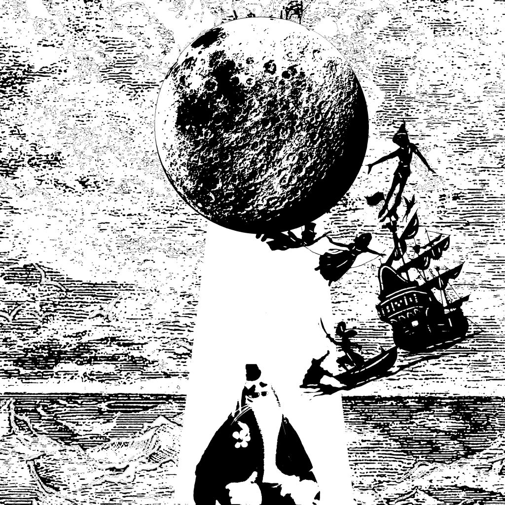
Critique:
– The ray of light highlights the imagery – which is nice.
– Like how Bing Bong is sad yet the overall composition is very happy and fun – the contrast.
– Bing Bong can be more obvious.
– Bing Bong can be bigger and sadder in posture.
Overall critique:
– Like the overall use of symbolism
As mentioned in my posts earlier, I encountered a lot of problems with printing of my design. I kept getting areas which the paint didn’t go through despite varying the amount of ink used, pressure and speed.
So one day while I was talking to a senior, he started talking to me about his silkscreen printing module in NIE as he wanted opinion on his new composition design. I asked his opinion on why I kept failing at getting a good print.
Hence we went to Google and watch Toutube videos of people silkscreen printing.
In the above video(and several other videos watched), their method of printing is that they first do a light sweep. This is so that the ink partially goes through or is at the surface of the holes. Then, they would do a hard sweep to push the paint through to print.
I’ve personally not tried this method. However, I noticed that their inks used seem to be more dilute, whereas the paints in the studio that we use are very viscous. My senior told me that in NIE, they add a medium to the paint to make it more “thin”, such that it goes through the holes smoothly. I think this is the difference, and possibly why I am having such a hard time. To further prove my point, the previous 3 trials, I used the ink from the bottom half of the bottle, hence they are most likely to be thicker. In my last trial, and the most successful one, I used a brand new tub of ink. When I opened it, I could see a thin layer of medium on top. I mixed it gently a bit before using it. I believe that using the medium mixed with the ink portion closer to the surface helped in smoothness of inks going through fully(without any holes).
Face Drawing
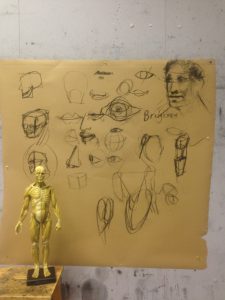
Prof taught us on how to draw faces. Lips can be drawn in semicircle-like discs. Depending on which lip is protruding out more, the position of the disc varies. Also, for the eyes, we don’t draw the entire eyeball. We can’t see the entire eyeball. So I learnt that it may help to draw a circle first to represent the eyeball, after which drawing the eyelids within the confines of the top and bottom of the eyeball.
Life Drawing Anatomy Exercise
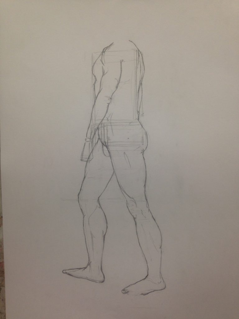
Life drawing exercise with model Kim. His muscles are very fun to draw haha. I chose to use the box method as I thought that was quite useful in helping me to visualize and draw the body angles and proportions better. It was quite sian to not be able to complete this drawing after 50 mins.
13 October 2016
Zoo Trip!
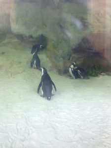
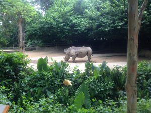
For this trip, we were to observe animals and do quick sketches of them. I learnt how to apply the things I learnt from drawing human anatomy to this. For instance, we are to draw the big forms first such as the body/torso, then move on to the head and legs, then the further details(if wanted).
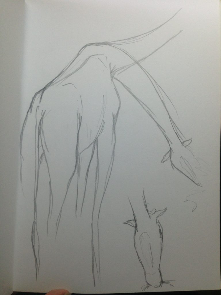 Giraffe (full body and head from bottom-up view)
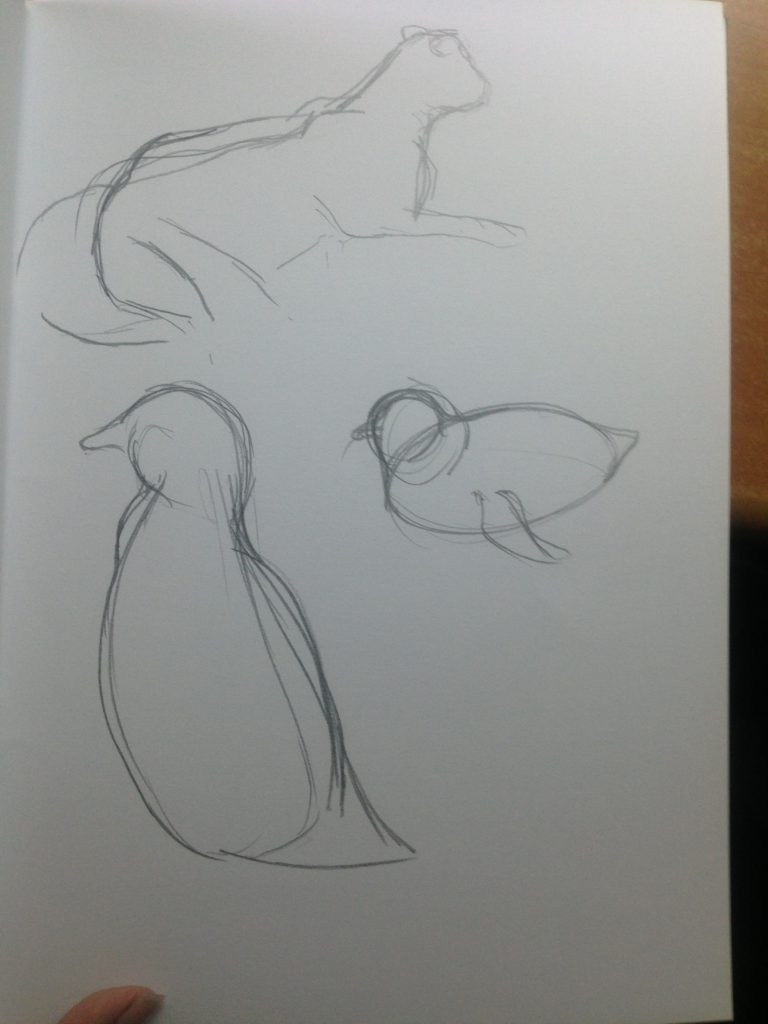 Lion, Penguins
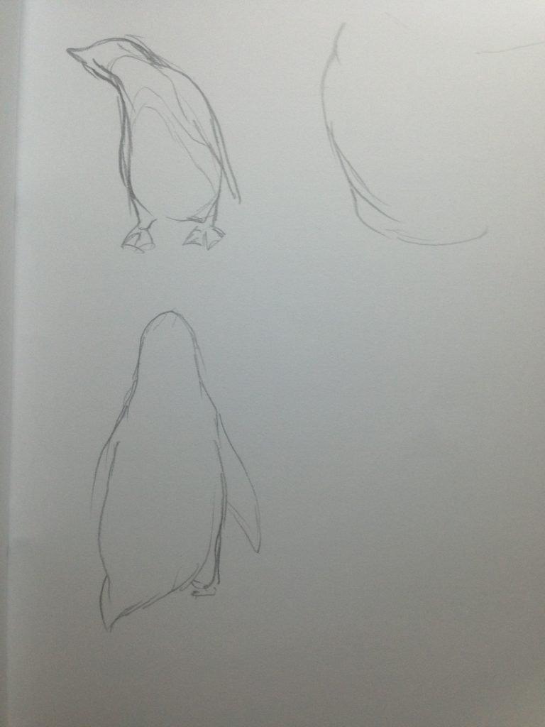 Penguins
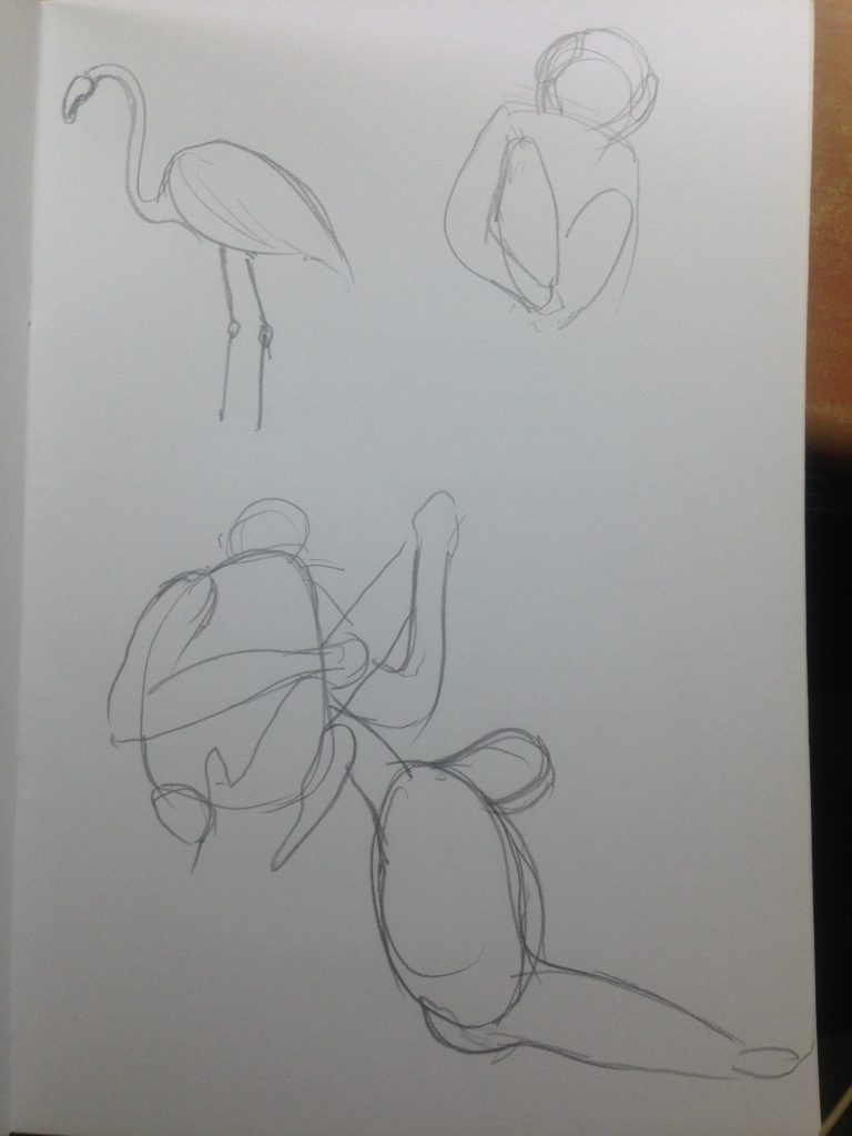 Flamingo, Orang Utans
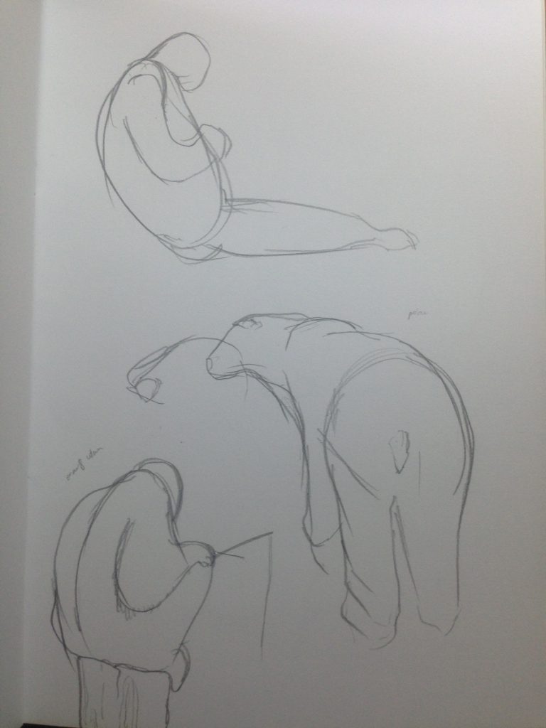 Orang Utans, Polar Bear
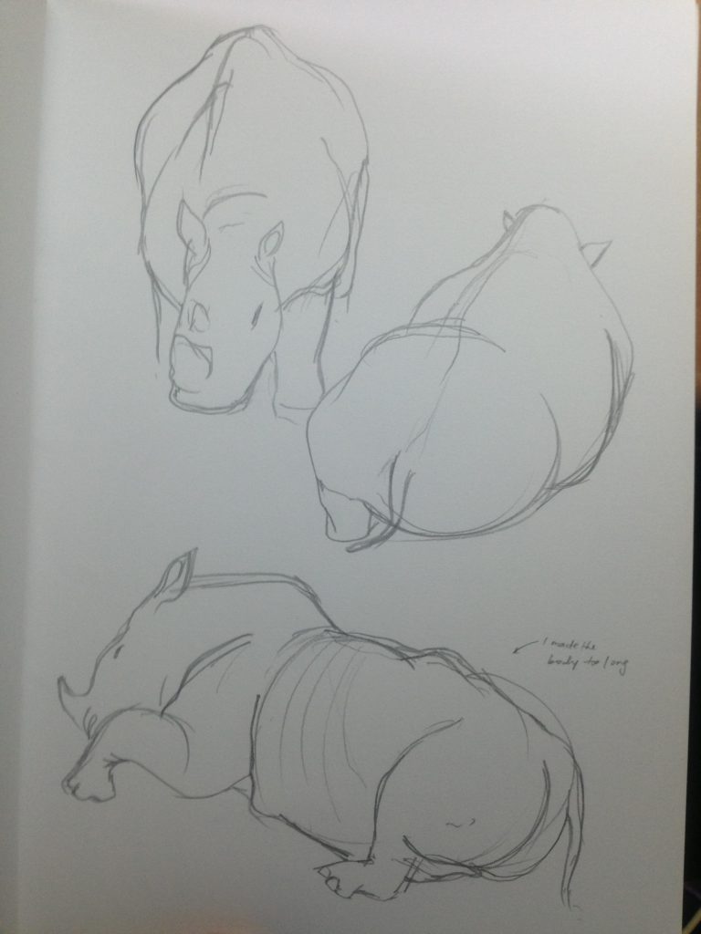 Rhinoceros
 Cheetah
Zebra, Ox(?? Very skinny and bony)
Hand Drawing
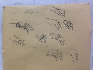
We recapped what we learnt the week before about how to draw hands. This time we were given time in class to do it too.
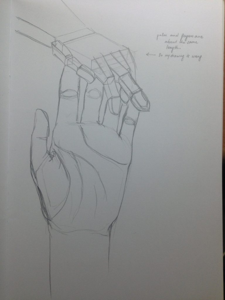
I received feedback that the hand I drew above was wrong. The palm was too small. The palm and fingers should be of roughly the same size.
Head Drawing
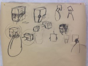
We were then taught how to draw the head. The head can be perceived a L-shaped block. The highest point of the head is at the back, and not the center. The neck is connected to the head at an angle. The next is almost always titling forward, unless the subject is purposely pushing their neck back or looking up/back.
Basic Watercolour
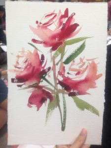
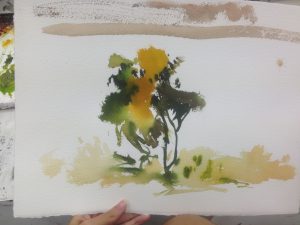
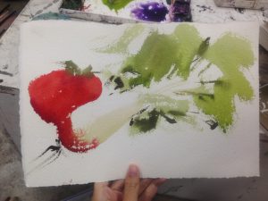

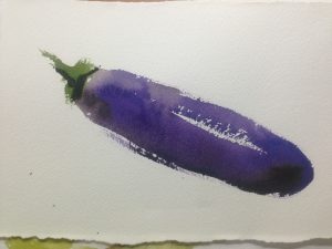
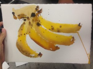
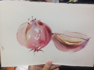
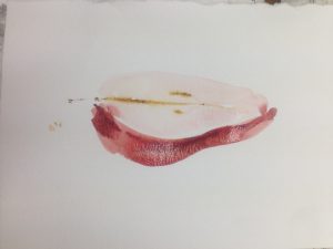
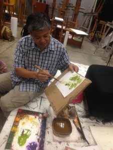
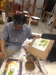
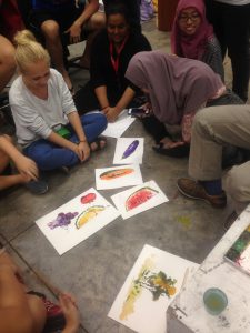
Prof Woonlam thought us how to do basic watercolour through painting fruits and veggies. As above!
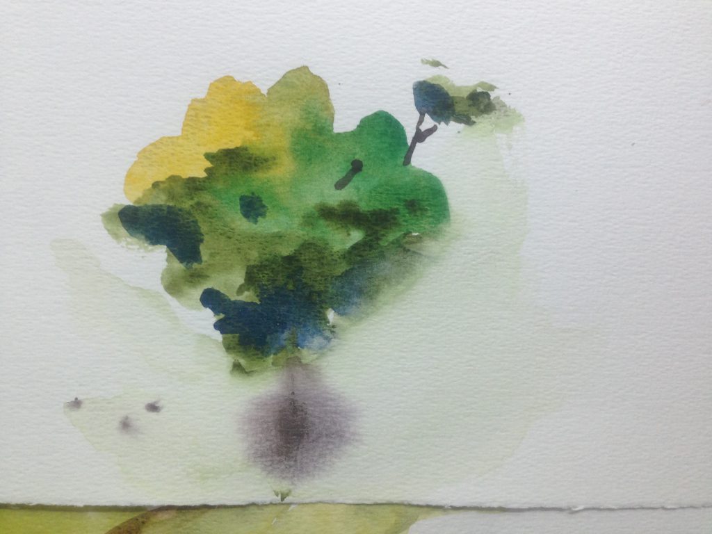
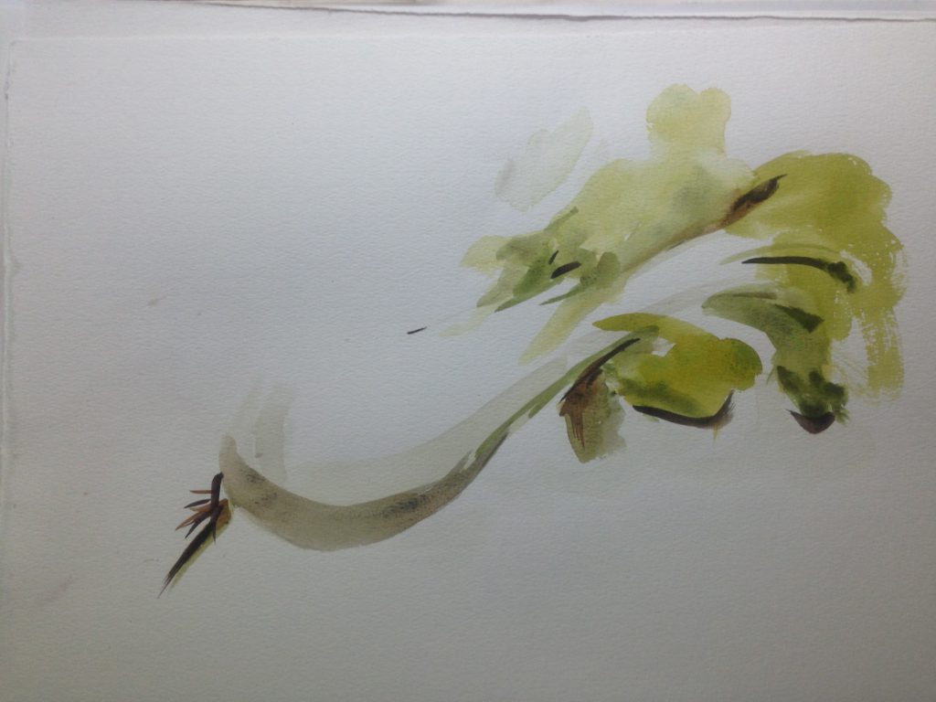
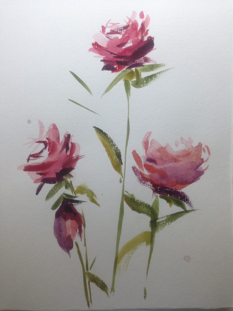
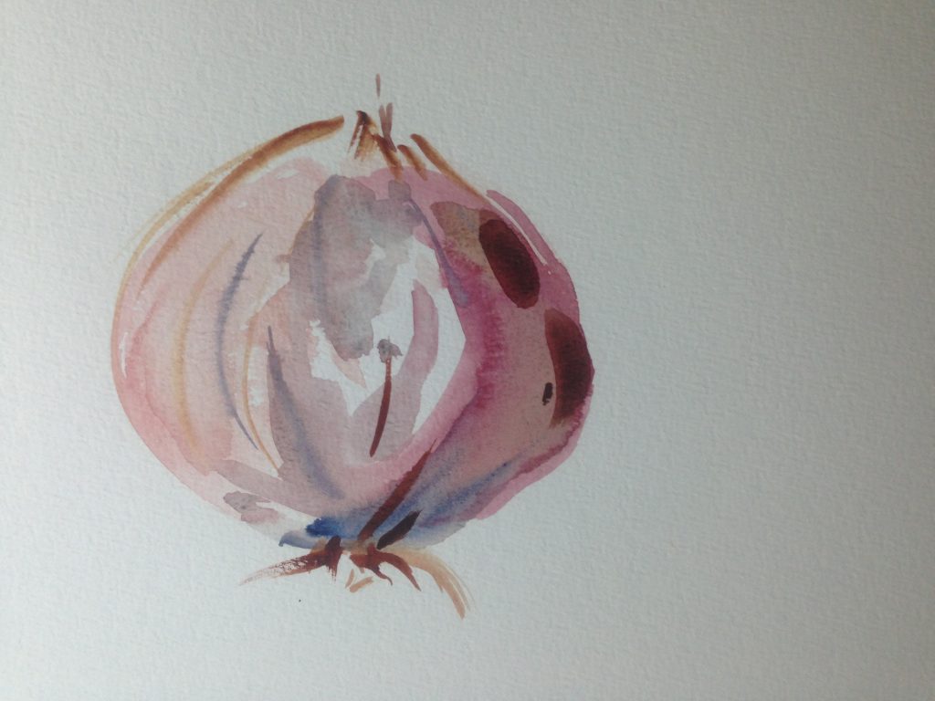
(The above are my tryouts) I loved this exercise the most! It was really fun haha. I didn’t find it easy, it was a lot of looking at work prof painting and trying to copy it. I feel that I still need to improve in knowing how much amount of each colour to mix to get what I want. As I was looking at Prof’s use of colour, I couldn’t really get back the same hues. I still don’t know how to paint, in the sense that where do I not paint? I love how not painting it gives a sort of emptiness yet it feels so full somehow. I feel that I’m learning in how to control the wetness of paint. I learnt that you should paint it wet first, then let it dry a bit before painting again. Also, wet paint glides faster and more easily, whereas drier paint doesn’t smudge as much.
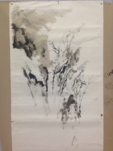
Prof also showed us a bit on how to paint Chinese ink paintings.
Prof also showed us a painting/drawing by using a charcoal stick and dipping its end into Chinese ink to draw.
17 September 2016
Sketchbook Notes
In Class Art Film Screening
Grizzly Man (2005)
Werner Herzog
The day was mainly spent watching the art film. I jotted down some notes. It is quite interesting how he sort of repurposes someone else(Timothy Treadwell)’s footage and life story into almost a new narration by adding his own takes(point of view as narrator, interviews with other people who had met Timothy Treadwell prior to his death). Personally, I’m quite happy that Herzog did not include the audio of the last moments before Timothy and his gf Amie died, as firstly that would have been quite traumatizing and awful to hear and secondly and definitely most importantly, it is out of respect to the two victims.

3 September 2016
Sketchbook Notes
In Class Art Film Screening
Uncle Boonmee Who Can Recall His Past Lives (2010)
Apichatpong Weerasethakul
The day was mainly spent watching the art film. I jotted down some scenes and did rough sketches for it. Overall, I felt that the film was really abstract and hard to understand. I was quite lost at some bits, probably due to cultural differences. Certain scenes were really weird to me, for instance his son appearing as a jungle monkey spirit creature(??) that resembles mystic+beast in Marvel, or the fish spirit having sex with the princess in the lake.


22 August 2016
Sketchbook Notes
The day was mainly spent going through ppt presentation of artists we should learn from, have interesting artworks or styles or concept or presentation.
There is also the consultation notes and feedback at the very end, for my preliminary presentation ideas and photos for Assignment 1.


15 August 2016
Sketchbook Notes
The day was mainly spent going through ppt presentation of artists we should learn from, have interesting artworks or styles or concept or presentation.

