


2. 
3. 
4. 
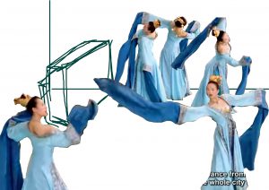
In the final piece, I made the lady on the front left even larger and the 3 ladies at the back even smaller.

I was really excited when we got to use colours for this assignment. I was quite bored from using black and white only for the last 2 assignments already. Nothing against it, but I just felt “adventurous” and wanted explore and try something new/different. So there was a lot of anticipation.
I guess I did hype myself up a bit too much. :/
I soon became to realize that it was not as easy as I first thought it was. It proved create additional layers of complexity. As unlike before, where my problem was figuring out how to use the black and whites as positive and negative space or even as texture to bring across my ideas or mood, now I have to worry about what each colour represents or signifies, and how multiple colours placed in assortment of ways can affect ever so subtly the meaning and mood within each frame. It definitely was challenging, I don’t think I pulled off some or even most of the colour combinations, but I feel that it was interesting to learn and quite an experience to try matching them.
I’m quite grateful we also got to chose our own mediums. I am now a convert of Faber-Castell’s Polychromos colour pencils!! Bye bye lousy Derwent Studio colour pencils. (Although very heart pain to buy the polychromos, they cost me a bomb D: ) I love how silky and easy to apply the colour pencils are. They have strong pigments that made colouring easy and also the image vibrant and bright. I felt that the blending was a lot easier than my earlier set of Derwent pencils. Especially when I used the white colour pencil to blend with other colours, they mix very well, which greatly surprised me. Overall, it was fun to play around with colour pencils as a medium, reminded me of when I was a child, when colour pencils are your only colouring art materials.
I still got lots more to learn in terms of digital mediums. I wanted to do something vector-ish too. But I completely do not know how, so I felt that it will take me too much time to learn it all hence I decided to not try this(and learn during the holidays instead). As mentioned in the first OSS post for EGO, I decided to go with the methods used in assignment 2, as a form of continued exploration. I think as I progressed through assignment 2, I better understood how to use found images from the internet to represent me(for instance the metaphors of animals). I felt that it was rather apt to continue learning and exploring this sector.
All in all, there are definitely regrets and of course rewards. I’m super happy that I’ve learnt so much through the 3 projects, and more about the different components of 2D. I’ll strive to be better at it. ((:
For this equation, I decided to deal with new media, by using found images on the internet and collaging them together. It is something like the third row equation.
JUNGLE-HAT ME
I used a army-green colour block background to represent the land-bound-ness. I feel that army green is a great colour as everyone easily associates it to NS and how there are lots of outfield exercises(which are mostly on land). I made it in a kind of instagram manner, whereby it is taken from a top down point of view of the overlay of the items one would bring on a hiking trip – you have the jungle-hat, insect repellent, boots and binoculars. Very systematic and symmetrical, creating almost an imaginary square inside the square.
+
FISH TANK
This frame is meant to represent the large water body that incites my phobia of water. I had ideas of river, swimming pool etc. However, I found them too plain and uncreative. Also, I feel that by using a fish tank, it is an indirect way of talking about my phobia.
In the end, I chose to make the design very simple by having a block coloured blue background. I added a collage of fishes, making the composition almost symmetrical for aesthetic purposes since fishes don’t swim like that. In a way, I was trying to balance this frame’s design with the first’s.
=
ANT TRAPPED IN A CIRCLE OF WATER
I had this original ideas of my fear and phobia of water and portraying it by literally drowning. Which is super direct and I didn’t like it at all. I next thought up of the idea of things dissolving in water such as vitamin C tablets or coffee powder. It is quite interesting in my opinion but hard to pull off. I did like how the idea tied in to how I did not like water, and its presence often knocks me off.
I wanted to portray this idea of hopelessness. So i thought and thought and thought. Then it dawned on me. We also symbolically view ants as very capable. They are smart and strong in that they are able to carry weights far heavier than themselves. So for an ant to be trapped in a circle of water and it can’t swim, the once nothing-can-stop-it ant is now hopelessly trapped and fearful. Which draws parallels to how I feel when faced with large amounts of water.
I googled for a picture of circular water, then I changed the colours on photoshop such that it is now blue. I’m aware that there’s no blue water in real life, but I wanted to portray the sadness when faced with this adversity.
SKINNY ME + GYM = LOST IN THE FOREST OF PREDATORS
For this equation, the method I’ve decided to use is digital. Also the style is the same as one I learned in assignment 2, whereby I use the different symbolic images metaphorically to piece together a story.
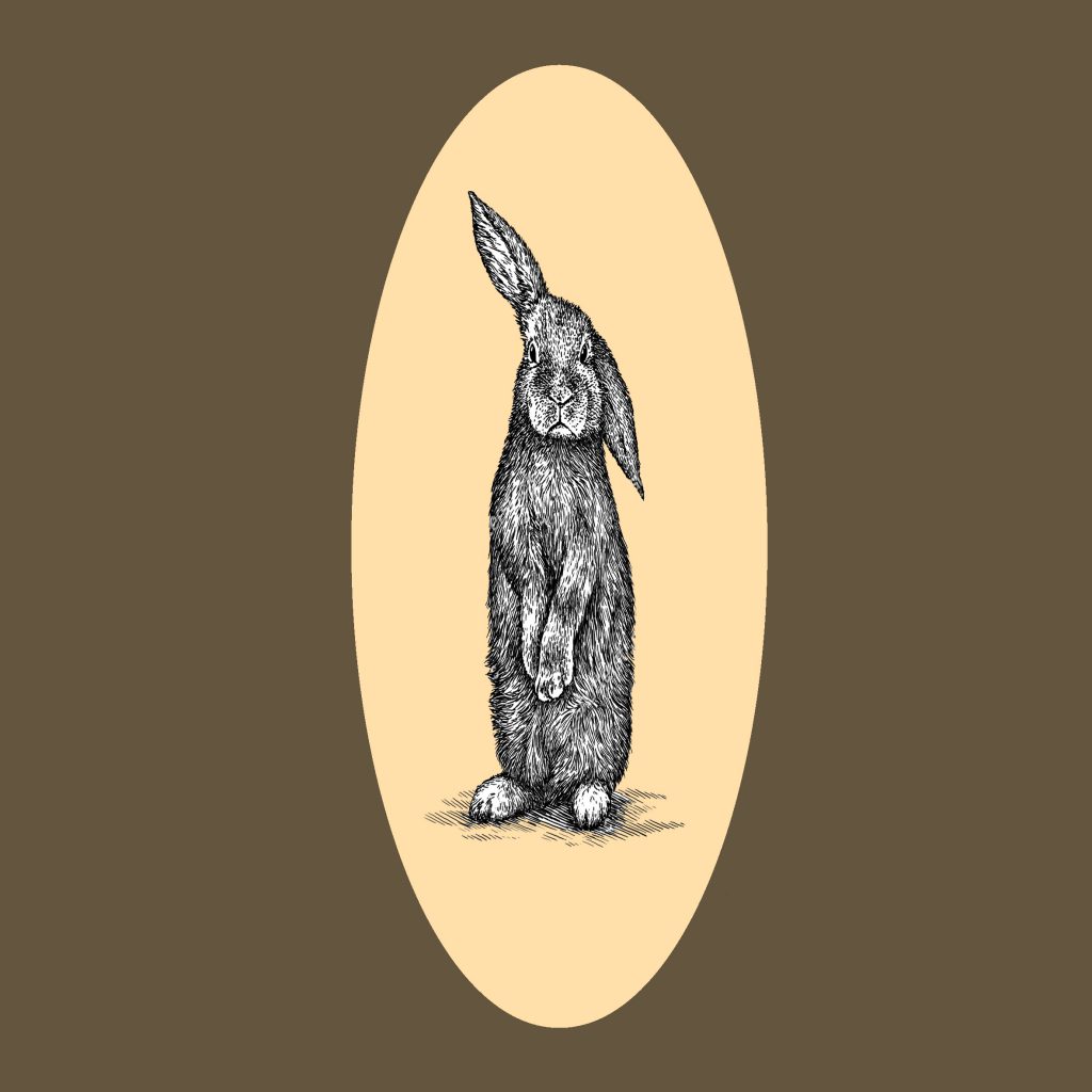
SKINNY ME
At first, I intended to depict myself as a stickman. In a way to represent my arms which are super skinny(unfortunately) and they look like chopsticks. However, during consultation, Prof mimi said that it would be better to make sure that there is a link throughout the equation hence I decided to swap out the stickman for a bunny to align it with the last frame.
A bunny represents me, due to my cheeks being quite puffy and the slight buck-teeth that I have. I’m generally quite quiet, that’s why my friends used that term on me and it stuck.
To represent this, I found a photo of an engraved rabbit online. I then edited it to make it skinnier than it’s original cute chubby picture. To emphasize on it being skinny, I drew an oval shape behind it. This oval is long and lean, to further emphasize the shape of the skinny rabbit.
+
GYM
For this, I found a photo online of a gym. When I think of a gym, I feel that the most characteristic thing is the dumbbells. Hence I googled for those kind of photos. I chose a photo I like, and changed the colour. I chose the colour red for this, as I feel that they gym is a very gusty place. It’s full of high adrenaline, strength and determination, which I feel that shade of red personifies very well.
=
LOST IN THE FOREST OF PREDATORS
Predators… This has 2 meanings in a way.
Due to the story of me going into my JC’s gym, everyone is allowed to access it, there’s no separate area for females (unlike the private gyms such as Amore for females only or that there is a segregation between genders).
Learning from assignment 2, I liked the idea of using animals to personify and collaging them together. Hence I decided to use this method. I chose the predator a giant bear standing up in an uproar angry pose to show it’s power and ferocity.
For the background colour, I used a bright red, to tie in with the second frame of the gym. Under the rabbit, there’s an oval that acts like a simplified vector shadow. For this, I used a muted shade of blue, to represent the fear and sadness felt by the bunny. This contrasts greatly.
Similar to the first row equation, I’m going to use traditional colour pencils for this and it’s also in the same illustrative style.
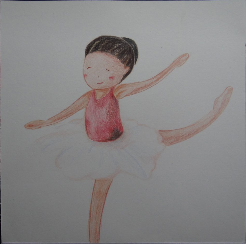
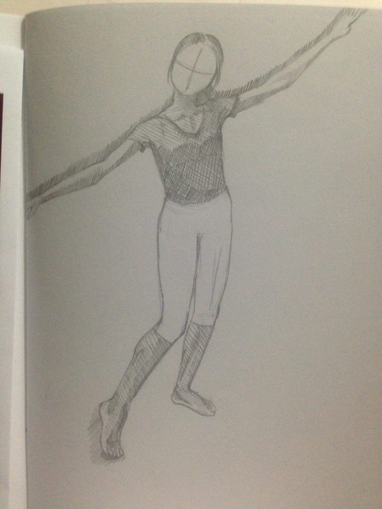
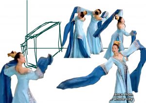
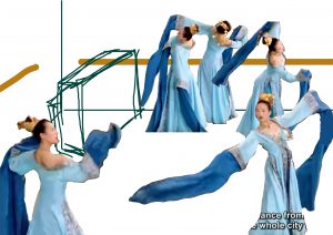
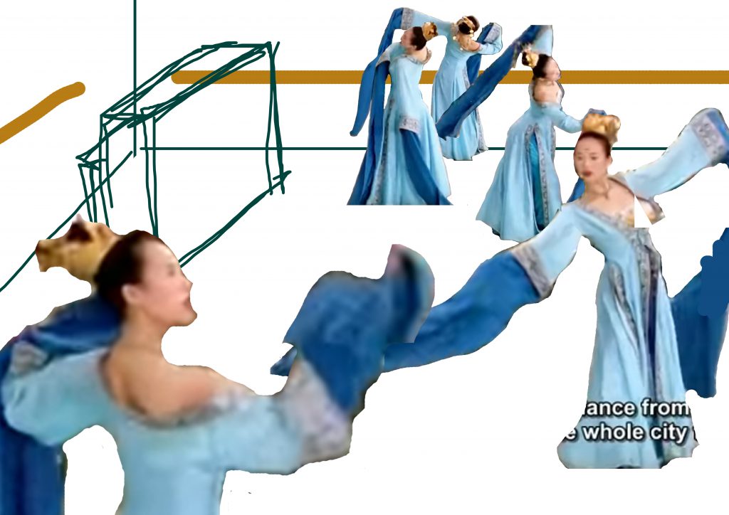
DANCER ME
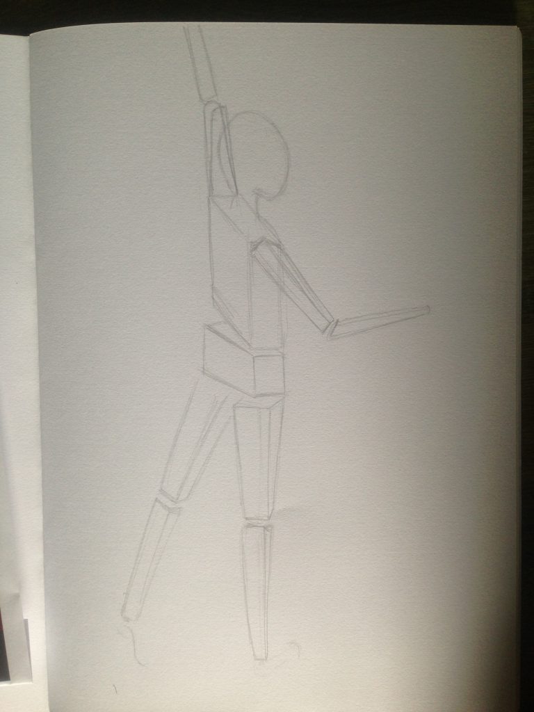
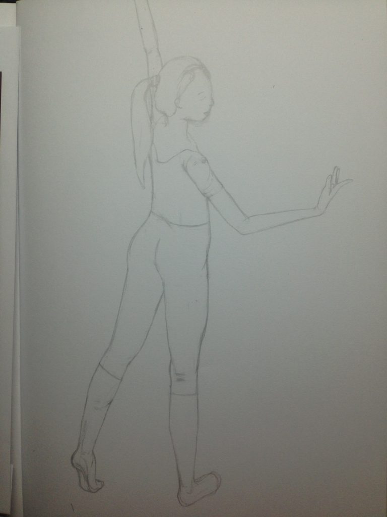
I’m a Chinese Dancer, but I felt that ballet elements would be more easily associated with than the former, so I decided to incorporate ballet elements to represent that I’m a dancer. I wasn’t exactly sure how I should portray this. So I did a few sketches for this.


I thought of the iconic tutu skirt of all ballerinas, that all young girls aspire to wear. Seeing how it’s circular in shape when viewed from top down, it reminds me of the way Morgan Huff uses the circle to encompass the subject matter’s head.

For this, I had the iconic Ballet Spanish dance, where ballerinas would wear red and hold this little fan as they danced. I decided to cover part of the ballerina’s face to signify that she’s a bit shy behind all these free dancing exterior.
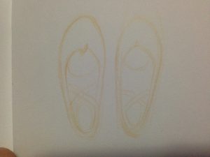
Simple beginner ballet shoes, something very iconic too. I rejected this as I feel that it does not fit the quite literal style of this equation.

Full ballerina in a static pose. I like how you can see almost the full body, gives one a better idea of a dancer, especially since we associate them with poses or movements. However, I didn’t quite like how static this one felt.
In the end, I chose to go with the design you see in the frame as it is more fluid and there is more movement. Which I feel encompasses the whole idea of being a dancer, being on the move, being free to express yourself.
–
(I realized I forgot to swipe off the hair strand when taking this photo)
DANCE STUDIO
I won’t dwell much into this, as I mentioned it in the preliminary ideas OSS post. I chose the setting to be a dance studio as I feel that it encompasses everything a dancer needs to feel secure and safe to be herself and to showcase her talents. It is a physical space that allows that. I feel that it also includes the idea of music, since music is the heart of the dance, a vehicle even. Hence I included a piano in this grand dancing studio that is big, wide and clean.
=
FALLEN PUPPET IN THE RAIN
For this, I wanted to show that how crestfallen I am when I can’t be myself, dancing freely and enjoying my hobby. It feels as if all hope is lost, like there’s nothing to live for in a sense, hence a flopped, broken and abandoned puppet.
After completing the entire equation, I realized I didn’t use much colour in the entire equation, which I regret now. The overall colours are mainly whites and some pink.