Minimalism Exhibition Reflection

There are so many interesting works that I was drawn to, it’s so hard to pick. I finally decided on the work Phase Mother Earth (1968) by Nobuo Sekine.

Sekine is born in Saitama, Japan in 1942. He was trained in painting in Tama Art University in Tokyo between 1962 and 1968, receiving a BFA in Oil Painting. It was here that he was taught by Yoshishige Saito and Jiro Takamatsu. Both were very influential and important artist making art in the 1960s and 70s. Sekine was very influenced by the western movements that influenced his teachers – Takamatsu’s work dealing with Dada, Surrealism and Minimalism and Saito’s European and Russian Constructivism art.

Sekine was part of this collective and movement in Japan called Mono-ha, which translates to “School of Things”. They were interested in exploring the relationships between natural and industrial materials such as steel plates, glass, cotton, wood, rope, water in unaltered, ephemeral states. They would focus on the interdependency of these materials with the surrounding space and on the elements themselves.

Mono-ha was very much shaped by and responded to the socio-political context of the 1960s. Many of the artists in the movements were young graduates starting their careers when the violent student protests of 1968-69 happened. The leftist student movements were protesting against social issues such as the harsh academic conditions nationwide and the unwelcomed American military presence and possibility of a second extension of the US-Japan Security Treaty (which would force Japan into providing logistical support for the US war in Vietnam). Mono-ha artists have denied involvement in the student activist moments but there is no denying that this volatile environment gave the artists reason and leeway to experiment and represent their unease, feelings of displacement and disillusionment of post war sensibilities.

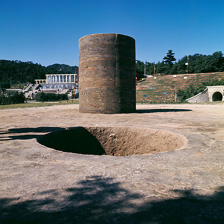
Phase – Mother Earth is often considered to be the initial work of the Mono-ha movement, as well as a turning point in Sekine’s career. The work in Suma Rikyu Park in Kobe consisted of a cylindrical hole in the ground measuring 2.7 meters deep and 2.2 meters in diameter. The displaced earth is then compacted into a cylinder of the exact same dimensions beside the hole.

Personally, I don’t believe that Mono-ha set out to be a Minimalist movement of the East. It did not purposely incorporate elements and defining features of Minimalism. Rather, it’s the ideals of Mona-ha was best represented and materialised in ways that could be seen as features of Minimalism. In Phase – Mother Earth’s case, the work has very clean lines creating geometric shapes. A simple cylindrical pile of earth and a cylindrical hole in the ground. No fancy embellishments or post processes. It is literally in its most raw form. The idea governing the work is serene and clear – a visual recreation of mathematical topology whilst engaging with the concept of “phase”. It deals with the connectedness – between humans and the space, as well as abstract space – how properties of space are persevered under continuous deformations (think voids).

Despite not seeing the actual work in real life in front of me, the monumental size of the work physically and its giant ideal/meaning (mentally) behind it does not wane. Somehow, I was able to feel the immense presence of both the thought behind the work and its physicality through a photograph on the wall. Sometimes, certain artworks are just so powerful that they transcend boundaries.

It is very interesting to note that Sekine names his artworks Phases of [something]. For instance, Phase of Nothingness (1969/70) is a sculpture presented at the Venice Biennale. It consists of a rock placed atop of stainless steel cuboid column. The cuboid is polished till it becomes mirror-like, reflecting its surroundings and almost seems to disappear from view. This creates the illusion that the heavy stone is floating on air, making it look cloud-like and effortless, which sorely contradicts a stone’s association as being very heavy. The play of materiality, creation of voids (“emptiness” under the rock) and the way we perceive things and spaces are explored here. The obsession in the commanding values and interests in the Mono-ha movement are clearly seen.

Perhaps for many of these artists (exhibited in this show), Minimalism is not a constant thing on their minds, or even crossed their minds. It just so happens that their work is best represented and executed in this serenity and simplicity that is often evoked in Minimalism works in the West, therefore the comparisons and associations to Western Minimalism.

Also, after walking through this exhibition, it made me question myself, how much is too much? How little is too little? What’s the fine line between effectively communicating ideas? I feel that these are very important things to think about as an artist or a designer. It reminds of the Thoughtful Interactive Design reading reflection we just did and how (from a subchapter) how the final design may be important, but the process and the designers’ (Mono-ha artists) approach to understanding the different problems (in the socio-political scene) (and even situations whereby solutions lead to new and more problems) and navigating through the ever-changing landscape is equally, if not more important.


An extra thing:

I found this article written by Alfonse who feels that the Minimalism exhibition is lacklustre, an amalgamation of works forced into the confines of what minimalism is. (https://hyperallergic.com/483840/a-show-on-minimalism-lacks-its-self-assured-presence/)
I agree that his view of “the acute absence of Minimalist works from/in Southeast Asia, and a lack of suitable explorations of why such a monumental movement failed to take root in the region”. I feel this is true since I didn’t quite learn or understand why the minimalism movement didn’t take root in this region when I walked through the exhibition. I saw how the movement took form in other places in other kinds of manifestations than I typically associate as defining points of minimalism. Yet nowhere did I feel its lack of presence in Southeast Asia was addressed through the exhibit. Nonetheless, I understand the restrictions the curators faced/went through to procure works and subsequently relabelling them as falling under the category of Minimalism. The curator is free to curate based on his/her definitions and set parameters of minimalism – which in this case differs from Alfonse.

Thoughtful Interaction Design Reflection

Thoughtful Interaction Design by Jonas Löwgren and Erik Stolterman
Chapter 1

The article talks about the design process and how we as designers, should be aware that it is a constant ongoing process that is affected by the forever-changing and growing new understandings of the problem (situation). The article talks about design having different approaches in solving these “problems”. Firstly, design is an ethical activity that is strongly influenced by values and ideals, be it of the designer or the target audience. An example that I can think of is the creation of Singapore Airline’s batik patterned sarong kebaya stewardess uniform being strongly shaped by Singapore’s conservative values. This is manifested in the long skirts and ¾ blouse sleeves. Overall, the whole Singapore Girl is branded as and engendering “Asian values and hospitality”.

Secondly, the article describes design as being an aesthetic activity whose artefacts influence our lives by their form and the way we experience them in use. This reminds me of Engineering Psychology which is a field of psychology that concentrates on the relationship between humans and the products we use every day. One other aspect that engineering psychology covers that is not apparent in the article’s description and discussion of aesthetics, is the emotional response that an object can garner in the user. Humans are very emotional and feeling-oriented beings. We are heavily affected by the way things make us feel and hence we make decisions or habits around these objects. The design process should be keenly aware of this as well.

Thirdly, design is said to be a political and ideological activity. I was very confused by this statement for a while. I started to think of real-world examples to comprehend what the statement means. I managed to come up with two. China’s Social Credit System 社会信用体系 is a mass surveillance system using big data analysis technology which is inline with its relatively authoritarian and anti-liberty stance. Basically, how it works is that if you do good, your actions will be captured and you gain more points. If you do bad or undesirable actions (deemed so by the state), you get points deducted. If your total points are below a certain number, you are blacklisted. This means you would be refused when you try to buy plane tickets, among other things. Another instance of politically and ideologically driven design would be Singapore government websites. They are always in English. You would be lucky to find one that has immediate Chinese translations and even luckier if there are Malay or Tamil translations (this disregards the user’s ability to turn on Google translate). This is deliberately done so to promote and align to Singapore government’s stance of English as a universal and unifying language in Singapore.

Lastly, the article emphasizes that design can incorporate any of the above qualities AND it includes responsibility. As designers, we need to take ownership and responsibility of the designs we come up with. As Uncle Ben in Spiderman puts it, “with great power comes great responsibility”. Taking ownership of the work ensures that we are accountable, and it pushes us to be better designers (in terms of produced end products and humans).


At the end of the day, the subchapter seems to hint that the final design may be important, however, the process and the designers’ approach to understanding the different problems (and even situations whereby solutions lead to new and more problems) and navigating through the ever-changing landscape is equally, if not more important. There is no clear right or wrong way either.


In the next subchapter, it asserts that design forces us to challenge the present and makes us think about the basic conditions of society. I find this very true, as good design should be thoughtful towards the needs of the society. The article points out that design is driven by a will for change. Yet, “almost any attempt to make a change will face some kind of resistance. This means that the person pushing for change must be brave and prepared to take on the resistance in a suitable way.” I feel that this is a very important point. Often times, we get too complacent or comfortable with the status quo. This includes myself. I think a very good example to illustrate a desire to improve and enhance a design for the different needs of society would be the humble scissors, or specifically Fiskars’ scissors. They produce scissors for lefties, scissors for fabric cutting such that it doesn’t cause the cloth to tent when doing so, differently lopped scissors for the elderly and young people, etc. This is done through understanding the needs and abilities of the people they are designing for. (You can read more here: https://www.fastcompany.com/3040816/48-years-later-this-is-how-fiskars-keeps-improving-on-its-classic-orang)


In response to the article, I find that Laurent Mareschal’s artworks reflects the concepts in the reading. His work can be seen as an ideological work. He incorporates the Islamic decorative patterns such as geometry and flowery patterns in his tile designs. His work is site specific, taking in the cultures of the area and representing it through his choices of spices in creating the tile patterns. Mareschal does not protect his works with a border. People often think that it is a real floor tile and trample over it. Sometimes the people realize that it’s actually spices and that they have just messed up the work, while others don’t. Hence his work is ephemeral, fading away with time. His art practice has grown in terms of him as an artist better understanding the human interaction with his work. The audience’s lack of awareness of their surroundings and their nonchalant actions have caused a “disruption” in their environment. It can also be seen as a social commentary (design as a political activity) about the impermanence of the Palestinian lives in Israel. By exhibiting it in a public space, he wants to draw parallels to the hardships that the Palestinians face. I really love his installation work. I find it to be quite an experiential experience where you can smell the spices and see the beautiful tile designs. I find it interesting how the design process in this work seems to be ever changing. Every time someone walks onto and disrupts the spice design, it becomes a new “problem”.


I would like to end off the reflection with a quote from the article, “To be a designer does not mean that you have to get rid of all obstacles. The real task for the designer is to develop something of lasting quality in the most suitable and creative way given the existing conditions.”

Pistoletto Reflection

Watching the documentary Brilliant Ideas: Michelangelo Pistoletto in the dome in the ADM library was a very helpful introduction to the life of Pistoletto, his influences and his progression of works and ideology. When the video was talking about his Mirror works and how they had evolved over time, it reminded me of how similar this moment was for many other artists – it was due to a coincidental experience that caused an unintentional effect that caught the attention of the artist and sparked off a new interest and obsession in their artmaking. It was also in this video where the movement Arte Povera was introduced to me. It was interesting how he shifted from his background in fine art, to produce modern art using “poor” materials such as rags he accumulated from cleaning his mirror paintings. The thing that struck me the most during this screening was some film shots of Pistoletto walking in the shape of Third Paradise, so much so that he seemed to have created a trench of about 30cm or so into the ground (of course I’m sure it was dug out first rather than walked to wear). Somehow, it evoked this feeling in me about his connection back to earth and nature we walk upon. It is quite poetic if you think of how in his Third Paradise ideal, the first paradise is nature and the second paradise is about humans (and how far we have advanced technology-wise). It is as if reconnecting physically these two entities and literally creating a Third Paradise.

“The artificial world has provided mankind with comforts, but also led to the deterioration of our natural environment,” said Mr Pistoletto. “The central circle in the symbol, the Third Paradise, represents a world in which there is an ideal balance between human activities and nature, something which is indispensable in order to ensure the survival of mankind.”

Pistoletto has exhibited Third Paradise in many other places prior to ADM and each time he has done so, he constructed it out of many materials according to the space and place it is exhibited in. When I first saw it on the ADM rooftop, I was quite puzzled by the new intrusion. It felt like a foreign entity invading a place I know so well and it honestly felt weird and uneasy. Looking at it, I couldn’t identify the plant, it’s not the usual ixora, spider lily or flame of the forest shrubbery we see so often in Singapore. I’ve never seen this plant before. Which felt contradictory to what Pistoletto has been doing – which is to take inspiration from the place/environment to construct the Third Paradise symbol. Upon research, I found out that they were actually a Red Sessile Joyweed plant, which is a local edible shrub with medicinal purposes. I see the connection to the place (Singapore) now, however, why this particular plant? It is not common sighting in Singapore as they are a horticulture only plant. Or was Pistoletto’s reason for choosing this plant having something to do with its herbal medicinal properties?

I attended the panel talk SCIENCE MEETS ART: HOW TO SHAPE THE FUTURE OF HUMANITY: Panel discussion between Maestro Michelangelo Pistoletto and Nobel Laureate Ben Feringa (moderated by Prof. Em. Helga Nowotny). Personally, I felt that the panel talk was quite disjointed. The scientist and an artist somehow didn’t quite see eye to eye (it’s okay to disagree but the discussion felt short) and the panel talk felt forced, like two polar ideologies fighting to coincide and be heard (that is of course an observation on a surface level). I could see a few overlaps in what both men staunchly believed in, and how each man’s conviction was embedded somewhere in the other. Yet, it could be attributed to time constraints, that the discussion wasn’t drawn out fully, where each speaker wasn’t given enough time to articulate their deep philosophies (for such topics are never really an hour or so discussions) and hence draw more nuanced parallels with each other. I could also tell that the mediator, Prof Nowotny was struggling to connect deep ideas from what was spoken by Pistoletto and the Feringa and draw them to comments made by the other. It is noticeable that she relied on her set of pre-prepared questions rather than engaging in the current discussion. Nonetheless, I learnt quite a few things from the panel talk. If given the opportunity again, would like to have asked if it was a consideration that the third paradise sign was symmetrical, since symmetry often represents balance. Also, if his vision he had so many years ago, about this paradise, about art championing social change has been achieved in his opinion. If yes, then is his Third Paradise symbol still valid today?


Other food for thought:
In class, Prof Kristy posted this question about how effective the icon has been. I felt that the class unanimously decided that as of now, the Third Paradise icon is not a universal icon unlike the peace sign, as many of us have never heard or seen it before Pistoletto came to ADM. Next, there was the question about what if this Third Paradise icon became more popular/universal. From there, what if the imagery of the Third Paradise becomes misused, would it matter since Pistoletto wanted the Third Paradise to be a universally recognised icon (and hence along with it, to propagate his ideals of society in the Third Paradise)? Clarita talked about it not mattering if the icon was misused since it would help increase awareness of the icon and consequently the idea/concept of it. Which I feel is true. However, as I subsequently brought up, many a times, when a symbol is misused, there might not always be a happy ending to it. If the symbol being misused is now associated with a totally opposite ideal, especially if its negative, and this misuse gains traction among people thus leading to people believing in this warped concept/meaning. It is sad and can potentially be dangerous. A parallel to this that I can think of is the misuse of the Swastika icon. The swastika is an ancient symbol that represented prosperity and had positive associations. It was widely embraced from the earliest civilisations (Indus Valley civilisation), a religious icon in Asia and even the West! It adorned American children’s school lunchboxes in 1920s, Coca-Cola bottle caps and Carlsberg bottle labels. An icon that was so loved around the world suddenly became one of the most hated symbols because of the Nazi misuse of it. Since WWII, many people now associate the swastika symbol with negative connotations rather than the positive ones it once did. The misuse of the symbol would now matter a lot.