We had to present our 4 quote composition designs to the class.
Gattaca
“You want to know how I did it? This is how I did it, Anton: I never saved anything for the swim back.”
Presented:
The Help
“Every morning, until you dead in the ground, you gone have to make this decision. You gone have to ask yourself, “Am I gone believe what them fools say about me today?””
Presented:
Critique:
– The sunburst is quite distracting. Maybe you can lighten it.
– The girl is very small and the owl head can barely be seen – the owl head blends into the background due to both being very dark. Make the owl-girl bigger so that it can be seen.
– Posture of girl comes off as arrogant.
– Liked the use of the tarrot card motif.
Further Edits:
Looking at the comment about the little girl having an arrogant posture instead of a subservient or neutral posture, I went to search the internet to replace it. I scrolled and scrolled till I finally found an image which I think would suit. It is of a girl crying(below). I wanted to use the picture, however, the size is small and resolution is terrible. It became very blurry after I tried to expand the size. I had to take into account that it looks very pixelated on my computer screen already.

With regards to the comment of the owl-girl being too small, I enlarged her figure so that she has more presence in the composition now.

Next, I tried to improve on 2 points. Even though the owl-girl is bigger and more visible now(so she does not blend so much into the background), I wanted to try to further make her more visible. Combining with the comment that the sunburst ray like effect seemed quite distracting and out-of-the-blue, I wanted to make the idea of why I chose to use this effect more obvious. Firstly, I originally intended it to correspond to the phrase “every morning” in the quote, to represent the sun. Anyway, I tried to make a circular white space around the owl-girl. Firstly, it makes the owl-girl more visible as she is in a white background now so she does not blend into the surroundings, and secondly, to make the idea of morning-sun more obvious by literally having a circular sun with light rays shining out.

Not quite sure how I felt about the ray lines continuing to extend to the center(despite faintly), hence I tried to clean it up some more in the next one.

I had second thoughts about the size of the circle, I then made the circle diameter bigger to surround the owl-girl fully ever so slightly.

Likewise, I’m still note sure about the faint lines leading to the center point as it feels slightly distracting. So I tried erasing it off.

It feels too abrupt though, in that the rays of light suddenly disappear into this massive white circle. I tried to decrease that “visual shock” by leaving an outer rim of faded lines before fully erasing it away.
Final design: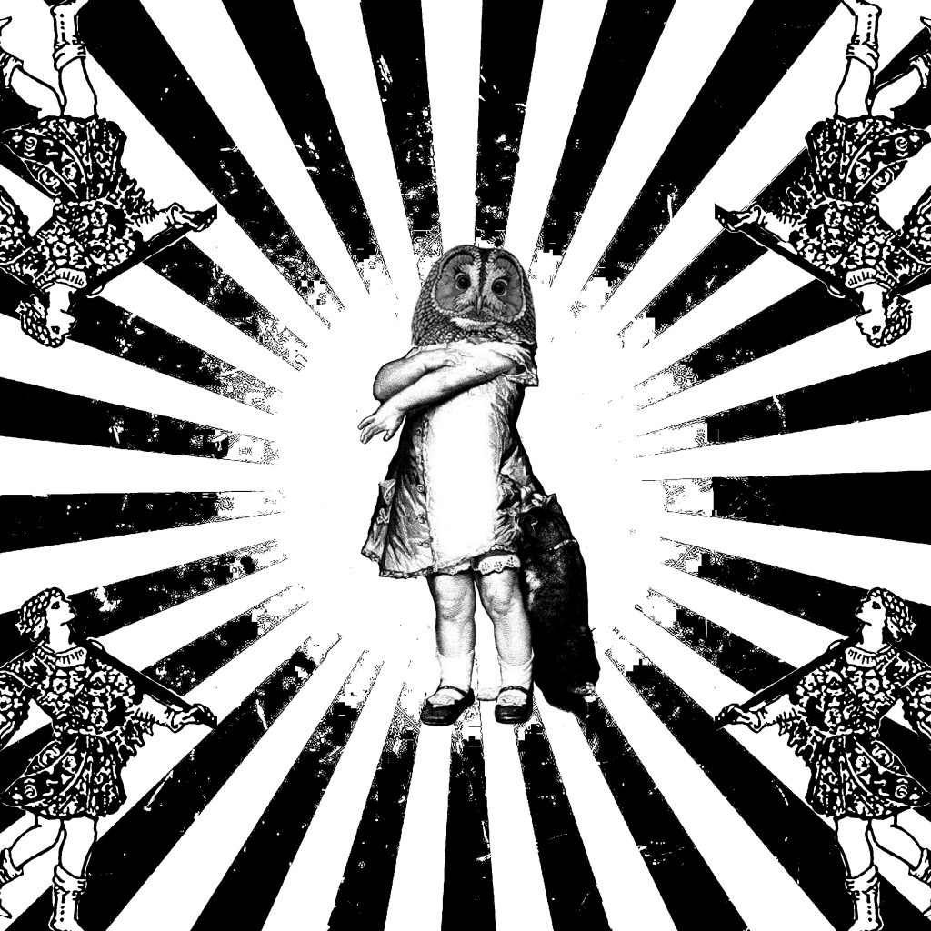
Forrest Gump
“My mama always said, ‘Life was like a box of chocolates. You never know what you’re gonna get.’”
Presented: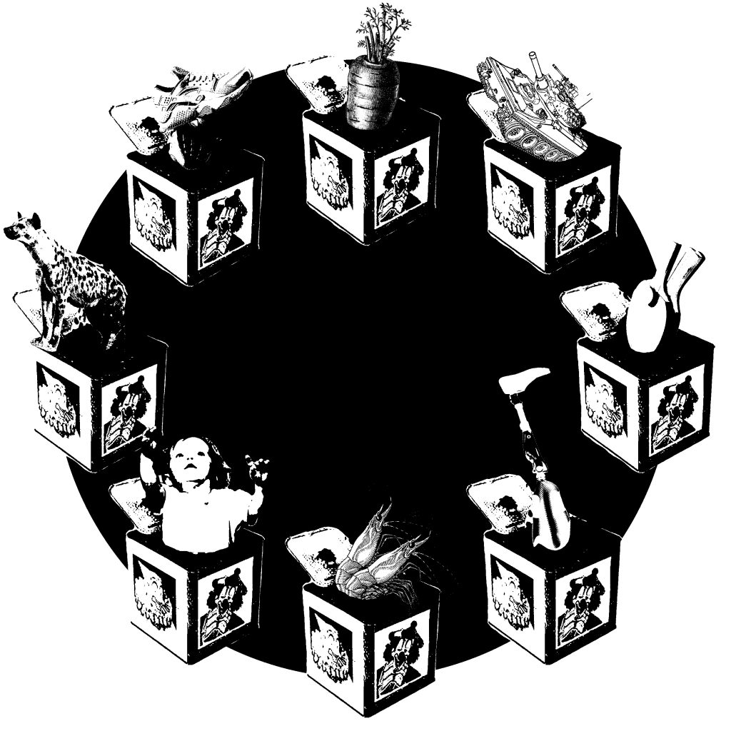
Critique:
– The chocolate idea can be more apparent. There is no show of what the choc is or where. Although (everyone) not sure how to either.
Further Edits:
I went to google on images of chocolates. These are some results of what I got.


Looking at these images, I’m still not quite sure how to best doing it without it being too literal. Some ideas I can think of is to use the the texture of the gold foil wrapper of Ferraro Rocher chocolates in the black circle.

However, I don’t really like it as it is far too much texture present – especially with the 8 boxes and their motifs, it complicates the composition too much in my opinion. I still prefer my composition I presented for class(a simple black circle to tie the composition together). I think it is so hard to incorporate chocolates as they literally come in every shape, pattern and size. There is not much of a recognizable form except for the block-y kind(last chocolate picture), which is very cliche in my opinion.
Inside Out
“Take her to the moon for me okay?”
Presented: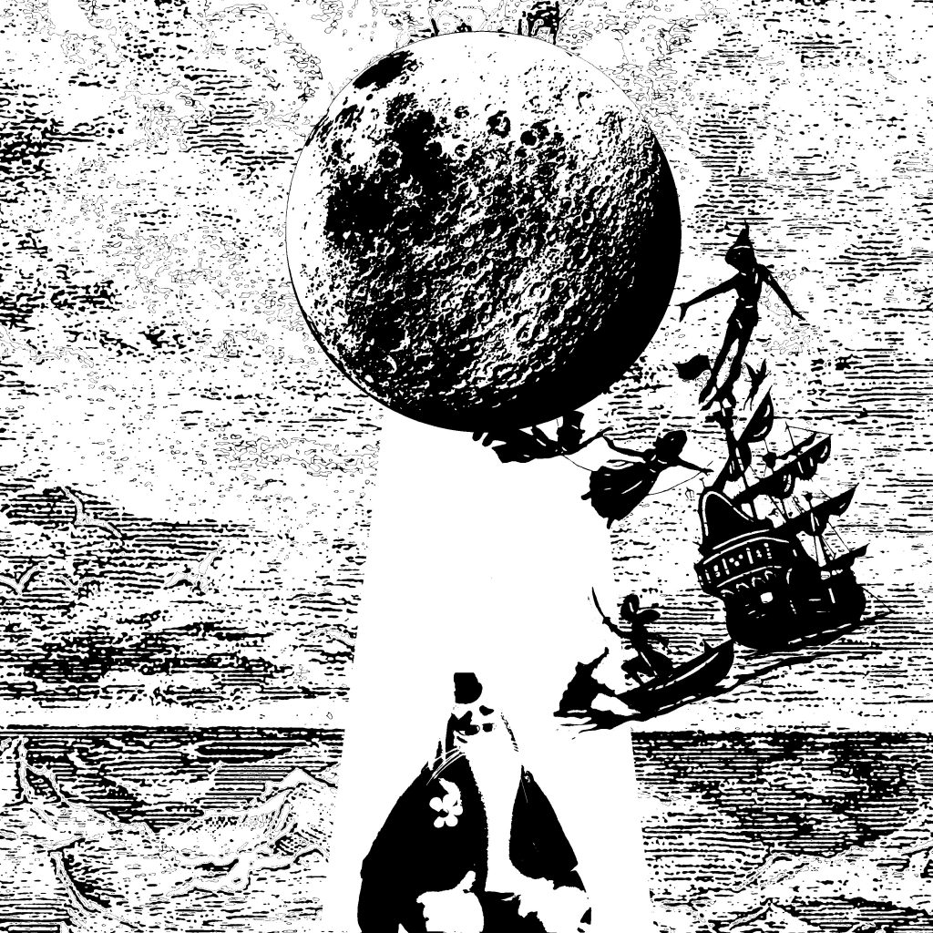
Critique:
– The ray of light highlights the imagery – which is nice.
– Like how Bing Bong is sad yet the overall composition is very happy and fun – the contrast.
– Bing Bong can be more obvious.
– Bing Bong can be bigger and sadder in posture.
Overall critique:
– Like the overall use of symbolism


