Creative Industry Report ~ Jun Lin

Jun Lin is a young multidisciplinary graphic designer based in Los Angeles who brings physicality into her written work. Jun’s integrated forms of visuals and text as part of her creative process is something I found very inspirational.

For Jun, it was not visuals but words that first sparked her interest in graphic design. She began her studies in foreign languages and literature in Taipei which led to countless snippets of loose thoughts and writings which she wasn’t sure what to do with. Following that, she found an interest in photography and editorial design which aided her creative direction to complement her existing words. Progressively, she learned about the power of typography, colour, paper stock and scale combined; how every delicate creative decision informs the way words are understood which reminds me of my personal learning takeaways at adm.

jun-lin-work-graphic-design-itsnicethat-2.jpg

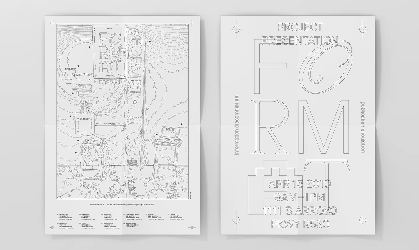
Her projects as described in my presentation, explores topics of speech empowerment and language perception. Through Format, a project of her’s that I admire, Jun imagines what “experimental and conceptual publishing can be in the digital age – as publications come out in unconventional formats to create new experiences” She also set out to create a fictional publisher that could release playful publications. “What are the differences between reading in print and on the web?” is a question that she explored. In response to this question, she designed the scroll, a 400 inch long scroll printed on bond paper that is also available in web format.

Throughout it all, I found her approach very inspiring as someone who might be too focused on the final outcome at times. I admire how she pushes the boundaries of looking at what the future of publishing might hold and work towards her concepts, also that there are no right or wrong answers but rather possible interpretations. These ideas can be taken into thought as I work towards developing my FYP, referring to her methods of combining texts and visuals to create a sense of storytelling.


References:

https://www.itsnicethat.com/articles/jun-lin-format-graphic-design-051020

https://junlin.info/FORMAT


Applied Illustration ~ Process + Final

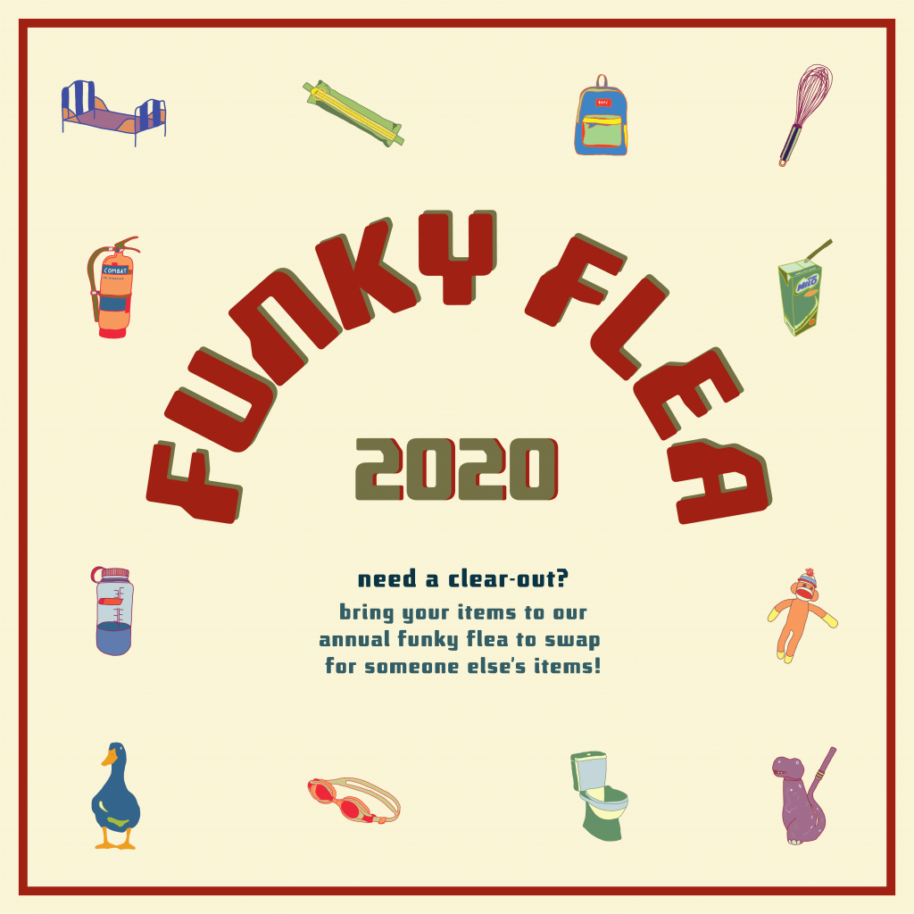
FUNKY FLEA SWAP

The event that I have created for project 3, applied illustration, is a funky flea swap. A flea market for anyone to trade their old gems for someone else’s. Bring a box of old items and propose a trade for something that has caught your eye. As long as the other trader agrees, you can proceed with the swap!

“one man’s trash is another man’s treasure”

I’ve decided that my 4 collaterals would be an event poster, an invitation card (with stickers), a tote bag (for storing your traded goods) and lastly some wrapping paper (for fragile goods).

PROCESS

Artist references + inspirations

  • a collection of illustrations
  • line work and solid colours
  • fun, bright colours
  • graphics that could also be made into stickers

http://graphsho25.blogspot.com/

https://www.behance.net/gallery/42025365/La-Porca-restaurant

https://creativemarket.com/atk_type/4312387-Cosmo?u=slvDev

https://les-surgeles.tumblr.com/post/85520577845/paul-cox/amp

The plan:

To create a series of graphics (maybe 10) that i could rearrange and work with for all 4 collaterals.


First batch of illustrations

I started off the project by creating the series of graphics, but I didn’t really have a direction to start with. Thus, I started drawing random objects that came to mind. After this first draft, I realised I wasn’t completely happy with it as I felt like I didn’t really connected to it personally.

So moving forward, I updated my graphics to personal objects that I had around me from my daily life. (keeping some from the first draft but forgoing others that I didn’t really like).

Second batch of illustrations

After further refining, I settled on the illustrations above. These were illustrated on adobe fresco. Upon finishing the graphics, I moved them into illustrator to begin organising the various compositions.

Poster – first draft

This was my first poster draft. While putting the graphics together, I struggled with the arrangement of the illustrations as they we created as individuals, not as a group. It appeared rather floaty and was not the main focus. The text was also too big and took attention away from the illustrations. Hence, I decided to rearrange everything in attempt to make the graphics the focal point.

FINALS

A3 Poster – final

Poster Mockup

Invitation card – final

Back of invitation card with stickers 

Tote bag design – final

Tote mockup

Tote mockup


Wrapping paper

VAROOM ~ Process + Final Cover

VAROOM RESEARCH

Varoom is a global magazine that features a broad variety of illustrations.  Their editor Olivia Ahmad, describes the intention for each issue as being “to convey a live reflection of what is happening in illustration art at any given moment… presenting new work and giving insight into how its done, but also asking questions about it – why do you make it? what does it mean to people?”

The magazine has been quietly but effectively getting on with a series of strong themed issues.

https://www.grafik.net/category/case-study/shelf-love

https://www.facebook.com/Varoommagazine/photos/a.366181926777187/1673858609342839/?type=3

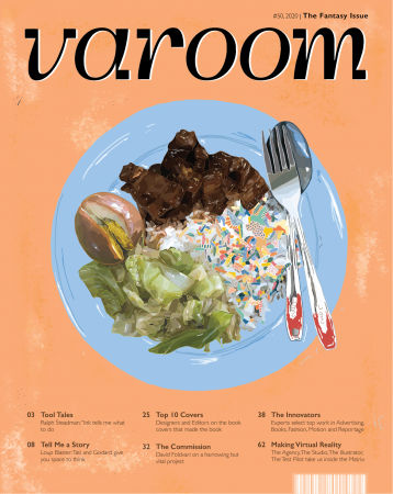
The publication welcomes any style of illustrations which ultimately helps to widen their spectrum of audiences. For my Varoom cover, I was inspired by the story of Horton Hears a Who! ; the idea of a world existing in another world. Hence, I decided on the theme of Fantasy.

PROCESS

The slides below demonstrate a few artist references which inspired me to look into abstract forms and bright unique colours for my fantasy world.

The idea : illustrating an unknown world within an existing world

Location : on a plate of cai fan (vegetable rice)

Visuals : simple composition, realism vs artificial

Audience : appeals to the any local Singaporeans

I decided to go with food illustrations which led me to the visuals of a simple plate of vegetable rice. Something simple that many consume daily hence easily relatable for my audience. It would also capture the scene of a local hawker ; executed with the cheerful colours of the tables, plates and utensils.

Reference image

Starting off with the top view composition, I began illustrating the realistic portions first which included the plate, utensils and ingredients. Lastly, finishing off the fantasy world in the rice area.

Colour trials

Towards the last touch ups, I explored with various background shades to see which was most suited with the main illustration. I ended up going with something in between so that it wouldn’t be too distracting to the graphics but balanced it out instead. Final textures were with a pixel brush to add depth.

FINAL

Inanimate Portraits ~ Process + Final

INTERVIEW

Questions for Dion

  1. What is a significant memory/representation of yourself? Broken inside and out
    1. Breaking the tip of her pinky from getting kicked from dance at 1am outside a supermarket 
    2. Last year she got a turf toe last year on her left big toe and the same thing happened this year at the same dance event
    3. when i broke my pinky and didnt yet know it was broken, i said “it better be broken because if its only a sprain i feel so stupid/like a pussy bc iT HURTS” then I felt mega british convert bc i did everything with my pinky hyperextended illustrating, drinking from my mug, showering
    4. all that bullying made me grow up really fast mentally, bc it was either i turn into a bitch or turn wise lol and at times i really hated being so ‘wise’ because it’s either to hate than to understand and forgive
  2. Describe habits of yourself
    1. Another thing is that I’m the type to do something i like repeatedly for literal months and then get sick of it. like listening to a song is the basic one, then in periods of my life i’ll eat literally everyday a bowl of oatmeal with water, honey, peanut butter, banana, chia seeds, bits of chocolate or granola. everyday.!!
  3. Do you have a favourite childhood toy/chow chow that you still have now and what does it mean to you/memories you have that ties to it
    1. my real one was a tiny pillow but actually i liked the pillow case and its texture but one day the case was gone and i didnt like the pillow anymore
    2. this green one my mom bought 2 of it for the sofa and i just took it as my own
    3. its a moose but for several months of years i saw it upside down, i thought it was a bee with a weird thing 
      1. It smells like home and it’s not meant to smell good, once you bring it to hall/exchange it doesn’t smell like home anymore 

Questions for myself

  1. What is a significant memory/representation of yourself? 
    1. Kerinci trip; it just really made me love travelling and wanting to see more of the world because I was in so much pain climbing the stupid mountain but it was so worth it in the end
    2. I felt so small in this huge world and found peace in escaping cities. The trip made me grow the appreciation and longings to travel and to live for experiences
  2. Describe habits of yourself
    1. ill listen to a song on repeat within a week till im sick of it and once I was obsessed with overnight oats(oat milk specifically) with bananas and i was once obsessed with running at night because sweating it out before bed was enjoyable 
    2. i always brush my teeth in the shower
  3. Insecurities of myself
    1. that i really dislike being in front of the camera

INTERVIEW

I decided that I would take the abstract route for this project. Creating a composition each for Dion and I that take on abstract forms of objects extracted from our interview exchange.

the nature of each of our composition reflects our personality in the sense that I am relatively more reserved in sharing in comparison to dion.

  • my compositions comprises of a few smaller parts that metaphorically symbolises “windows” to my personality
  • whereas dion’s composition is more open and active


Teri

Visuals of my inanimate portrait:

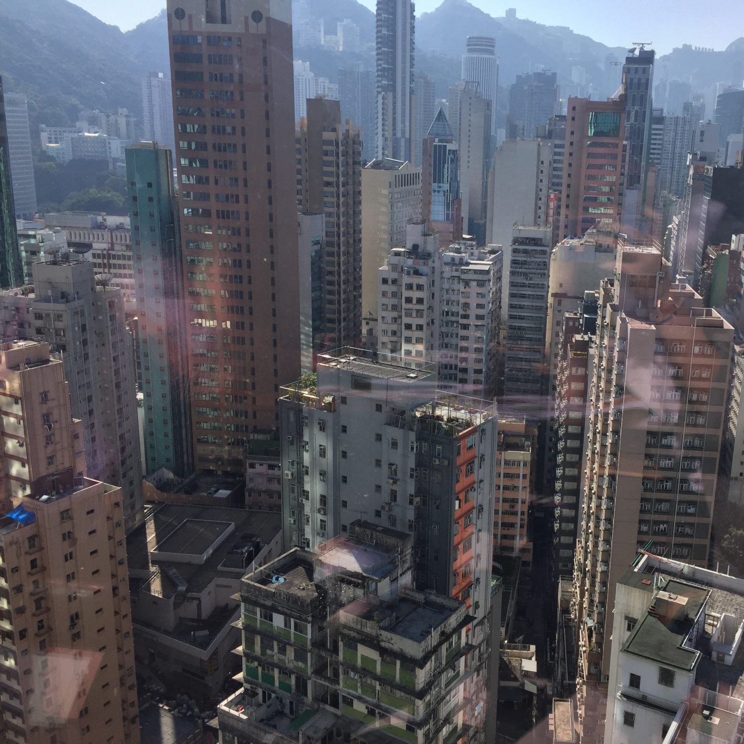
  • vertical blocked shapes – to represent city landscape (having grown up in hong kong, the city landscape is something I miss often)
  • mountain and nature forms in the bottom – my love for travelling and nature
  • hand outlines in the middle – to express that i really dislike being in front of the camera “dont take a photo of me!”

Dion

Visuals of dion’s portrait:

  • a bowl in the bottom – to represent her daily oat bowl
  • pinky forms – to represent her broken finger
  • many circular forms – to represent her struggles she had with her weight and “yo-yo” dieting over the years of growing
  • fluid forms – to represent her passion for freestyle dancing

Manifesto

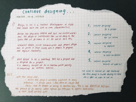
manifesto – written

Physical copy – in folder.

Content of the manifesto:

Design to me is a constant development of styles that marks each era with its own characteristics. Design has physically created and built our current world; from the design of toothbrushes that we use daily to the homes that we live in. To this day, many various forms of design including all that we have learnt this semester, interactive media, visual communication and product design, have proven to serve society with a purpose to progress and improve constantly.

good design to me is something that has a purpose and is designed for its purpose. it is smartly thought out for its function whilst possibly encompassing an aesthetic exterior.

but with that being said, designs are also very subjective to every individual. a design which I may deem as simple and classic could be thought as boring to someone else. but that is the beauty of design. the presence of its variety caters choice and options for everyone to express themselves in their own unique way.

  1. continue designing for a purpose
  2. continue designing for our future
  3. continue designing to improve
  4. continue designing to fulfil our desires
  5. continue designing because we want to

Moving forward, think we need to continue whatever mankind has been doing to further develop this world into a place we enjoy living in.

Creative Response ~ Bauhaus

Inspired by vibrantly coloured hawker tables and seats, the rounded table setting reminds me of Chinese families; and how we always had a preference for round tables especially during family gatherings, for the easy sharing of food.

2013 – WHITEvoid – FLUIDIC Sculpture in Motion

https://www.whitevoid.com/tag/fluidic/

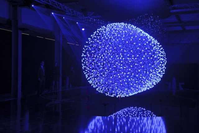
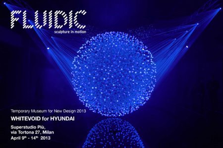
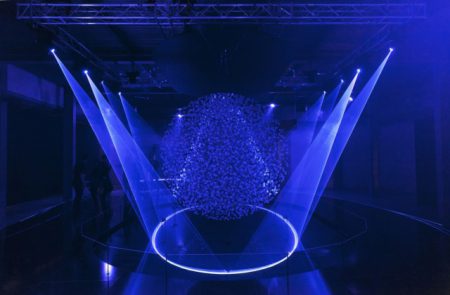
FLUIDIC – Sculpture in Motion is a kinetic laser light sculpture created by Hyundai Motor Co. with WHITEvoid, an interactive design company and kinetic artist Reuben Margolin. This installation exhibited in 2013 won a prestigious Red Dot award for communication design. Comprising of 12,000 translucent spheres attached to almost invisible strings that act collectively as a screen and surrounded by 8 high powered lasers, the sculpture is suspended over a pool of water. This pool of water provides a reflective surface that mirrors the lit up sculpture. Within the world of multimedia concepts, I think that FLUIDIC includes traits of interactivity as well as immersion to certain extents.
http://www.creativeapplications.net/featured/fluidic-sculpture-in-motion-by-whitevoid/

The set up of this exhibition is amongst a darkened space whereby the viewer’s eyes will adapt to the dim lighting over time. Leading up to the core installation, there are also wide curved cascading podiums. (as seen in the image above) Clearly, the detailed considerations going into the exhibition space as a whole plays a very important role in the viewer’s experience as I would consider it an immersive one. Although the application of immersion here doesn’t exactly fit the definition of immersion as according to Ivan Sutherland in The Ultimate Display, “A display connected to a digital computer gives us a chance to gain familiarity with concepts not realizable in the physical world.”, immersion, in this case, refers more to the idea of having your senses immersed in a space that is slightly altered from your everyday space. One where your body will readjust from when you leave the exhibition.

Its performance begins with a recreation of virtual rain with the lasers, followed by an interactive segment whereby the human presence creates three-dimensional visuals. A 3D scanning system that registers body warmth has made its interactivity possible. Anyone involved in interacting with the switches become unwitting ‘puppeteers’ that are working as a collective to change the overall aesthetic exterior of the work. “For the last 20 years, I’ve been making kinetic sculptures that seek to combine the sensuousness of nature with the logic of math.” – Reuben Margolin. This interactivity links back to the concept of cybernetics where there is a presence of a relationship between man and machine; and the idea of action and reaction. Similar to Robert Rauschenberg’s Soundings, where the intensity of light would vary based upon sound pitches, light elements in FLUIDIC would flicker, rearrange and mimic the viewer’s movements. These interactions lead to a series of initiated communication.
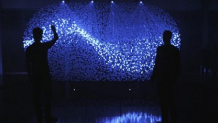
http://www.digitalmeetsculture.net/article/fluidic-sculpture-in-motion/

“They are constantly in motion, reacting and adapting with the people who seek to engage with the installation.”

Technology has allowed for the programming of algorithms to react accordingly through senses other than touch. FLUIDIC’s ability to register body warmth allows for the automatic arrangement of the floating spheres as well as the positioning and projection of laser lights. Generating both bright and dim light points, seamless graphical compositions are formed. Examples of this interactivity are evident around the 1 min 25 sec mark of the video below.

Amongst the various aspects of interactivity, FLUIDIC also supports the idea of behavioural art whereby the presence of people aka participants makes the artwork complete. With the lack of human interaction, the installation would not be able to display itself to its full ability. The idea of interactivity, in this case, is not subjected to a one on one relationship between the work and one other viewer. Instead, it allows for collaboration between anyone who is involved.

FLUIDIC portrays the idea of nature and flow in life through instinctive rhythms and ability to adapt as human motions are reflected in its dynamic arrangements. This idea was based on Hyundai’s identity to embrace harmony with rhythm. It’s 4 principles: fluid, dynamic, motion made easy and driving pleasure. The fluidity presented in this work mimics the organic movements of the human body hence why this installation was probably made to be interactive.

Speaking of all this interactivity, interactive art was first explored in the early 1960s. Nam June Paik’s Magnet Tv was one of the earliest examples of interactive media art. “Paik challenged the notion of the art object as a self-contained entity and established a process of instant feedback, in which the viewer’s actions have a different effect on the form and meaning of the work.” – Whitney Museum of American Art

The phrase “process of instant feedback” really stuck with me because I felt that it is the key achievement in Paik’s production of his work. Without this ability for technology to react instantly, the interactive quality would not have been as engaging and exciting. As one of the pioneer interactive works, Magnet TV “anticipated the participatory nature of much contemporary art.” Increasing technological advancements have undoubtedly led to the evolution of today’s work where cybernetics and behavioural art plays an important part in contemporary art.


Explained: Understanding Hyundai’s Fluidic Sculpture Design Philosophy

http://www.digitalmeetsculture.net/article/fluidic-sculpture-in-motion/

Fluidic – Sculpture in Motion by WHITEvoid

Artist Selection : WHITEvoid

http://www.digitalmeetsculture.net/article/fluidic-sculpture-in-motion/

FLUIDIC – Sculpture in Motion

was an installation created for Hyundai’s advanced design center installed for Milan design week and created by Berlin-based design studio WHITEvoid. The sculpture consists of 12,000 translucent spheres that float over a pool of water. This piece of work covers the concepts of interactivity as well as immersion to certain extents which I have covered in the hyperessay.

FLUIDIC was an updated selected choice of work because I realized that what I had initially chosen, which was CLOUD installation by Wayne Garrett, didn’t quite have elements of technology integrated into art even though it carried traits of interactivity. Below is the research I did for Wayne Garrett’s CLOUD sculpture before my updated change.

Art + Sustainability | Singapore

CLOUD – Wayne Garrett

Created from 6000 incandescent light bulbs, CLOUD is an interactive sculpture by Canadian artists Caitlind r.c. Brown and Wayne Garrett. Viewers can interact with the CLOUD during exhibitions by ‘initiating impromptu collaborations’, working together as a collective to activate lights on its surface. The strings dangling down are pull chain switches that control the CLOUD’s canopy exterior.

https://incandescentcloud.com/aboutcloud/

Beneath its beautiful illuminating facade, the CLOUD’s underbelly exposes it’s industrial and utilitarian side. Supported with structural beams, exposed electronics and imperfect hand-bent steel, the ‘reveal’ breaks our initial impression of its delicate exterior aesthetic. Similarly, with the bulbs, there are actually LED bulbs beneath the surface of incandescent bulbs filtering the bright LEDs.

The interactive aspect of this sculpture draws viewers underneath it, hence exposing them to the awareness of domestic waste and the presence of insignificant objects within our urban environments. This has been portrayed through the surface of incandescent bulbs; as they are phased out in the EU and various other countries, the sculpture demonstrates the ongoing transitions in today’s technological advancements.

“the sculpture gains new meaning as a beacon of transitional technologies and changing futures – where are we going next?”

In the midst of this collaborative action that alters the CLOUD as a whole, viewers engaging with the pull chains become performers and puppeteers that are orchestrating a changing visual for others observing from a distance. The viewer’s experience and takeaways from this piece vary depending on their level of participation and observation.

CLOUD relies on the universal symbol of our environment (rain clouds) to communicate against cultural differences and language barriers.

interactivity

Relating this installation piece back to interactivity as discussed in class, the CLOUD supports the idea of behavioural art whereby the presence of people and participants makes the artwork complete. Without the human ‘factor’, the whole message about environmental sustainability and excess presence of insignificant objects will no longer be projected. Even though its purpose can still be communicated through displayed descriptions of the work, its impact would be a lot stronger through interactive experiences with the CLOUD up close.