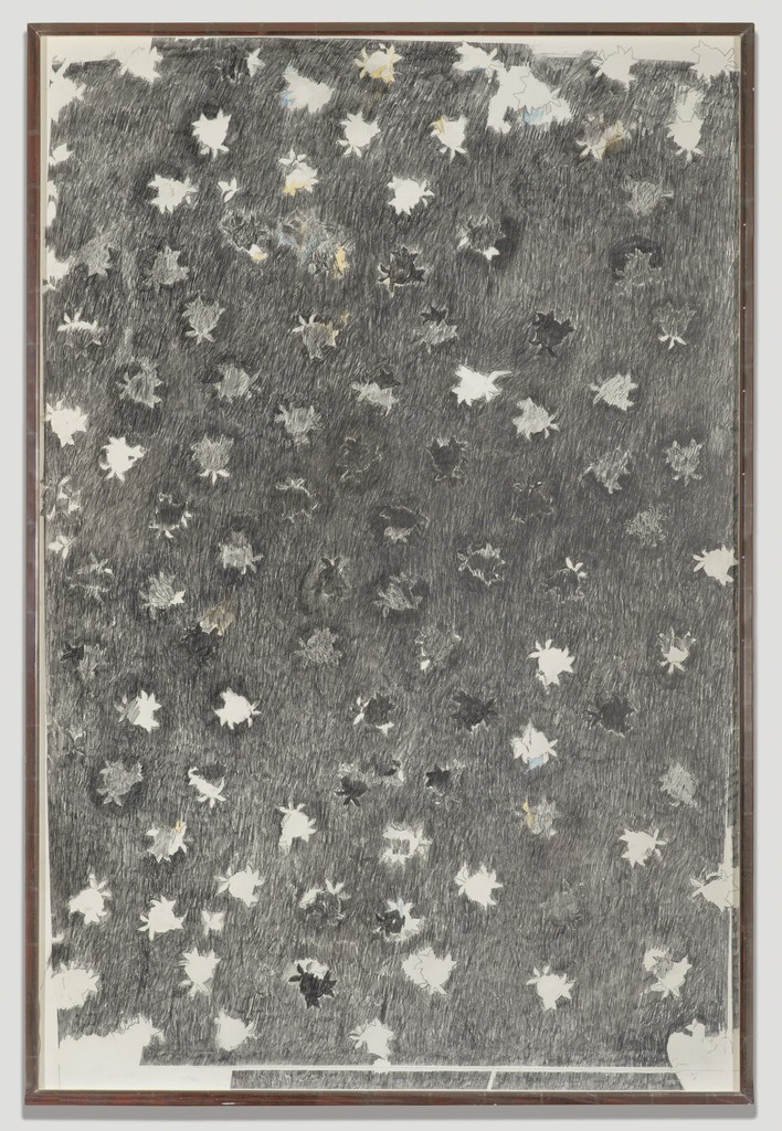
Before the exploration of “My line is emo” began, I did some research on artists that have worked with mark making techniques to give myself more of an idea on what mark making really is. It also helped me to gain inspiration on what I could possibly work towards with experimentation on the second week. My first OSS post inclusive of the artist research can be found here!
Mark Making Journey
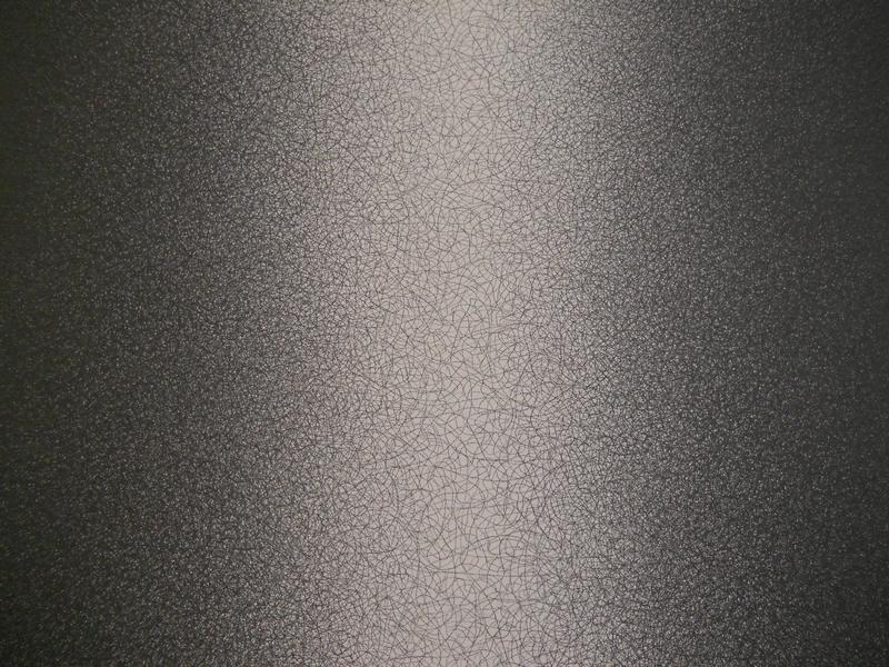
The journey of experimenting with different materials and tools started in Week 2 when I began my first attempt at mark making. Since this project was to be done exclusively by hand, our outcomes will only be in black and white. Hence, the medium that we will be working with is blocking printing ink. During this first hands-on lesson, we were taught about the method of mono printing and ways to use the lithography machine as well as the roller.
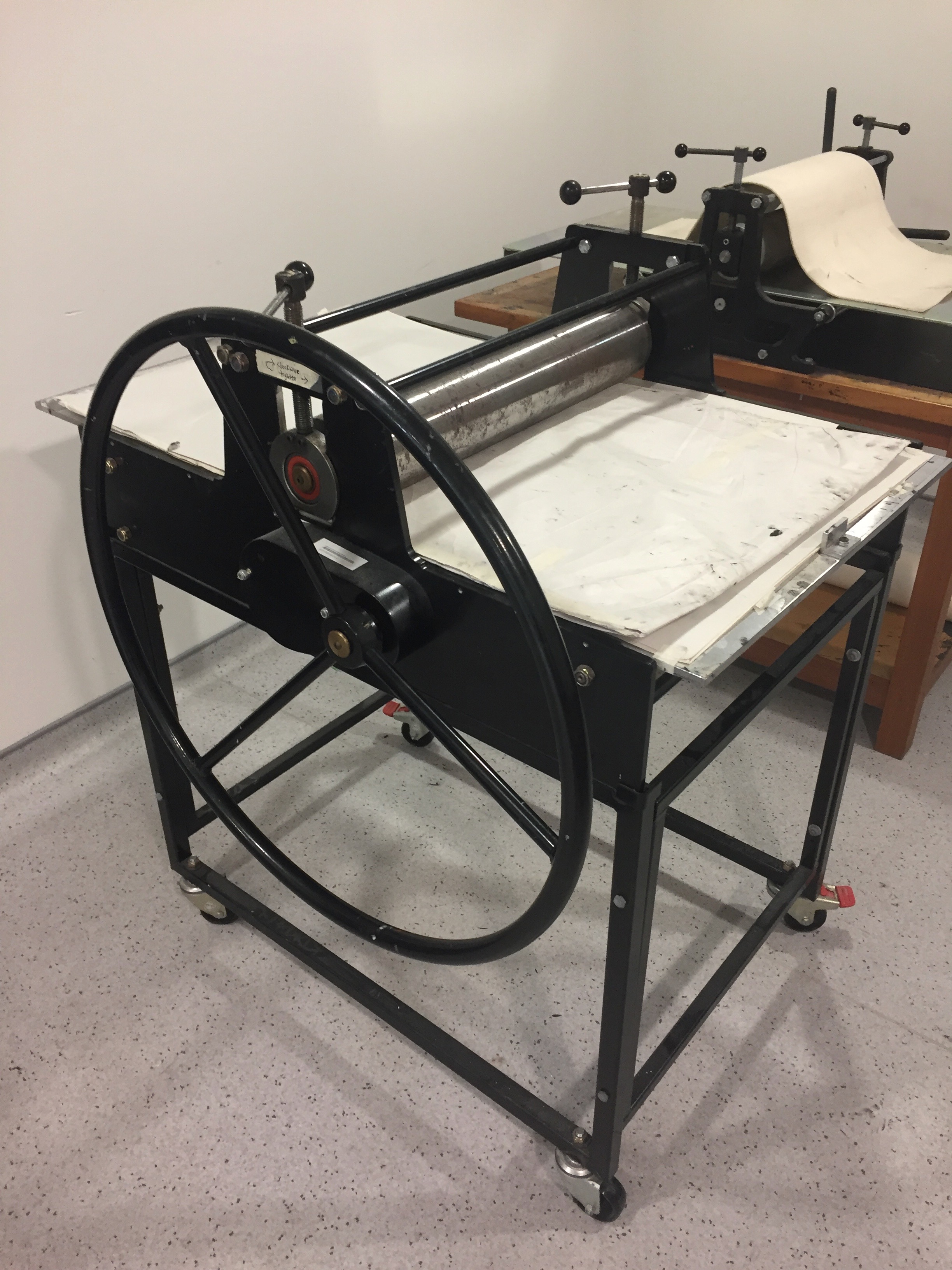
Lithography Machine

Placing paper over ink under the blanket
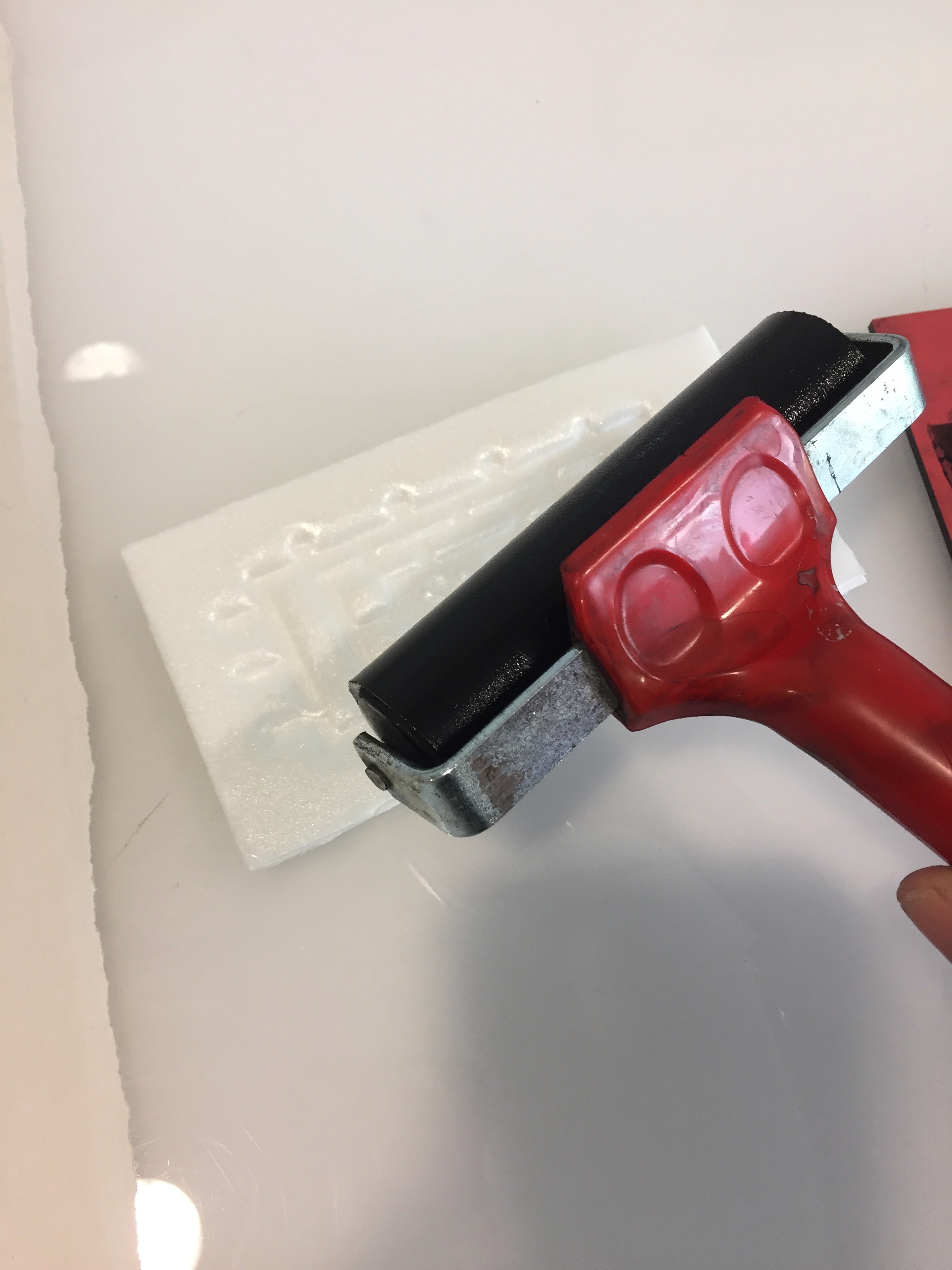
Roller
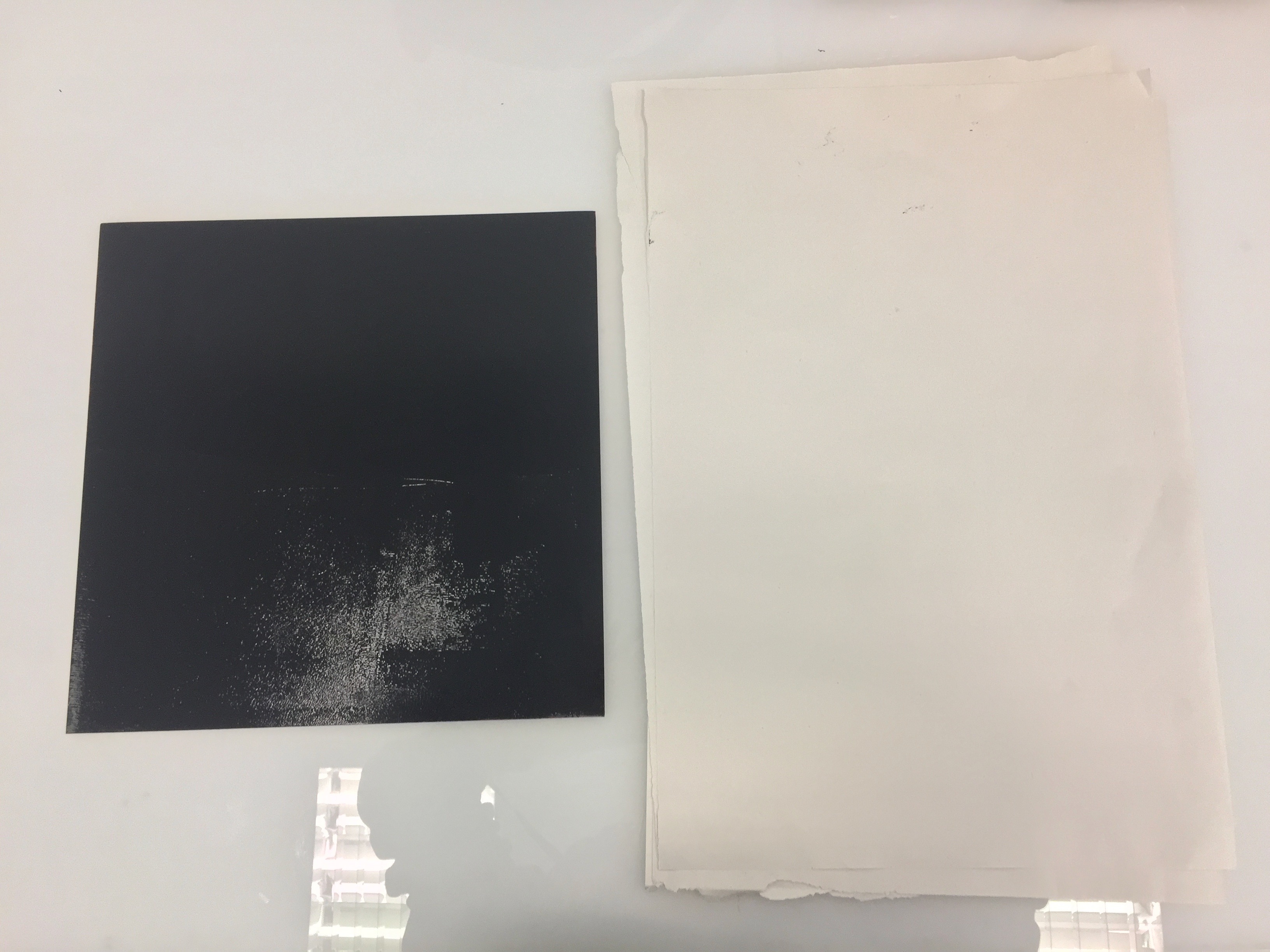
Ink and Paper
In preparation for this lesson, we brought in a variety of materials to explore mark making with. Some other materials I brought included cotton wool, a leaf, plastic bag, chopsticks, bubble wrap and styrofoam.
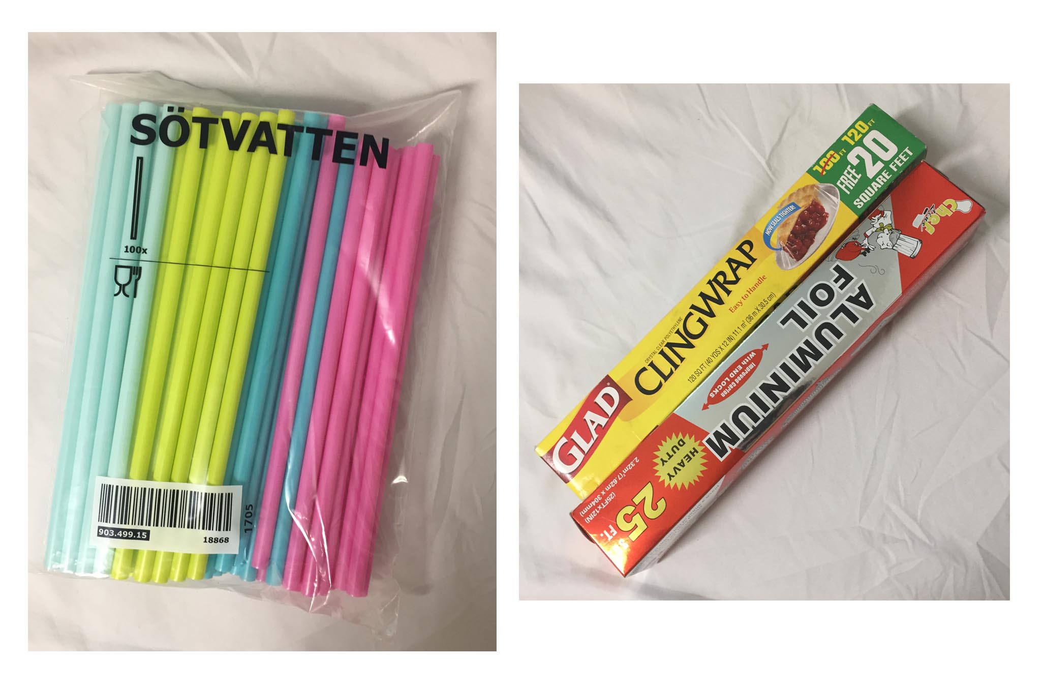
Straws // Aluminium Foil // Cling Wrap
Attempts at Experimentation
Since my mind had not formulated any ideas at the point in time of our second lesson yet, I took the time to explore the different methods first to get the hang of achieving outcomes that I prefer.

Plastic wrappings under paper over ink Used my hand to put pressure on the paper
Outcome
First Layer
What I learned here is that the method of the first outcome is successful for achieving strongly defined shapes based on how I layered my object over the ink (provided that it did does not absorb the ink).
Second print on the same layer of ink
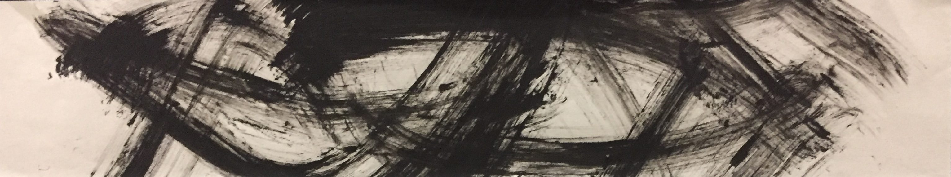
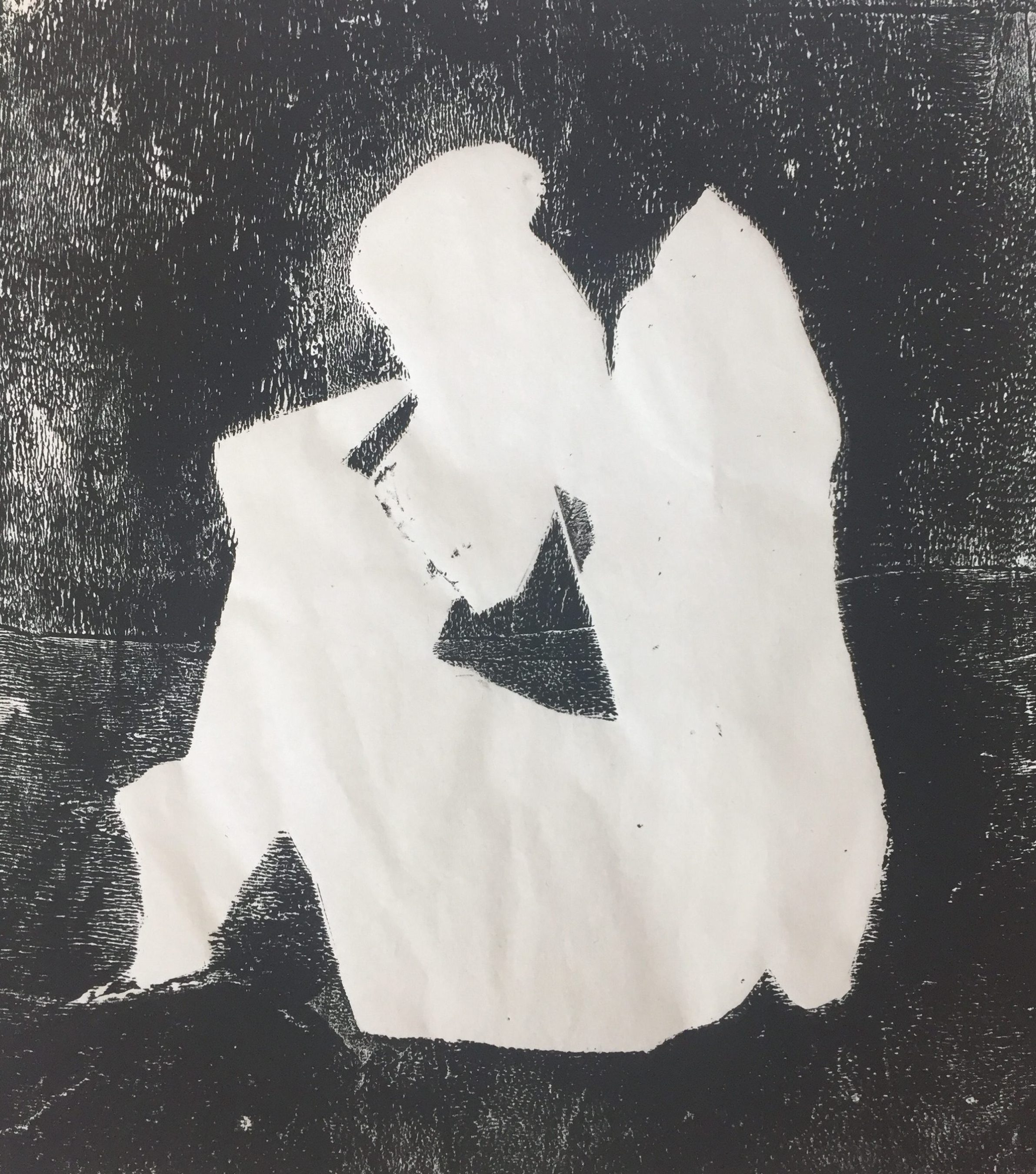
Since the outcome of the first attempt did not provide much texture, I thought the second outcome looked a lot more interesting as there was a combination of geometric lines and organic lines. The geometric lines are present in the creases that the cling wrap made, contrasting with the organic lines that formed when I dragged the circular tool (shown in the image below) over the paper.
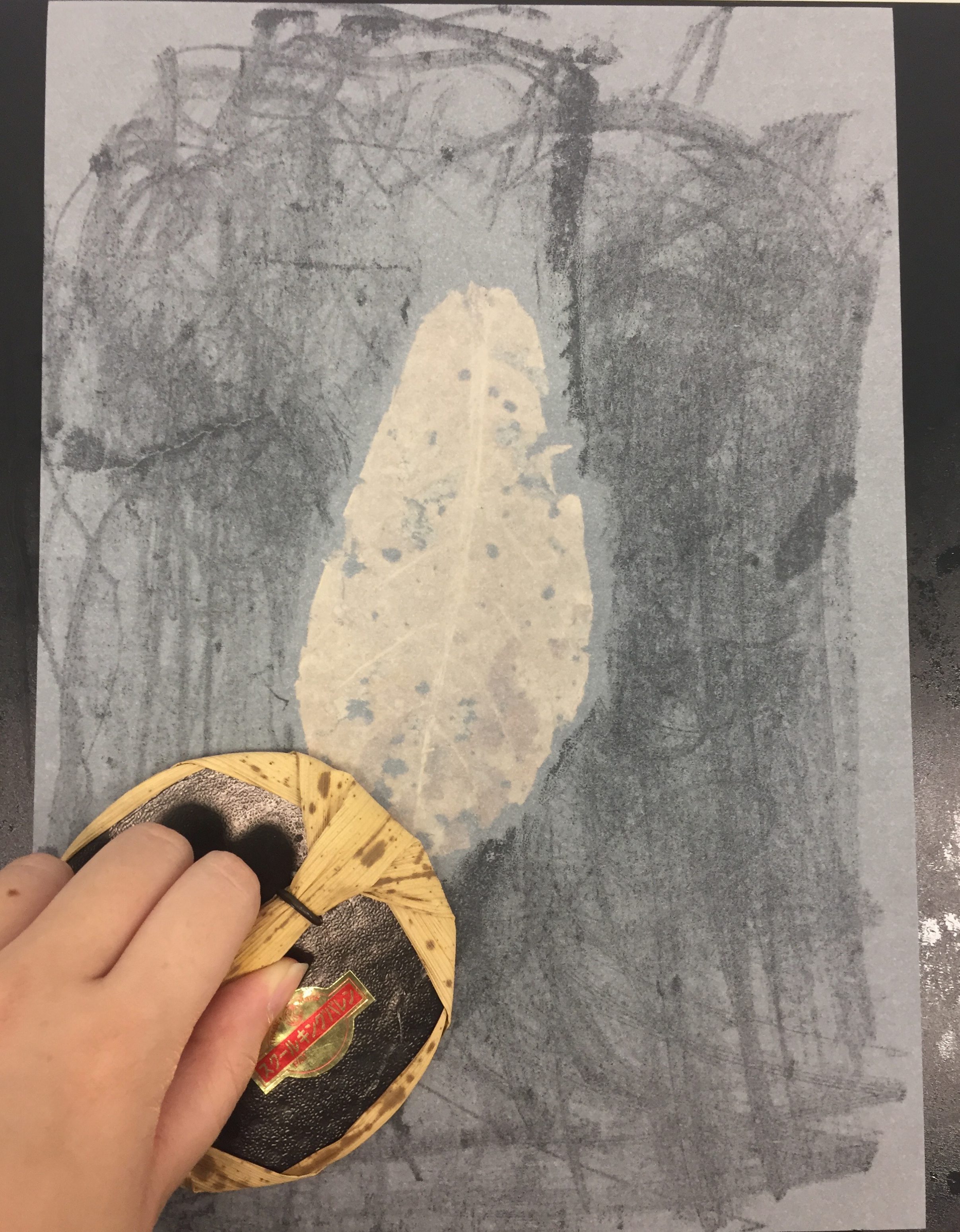
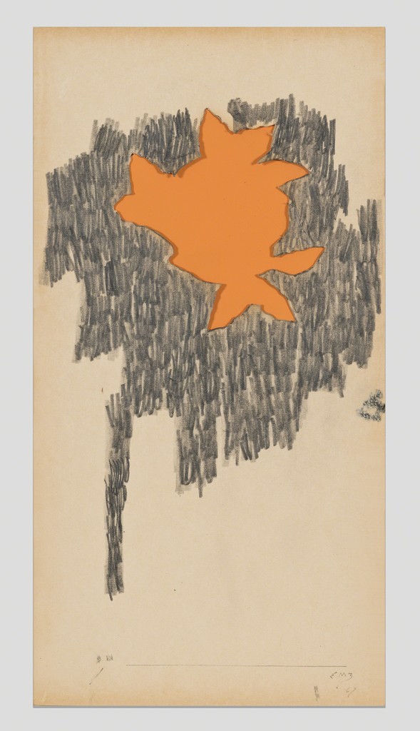
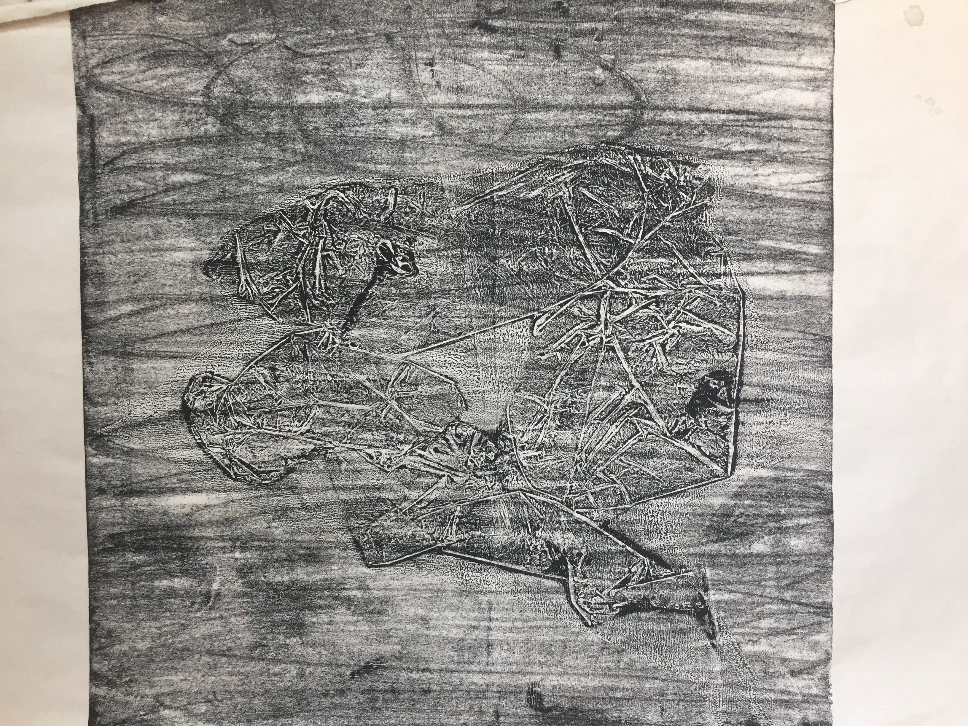
Leaf Attempt but unfortunately the print was lost 🙁
The tool as seen in the image below helps to create different mark making strokes depending on the direction in which I choose to move it in.

Cotton buds // Plastic Bag Aluminium Foil // Bubble wrap
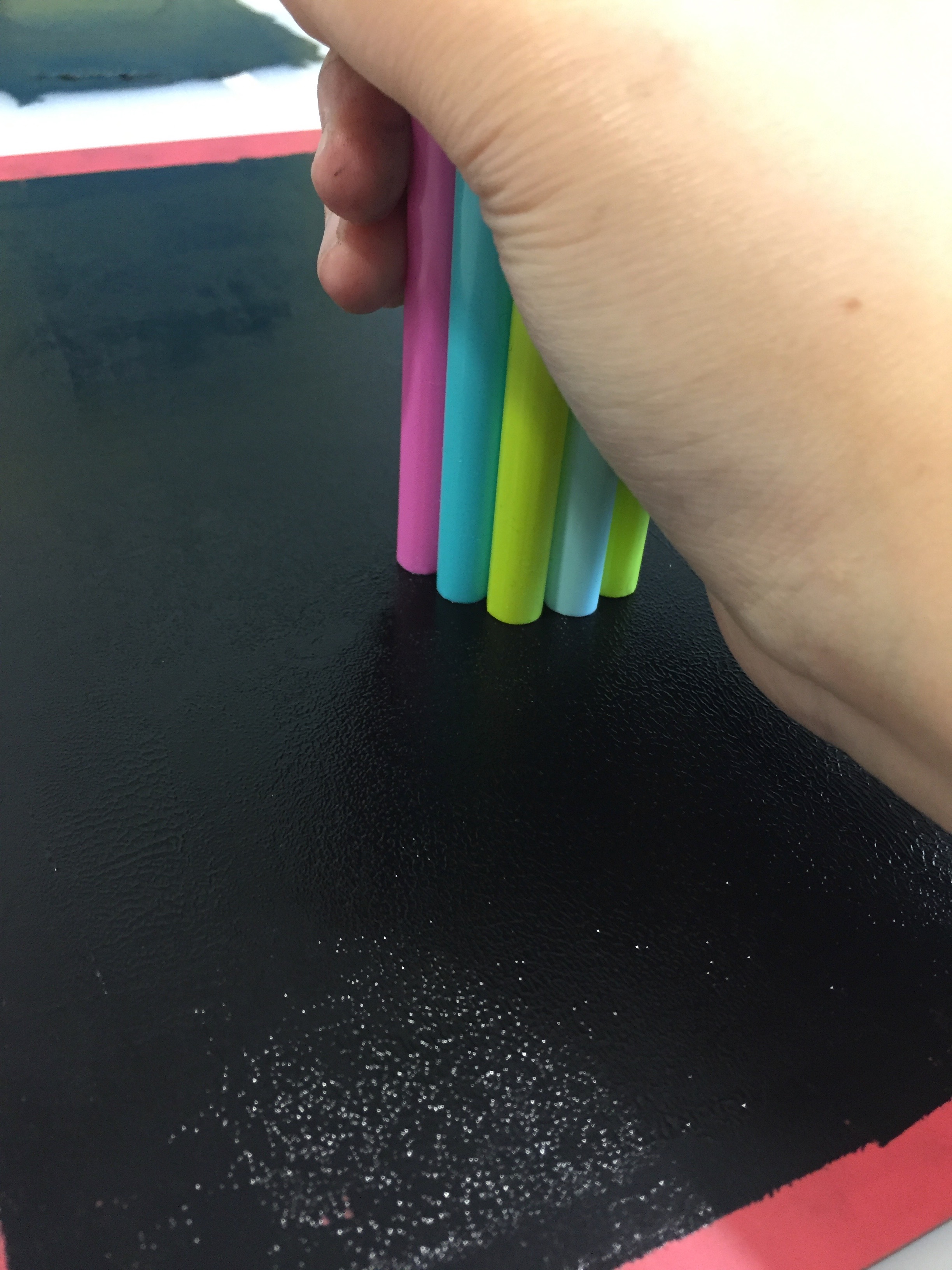
Bunch of Straws

Stamping of straws
Fine prints created by the stamping of straws.
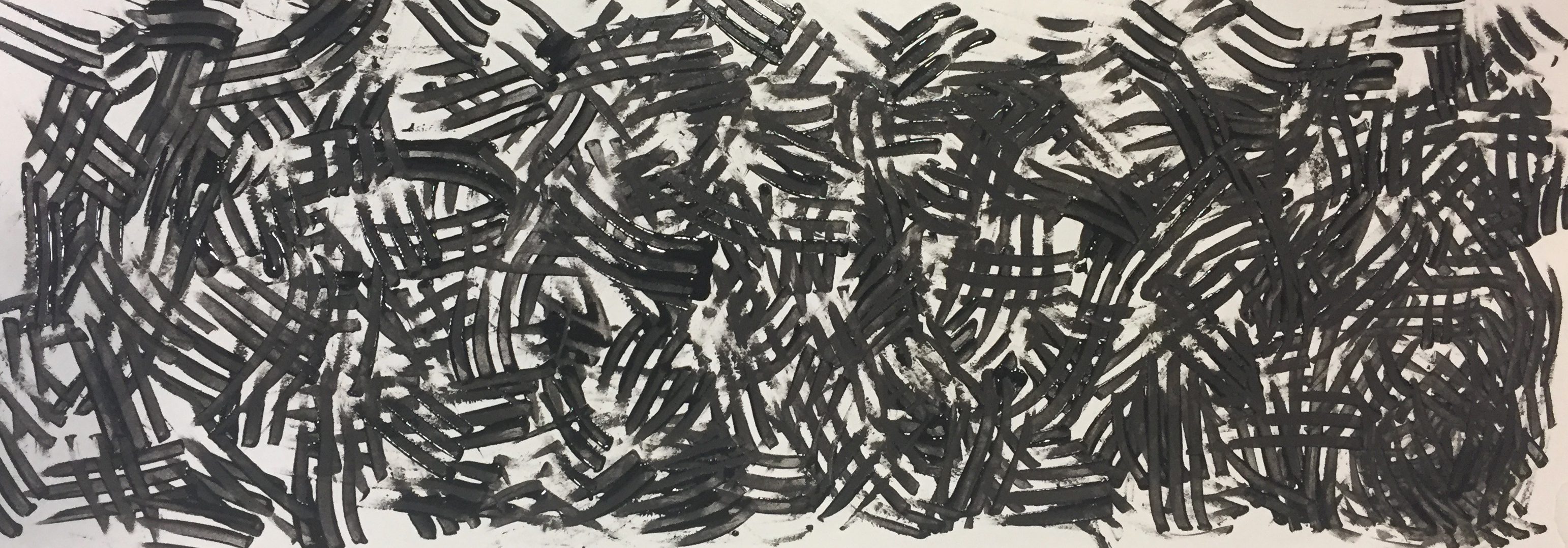
Strokes created through the use of the brush below

Sprinkled Oats
I experimented with instant oats that I had in my hall room by sprinkling them over the ink pad and placing paper over it.
Oats Print
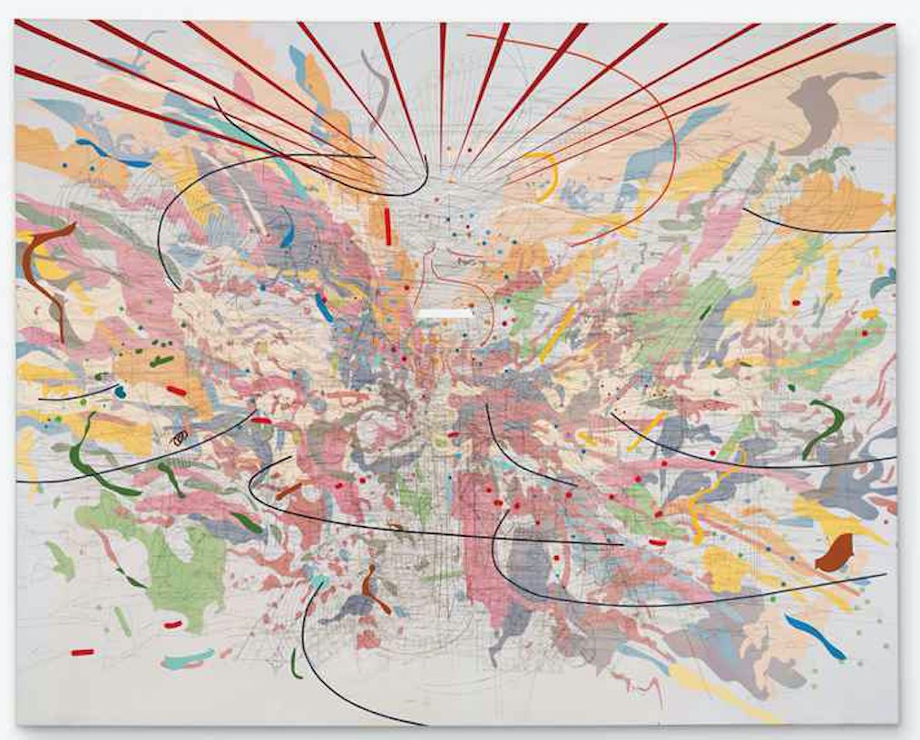
Final “Emo Lines”
Moving on from the experimentation mark making creations that I did not end up choosing for the final series, I will continue on with the final pieces and the process of creating them.
For my series of emotions, I decided to approach it from a more analytical way by looking at the formal qualities of art and design since I did not have a theme/story that ran throughout all the emotions.
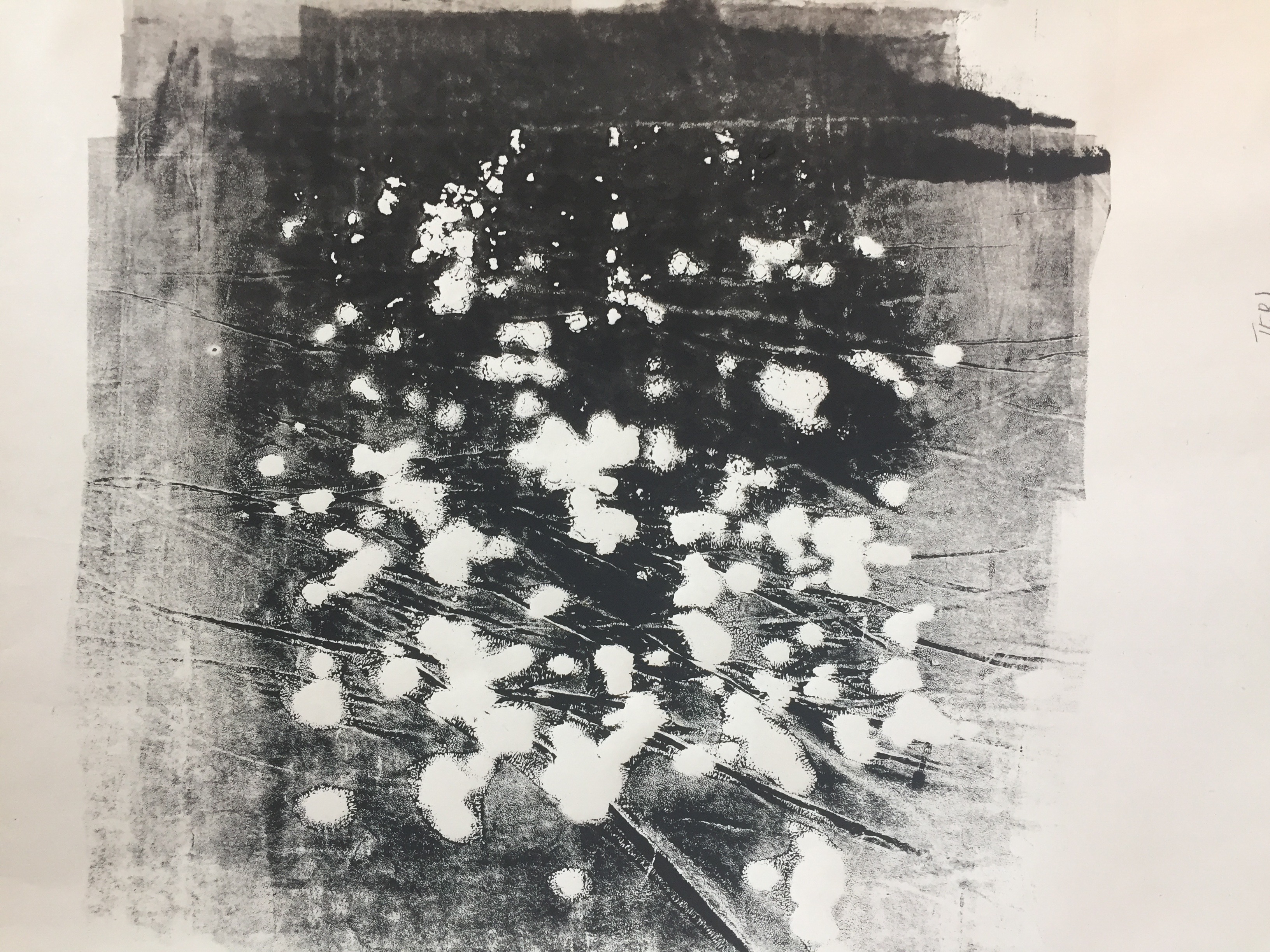
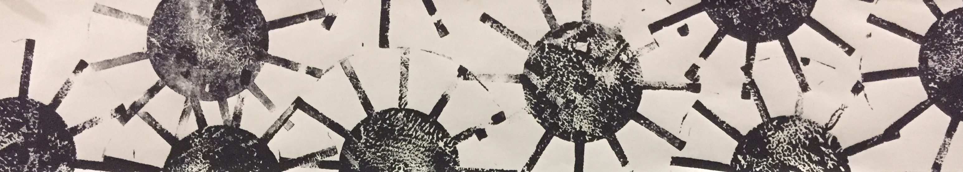
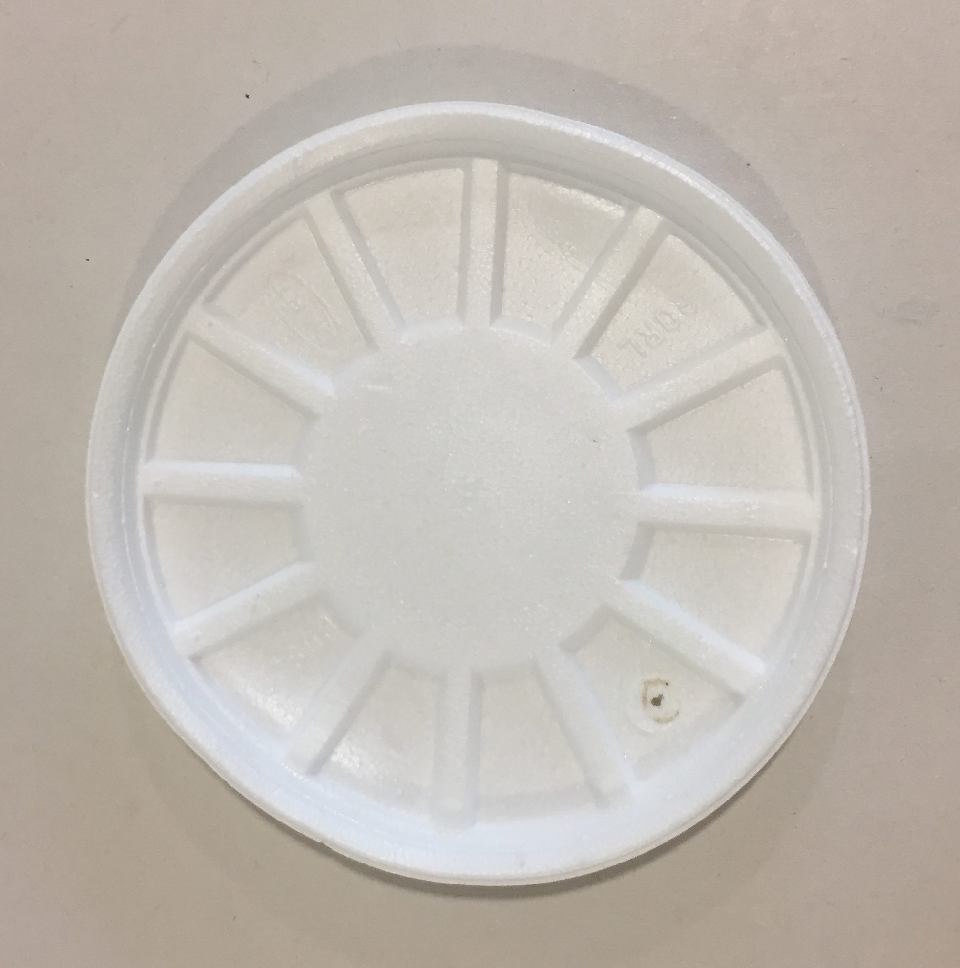
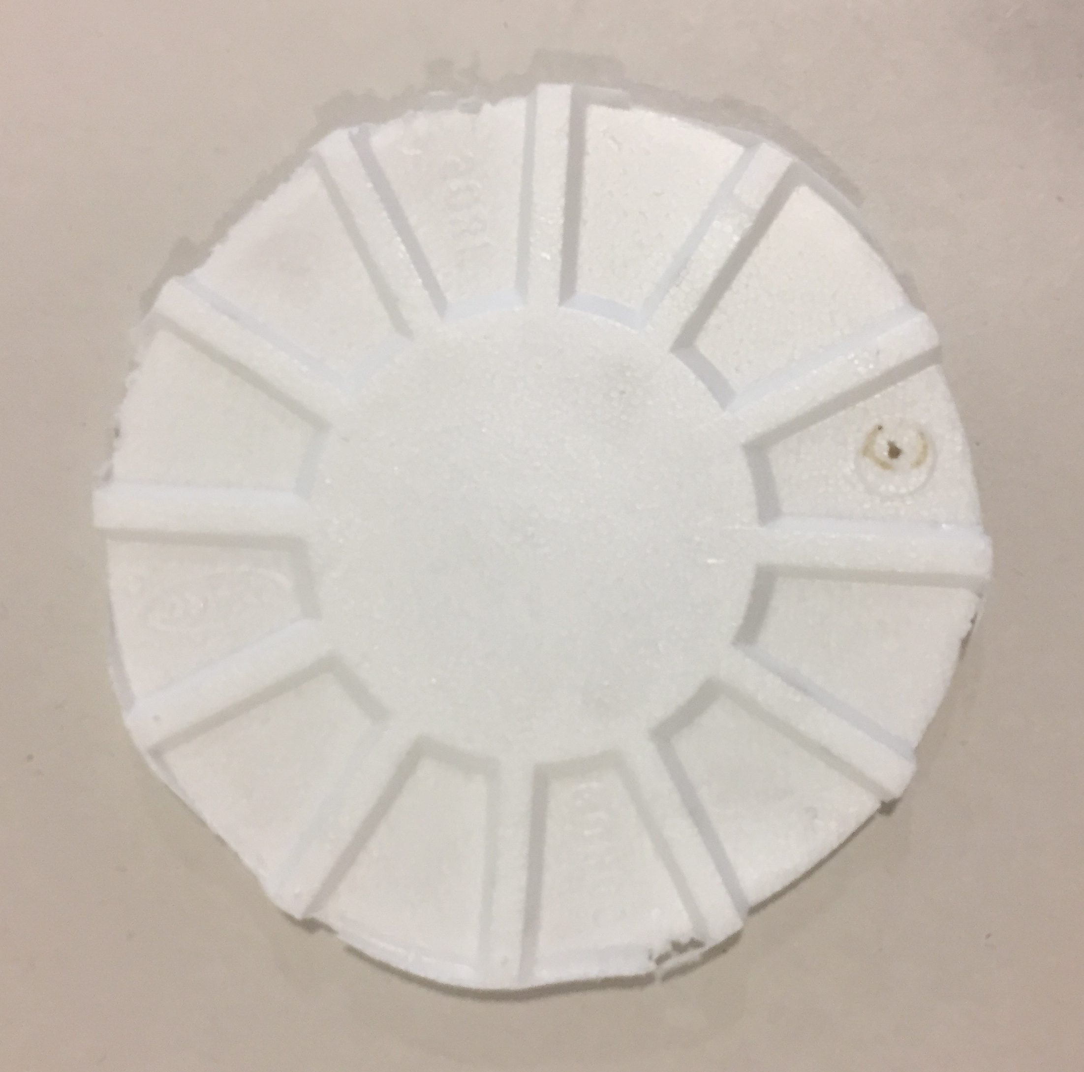
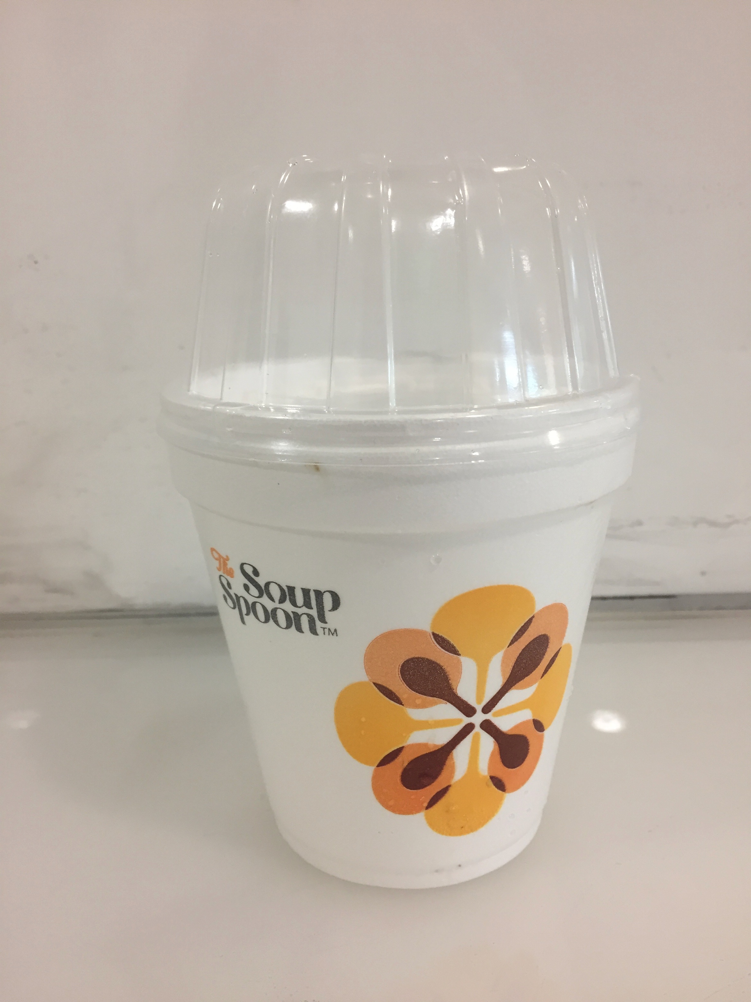
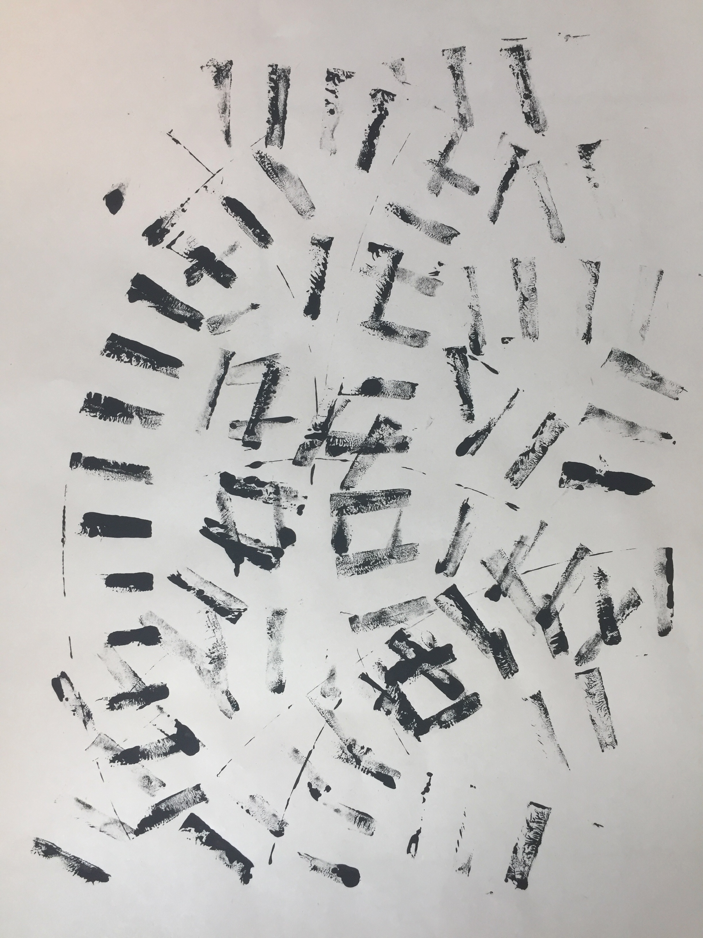
- Passion

Material: Styrofoam Soup base
Created by stamping a styrofoam container onto the paper, this pattern consists of explosive structure to show excitement and passion that I have for art. While the circles represent the ideas that are churning in my brain, the thinner extended lines surrounding it represent the act of “putting my work out there” and not being afraid to share it. As some of the lines overlap and connect with each other, it shows that my ideas and creations are all connected in some ways due to my identity as a creator.
To achieve this design, I stamped a soup container cover repeatedly over the paper.

Pre-trimming of outer rim

Post-trim
After the trimming of the outer rim, I proceeded to use the roller for even ink application over the surface.

Another attempt created from the same material
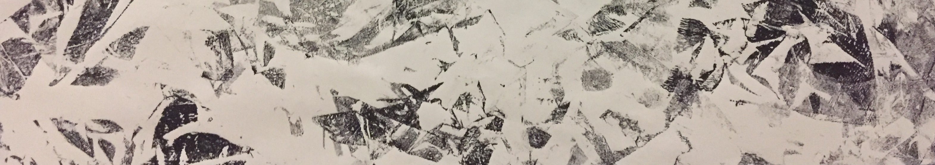
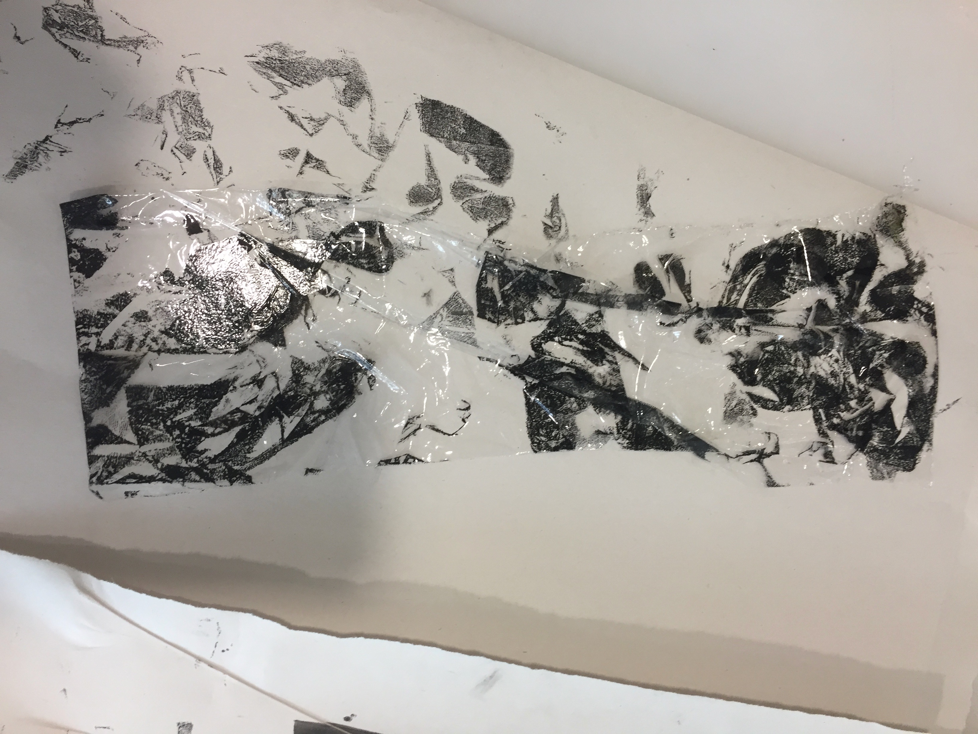
I didn’t end up choosing my line from this piece because the smudged patterns reflected an emotion of uncertainty which contradicts with passion.
- Relief

Material: Plastic Cover
This line was created by rolling a plastic container over the paper which created a track-like print. Since the amount of ink lessened after every round, I felt like it conveyed the emotion of relief similarly to how one’s shoulders feel lighter when weight is being lifted off it. There is also movement present within this line because of the rolling motion. As the amount of ink decreases, the “track” fades into a lighter gradient.

Bread Cover from Soup Container

Another Attempt
My first attempt at using the plastic cover consisted of multiple tracks laid over each other. Although I really liked how the fading of the ink turned out, I felt like the visuals were too clustered and therefore decided to recreate a simplified version where the tracks faded into emptiness.
- Surprise

Material: Cling Wrap
The printing of ink on creased cling wrap created various tones of darkness and geometric shapes in this line. My aim was to express surprise through different tones of ink to represent the initial shock of surprise followed by the aftermath. To achieve this effect, I tore pieces of cling wrap (not too big so that it was easier to handle) and placed it over the ink slightly crinkled in order for the ink to come into contact with certain areas only.

Cling Wrap on Ink
To achieve the different tones of ink, I reapplied the ink onto the cling wrap strategically. The cropping of this line was also tricky because I had to ensure that there was a combination of different gradients.

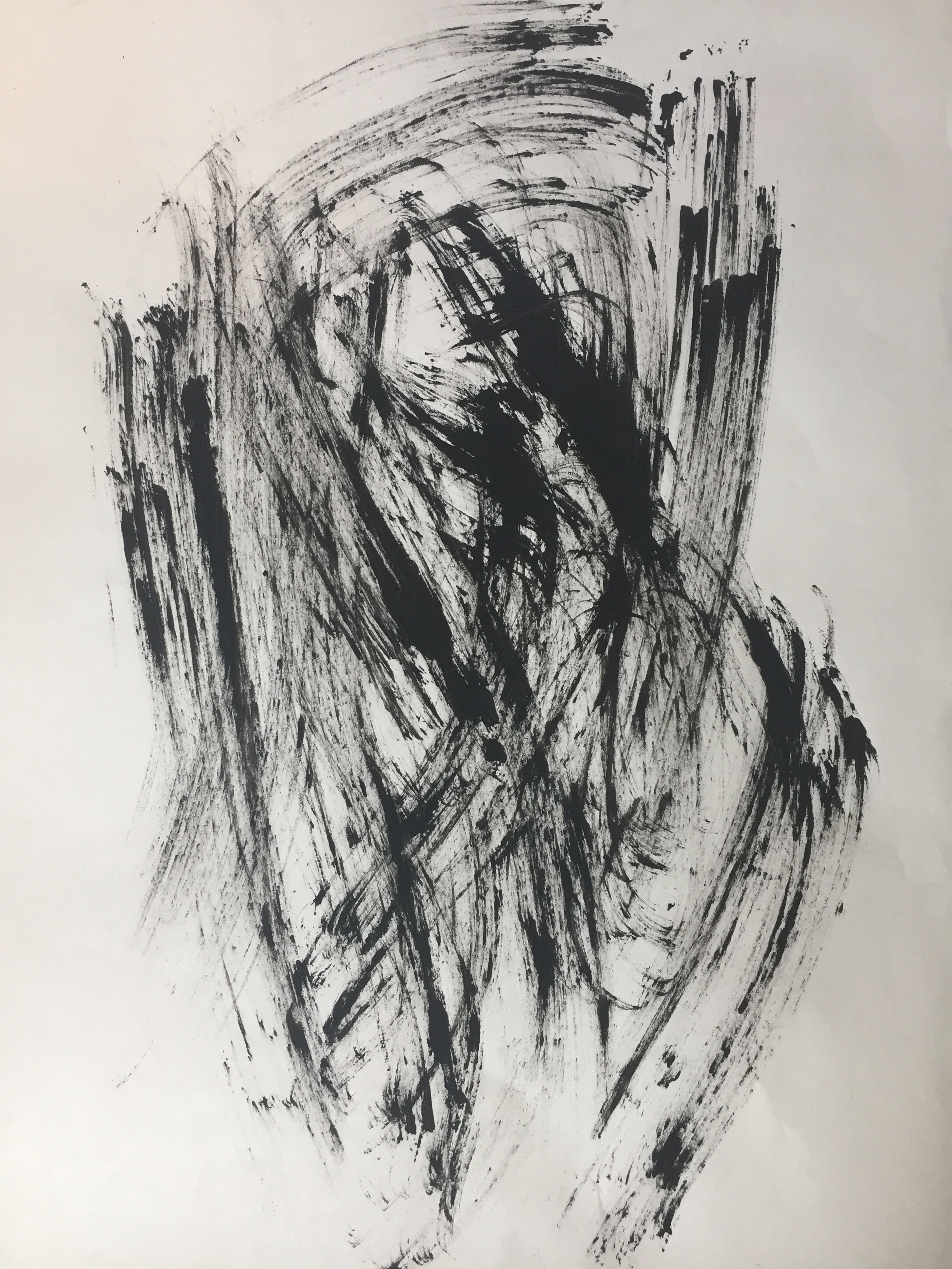
- Frustration

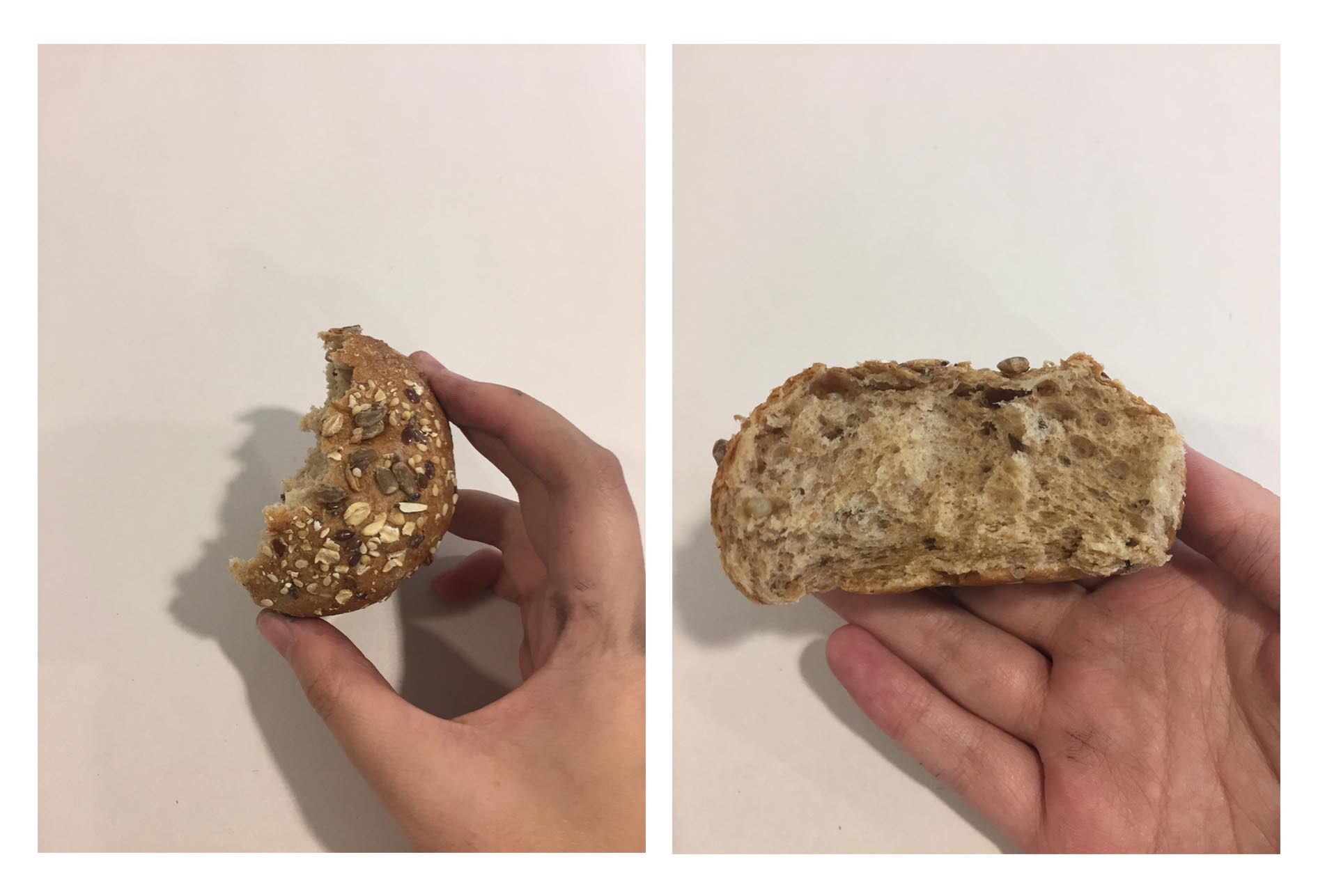
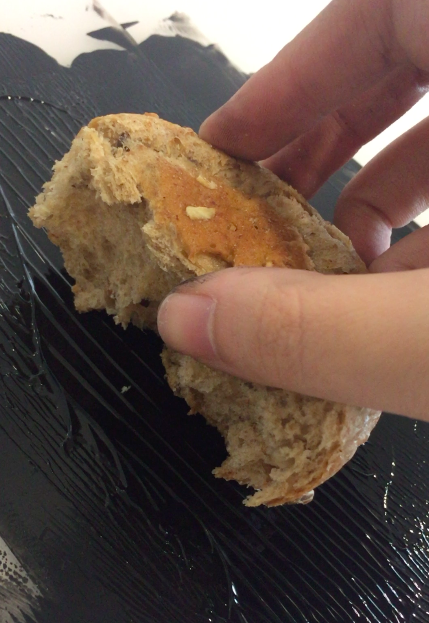
Material: Bread
The smudgy strokes created on this line was achieved by applying pressure onto my half eaten bread and dragging it across the paper. The fast and hard motion created an expressive structure to portray frustration. Normally when I feel frustrated about something that I can’t get right after many tries, the feeling of frustration urges me to tear things apart which explains the torn bread as well as the motion of speed and pressure.

Half Eaten Bread
For my first experimentation with this piece of bread, I placed ink onto the top surface where there are seeds and grains. Since the toppings are rather small, thinner strokes of lines were created. I felt that it did not express a high pressure of strength, therefore I decided to work with the cross section of the bread instead where the texture was more spongy and absorbed more ink to be imprinted onto the paper.

Inking top of bread

Thinner lines created
Thicker strokes in the final piece express greater frustration which conveys impatience.
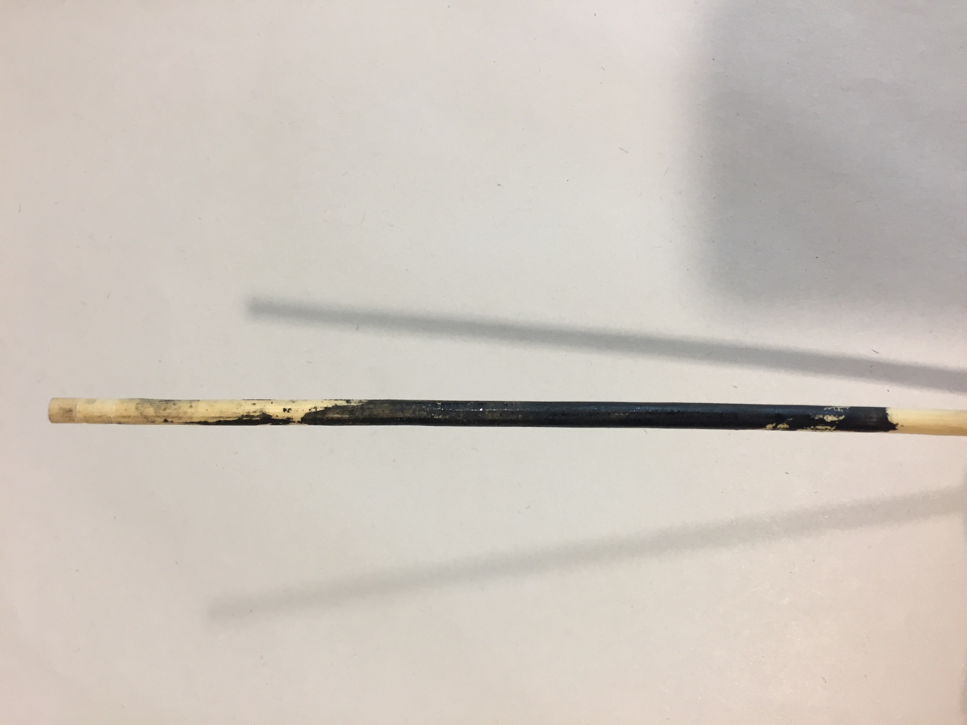
- Disappointment

Material: Wooden Chopstick
Achieved by rolling a wooden chopstick covered in ink over the paper, this line expresses the emotion of disappointment. Often when I get disappointed, the main reason is that I had hope for something to go well in the first place. Hence, I decided to place hope as the cause of disappointment in this line. Following the direction of movement from left to right, the areas of concentrated ink represent the initial hope that I have. As the series of events continues and disappointment arises, this is where the ink fades into a lighter gradient. This cycle repeats throughout the line and disappointment is portrayed where the ink fades. It can also be looked at as a climax and anti-climax.

Wooden Chopstick

Rolling of chopstick with hand
This image shows another attempt of mark making with the same technique but instead of only rolling in one direction, it was rolled in multiple overlapping directions. I did not end up choosing this outcome because the overlapping made the effect less prominent.
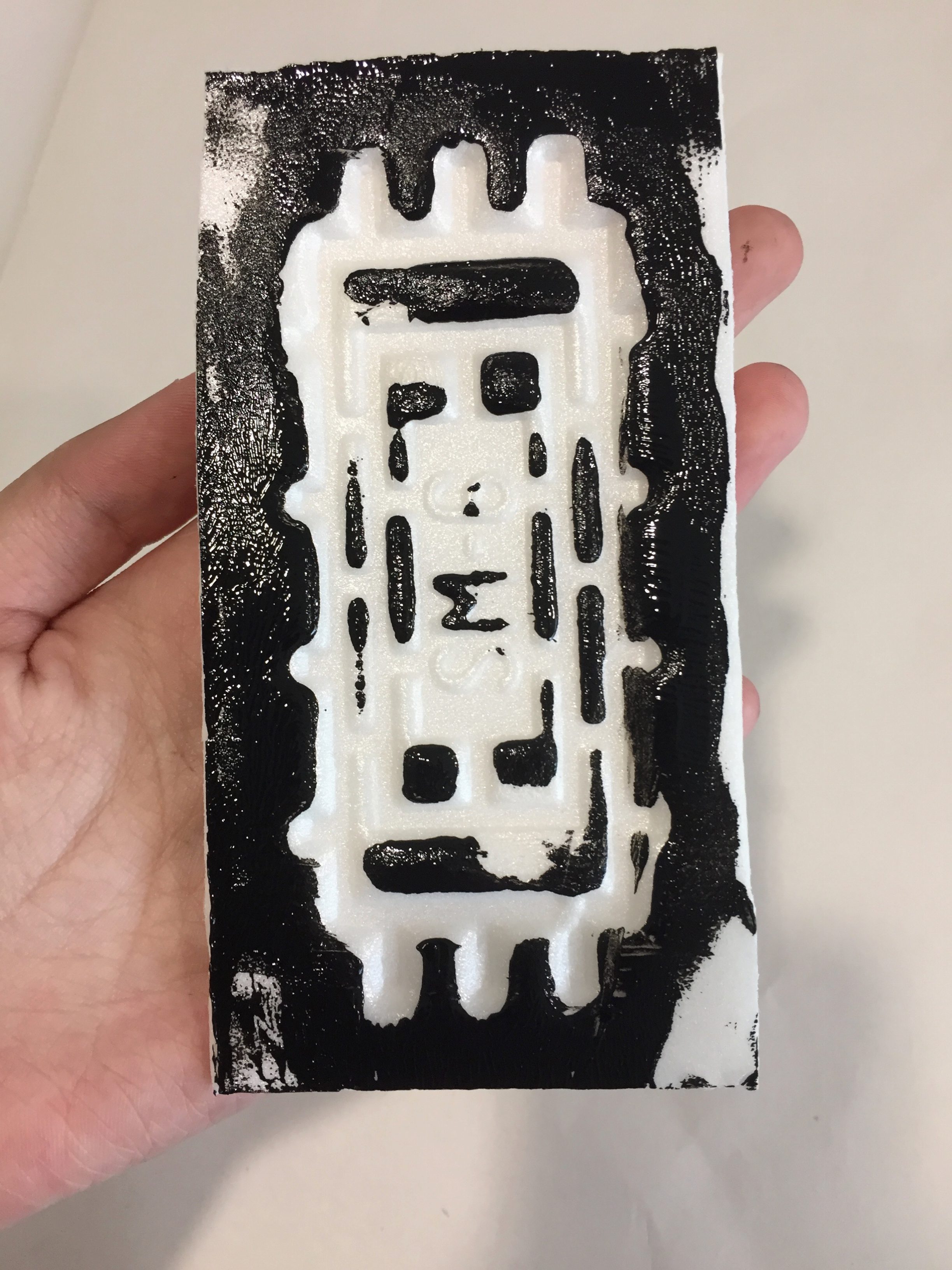
- Anxiety

Material: Styrofoam Tray


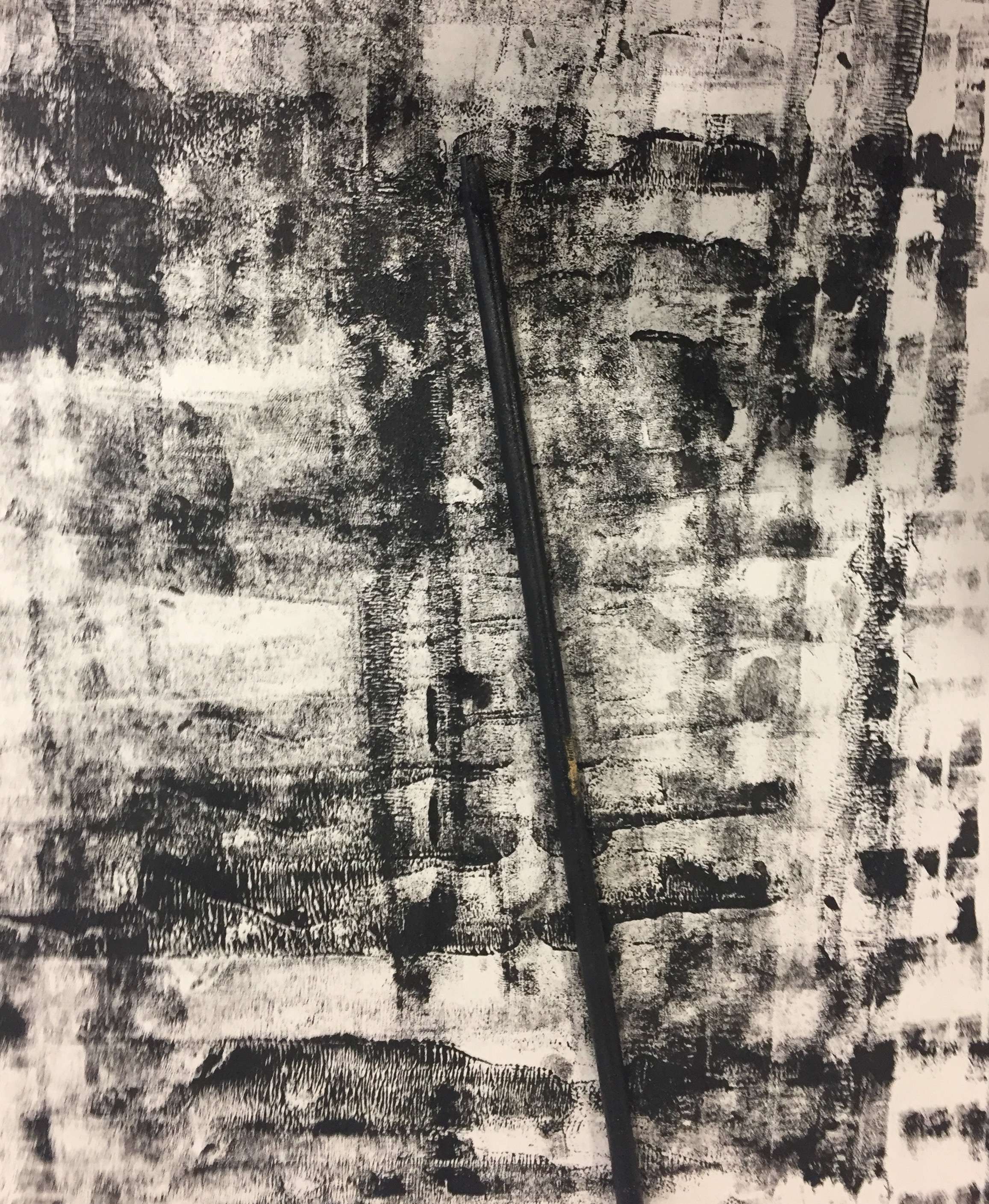
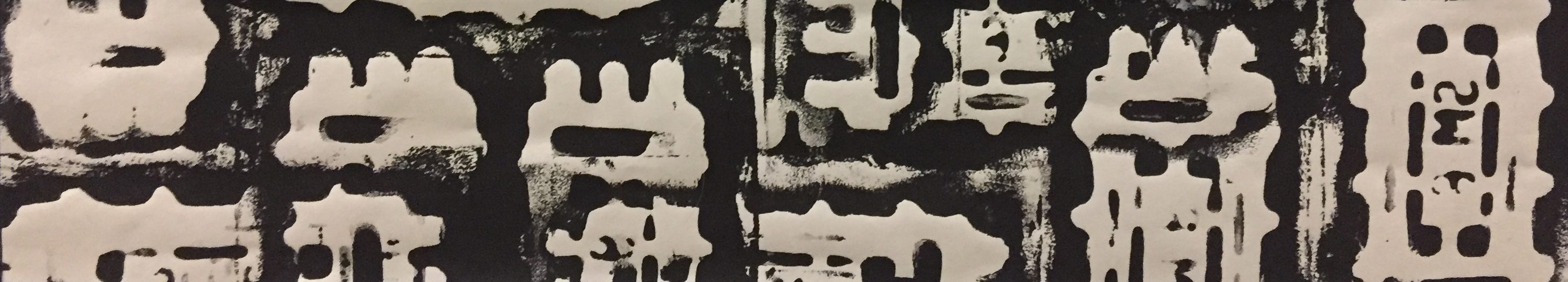
This overlapping pattern present evokes a sense of over thinking and nervousness. Normally when I get anxious about something, often related to public speaking and presenting in front of others, nervous thoughts about the presentation consume my mind for hours before it’s over. I wanted to express this thought of over thinking through multiple overlapping prints. Although the pattern is repeated, the prints are distorted to convey distress.
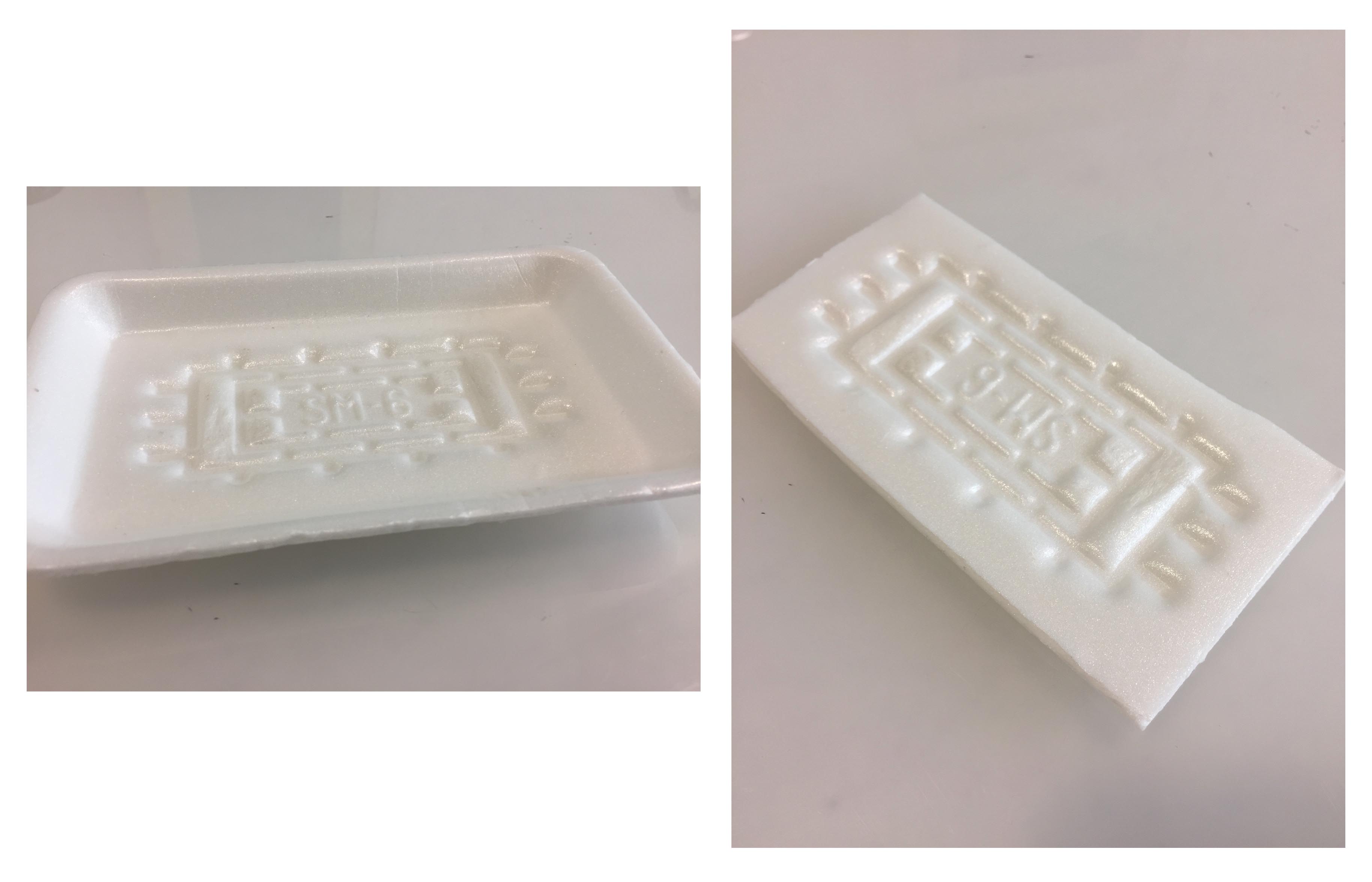
Styrofoam Tray
I trimmed the edge of this styrofoam tray in order to have a flat surface to roll the ink over.
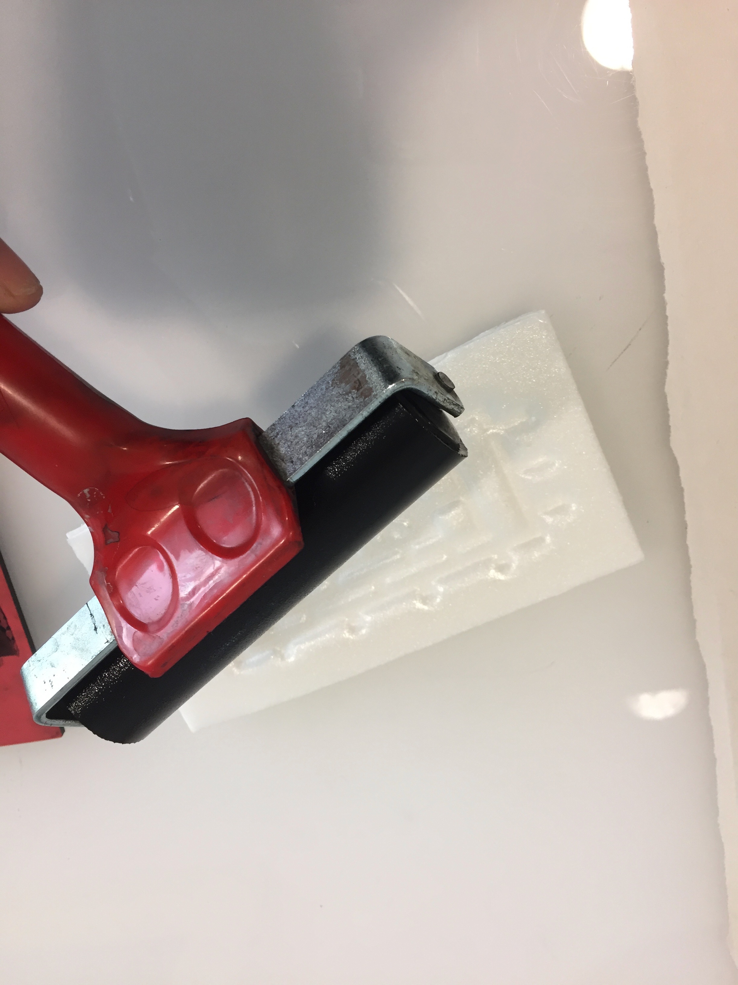
Rolling of Ink
Stamping of this over paper
The methods that I have mainly used to create my lines are by smudging, printing, overlapping and rolling. Since most the materials that I ended up using were not flat, the prints were created by hand rather than with the lithography machine. The creation of prints by hand also gave me more freedom to experiment with different pressure, movement and smudges.
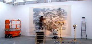
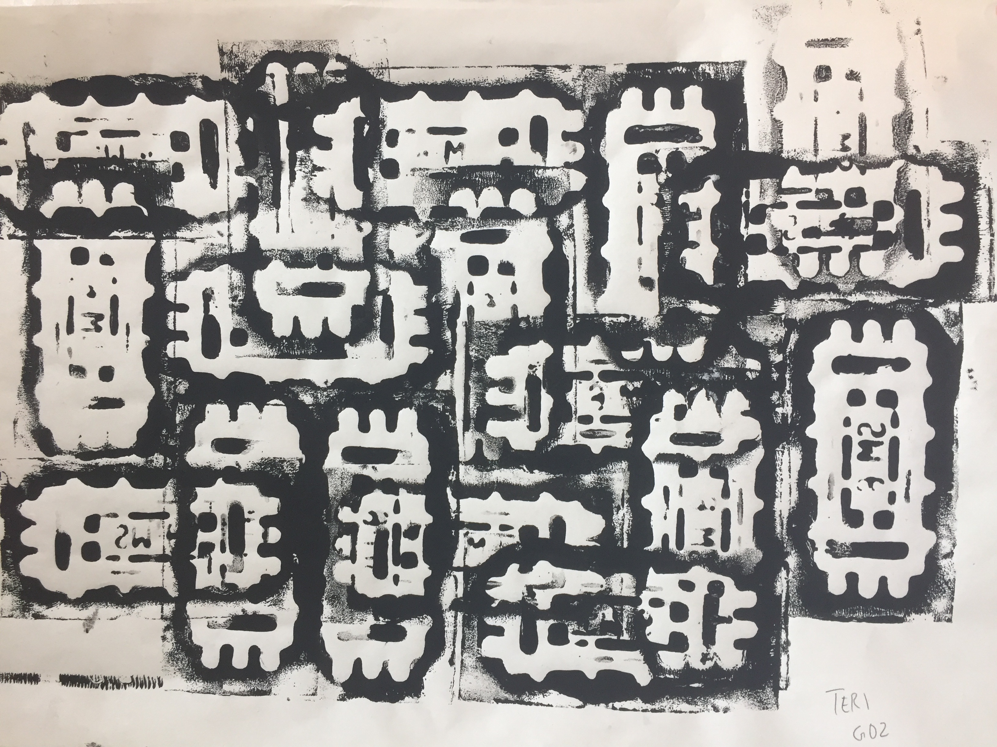
Final Presentation
 The lines were arranged in the order of positive emotions on the top and negative emotions at the bottom.
After the presentation of my work, I felt that I could have done better in delivering the reasons for my emotions more clearly. While I considered the delivery of emotions individually in each line, I lacked on interconnecting them to each other which is something I hope to improve on in the future.
One of the challenges that I faced in this project was finding the right cropping of my line. Since it was hard to picture which areas would look the best in the size requirement, I created a frame out of paper that measured 38cm by 7.2cm. I dragged the frame around my mark making creations and decided on which was the best crop to portray my emotions.
Reflection:
This project was enjoyable as it gave me the opportunity to experiment with mark making for the first time. Although challenging at times, it was fun to work with many materials and evaluate which would fit each emotion best.
Surprisingly, I also learned a lot about my classmates through the sharing of their work and was also very inspired 🙂