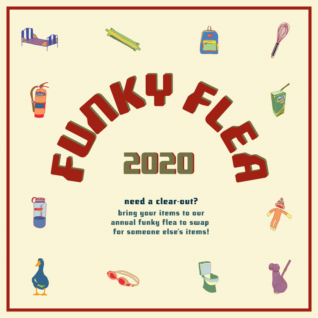
Applied Illustration ~ Process + Final

FUNKY FLEA SWAP

The event that I have created for project 3, applied illustration, is a funky flea swap. A flea market for anyone to trade their old gems for someone else’s. Bring a box of old items and propose a trade for something that has caught your eye. As long as the other trader agrees, you can proceed with the swap!

“one man’s trash is another man’s treasure”

I’ve decided that my 4 collaterals would be an event poster, an invitation card (with stickers), a tote bag (for storing your traded goods) and lastly some wrapping paper (for fragile goods).

PROCESS

Artist references + inspirations

  • a collection of illustrations
  • line work and solid colours
  • fun, bright colours
  • graphics that could also be made into stickers

http://graphsho25.blogspot.com/

https://www.behance.net/gallery/42025365/La-Porca-restaurant

https://creativemarket.com/atk_type/4312387-Cosmo?u=slvDev

https://les-surgeles.tumblr.com/post/85520577845/paul-cox/amp

The plan:

To create a series of graphics (maybe 10) that i could rearrange and work with for all 4 collaterals.


First batch of illustrations

I started off the project by creating the series of graphics, but I didn’t really have a direction to start with. Thus, I started drawing random objects that came to mind. After this first draft, I realised I wasn’t completely happy with it as I felt like I didn’t really connected to it personally.

So moving forward, I updated my graphics to personal objects that I had around me from my daily life. (keeping some from the first draft but forgoing others that I didn’t really like).

Second batch of illustrations

After further refining, I settled on the illustrations above. These were illustrated on adobe fresco. Upon finishing the graphics, I moved them into illustrator to begin organising the various compositions.

Poster – first draft

This was my first poster draft. While putting the graphics together, I struggled with the arrangement of the illustrations as they we created as individuals, not as a group. It appeared rather floaty and was not the main focus. The text was also too big and took attention away from the illustrations. Hence, I decided to rearrange everything in attempt to make the graphics the focal point.

FINALS

A3 Poster – final

Poster Mockup

Invitation card – final

Back of invitation card with stickers 

Tote bag design – final

Tote mockup

Tote mockup


Wrapping paper

VAROOM ~ Process + Final Cover

VAROOM RESEARCH

Varoom is a global magazine that features a broad variety of illustrations.  Their editor Olivia Ahmad, describes the intention for each issue as being “to convey a live reflection of what is happening in illustration art at any given moment… presenting new work and giving insight into how its done, but also asking questions about it – why do you make it? what does it mean to people?”

The magazine has been quietly but effectively getting on with a series of strong themed issues.

https://www.grafik.net/category/case-study/shelf-love

https://www.facebook.com/Varoommagazine/photos/a.366181926777187/1673858609342839/?type=3

The publication welcomes any style of illustrations which ultimately helps to widen their spectrum of audiences. For my Varoom cover, I was inspired by the story of Horton Hears a Who! ; the idea of a world existing in another world. Hence, I decided on the theme of Fantasy.

PROCESS

The slides below demonstrate a few artist references which inspired me to look into abstract forms and bright unique colours for my fantasy world.

The idea : illustrating an unknown world within an existing world

Location : on a plate of cai fan (vegetable rice)

Visuals : simple composition, realism vs artificial

Audience : appeals to the any local Singaporeans

I decided to go with food illustrations which led me to the visuals of a simple plate of vegetable rice. Something simple that many consume daily hence easily relatable for my audience. It would also capture the scene of a local hawker ; executed with the cheerful colours of the tables, plates and utensils.

Reference image

Starting off with the top view composition, I began illustrating the realistic portions first which included the plate, utensils and ingredients. Lastly, finishing off the fantasy world in the rice area.

Colour trials

Towards the last touch ups, I explored with various background shades to see which was most suited with the main illustration. I ended up going with something in between so that it wouldn’t be too distracting to the graphics but balanced it out instead. Final textures were with a pixel brush to add depth.

FINAL

Inanimate Portraits ~ Process + Final

INTERVIEW

Questions for Dion

  1. What is a significant memory/representation of yourself? Broken inside and out
    1. Breaking the tip of her pinky from getting kicked from dance at 1am outside a supermarket 
    2. Last year she got a turf toe last year on her left big toe and the same thing happened this year at the same dance event
    3. when i broke my pinky and didnt yet know it was broken, i said “it better be broken because if its only a sprain i feel so stupid/like a pussy bc iT HURTS” then I felt mega british convert bc i did everything with my pinky hyperextended illustrating, drinking from my mug, showering
    4. all that bullying made me grow up really fast mentally, bc it was either i turn into a bitch or turn wise lol and at times i really hated being so ‘wise’ because it’s either to hate than to understand and forgive
  2. Describe habits of yourself
    1. Another thing is that I’m the type to do something i like repeatedly for literal months and then get sick of it. like listening to a song is the basic one, then in periods of my life i’ll eat literally everyday a bowl of oatmeal with water, honey, peanut butter, banana, chia seeds, bits of chocolate or granola. everyday.!!
  3. Do you have a favourite childhood toy/chow chow that you still have now and what does it mean to you/memories you have that ties to it
    1. my real one was a tiny pillow but actually i liked the pillow case and its texture but one day the case was gone and i didnt like the pillow anymore
    2. this green one my mom bought 2 of it for the sofa and i just took it as my own
    3. its a moose but for several months of years i saw it upside down, i thought it was a bee with a weird thing 
      1. It smells like home and it’s not meant to smell good, once you bring it to hall/exchange it doesn’t smell like home anymore 

Questions for myself

  1. What is a significant memory/representation of yourself? 
    1. Kerinci trip; it just really made me love travelling and wanting to see more of the world because I was in so much pain climbing the stupid mountain but it was so worth it in the end
    2. I felt so small in this huge world and found peace in escaping cities. The trip made me grow the appreciation and longings to travel and to live for experiences
  2. Describe habits of yourself
    1. ill listen to a song on repeat within a week till im sick of it and once I was obsessed with overnight oats(oat milk specifically) with bananas and i was once obsessed with running at night because sweating it out before bed was enjoyable 
    2. i always brush my teeth in the shower
  3. Insecurities of myself
    1. that i really dislike being in front of the camera

INTERVIEW

I decided that I would take the abstract route for this project. Creating a composition each for Dion and I that take on abstract forms of objects extracted from our interview exchange.

the nature of each of our composition reflects our personality in the sense that I am relatively more reserved in sharing in comparison to dion.

  • my compositions comprises of a few smaller parts that metaphorically symbolises “windows” to my personality
  • whereas dion’s composition is more open and active


Teri

Visuals of my inanimate portrait:

  • vertical blocked shapes – to represent city landscape (having grown up in hong kong, the city landscape is something I miss often)
  • mountain and nature forms in the bottom – my love for travelling and nature
  • hand outlines in the middle – to express that i really dislike being in front of the camera “dont take a photo of me!”

Dion

Visuals of dion’s portrait:

  • a bowl in the bottom – to represent her daily oat bowl
  • pinky forms – to represent her broken finger
  • many circular forms – to represent her struggles she had with her weight and “yo-yo” dieting over the years of growing
  • fluid forms – to represent her passion for freestyle dancing