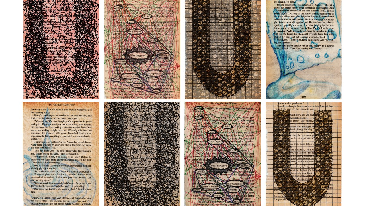
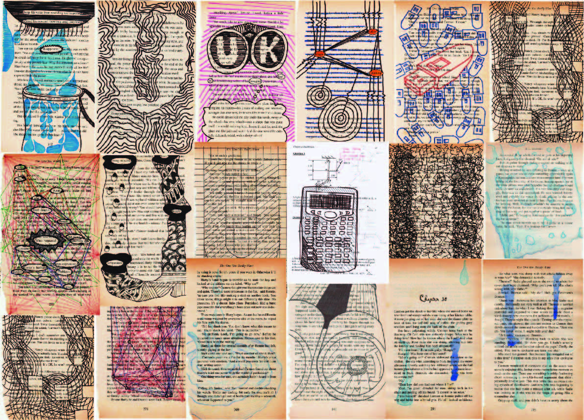
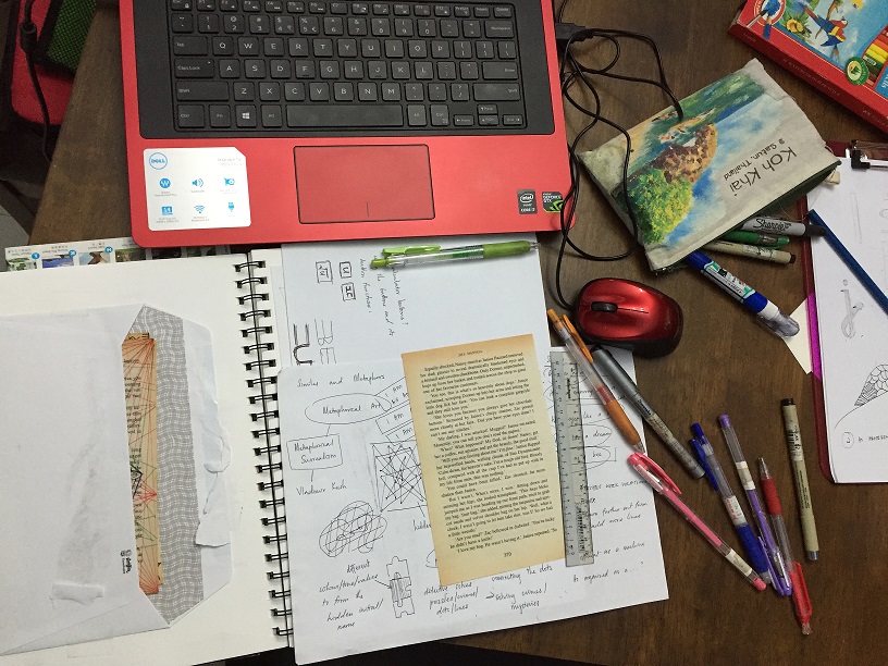
What you’ll see below are the snapshots of how and what the interior of my hard copy journal looks like, consisting of mindmap, research, safe keeping of original book pages, and more research.
What you’ll see below are the snapshots of how and what the interior of my hard copy journal looks like, consisting of mindmap, research, safe keeping of original book pages, and more research.
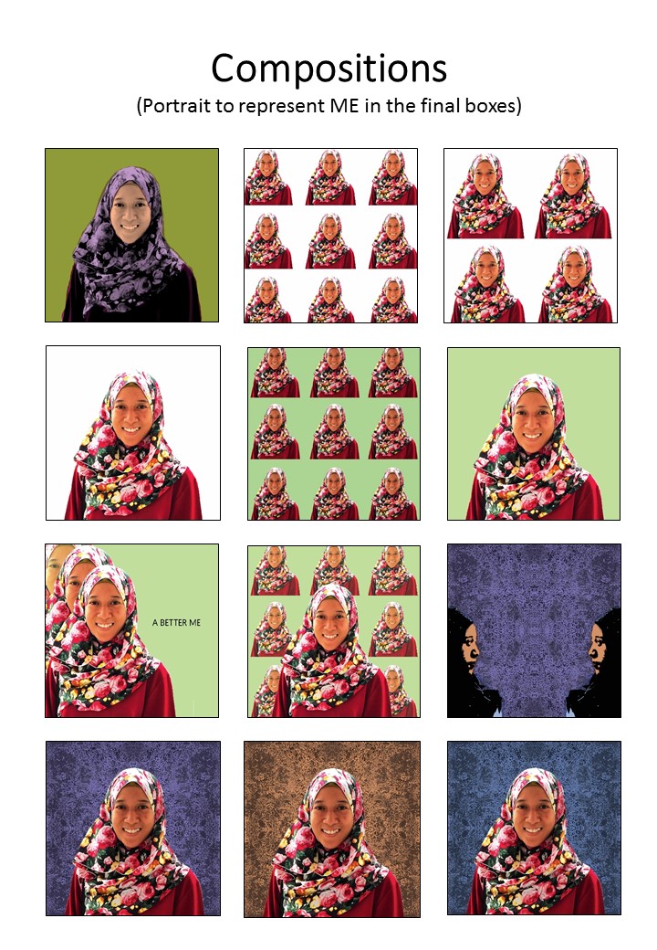
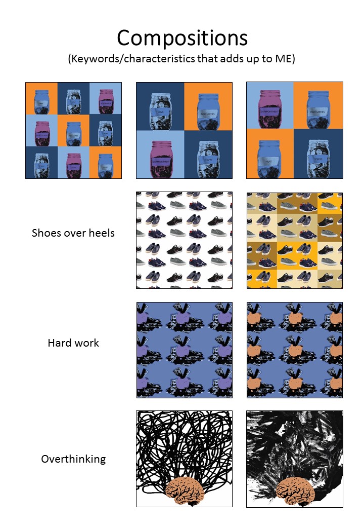
So I have chosen a few designs and printed them out for the final 4 pieces!


This post basically contains the process of the book page making for the project.
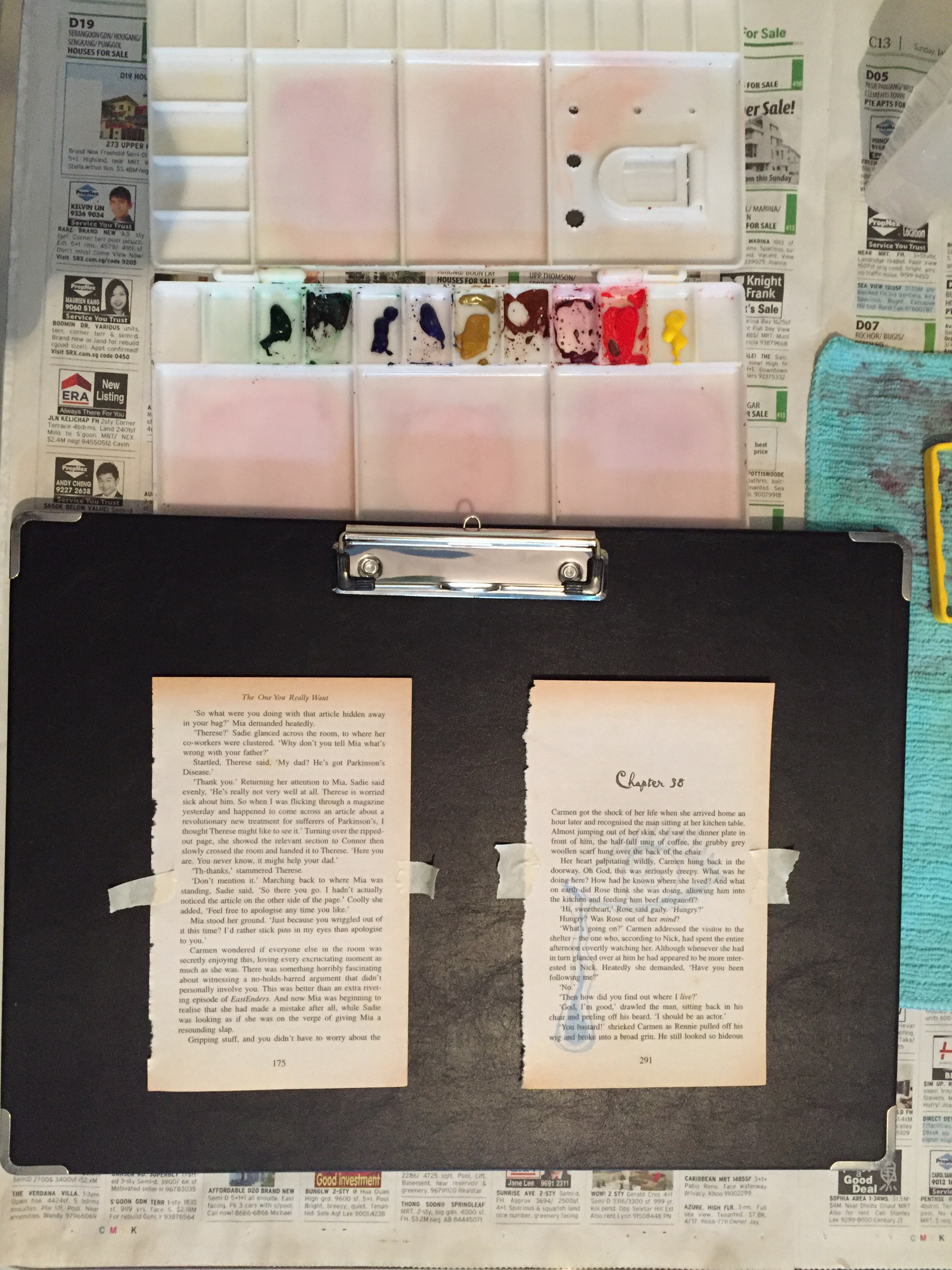
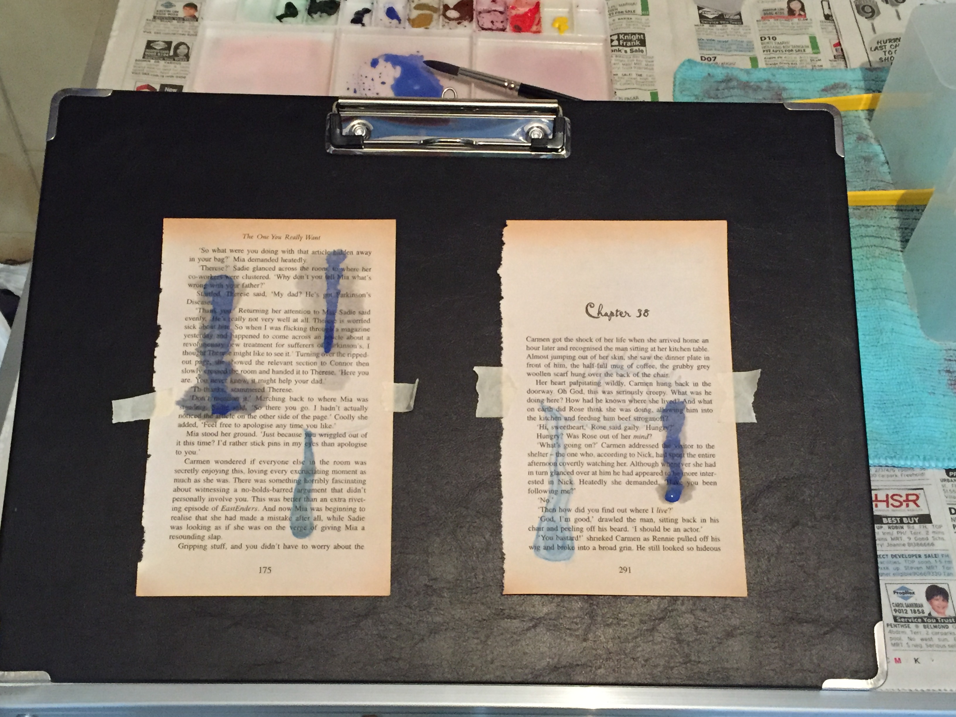
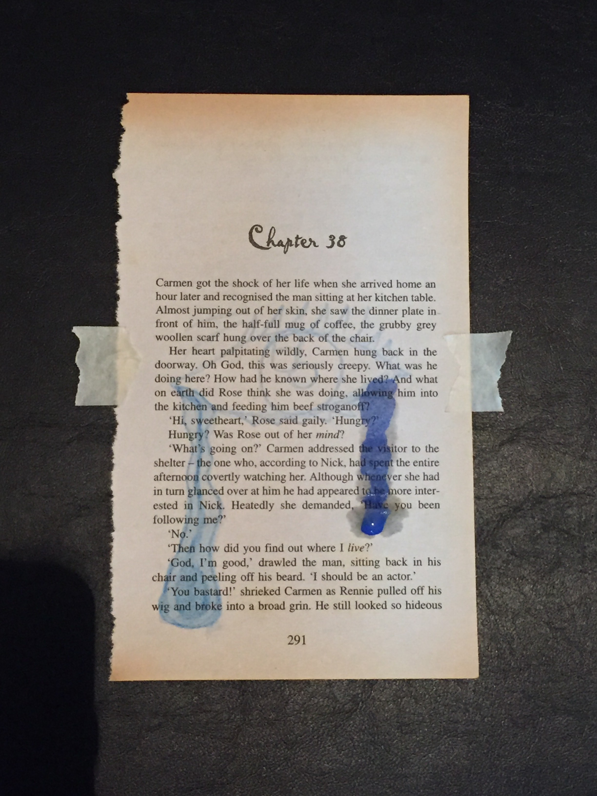
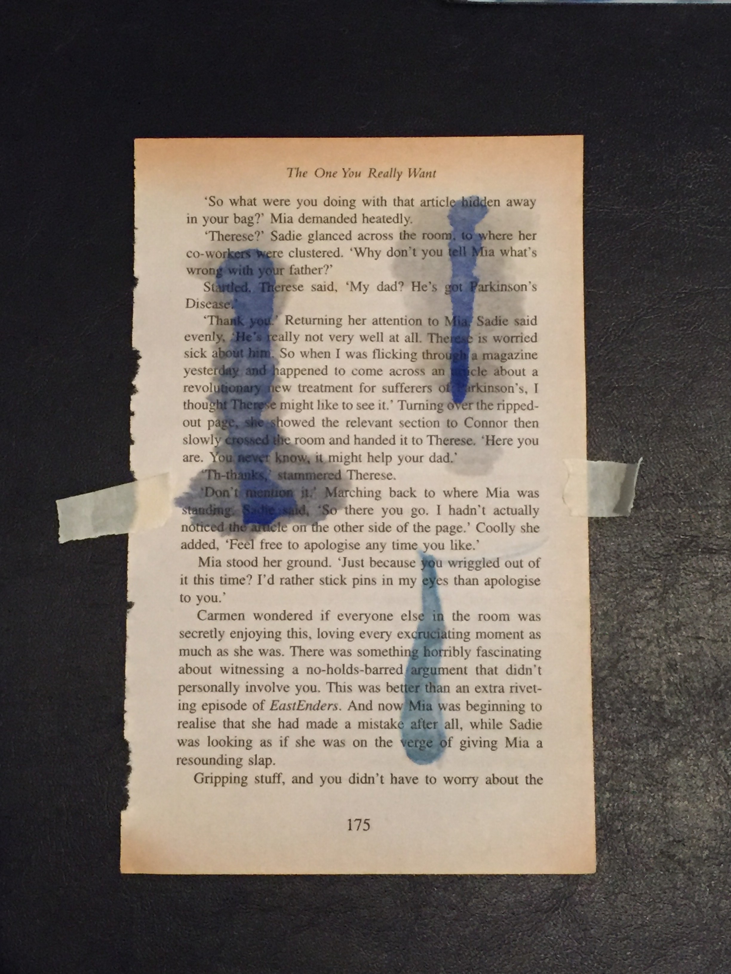
Below are the snapshots of the compiled book pages unedited and edited, versions after versions.
(I would have put the original compiled images here but the file was too big)


With all these versions that I had, I came to a conclusion of what I’d pick for the final 4. (But of course still couldn’t actually decide!)
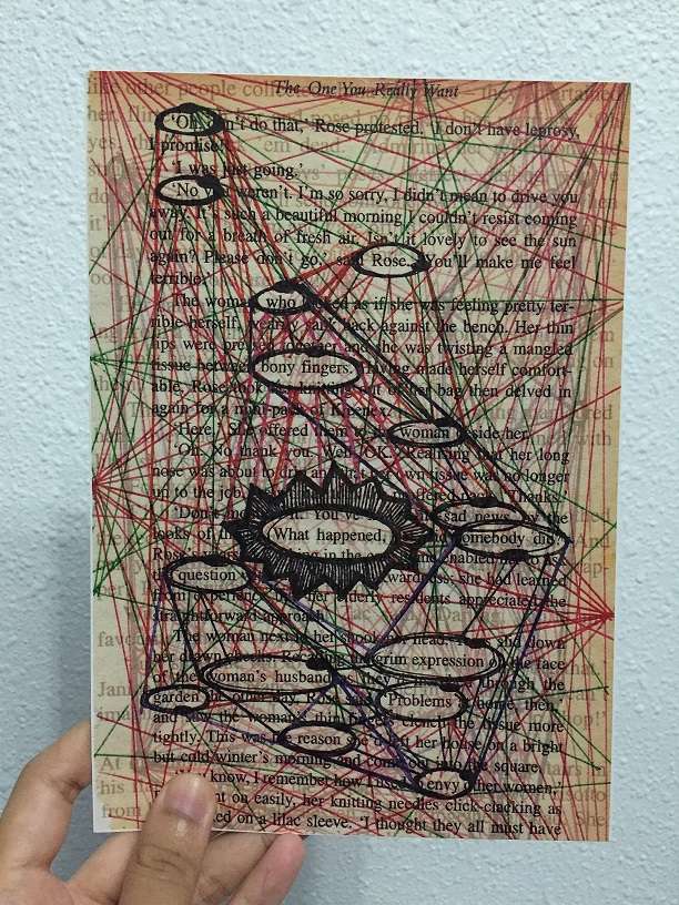
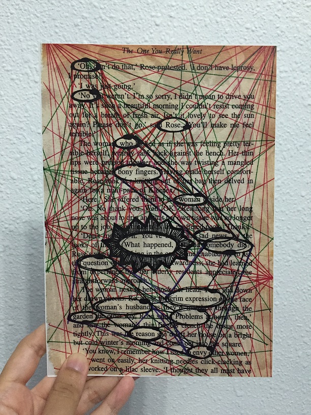
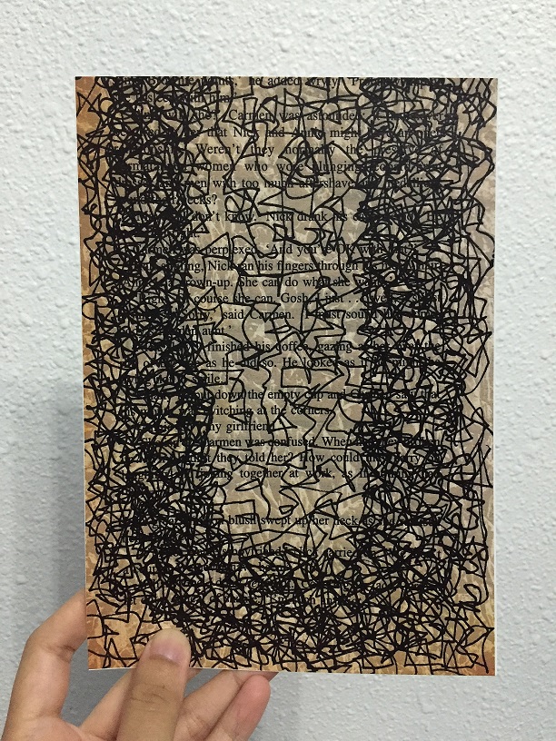
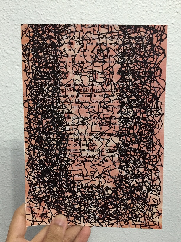
After all the research I did, I tried it out on my book page, scanned it in and gave a little bit of editing — more to enhancing the image with exposure and all.
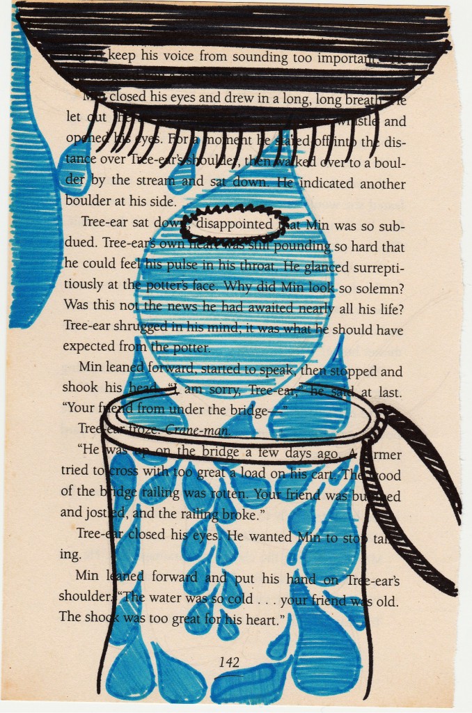
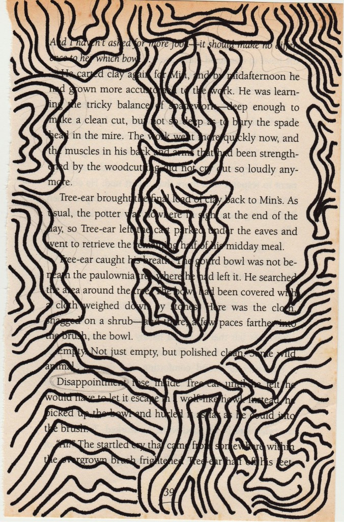
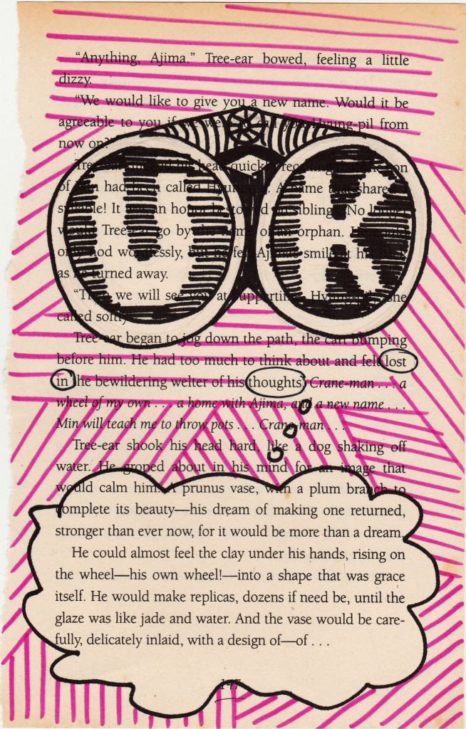
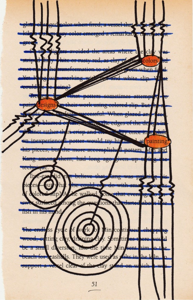
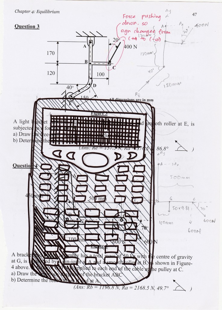
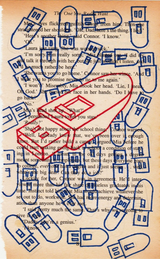
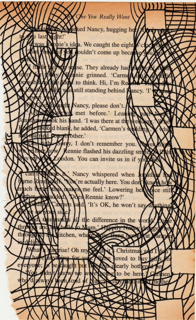
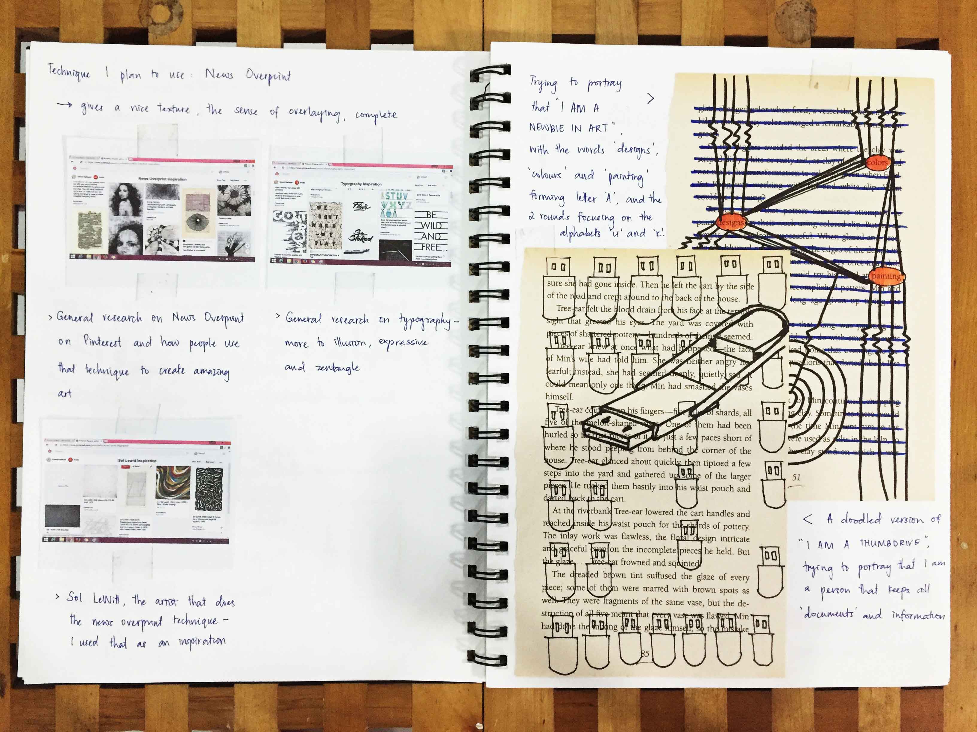
Then I realised after I did all these, that I am somewhat at the metaphor or conceptual phase, for example: the thumbdrive, the binoculars, and perhaps the calculator represents tells something about me. Or more to representing me?
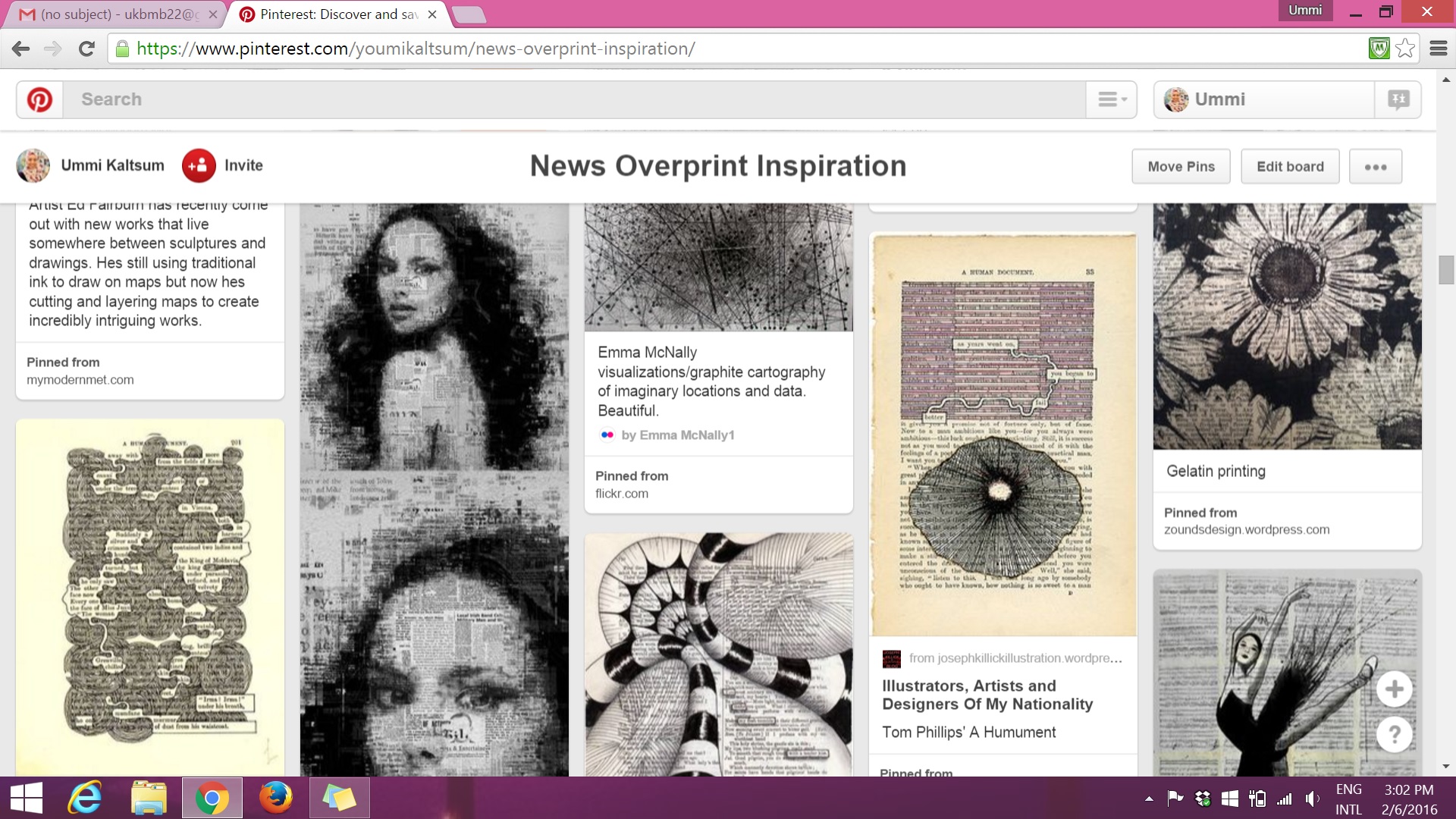
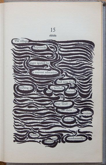
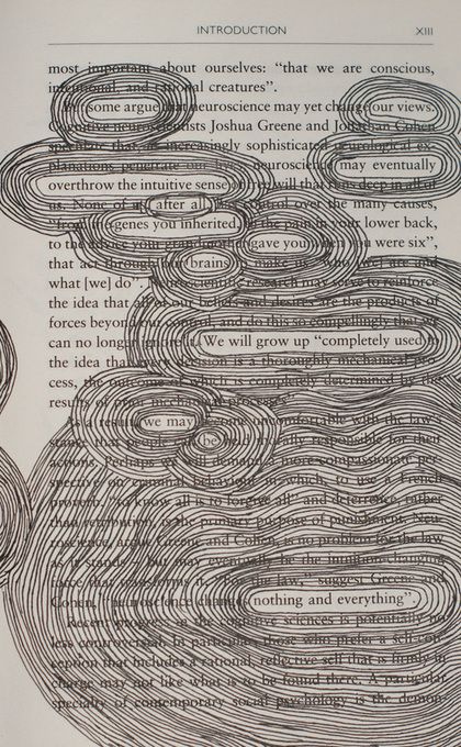
From the previous post, I mentioned my attraction and interest on the technique of News Overprint. So this post will hold a slightly in-depth portion on my research throughout the project.
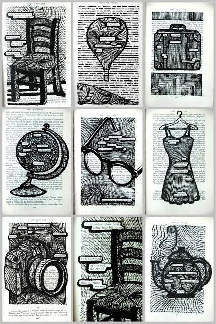
(above) I used these images as an example of how I could incorporate designs into my own book page.

(above) I used these images to help me have an idea how I want to make the typography stand out within the designs in the book page. I thought alot of contrast between bold and light, negative space etc.

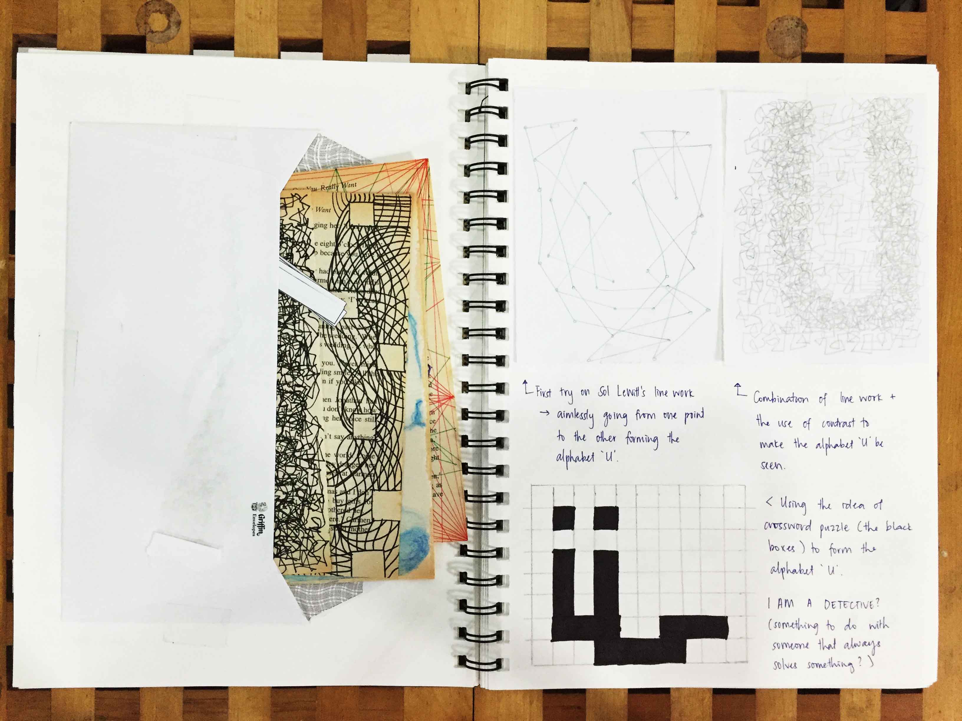
(above) I refer to Sol LeWitt’s wall drawing line works to see how I could portray my personality by using just lines.
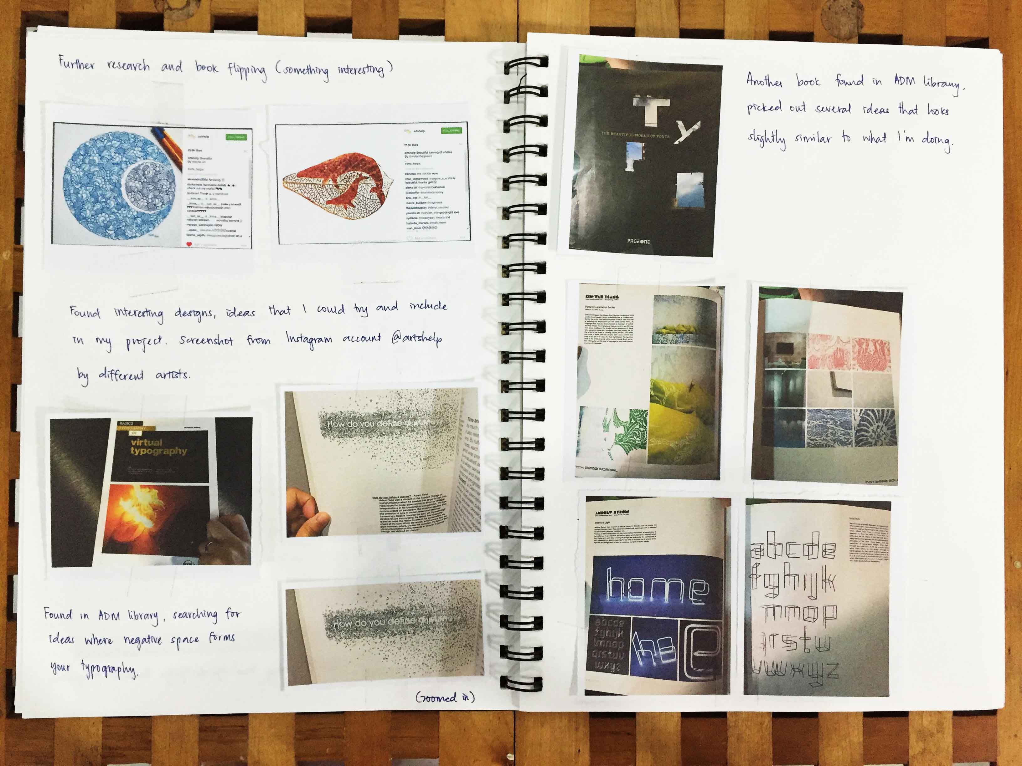
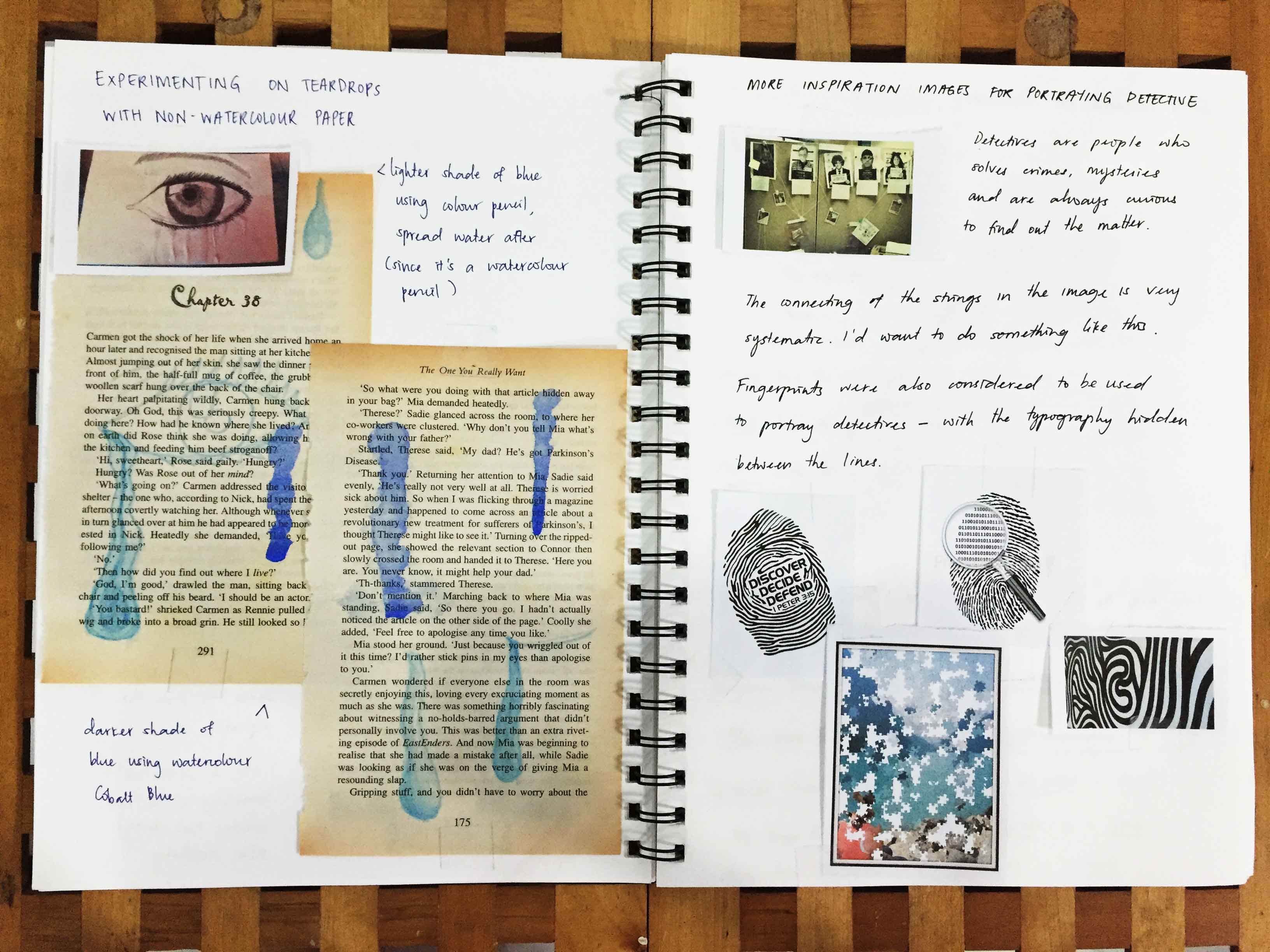
There are other resources that I came across with that I found to be interesting to add on as an inspiration:


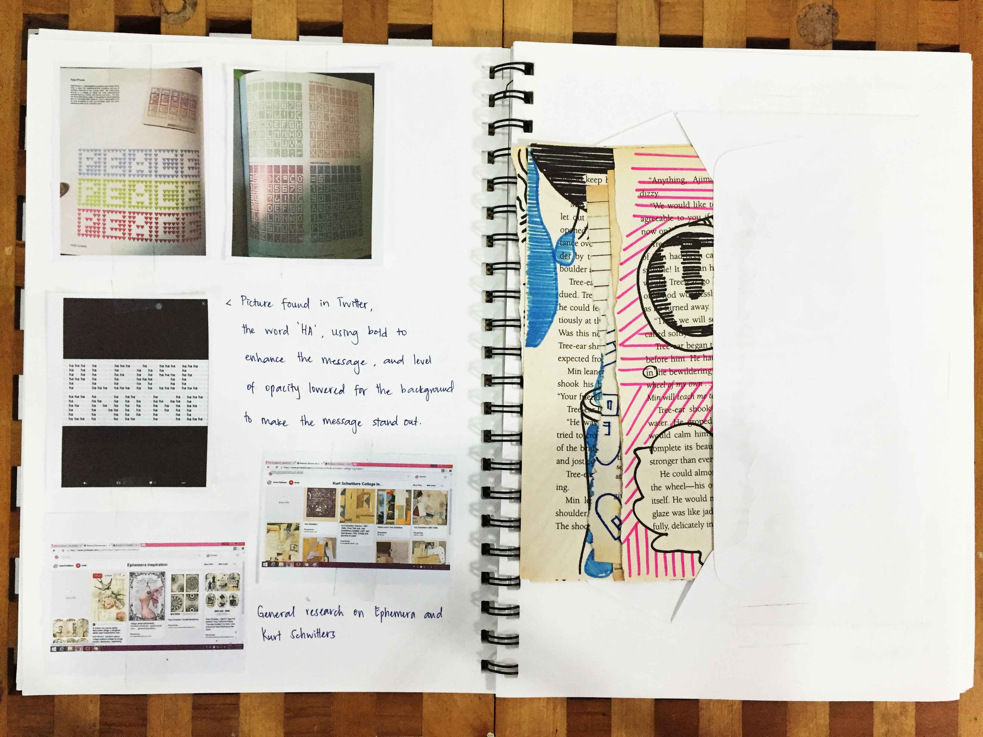
The third image uses the same word throughout the work “HA”. The bold effect allows one to actually see what the message is, with its background faded.


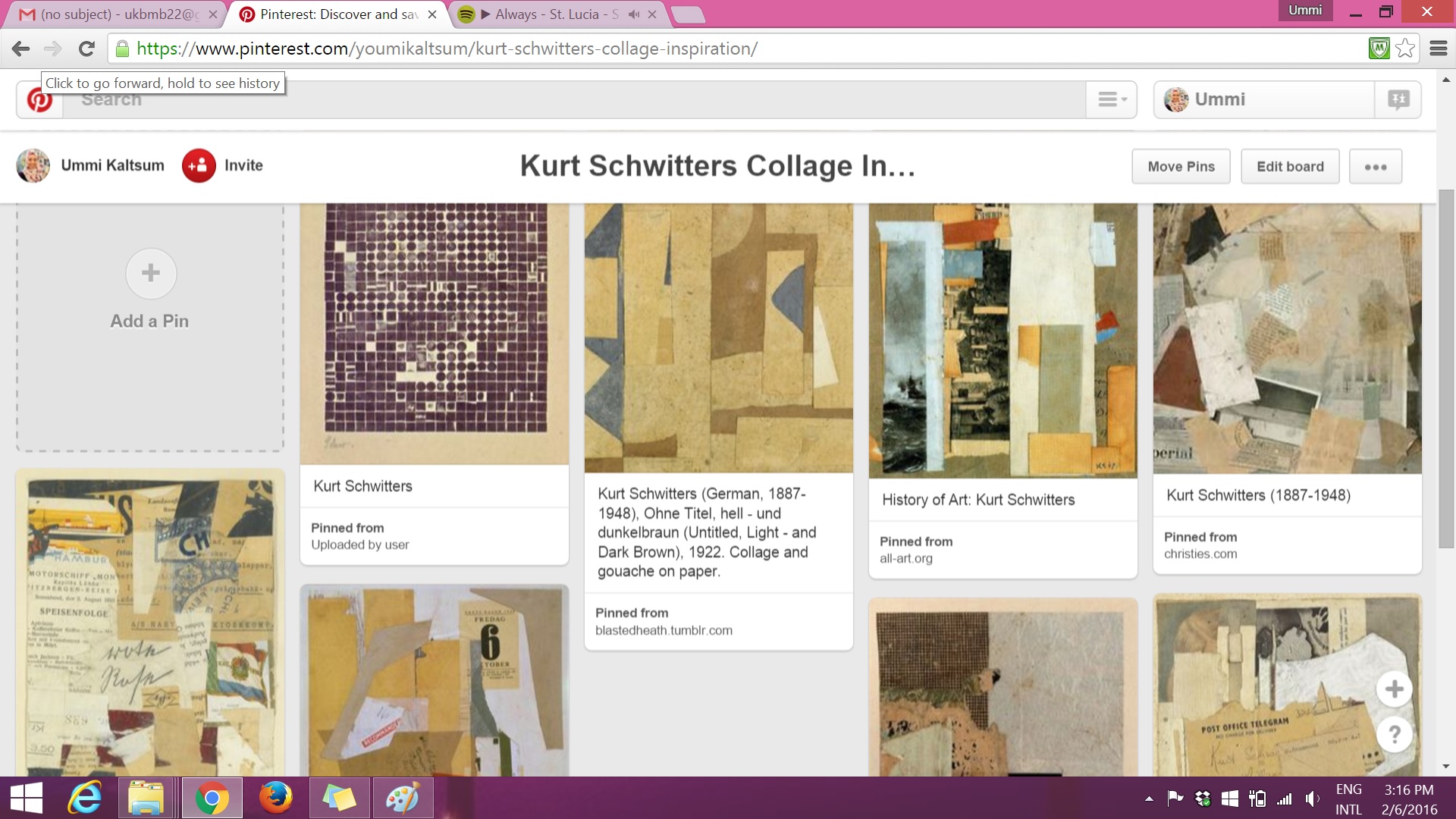
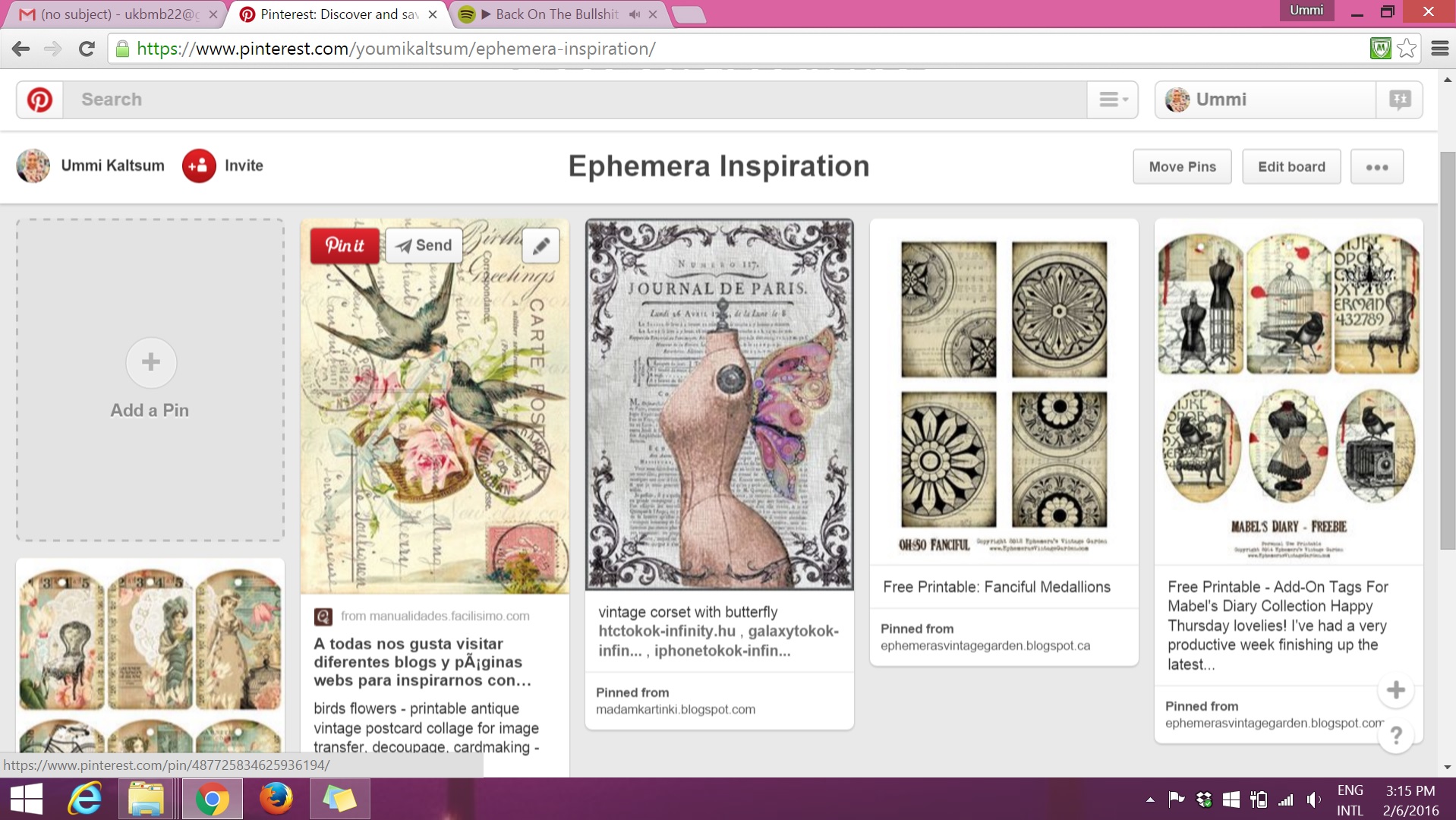
The 2 images below consists of Pinterest research on artist Kurt Schwitters on his collage works and the technique of Ephemera:
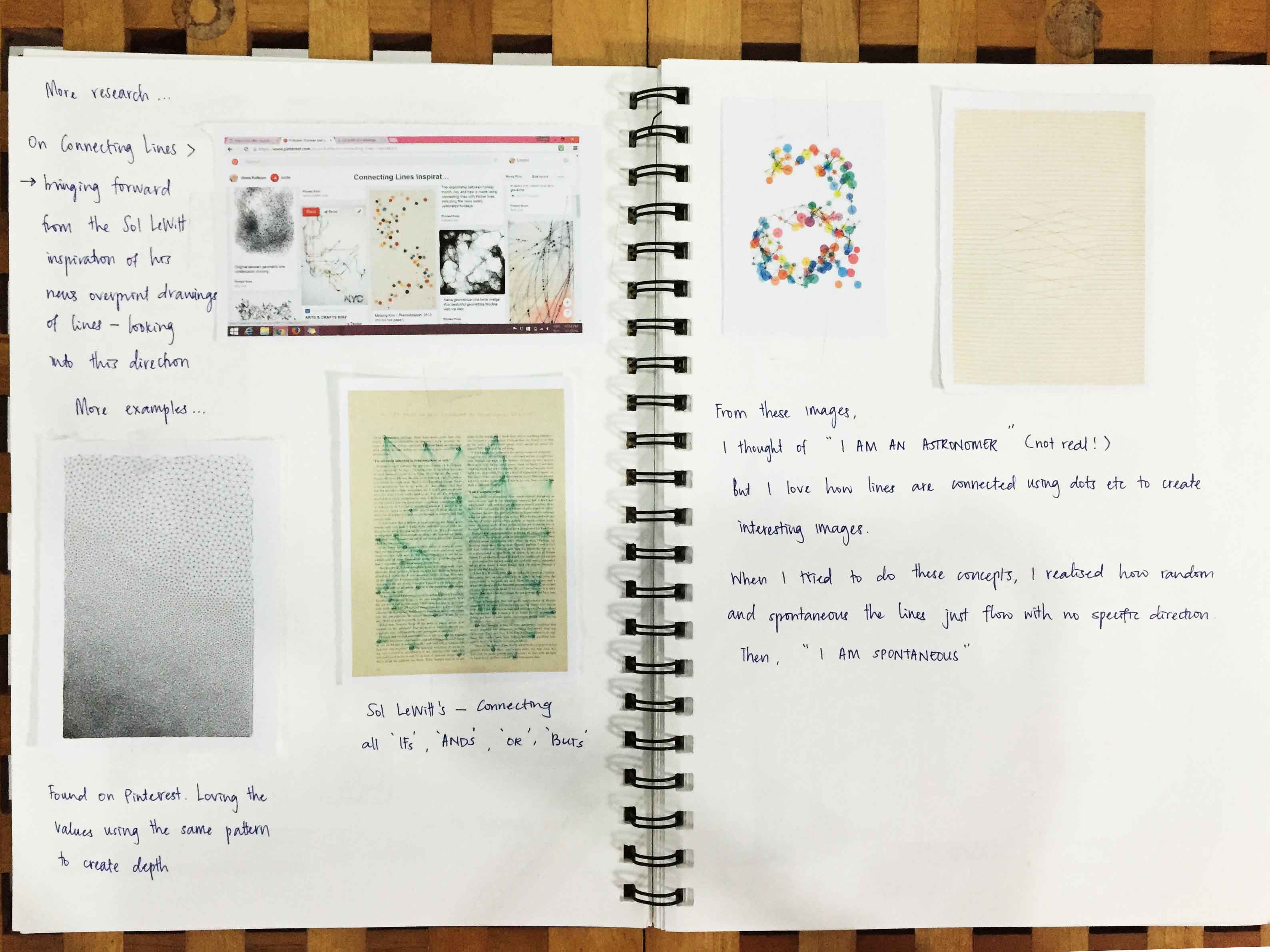
Continuing research on ‘Connecting Lines’ — I wanted to look further from Sol LeWitt’s line works, example: on how I could use these lines to form shapes or typography?

And after these research, I’d try it out myself to see if it suits with the vocation or personality I chose.
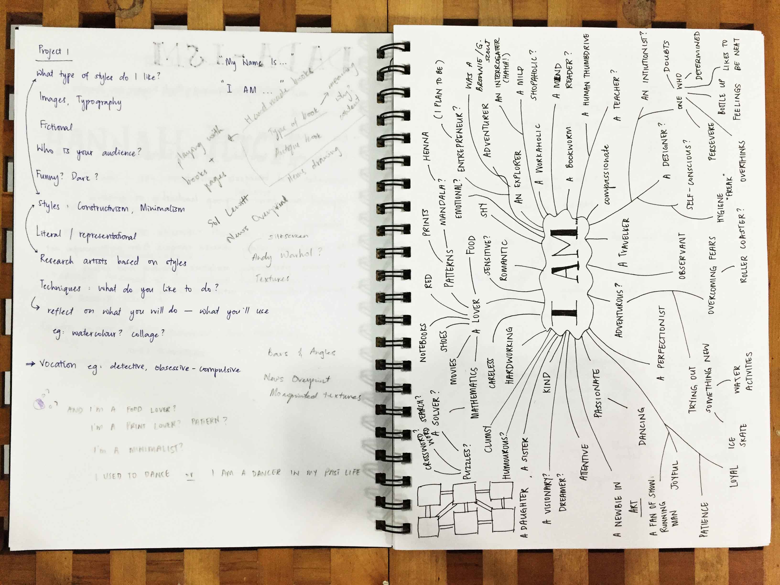
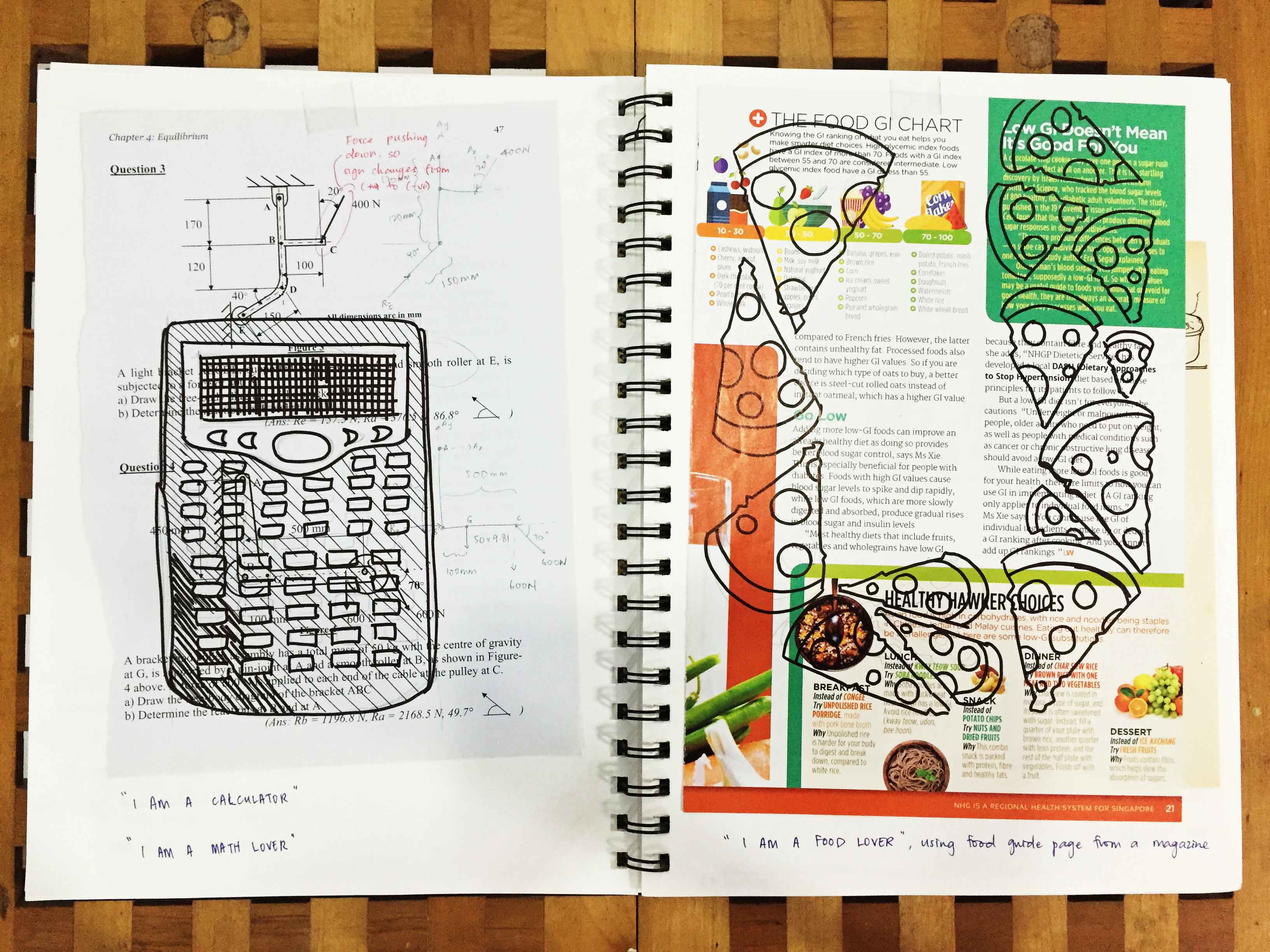
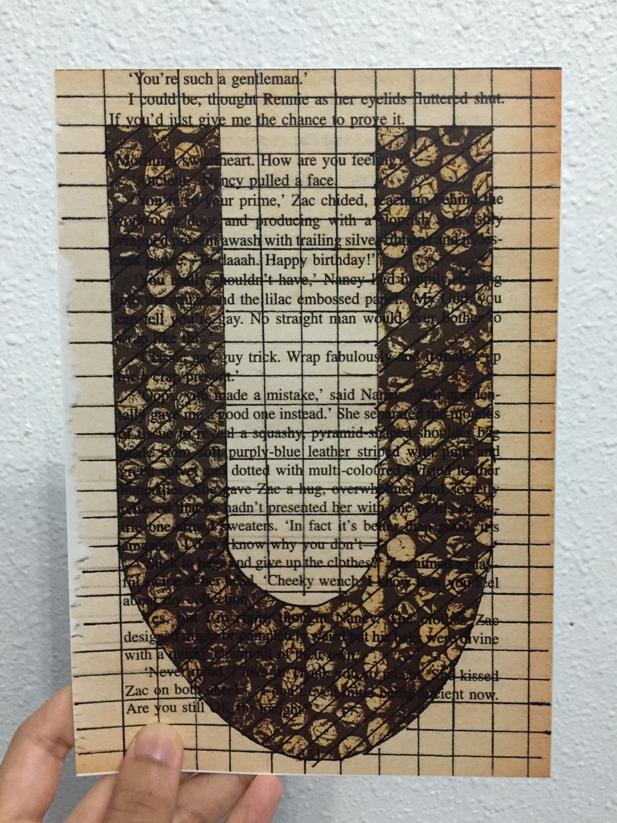
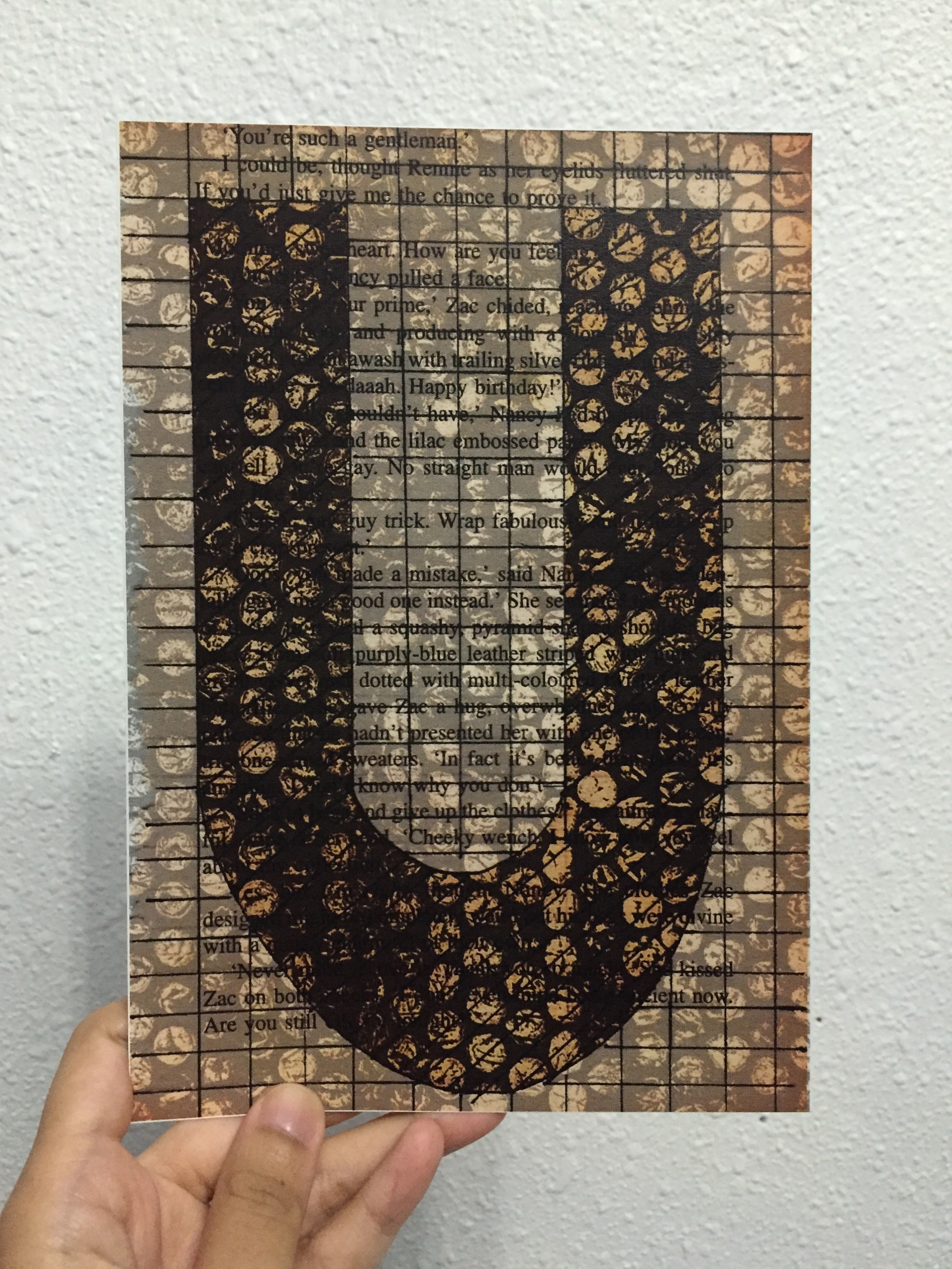
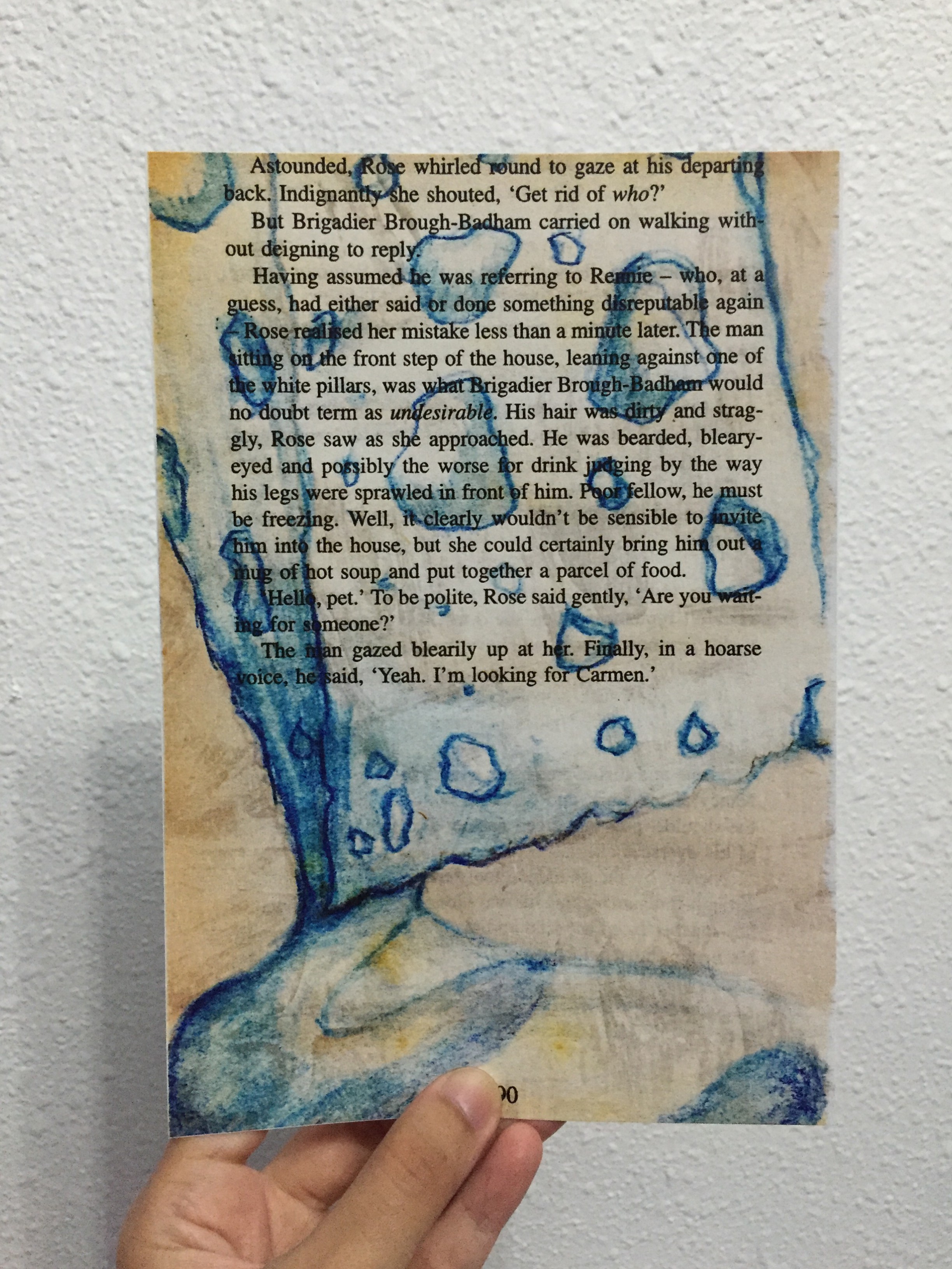
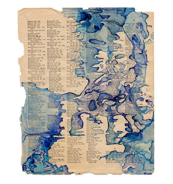
For Project 1, I thought having texts, words, paragraphs from a book page as a background would be interesting. I am one who is attracted to prints and patterns thus I find that the paragraphs on a book page falls under that category as well.
With that, the one artist I know that has done these type of art work would be Sol LeWitt. Examples of his work shown below:


Besides Sol LeWitt’s, these are some of the research from Pinterest:

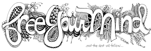
And then I came across these beautiful eye-catching art/designs of Zentangle:


Perhaps, the negative space being the alphabet/initial(s) of my name?
‘HELLO’ was an in-class exercise that we did before Project 1 was introduced.
Here are the scanned version of the name tags:
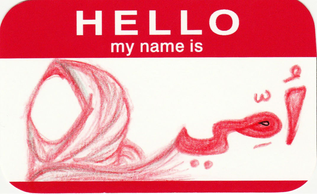


And so,
HELLO MY NAME IS UMMI (:
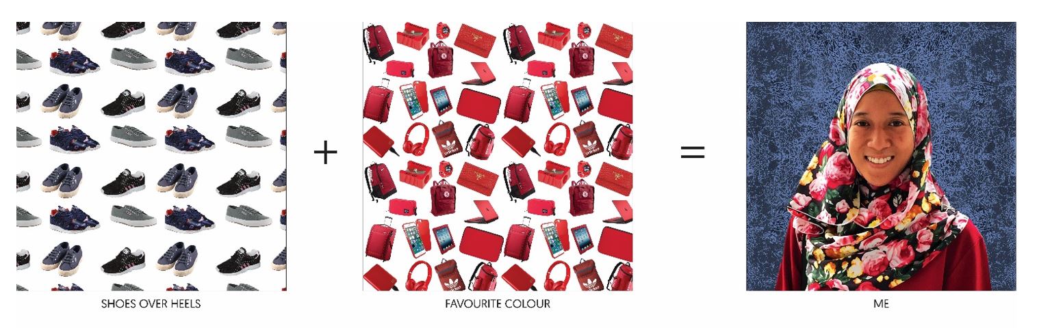
After much decision on which composition to use for the final, it came to this:
_____ + _____ = ME
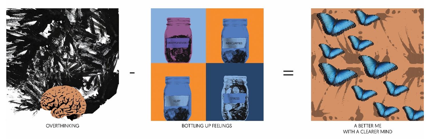
_____ – _____ = A BETTER ME
____ x _____ = AN IDEAL ME

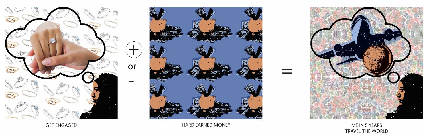
____ + ____ = ME IN 5 YEARS

Therefore, the picture above shows the completion of the project!
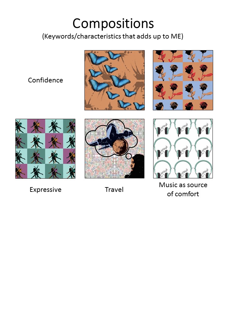
With all the things I listed about myself, I came up with some compositions with some of the keywords. It was a challenge as the process of the pop art effect is pretty time consuming, plus trying to come up with the concept of the compositions took away most of my brain juice. But I was reminded that I too, like minimalism as much as patterns (that can also be seen as messy).
These are the compositions of ME and the different keywords of myself:


EGO
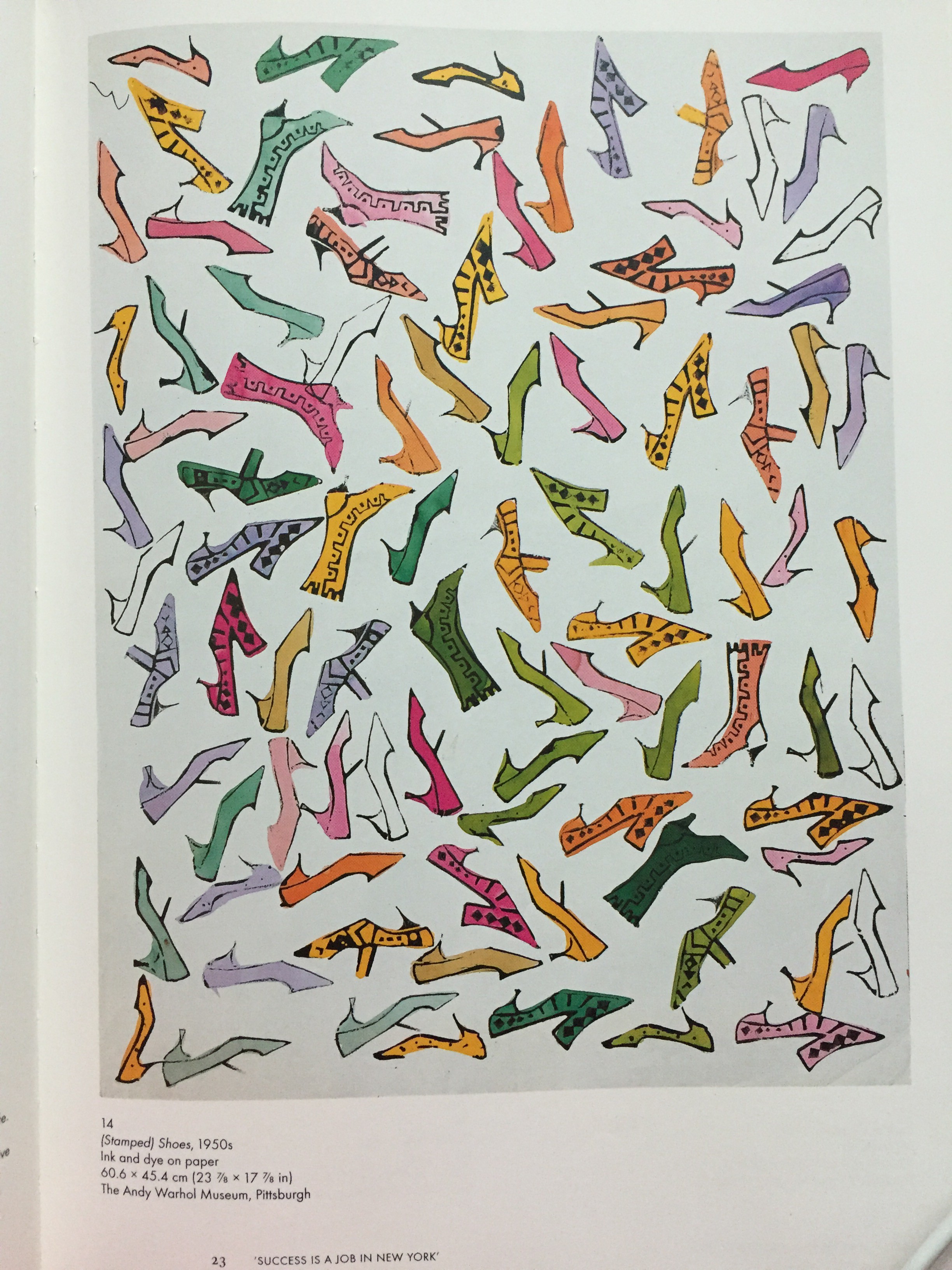
Basically, this project tells people about me, my personalities, my likes and dislikes etc. I listed the things about myself and thought that I would want to have something threshold-y. Consultation with Prof Ina came to the point where mine could be something like Andy Warhol’s pop art.
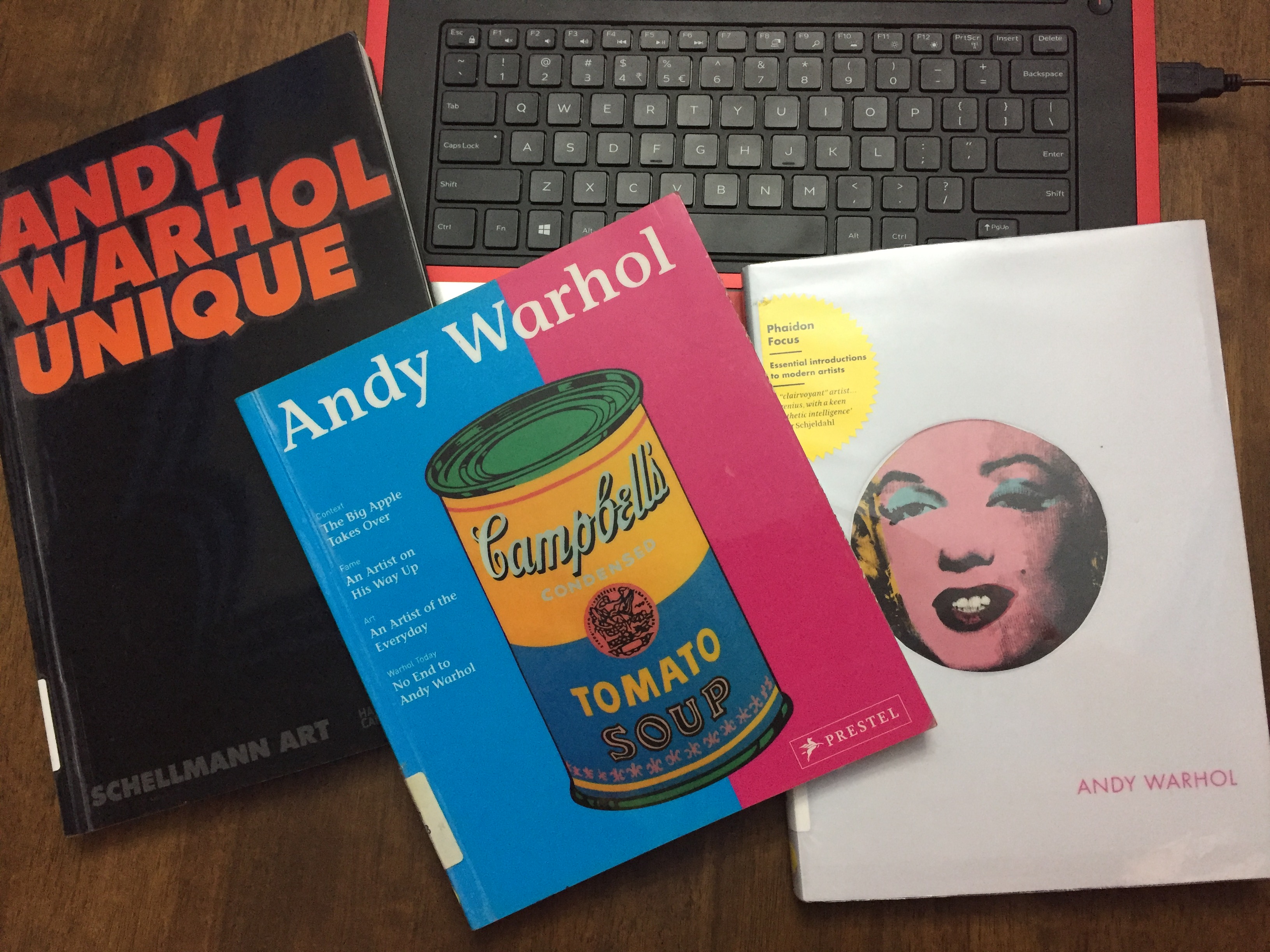
So, I went to the school library and got myself some reference books: