Tag Archives: 2D

Typographic Portrait: Selected few

So I have chosen a few designs and printed them out for the final 4 pieces!

Possible caption of: "MY NAME IS..." "AND I'M LIKE SHERLOCK HOLMES" (Version 2 -- overlay of book page)
Possible caption of: “MY NAME IS…” “AND I’M LIKE SHERLOCK HOLMES” (Version 1 — overlay of book page)
Possible caption of: "MY NAME IS..." "AND I'M LIKE SHERLOCK HOLMES" (Version 2 -- monoprint darken effect on background)
Possible caption of: “MY NAME IS…” “AND I’M LIKE SHERLOCK HOLMES” (Version 2 — monoprint darken effect on background)
Possible caption of: "MY NAME IS..." "AND I'M AS BUSY AS A BEE" (Version 1)
Possible caption of: “MY NAME IS…” “AND I’M AS BUSY AS A BEE” (Version 1)
Possible caption of: "MY NAME IS..." "AND I'M AS BUSY AS A BEE" (Version 2)
Possible caption of: “MY NAME IS…” “AND I’M AS BUSY AS A BEE” (Version 2)
Possible caption of: "MY NAME IS..." "AND I'M SYSTEMATIC" (Version 1)
Possible caption of: “MY NAME IS…” “AND I’M SYSTEMATIC” (Version 1)
Possible caption of: "MY NAME IS..." "AND I'M SYSTEMATIC" (Version 2)
Possible caption of: “MY NAME IS…” “AND I’M SYSTEMATIC” (Version 2)
Possible caption of: "MY NAME IS..." "AND I'M SENSITIVE/EMOTIONAL" (Version 1 -- monoprint darken effect)
Possible caption of: “MY NAME IS…” “AND I’M SENSITIVE/EMOTIONAL” (Version 1 — monoprint darken effect)
Possible caption of: "MY NAME IS..." "AND I'M SENSITIVE/EMOTIONAL" (Version 2 -- monoprint overlay effect)
Possible caption of: “MY NAME IS…” “AND I’M SENSITIVE/EMOTIONAL” (Version 2 — monoprint overlay effect)
Possible caption of: "MY NAME IS..." "AND I'M AS ABSORBENT AS A SPONGE"
Possible caption of: “MY NAME IS…” “AND I’M AS ABSORBENT AS A SPONGE”


Typographic Portrait: More WIP Works

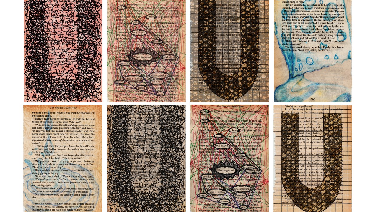
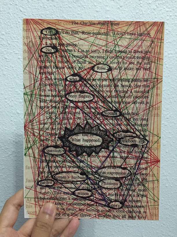
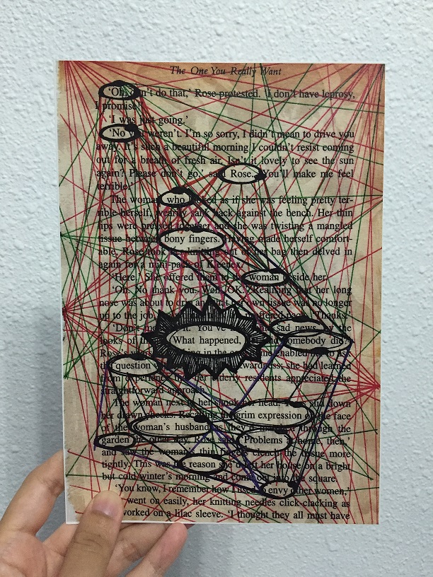
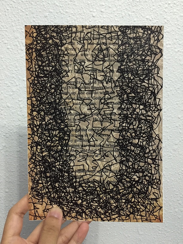
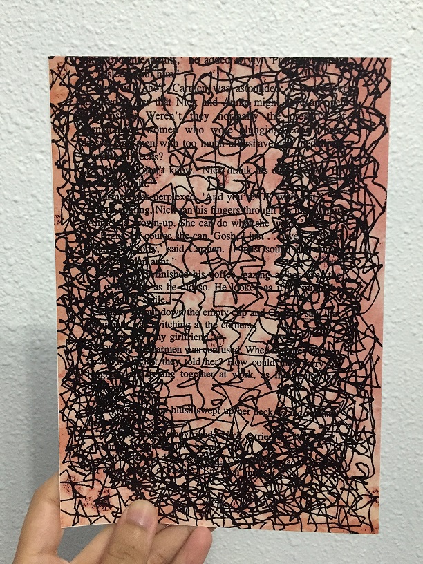
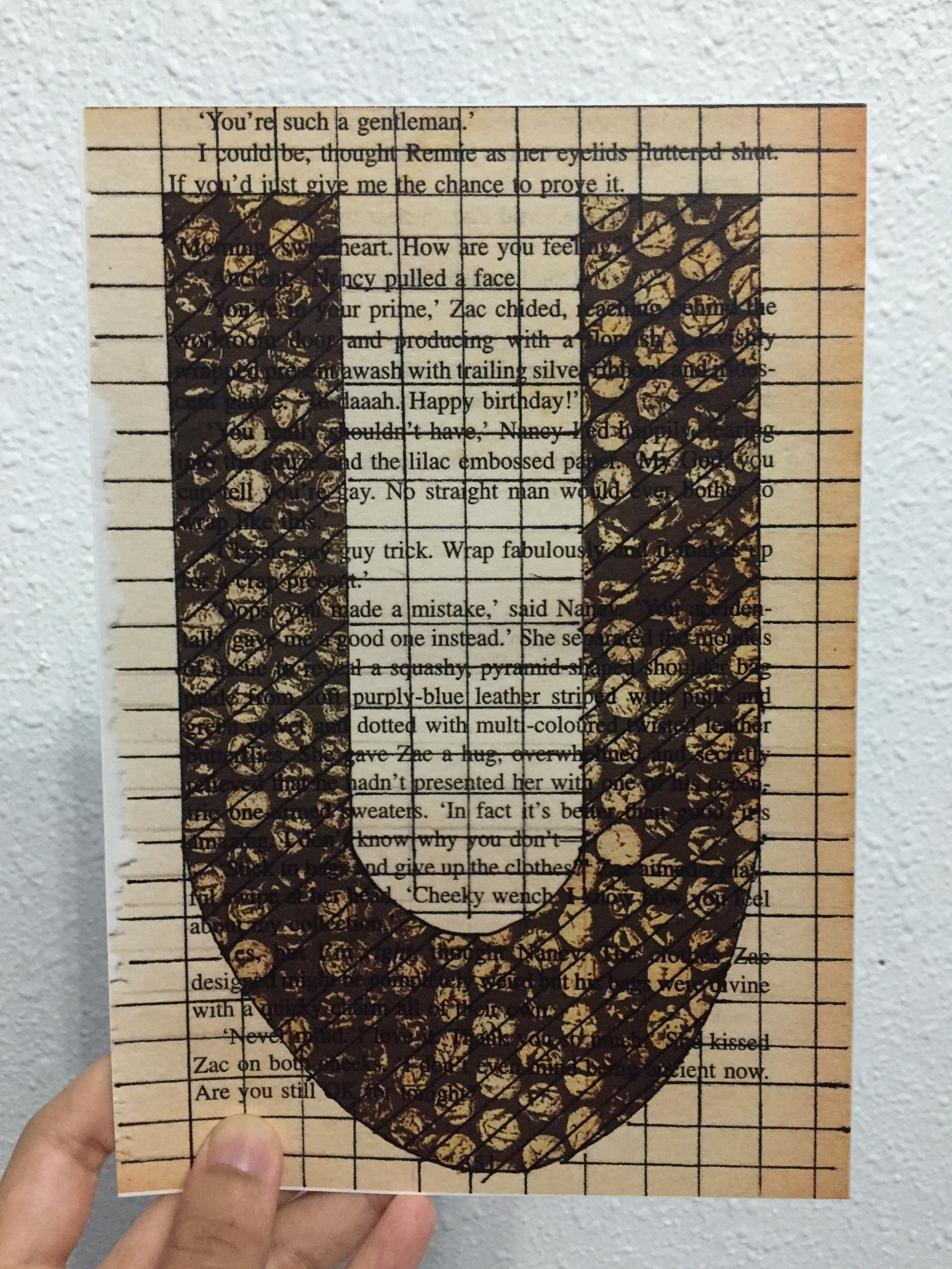
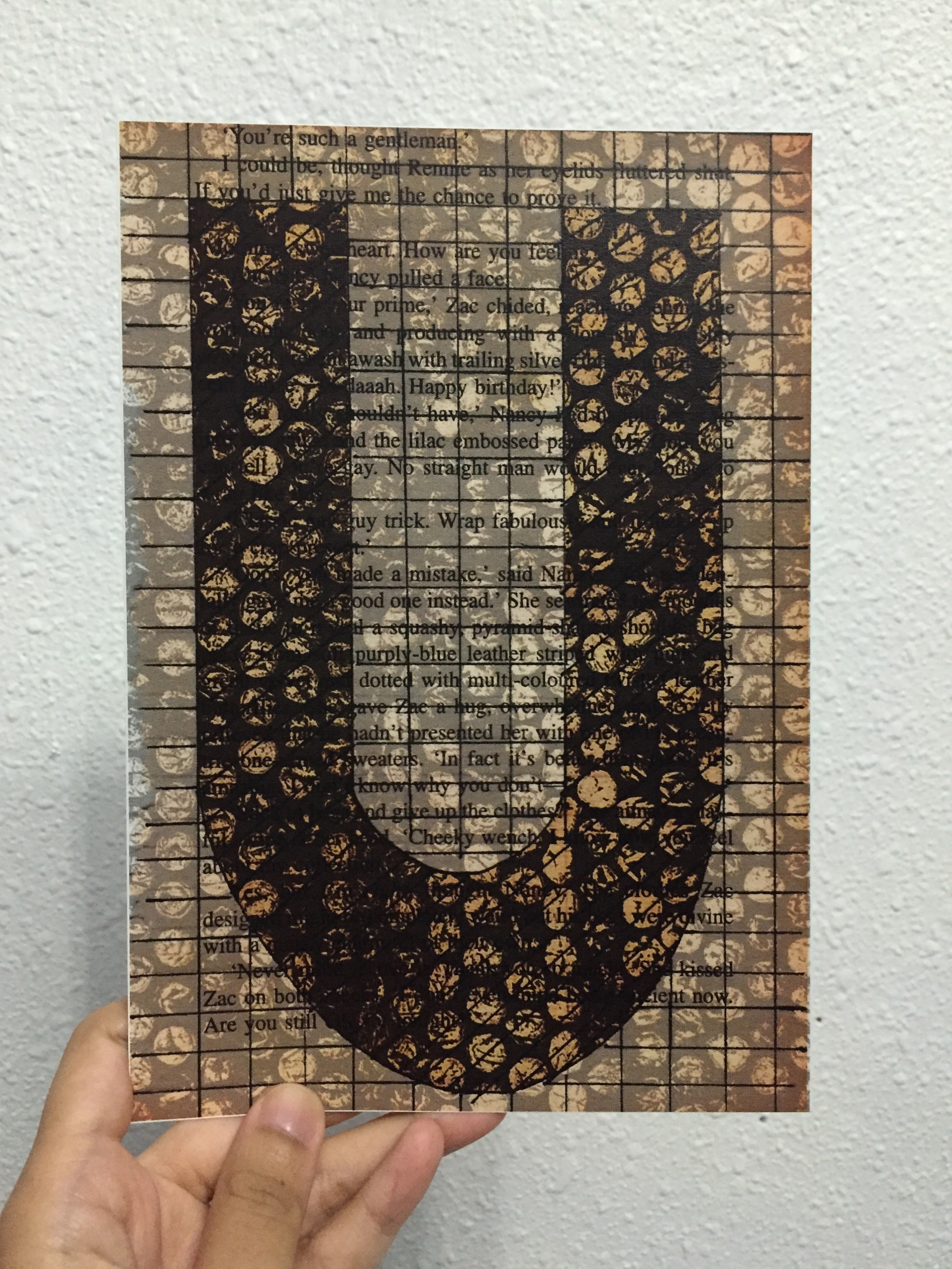
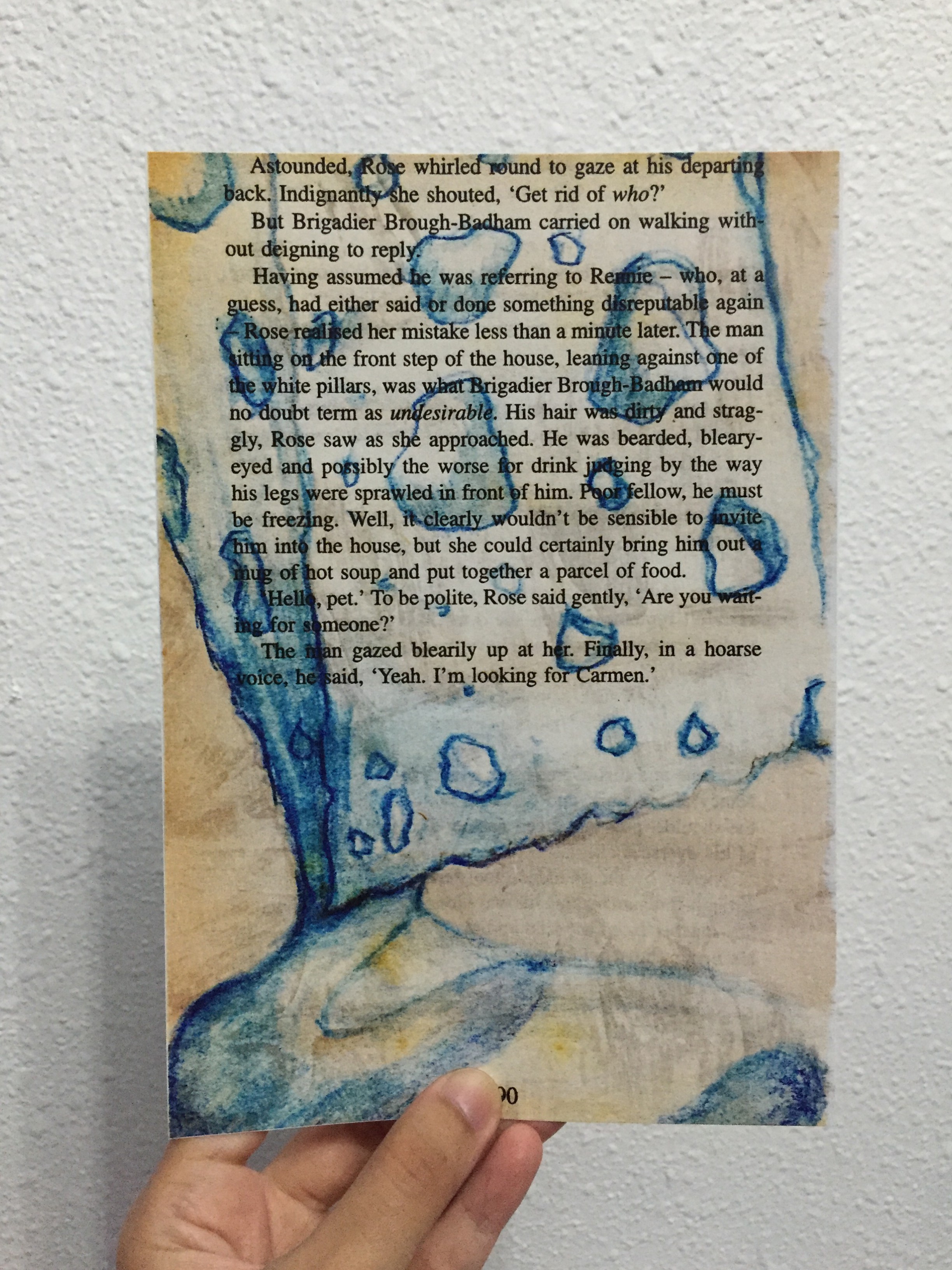
This post basically contains the process of the book page making for the project.

Book Page in the making


Setting up for an experiment!


Testing the effect of (1) how well the paper is after water is spread on it (2) the difference between using watercolour pigment itself (darker blue) and watercolour pencil (lighter blue)


Process Images (7)


Process Images (6)


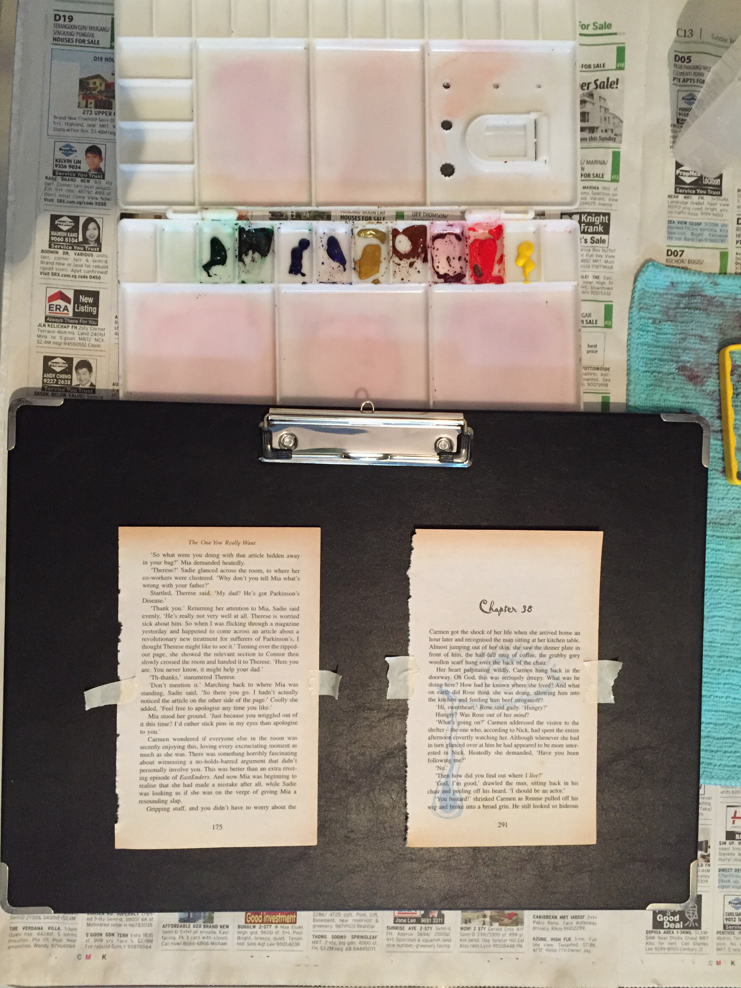
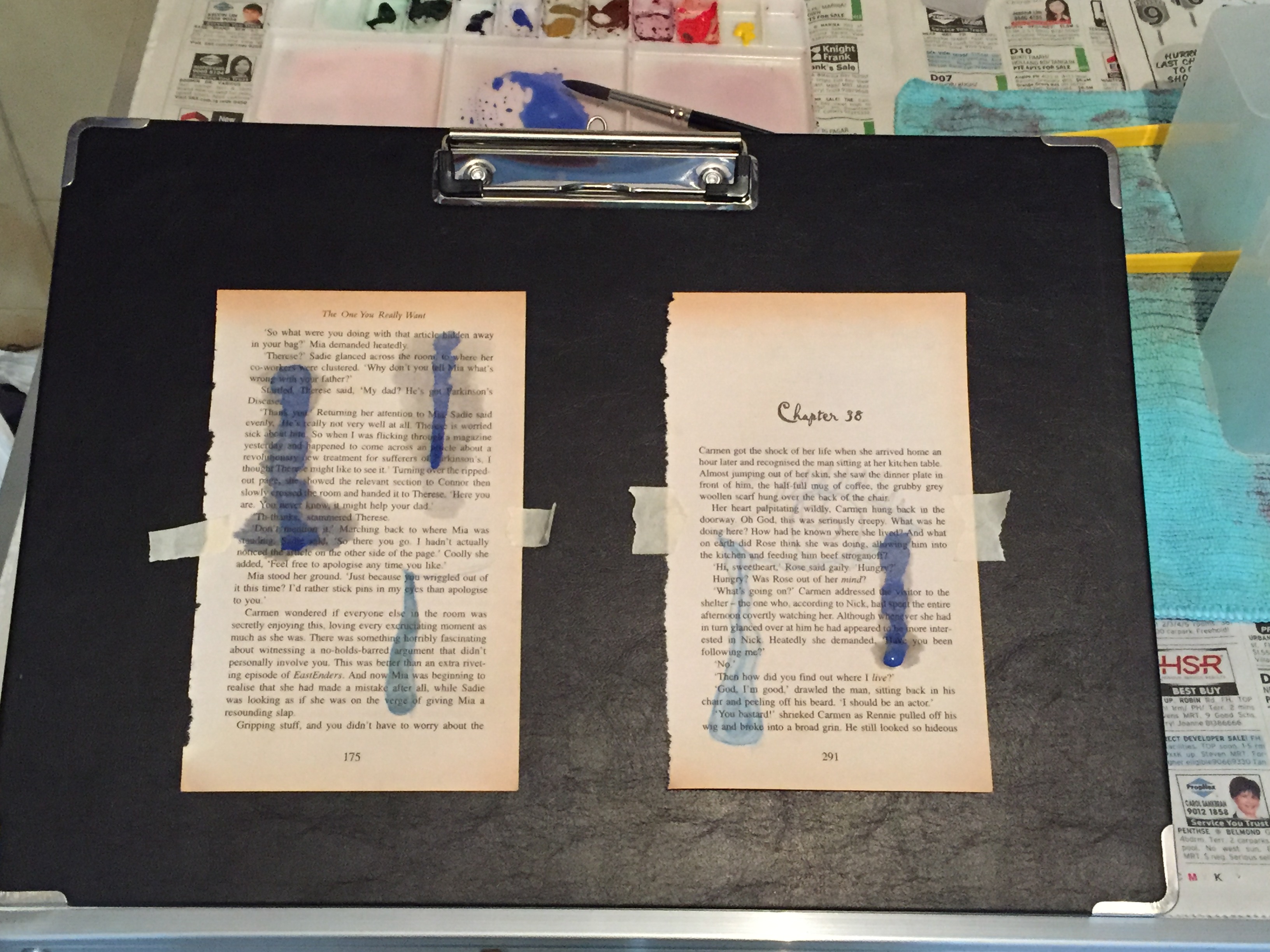
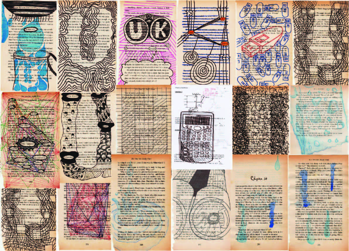
Below are the snapshots of the compiled book pages unedited and edited, versions after versions.

(I would have put the original compiled images here but the file was too big)


With all these versions that I had, I came to a conclusion of what I’d pick for the final 4. (But of course still couldn’t actually decide!)

Final Compositions

After much decision on which composition to use for the final, it came to this:
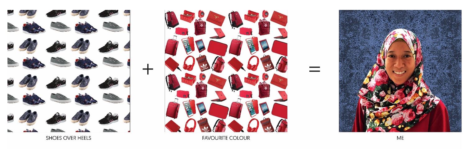
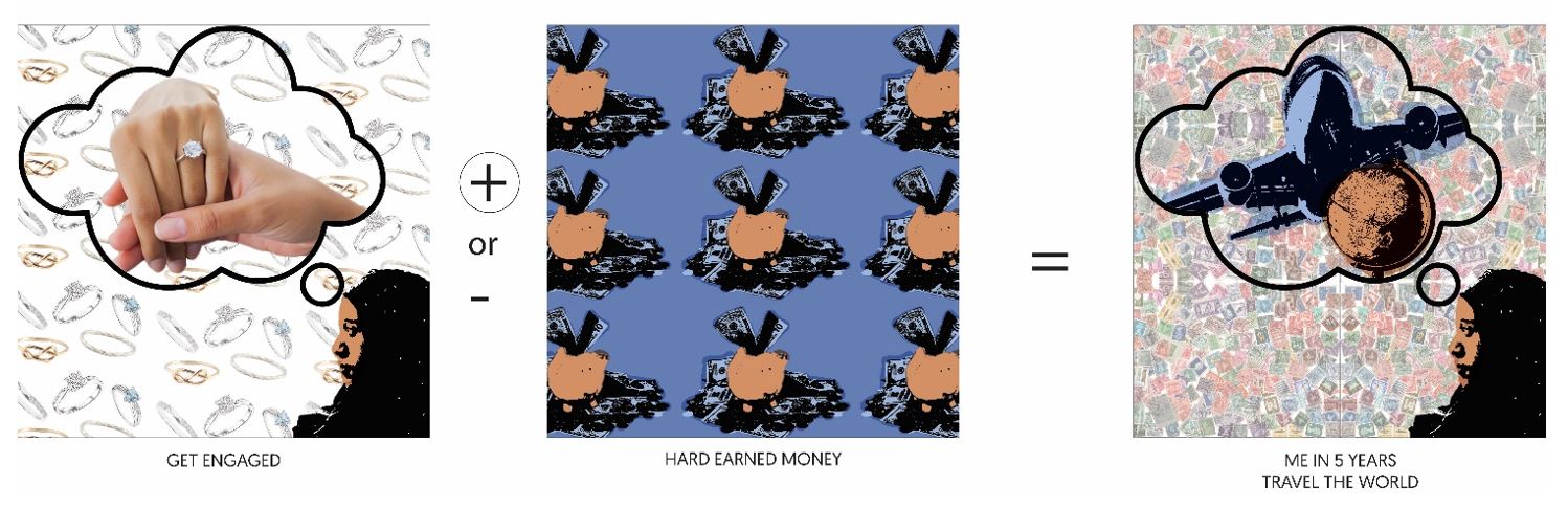
_____ + _____ = ME

  • I find myself comfortable wearing slippers, sandals, and shoes most of time instead of high heels. This composition had a variation where I tried to add some pop art effects, but I the original image colour of the shoes are nice thus I went for minimalism with the background.
  • As shown from the image above, I like the colour red thus the image implies that most of my items are in red.
  • ME, a portrait of myself with textured background from the previous monoprint works.

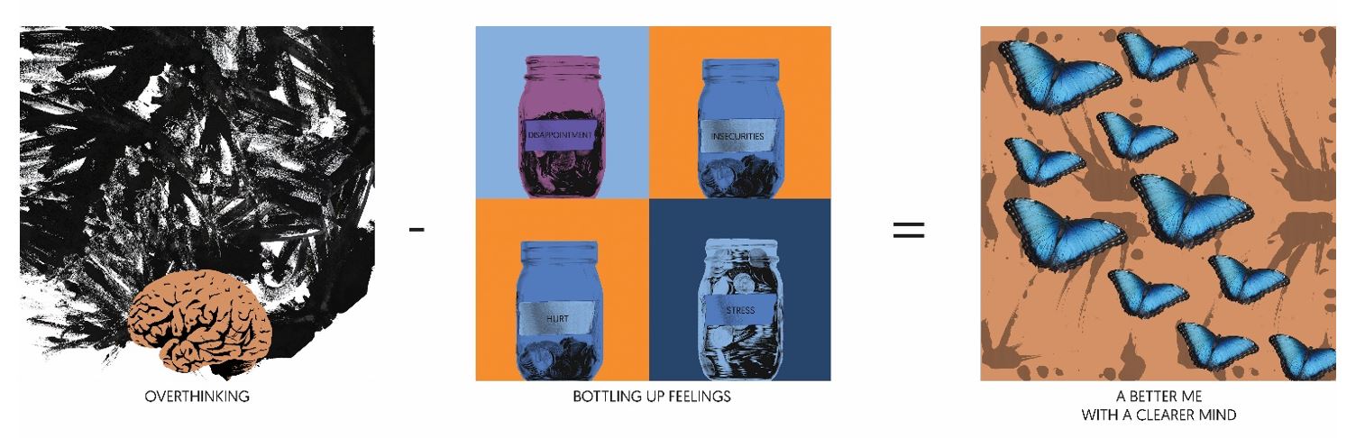
_____ – _____ = A BETTER ME

8

  • I tend to overthink alot whenever I am working, and it would mess up my mind — bringing myself down
  • I also tend to bottle up my feelings whenever I am not feeling too happy or etc.
  • Therefore when I minus Overthinking with Bottling Up Feelings, it would get me to be free from the mess in my mind and heart and soul. I used butterflies to symbolise being free.

____ x _____ = AN IDEAL ME

9

  • Because I tend to overthink which leads me to pull myself down with such negativity, I would like to be more optimistic than pessimistic.
  • I want to be more expressive, more vocal so that people actually know how I feel. I used the image of dancers because dancers are always told to show emotions through their body movement and their facial expression.
  • If I were to multiply optimistic with being more expressive, I would get the ideal me who blooms with confidence. I used flower (rose in particular) because it is in my favourite colour but at the same time, it is known that flowers bloom. Thus when you bloom, you tend to be ready, be brave for whatever that comes your way.

____ + ____ = ME IN 5 YEARS

10

  • Pretty ambitious thinking, but I would like to see myself at least getting engaged. These series composition were the tough ones as I wanted to show that I was dreaming (which explains the bubble thought in the image). However, the background would have been plain thus I decided to add repetition at the background for consistency in style.
  • Hard earned money saved in the piggy bank for future use
  • Therefore, the equation added up as such — seeing myself travelling around the world with the money that I earned. The background comprises of repetition of stamps to show the travelling to different countries.
FINAL OF THE FINAL


Therefore, the picture above shows the completion of the project!

Work in Progress

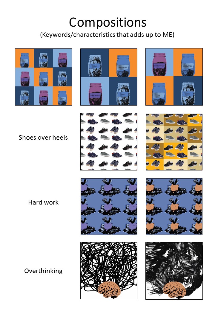
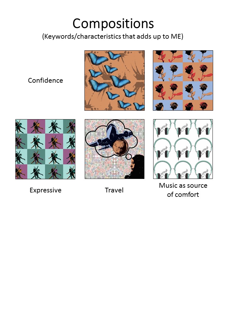
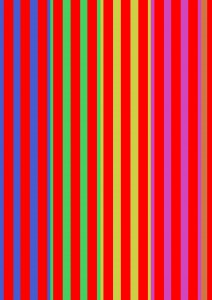
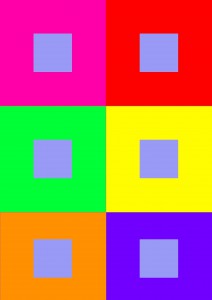
With all the things I listed about myself, I came up with some compositions with some of the keywords. It was a challenge as the process of the pop art effect is pretty time consuming, plus trying to come up with the concept of the compositions took away most of my brain juice. But I was reminded that I too, like minimalism as much as patterns (that can also be seen as messy).

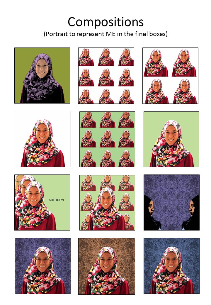
These are the compositions of ME and the different keywords of myself:

Portrait of myself with different trials of colour schemes
Different compositions of the different keywords of myself

3

4

5

Colour Schemes for the compositions

Artist Reference/Style

EGO

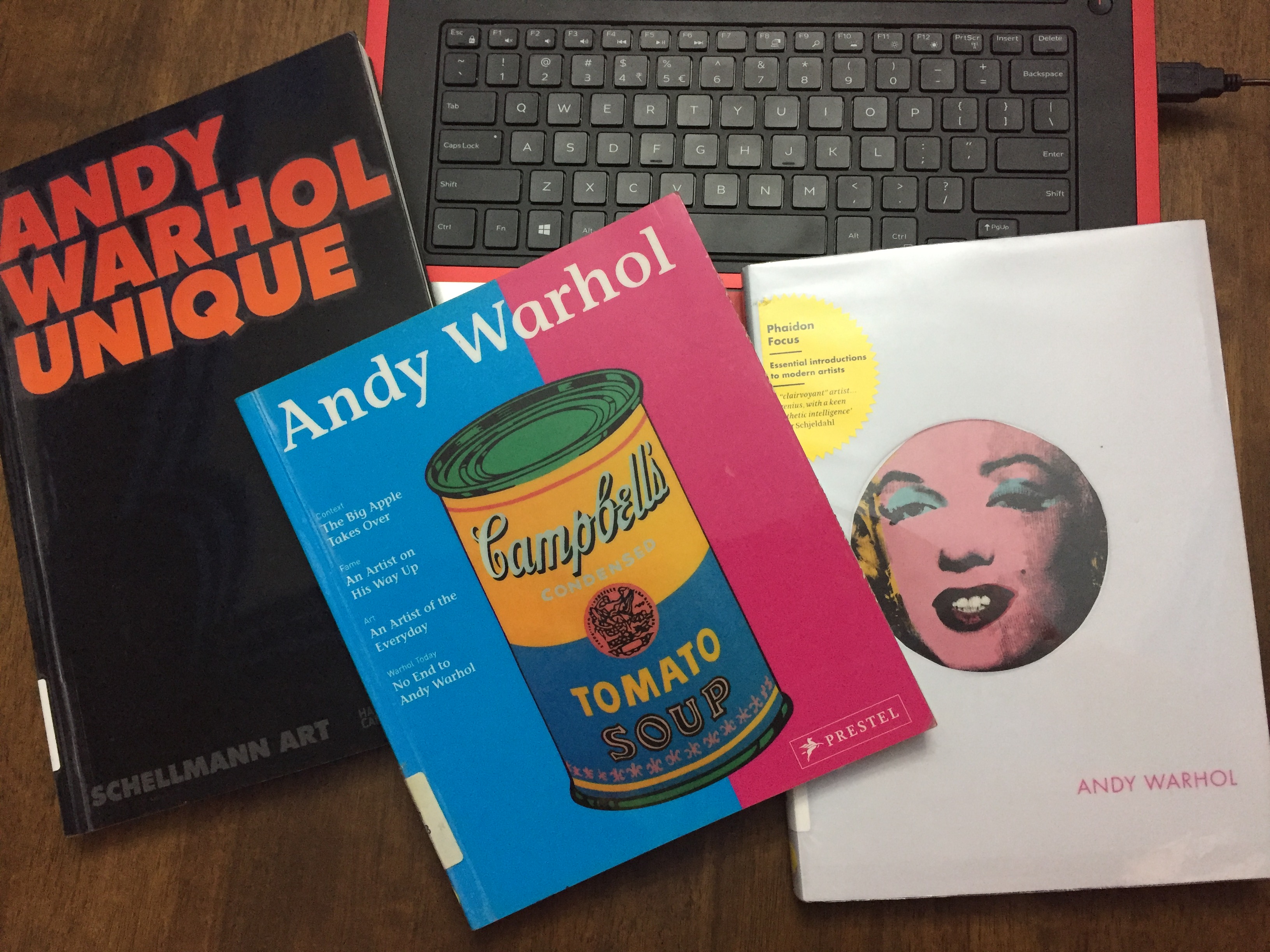
Basically, this project tells people about me, my personalities, my likes and dislikes etc. I listed the things about myself and thought that I would want to have something threshold-y. Consultation with Prof Ina came to the point where mine could be something like Andy Warhol’s pop art.

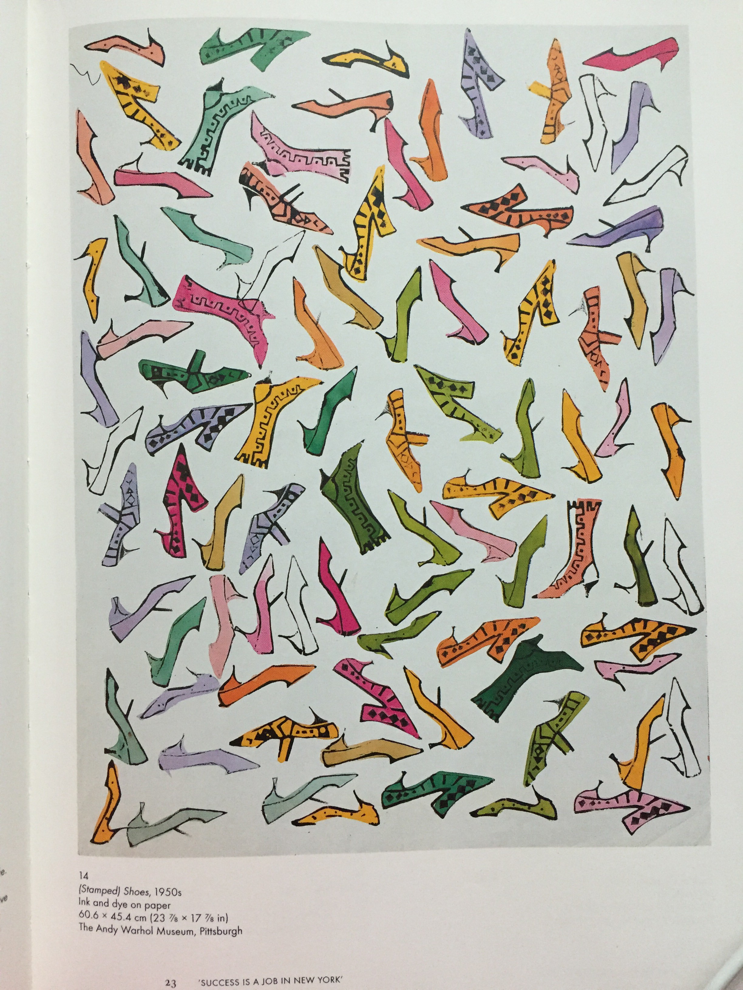
So, I went to the school library and got myself some reference books:
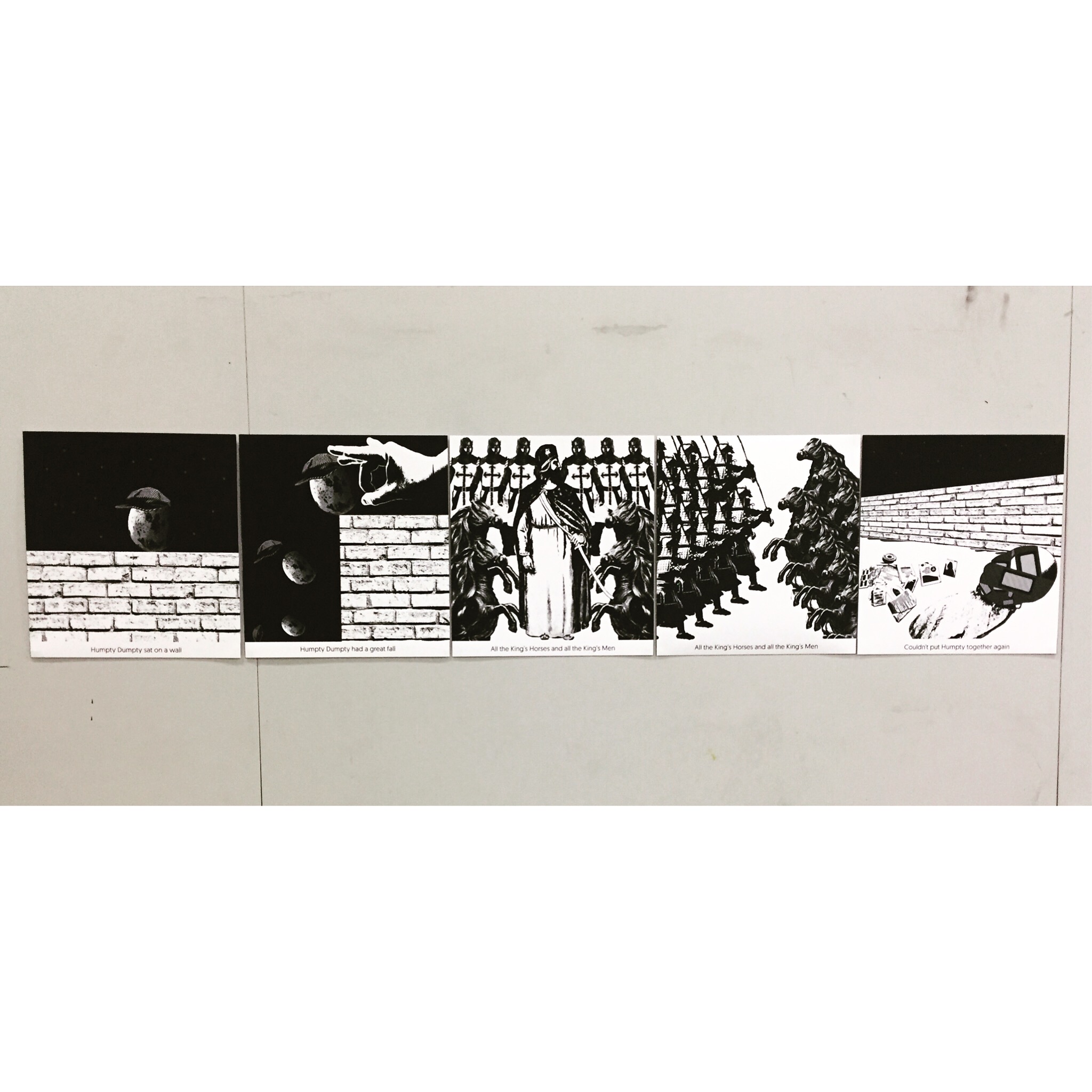
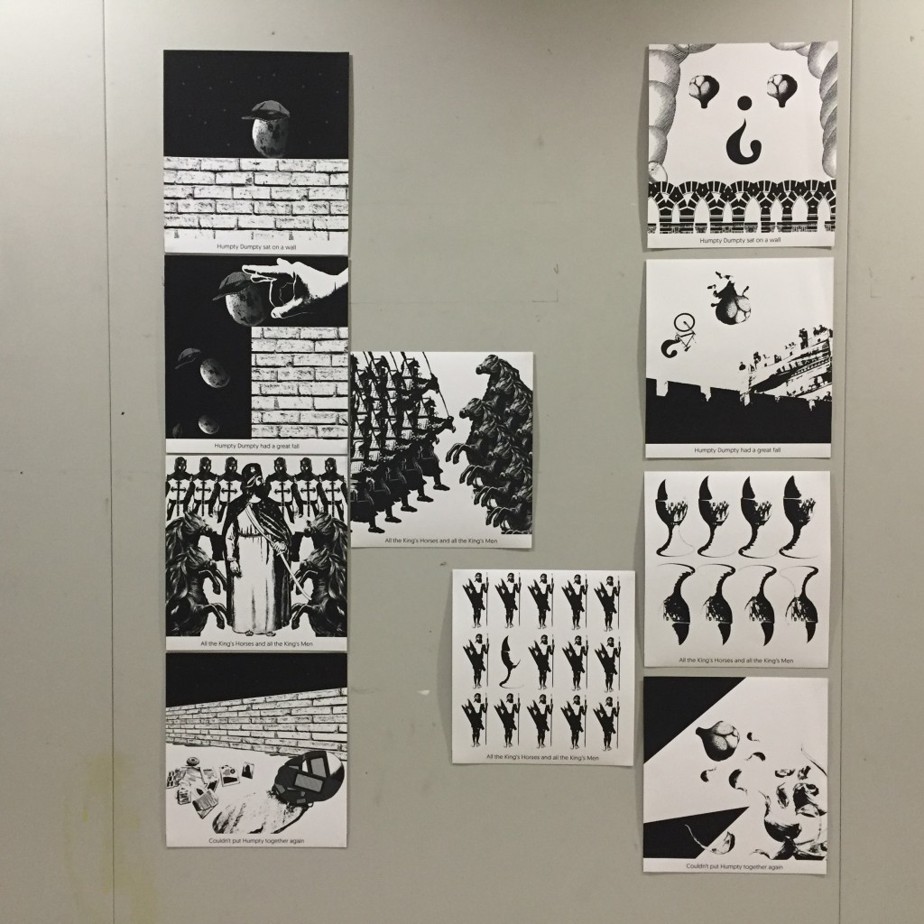
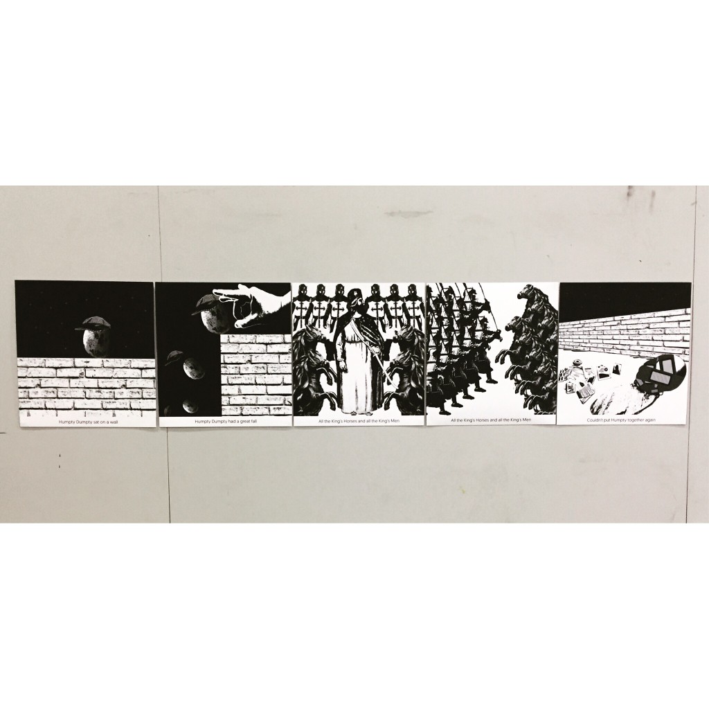
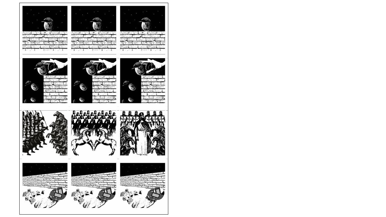
Reference Books (1)
Reference Books (1)
Reference Books (2)
Reference Books (2)
My work was inspired by these artpieces
I like prints, repetition, and patterns. Thus it became one of the style to the project


Colour Exercises


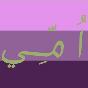
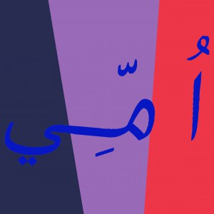
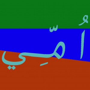
It was all about colours and its hue, value and saturation. These are the ones I did for the in-class colour exercise. Part 1 was the one colour being on top of the other, and I am slowly learning of observing how one colour actually looks warmer than the other when it is put against a different shade/tint/tone/value of another colour. Part 2 on the other hand, was supposed to be using chinese characters but my name doesn’t have one. I would like to use anybody else’s, but then I forgot my name can be done in Arabic characters as well. (That explains the characters you see on the image, basically its called UMMI)

Rhymes – Final Composition

After one to one consultation with Prof, I had a few that was in the “Chosen” folder. In the process of selecting which image actually suits and flows with one another, I aligned them all into the template.

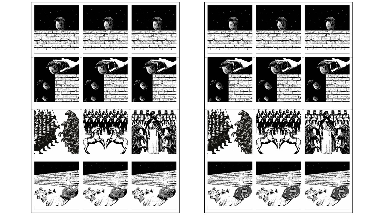
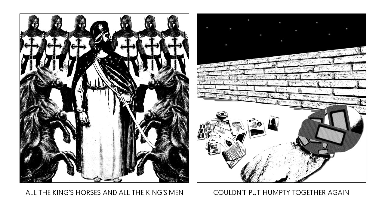
Therefore, these are my final 4 compositions that makes up the whole Humpty Dumpty rhyme.

Exploration of Compositions

So, I have decided to proceed on Humpty Dumpty for this project.

I had brainstorming moments with the images that the class shared in Dropbox. I also looked for my own images and mix and match wherever it looks suitable. With the images, I tried to think simple and play around with the positions to try and avoid symmetry. However, I still think those in symmetry looks the best.

The composition images below will be divided into its different lines from the verse.

(Some of the compositions had to be shared in one frame due to exceeding limit of image size for upload.)
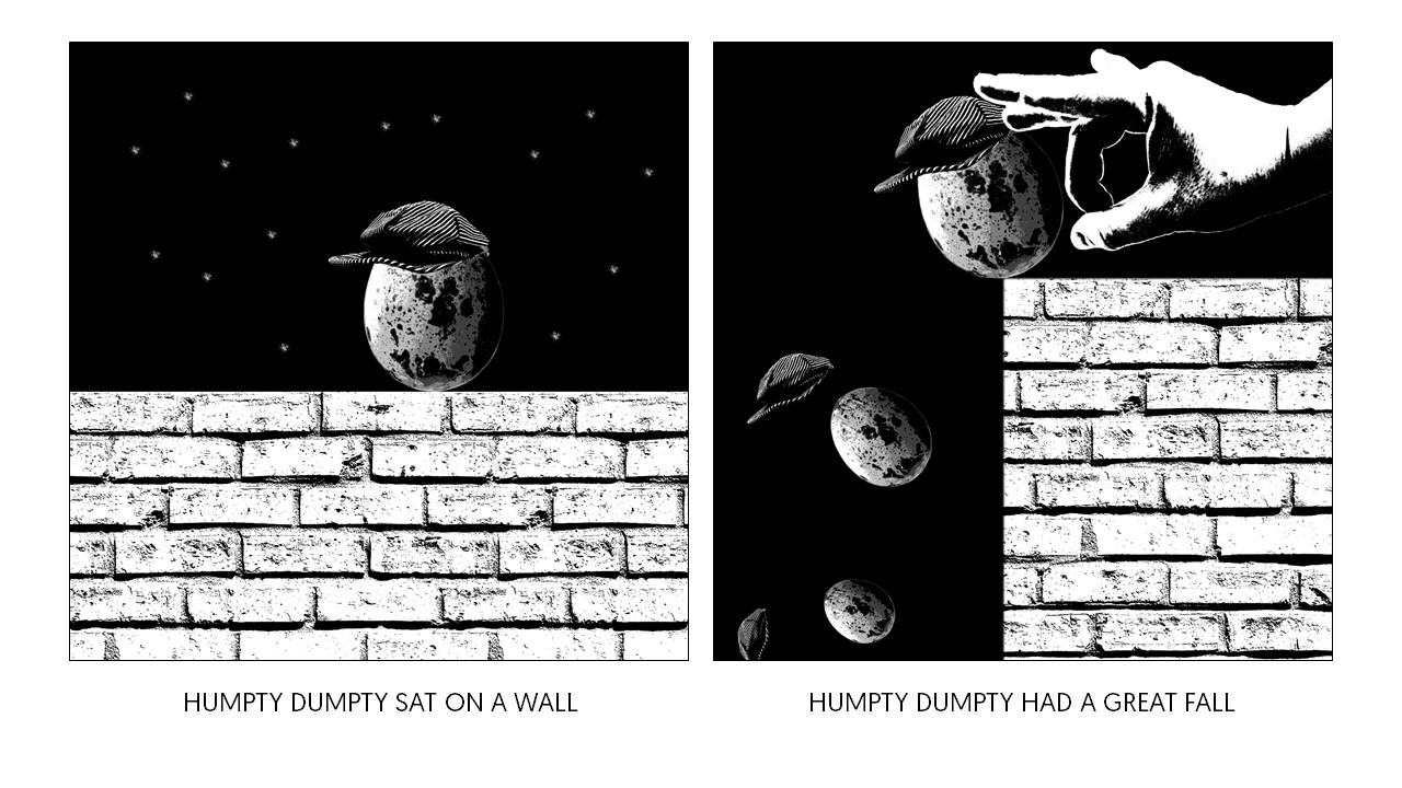
LINE 1:

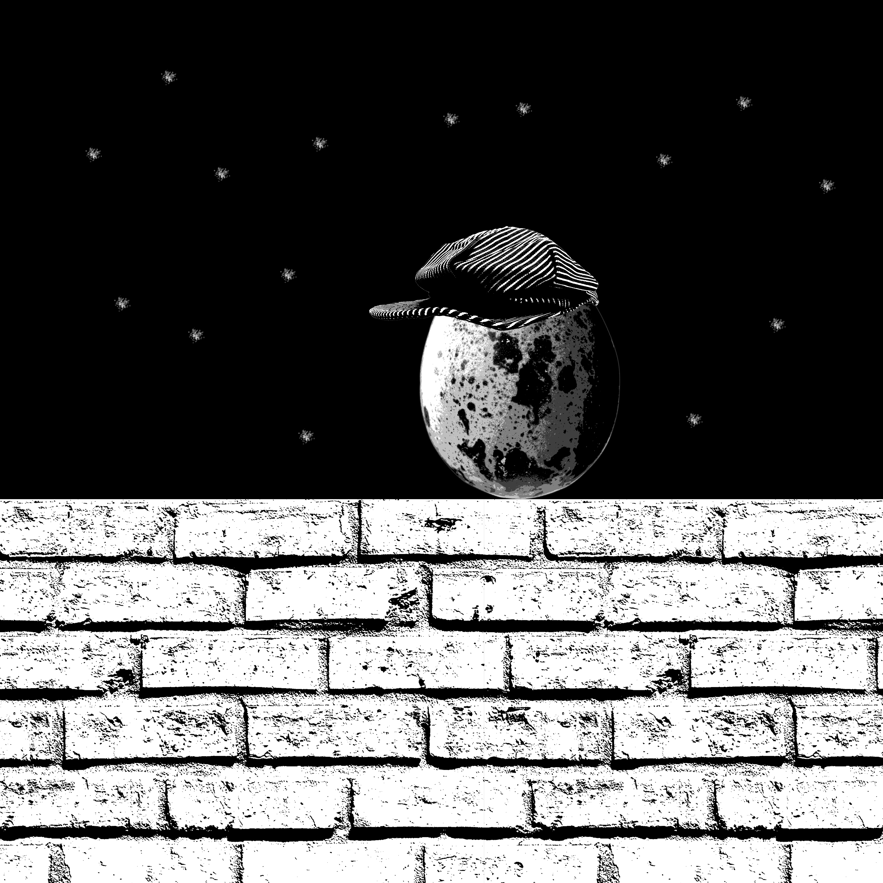
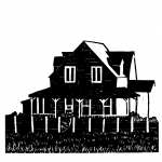
“Humpty Dumpty sat on a wall”

LINE 2:

“Humpty Dumpty had a great fall”

LINE 3:

“All the King’s horses and all the King’s men”

LINE 4:

“Couldn’t put Humpty back together again”

In conclusion, I tend to go for minimalism in the compositions, and I liked the repetition being included in the compositions for Line 3. These compositions are experimented on but sadly, not chosen for the final composition.

Mary had a little Lamb

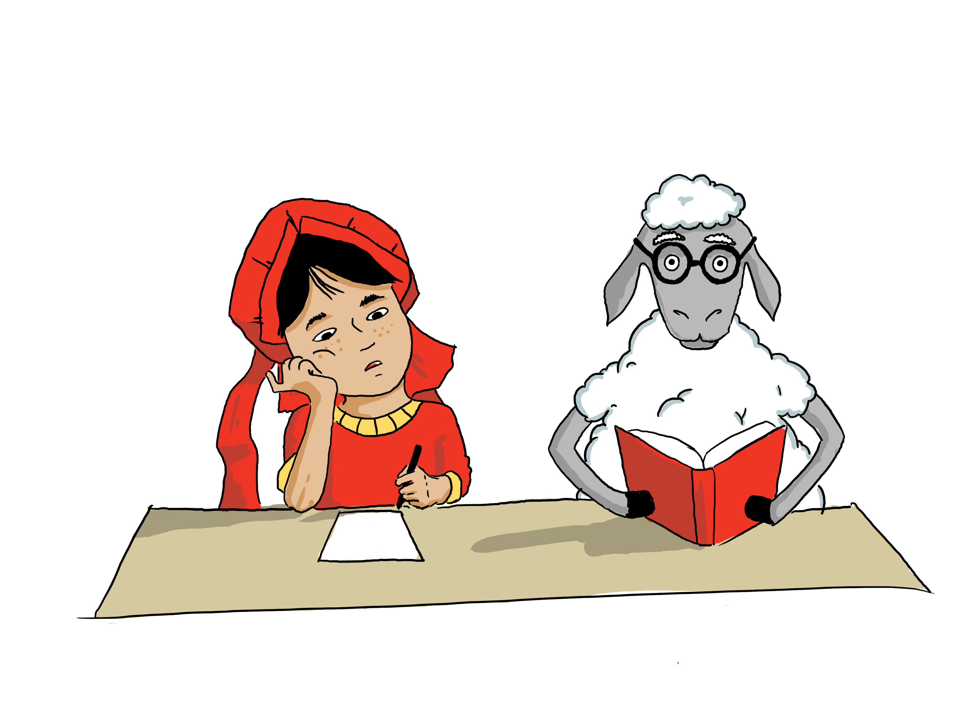
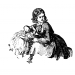
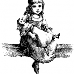
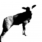
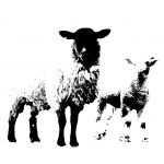
“Mary had a little Lamb”

Mary had a little lamb,
Its fleece was white as snow;
And everywhere that Mary went,
The lamb was sure to go.

He followed her to school one day,
Which was against the rule;
It made the children laugh and play
To see a lamb at school.

And so the teacher turned him out,
But still he lingered near,
And waited patiently about
Till Mary did appear.

“What makes the lamb love Mary so?”
The eager children cried.
“Oh, Mary loves the lamb, you know,”
The teacher then replied.

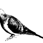
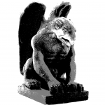
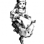
When the assignment was given, for a second, I don’t really remember any nursery rhymes only until it was played in class. At first I thought it was really just sourcing for images that has die-die got to do with the rhyme but then I realised we can go out of the box. And I think the most interesting image I had was the Gargoyle. (hahahahahaha blame the lecture of Art History.)

These are the photos that was edited so far, and saved in Dropbox.

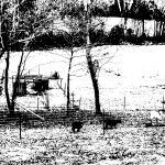
*still in the mode of searching for more interesting images to edit*


P/S: these images are sourced from googling Old Engraving (of insert word), Vintage (insert word), or mainly (insert what you want to find). I don’t really have the original website with me…..but I’ll put it up the next time!