Tag Archives: Design

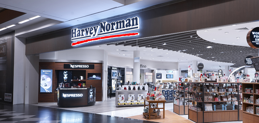
Trip down to Harvey Norman

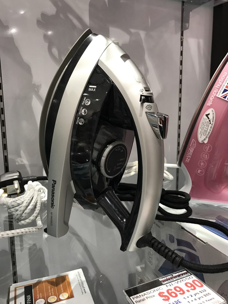
During the Harvey Norman’s field trip, there were 2 products that has the same emotion and interesting factor, as well as products in similar trends.

Firstly,

The 2 products with same emotion, same interesting factor:

Panasonic steam iron

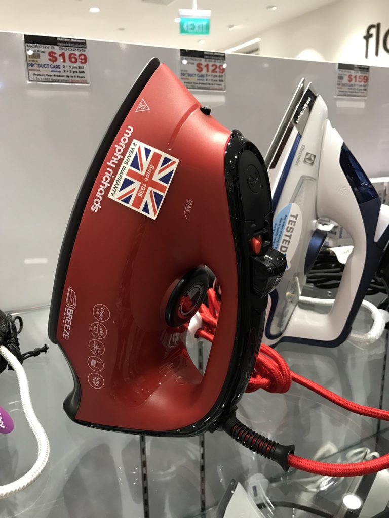
Morphy Richards steam iron


In terms of emotion:

  • Both products are designed in a streamlined shape with multiple functions installed on the steam iron. As a user, I think having multiple functions makes me feel that the product brings efficiency to the user to complete as much ironing as possible.  

In terms of interesting factor:

  • Panasonic steam iron has a steep convex shape towards the tip of the iron base while Morphy Richards’ has a hump-like shape towards the tip of the iron base.
  • Panasonic steam iron bottom part of the body, designed looking like a 3-legged rocket,  plays more with negative space to stabilize the entire form. With the negative space, the iron looks rather lightweight as compared to a heavy-looking Morphy Richards’, where the bottom part of the body is solid.

Secondly,

The products that were similar in trend:

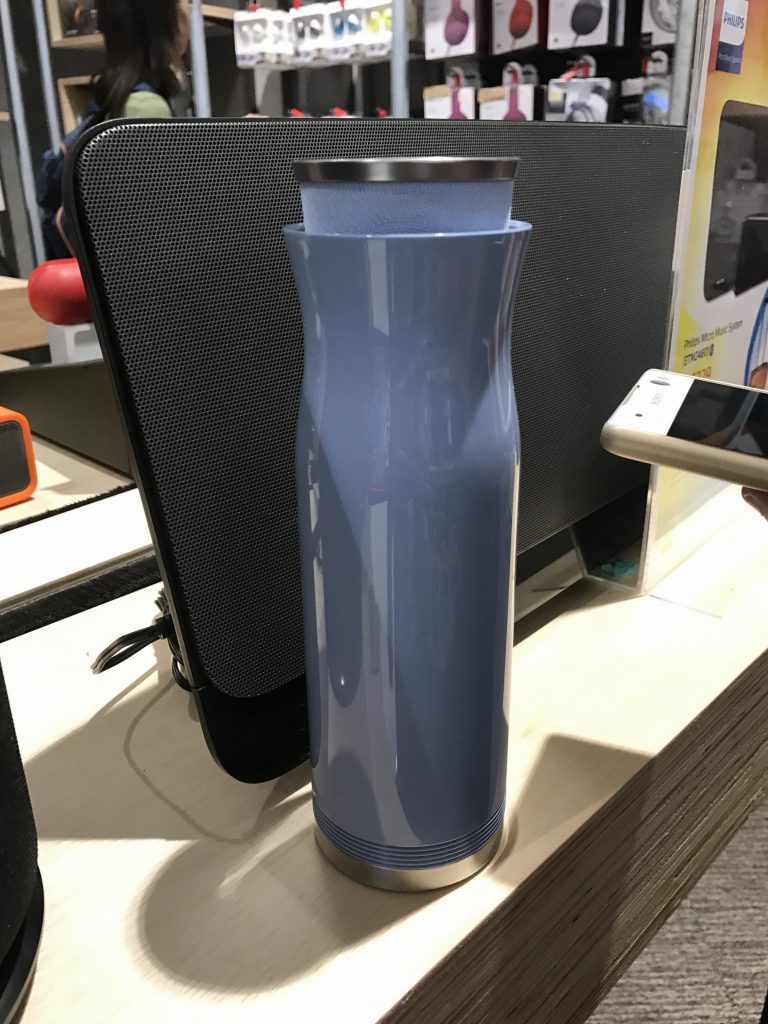
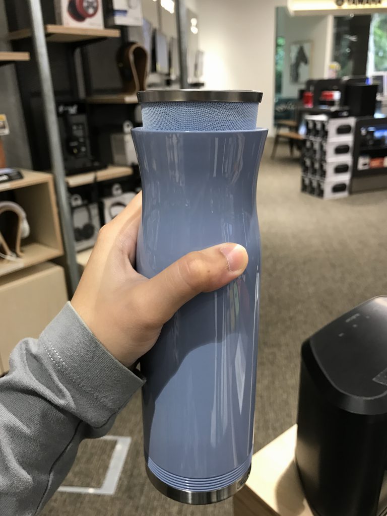
LG (bottle-like) speaker

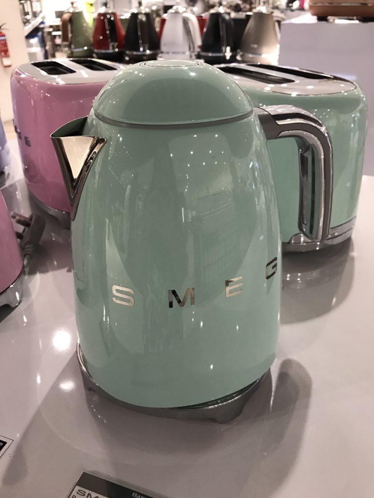
SMEG Electric Kettle

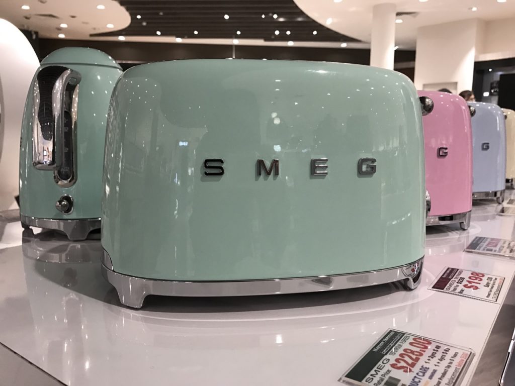
SMEG Toaster

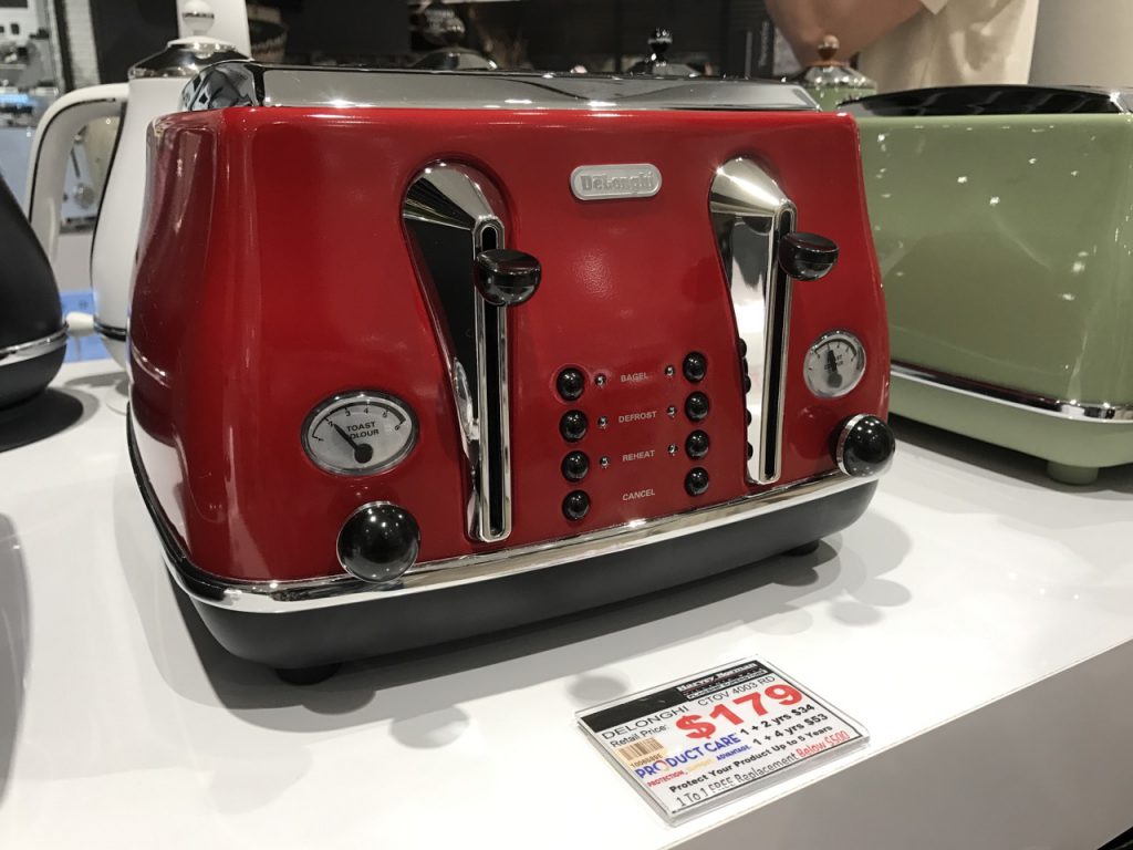
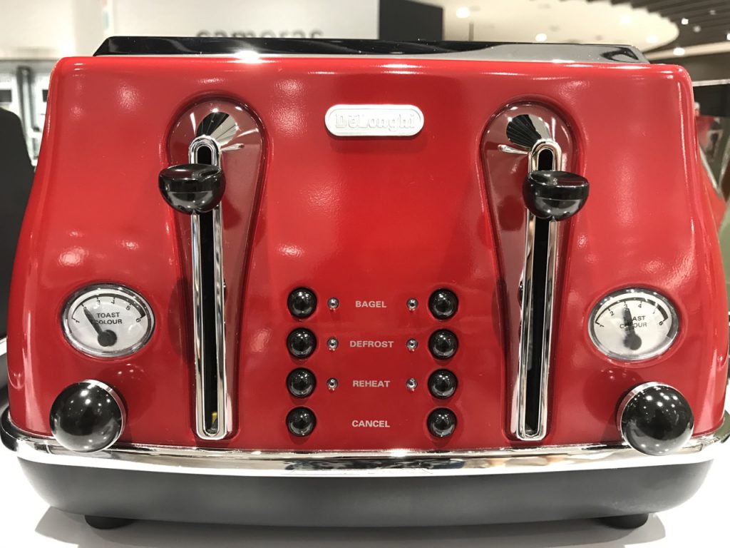
Delonghi Toaster

In terms of similar trend:

  • I find that the products used colours that attracts user’s attention from afar. The cool pastel colours of LG and SMEG products were approachable and allowed the users to want to take a closer look.
  • Delonghi toaster on the other hand was the next product that caught my attention after the pastel-coloured products. The range of colours gave me the feeling of nostalgia and retro.
  • Similarities between the SMEG and Delonghi toaster showed another trend of having small, thin and sleek rounded knobs.

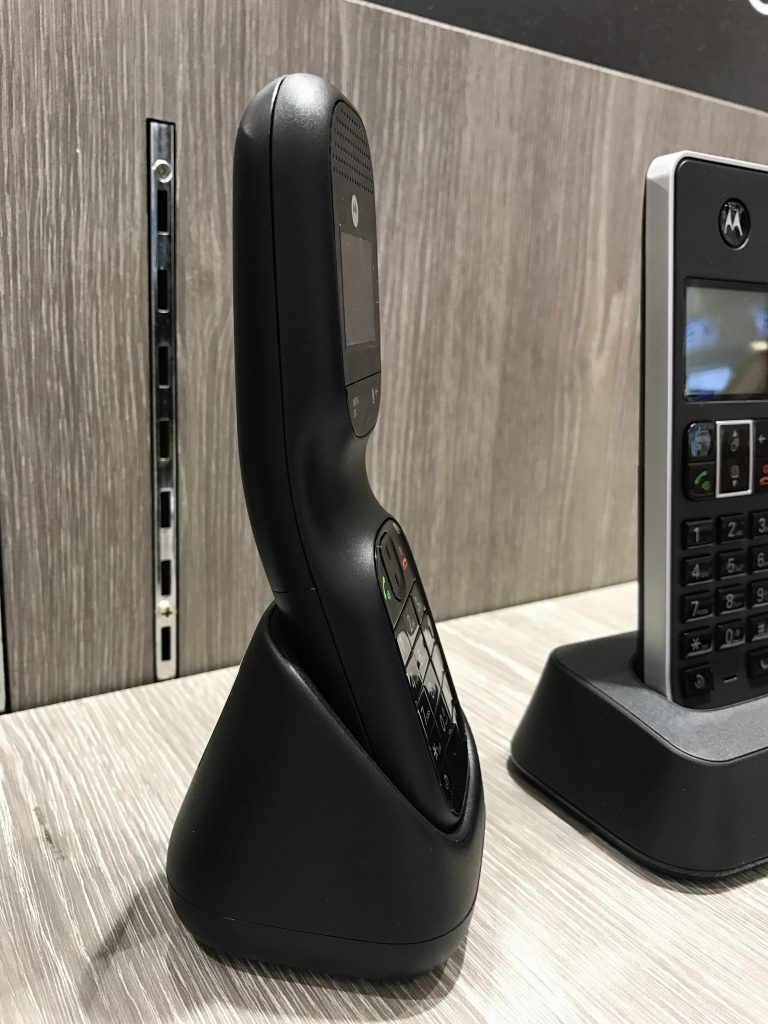
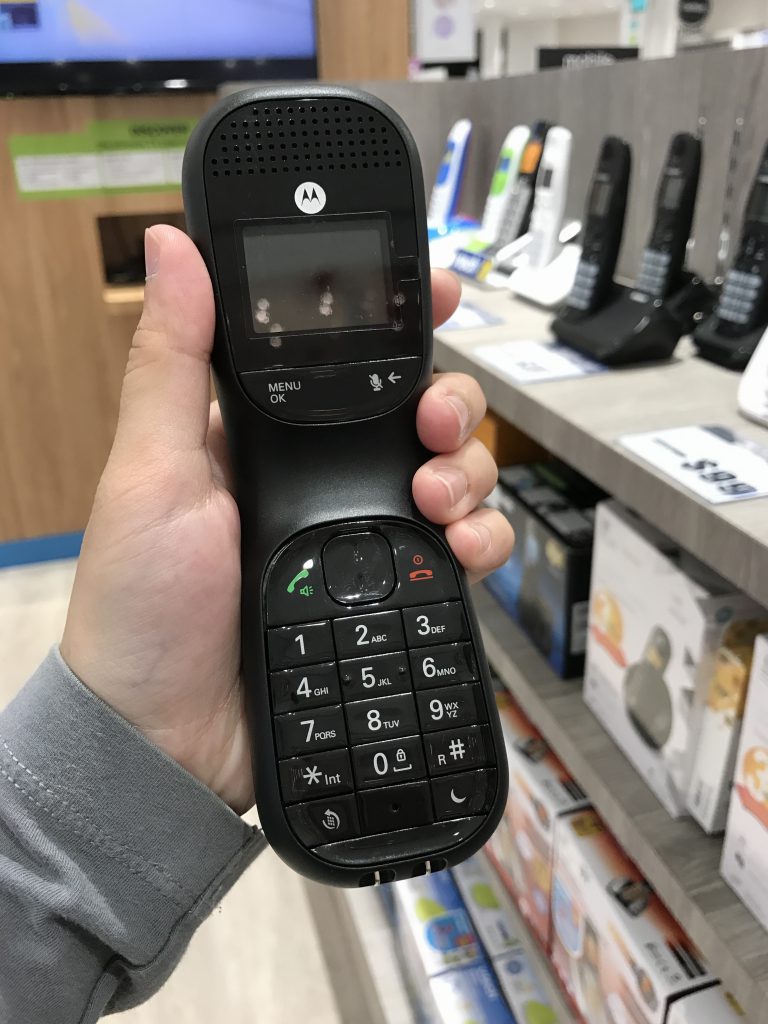
Motorola Cordless Handset

LG Speaker

In terms of similar trend:

  • Aesthetic and form of both product are designed in consideration of the human factor/ergonomics, where user’s hand fits nicely around the inward curvature of the product.
 

City: Moodboard & Theme selection

This post will contain information and images on the themes ideas for the Project City.

SUPERNATURAL CITY

Transform city found objects, and/or data, into representational or abstract forms, designs, and patterns for a large-scale public art installation.

When I think of cities, I think of man-made and natural aspects. I considered what can be seen in the cities, what can be felt in terms of how you feel etc. I decided to go on the direction of Nature for my City. Recently, I went to Chinese/Japanese Garden to see what I can be inspired from.

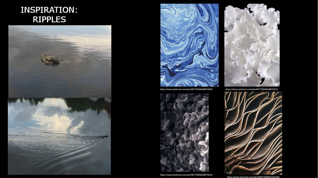
The first thing that came to my mind were ripples, how the water flows naturally could be turned or modified into an organic pattern following the movement or direction. After my personal trip, I went on Pinterest to gather inspiration and created my moodboard.

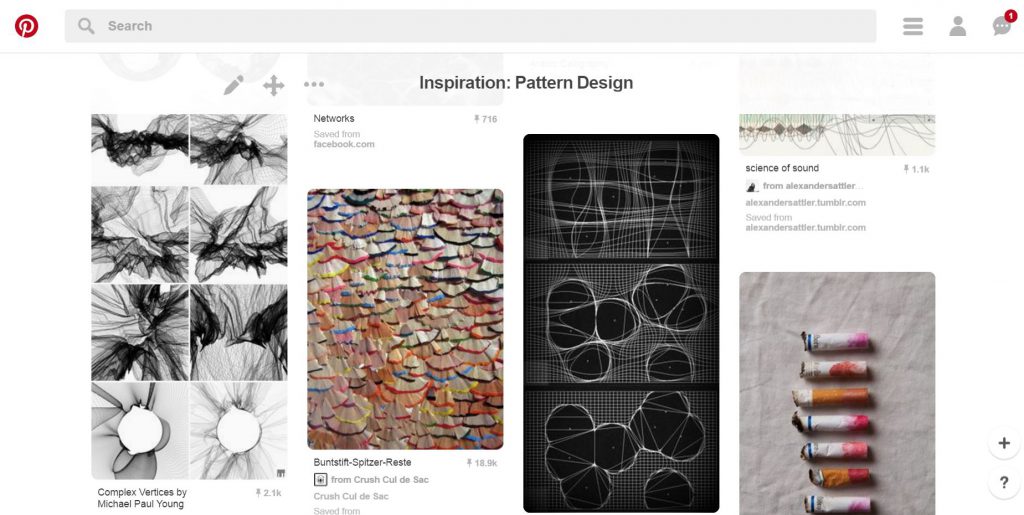
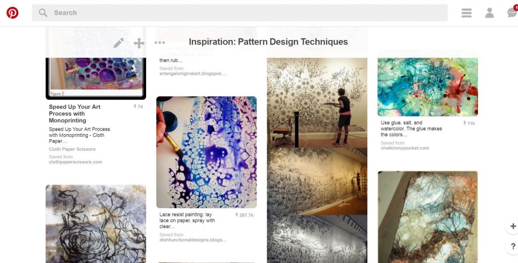
Inspiration Tab-Pattern Design
General research on Pattern Design on Pinterest. (Link: https://www.pinterest.com/youmikaltsum/inspiration-pattern-design/)


Moodboard - Ripples Inspiration
Moodboard on idea #1

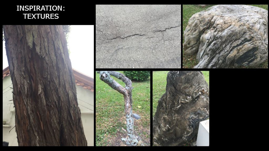
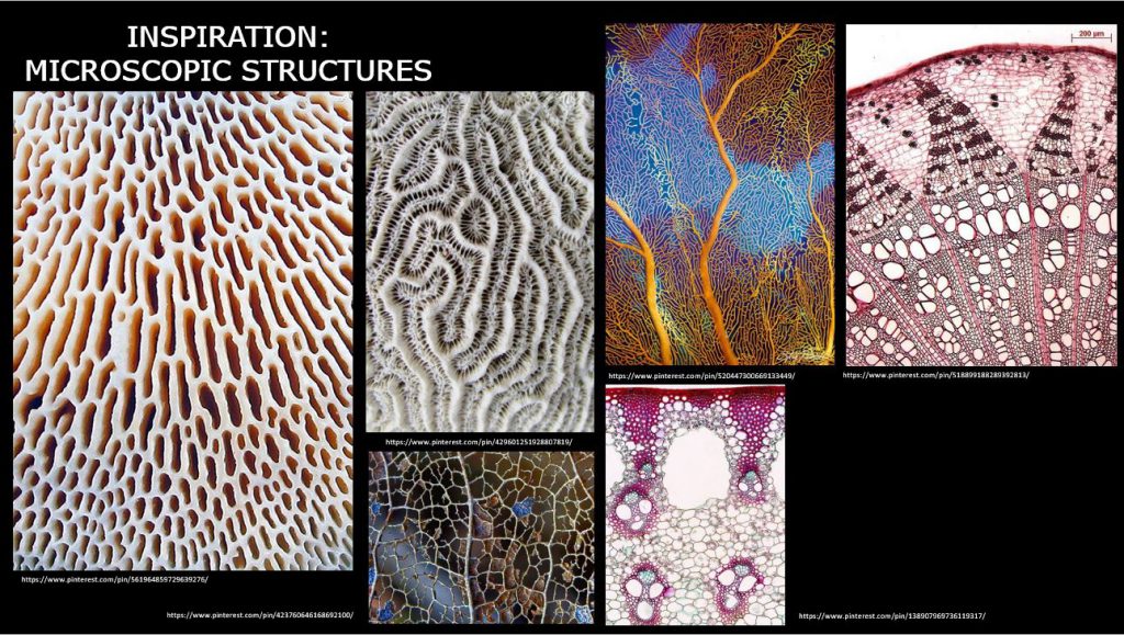
The second idea I had in mind was textures. So I looked out for trees, the road and other materials I can find along the park for unique textures. Some trees that had scales growing on the trunk thus it lead me to think of bio-mimicry, and/or microscopic structure.

Moodboard - Textures Inspiration
Moodboard on idea #2 – textures
Moodboard - Microscopic Inspiration
Moodboard on idea #3

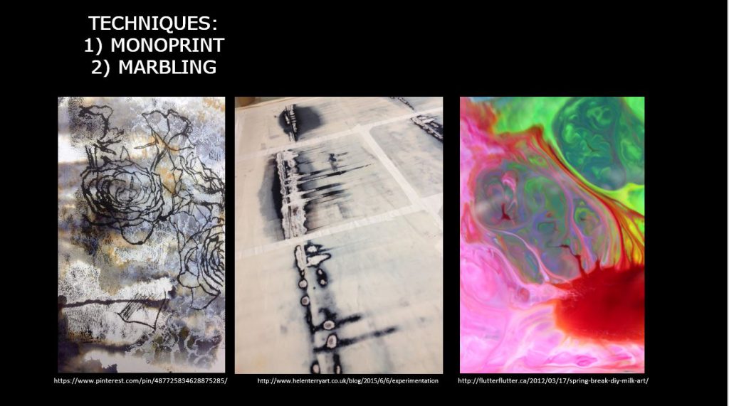
 Lastly, I researched on the different techniques to go create patterns. After browsing through Pinterest, I narrowed down to 2 techniques which you can find below:

My compilation of the different ways to create pattern using different tools (Link: https://www.pinterest.com/youmikaltsum/inspiration-pattern-design-techniques/)


Moodboard on techniques
  1. marbling — I thought of using watercolour or milk with food colouring to create the cross section of the pattern
  2. monoprint — I thought of re-using the monoprint from previous semester, and do a few more to get variations so that I could collage them digitally.

In terms of colour, I thought of bright and contrasting colours like the last picture on the right from the techniques moodboard.