Concept Brief

Title: Urban Forest

by Vanessa Ang

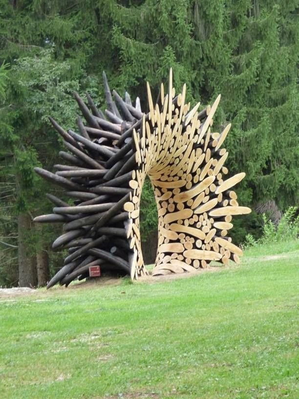
Urban Forest is a sculpture that represents the effects of deforestation. In order to make room for a growing population, countries have cleared out forests, home to thousands of flora and fauna. In contrast with the curved wood, in its raw and organic form, shards of cold, hard steel sticks out. This represents how urbanisation has impeached into nature, taking up the space meant for trees to grow and expand.  Even in Singapore, where NParks is constantly ensuring that the trees in Singapore grow healthily, it is in a controlled environment, and the idea of nature taking full control is no longer one we embrace in this city.

Yet, this sculpture also explores the idea of living in harmony, with a balance of nature and man-made buildings, and aims to let Singaporeans reflect on this idea.


Research and Inspiration


Process

After trying (and failing) to bend the wooden popsicle sticks with an iron, I resorted to steaming the popsicle sticks on the stove. It was very effective and I managed to bend the sticks quite a bit.


Then, I cut off one end of the sticks and used a hot glue gun to stick them on the foam board.

Here’s the mess I created halfway through


Concept Development and Inspiration


Final Outcome


For the second project, we were each assigned a word and had to create something that critiqued the concept of that word. The word I received was “Elitism”.

Hence, I did some research and created a powerpoint presentation regarding the concept:

I wanted to focus on elitism in the arts industry. The common opinion of the arts industry is that it is only meant to be enjoyed and appreciated by the elites. However, I wanted to say that this stereotype is superficial and only touches the surface. To illustrate that, I made a tie out of newspaper. I chose a tie as it is a symbol of success. A tie is often worn with a suit and formalises the entire outfit (a suit without a tie can sometimes look casual). A suit and tie is also often the dress code for art events such as an orchestra concert or a gallery opening. Hence, it represents the elites.

I chose to use newspaper as it is a material that can be easily found and is for the masses. This symbolises that beneath the facade of elitism, the arts industry is actually for the masses too.


For the first project, we had to create a gift for our clients.

Client’s Name: Clara

Major: Product Design

Likes: Nature, practical gifts, earth tones, sculpting animals out of clay


Thus, I created a pen holder that imitates a tree for her to put her sculpting tools. The holder itself is geometrical in form and is very structured, which I used to contrast with the raw and organic form of a tree.

Research

As I walked down Orchard Road and the Downtown area, I saw a lot of unique architecture and initially wanted to focus on that.

For example, Millenia Walk had a structure that reminded me of the Great Pyramids in Egypt.

I also went to Marina Bay and took a photo of the architecture there. However, Shirley said that it lacked a personal touch and would feel too much like a tourism board brochure, promoting Singapore. Hence, I took another trip down Orchard Road and saw this performance, with huge crowds surrounding them. Then I was reminded of how many interesting performances and buskers I have seen along the street and wanted to talk about them, since they were quite a unique feature about Orchard Road.

I decided to approach Orchard Road with five senses, five senses that would not usually be associated with Orchard Road. It is often associated with high-end brands such as Louis Vuitton and Miu Miu, brands that would not be found in heartland malls. Yet, there was something down-to-earth about Orchard Road and I wanted to convey that. Hence, I chose features that normally wouldn’t be associated with luxury and glamour:

Sight: Unique architecture (I wanted to keep this from my original intention as it was definitely an interesting feature)

Hearing: Street performers (buskers are often thought of as poor and unemployed, thus resorting to busking)

Smell: Smokers (I personally feel that a high end shopping area is usually very well managed, and would be very clean. Yet, there are a lot of smokers all along the street and this has not be intervened by the government even though the government has already implemented stricter smoking laws in public places. Hence, it was rather interesting to note that the smoking laws at Orchard were relatively less strict.)

Touch: Crowds (Coming here on weekends is a challenge as it is often crowded. Even though the numbers have dwindled over the years, it is still very crowded and you would definitely have to bump shoulders with someone as you walk.)

Taste: Ice cream (One thing I will always remember about Orchard is the ice cream trucks scattered along the street. I especially love going to the uncle situated at the traffic light junction near Paragon and Takashimaya. Since the ice cream is so cheap, it does not match with the high end reputation of Orchard Road.)


Process

Layout 1:

I felt that my first layout was very empty and did not have enough elements on the page. Referring to my main inspiration, even though it was very simple and minimal, there were a lot of small elements in it that kept it interesting. Hence, for my next layout, I decided to add paint splatters to give the pages more interest. (I had forgotten to save that version so here’s an example of what it looked like, the photos were initially vibrant, like the ones in the second layout.)


Layout 2:

After tweaking with the paint splatters, I ended up really liking it. I decided to keep the splatters black as my photos did not have a specific colour palette and having coloured paint splatters would have made it look uncoordinated. I also changed the fonts on the first and last page as Shirley mentioned that the font was “shouting”, being all caps.


Layout 3:

After editing the photos and making it more muted, I wanted to try adding some colour to my layout. But Sammi mentioned that it felt as if I was adding the pink strips just for the sake of it, which I realised I was. Hence, I took it out.


Reflections

Overall, this was a tiring project. From the research to sifting out personalised and interesting content to arranging that same content in an easy and fun to read layout. However, I definitely enjoyed it and I felt a sense of accomplishment when I got my zine printed. Some things that I learnt from this project includes realising the importance of getting feedback.

During the musical chair critique session, I realised my classmates had pointed out certain details in my zine that could be edited and improved on. These were things that I did not notice and after reading their comments, it opened my eyes. As designers work on their designs, they can sometimes become numb to their own designs and it would definitely be helpful to get a second or even third opinion about the design. It was also very fun to discover InDesign as I worked on my zine and realising the things it could do!

Check out this link for the final outcome of my zine!

What is a zine?

“A zine is usually a non-commercial, non-professional publication, kind of
like a magazine but with a twist. The main difference between a magazine
and a zine is that zines are not out there to make a profit but, rather, to add
other, often unheard voices into the mix. Zines are usually made out of
interest and passion and are often self-published by the writer/artist/creator.
Typically zines are made using collage techniques and are then photocopied
since these are means available to almost everyone.” – as defined by Art Gallery of Ontario


What is the aim of my zine?

Orchard Road is known to be a high-end place, where one goes to buy their branded goods. I wanted to get the readers to see Orchard Road in a different light.


Layout Inspirations

This was my main inspiration. I really liked the big numbers as well as the colour splatters throughout the page. I felt that the large numbers took the main focus here and it would fit nicely with numbering the five senses that i wanted to include. It is also very minimal, with large open spaces and very little words, which was another thing I wanted to do.


I really liked the colour palette of this layout, using pastel shades to convey a very calm and feeling of coastal cities. The transparent overlay on the cover also caught my attention, and really allowed this zine to stand out from the rest. While I don’t think I will be incorporating this idea into my zine, it serves as a reminder to be unique as a designer. I took inspiration from the colour palette and created muted photos for my zine to convey the calmness that I felt while walking along Orchard Road, even though many feel differently.


This was another cool yet simple layout that caught my eye. Instead of using colour to capture attention, the designer contrasted the photo with a plain black page and added simple lines and dots to complete the photo.


I liked the bold lines in this layout, creating a structured and bold look. The play on colours also matches nicely with the bold lines and creates a playful look.


I like the colour palette of this layout, it has a very muted palette and the photos are very muted too!


Team Members: Calista Lee, Claudia Tan, Lydia Lui, Sammi Neo, Vanessa Ang

Title: Toilets – Our Shared Space

Location: ADM Level 2, Female Toilet beside 4D classroom


Artists’ Statement
Toilets are a shared space amongst people from all walks of life; and within these space are more often than not, unspoken rules for people to follow. Flush the toilet after using, use only what you must. ‘Toilets: Our Shared Space’ explores the nature of getting people together, and with a set of simple but open instructions, to create a piece of music together; and enjoy the symphony of the space as itself.


Here’s our final outcome as well as the explanation of what we did!

Check out Lydia’s post for more photos and videos of the actual outcome!


Reflections:

I was pleasantly surprised to find that our classmates were very enthusiastic in participating in our project. Initially, we were afraid that they might not be too interested or enthusiastic about creating sounds, hence we created a score that they could refer to. But they were very creative in creating the sounds and surprised me by going entirely freestyle!


To crf to Calista’s post for secondary research:

To test out our project, we did a dry run and fine-tuned some details.

In order to solve some of the possible issues we came up with (as mentioned in Calista’s post), we decided to create a sample score for the class so that they have an idea of how to create sounds using the things found in the toilet. Also, this solves the possible problem of the participant not being able to come up with a sound of their own, yet if they would like to freestyle, they had the freedom to do so too.

Regarding the scale of the project, we were afraid that if all 13 people in class were to participate, it could get chaotic and very hard to coordinate. Hence, we decided to split the class into two groups. Depending on the situation during presentation day, we would either get 7 people to volunteer, or rotate between the two groups such that everyone will get a chance to participate.

We also decided to keep the beats rather simple as we found that it was hard to focus on your own part (if it was too complicated) when all the sounds were combined.

Here’s a video of us doing a sample score.


We also created instruction sheets and included the beats of the sample score for ease of understanding or in case the participant forgot his/her assigned beat.


Next up, the presentation day!

This project required us to find out more about a part or aspect of Singapore and present it in a visual narrative.

Here are some of the approaches we could take:

  1. Have a conversation with someone to find out about their way of life in Singapore.
  2. Visit a place or an area in Singapore that you are less familiar with, have not been for quite a while or have never been before. Go on a wander, what did you see, smell or hear?
  3. Visit a place at a different time of the day (e.g. a market at night)
  4. Have a conversation with your family member, are there life stories, tradition or experiences about Singapore that you might find?

I didn’t end up following any of the approaches directly. But I wanted to focus on the MRT as it was a place where people of all walks of life came together and was contained in a small cabin. I wanted to investigate the relationship between these people and the transportation as well as the interaction between the people in this space. I started observing the people and realised that no one was interacting with each other, only with their phones.

That got me thinking of how I could get them to interact. It also reminded me of a project my friend did, where she had a set of questions and placed it in HDB lifts, to get a conversation started between the people in the elevator.

So my initial idea was to create a set of questions and pass it around to people on the MRT, to get a conversation started. But realising that Singaporeans are relatively shy people, a set of questions was not going to get them to start talking. It would require a lot more work to solve that issue and due to time constraints, it would have been quite impossible to do so.

Hence, I scraped that idea and chose to focus on another perspective, the problems and inconveniences on the MRT, that is known for its ease of use and convenience, such as MRT breakdowns. But ultimately, I chose to focus on the elderly and the problems they face when taking the MRT.

This old man was squatting down in a corner of the train travelling down East-West line. Many people surrounded him but did not approach him and asked if someone could offer their seat to him. Instead, they ignored him. I also took many videos but am unable to post them as they are too big 🙁

To see my final work, click here.