
Event Poster


Front of event flyer Back of event flyer

Lanyard

Mockup of staff ID lanyard
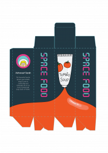
Dieline for space food packaging

Mockup for event flyer
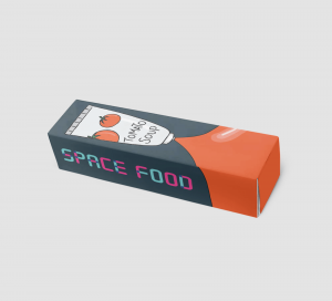
Mockup of packaging
Event Poster
Front of event flyer Back of event flyer
Lanyard
Mockup of staff ID lanyard
Dieline for space food packaging
Mockup for event flyer
Mockup of packaging


What do you find inspiring?
Using illustrations of mythical creatures like unicorns and Bigfoot, it appeals to children, their target audience. They also put the focus on the individual illustrated creatures on their packaging rather than the ingredients or photos of the product itself as it would not be as appealing to children.
What type of information is on the label/bag/box?
On the box packaging, it highlights that the snack is school safe and includes fruits and veggies, keeping the information minimal and direct.
Who do you think is the target audience?
This product is targeted as kids.


What do you find inspiring?
I like that this company not only designed the actual packaging of their soda cans, but also shipping box packaging. The boxes are designed as boomboxes and record players and relates to their tagline of “soda with soul”. Their illustrative style is casual and friendly and reflects their visual identity and branding.
What type of information is on the label/bag/box?
Since this is a shipping box, it does not contain much information about the product itself. It does include their tagline, “soda with soul” and their logo for their customers to immediately identify their brand. It also includes information about their product which would likely most appeal to their target audience like how the soda contains real fruit.
Who do you think is the target audience?
From the casual illustrative style, I think they are targeting people who keep up with trends, who have laid-back and free attitudes.

What do you find inspiring?
This chocolate packaging features a beautiful hand-drawn illustrative style. For each flavour, the illustration and colour palette is tied to the flavour of the chocolate. For instance, the pumpkin spice flavour uses orange and earthy colours to reflect the fall season, when pumpkins are in season.
What type of information is on the label/bag/box?
The brand name, the name of the flavour and the description of the flavour.
Who do you think is the target audience?
The hand-drawn illustrative style appeals to people who appreciate packaging and details, most likely females.


What do you find inspiring?
Each illustration is linked to the flavour of popcorn. By pairing a black and white line illustration with a bright pop of colour in the background, it gives a nice contrast.
What type of information is on the label/bag/box?
The brand name, the flavour, as well as the calorie count.
Who do you think is the target audience?
As the packaging brings out the calorie count, I think the target audience is one who is more health-conscious but still wants to have a little snack.

What do you find inspiring?
I like the abstract patterns on the packaging that still ties together through the colour palette and consistent layout and mix of patterns.
What type of information is on the label/bag/box?
The brand name, the type of coffee, and the various information about the coffee
Who do you think is the target audience?
Coffee drinkers who are not loyal to any brand and appreciate good coffee.
MOODBOARD AND USER PERSONA
For my event, I chose to do a space food exhibition targeted at children, where they can learn about space food and how they package and rehydrate it. I took inspiration from children’s book illustrations that went for a simple line illustration.

SKETCHES


RESEARCH – VAROOM
Varoom is a publication that comments on contemporary illustration. Its articles include interviews with illustrators and critical articles, all relating to a specific theme set for the particular issue.
What do you find inspiring?
What I find inspiring about Varoom is that they have all kinds of styles of illustrations. It isn’t just one particular style but really shows that illustration comes in all sorts of different styles. It is also inspiring to get an insight into illustrators’ process and their thought process. For instance, in this article in the Rhythm issue, Lesley Barnes reflect on the process of creating her book, Jill and Lion, which was insightful and inspiring.

What type of information is in the magazine?
The magazine features interviews with illustrators, relating to the theme of each issue. These articles explore their process and individual style. There are also articles like Drawing with VR Tools: The Test Pilot that talks about different techniques in illustration, such as using virtual reality.

Who is the target audience?
People who are interested in illustration, perhaps who are illustrators themselves or aspiring to be.
EDITORIAL ILLUSTRATIONS
John W. Tomac

Stopping Data Leaks | National Underwriter

The destruction of our democratic institutions | Los Angeles Times

How music influences memory | Rochester Review

Liberty’s Flameout | The New Yorker
John W. Tomac is primarily an illustrator who has worked with big names like The New Yorker, Washington Post and The Wall Street Journal to name a few.
What do you find inspiring?
He creates illustration pieces that are simple, with a very strong concept that is impactful. I find it inspiring that he is able to easily identifiable elements and combines them to create an illustration that can be interpreted easily.
What medium do they use?
He mainly works with vector illustration that has very clean edges
How do they creatively interpret the text for the article?
Each piece that he creates is strong enough to stand on its own but paired with the text, becomes clearer instantly, and adds another perspective to the topic.
CHOSEN THEME: PLAY
Out of the three themes, play was the one I was immediately drawn to. Here’s a wordlist of that things that immediately come to mind when I think of play:
A few ideas:
USER PROFILE

MOODBOARD

THUMBNAIL SKETCHES


Nisa’s Portrait

My Portrait

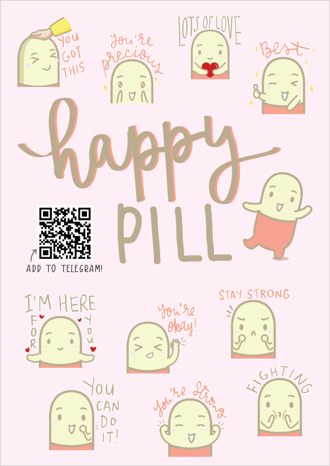
INDIVIDUAL STICKERS


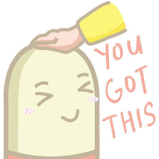


LINK TO TELEGRAM STICKERS
https://t.me/addstickers/happypill
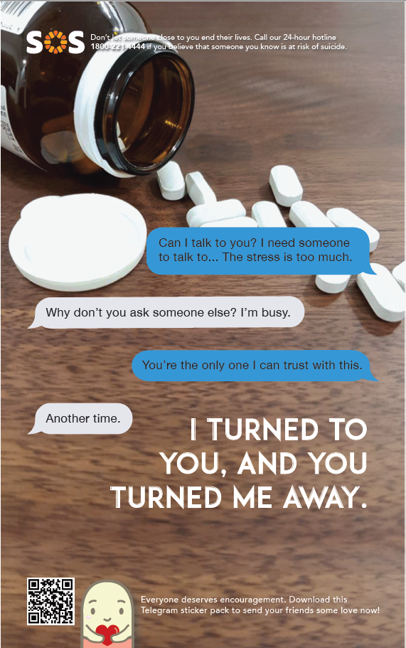
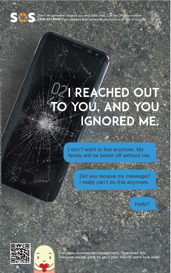
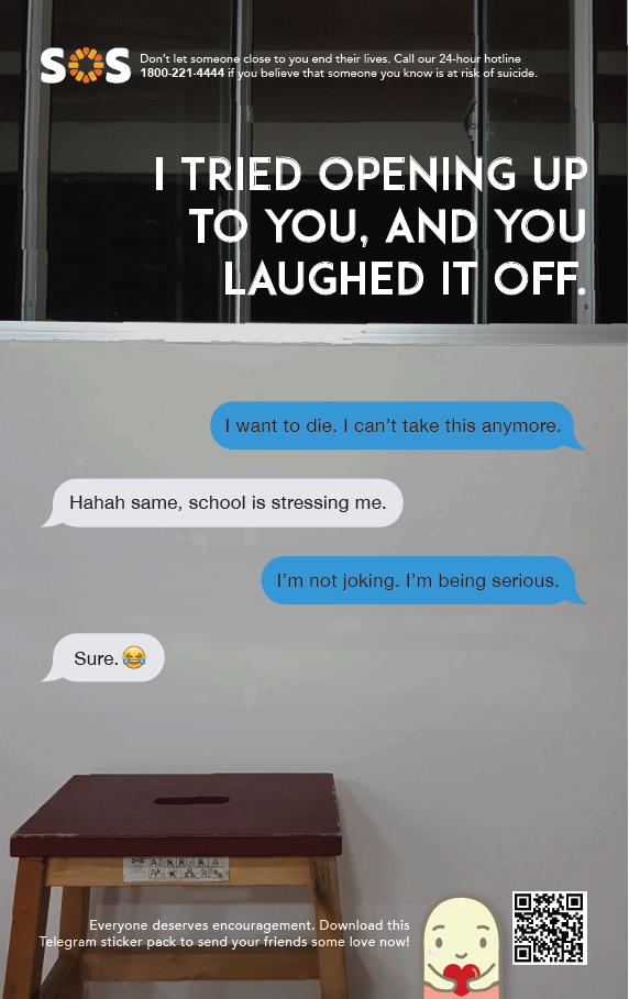
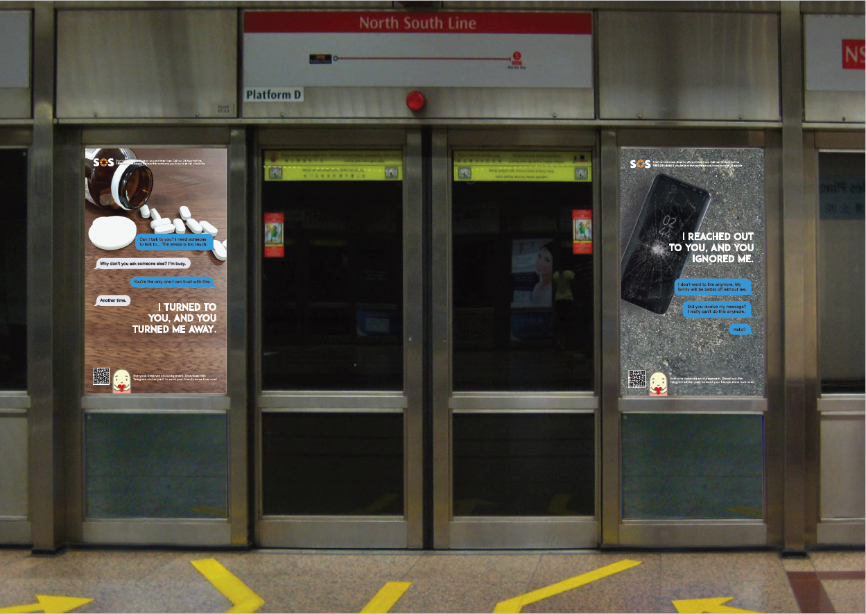

I used an umbrella as the main icon for my infographic as a symbol of shelter. It is a sign of reaching out to others who are left vulnerable and alone to deal with suicidal thoughts. The rain also comes in the form of pills and razor blades, which are objects normally associated with suicide.
Reflections:
Some comments during critique include that there might not be enough breathing space, hence making the infographic a little bit messy and lacking visual hierarchy, which I agree. This assignment was challenging in the sense of consolidating data and information into bite-sized, digestable chunks. However, it was also fun to see my classmates’ works and see the difference in styles and approach that we took.