PROJECT 3A
I thought about what image to do for a while. Initially, I wanted to do a ‘B’ series where I do images out of objects beginning with B.

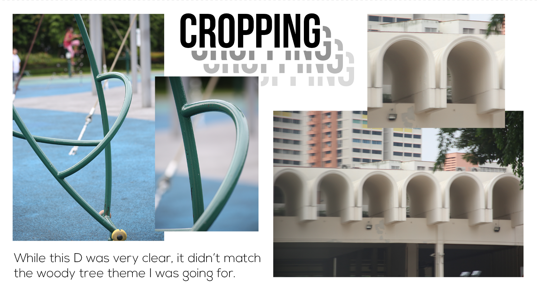
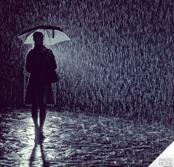
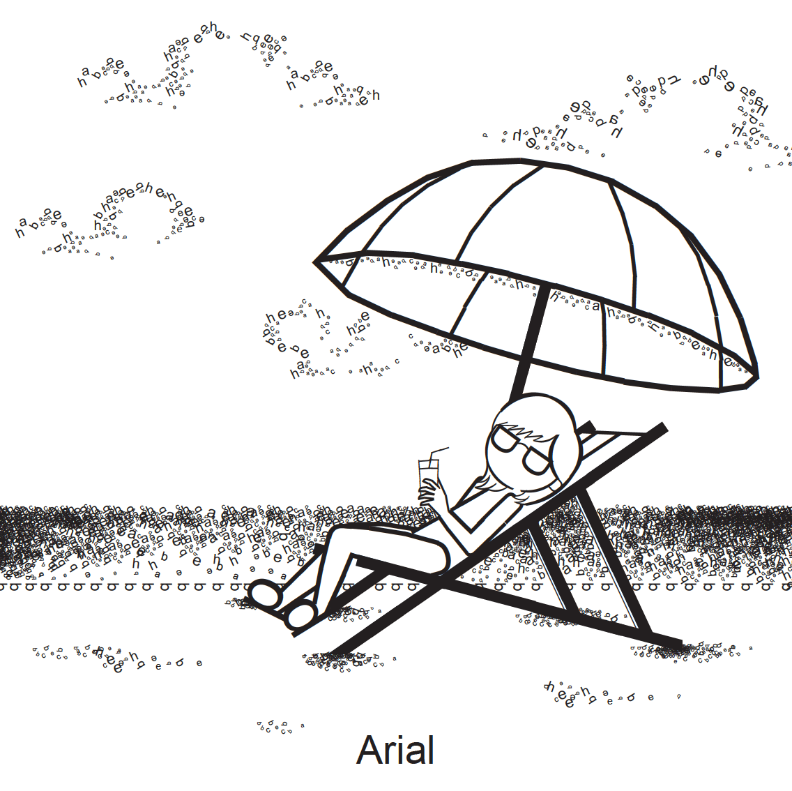
I didn’t like how the burger turned out so I didn’t finish it. I wasn’t using too many parts of the anatomy for the burger. Then I decided to do a scene image. I first thought of what the letters could be used to represent. And I thought of water droplets, or rain drops. Thus, I started doing a rainy day scene and wanted to contrast that with a sunny day scene. Here are the inspiration images (not the best quality)

Here’s how the final pieces turned out:

PROJECT 3B
I enjoyed doing 3B even though i spent a long time trying to get a pattern that I liked.
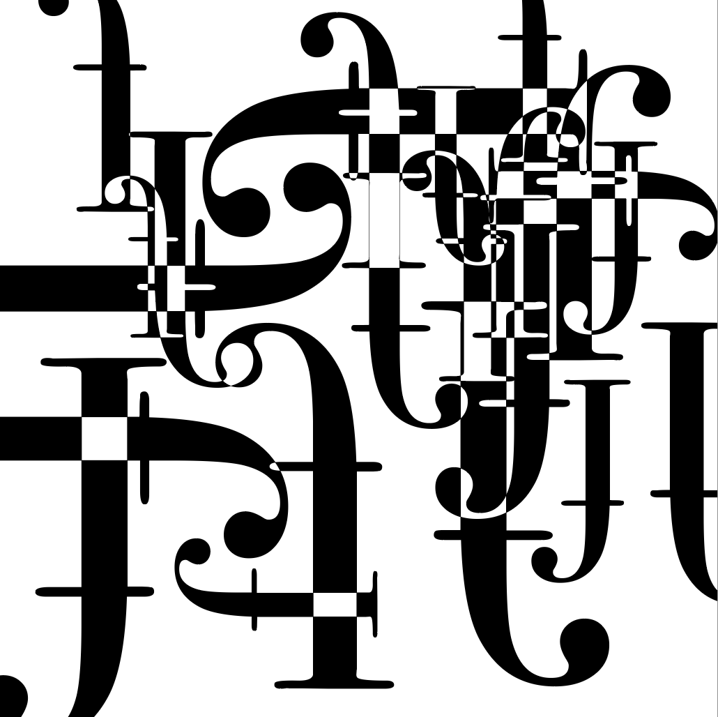
First, some research that I did.
I liked this series of type as patterns because it was really simple and brought out the anatomy of the type really well.
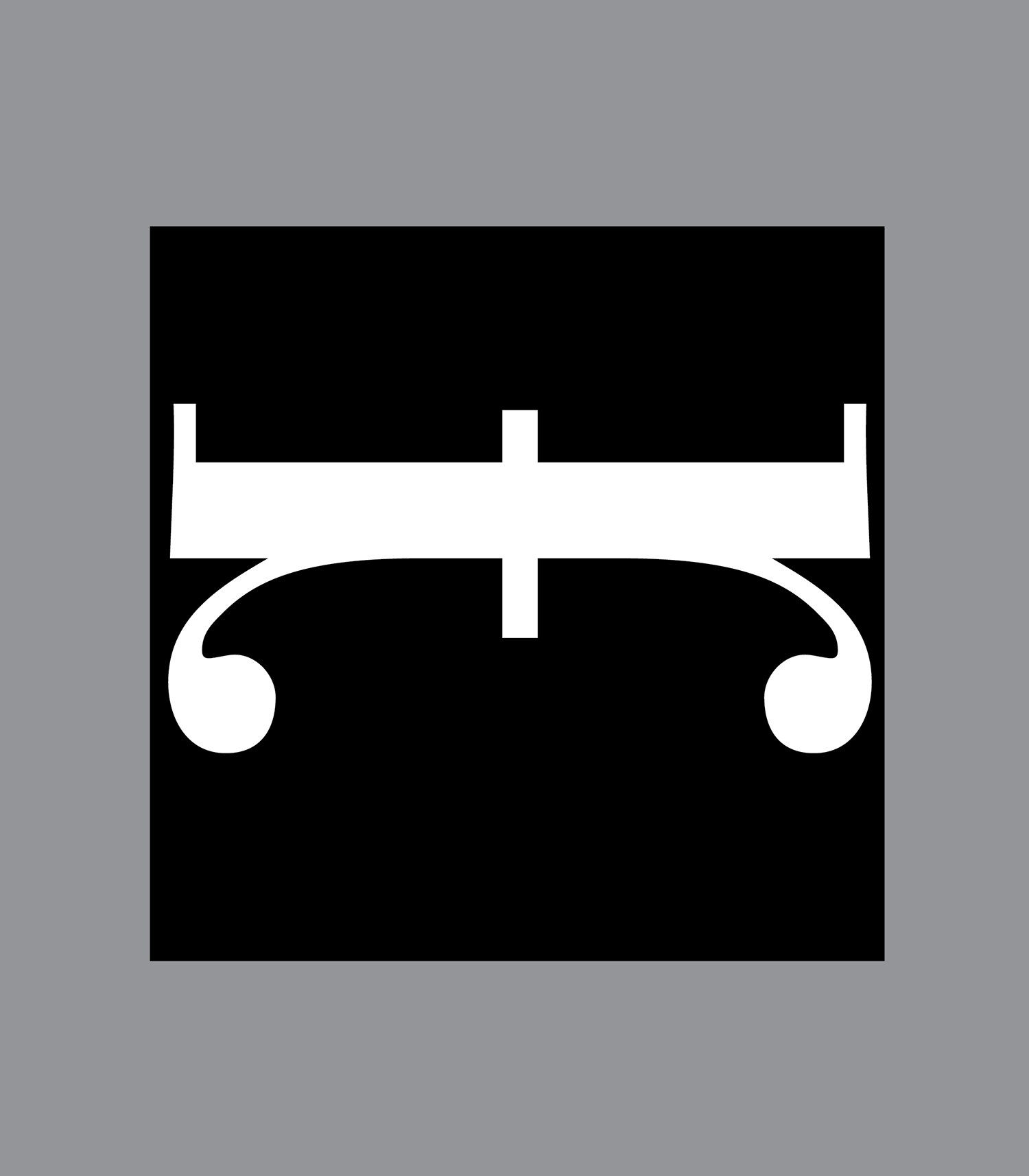
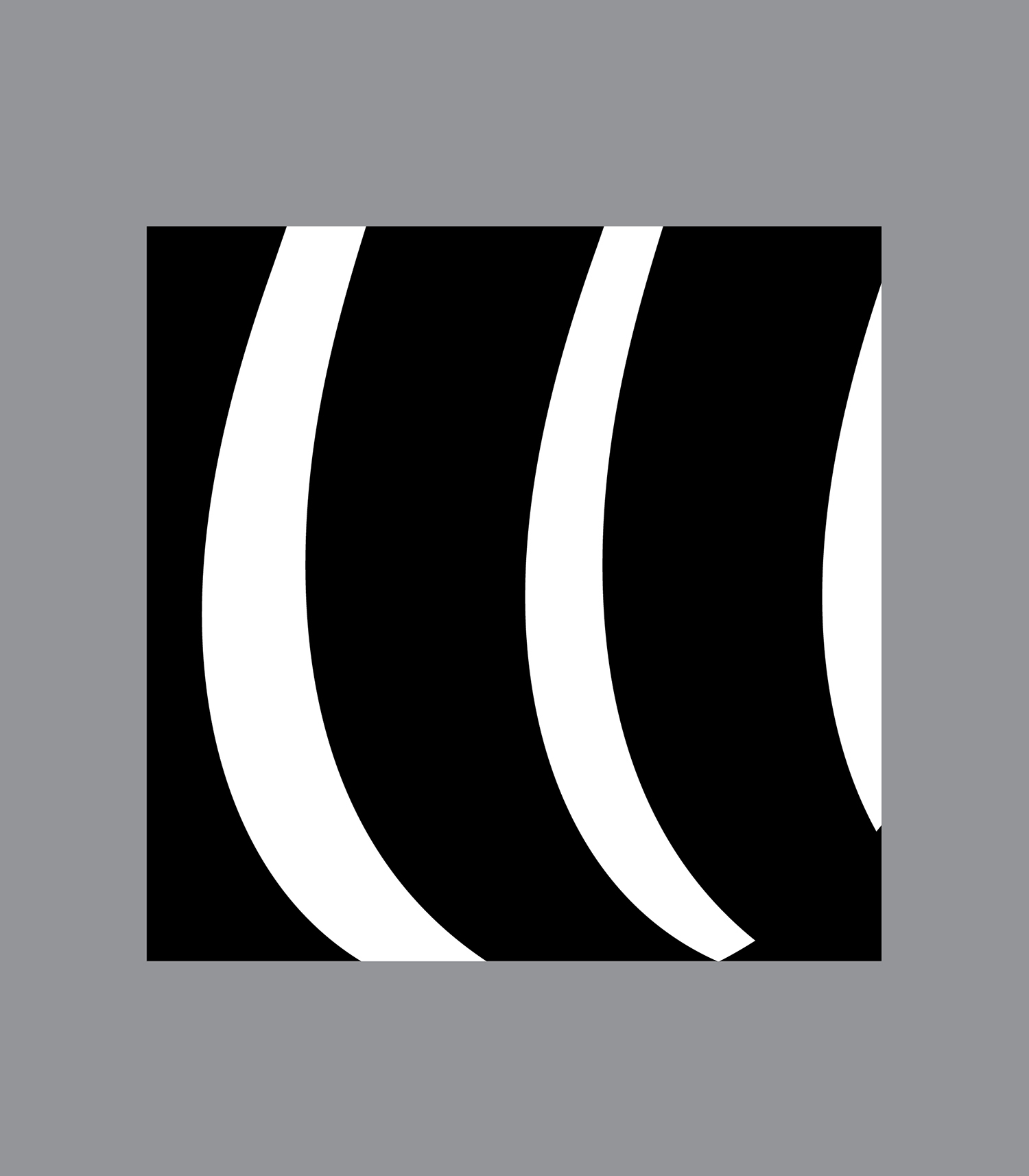

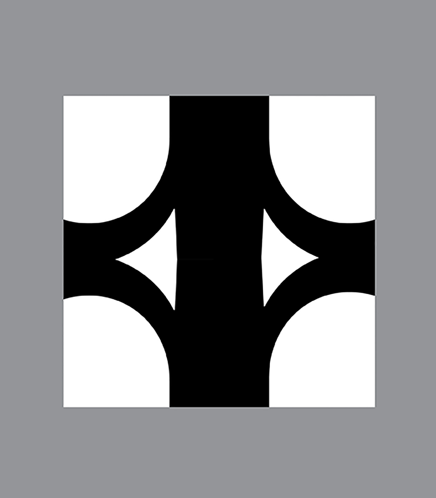
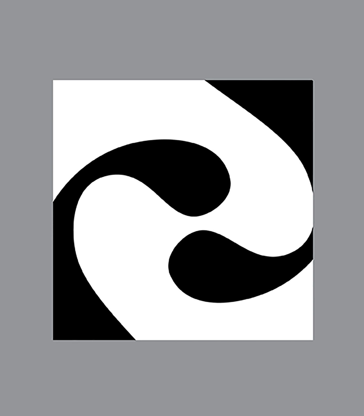
I knew immediately that I wanted to use a serif font due to its differences in thin and thick strokes which would allow me to play with the anatomy better. I chose to use Bodoni 72 as the differences between thick and thin were quit distinct and it had a 90 degree horizontal serif and yet had gentle curves in other parts. I chose to use F and R as they both had soft curves and straight, structured strokes.
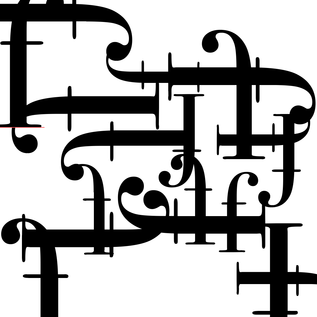

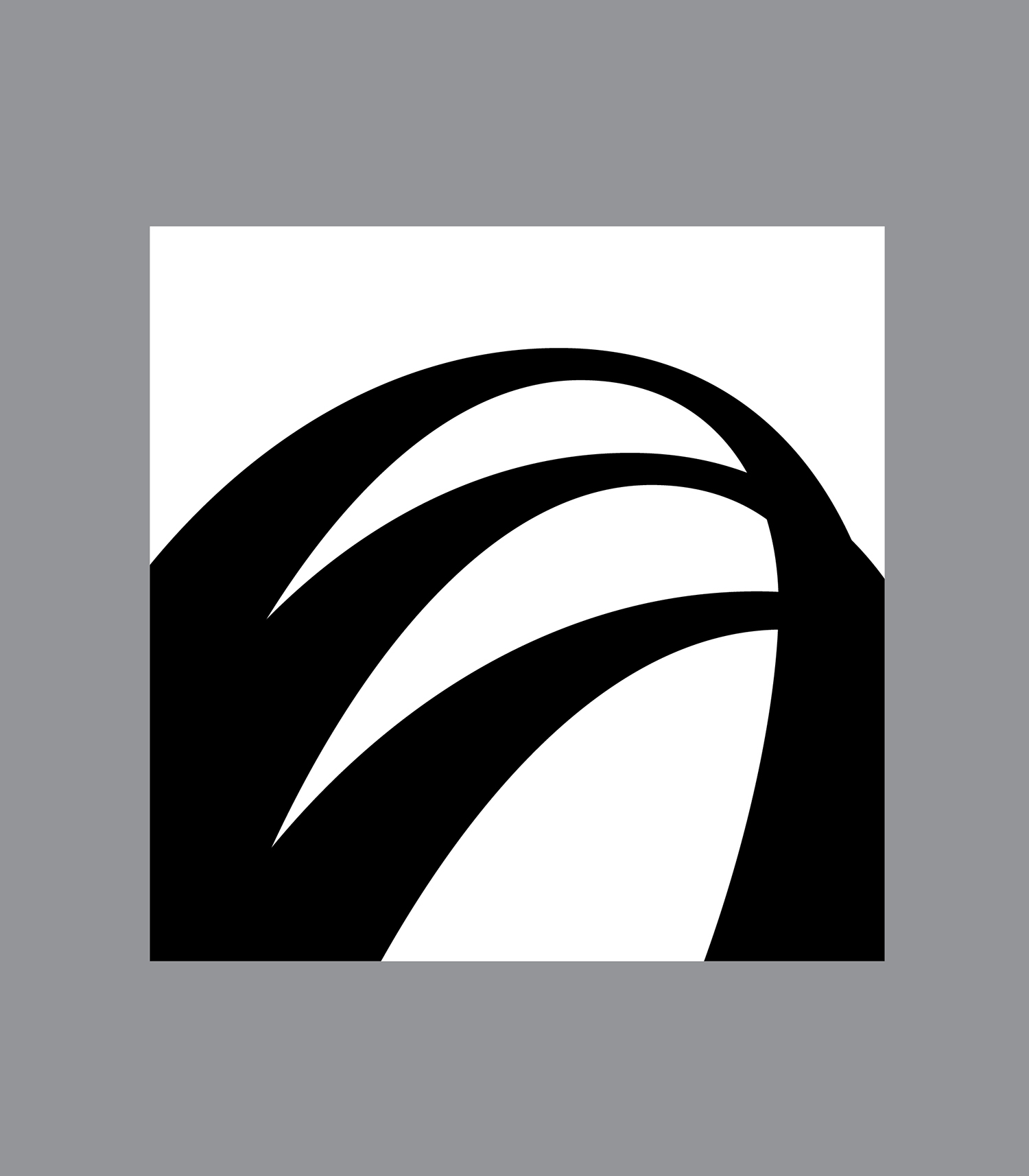
After rotating the r multiple times, it reminded me of a snowflake so I decided to do that in my final.
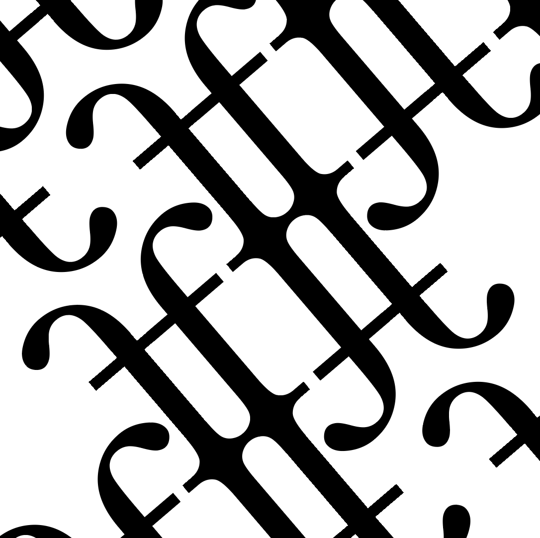
Here are the final pieces:


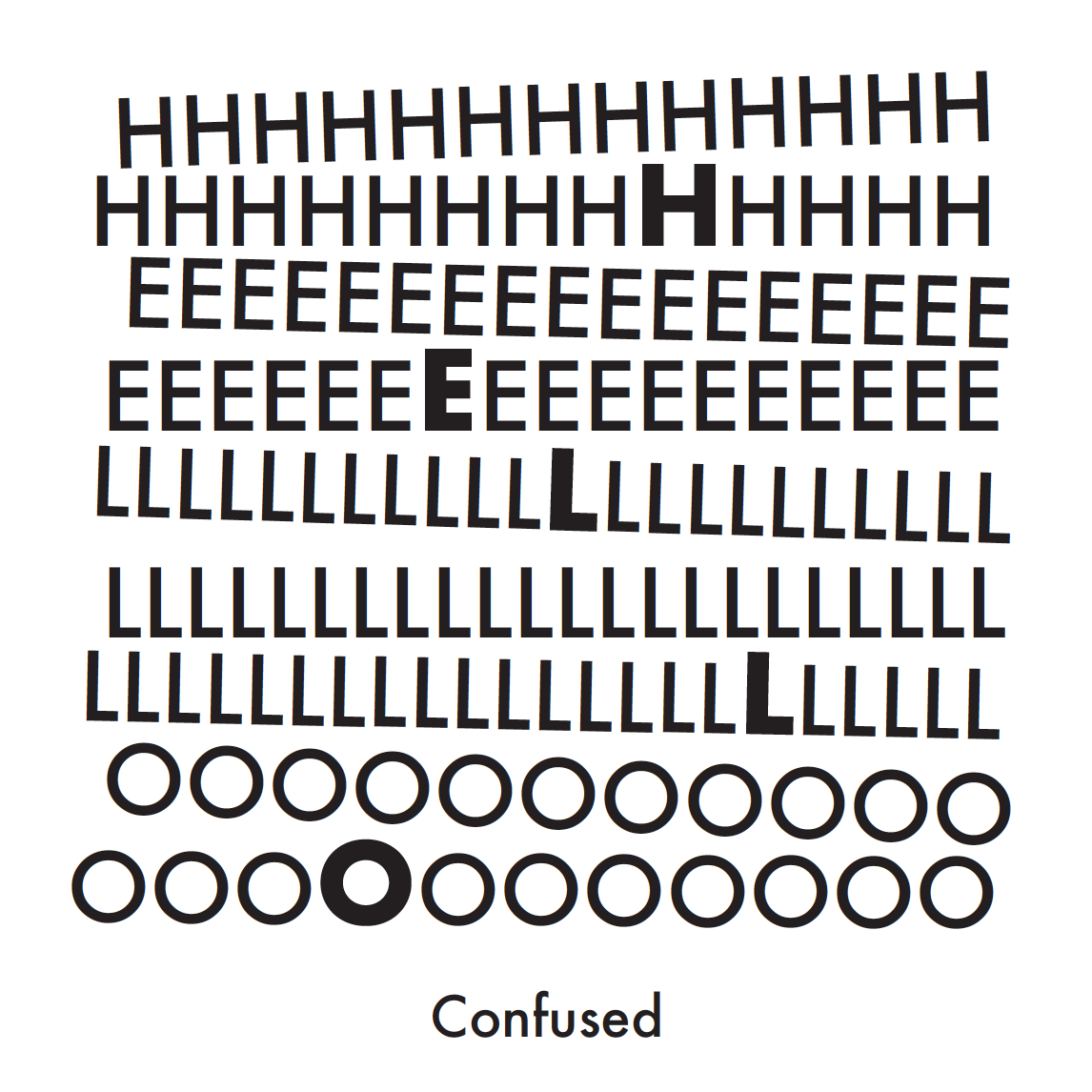
PROJECT 3C
This was my favourite project because the word ‘HELLO’ was just so fun to play around! I chose a sans serif font for this (Futura) as i felt like it was more neutral and I could express both positive and negative emotions with it.
Here are my final pieces:

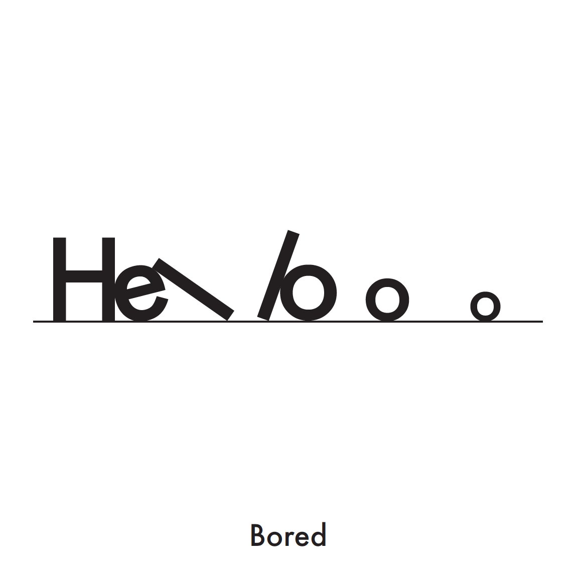

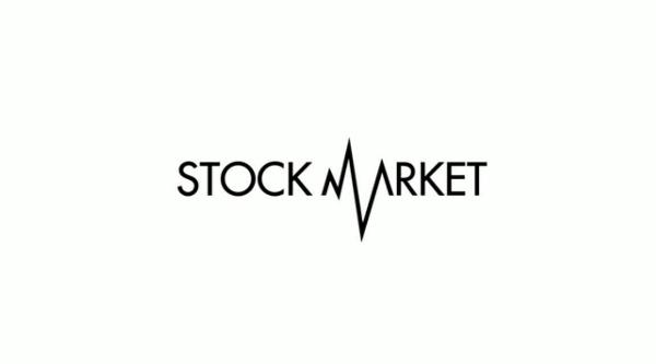
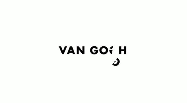
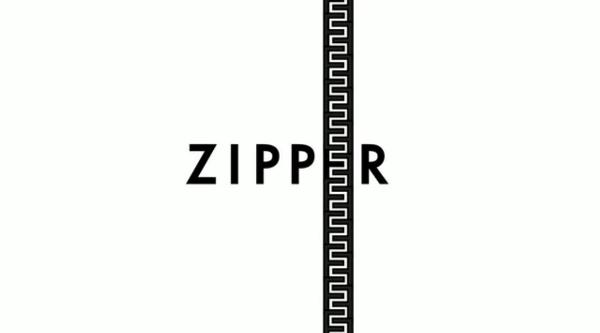
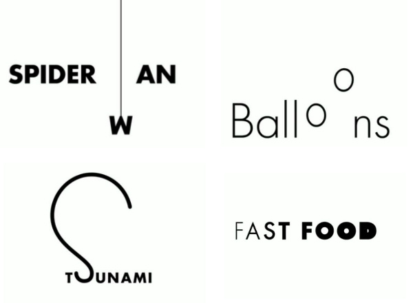
I really liked this designer who used the letters to communicate the word so simply but so effectively.
Also, I misread the brief initially so I did it wrong but I didn’t keep a record of it.. 🙁 But here’s one that i managed to keep and I really like it! Too bad it wasn’t a part of the list of emotions.