
Event Poster


Front of event flyer Back of event flyer

Lanyard

Mockup of staff ID lanyard
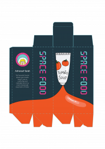
Dieline for space food packaging

Mockup for event flyer
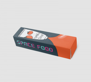
Mockup of packaging
Event Poster
Front of event flyer Back of event flyer
Lanyard
Mockup of staff ID lanyard
Dieline for space food packaging
Mockup for event flyer
Mockup of packaging


What do you find inspiring?
Using illustrations of mythical creatures like unicorns and Bigfoot, it appeals to children, their target audience. They also put the focus on the individual illustrated creatures on their packaging rather than the ingredients or photos of the product itself as it would not be as appealing to children.
What type of information is on the label/bag/box?
On the box packaging, it highlights that the snack is school safe and includes fruits and veggies, keeping the information minimal and direct.
Who do you think is the target audience?
This product is targeted as kids.


What do you find inspiring?
I like that this company not only designed the actual packaging of their soda cans, but also shipping box packaging. The boxes are designed as boomboxes and record players and relates to their tagline of “soda with soul”. Their illustrative style is casual and friendly and reflects their visual identity and branding.
What type of information is on the label/bag/box?
Since this is a shipping box, it does not contain much information about the product itself. It does include their tagline, “soda with soul” and their logo for their customers to immediately identify their brand. It also includes information about their product which would likely most appeal to their target audience like how the soda contains real fruit.
Who do you think is the target audience?
From the casual illustrative style, I think they are targeting people who keep up with trends, who have laid-back and free attitudes.

What do you find inspiring?
This chocolate packaging features a beautiful hand-drawn illustrative style. For each flavour, the illustration and colour palette is tied to the flavour of the chocolate. For instance, the pumpkin spice flavour uses orange and earthy colours to reflect the fall season, when pumpkins are in season.
What type of information is on the label/bag/box?
The brand name, the name of the flavour and the description of the flavour.
Who do you think is the target audience?
The hand-drawn illustrative style appeals to people who appreciate packaging and details, most likely females.


What do you find inspiring?
Each illustration is linked to the flavour of popcorn. By pairing a black and white line illustration with a bright pop of colour in the background, it gives a nice contrast.
What type of information is on the label/bag/box?
The brand name, the flavour, as well as the calorie count.
Who do you think is the target audience?
As the packaging brings out the calorie count, I think the target audience is one who is more health-conscious but still wants to have a little snack.

What do you find inspiring?
I like the abstract patterns on the packaging that still ties together through the colour palette and consistent layout and mix of patterns.
What type of information is on the label/bag/box?
The brand name, the type of coffee, and the various information about the coffee
Who do you think is the target audience?
Coffee drinkers who are not loyal to any brand and appreciate good coffee.
MOODBOARD AND USER PERSONA
For my event, I chose to do a space food exhibition targeted at children, where they can learn about space food and how they package and rehydrate it. I took inspiration from children’s book illustrations that went for a simple line illustration.

SKETCHES


RESEARCH – VAROOM
Varoom is a publication that comments on contemporary illustration. Its articles include interviews with illustrators and critical articles, all relating to a specific theme set for the particular issue.
What do you find inspiring?
What I find inspiring about Varoom is that they have all kinds of styles of illustrations. It isn’t just one particular style but really shows that illustration comes in all sorts of different styles. It is also inspiring to get an insight into illustrators’ process and their thought process. For instance, in this article in the Rhythm issue, Lesley Barnes reflect on the process of creating her book, Jill and Lion, which was insightful and inspiring.

What type of information is in the magazine?
The magazine features interviews with illustrators, relating to the theme of each issue. These articles explore their process and individual style. There are also articles like Drawing with VR Tools: The Test Pilot that talks about different techniques in illustration, such as using virtual reality.

Who is the target audience?
People who are interested in illustration, perhaps who are illustrators themselves or aspiring to be.
EDITORIAL ILLUSTRATIONS
John W. Tomac

Stopping Data Leaks | National Underwriter

The destruction of our democratic institutions | Los Angeles Times

How music influences memory | Rochester Review

Liberty’s Flameout | The New Yorker
John W. Tomac is primarily an illustrator who has worked with big names like The New Yorker, Washington Post and The Wall Street Journal to name a few.
What do you find inspiring?
He creates illustration pieces that are simple, with a very strong concept that is impactful. I find it inspiring that he is able to easily identifiable elements and combines them to create an illustration that can be interpreted easily.
What medium do they use?
He mainly works with vector illustration that has very clean edges
How do they creatively interpret the text for the article?
Each piece that he creates is strong enough to stand on its own but paired with the text, becomes clearer instantly, and adds another perspective to the topic.
CHOSEN THEME: PLAY
Out of the three themes, play was the one I was immediately drawn to. Here’s a wordlist of that things that immediately come to mind when I think of play:
A few ideas:
USER PROFILE

MOODBOARD

THUMBNAIL SKETCHES


Concept Brief
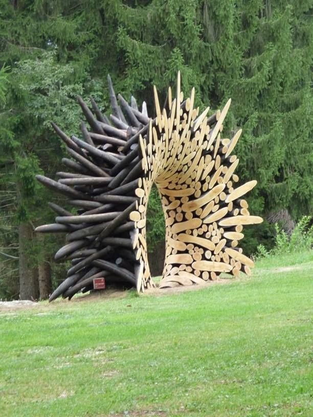
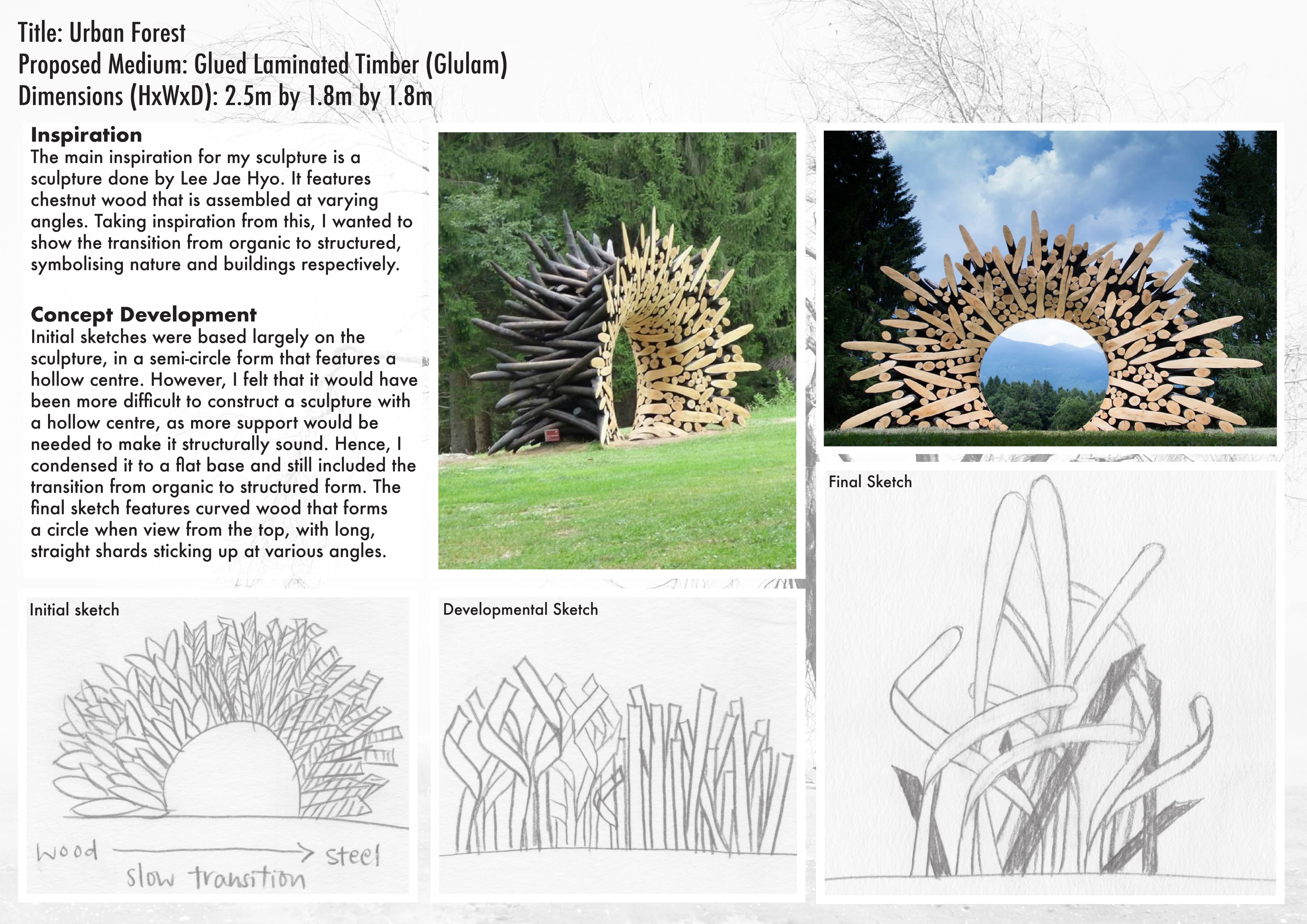
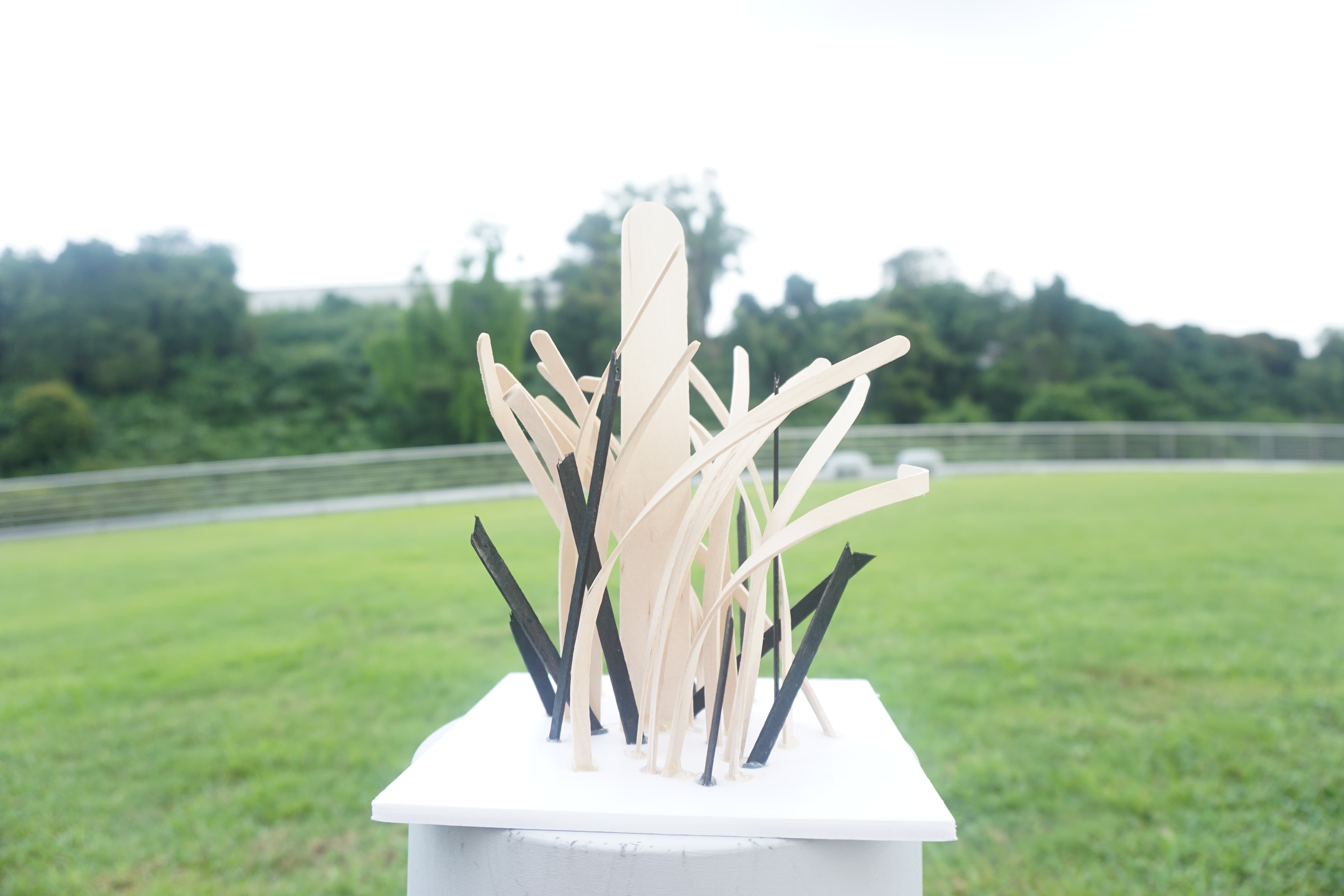
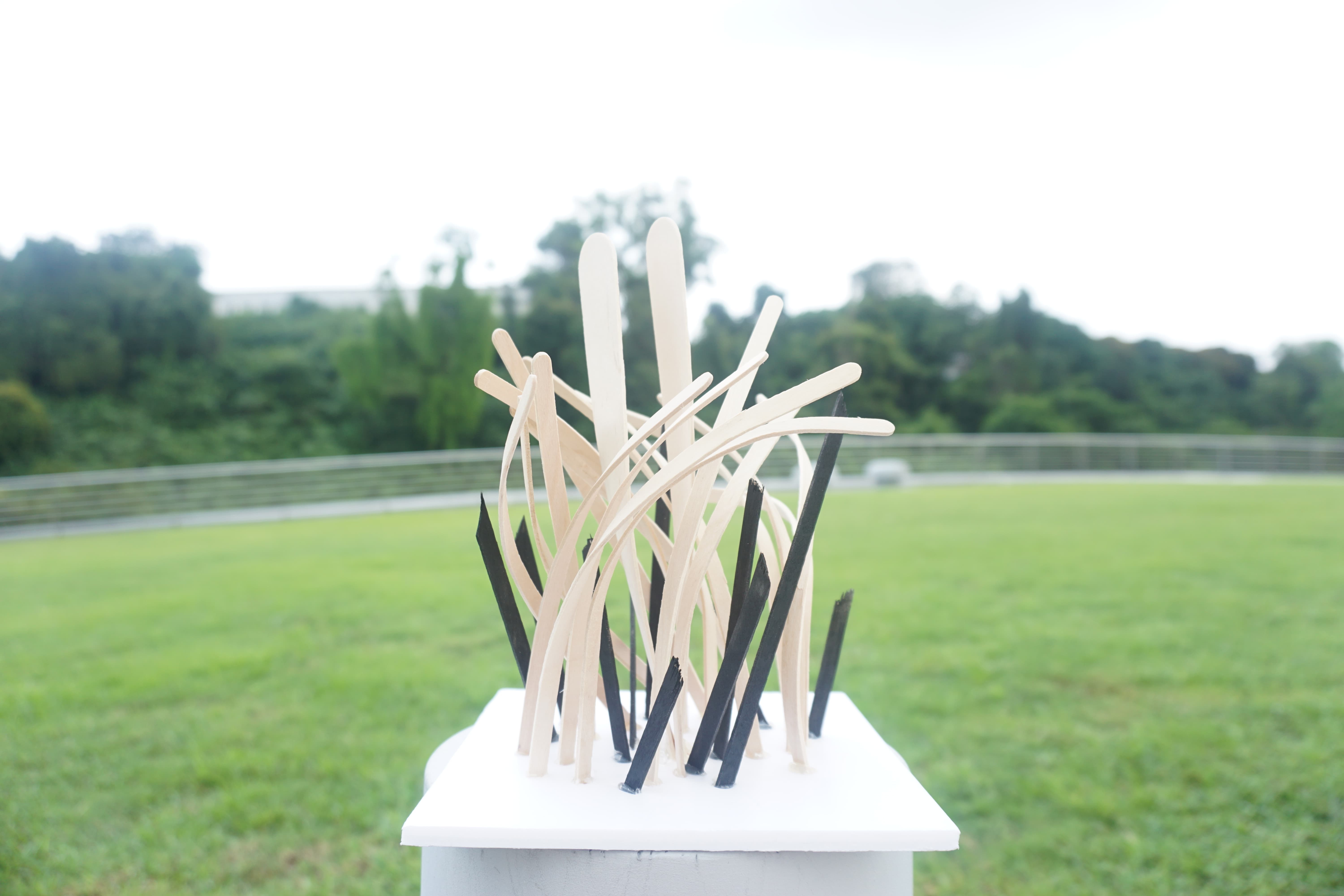
Title: Urban Forest
by Vanessa Ang
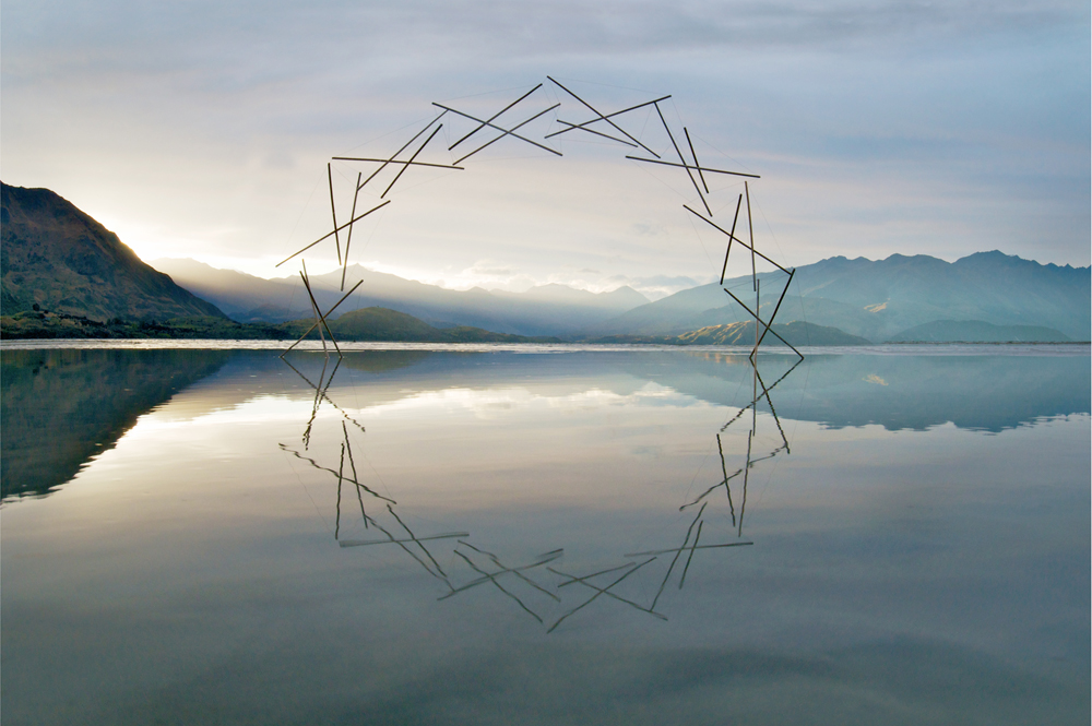
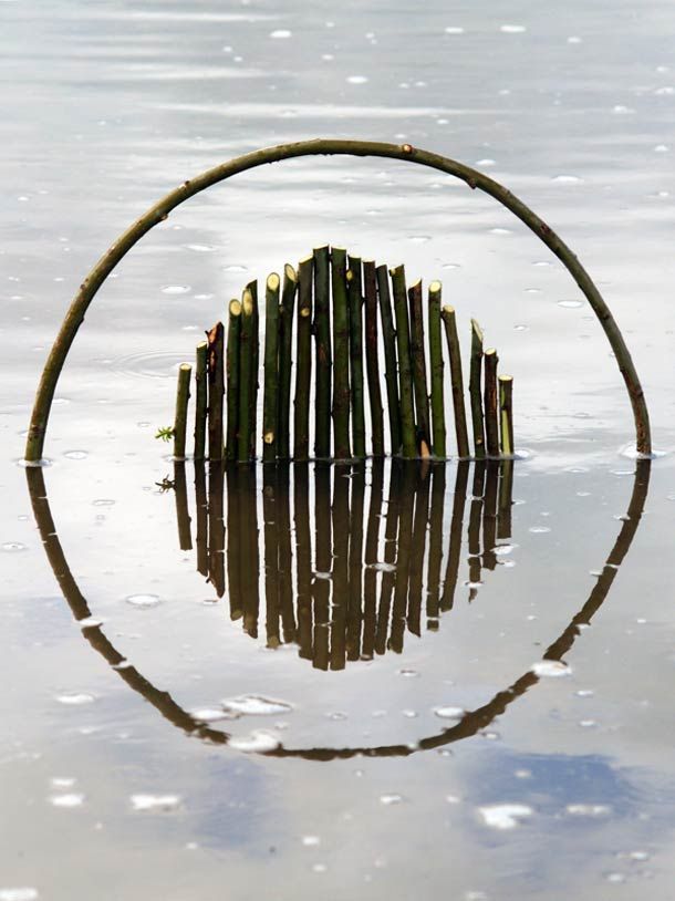
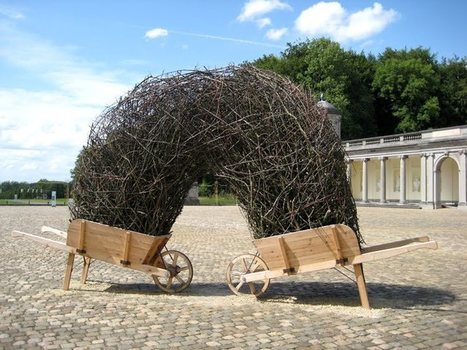
Urban Forest is a sculpture that represents the effects of deforestation. In order to make room for a growing population, countries have cleared out forests, home to thousands of flora and fauna. In contrast with the curved wood, in its raw and organic form, shards of cold, hard steel sticks out. This represents how urbanisation has impeached into nature, taking up the space meant for trees to grow and expand. Even in Singapore, where NParks is constantly ensuring that the trees in Singapore grow healthily, it is in a controlled environment, and the idea of nature taking full control is no longer one we embrace in this city.
Yet, this sculpture also explores the idea of living in harmony, with a balance of nature and man-made buildings, and aims to let Singaporeans reflect on this idea.
Research and Inspiration


Process
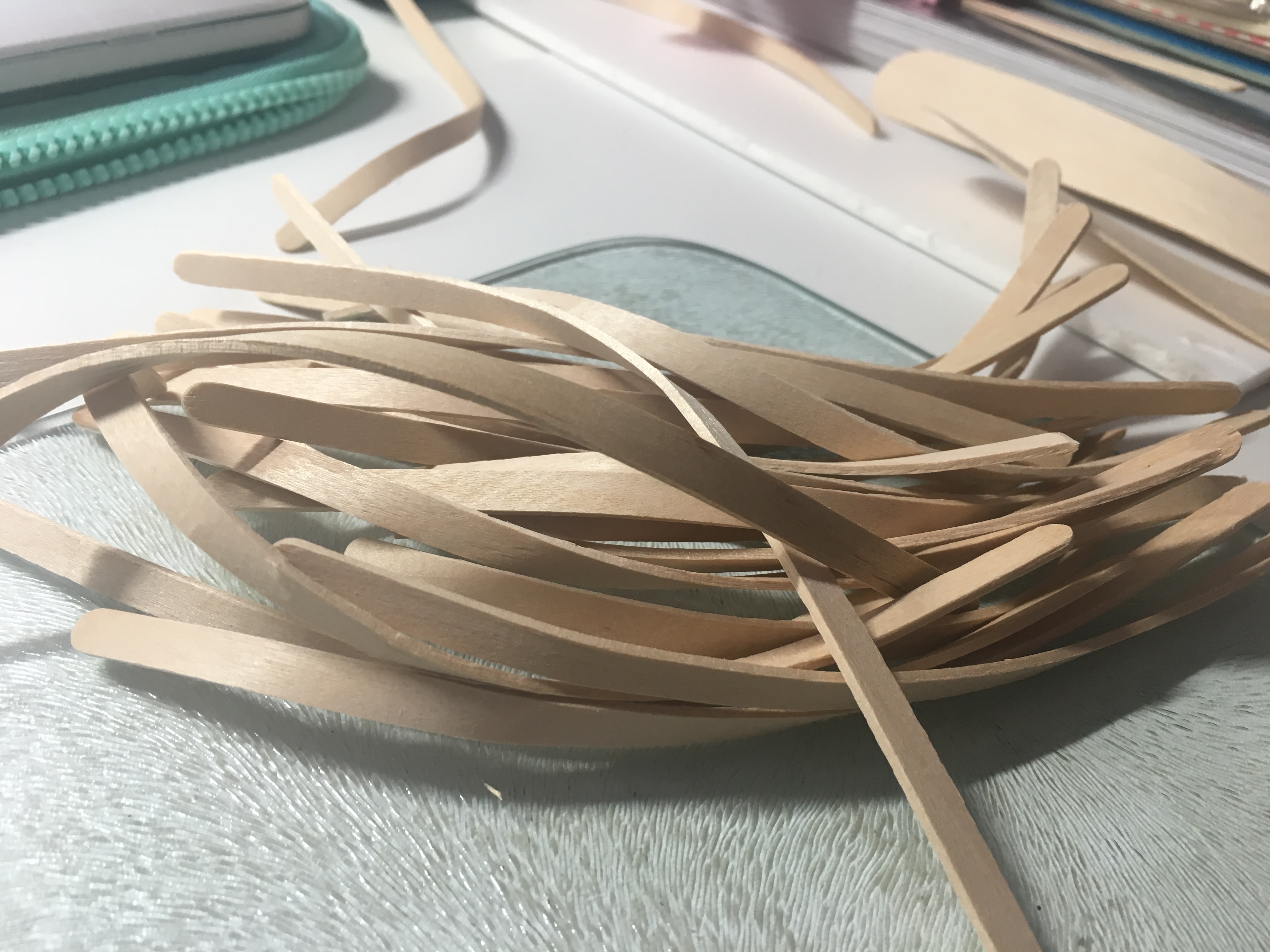
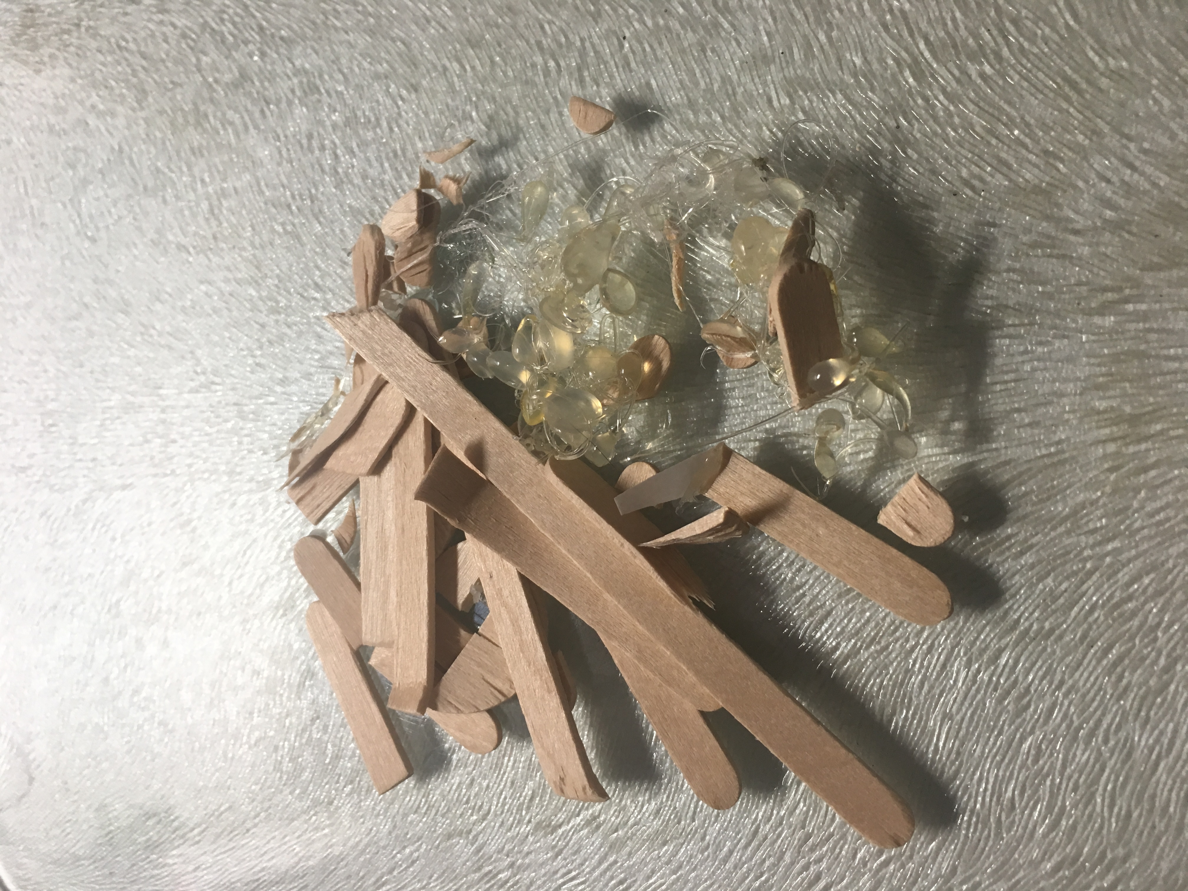
After trying (and failing) to bend the wooden popsicle sticks with an iron, I resorted to steaming the popsicle sticks on the stove. It was very effective and I managed to bend the sticks quite a bit.
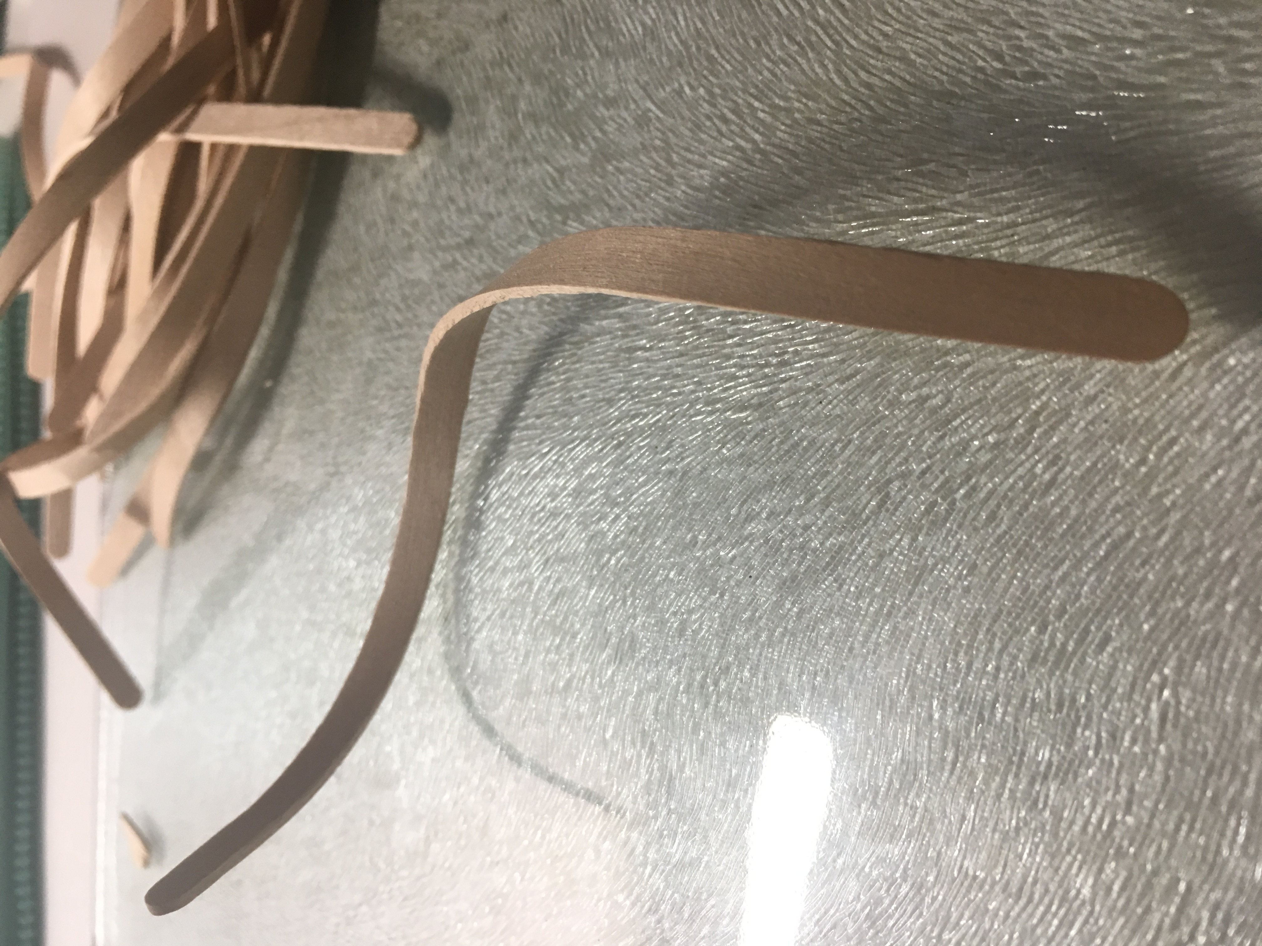

Then, I cut off one end of the sticks and used a hot glue gun to stick them on the foam board.
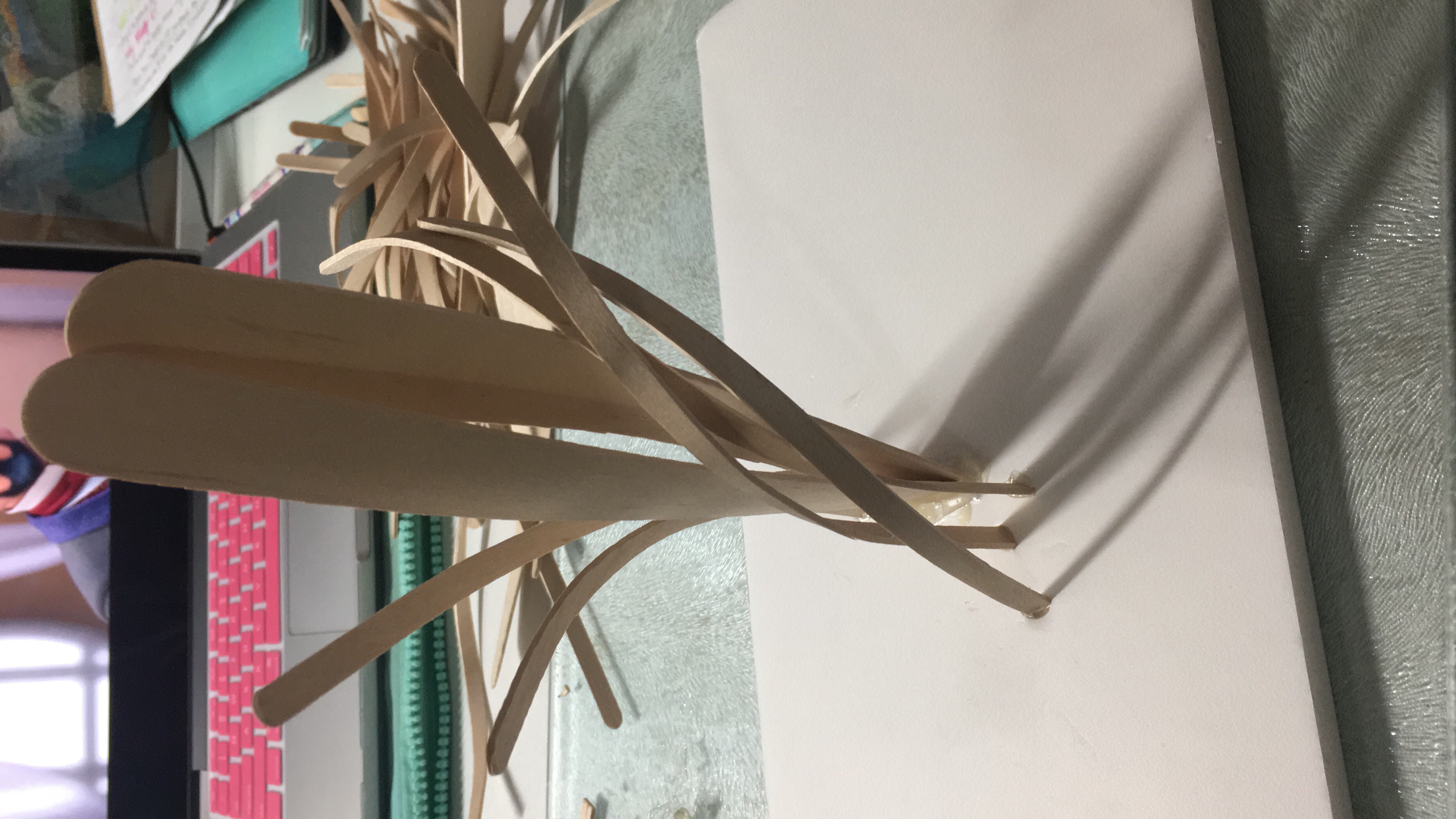
Here’s the mess I created halfway through
Concept Development and Inspiration
Final Outcome

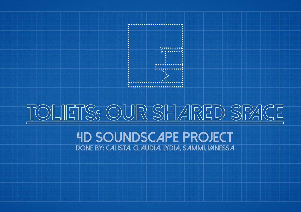
Team Members: Calista Lee, Claudia Tan, Lydia Lui, Sammi Neo, Vanessa Ang
Title: Toilets – Our Shared Space
Location: ADM Level 2, Female Toilet beside 4D classroom
Artists’ Statement
Toilets are a shared space amongst people from all walks of life; and within these space are more often than not, unspoken rules for people to follow. Flush the toilet after using, use only what you must. ‘Toilets: Our Shared Space’ explores the nature of getting people together, and with a set of simple but open instructions, to create a piece of music together; and enjoy the symphony of the space as itself.
Here’s our final outcome as well as the explanation of what we did!
Check out Lydia’s post for more photos and videos of the actual outcome!
Reflections:
I was pleasantly surprised to find that our classmates were very enthusiastic in participating in our project. Initially, we were afraid that they might not be too interested or enthusiastic about creating sounds, hence we created a score that they could refer to. But they were very creative in creating the sounds and surprised me by going entirely freestyle!
To crf to Calista’s post for secondary research:
To test out our project, we did a dry run and fine-tuned some details.
In order to solve some of the possible issues we came up with (as mentioned in Calista’s post), we decided to create a sample score for the class so that they have an idea of how to create sounds using the things found in the toilet. Also, this solves the possible problem of the participant not being able to come up with a sound of their own, yet if they would like to freestyle, they had the freedom to do so too.
Regarding the scale of the project, we were afraid that if all 13 people in class were to participate, it could get chaotic and very hard to coordinate. Hence, we decided to split the class into two groups. Depending on the situation during presentation day, we would either get 7 people to volunteer, or rotate between the two groups such that everyone will get a chance to participate.
We also decided to keep the beats rather simple as we found that it was hard to focus on your own part (if it was too complicated) when all the sounds were combined.
Here’s a video of us doing a sample score.
We also created instruction sheets and included the beats of the sample score for ease of understanding or in case the participant forgot his/her assigned beat.


Next up, the presentation day!

This project required us to find out more about a part or aspect of Singapore and present it in a visual narrative.
Here are some of the approaches we could take:
I didn’t end up following any of the approaches directly. But I wanted to focus on the MRT as it was a place where people of all walks of life came together and was contained in a small cabin. I wanted to investigate the relationship between these people and the transportation as well as the interaction between the people in this space. I started observing the people and realised that no one was interacting with each other, only with their phones.

That got me thinking of how I could get them to interact. It also reminded me of a project my friend did, where she had a set of questions and placed it in HDB lifts, to get a conversation started between the people in the elevator.
So my initial idea was to create a set of questions and pass it around to people on the MRT, to get a conversation started. But realising that Singaporeans are relatively shy people, a set of questions was not going to get them to start talking. It would require a lot more work to solve that issue and due to time constraints, it would have been quite impossible to do so.
Hence, I scraped that idea and chose to focus on another perspective, the problems and inconveniences on the MRT, that is known for its ease of use and convenience, such as MRT breakdowns. But ultimately, I chose to focus on the elderly and the problems they face when taking the MRT.

This old man was squatting down in a corner of the train travelling down East-West line. Many people surrounded him but did not approach him and asked if someone could offer their seat to him. Instead, they ignored him. I also took many videos but am unable to post them as they are too big 🙁
To see my final work, click here.

Team Members: Vanessa and Sammi
The last project of 4DII is finally done! With this, the semester is over and so is my first year in ADM! This project was definitely interesting and my favourite project for 4DII this semester. Here’s a link to our previous post, if you want to find out more about our thinking process.
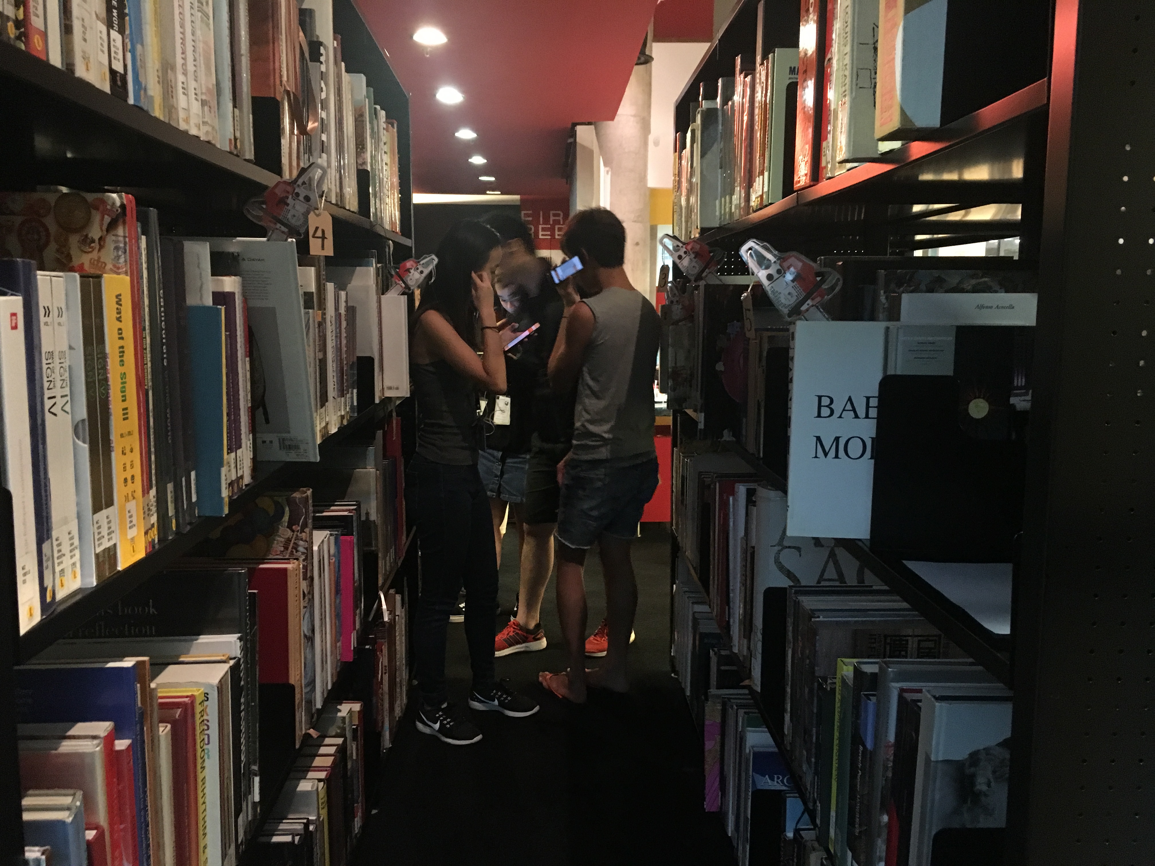
Now on to the photos we took during presentation day! (The photos might be a little dark due to the gloomy weather that day)
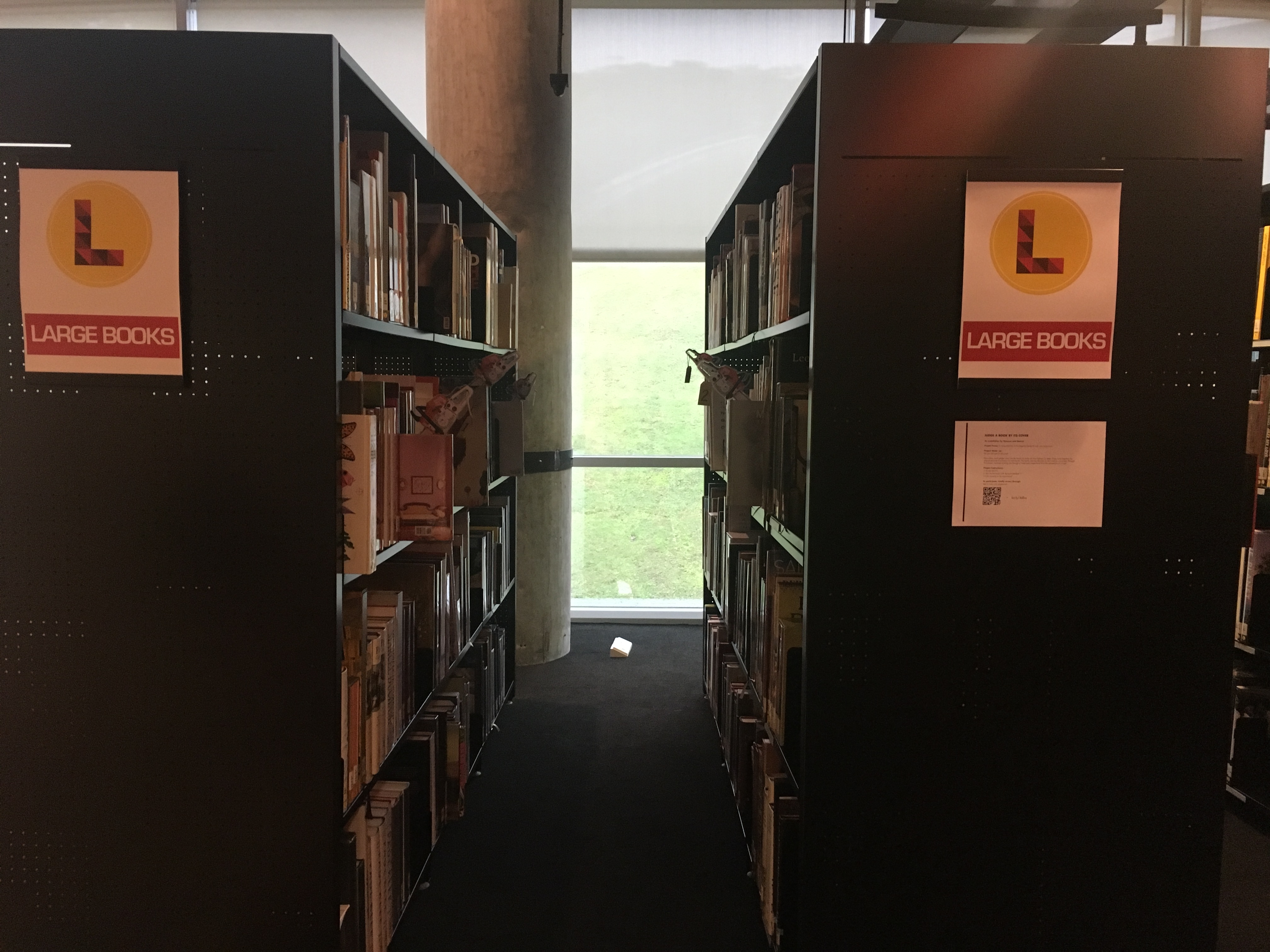
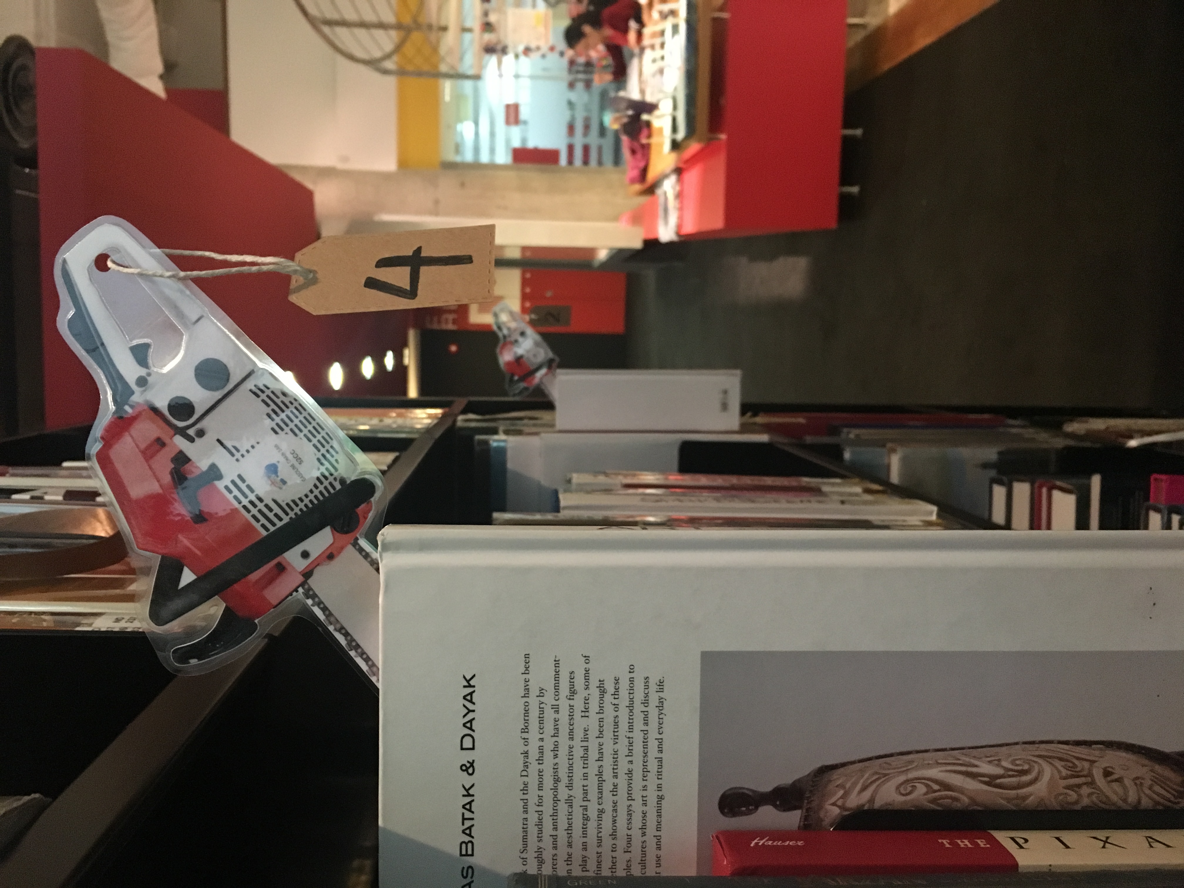
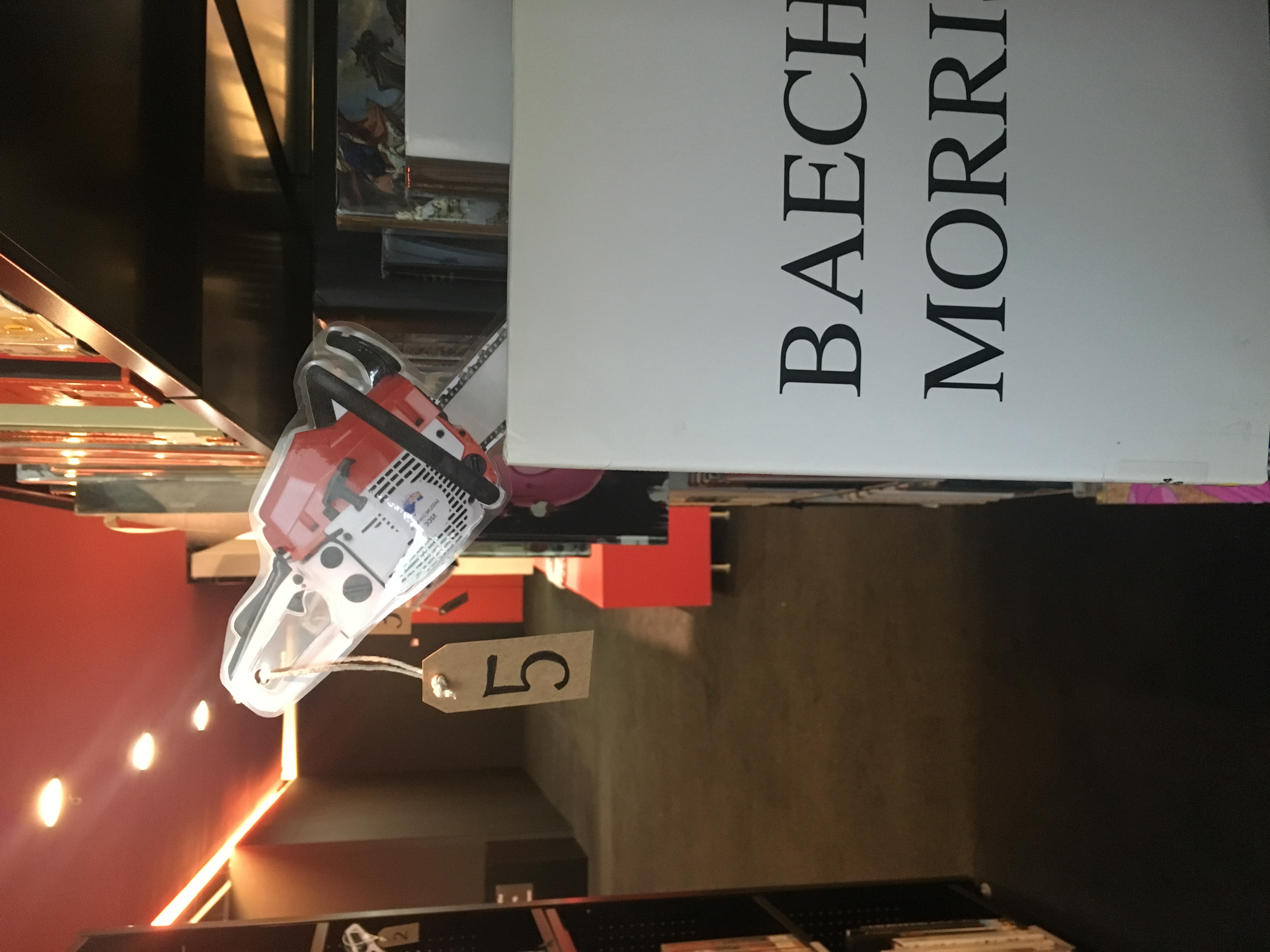
We placed our installation along the aisle of books right in front of the study tables. We chose this aisle of books for three reasons:
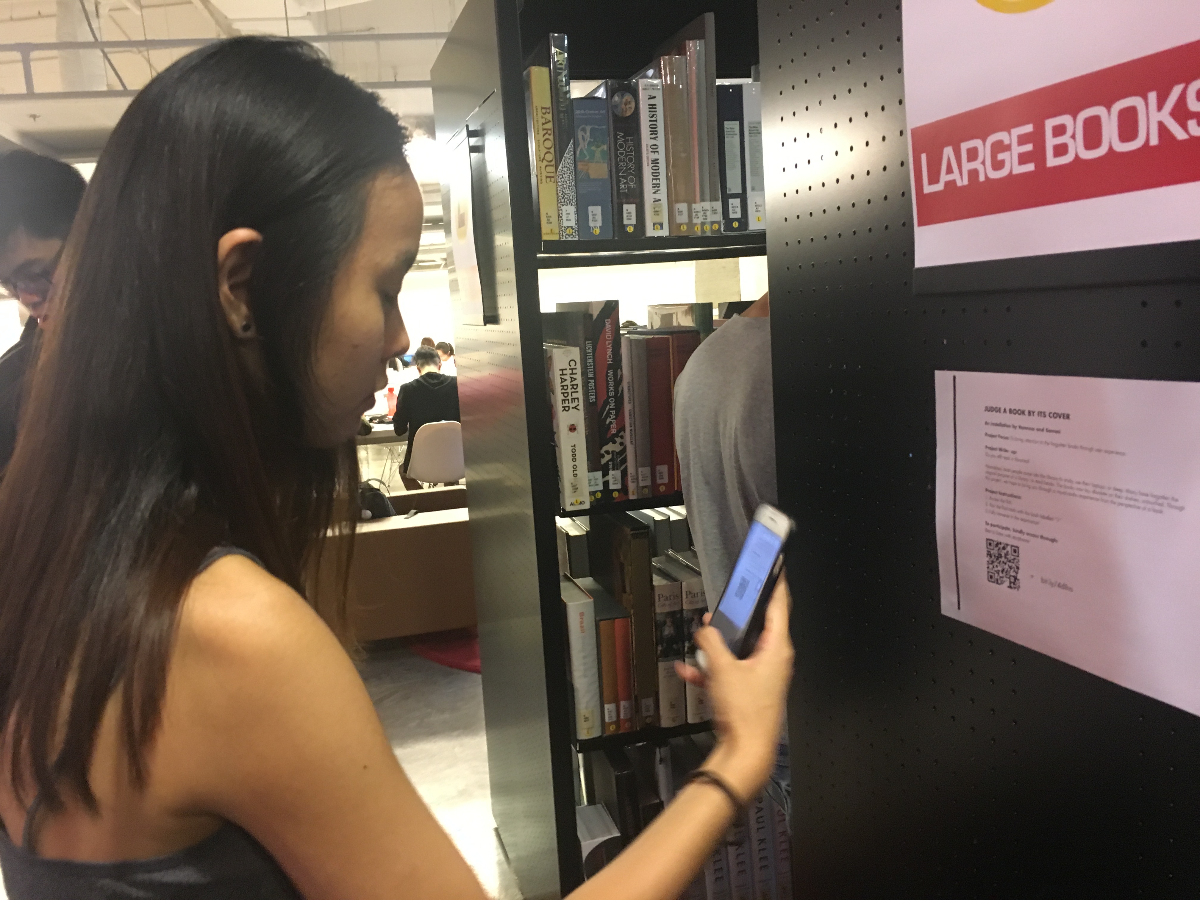
Our write up was placed on the shelf beside the aisle, which Michael said might have been too inconspicuous and people might not notice it.
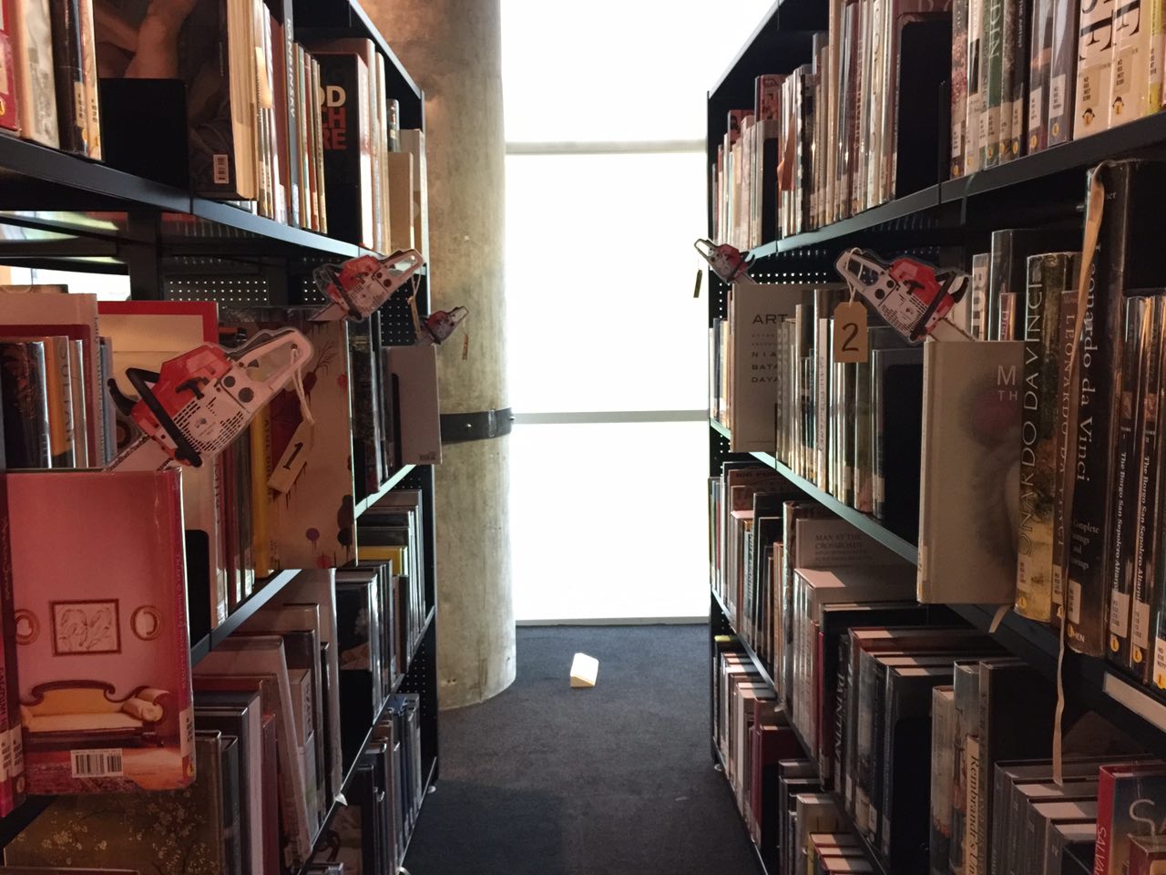
This is what you’ll see when entering the aisle
Here are our classmates trying out our installation!
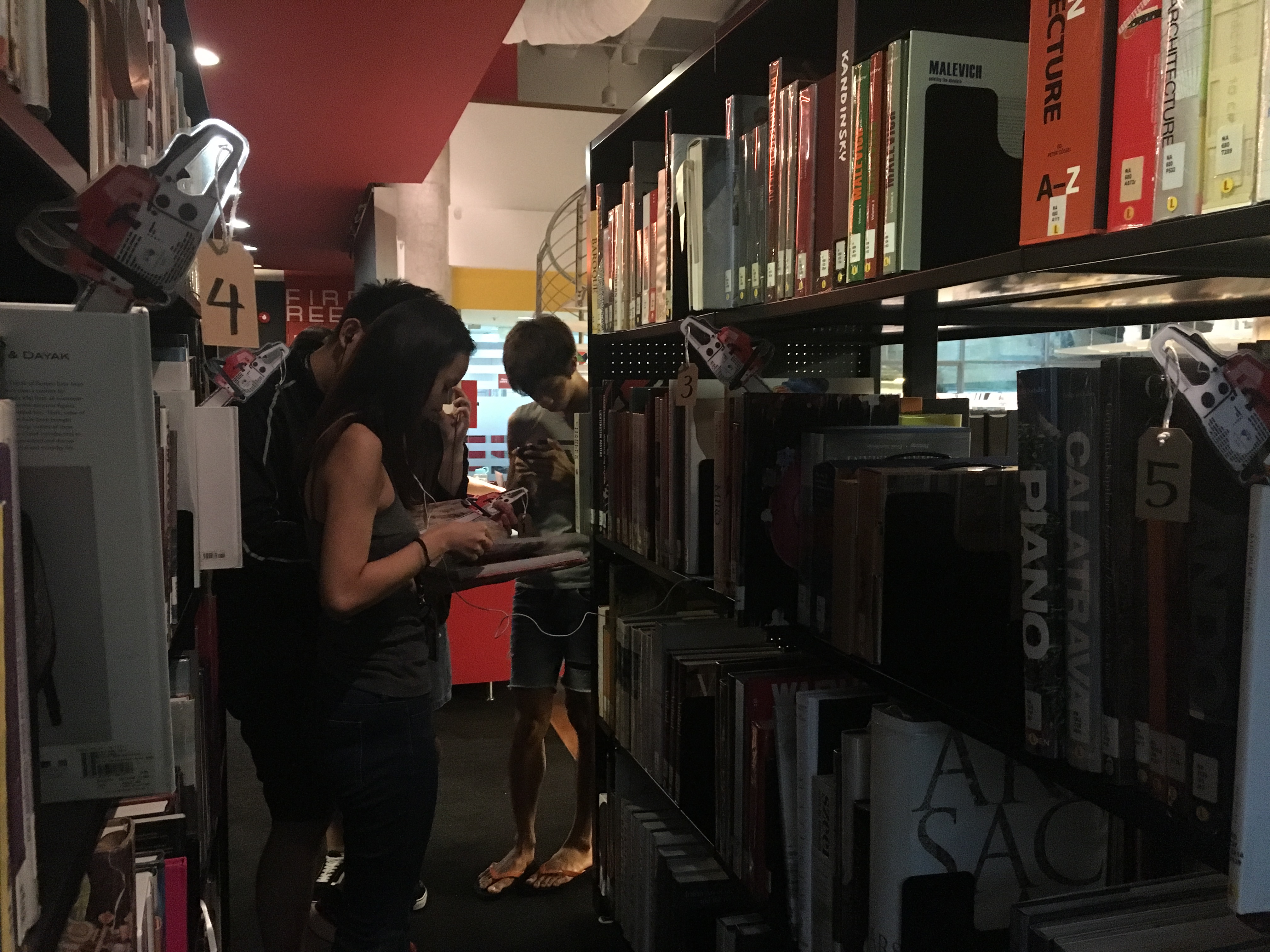
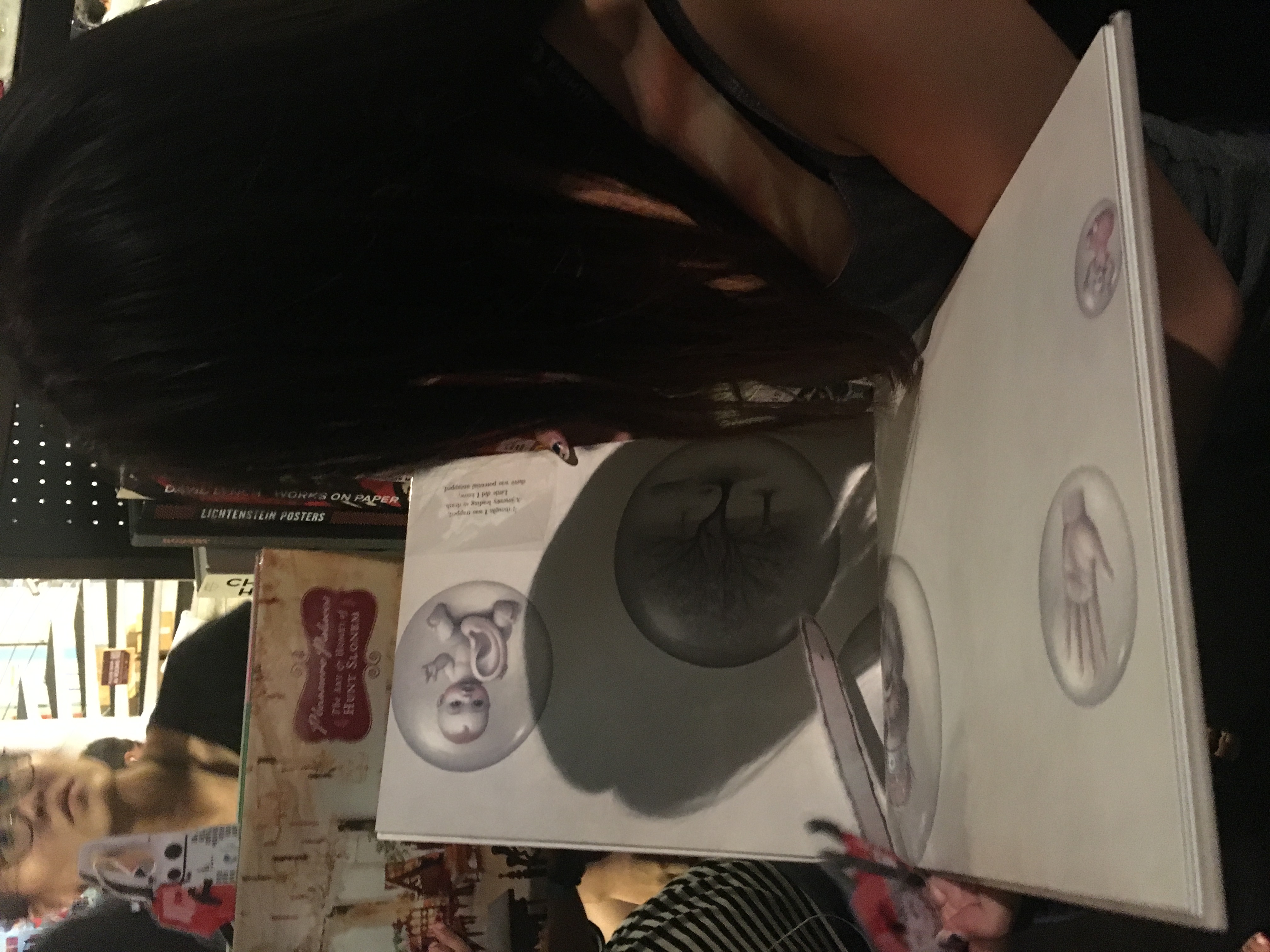
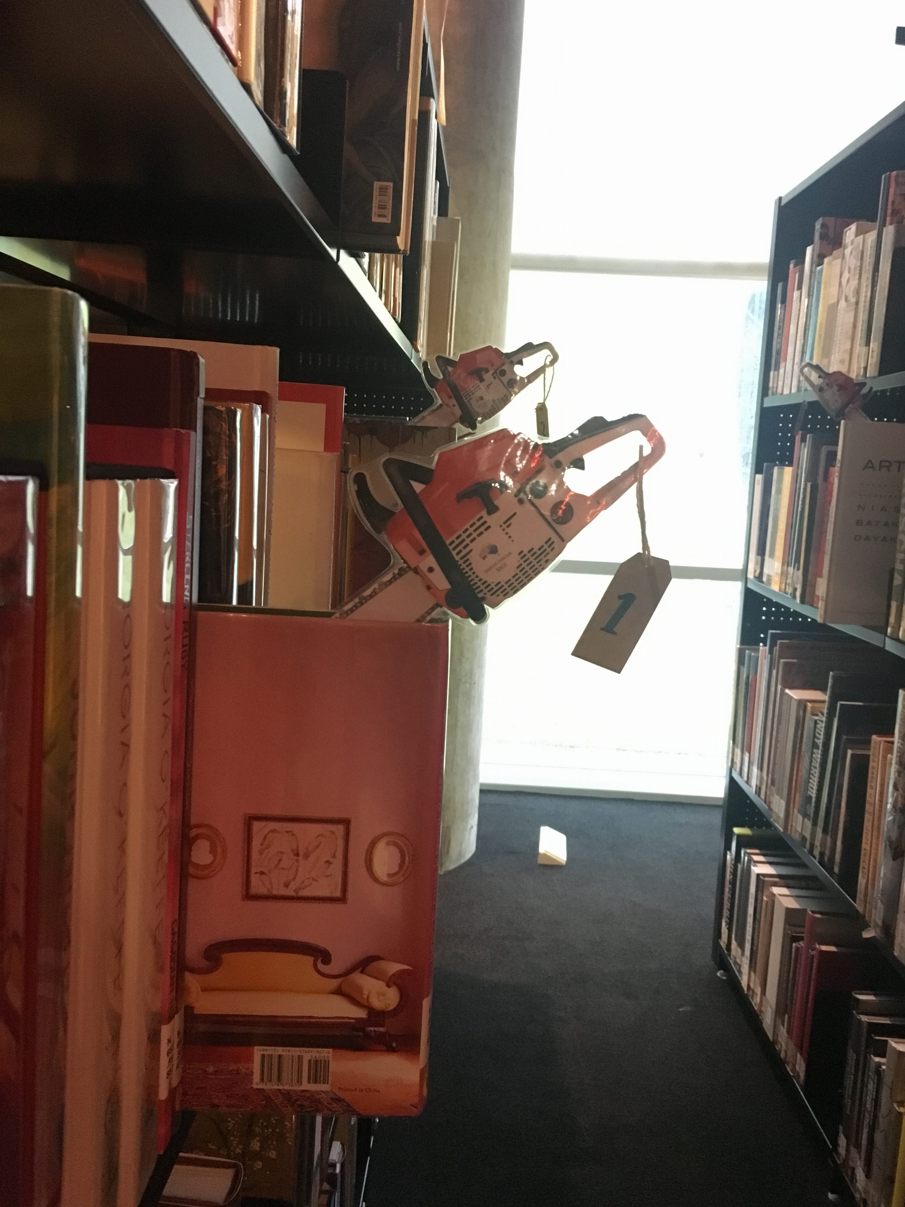
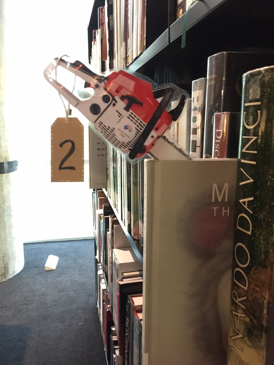
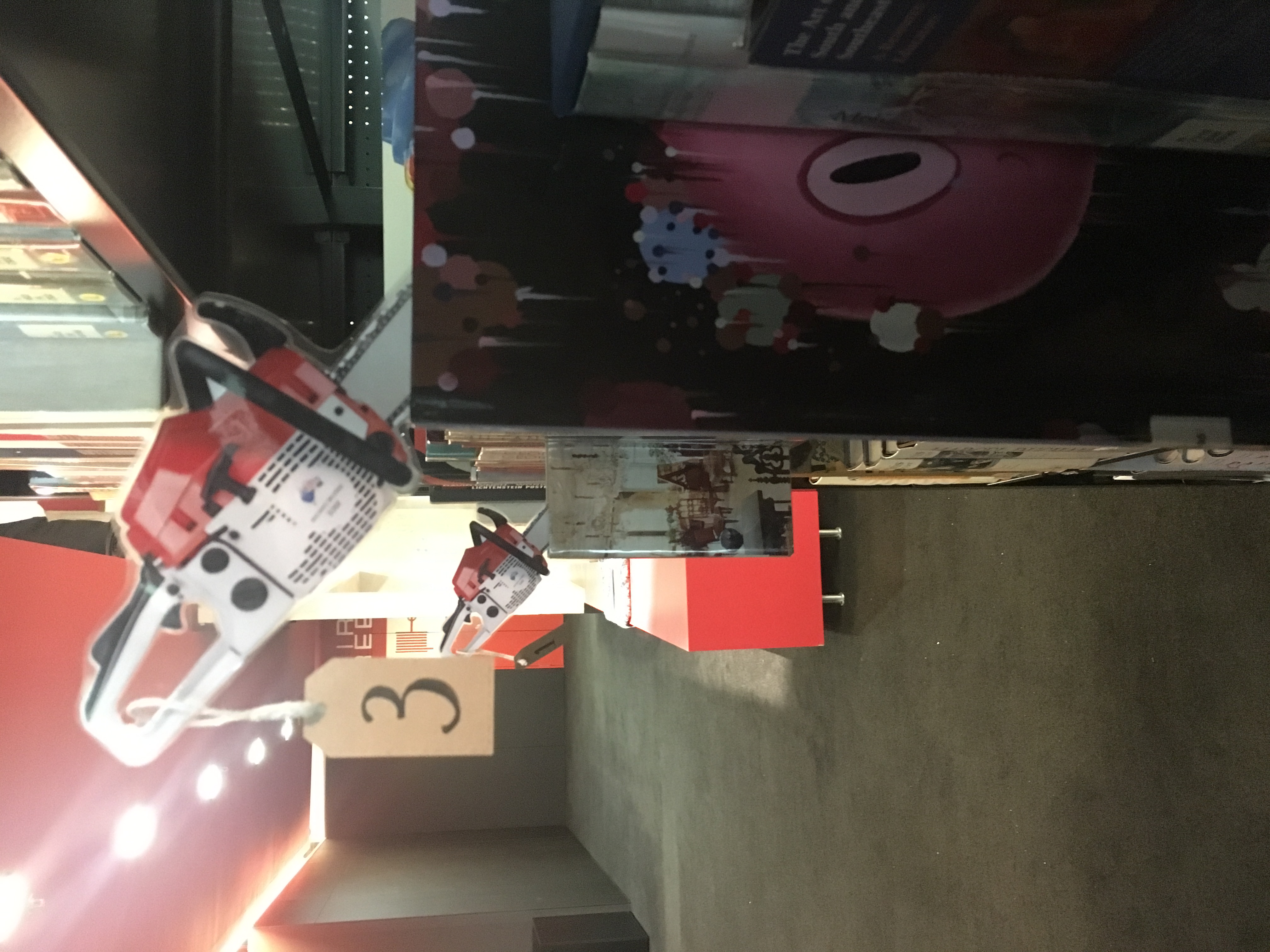
In case you didn’t get to experience the installation for yourself, here are the close ups of the books and the accompanying audio files!
1. The Beginning
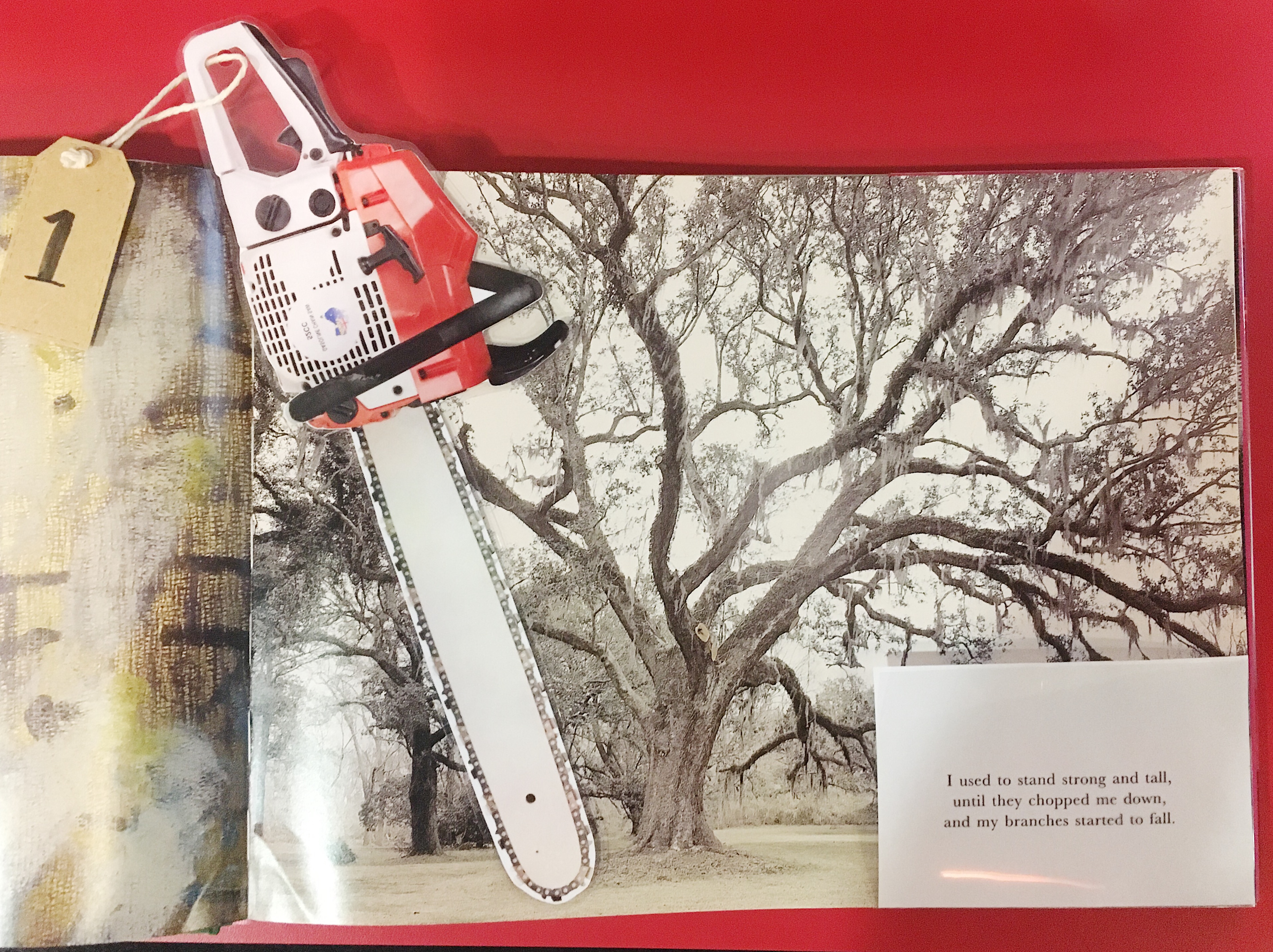
“I used to stand strong and tall,
until they chopped me down,
and my branches started to fall.”
This talks about the first step. The character was a tall tree, but was cut down in order to make paper, for the pages of a book.
2. Transition
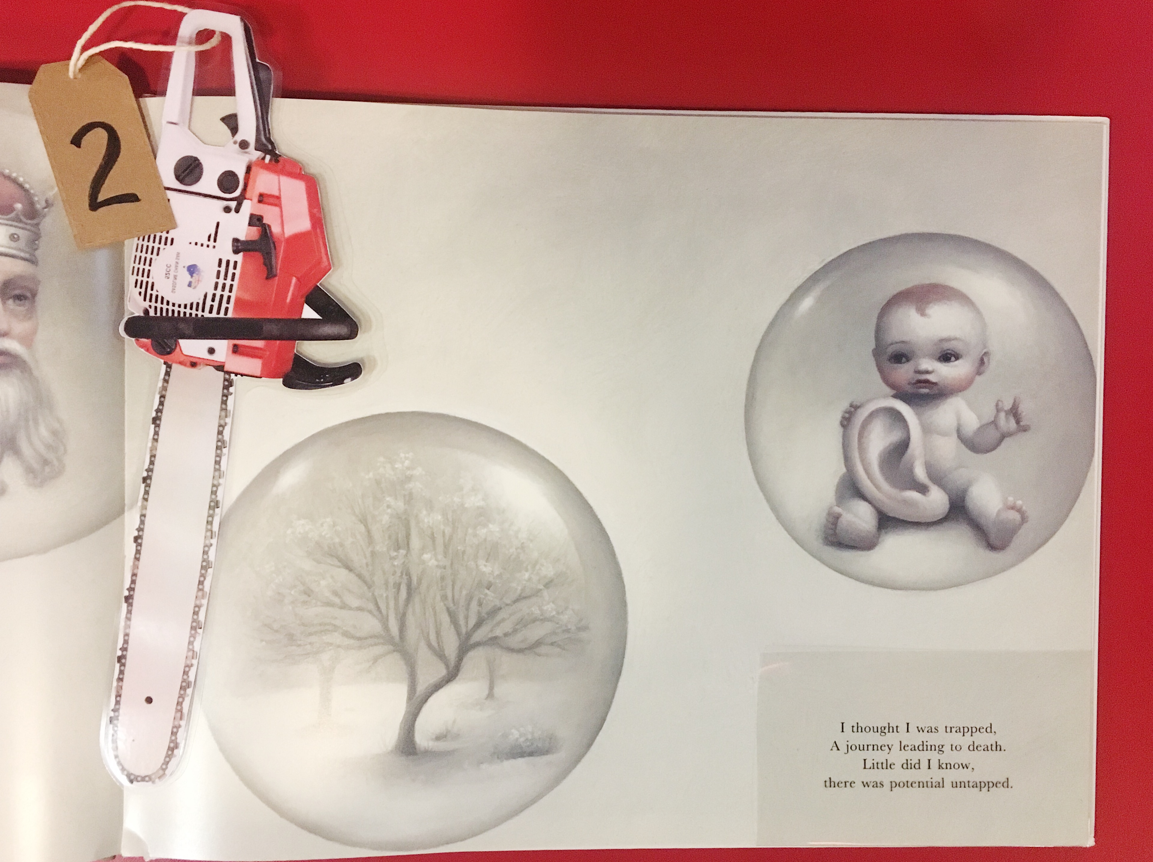
“I thought I was trapped.
A journey leading to death.
Little did I know,
there was potential untapped.”
The character then goes through a transition, losing hope at first, expecting death. Yet, he slowly discovers a new direction and purpose.
3. A New Life
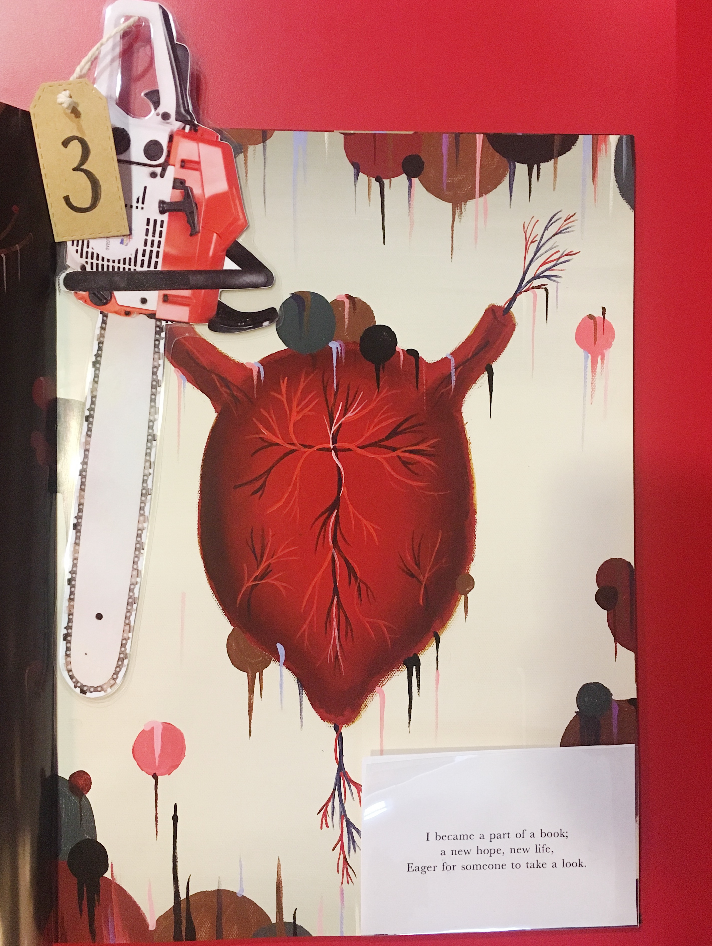
“I became part of a book;
a new hope, new life.
Eager for someone to take a look.”
This is where he understands his new purpose and is enthusiastic in embarking on this new journey. He is filled with hope and is reborn, as a book.
4. Neglected
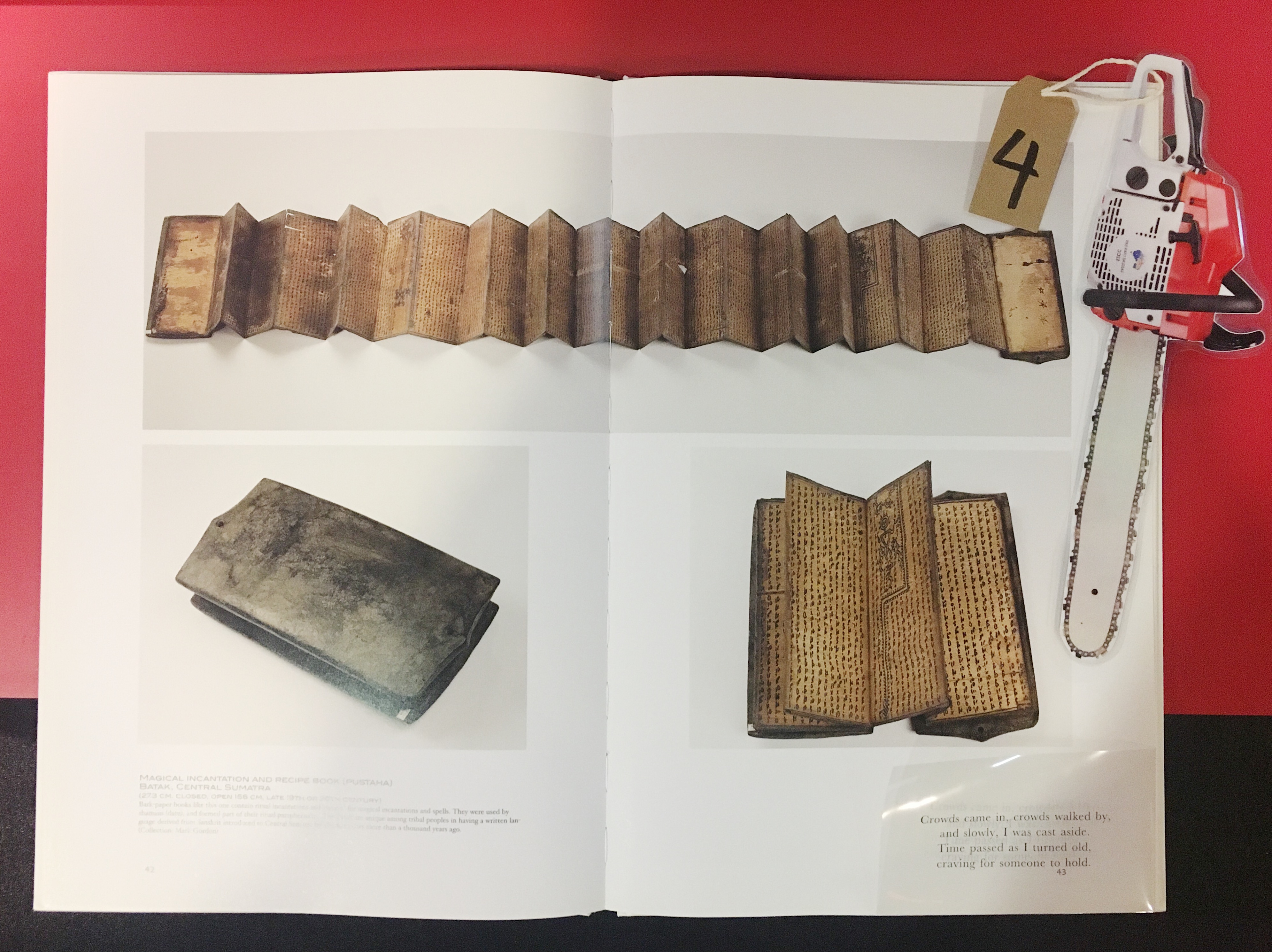
“Crowds came in, crowds walked by,
and slowly, I was cast aside.
Time passed as I turned old,
craving for someone to hold.”
As time passed, nobody comes to hold him. They simply walk by to the study tables, to do their work on their laptops, leaving him feeling neglected.
5. Obsolete
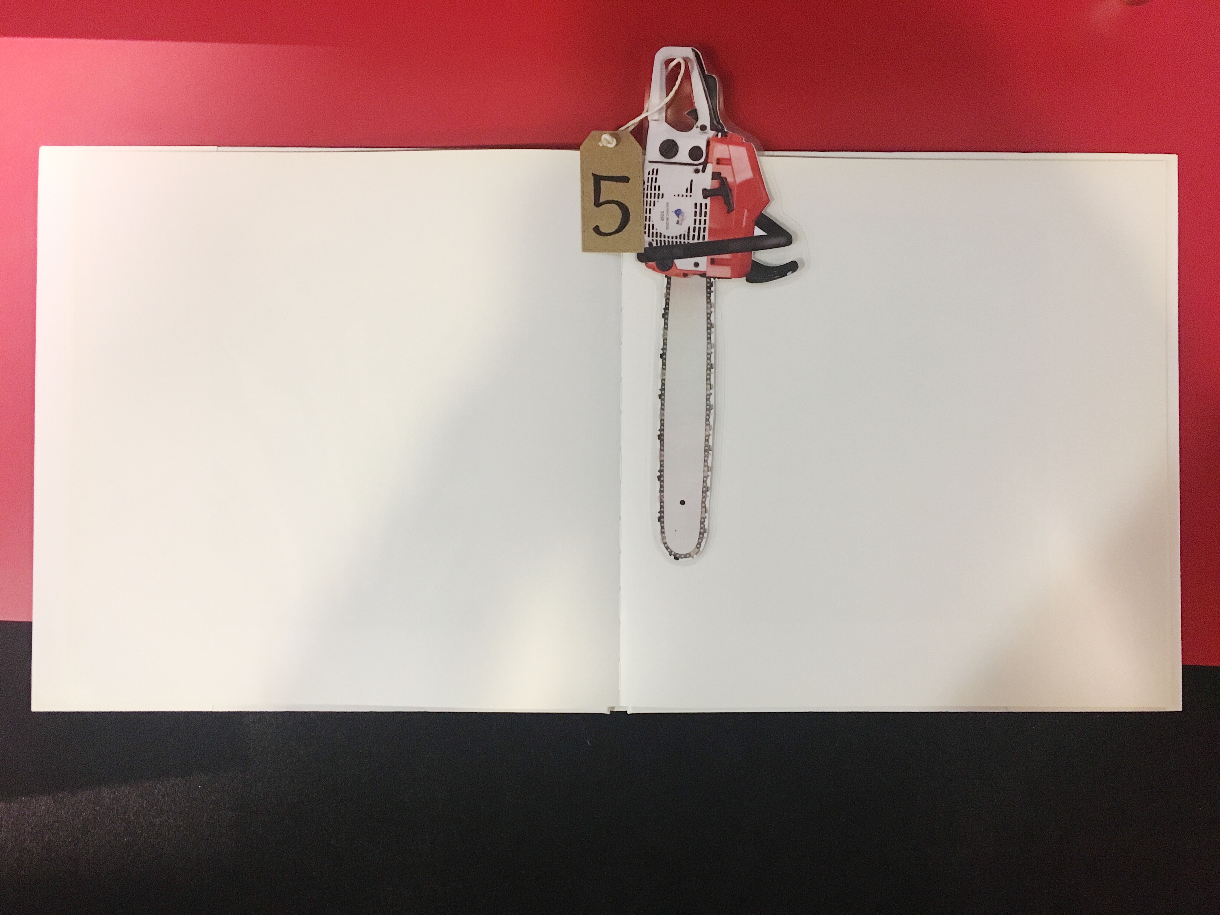
As the book lays on the shelf, untouched, he starts to feel obsolete and forgotten, leaving behind an empty void in his heart.

We also placed our concluding statement beside the last book to get the participant to start reflecting.
Here’s what it says:

Reflections:
This was my favourite project to do in 4DII. I definitely learnt how to manage my time and pace myself, from coming up with an idea, to doing our proposal then submitting it, to finalising our idea and creating it. It was challenging and there were a lot of changes made. For example, we initially wanted to put an electronic device together with the books so that the participant could listen to the audio track. Realising that it was not practical, we ended up using a QR code and a link so that the participant could easily access the audio tracks. This also allowed more people to participate at once. We also had to think through all the tiny details that seem unimportant at first, but could make a big difference to the effectiveness of the installation. It is also important to get a friend to experience the installation as they would be able to spot problems that we might not have noticed before.
From this project, I not only learnt how to accommodate our installation to be site-specific, I also learnt the practical side of creating an installation. All in all, a very exciting project and I wouldn’t mind doing it again!