FINAL OUTCOMES
My name is

and I’m an Origami Artist
My name is

and I’m a Mattress Tester
My name is

and I’m a Librarian
My name is

and I’m a Construction Worker
RESEARCH
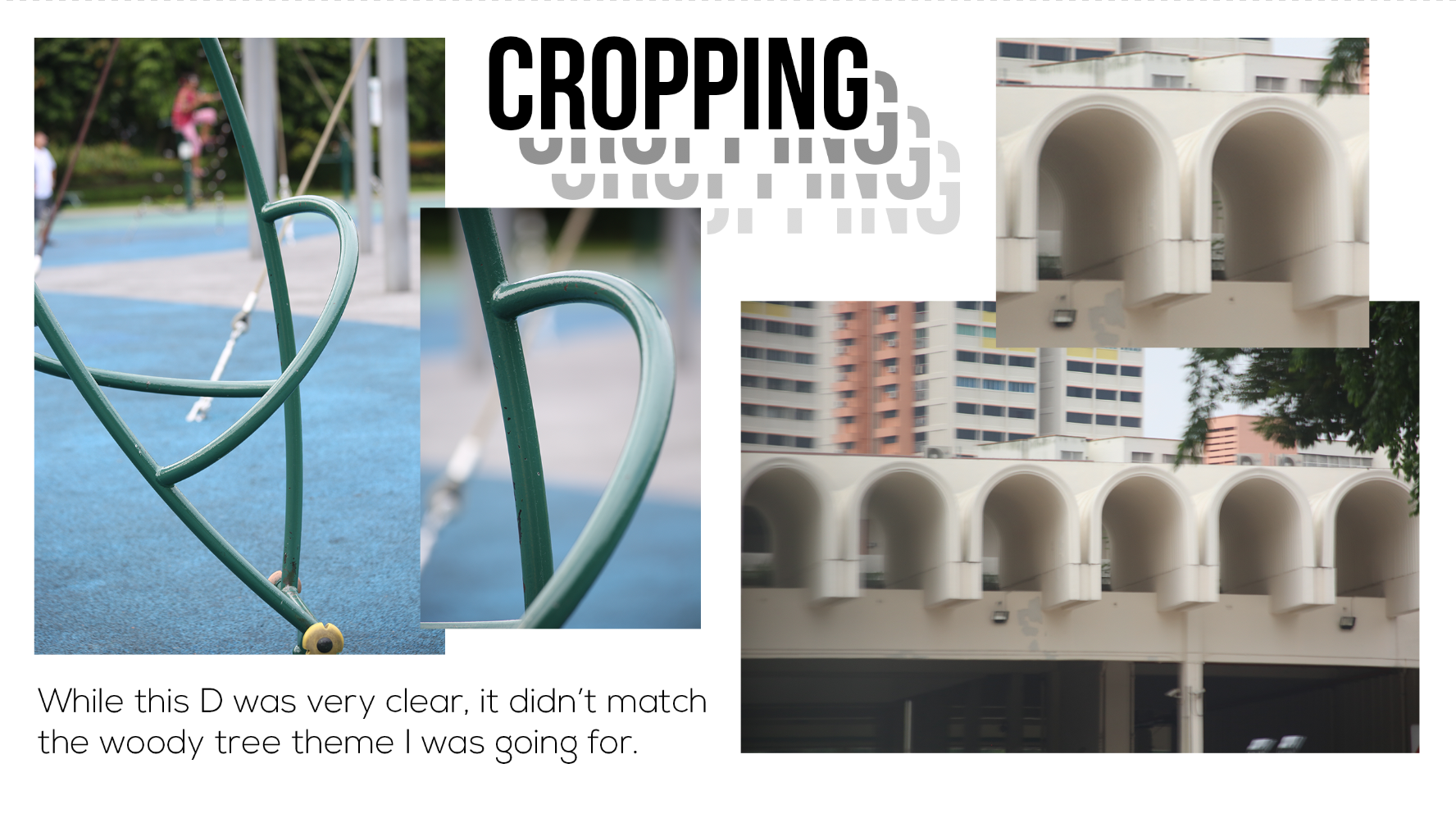
So first, I went to research on the key elements and visual cues of each of the occupation I wanted to do.
- Origami Artist
- Paper
- Diagrams
- Folding instructions

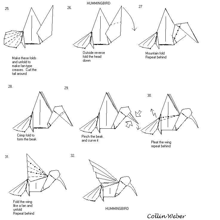
As seen in the diagram, dotted lines and arrows are used to indicate the folds and I wanted to include that in my design.
Initially, I wanted to incorporate it into the background but the letters looked a little flat and the background looked messy. Also, the letters and background looked like separate elements.
Thus, I decided to add the dotted lines into the letters itself and keep the background simple.
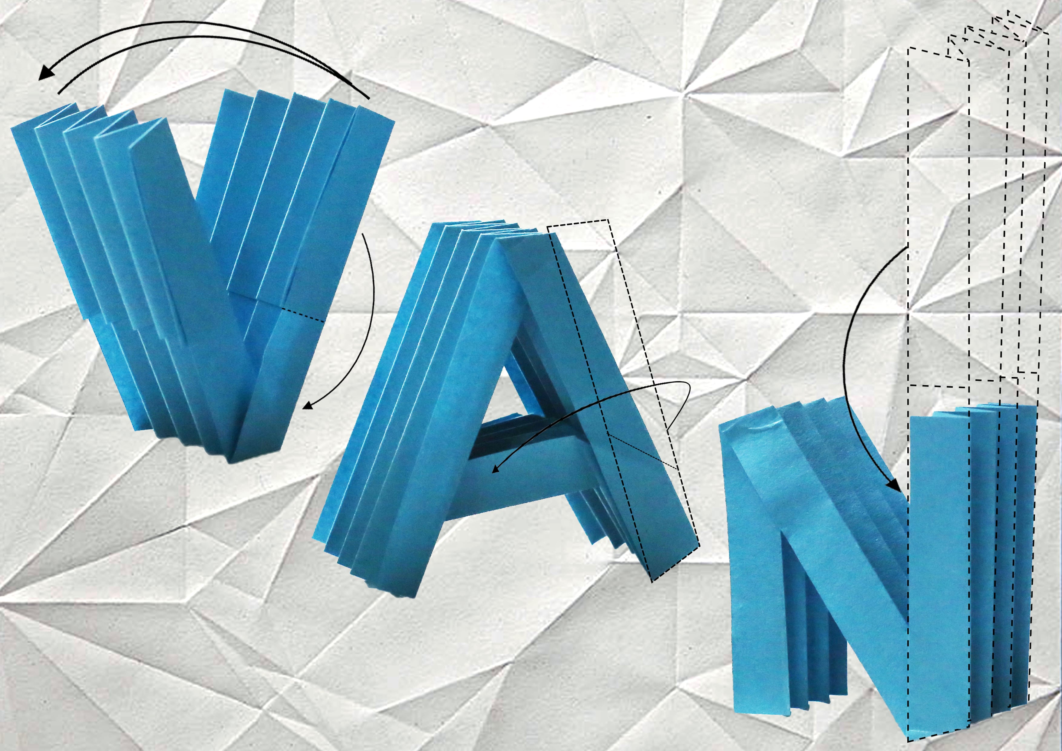
Here are some photographs that i took of the origami letters I folded.


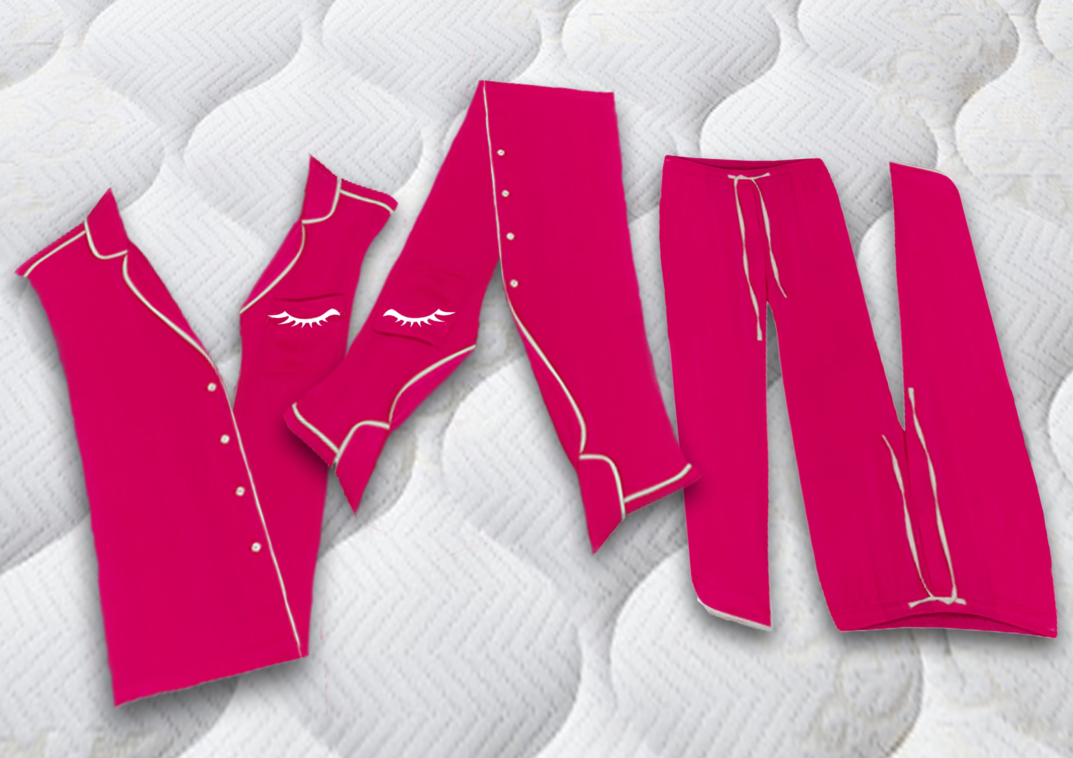
2. Mattress Tester
Yes, this is a job. In my opinion, the best job in the world. What other job pays you to sleep?
- Mattress
- Pillow
- Blanket
- Sleeping
- Pajamas (more of a visual cue to sleeping, which is part of the job scope)

I felt like the mattress texture was very unique and spoke for itself so I used it as my background. To indicate sleep, I used pajamas to create the text. I also added a little detail on the pockets of the pajamas and included sleeping eyes!
I also tried to tweak with the perspective in Photoshop and tried to make it look like the letters are lying down on the mattress.
3. Librarian
- books
- barcode scanner
- keep quiet sign
- library card


Initially, I wanted to use the books to form the letters. But after consultation, I realised that it wasn’t really creating a typography. Therefore, I scrapped that idea and just played around with books to get more ideas.

Then Sammi gave me an idea, which is the keep quiet sign, or the “shh” action that librarians are known for doing.
Therefore, I incorporated that into my design. Since the first thing that comes to mind is definitely the never-ending shelves of books in libraries, I used it as my background. Then, since the “keep quiet” signs are always hung outside libraries, I tried to create a glass door effect to overlay the shelves of books. I think this didn’t turn out as obvious as I had initially hoped, but I think it’s quite subtle which I liked.


4. Construction Worker
- tower cranes
- bulldozer
- colour: black and yellow, sometimes orange
- metal structures


For this occupation, I decided to use tower cranes as the main element since it is what we often see everywhere in Singapore.
I also added strips of black and yellow stripes to further indicate the job, since warning signs or danger signs associated with construction sites are usually these colours.
REFLECTIONS
I definitely had challenges but at the same time, I enjoyed myself. Initially, I was confused as to how to go about creating the typography. But after watching a lot of Youtube videos and reading tutorials online, I have learnt a few new skills in Photoshop, like how to create a transparent glass effect, which I think may come useful someday. I also enjoyed creating the origami typography very much as I got to fold origami!