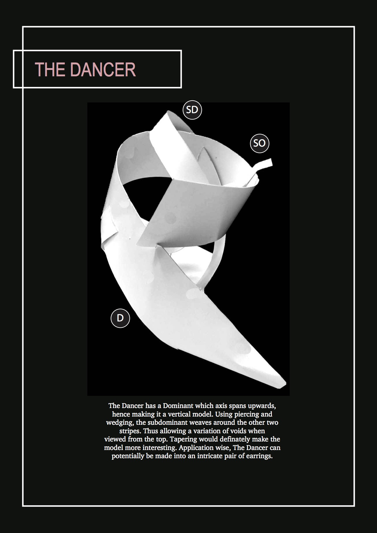
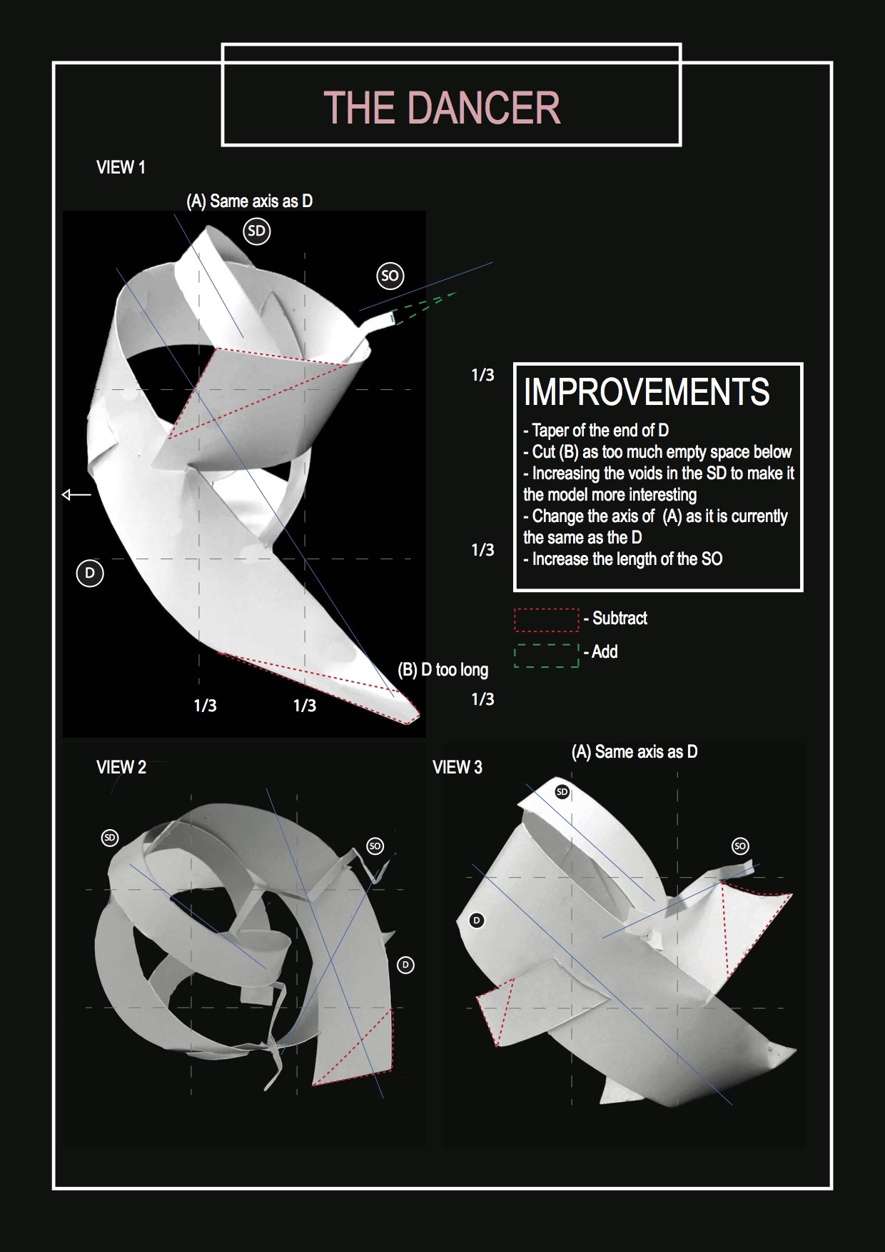
Here is my PDF file for our recent project – to execute D, SD and SO with strips of papers! Click on the images to see it closeup.

Here is the PDF file where you can see everything in HD 🙂
Here is my PDF file for our recent project – to execute D, SD and SO with strips of papers! Click on the images to see it closeup.
Here is the PDF file where you can see everything in HD 🙂

Here is my final model and it’s application!

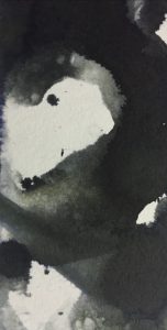
The Rocket That Never Flew
Application 1: Artisan Kaya Toast
A Singapore staple with a twist

How it initially looked like in real life, decided to photoshop it LOL
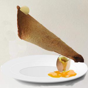
Much better!
Can you identify the D, SD, and SO? 😉
Application 2: Ear Rings
DIY a pair of earrings using plain paper, gold reflective paper, ombre thread, two sequins, and strings to attach to the hook! Simple with beautiful results.

I intentionally took note of the colour scheme. Added small sequins I found in my unwanted jewelry and added to the SO to give it more “blingz”

How it looks like when worn
The big reveal with my supportive classmates 
Here is my completed final PDF file!
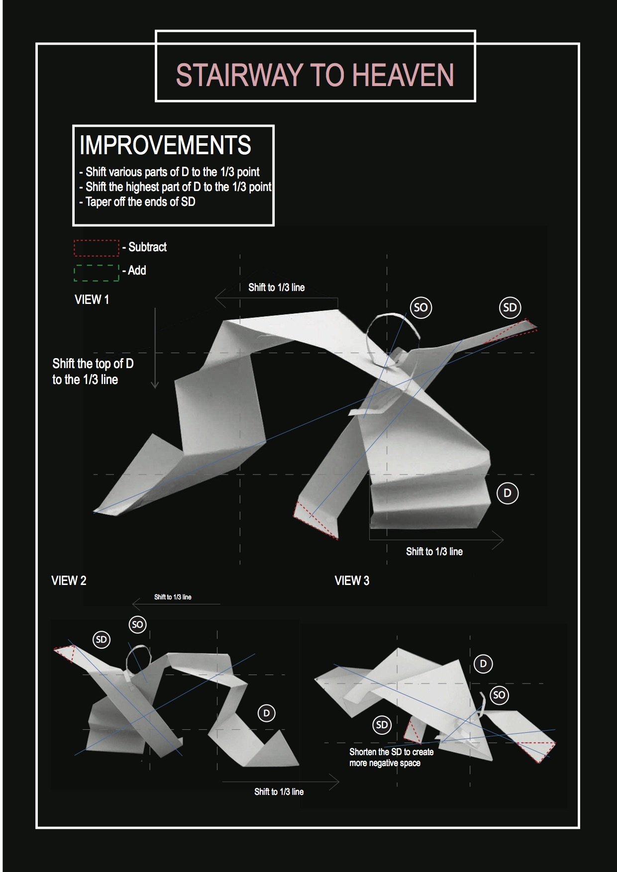
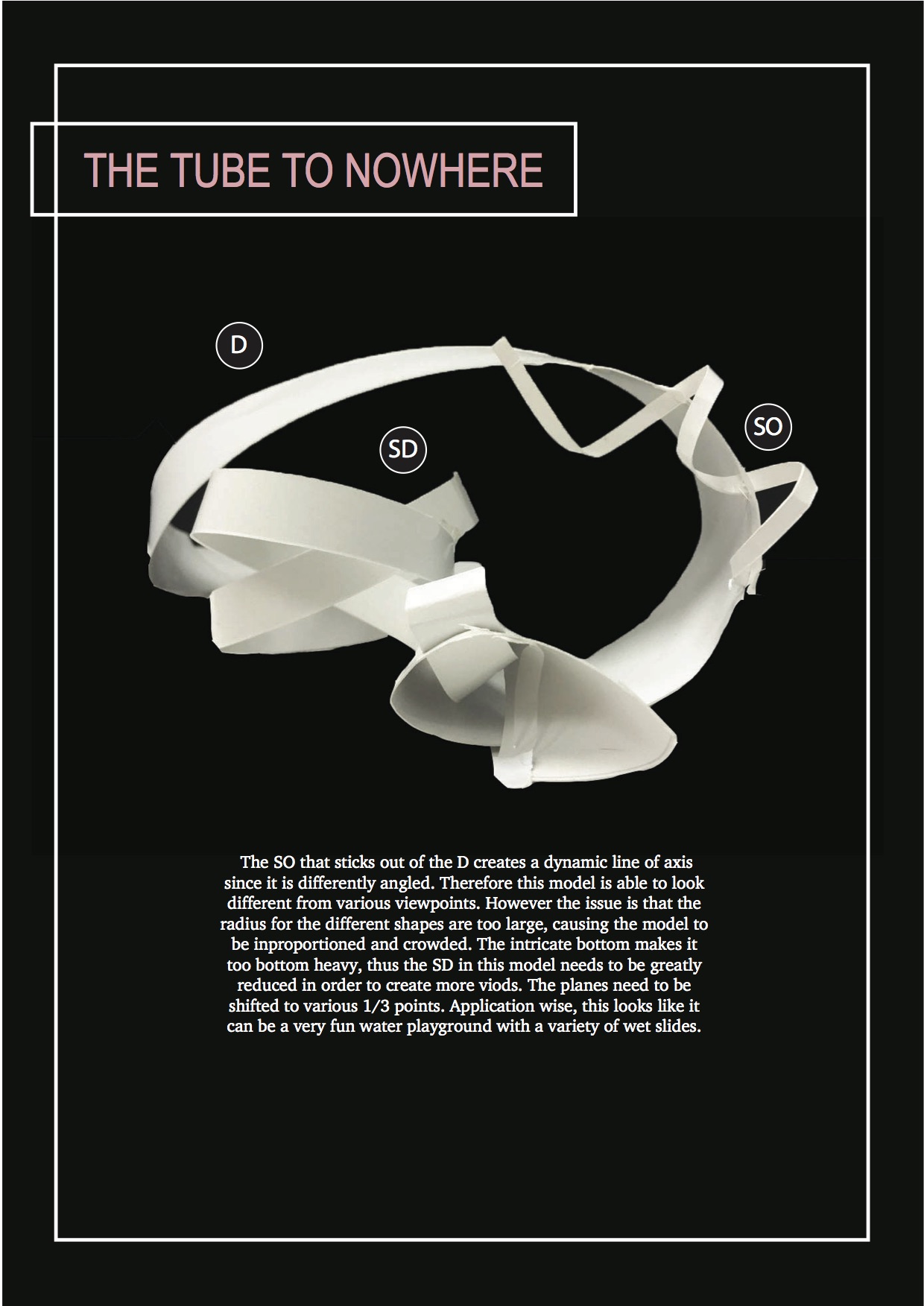
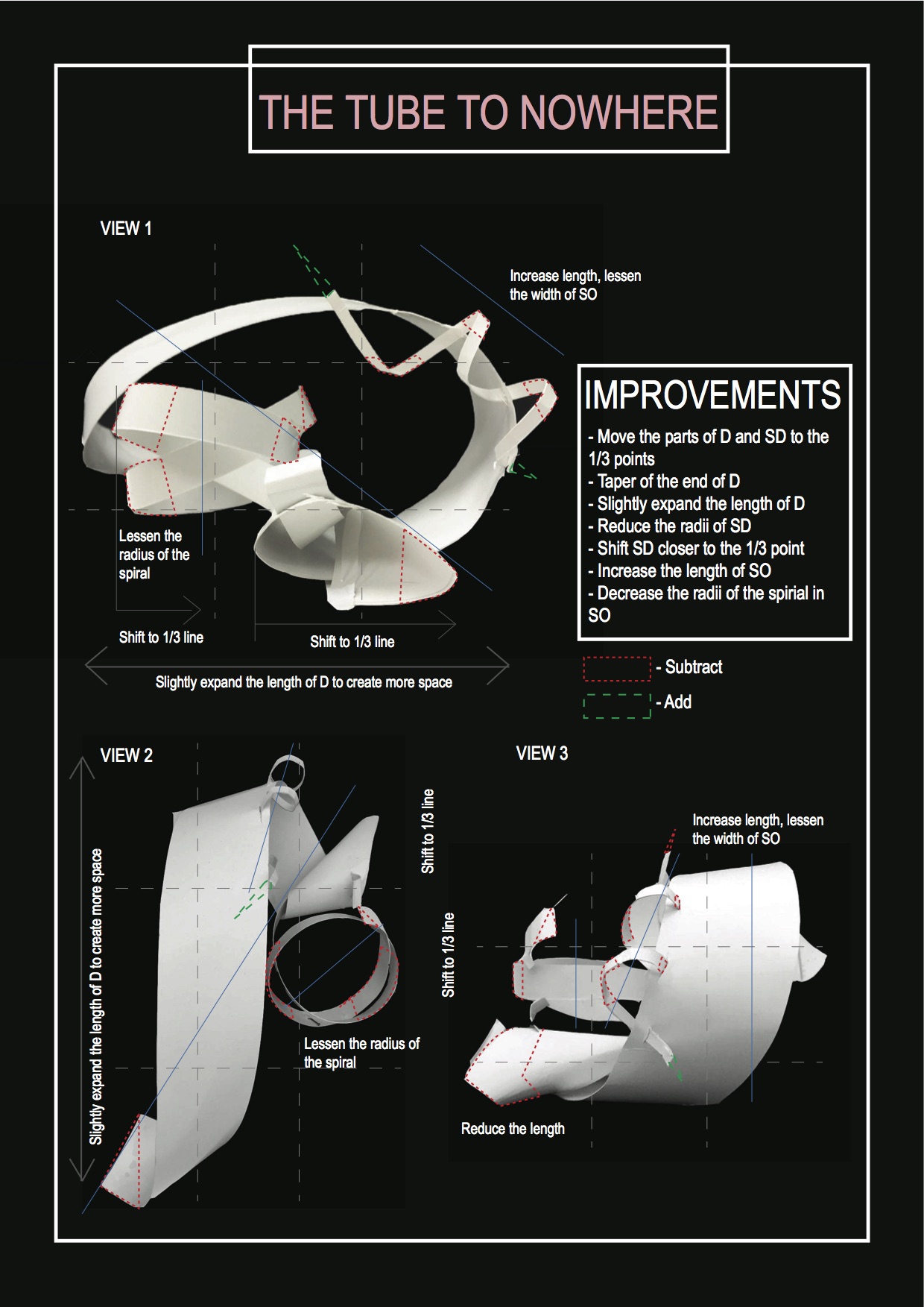
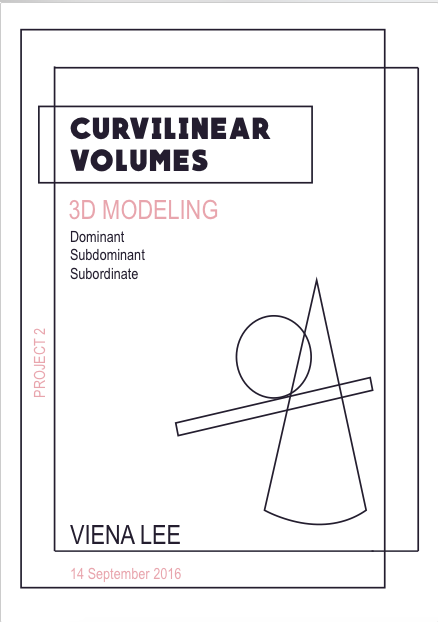
Hello! Here is my working file for what I have done so far for our latest 3D project. This time instead of rectilinear, we are to create curvilinear volumes using shapes like spheres, cylinders and cones.
Dotted green lines mean addition and dotted red lines means subtraction 🙂
My first page
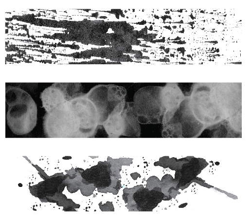
A summary of all the models I have done
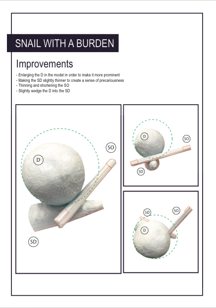
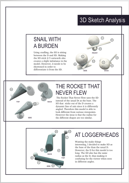
The first model looks like a snail that is carrying a workload representing me and uni life.
Had to make the dominent much larger to create more presence and shorten the SD.
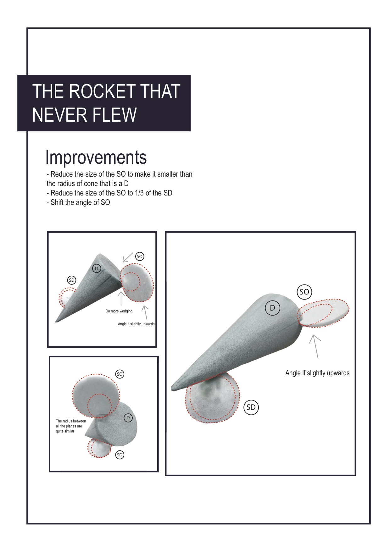
My favourite model, I am doing this for my finalised model 🙂
I jokingly said that the rocket, which is the cone represents my dreams and ambitions. However the sphere which is my responsibilities and burdens is weighing me down greatly. The thin cylinder at the side represents me trying to drive the rocket.
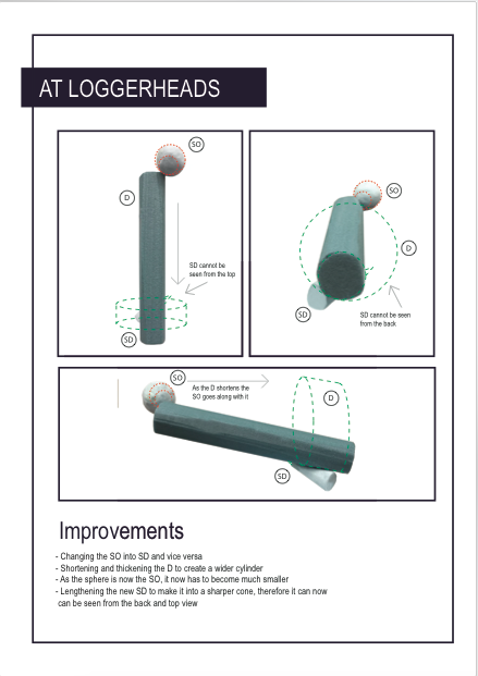
Decided to give it a try to change the cylinder, which is too long for my liking. Shortened it and made it wider and it now roughly looks like this:
Kind of looks like the cakes/dessert sets we see in gourmet kitchens!
Kind of have a liking to it however I still prefer The Rocket That Never Flew as it looks like something I have never seen before!
Will try to recreate it into food and a pair of earrings!
Here is a clearer version of the files 🙂
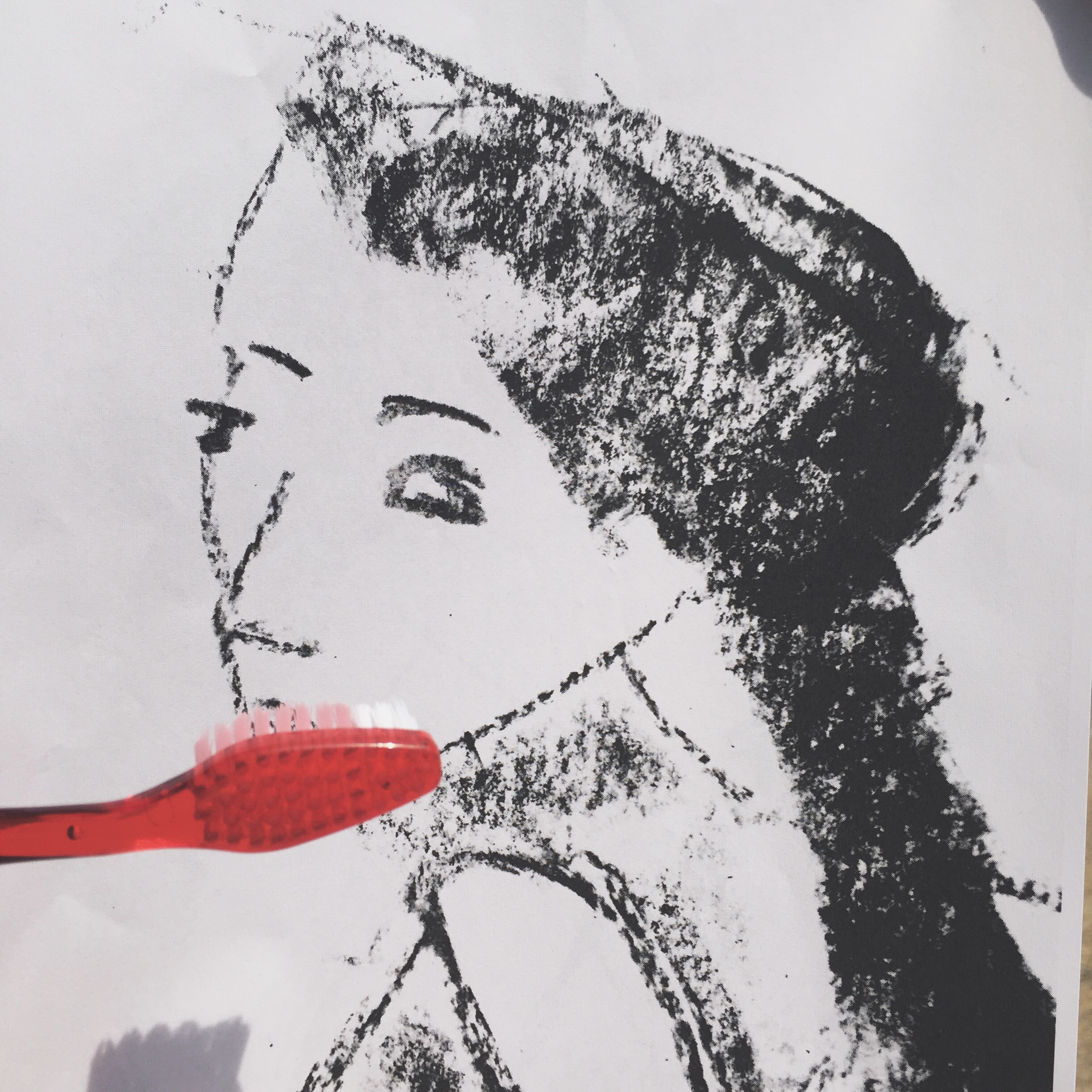
For this week’s class activity, we were tasked to take photos of an object as itself and as a signifier!
A toothbrush is for brushing teeth!
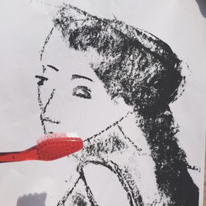
A toothbrush is for brushing teeth
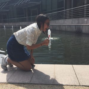
Me brushing my teeth
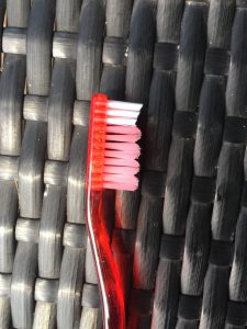
Closeup of the shape of the bristles
Object as signifier
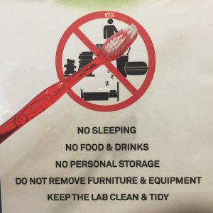
hmmm…
How essential toothbrushes are?
Am I cool yet


Task 1: Me
I spent some time thinking about which faucet of myself should I introduce, one that will be engaging and interesting to the viewers. Then I decided to do a project that most people probably wouldn’t have the experience of – being an individual of a mixed race.

My parents wedding photo and I. The photo is done by using a visualiser to create the backdrop behind me. My father is a Singaporean Chinese whereas my mother is a filipino from Cebu.
I was questioned why I chose to use my parents wedding photo. Marriage is a deep rooted symbolism of two people coming together to be one. And from that very day onwards this combination of my parents resulted in me, a Filipino Chinese that happened to be raised in Singapore.
Race is something that runs deep within individuals, and the way people perceive and treat me (even so subtly) is according to the of race they identify me as.
Most of the time, I feel that race is often stereotyped by the way one look. One of the most distasteful things I’ve heard was when my mother and I were in the Philippines and a foreigner nonchalantly said “yea, you look very filipino”, to a lady who is seated next to both of us.
Which got me thinking, what actually identifies a race? Is it based only on the outer appearances or does it run deeper than that?
Task 1 explores this question and expresses how I feel being a multi racial individual.

Characteristics that people say make me look Chinese, slanted eyes and yellow skin

Comments that I heard from people who said what characteristics made me look filipino. Prominent eyebrows, wider set eyes and tanned skin.
I chose to place my portrait next to each other in the photo presentation, signifying that these two cultures I stemmed from forms me. I am not me without one race or the other.
This article is something I can relate to (don’t worry, my situation isn’t so exaggerated)
17 Struggles Of Being Mixed-Race
Artist reference:
Ms Lei pointed out that my ideas is similar to John Clang, who used the visualiser to take his family portraits when he was studying overseas.
Upon referencing from him, I started to take note of my positioning and how I wanted the background photo composition to be like. I specifically wanted to stand in the middle of my parents, and thankfully I managed to dig out a wedding photo that fits my criteria.
Another artist I was referred to was Orlan, who does plastic surgery as a form of art and photographs the journey. This was very relevant especially since I wanted to draw the comments on my face. I took inspirations from her drawings and tried to replicate some of it on my face.
Areas of improvements:
Concept 2: Object
If you were to ask me to name a significant object in my life, it would definitely be my stuffed toy who has been around with me for almost 10 years.
For this task, I want to capture how important my stuffed toy is to me.

Me going overseas with my stuffed toy
With the luggage and my toy above it, it signifies that my toy is so loved by me that I want to bring it overseas (though I don’t do it now because I am an “adult”).
I took this picture by myself with a tripod and it was quite an experience to run back and forth to make the necessary changes. I also purposely positioned the camera at the certain angle because the road leads the eye to me, the main subject.
I did not make use of the road for the first few shots and this resulted a very messy shot as the eye did not know where to look. Did not help that there was a messy background too with all the pavements and street lights.

Mandatory shot of the main purpose of my stuffed toy, to cuddle!
For this shot I wanted to avoid making my room too dark. Had to play around with the curtains to get the light to shine at my stuffed toy.
My real dog and my stuffed toy are the same breed
One of the funniest things I noticed is that my puppy is actually the same breed as my stuffed toy. It is purely a coincidence!
Artist reference:
I had to look through Cindy Sherman, who dresses herself up and compose the shots to portray a certain meaning, to find some inspiration. Looking at her photos made me think of what kind of props and outfits I can use to express this point.
The rest of the photos in this task is done my experimenting and trail and error. I did search for bedroom shots in Pinterest to see the kind of lighting I can replicate for this shot.
Areas of improvements:
Theme 3: place
My father is a scuba diver and my mum is a fisherman from the province of Cebu. With this, water is a huge part of me and my family’s life. In fact we are going to Bali to scuba dive this December!

Taken with an underwater digital camera that my friend kindly lent
For this photo, I wanted to to portray that it feels like I am birthed out from water.

A guy’s hand, which represents my dad’s
My dad is not the kind of person that openly display his love. When we go on diving trips his love is more obviously shown more when he holds me by my tank, afraid that I feel sink to the deep bottom. He also saved me from drowning a few times and the imagery of his hand pulling me out of the water is stuck strongly in my mind.

If you look into my heart and into my soul what you’ll find is water

Me and how I feel at peace with water

How I perceive water, the sun representing shallow waters and the dark which suggests deeper waters. Both I experienced and love
Artist reference:
Again, was search through Pinterest and I stumbled across Elena Kalis, Alice in waterland and looking glass series where she did photographed a girl reenacting Alice in wonderland underwater. With the lack of gravity and unique props, the results were beautiful and it seemed like the subject was in a timeless space. Definitely, it was difficult to recreate the quality of her photos. But giving underwater photography a try was a unique experience that I would definitely love to explore again.
If you want to see her works, click on the link below:
http://www.elenakalisphoto.com/alice/
Areas to improve:
Overall conclusion,
There is a lot of areas where I need to grow in photography. After looking through the class works, I realised that the next thing I should work on is lighting and exploring different angles. I looking back at the way I lay out my work, I realised that I could’ve laid it out better. For example, placing the undershot in the middle of the wall not at the top since it was one of the better photos.
One way to improve is to look through more photographs by artists and study their shots.
Excited to learn more in 4D!
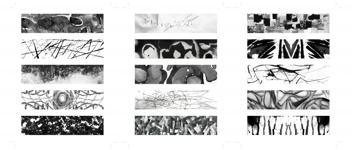
Here is a compilation of all of all of my final lines! If you want, here is a recap of my other posts for this project 🙂
This is the start of my final lines!
Board 1

Board 2

Anger – Exasperation. Sometimes you have to restrain yourself from hitting someone
Anger – Hate. A emotion that grows over time, and hardens your heart
Anger – Irritation. This emotion pierces into your inner peace

Fear – Fear. Something dark, something ambiguous. All you want to do is flee
Fear – Horror. When your soul feels like it is out of own physical body
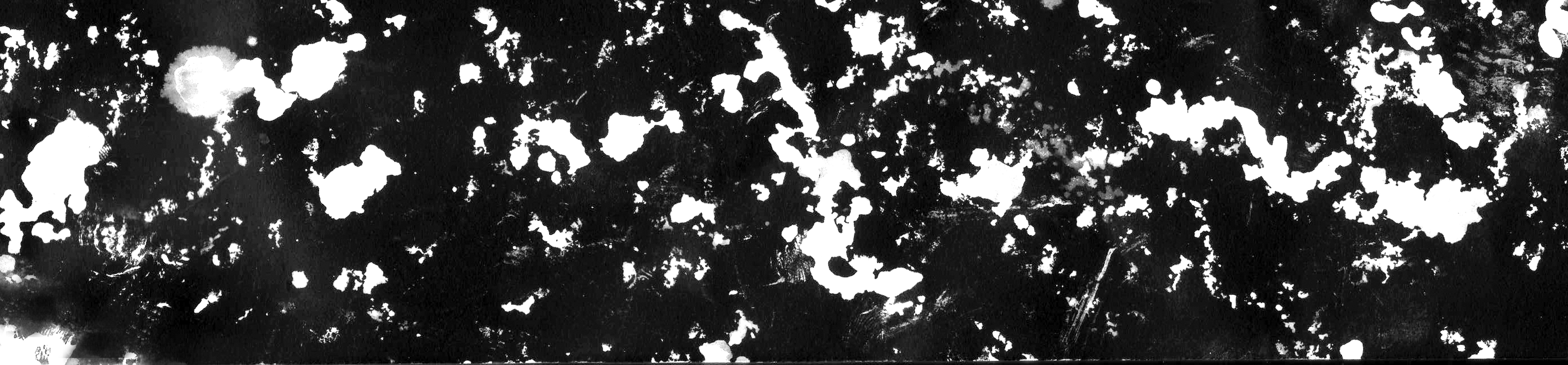
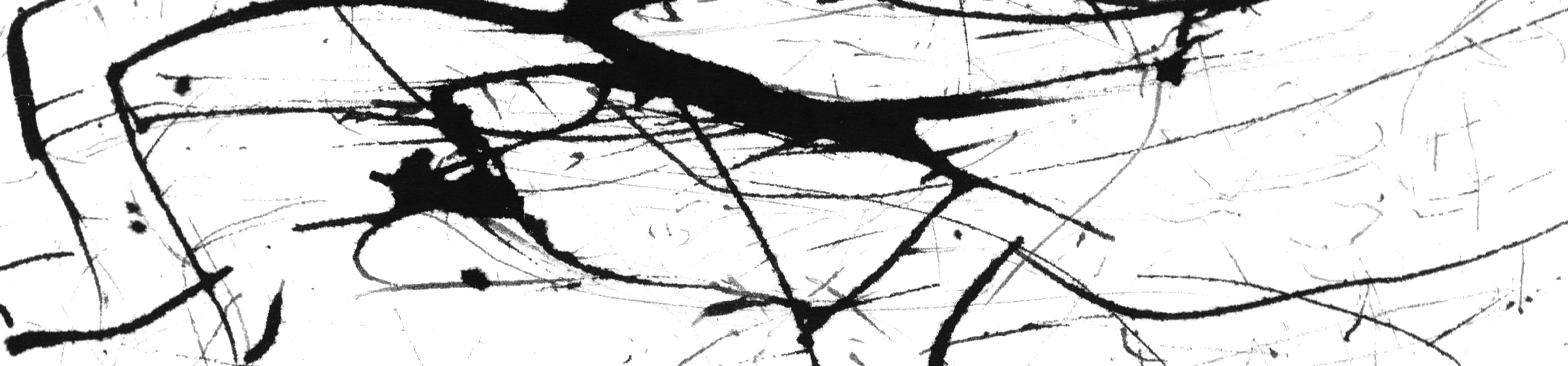
Fear – Panic (Looks like Jackson Pollock’s works), where nothing makes sense
Happy – Pleasure. Waves of pleasure hits you
Joy – Exhilaration. Uncontrollable, untamed
Joy – Truimph. This emotion rolls off you
Love – Infatuation. Slow and steady it grows each time you feed it
Love – Longing. Missing, reminiscing. A ball of emotions rolled into one.
Love – Passion. Crazy, rawest form of love. When a pair becomes one.
Sadness – Guilt. An inner debate between light and dark
Sadness – Hurt. Once you are hurt, the holes will remain there forever
Sadness – Insecurity. You are never satisfied, always comparing

Surprise – Surprise! Happiness and ecstasy in the burst of that second
Surprise – Astonished. “Wait, you mean what?”
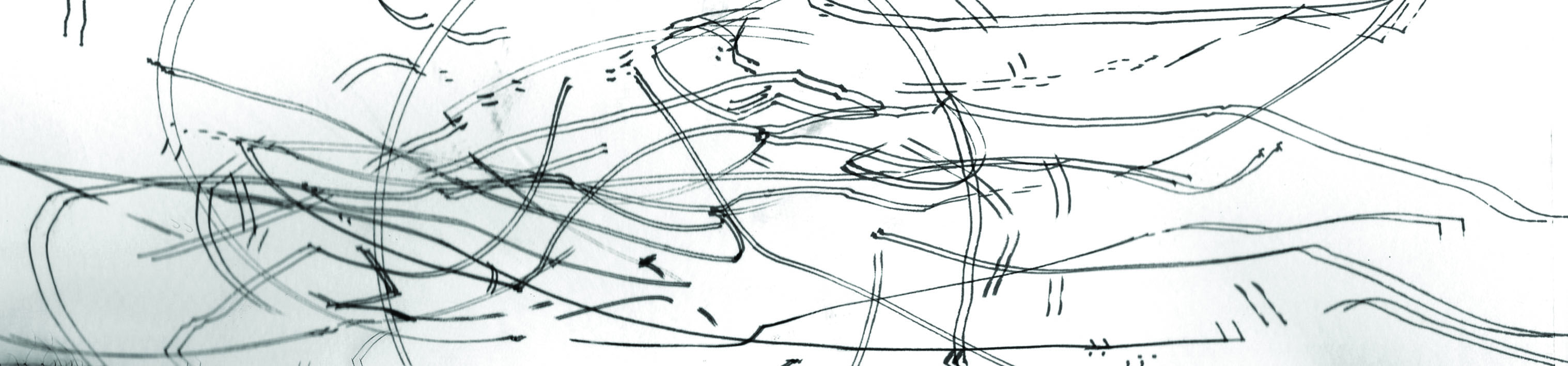
Surprise – Perplexed. Bubbles of thoughts sifting through your head

The best part of this project that that we are able to explore different techniques and methods.
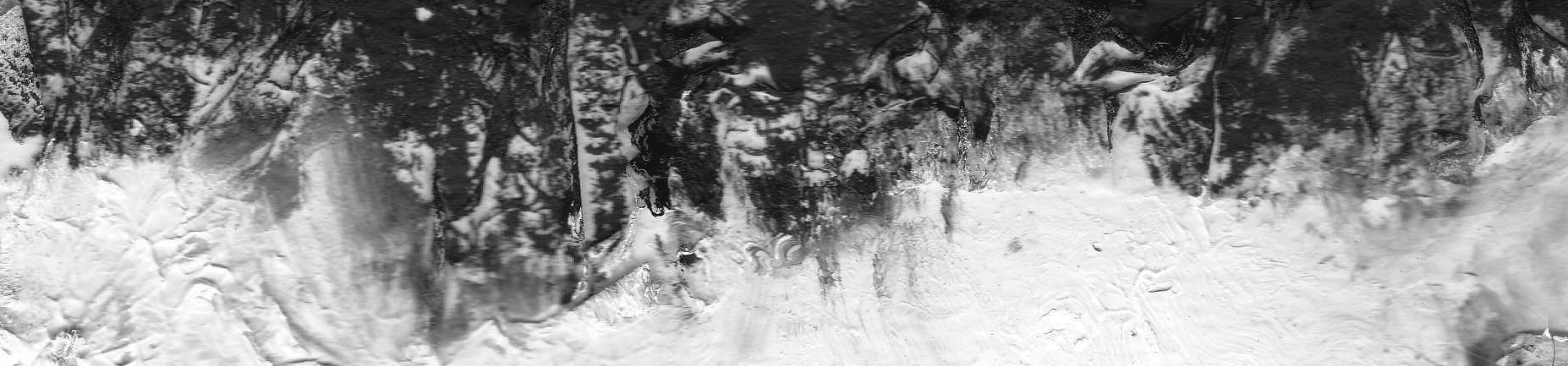
It all started with this. a line of long folded triangles pasted together. Initially, I wanted to make it as a form of 3D texture art. However, I was not convinced with this end result.
Folding long triangles and pasted them onto the paper
So I consulted Ms Ina who suggested me to scan it. Initially, I was very skeptical because firstly – how much better can it look? Secondly – wouldn’t it look very flat, thus loosing its main feature of it being 3D?
However, I was pleasantly surprised that the end result turned out well! And coincidentally, I feel that the image also represents the emotion surprise.

Emotion: Surprise!
Then a door to an entirely new world of possibilities opened for me. This was the power of a scanner (and photoshop).
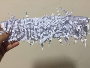
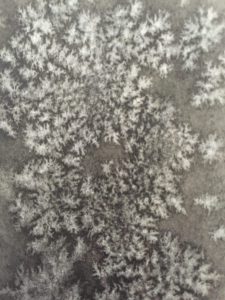
Then I chanced upon Tara Donovan’s artwork on pinterest. I did more research and found out that it was done by layering slices of tracing paper. Enchanted by the movements of the lines, I tries to recreate it.
Tracing paper sculpture done by Tara Donovan
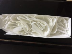
Had to create borders around the paper to contain it
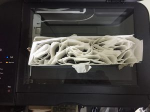
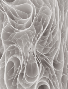
So excited when I placed it into the machine!

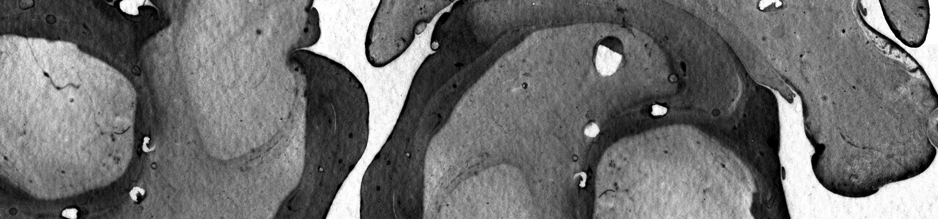
End result which signifies the emotion Truimph
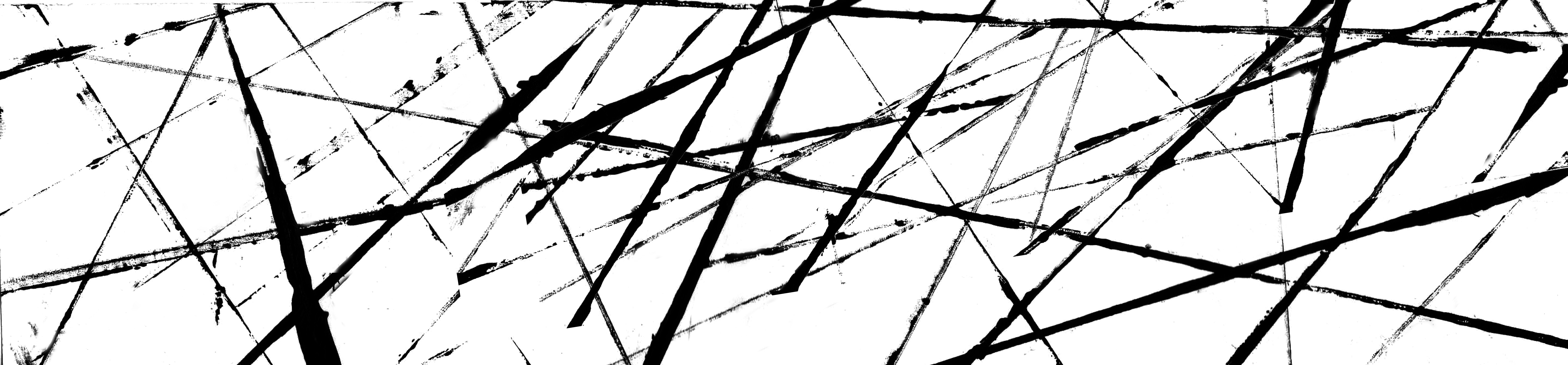
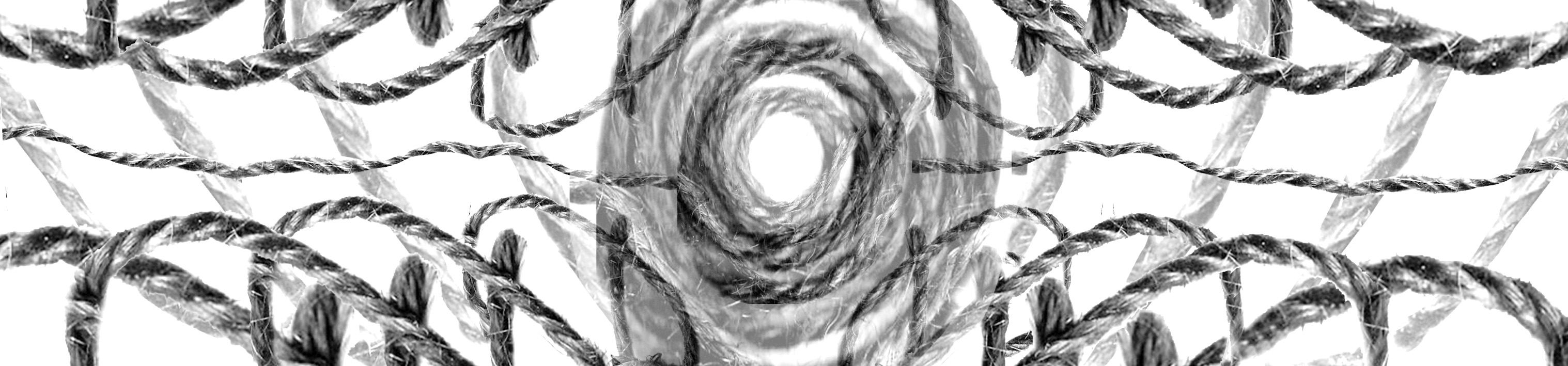
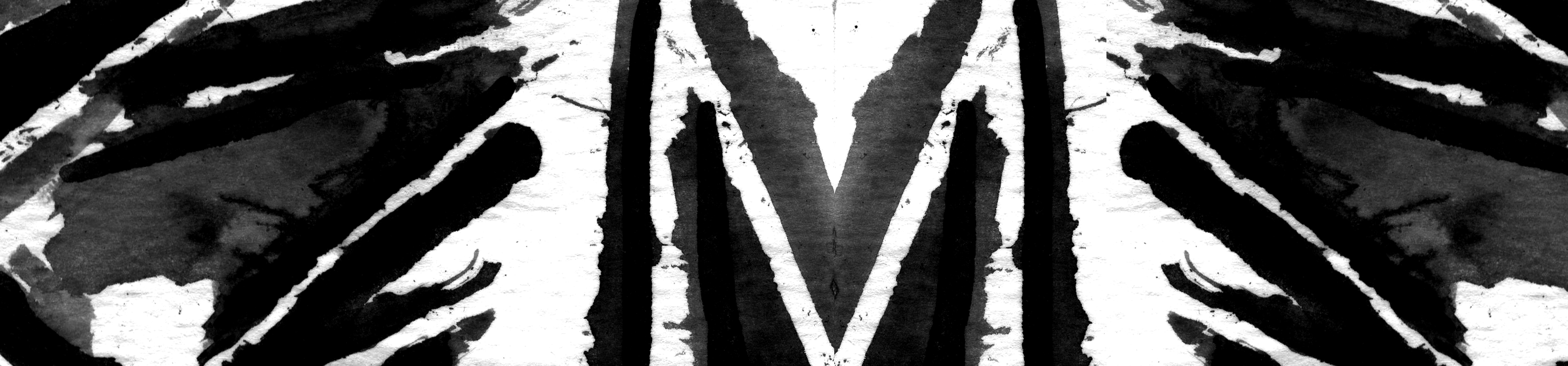
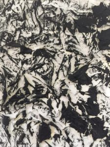
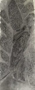
So I decided to push it further, and switched to ropes!
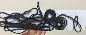
Intended for it to represent joy
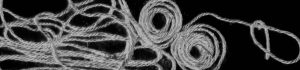
Was disappointed when I scanned it, as it does not look very joyful
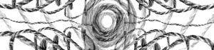
But photoshop is just as powerful as scanners. I thought about what makes something look ‘happy”, and thought of making the strings have a kaleidoscope effect.
I intended for this print to be 3D as well, but decided to give it a try at the scanner
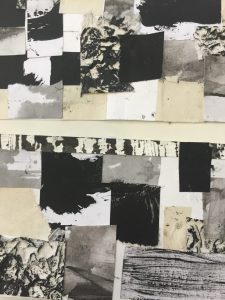
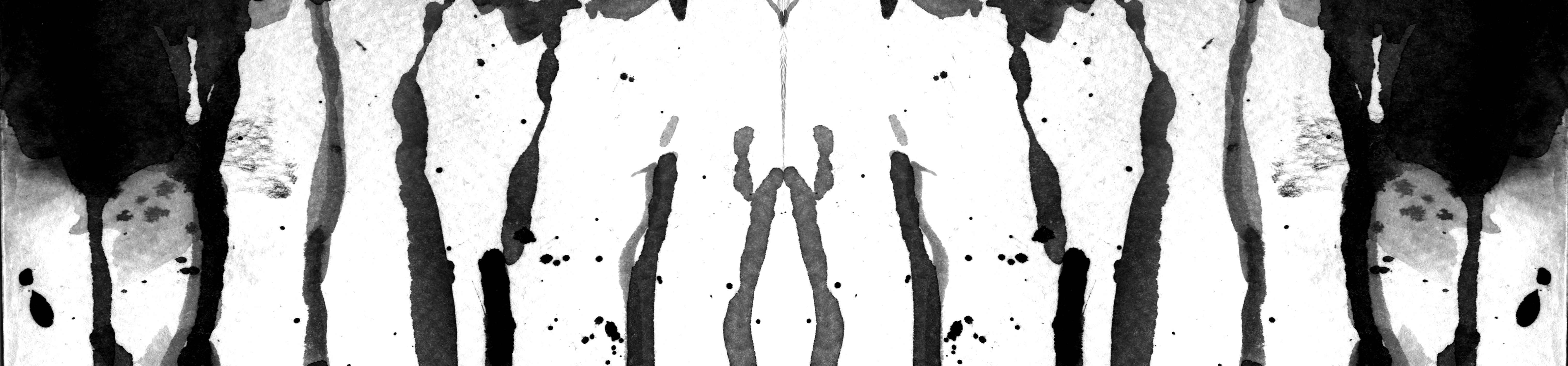
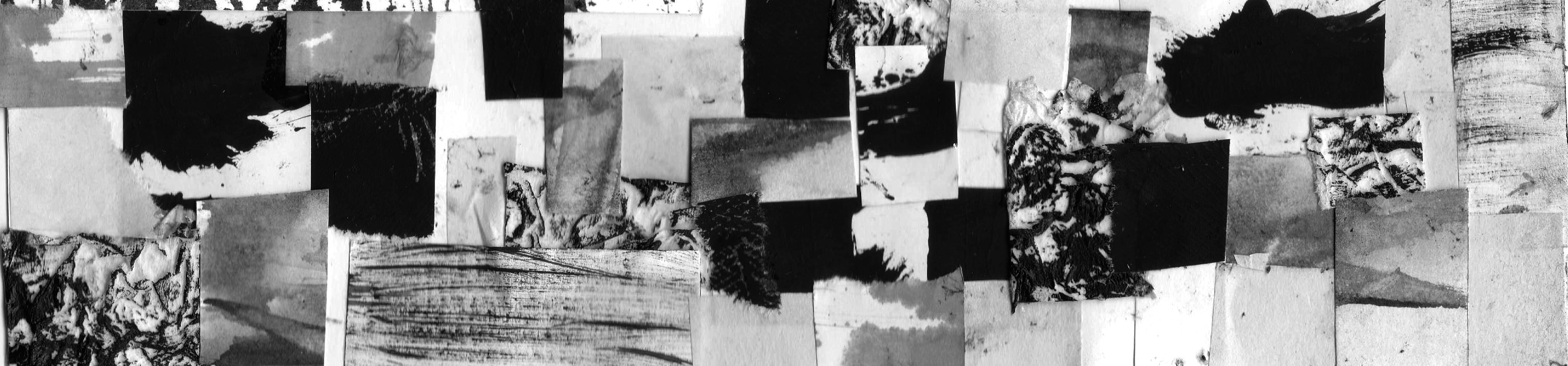
A montage of the different papers/prints that I made
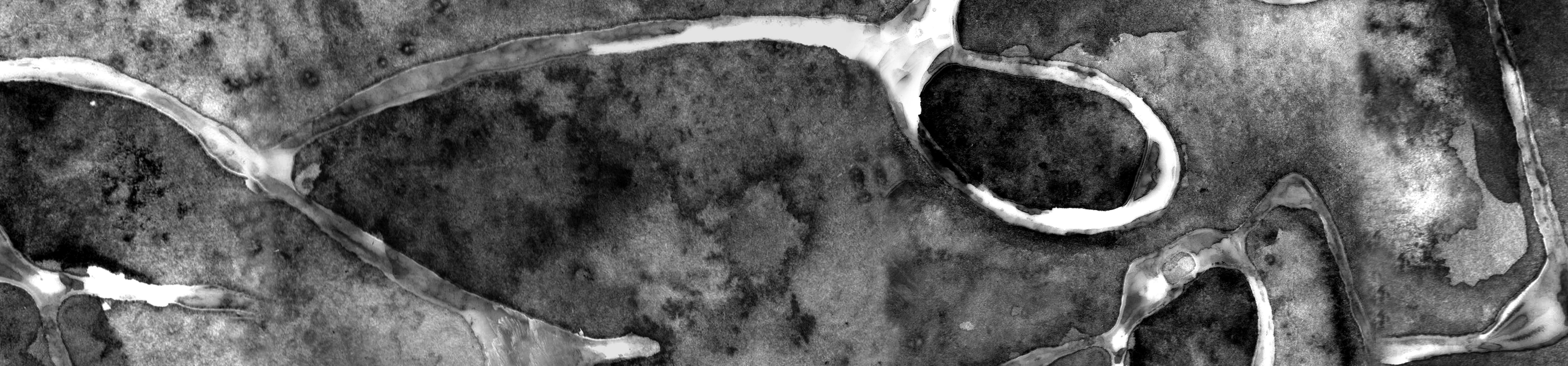
I wanted this montage to represent insecurity. When one is insecure, he/she are always comparing, always not satisfied, have not found their own identity and stand yet. This montage is a physical representation of the emotion.

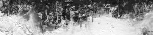
How it looks like through a scanner
I personally feel that this line looks better in real life, rather than digitally. However, since the rest of my work is going to be digital it will stand out to not have it done digitally.
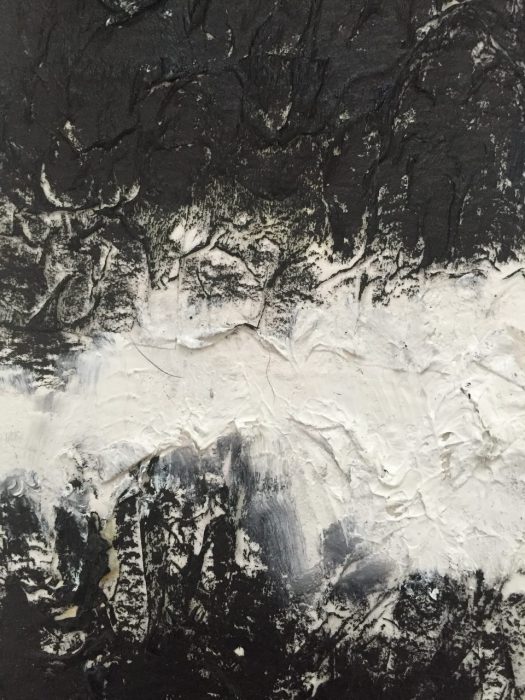
And lastly…
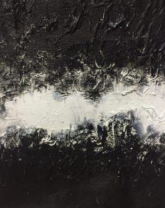
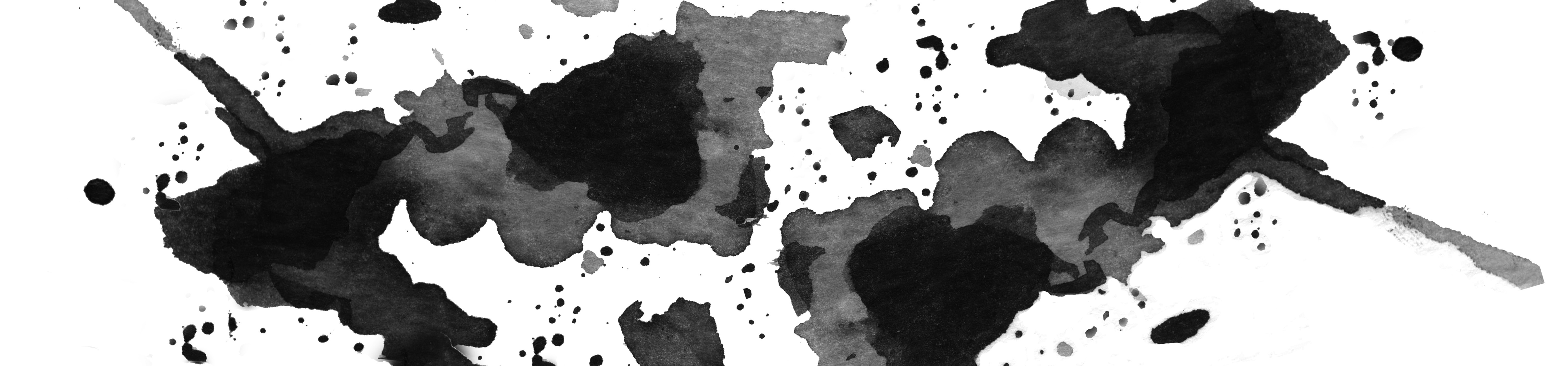
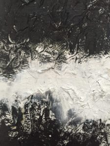
A combination of white glue, tissue paper and black and white acrylic paints
Beautiful end results which represents hate
That is the end for my post! Next post will be about some fails I experienced. Because when it comes to design/art, I (and I’m sure you too) end up in this situation:
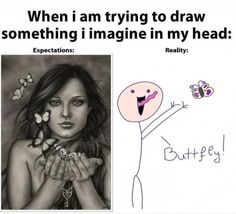
Credit: www.pinterest.com
Goodnight!

The pain of expectation of vs reality strikes closer to our hearts as visual artists.
Fail #1: Every detail is important
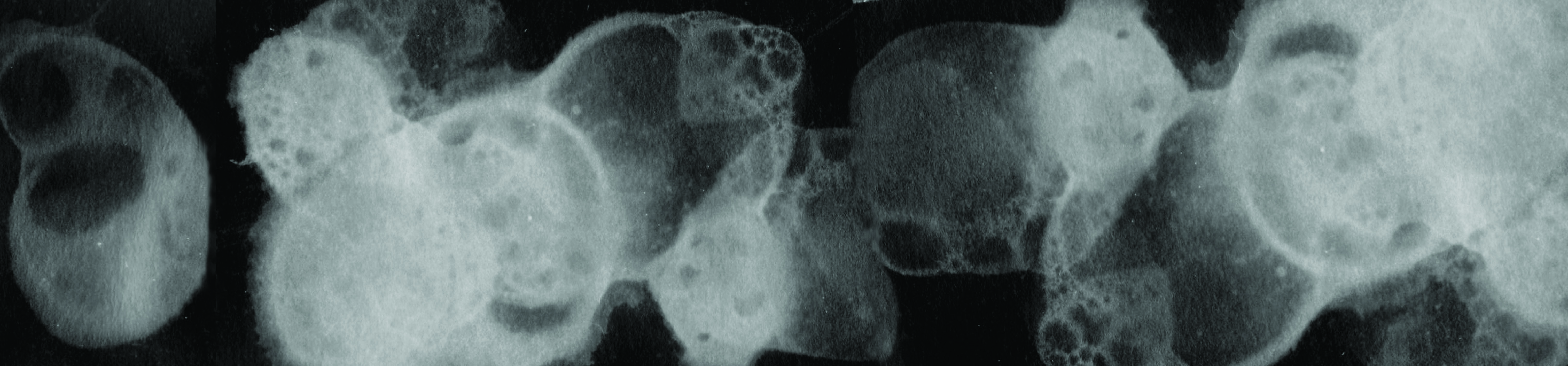
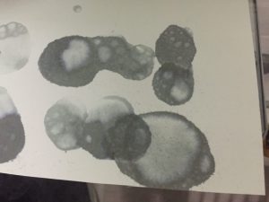
So I came across this very cool thing online, and it was done by Charlotte X.C Sullivan. It is called bubble printing.
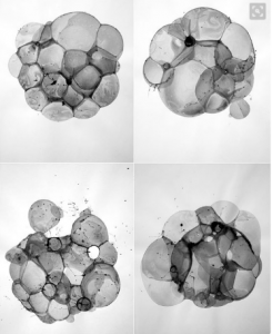
Work done by Charlotte X.C. Sullivan, it is beautiful
Being a #Gobigorgohome kind of gurl, I decided to give it a try.
Here is a video of me doing it:
What happened? The end result of my first few tries.
And after many rounds of detergent, ink, and time, this was the end result…
I kept on thinking of where did it go wrong. The very next day, it hit me that it could be because I used watercolour paper, which did not allow the water to seep through the paper *facepalm*
So I changed the paper and yassss it finally worked!

Ink forming around the bubble, unlike with watercolour where the ink runs everywhere around the paper
Yes, I have marks!
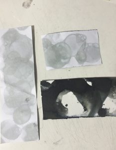
Not as clearly defined as the original work, but I believe with photoshop something would be able to come out

In photoshop I gathered the most prominent marks and inverted the colours to make the prints more obvious. This emotion is perplexed.
Don’t know how those pros manage to do it so beautifully, maybe you should give it a try 🙂
Fail 2: Almost burned down my house
I wanted to try to burn paper to see what kind of effect it will give. So I borrowed by dad’s lighter, went into my room (you can see where it is going) and started to light up newsprint paper.
Newsprint is super flammable due to its thinness, so the entire thing caught on fire almost immediately. I had to quickly dump water on it before the situation got worse. I got wiser and chose watercolour paper which is definitely thicker, thus I have more control.
Emotion – fear
Layered the edges of the paper and inverted the colours to give it a more eerie and dramatic feel.
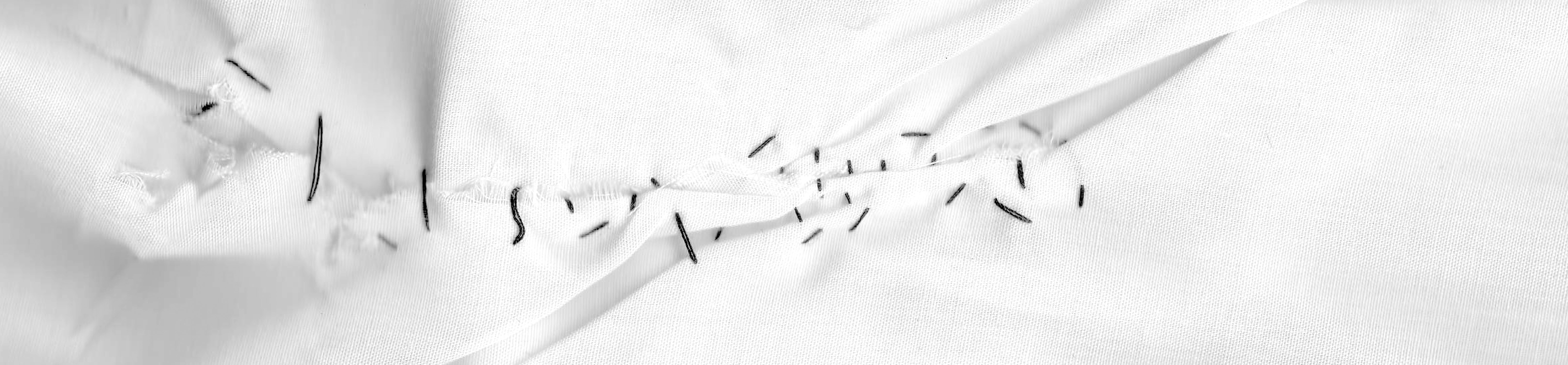
Fail 3: Dying gone wrong
Found this method called the shibori method, a Japanese style of dying fabric:

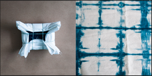
www.designsponge.com
So pretty and looks easy
Looked simple enough, so I decided to give it a go.
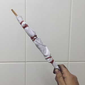
One of my fabric
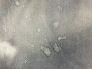
End result??
Again, this was a mystery because I could not identify the main problem. Was it the ink? The cloth? The timing? But after a few tries and letting it sit out for a few days, sadly nothing significant appeared.
Since I wanted to do something with cloth, especially since it can make interesting textures, I decided to go for something else. Simple stitching.

This represents hurt
Wanted to keep it simple and not too extravagant. Also wanted the stitching to be uglier to emphasise on the valleys of emotions one goes through when they are hurt.
Thats all! There are many times where I had to redo and learn from my mistakes from the many techniques I tried, but this is part of the fun for this project as well.
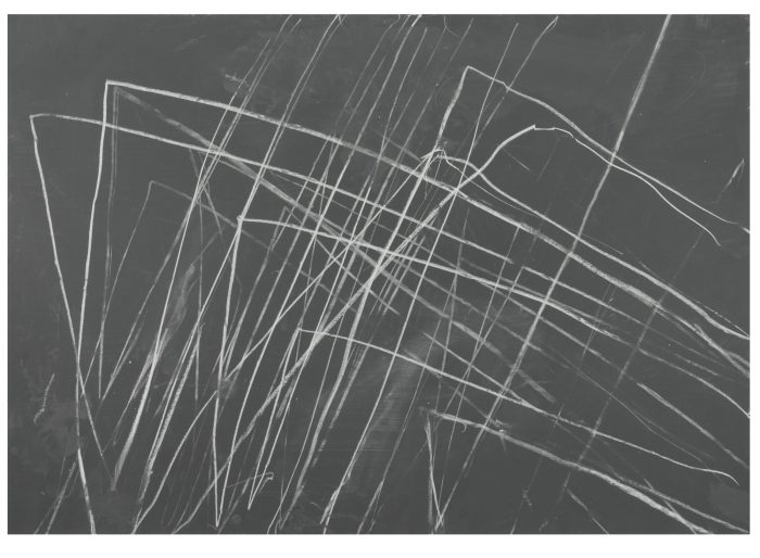
Inspiration 1: CY Twombly
Focusing on abstract work, I really like CY Twombly’s ‘scribbled’ art.
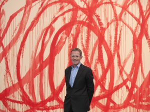
CY Twombly with one of his most famous art pieces

Love this

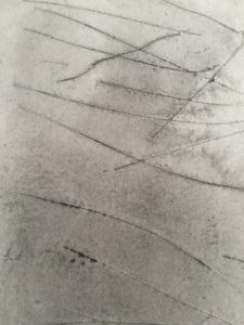
I wanted to do a line for love, mainly passion. When I think about a crazy, sort of passionate form of love, I envision two lovers being hopelessly together in their own messy world. CY Twombly’s style of ‘scribbles’ really resonates with what I envision the line to be, so I dove right in to try it out.
Tying two pens together with a fishing line (with the two pens signifying a pair of lovers), I let my emotions flow and thought of an image of messy love. Here is a video of me trying it out:
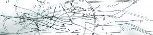
Emotion – Passion. I layered the same image below it to emphasize on the love between two people.
He is the few artists that I got my inspiration from. My other pieces are techniques that I found online 🙂
The internet allows us to learn so much. After spending much time surfing on and google, I came across some techniques that could potentially help me for my lines.
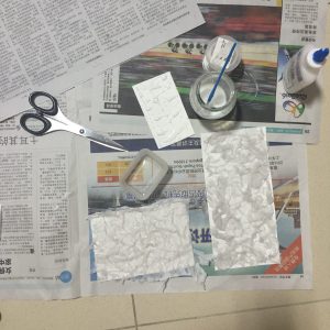
PVC glue and tissue paper
The results
Played with only black acrylic paint
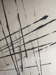
Ruler and ink
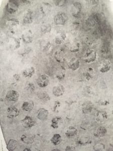
Watercolour and bubble wrap
Watercolour and slicing the paper with pen knife
Watercolour and cling wrap
Water colour and salt, a chemical reaction!
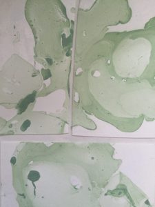
Marbling with nail polish! (used green because can photoshop the colour, did not want to spend more $$)
That’s all! 🙂