3d(II): Soundscapes

For this assignment, we are tasked to create a texture based on a good sound an a bad sound. Kind of a step up from last semester’s obscure cities project (which I enjoyed!) and our last project of create a sculpture out of smells.

I opened up my ears and really started to listen carefully. In my head, I started to think of my personal sounds. Musical instruments for example, or the sound of a pan fry cooking, or a dog panting… so on and so forth.

My good sound: 


This is the sound of a vending machine! Back in Singapore Polytechnic, the area where I used to study was surrounded by vending machines. It was a pleasant memory as it reminds me of the good times then.


img_2017-02-08-162957

The crumples represent the humming of the machine, whereas the irregular cut outs at the bottom represents the item falling onto our hungry or thirsty hands!

Then, we were given time to experiment at home to choose our own materials to represent the sound. I decided to go for aluminium, as I can imagine the presence of a huge metal thing containing more metal thingies for our needs!

img_2017-02-08-162854

img_2017-02-08-163001 The crumples represent the gentle hums of the machine. Though it is not captured, I also added a layer or two to show the different tones of it as well!

My bad sound:


The high peaks of our squeaky classroom chair raises the many hairs on my body.

img_2017-02-08-163006

The peak represents the high squeaks of the chair, and the form represents my disgust towards it

img_2017-02-08-163001

Irregular cuts that represent the other softer squeaks and sounds. The paper is crumpled to also show the inconsistent yet very present rolling sounds.

After the lesson, I decided to go with cardboard for my sound!

img_2017-02-08-162837

I personally feel that the cardboard represents the entire soundscape so much better. The rolling sounds are the ridges of the board, whereas the speaks are the top parts of the cardboard that still remain, it also peaks!

img_2017-02-08-162845

A wider shot of the work!

Overall, sound is another sense that is also underestimated in our human body. So far, this project reminds me of a condition called synesthesia, where people can see, taste or hear colours!

Read this article to find out more!

http://www.livescience.com/169-rare-real-people-feel-taste-hear-color.html

As an Art student, I wish I can live in their shoes for a day as well!

Upon reflection so far, I feel that I have to grow a lot in this area of interpreting our sense into various things. It is awesome to see how other classmates execute it, using such a variety of materials I never thought of utilizing and expressing things so accurately yet creatively. Perhaps the trick is not not think so much and just do it? Or maybe I just really need to take the time to explore in general.  Can’t wait to start on the next project!

2D(ii): Que Sera Sera final

To end this post and project, here are my completed typos!

screen-shot-2017-02-07-at-8-41-45-am

My name is Viena and I want to be a Treasure Hunter

Shirley kindly helped me improved the overall type by added a vignette to focus on the fonts more. Also, the recommended shadings and shadows to heighten the 3D effect. Moving up the cross to the 1/3 creates a more balanced composition (initially, I really did not know where to place it).  This is my favourite design out of the 4 and one of the best works I have done so far!!

The dotted lines in the inside of the letters also bring out the theme of “treasure hunter”, which I intentionally did as I was afraid that the jobscope cannot be brought out enough with the different landscapes.

lifeguard

My name is Viena and I want to be a Lifeguard

lifeguard2

My name is Viena and I want to be a Lifeguard

I chose to present with the first image, incorporating some of the changes Shirley recommended like changing the shading of the other elements to a grey colour. However, I chose to stick with having two colours for each letter, highlighting the distinctive elements with the red colour. Also, the colour play enables to bring out a sense of “fun” to replace the suggested play of perspective.

screen-shot-2017-02-07-at-8-40-08-am

My name is Viena and I want to be a Fisherman

Cutesy and fun due to the elements that are around the fishes!

screen-shot-2017-02-07-at-8-41-00-am

My name is Viena and I want to be a Pirate.

Love it as well! Though somehow I feel that scanning the type in emphasises on the “flaws” of the type more than taking a photo of it.  I like the scars, blood and sweat which is subtle but brings out the job scope more!

In conclusion, 

I really enjoyed this project and creating these fonts! I learnt many things through this project, like using 3D in photoshop, my first time doing a hand drawn work, and basically exploring so many functions and methods to communicate to my viewers. Hope to continue to improve to be a better designer in time to come!

2D(ii): Que Sera Sera process

Here is the process of getting to my final product!

  1. Lifeguard

2. Treasure hunter

3. Fisherman!

fisherman2

Completed it and it looks like this. Unsatisfied with the way it looked, probably because it still does not look fishy (fish is very fluid but it looks very structured) and looks different from my other works.

screen-shot-2017-02-06-at-10-46-05-am

Starting out from the start!

Therefore I decided to this typo as an illustration because I am running out of time and it is my quickest way to execute it haha!

4. Pirate


2D(ii): Que Sara Sara Research

For the first project of 2D, we are tasked to create a typography out of our dream jobs!

What is typography?

Typography is the visual component of the written word. It is able to evoke different feelings through its appearance. Good typography sets the tone of your written message and helps to reinforce its meaning and context. Good ty­pog­ra­phy can also help your reader de­vote less at­ten­tion to the me­chan­ics of read­ing and more at­ten­tion to the mes­sage!

For example, this table that I found on Pinterest

How can different fonts evoke different emotions

These are a few things we as designers can take note in order to create a visual hierarchy for our reader:

– Size and weight

– Colour

– Positioning

– Typeface

Typography is also very technical, in terms of many terms like kerning, baseline, serif non serif and etc. The good thing about this project is that our lecturer Shirley emphasised we do not need to make it logical. So we can let our imagination run wild and play around with many different looks!


My first thought process:

Breaking down the entire brief and after reading typography articles online, basically the ultimate goal is that:

– Reader can legibility read the font

– Able to identify occupation

– A E S T H E T I C S

– Able to convey the feelings and emotions related to the job scope (this one is next level!)

Points above are listed out in accordance of importance to me. Overall, there is a need to find the balance between the art and function that is created. Throughout this project, it is key to ask the people around me for their feedback and their opinion towards my typo.

To start out the project, here are some of the jobs that I considered: 


After consultation and thinking about which type I ca execute the most interestingly, I decided to settle on these four job scopes: 

1. Pirate: People who attacks and robs ships at sea.

Perhaps inspired by the many series of Pirates by the Caribbean in my growing years, I have always imagined myself sailing the seas and living my life under Caption Jack Sparrow. I decided to go forth with the idea of doing a pirate tattoo, meaning that I had to hand draw it.

Key characteristics of a pirate: Hook, eye patch, destroyed ribbon, skulls, octopus tentacles, swords, anchor, pirate flag, pirate ship,  ropes, fish scales, mermaids.

I kept in mind to make it look rugged and manly as well.

screen-shot-2017-02-07-at-7-12-00-am

Some inspirations

2. Fisherman: A person who catches fish for a living or for sport

Growing up, my dad used to take us to Jurong lake to do some fishing and prawning. Meanwhile my mother came from a fishing (and rice planting) family.

Initially, I wanted to do physically DIY the font and take a photograph of it. However I changed my idea last minute. Here is what I had in mind initially!

I wanted to create a typography out of styrofoam and paste DIY fish scales and fins onto it. For the background, I wanted to place a fishnet and the background to have a blue colour.

3.  Treasure Hunter

Again, perhaps inspired by movies while I was younger, I can imagine myself travelling across the world and across different terrains to look for the treasure. More than that, last year in Philippines there was a rumour about a treasure being hidden around the island going, and I saw a legit real map. Looks more beautiful and intricate than the maps we see on Google images, sadly I am forbidden to take a picture of it! Haha.

For this idea, I am going to create a 3D font and photoshop, emphasising the nature of the occupation itself – exploration and the lookout for a treasure.

Mostly inspired from this online tutorial which luckily I found! It helped me a lot because it is the first time I am using the 3D function and photoshopping many small elements together.


– Lifeguard

BAYWATCH. Red swimsuits, surfing, running slow motion in the beach. I am all up for it. Or in Singapore context working in Wild Wild Wet looking at patrons chilling at the lazy river.

The only series that I watch, Bondi beach rescue!

For this, I decided to go ahead with combining different elements of lifeguard equipment and illustrating them into vectors before piecing them together to form the alphabets.

For this, I had no need for as much inspirations as my other occupations because I already knew what I wanted. Perhaps it is because I am inspired by the many examples shown in class as well, which I did not manage to stumble across online.

That is all for this post!


Our senses: Touch and sound

How does human’s hear?

  1. Sound waves enter the outer ear through the ear canal to the eardrum
  2. The eardrum will vibrate from the incoming sound waves, these vibrations occurs in the middle ear with bones called the malleus, incus, and stapes, which amplifies or increase, the sound vibrations and send them to the inner ear.
  3. The vibrations cause the fluid to form traveling waves along the basilar membrane.
  4. Which moves to the hair cells near the wide end of the snail-shaped cochlea detect higher-pitched sounds, such as an infant crying. Those closer to the center detect lower-pitched sounds, such as a large dog barking.
  5. As the hair cells move up and down, it will bump against an overlying structure and bend. Bending causes pore-like channels, to open up and creates an electrical signal to the brain

Here is a video to explain everything above!

How does human’s feel?

Our sense of touch is controlled by a huge network of nerve endings and touch receptors in the skin known as the somatosensory system. This system is responsible for all sensing cold, heat, smooth, rough, pressure, tickle, itch, pain, vibrations, and more. Within the somatosensory system, there are four main types of receptors:

r12269

Mechanoreceptors: Pressure, vibrations, and texture

Thermoreceptors: Found in the dermis layer of the skin, it contains two categories of  hot and cold receptors.

(Cold receptors start to perceive cold sensations when the surface of the skin drops below 35° . They are most stimulated when the surface of the skin is at 25 °  and are no longer stimulated when the surface of the skin drops below 25° .)

(Hot receptors start to perceive hot sensations when the surface of the skin rises above 30 °  and are most stimulated at 45 ° beyond this, pain receptors take over to avoid damage being done to the skin and underlying tissues.

Pain receptors: These receptors detect pain or stimuli that can or does cause damage to the skin and other tissues of the body. There are over three million pain receptors throughout the body, found in skin, muscles, bones, blood vessels, and some organs. They can detect pain that is caused by a cut or scrape, or thermal stimuli (burn), or chemical stimuli (poison from an insect sting).

Proprioceptors: It senses the position of the different parts of the body in relation to each other and the surrounding environment. Proprioceptors are found in tendons, muscles, and joint capsules. This location in the body allows these special cells to detect changes in muscle length and muscle tension. Without proprioceptors, we would not be able to do fundamental things such as feeding or playing sports.


What is the similarity between the frog and humans?

Hearing:

  1. Frogs, like humans have tympanum

The tympanum are part of an ear structure
– However for the frog, it is located behind its eye and is used to transmit sound waves into the inner ear. Its unique structure also allows protection and to keep it hearing while it is submerged, which is an ability humans lack as we have an outer ear structure.

2. Neuromuscular junctions

Frogs and humans also both have neuromuscular junctions that transmit motor impulses from the nervous system to muscles.

*Interesting fact! Frogs can only detect high-pitched sounds with their ears; low-pitched sounds are detected through the skin.


4D(ii): Alter Ego (research, progress and final video)

Alter Ego:

A second self or different version of oneself, like the opposite side of your personality

Task 1: Name 5 characters or fiction with whom you have a special affinity

Miss Saeki – Kafka On Shore, Main character (unnamed) – A Wild Sheep Chase. Piggy – Lord of the Flies, Melanie Stryder – The Host, The Untold Story of the Witches of Oz – Wicked

Task 2: 5 Public figures whom you have a special affinity

Britney Spears, Steve Jobs, Emma Watson, Mother Theresa, Melania trump

Task 3: 5 people you know or whom you have known

My Mother, My dog, Mr Kan (my poly teacher), My pet bird, Sheng Jia

Boiling down my alter ego,

Miss Saeki: 

  1. Special events for Miss Saeki from Kafka on the Shore:
  • The death of her lover
  • Created a one hit wonder called “Kafka on the shore”
  • She obsessed with the past (of her lover) and becomes a hollow shell that dwells in the past
  • Retreats into realm where time and desire stalls, can shift back between past and present
  • Writes a book of all of her memories
  • To free from her memories, she managed to push another character in the book to burn all her memories

2. Characteristics:

  • Lost in between the worlds (past vs present)
  • Have a strong sense of desire
  • Empty
  • Obsessed

3. Significant symbols:

  • Entrance stone
  • Miss Saeki has no shadow
  • Raining leeches
  • Talking cats
  • Her death after the burning of her notebook containing her memories, meaning she has returned to the other realm

Quote from Miss Saeki:

“‘I haven’t had anyone I could call a friend for a long time…except for my memories.’”

Taxi uncle:

Initially, I wanted to use miss Saeki as my Alter Ego. The part which draws me to her is the way she is obsessed with her memories. Not because I myself is obsessed with own memories, but for the fact each experience is greatly appreciated and stored at the back of my head, replaying the particular moments whenever I have the desire to do so. However, I do not really feel a complete “connection” with her. I was more drawn towards recreating the fictional crazy world that she lives in and the whole idea of an obsession with a memory, which could be greatly explored in a 1 minute video due to its short timeframe.

After considering about it for many days, I met a taxi uncle. He shared his life with me, talking about how different Singapore was back then, and how NTU used to be a kampong area that he grew up in. Our conversation was extremely engaging and it hit me how this part of his personality is similar to mine, being reminiscent of the past and treasuring the time that we had.

Quote from the taxi uncle:

“You know last time everything so different, now Singapore too fast”

*Btw the uncle told me that the land of NTU and beyond used to be a fish/sheep farm with plantations. NTU expanded and the people moved to the surrounding areas in Pioneer/Boonlay. A few of his friends he grew up with became canteen vendors in NIE and some of the foodcourts in NTU. Talk to taxi uncles they have so many stories to share 😉

In conclusion, 

Boiling down both characters made me realise have much I treasure and value memories, which is something important because it builds and shapes the very core of a person. This is the direction that my video is focused on.

Key words for the idea: 

To start this entire project, I read up the definitions of certain key words that came to my mind:

Reminiscent: To remind one of something/absorbed in or suggesting absorbing in memories

Longing: Having or showing a yearning desire

Nostalgia: A sentimental longing or wistful affection for a period in the past

Remembrance: Have in or be able to bring to one’s mind an awareness of
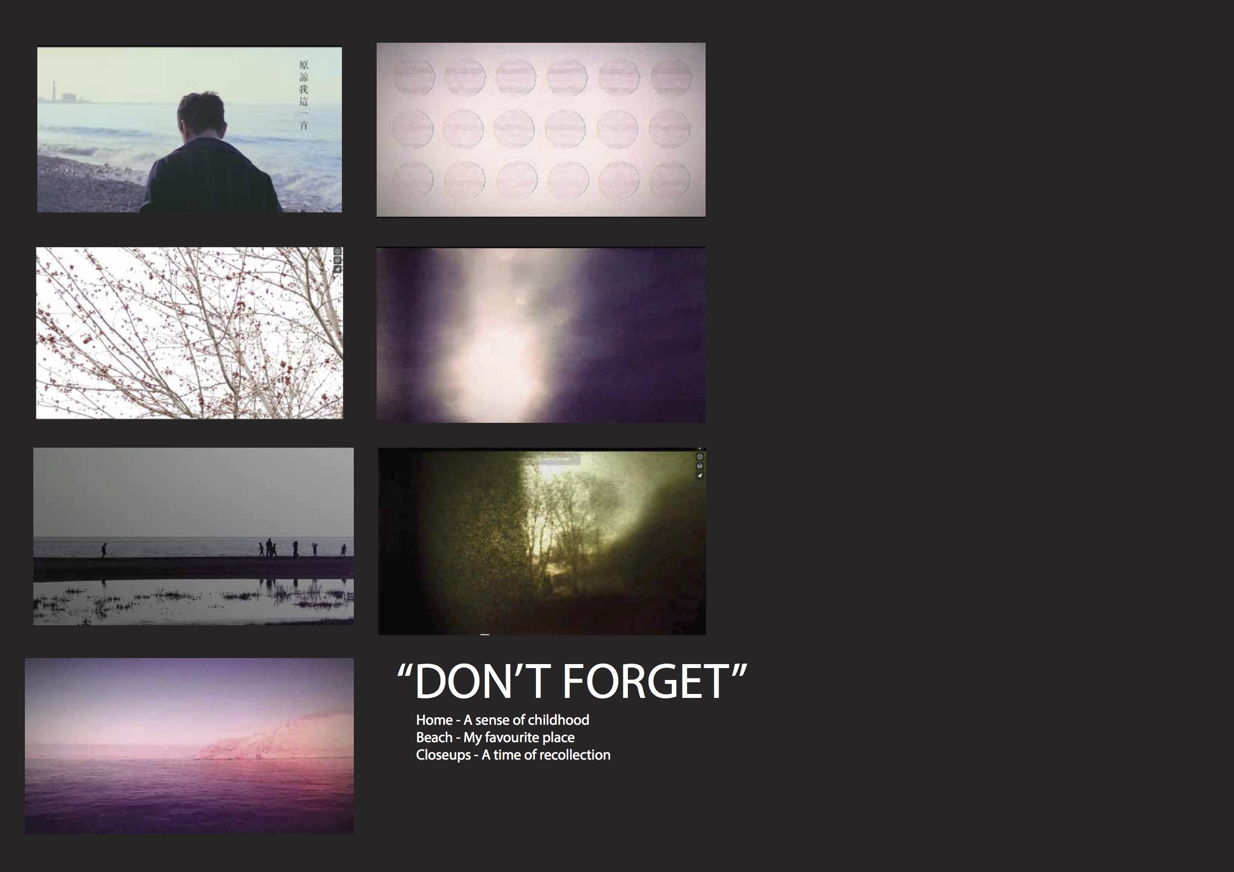
Video concept:

Many ideas ran through my head, here were some of the areas which I thought I could do my video on:

  1. The easiest would be showing my personal favourite memories to people

2. Reenact the entire scene where I talk to the taxi uncle

3. Tap on textures and sounds (suggested by Lei)

I decided execute the third idea, something of which I am unfamiliar with and have not touched on before. It was difficult for me to start the entire project because videos of textures and sounds only were very foreign to me, therefore scouting  Vimeo really helped shaped my video’s direction and the aesthetics. In particular, Charlie McCarthy was my main source of inspiration as his videos were able to capture daily, familiar things so beautifully. Moreover, his video is able to evoke certain emotions to me. This is therefore something I want to challenge myself in my minute video – to evoke certain emotions and feelings to memories they had in the past.

To capture texture, I decided to use Macro lenses to up up close and personal with the things I capture.

Inspiration:


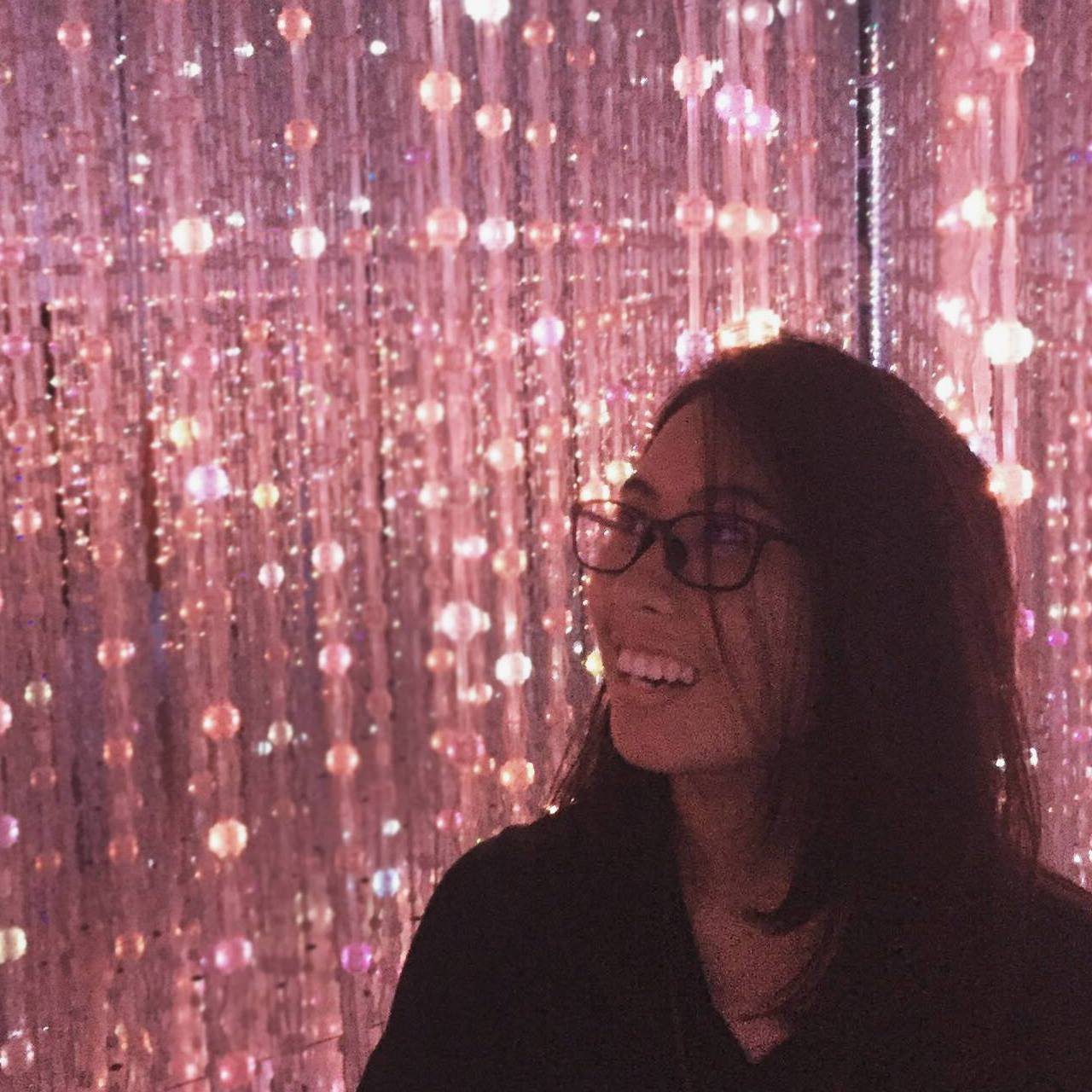
I decided to go forth to filming with my gut feelings. Therefore no storyboard was created for the video. But as a guideline to the visuals I wanted to have, I have a moodboard which I studied very closely as a guide for the video.

untitled-3-13-2

I went around filming “aimlessly” for a few days, carrying around the DSLR and hoping to capture beautiful things that has meaning to me and hopefully my viewers. I also wrote a script, which help shaped my video too. Here is the script:

Dear viena, 

Don’t forget.

We all grow old, 

and things become distant. 

But don;t forget. 

Keep the days of your youth close.

And simple parts of life that makes your heart warm.

Even those moments when the emotional affliction is too much too bear.

Don’t forget.

Experiences shapes us, 

like the waves of the ocean shifting the landscapes. 

So future Viena, 

I hope you managed to ground yourself in the past, 

and remember those small fleeting moments. 

For without memory, we are not us. 

So Never forget. 

-END-

Especially since we are talking about memories here, I thought why not write a letter to my future self! To make things more meaningful, I kept in mind that this is really a video that I want my future self to watch. So this video have a personal attachment to me 🙂
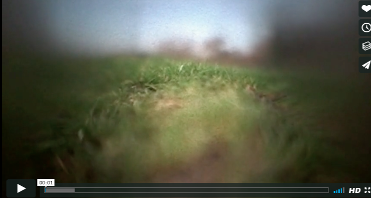
Video:

Decisions of the art direction and why:

– Everything is intentionally made to be blurry because memories are faded and unclear anyways! To create this effect, I made use of bokeh effects. Also, I actually played the clips on my laptop and filmed it again to make the kind of effects you see in this video. An idea I got from here, one of my inspirations. It was just something I wanted to try out and have fun with. I liked the effect as it enables me to get super close up clips and made things more blurry.

– Warm colours were utilized when doing my colour correction. Also, lens flare effects were use from a freestock footage and blended into the video, using “screen” mode. You can particularly see it from 17 – 23secs, which enhanced the “feel” that particular scene and the entire video as a whole.

– I also played a lot with the sound effects! An inspiration I had from the previous 4D lessons. This time I spent more time editing the audio than the clips itself. Again, you can see it most particularly from 17 – 23 secs when I talk about the hard parts of life and you can hear fighting sounds at the background

– If you have not noticed, there were no images or footages of me! As anyway, all these “memories” makes up “me” anyway. It was challenging in that aspect because it meant that I had to fill the 1 minute with more “gut feeling footages” that I had to source. But I personally like this concept and idea!

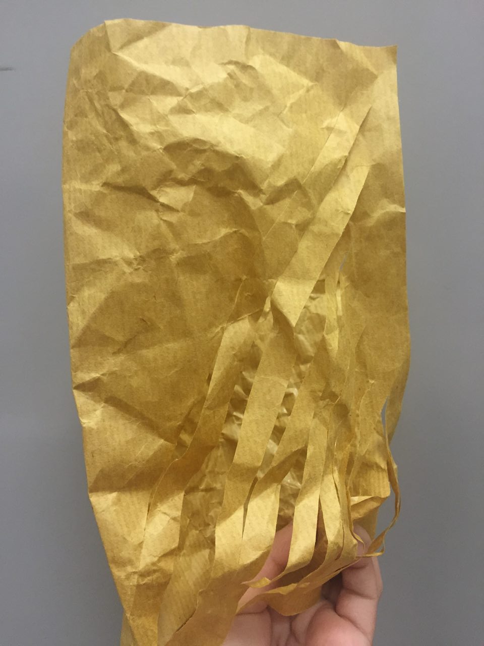
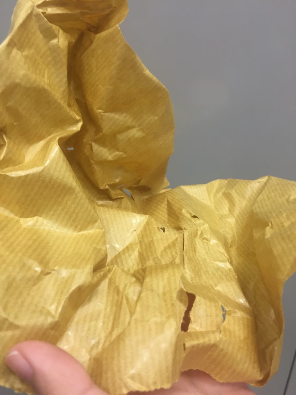
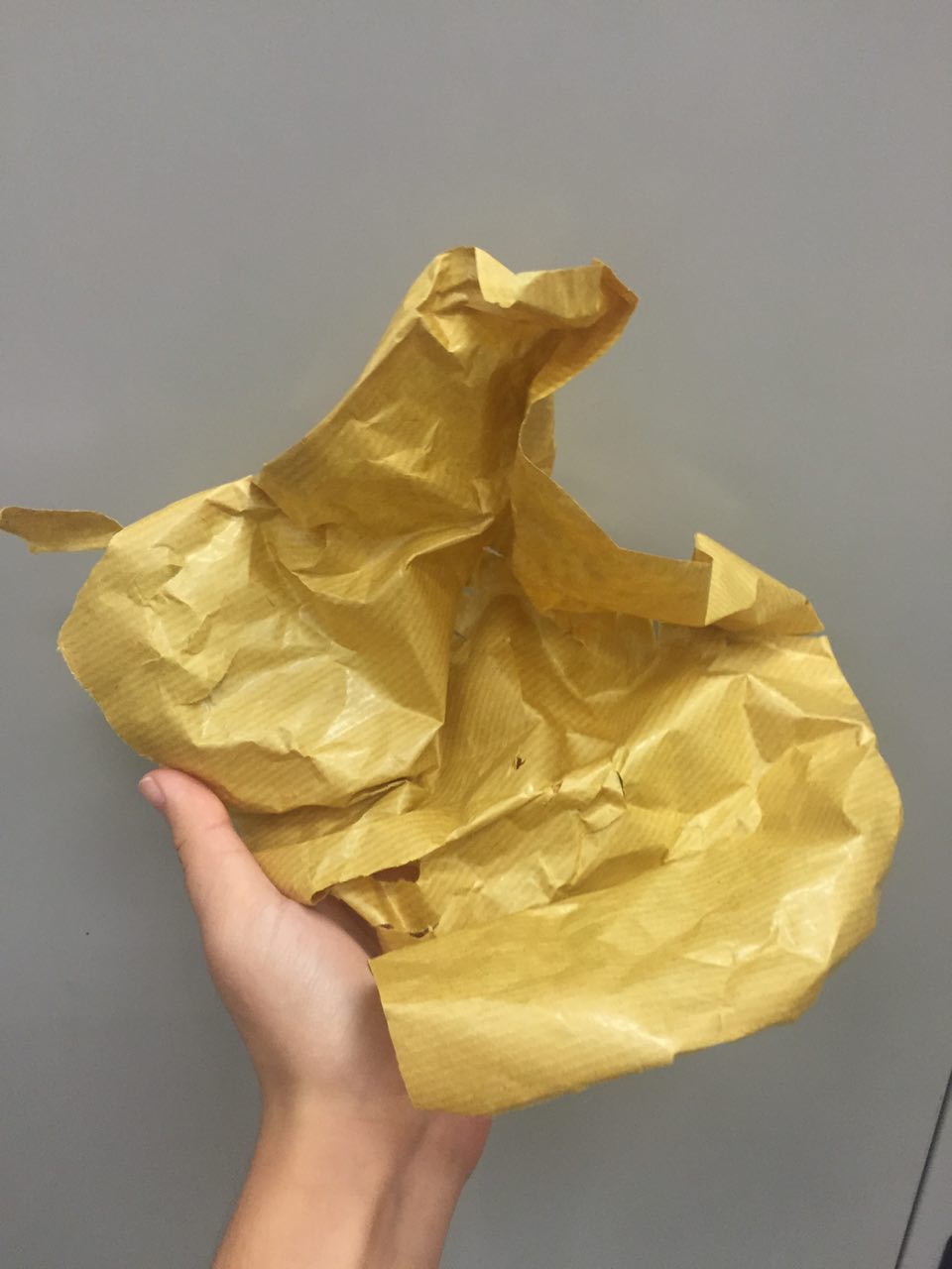
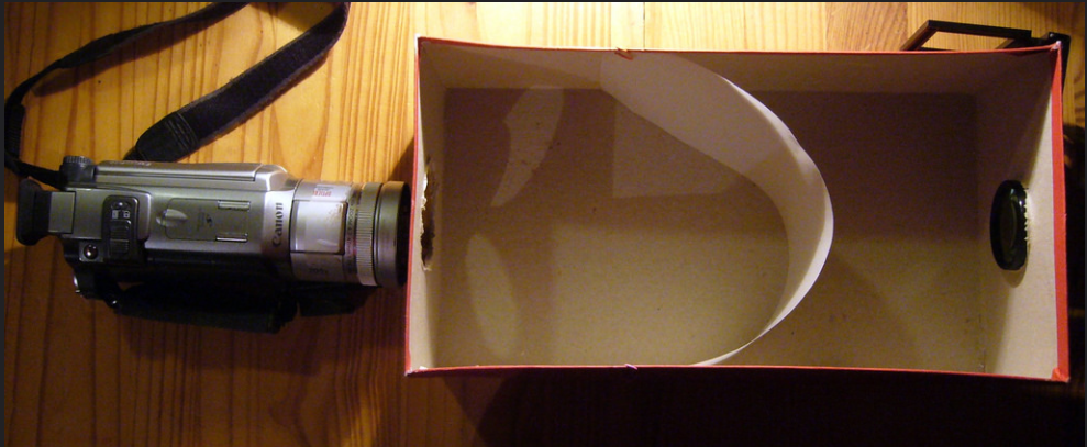
– – To make my video more “vintage” and more “old feel”, I wanted to add a vingette effect. There was something online which I explored called the shoebox effect.


screen-shot-2017-02-09-at-2-07-08-pm screen-shot-2017-02-09-at-2-07-30-pm

It looks like this! But my own shoebox failed, which I think is due to the thick tracing paper that I could only find. But it was all good, and I will definitely try it out in my own time again. Another thing that could be tried which is called the pinhole camera (also DIY-able!).

In conclusion, 

I was honestly super unconfident about this video as it is a really new area for me. However, I am glad that people liked it! But there are definitely areas in which can be improved, like the narration and more of the audio that can be pushed. But what I am glad is that this project allowed me to push myself in different areas and to explore on many things and techniques (like it is my first time using macro lenses, it was such a pleasure!). This project was an interesting one for me.

Thank you for reading this far! Hope you enjoy my video as much as I enjoy creating it.