Here is the process of getting to my final product!
Lifeguard
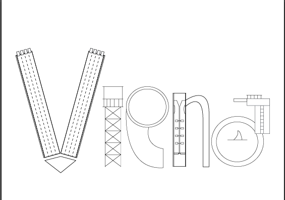
1. Rough sketch up of what elements i want to incorporate before settling down on the finalised vectors
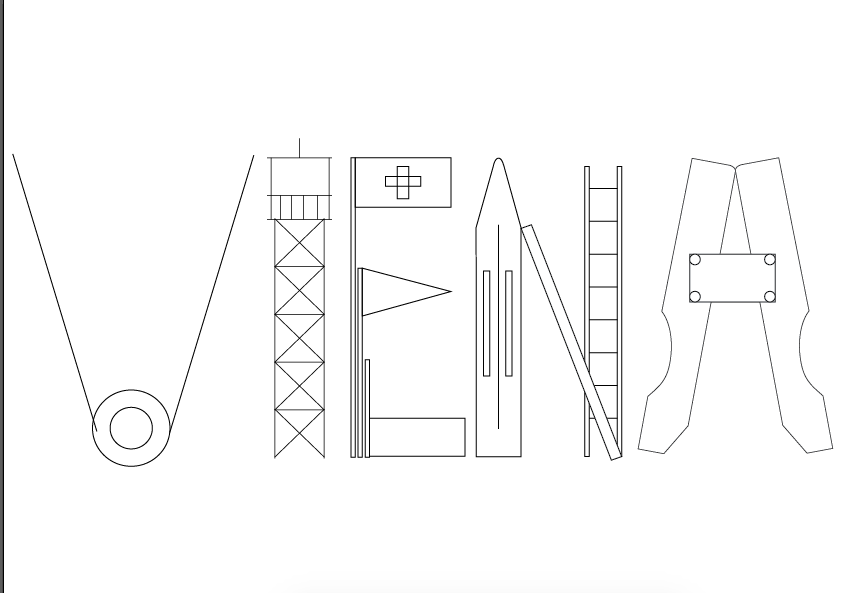
2. Felt the first one was not nice and played around more, this time using capitals letters instead
3. Created the objects into my own vectors. Did not use online ones as it will not give me my desired shape and height, quicker to make it myself. First colour combination I tried out. Consulted Shirley and she said that it does not exactly embody the fun-ness of a lifeguard, probably due to the stagnant baseline.
4. Changed colour scheme and did not stick to baseline
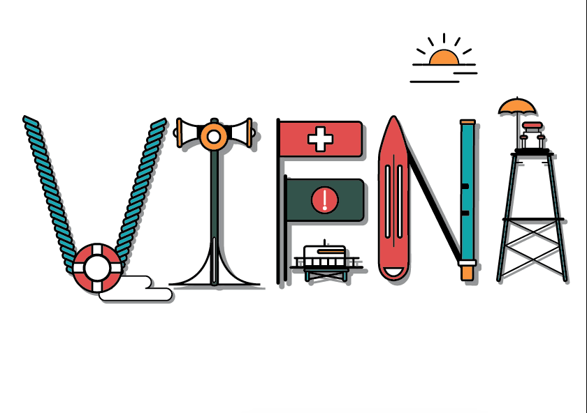
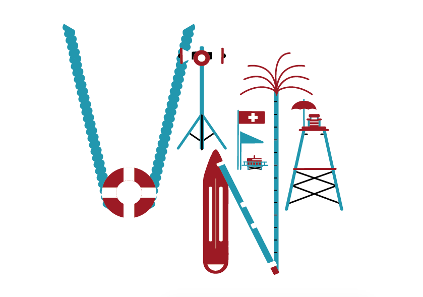
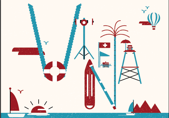
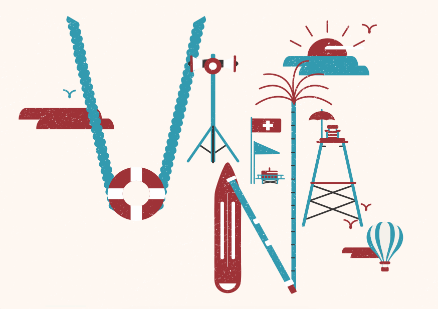
5. Tried colour scheme 3 and I love it! Also experimented a lot and decided to stick to this layout. Starting to get more satisfied with my work.
6. Added beach elements in, texture and a gainy paper background to represent the sand on the beach. Illustrating the sand does not look very nice despite using diferent colours and techniques
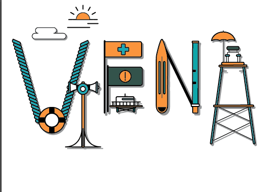
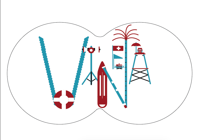
7. Tried to do it another way but I think it is too much. The circles are binoculars that lifeguards uses
8. Lessened the vectors as it was too distracting and sent it to Shirley and friends for their opinion!
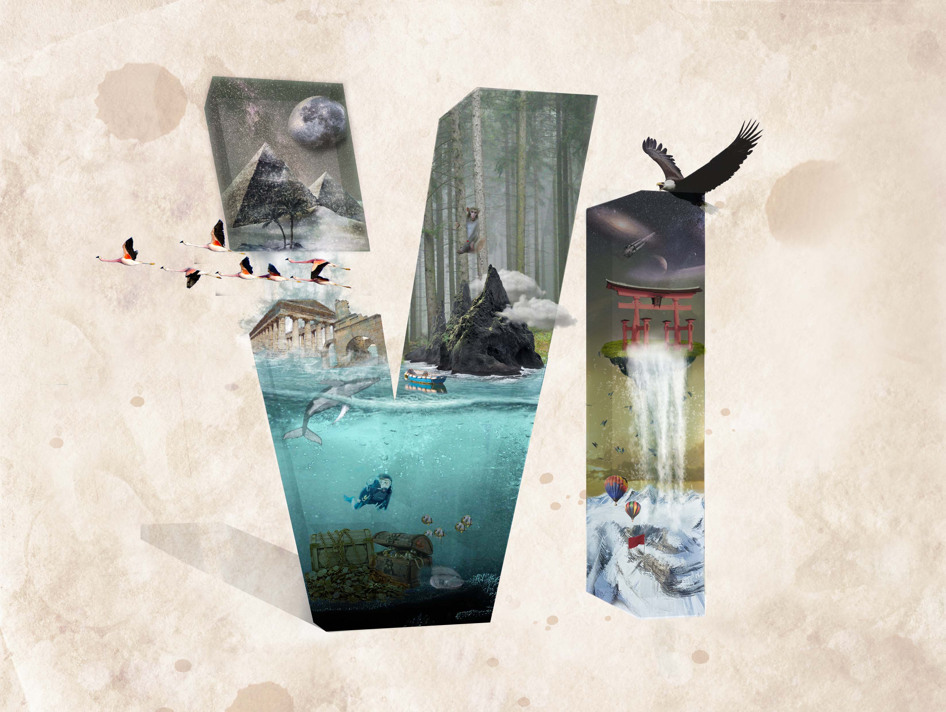
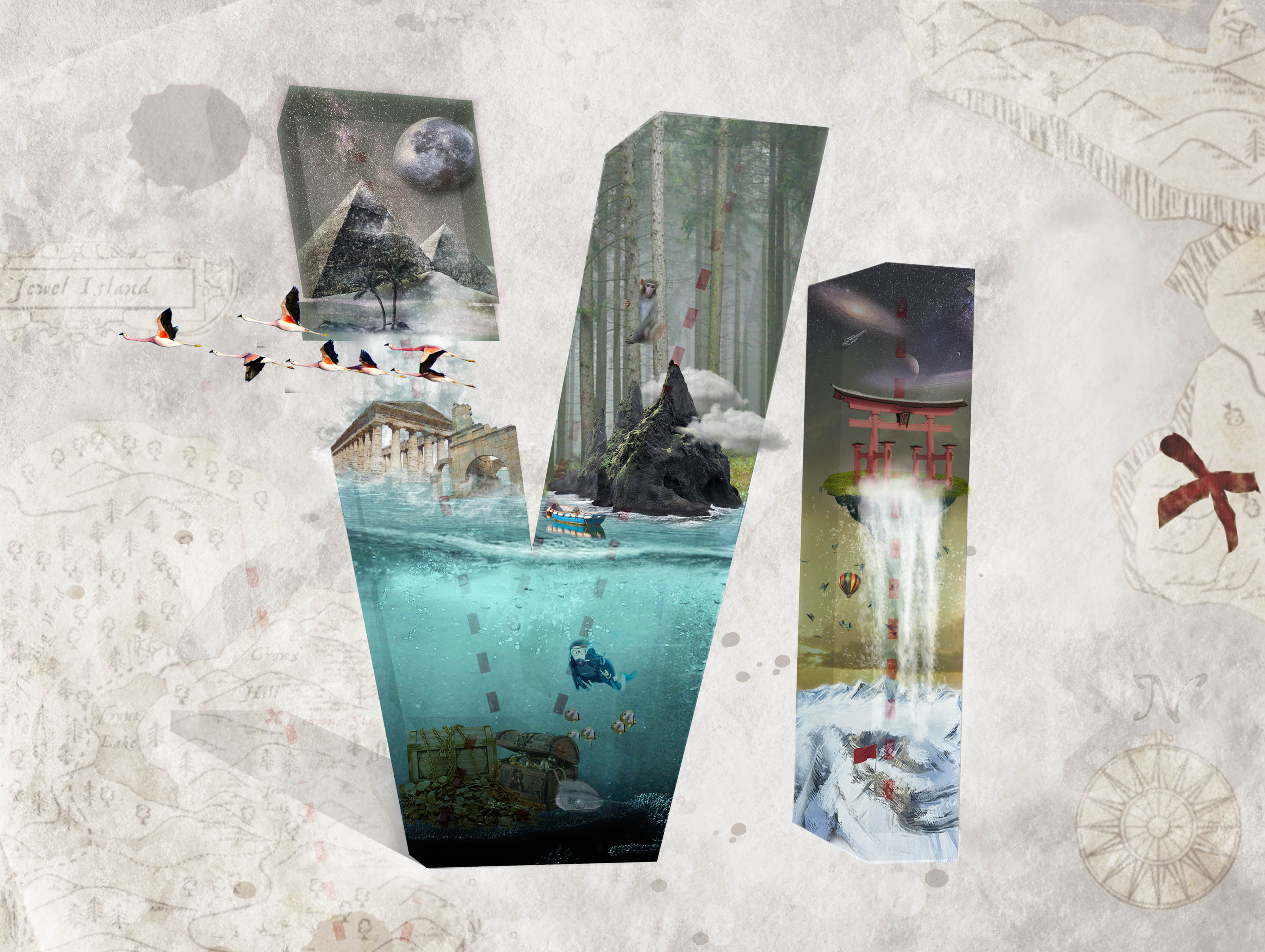
2. Treasure hunter
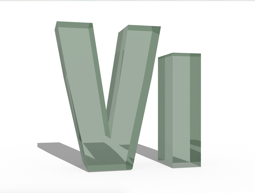
1. Created the 3D type using Photoshop
2. Added the elements in, also added the map background. Decided to photoshop a map myself as all online maps are too messy for this concept!
3. Desaturated the background and added some finalising touches. Added faint red dots within the letters to make the occupation more obvious for readers.
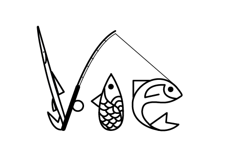
3. Fisherman!
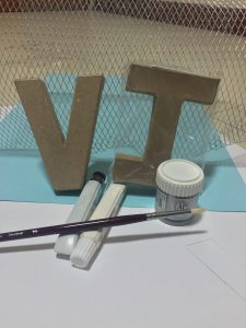
1. Bought a ready made font from artfriend along with necessary items!
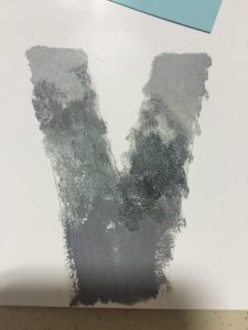
2. Wanted to paint the V and cut out scales. I tried to do so, but the work is tedious and the effect is not very nice as well. Went online and found another way to do it!
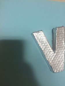
3. Basically to create this effect I had to press aluminium foil onto a wired net which I have
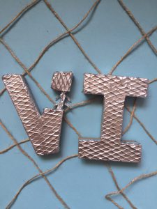
4. Outcome! Not satisfied with it though..
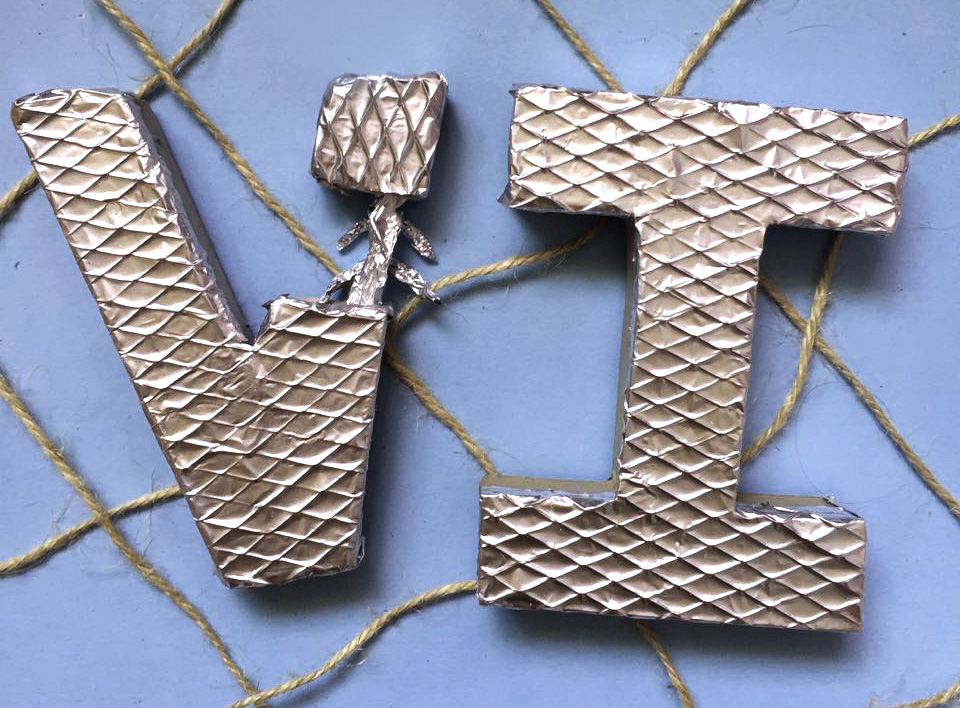
Completed it and it looks like this. Unsatisfied with the way it looked, probably because it still does not look fishy (fish is very fluid but it looks very structured) and looks different from my other works.
Starting out from the start!
Therefore I decided to this typo as an illustration because I am running out of time and it is my quickest way to execute it haha!
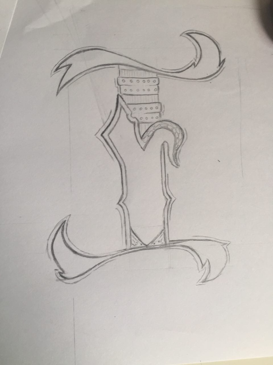
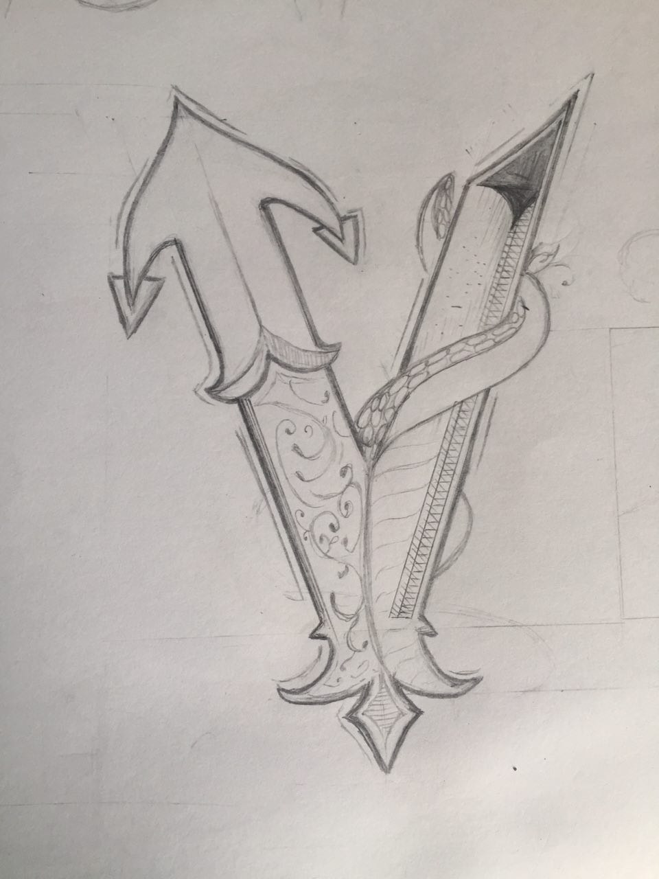
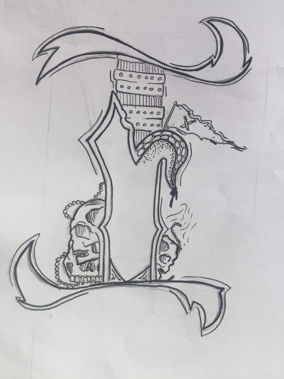
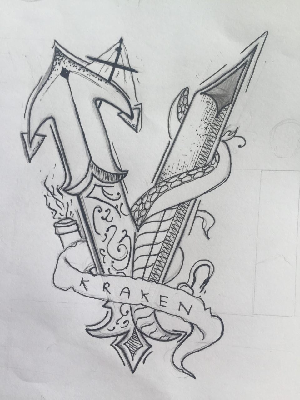
4. Pirate
1. First draft and I quite like it already!
2. Letter “V”
3. Sent the images to my friends and Shirley for their opinion. All agreed that I needed to make the theme more odvious. Therefore I added skulls and a pirate flag onto the letter
4. For “V”, I added a mast, canon and a frayed ribbon to bring out the theme.
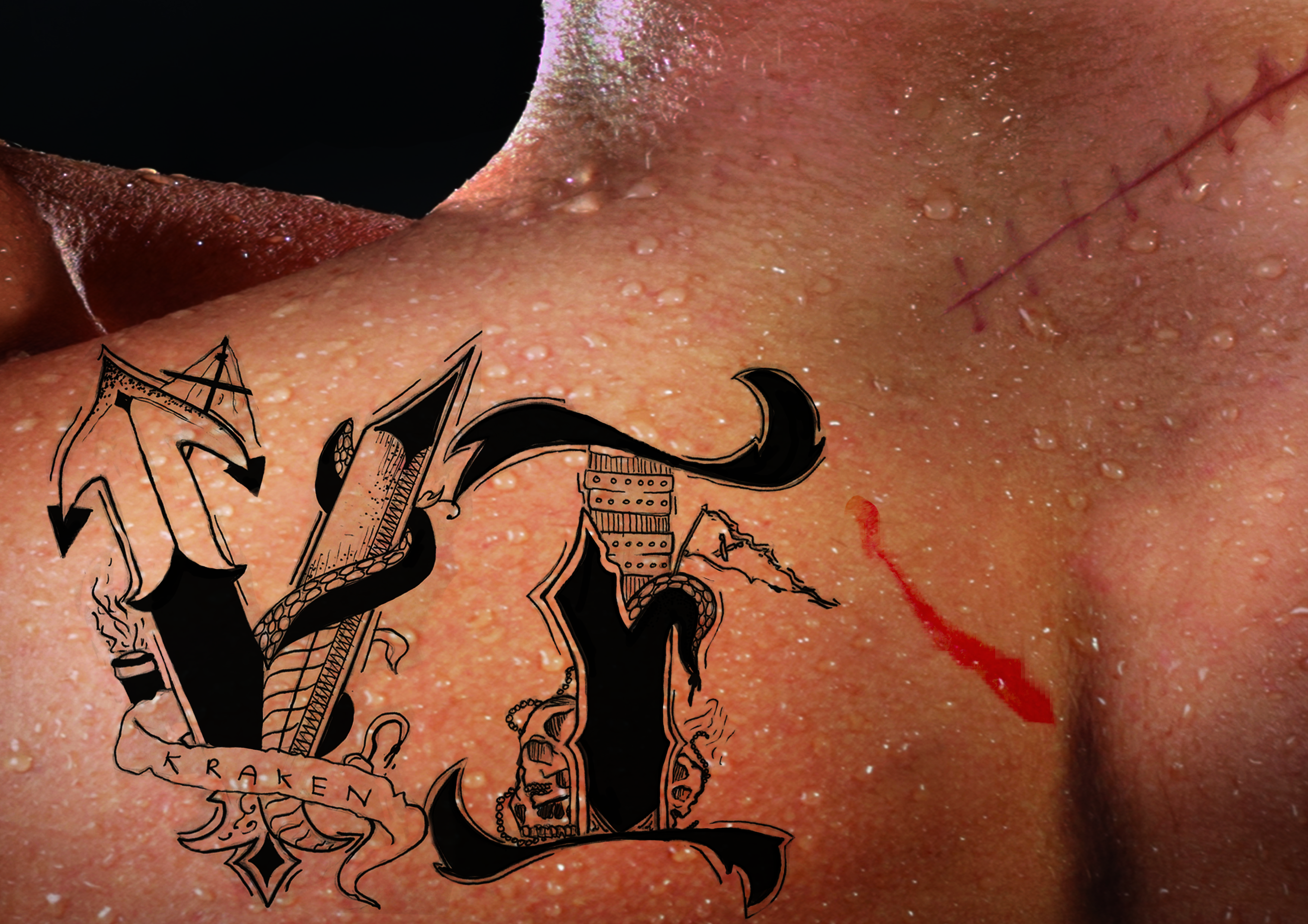
5. First try of doing a tattoo, I think the composition is not very nice
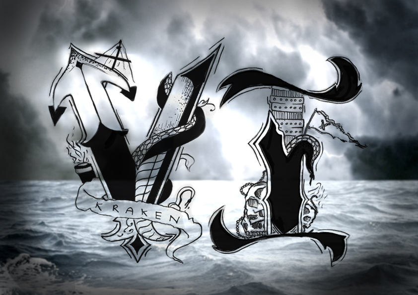
6. Played around with another idea of using the sea as the background, which I feel works too!
You must be logged in to post a comment.