The best part of this project that that we are able to explore different techniques and methods.
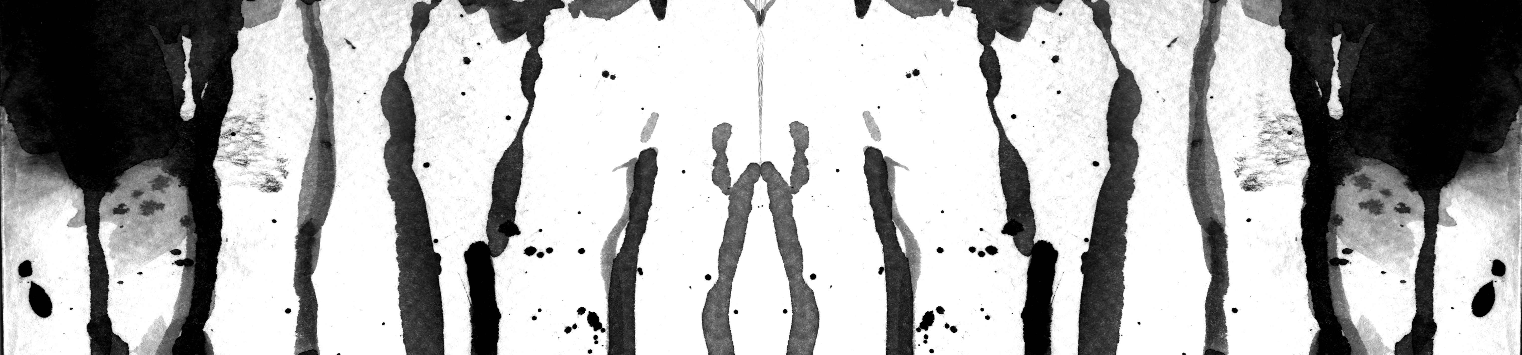
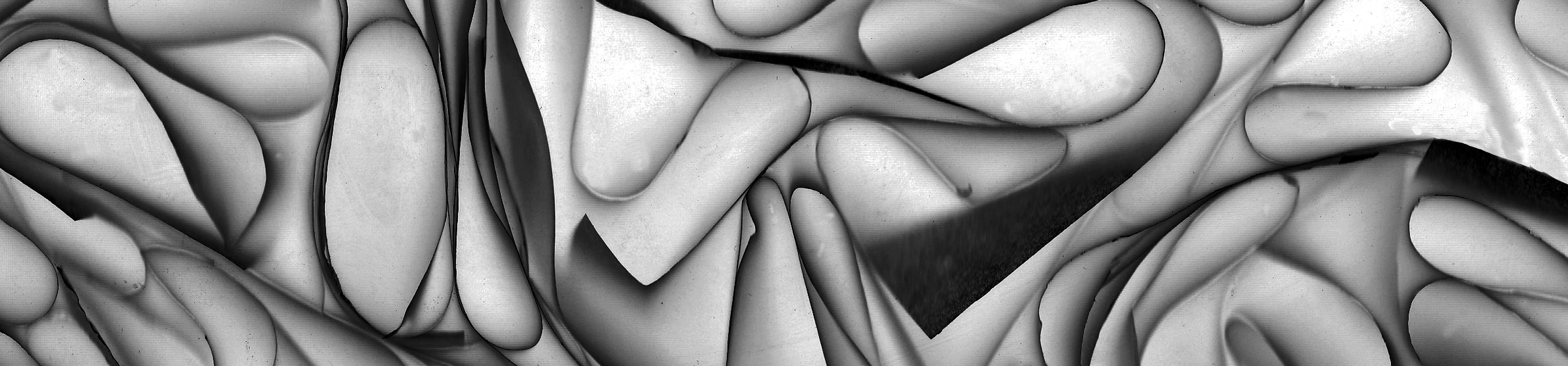
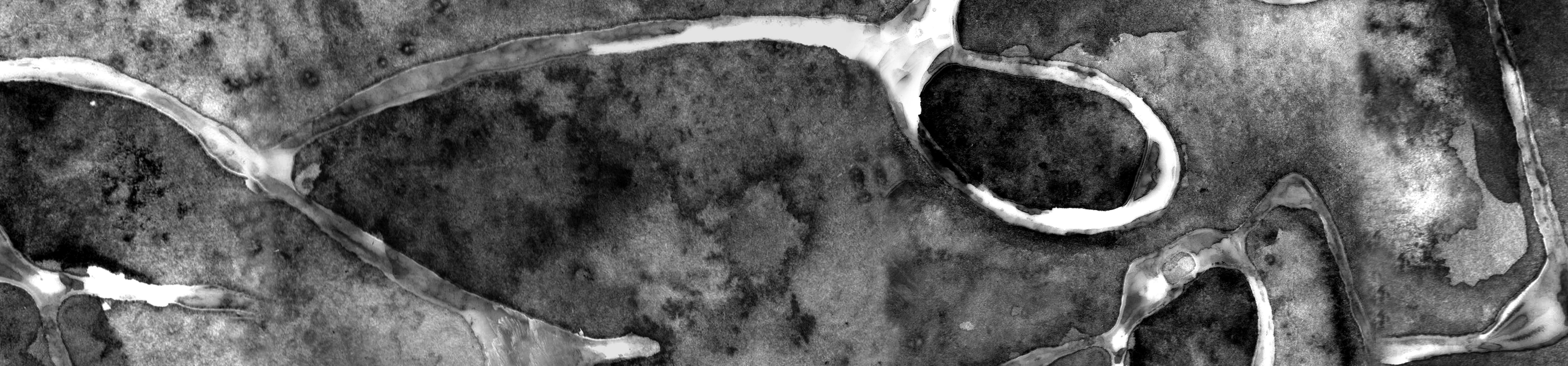
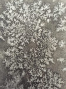
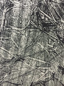
It all started with this. a line of long folded triangles pasted together. Initially, I wanted to make it as a form of 3D texture art. However, I was not convinced with this end result.
Folding long triangles and pasted them onto the paper
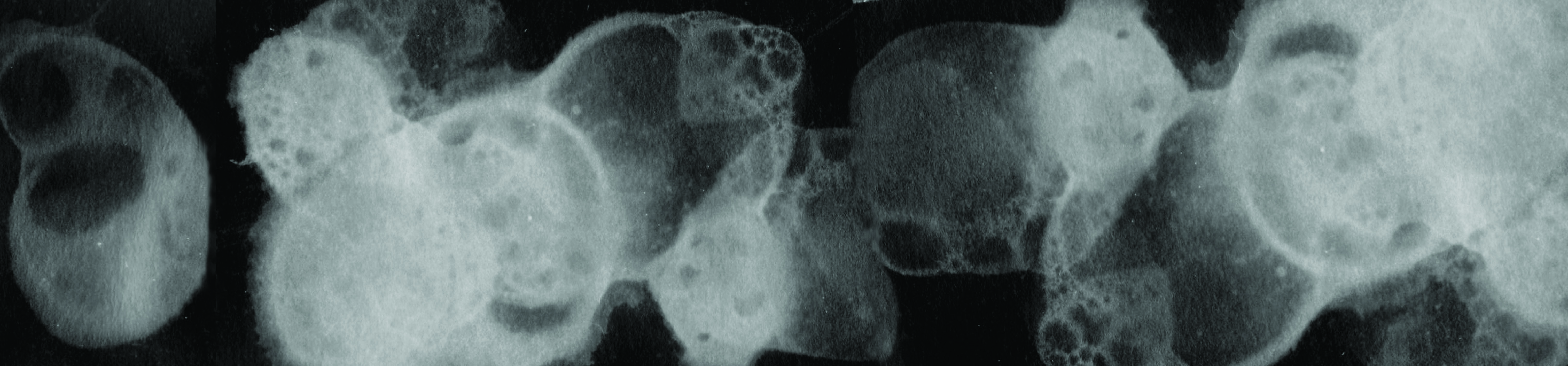
So I consulted Ms Ina who suggested me to scan it. Initially, I was very skeptical because firstly – how much better can it look? Secondly – wouldn’t it look very flat, thus loosing its main feature of it being 3D?
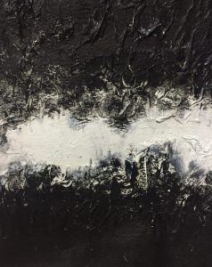
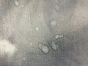
However, I was pleasantly surprised that the end result turned out well! And coincidentally, I feel that the image also represents the emotion surprise.
Emotion: Surprise!
Then a door to an entirely new world of possibilities opened for me. This was the power of a scanner (and photoshop).
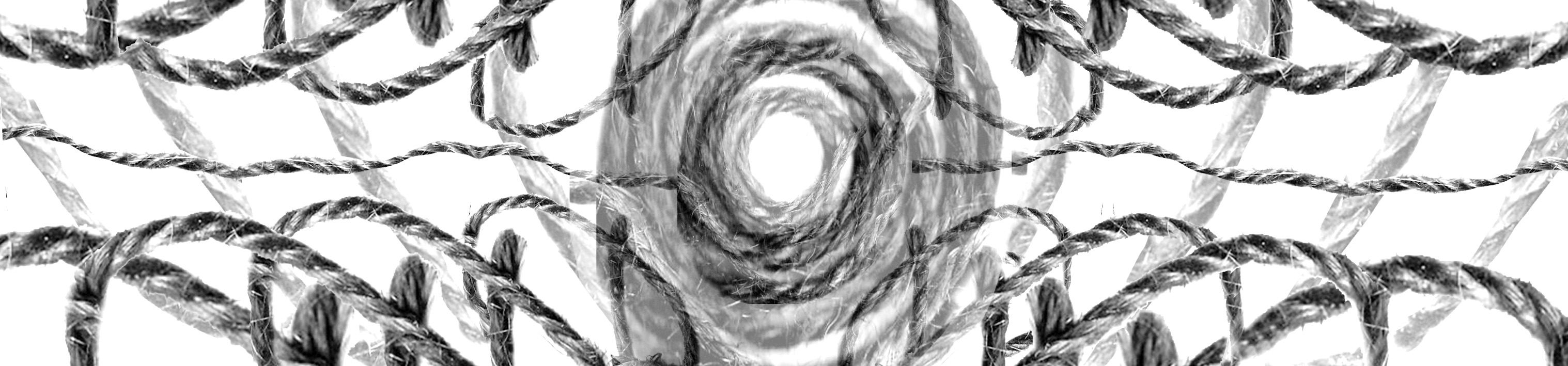
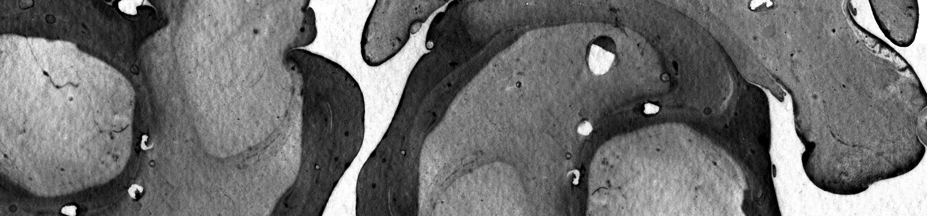
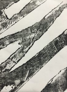
Then I chanced upon Tara Donovan’s artwork on pinterest. I did more research and found out that it was done by layering slices of tracing paper. Enchanted by the movements of the lines, I tries to recreate it.
Tracing paper sculpture done by Tara Donovan
Had to create borders around the paper to contain it
So excited when I placed it into the machine!
End result which signifies the emotion Truimph
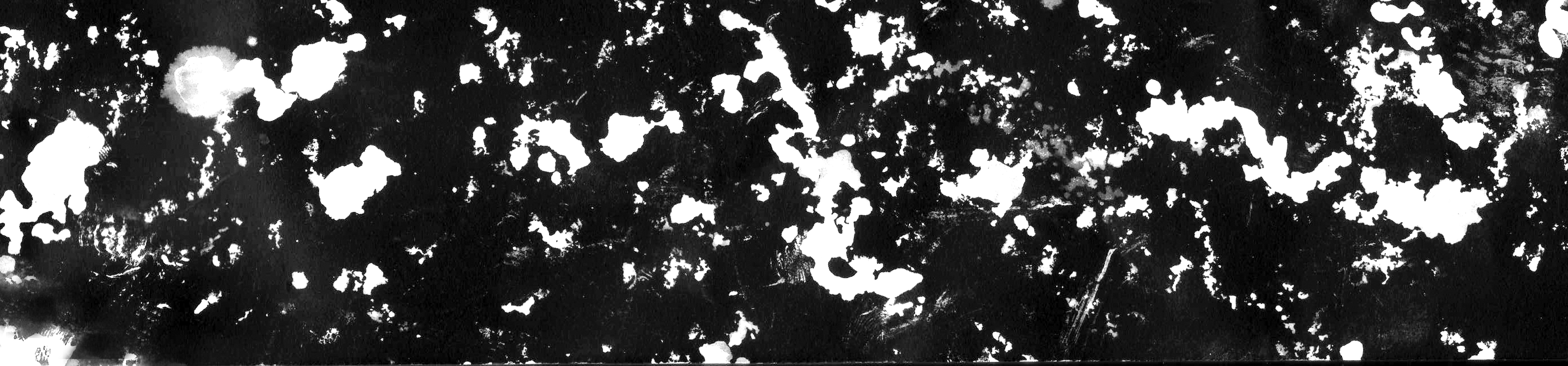
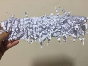
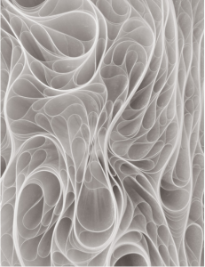
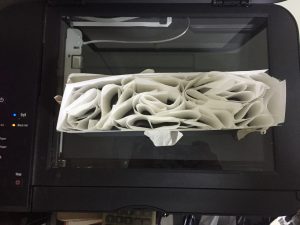
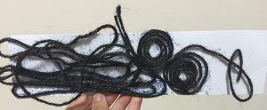
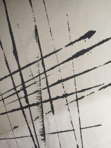
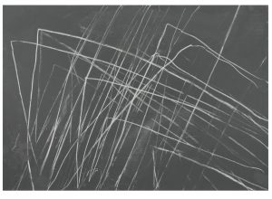
So I decided to push it further, and switched to ropes!
Intended for it to represent joy
Was disappointed when I scanned it, as it does not look very joyful
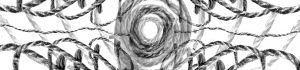
But photoshop is just as powerful as scanners. I thought about what makes something look ‘happy”, and thought of making the strings have a kaleidoscope effect.
I intended for this print to be 3D as well, but decided to give it a try at the scanner
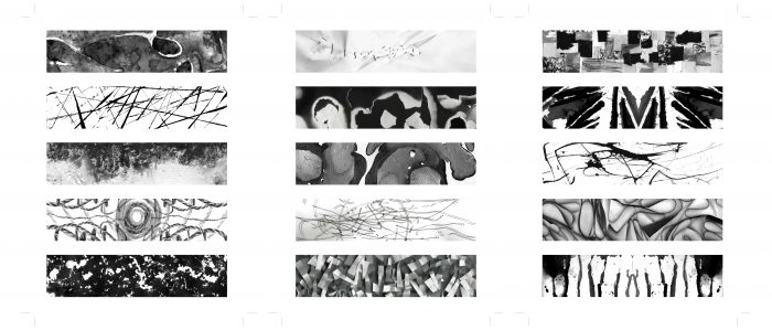
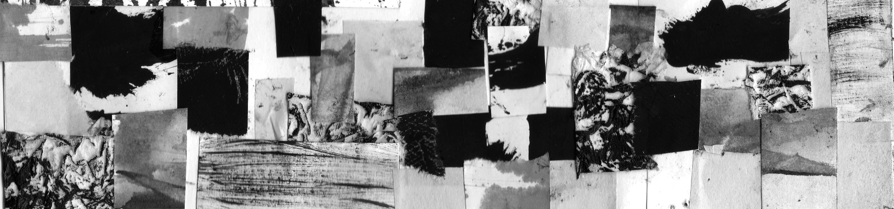
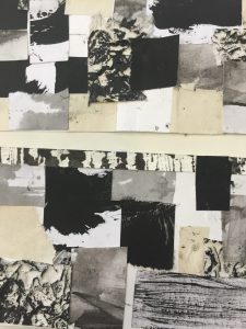
A montage of the different papers/prints that I made
I wanted this montage to represent insecurity. When one is insecure, he/she are always comparing, always not satisfied, have not found their own identity and stand yet. This montage is a physical representation of the emotion.
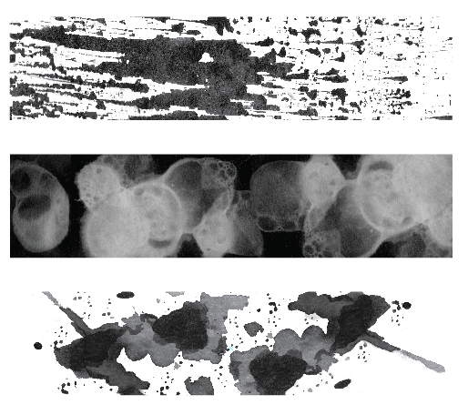
How it looks like through a scanner
I personally feel that this line looks better in real life, rather than digitally. However, since the rest of my work is going to be digital it will stand out to not have it done digitally.
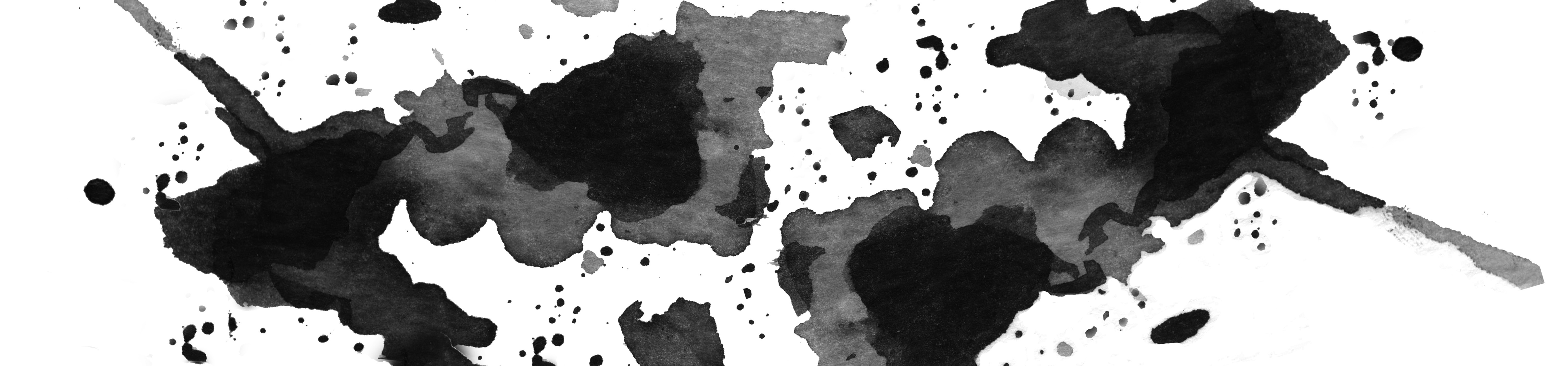
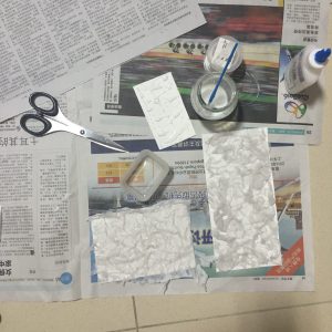
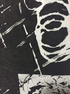
And lastly…
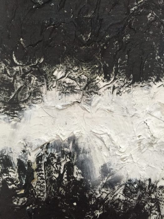
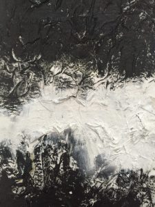
A combination of white glue, tissue paper and black and white acrylic paints
Beautiful end results which represents hate
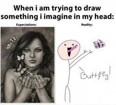
That is the end for my post! Next post will be about some fails I experienced. Because when it comes to design/art, I (and I’m sure you too) end up in this situation:
The pain of expectation of vs reality strikes closer to our hearts as visual artists.
Fail #1: Every detail is important
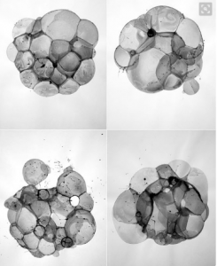
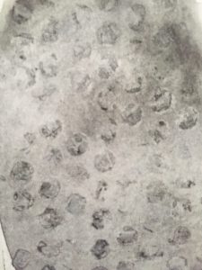
So I came across this very cool thing online, and it was done by Charlotte X.C Sullivan. It is called bubble printing.
Work done by Charlotte X.C. Sullivan, it is beautiful
Being a #Gobigorgohome kind of gurl, I decided to give it a try.
Here is a video of me doing it:
What happened? The end result of my first few tries.
And after many rounds of detergent, ink, and time, this was the end result…
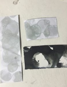
I kept on thinking of where did it go wrong. The very next day, it hit me that it could be because I used watercolour paper, which did not allow the water to seep through the paper *facepalm*
So I changed the paper and yassss it finally worked!
Ink forming around the bubble, unlike with watercolour where the ink runs everywhere around the paper
Yes, I have marks!
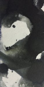
Not as clearly defined as the original work, but I believe with photoshop something would be able to come out
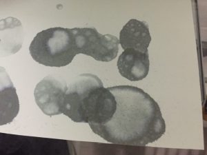
In photoshop I gathered the most prominent marks and inverted the colours to make the prints more obvious. This emotion is perplexed.
Don’t know how those pros manage to do it so beautifully, maybe you should give it a try 🙂
Fail 2: Almost burned down my house
I wanted to try to burn paper to see what kind of effect it will give. So I borrowed by dad’s lighter, went into my room (you can see where it is going) and started to light up newsprint paper.
Newsprint is super flammable due to its thinness, so the entire thing caught on fire almost immediately. I had to quickly dump water on it before the situation got worse. I got wiser and chose watercolour paper which is definitely thicker, thus I have more control.
Emotion – fear
Layered the edges of the paper and inverted the colours to give it a more eerie and dramatic feel.
Fail 3: Dying gone wrong
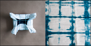
Found this method called the shibori method, a Japanese style of dying fabric:
www.designsponge.com So pretty and looks easy
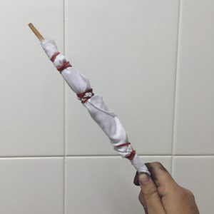
Looked simple enough, so I decided to give it a go.
One of my fabric
End result??
Again, this was a mystery because I could not identify the main problem. Was it the ink? The cloth? The timing? But after a few tries and letting it sit out for a few days, sadly nothing significant appeared.
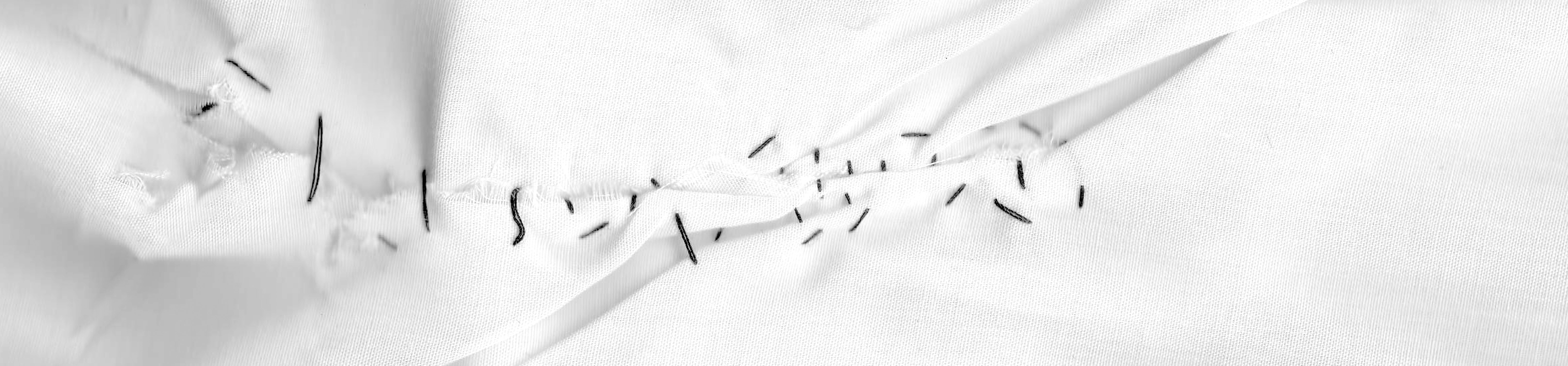
Since I wanted to do something with cloth, especially since it can make interesting textures, I decided to go for something else. Simple stitching.
This represents hurt
Wanted to keep it simple and not too extravagant. Also wanted the stitching to be uglier to emphasise on the valleys of emotions one goes through when they are hurt.
Thats all! There are many times where I had to redo and learn from my mistakes from the many techniques I tried, but this is part of the fun for this project as well.
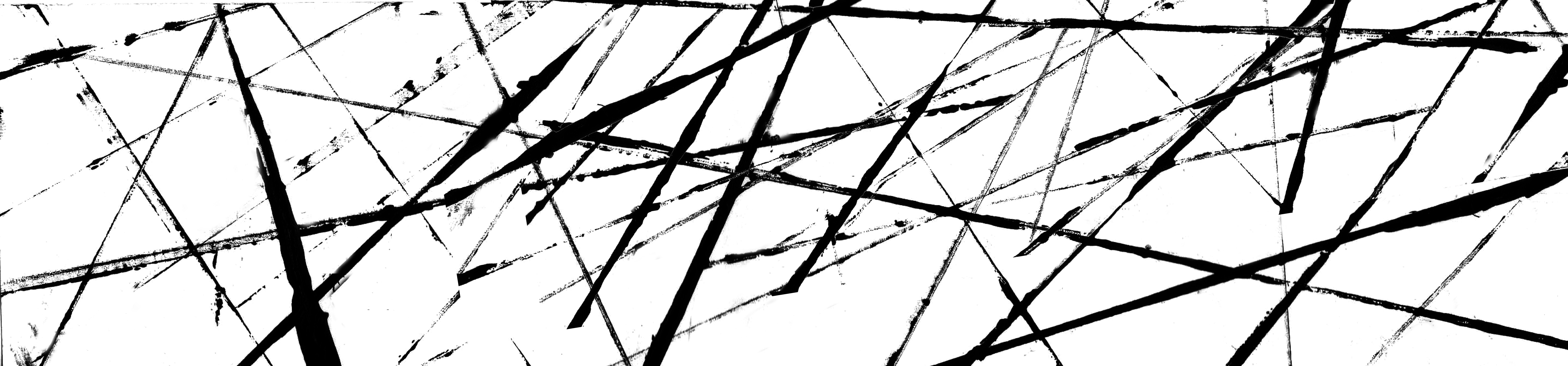
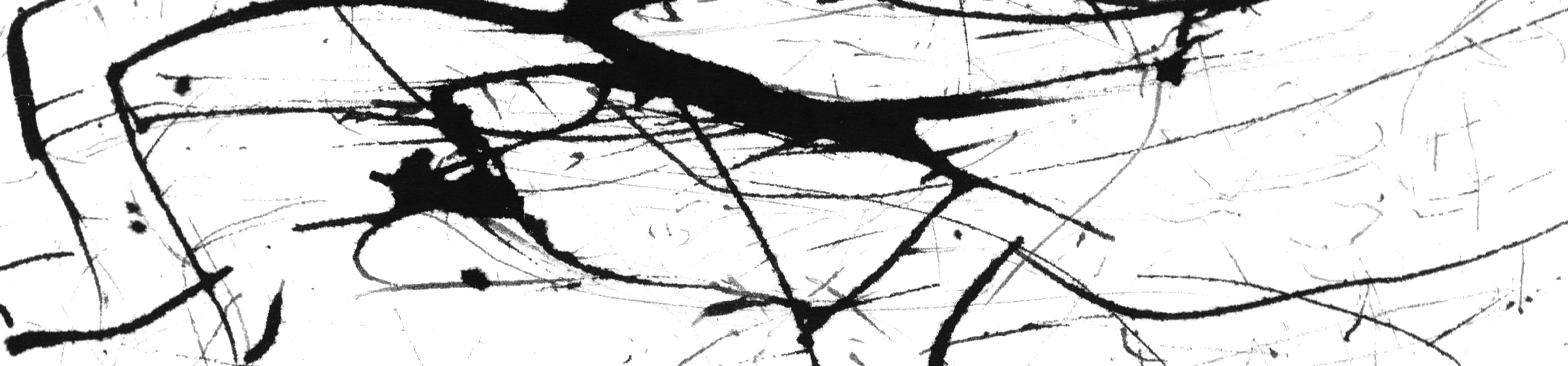
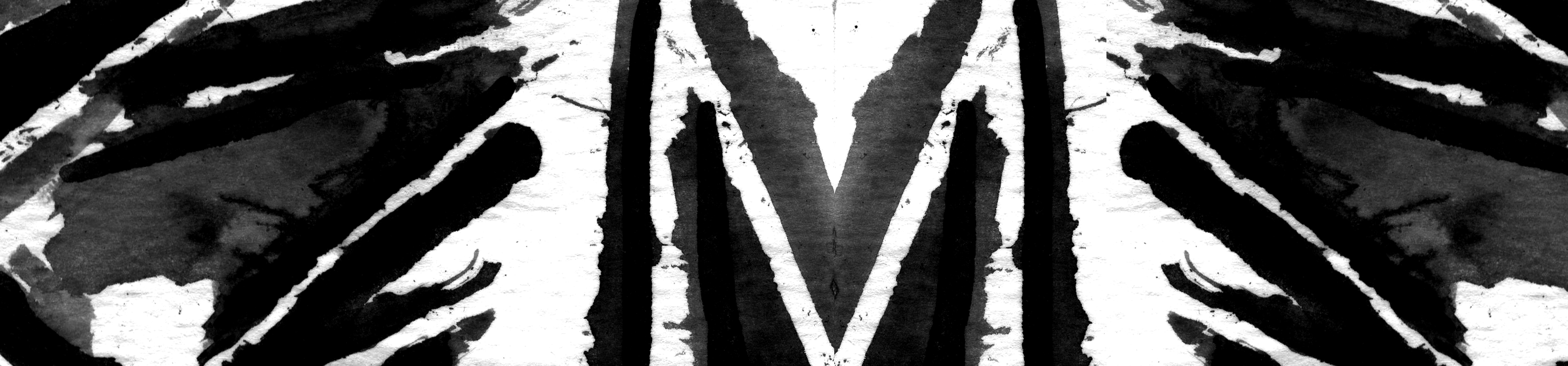
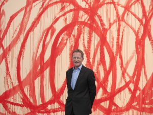
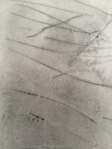
Focusing on abstract work, I really like CY Twombly’s ‘scribbled’ art.
CY Twombly with one of his most famous art pieces
Love this
I wanted to do a line for love, mainly passion. When I think about a crazy, sort of passionate form of love, I envision two lovers being hopelessly together in their own messy world. CY Twombly’s style of ‘scribbles’ really resonates with what I envision the line to be, so I dove right in to try it out.
Tying two pens together with a fishing line (with the two pens signifying a pair of lovers), I let my emotions flow and thought of an image of messy love. Here is a video of me trying it out:
Emotion – Passion. I layered the same image below it to emphasize on the love between two people.
He is the few artists that I got my inspiration from. My other pieces are techniques that I found online 🙂
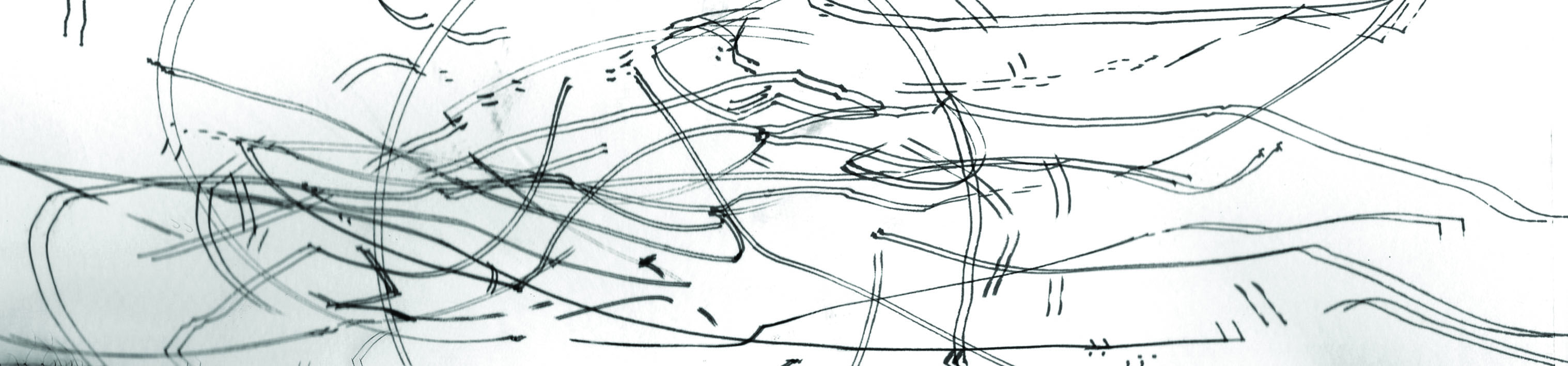
The internet allows us to learn so much. After spending much time surfing on and google, I came across some techniques that could potentially help me for my lines.
PVC glue and tissue paper
The results
Played with only black acrylic paint
Ruler and ink
Watercolour and bubble wrap
Watercolour and slicing the paper with pen knife
Watercolour and cling wrap
Water colour and salt, a chemical reaction!
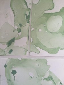
Marbling with nail polish! (used green because can photoshop the colour, did not want to spend more $$)
To kickstart our project, we were told to try out monoprints. Monoprinting is pressing an inked plate onto a variety of inks, tools, and items to create different types of prints. The beauty of monoprint is that one can achieve a huge variety of prints by experimenting with different methods, and that no print will ever look similar.
Here is a video example of how monoprints are done!
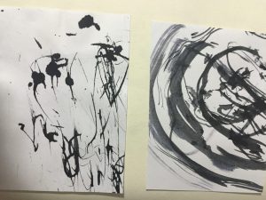
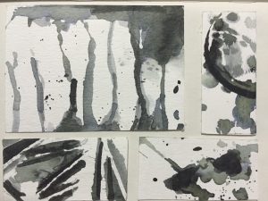
These are a few samples of my work:
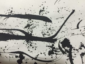
Digital version of one of my monoprint
Masking tape
Clingwrap
Masking tape
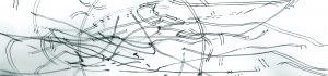
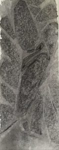
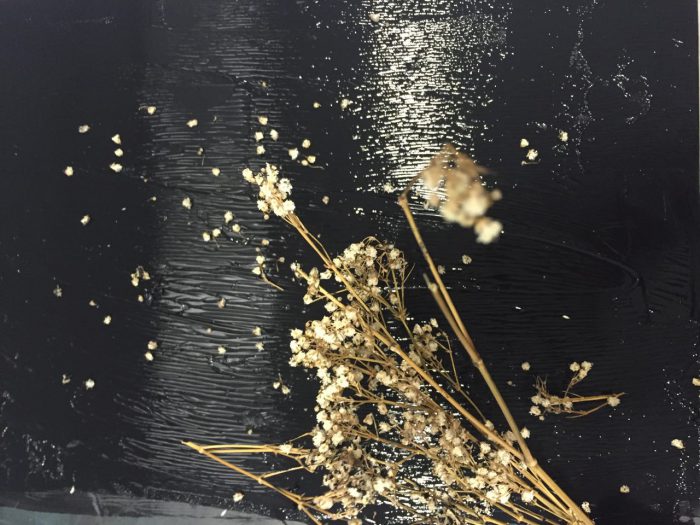
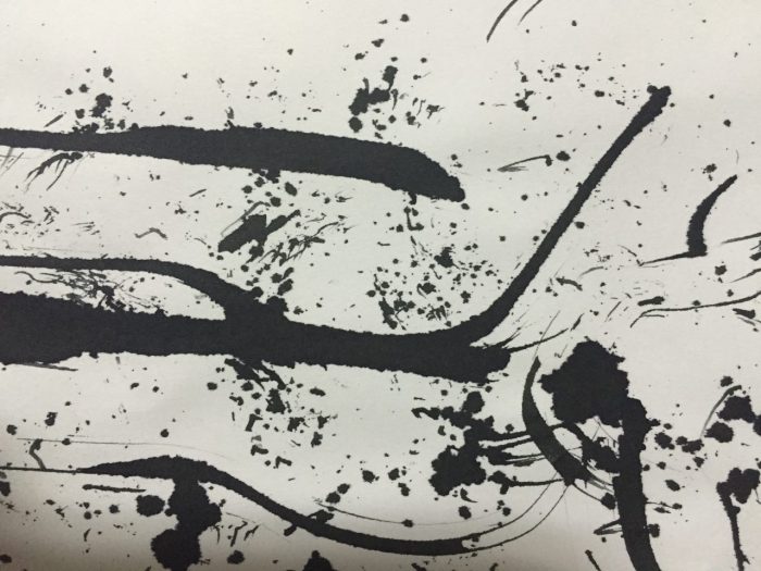
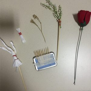
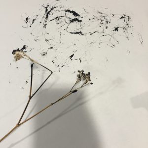
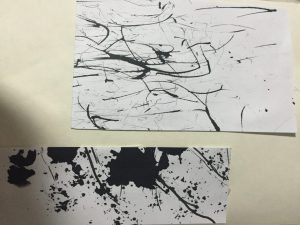
Largest paper – Fishing line Black piece of paper – Scratching with penknife Paper at bottom right – Baby’s breath flowers
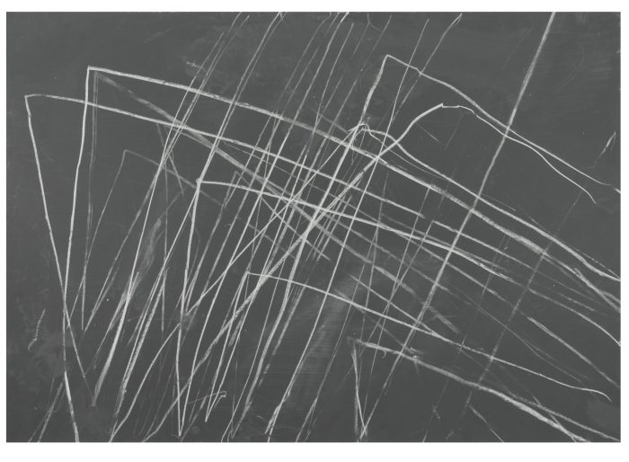
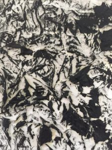
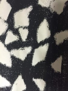
I realised that the black piece of paper looks very similar to CY Twombly’s artpiece