Here are my completed files! Somehow, the colours here are much different compared to how it looks like in the original files.
Let me explain you to more details of my work and my thinking behind it!
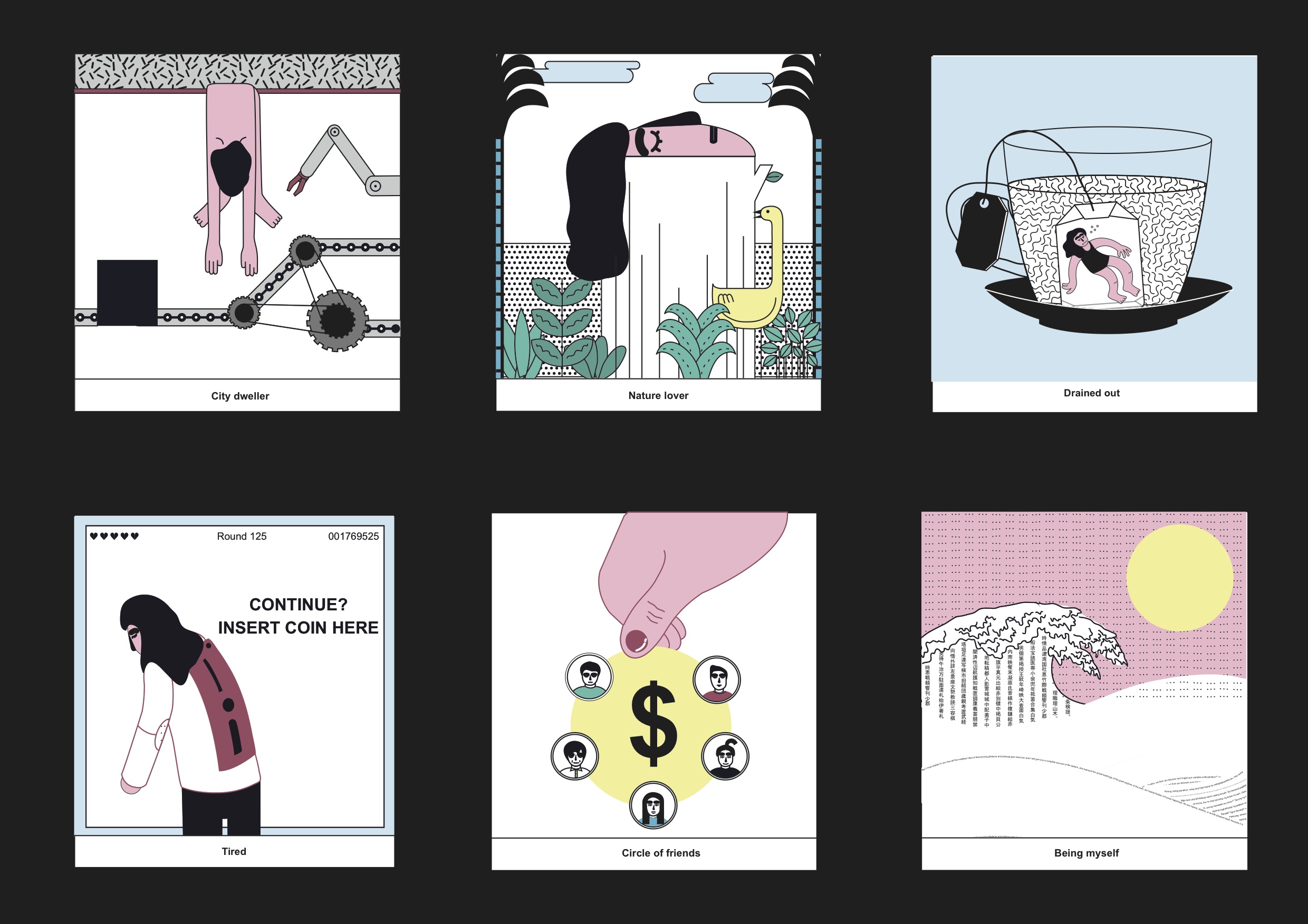
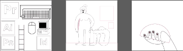
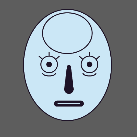
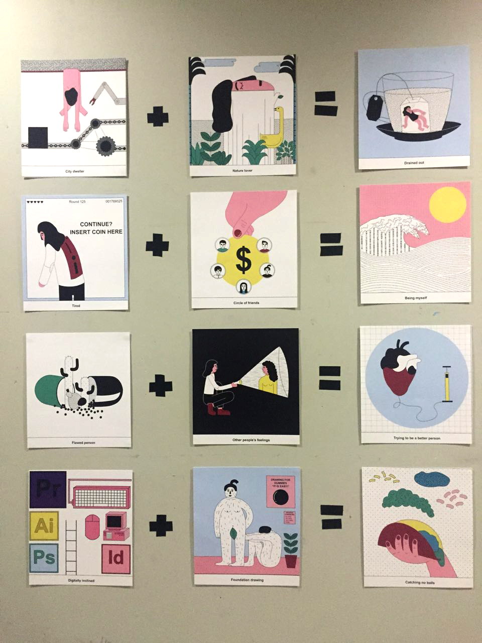
First row:
City dweller + nature lover = drained out
For the city dweller, I wanted to show how I feel like a machine in the city. That is me being “wrung dry” and hung like another piece of asset in the society. For nature lover, I placed my head on top of a tree bark of represent how I feel that we are all born out of earth, and I just feel so at home there. This results in me being drained out, and like tea, me losing my flavour in the hot water.
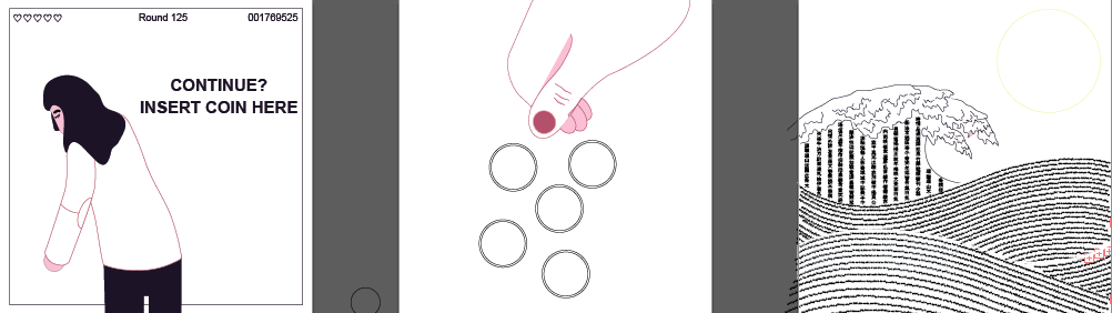
Second row:
Tired + Circle of friends = Being myself
My personal favourite! Me being tired and need something to function. Added the lives and points as another touch, as I feel sometimes in life it is like a game. A game to get the highest points possible. Next is my friends, which I placed in a circle to represent coins (geddit? circle of friends haha). And lastly. the famous wave. But I added a twist, which is to insert words representing my story and life into the waves. Also showing that when I am with my friends I can really be myself and talk a lot!
Initially, I wanted to put real personal stories into the waves. But I tried and realised that the font size is too small to read anyway, and it does not look very appealing to have a larger font size.
Are you still with me? We have two more rows left!
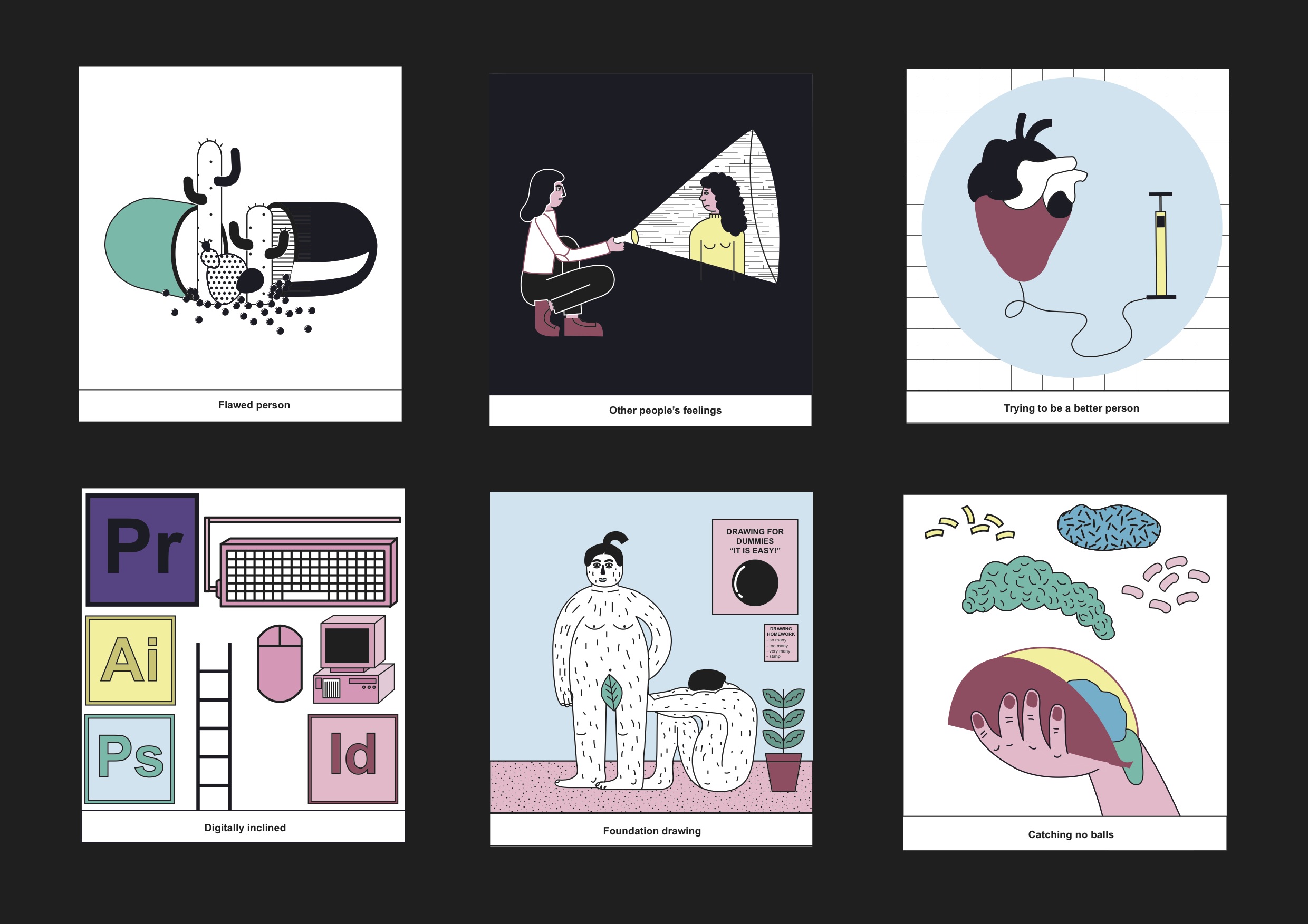
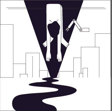
Row three:
Flawed person + Other people’s feelings = trying to be a better person
I feel that this row is more self explanatory. Does not have as much double meaning other than the heart and the air pump, which represents me trying to make my heart bigger!
Row 4:
Digitally inclined + Foundation drawing = Catching no balls
Me climbing up the ladder to the digital world where I belong, and the nude models in foundation drawing class (read the posters at the back btw) = to me catching no balls. But I decided to go crazy a little and I used tacos instead! I was inspired my the catching sandwich games that I used to play when I was a kid, and always fail to win the game haha
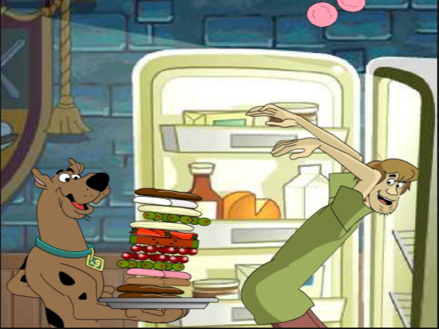
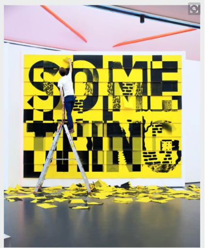
Kind of something like this!
Pixelated but you are able to see the colour and how I added the textures in the end!
Here are how my boards look like beforehand too!
Some of the works which I explored and dumped:
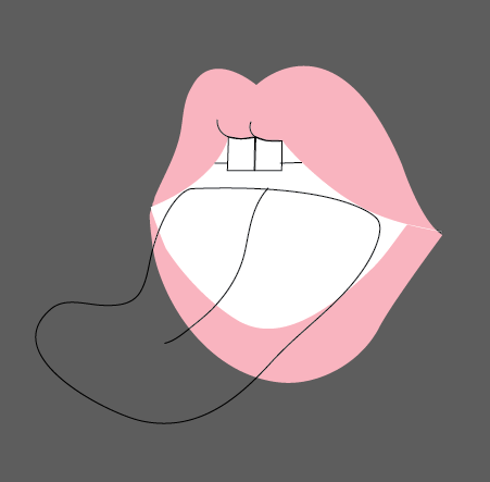
Wanted to put cactuses on my tongue than in the pill but changed my idea hehe
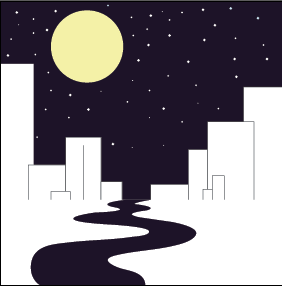
Wanted to use this for the “City dweller” board
The first sketch of my self portrait, which I did not quite like
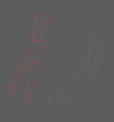
Sketch of people
Playing around with the city dweller frame again before I settled with the factory idea
Improvements:
I guess one I thing that I can take away from this project is to explore more methods. I am quite the digital person, so doing physical work is something that is quite foreign to me.
Here are some things I found online that I could have did:


These are all just the tip of the iceberg, perhaps I can play with lights and different materials as well. Especially since this is ADM and my last few chances to really explore, I am motivated to do and try out new things for my upcoming projects for the next semester!
Still happy with what I produced and looking forward to more improvements!
Onto the holidays!


