There are 5 posts filed in AY1617 S2 FDN2DII G4 (this is page 1 of 1).


Learning points:
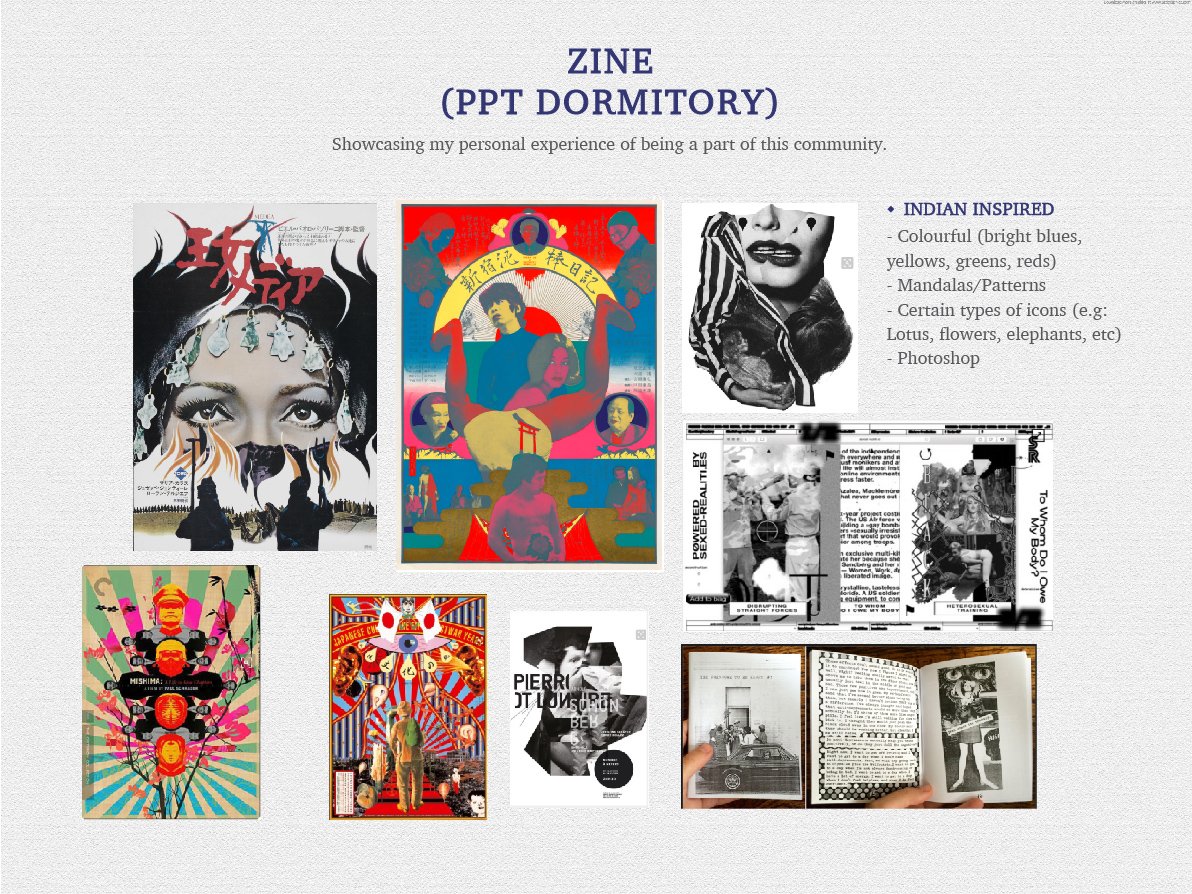
– This was a different illustration style for me, and it was enjoyable executing it.
– This zine project emphasises on the hierarchy of the elements in the page, which is a skill that I learnt and one that needs to be further honed in future.
– It has taught me to be much more creative in my layout design instead of just depending on online resources. I realised that a combination of references, inspiration, and my own ideas helped to create something that is more original
– On top of my point above, research is also key for design. This is why site visits and a study of our topic is crucial for our project
– Looking at other people’s zine made me realise that design can be further ventured from digital techniques only. Instead, many did theirs in so many different methods outside of the screen which makes design so colourful with variety
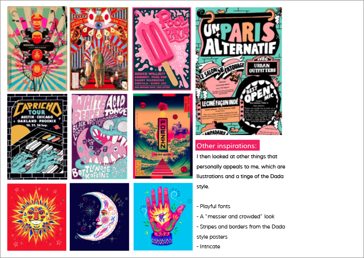
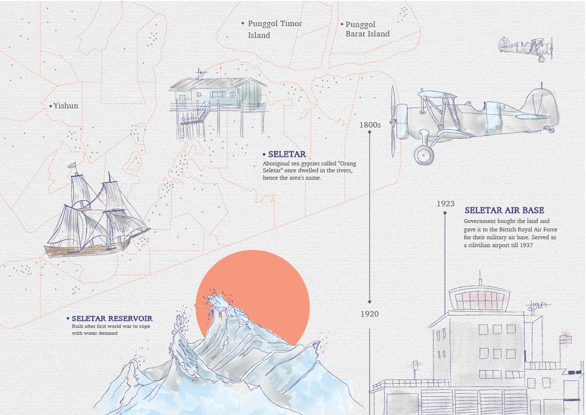
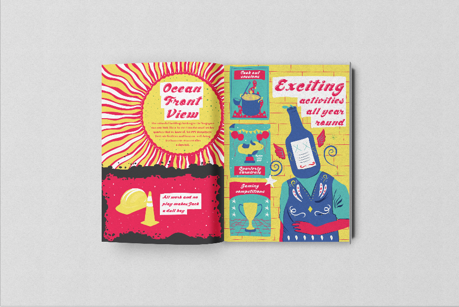
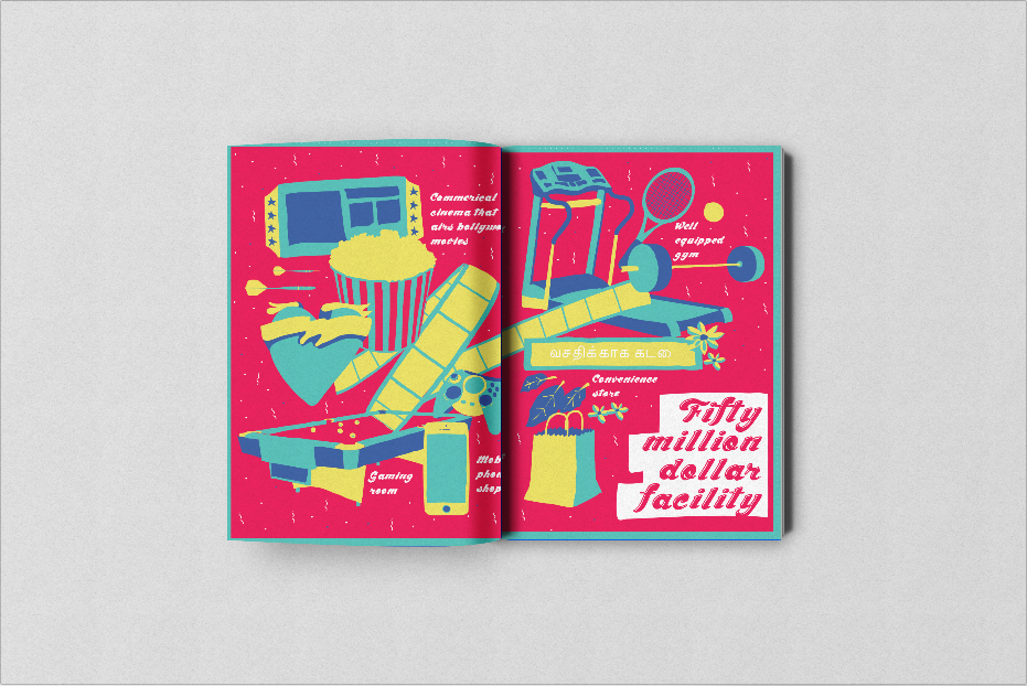
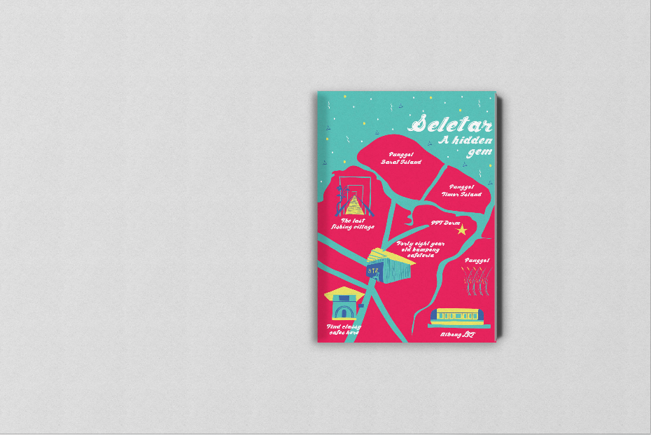
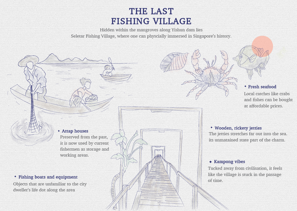
For project 2, we are tasked to firstly create an infographic on a location we were randomly allocated to. So, what is an infographic? According to Canva.com, it is creating graphic visual representations of information, data or knowledge intended to present information quickly and clearly.
Here are my slides!


To end this post and project, here are my completed typos!
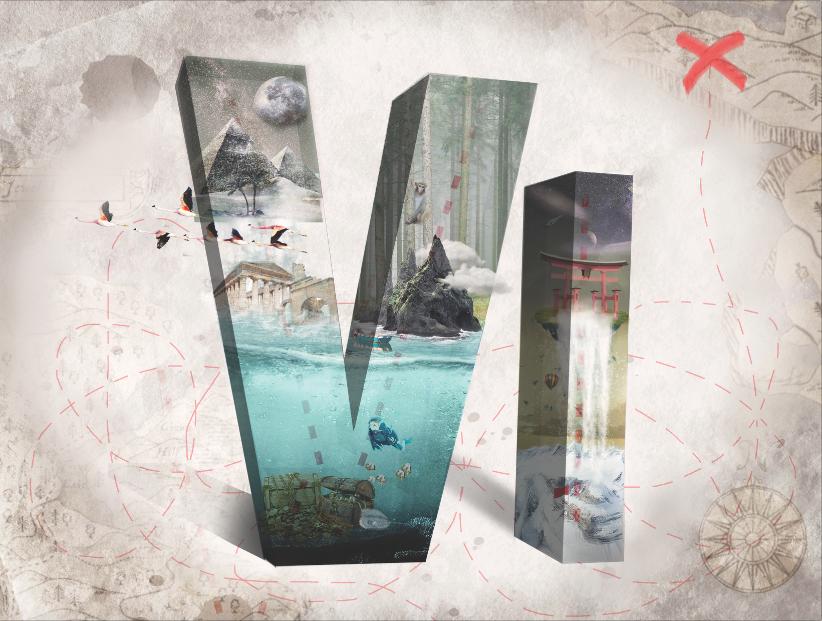
My name is Viena and I want to be a Treasure Hunter
Shirley kindly helped me improved the overall type by added a vignette to focus on the fonts more. Also, the recommended shadings and shadows to heighten the 3D effect. Moving up the cross to the 1/3 creates a more balanced composition (initially, I really did not know where to place it). This is my favourite design out of the 4 and one of the best works I have done so far!!
The dotted lines in the inside of the letters also bring out the theme of “treasure hunter”, which I intentionally did as I was afraid that the jobscope cannot be brought out enough with the different landscapes.
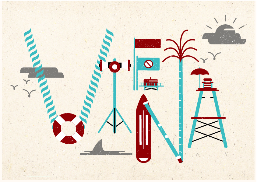
My name is Viena and I want to be a Lifeguard
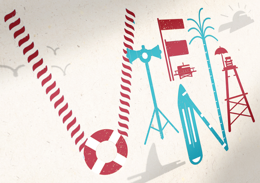
My name is Viena and I want to be a Lifeguard
I chose to present with the first image, incorporating some of the changes Shirley recommended like changing the shading of the other elements to a grey colour. However, I chose to stick with having two colours for each letter, highlighting the distinctive elements with the red colour. Also, the colour play enables to bring out a sense of “fun” to replace the suggested play of perspective.

My name is Viena and I want to be a Fisherman
Cutesy and fun due to the elements that are around the fishes!
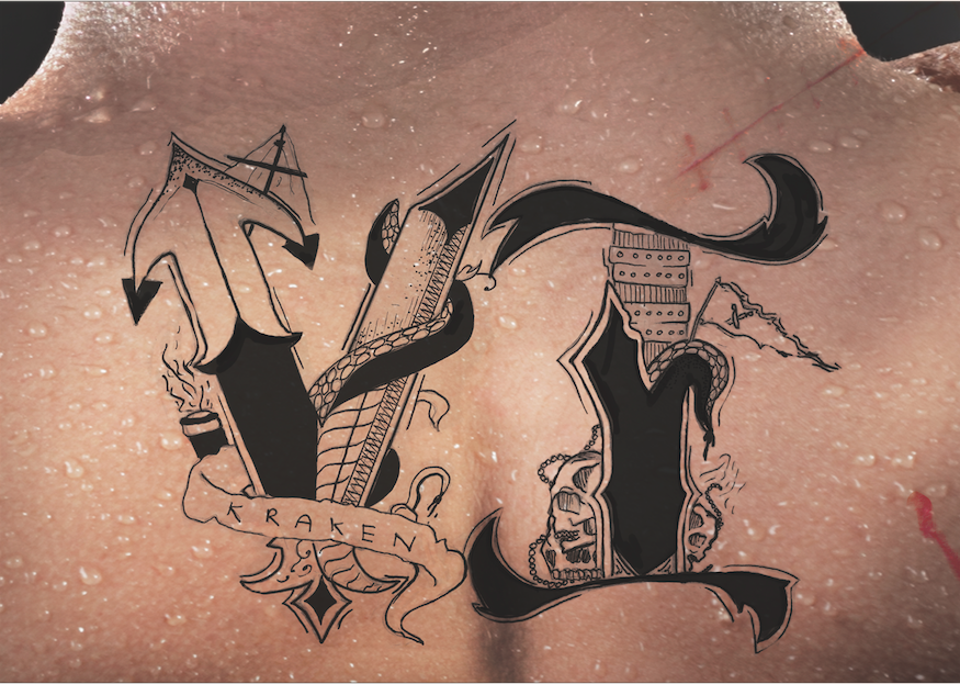
My name is Viena and I want to be a Pirate.
Love it as well! Though somehow I feel that scanning the type in emphasises on the “flaws” of the type more than taking a photo of it. I like the scars, blood and sweat which is subtle but brings out the job scope more!
In conclusion,
I really enjoyed this project and creating these fonts! I learnt many things through this project, like using 3D in photoshop, my first time doing a hand drawn work, and basically exploring so many functions and methods to communicate to my viewers. Hope to continue to improve to be a better designer in time to come!

For the first project of 2D, we are tasked to create a typography out of our dream jobs!
What is typography?
Typography is the visual component of the written word. It is able to evoke different feelings through its appearance. Good typography sets the tone of your written message and helps to reinforce its meaning and context. Good typography can also help your reader devote less attention to the mechanics of reading and more attention to the message!

How can different fonts evoke different emotions
These are a few things we as designers can take note in order to create a visual hierarchy for our reader:
– Size and weight
– Colour
– Positioning
– Typeface
Typography is also very technical, in terms of many terms like kerning, baseline, serif non serif and etc. The good thing about this project is that our lecturer Shirley emphasised we do not need to make it logical. So we can let our imagination run wild and play around with many different looks!
My first thought process:
Breaking down the entire brief and after reading typography articles online, basically the ultimate goal is that:
– Reader can legibility read the font
– Able to identify occupation
– A E S T H E T I C S
– Able to convey the feelings and emotions related to the job scope (this one is next level!)
Points above are listed out in accordance of importance to me. Overall, there is a need to find the balance between the art and function that is created. Throughout this project, it is key to ask the people around me for their feedback and their opinion towards my typo.
To start out the project, here are some of the jobs that I considered:


After consultation and thinking about which type I ca execute the most interestingly, I decided to settle on these four job scopes:
1. Pirate: People who attacks and robs ships at sea.
Perhaps inspired by the many series of Pirates by the Caribbean in my growing years, I have always imagined myself sailing the seas and living my life under Caption Jack Sparrow. I decided to go forth with the idea of doing a pirate tattoo, meaning that I had to hand draw it.
Key characteristics of a pirate: Hook, eye patch, destroyed ribbon, skulls, octopus tentacles, swords, anchor, pirate flag, pirate ship, ropes, fish scales, mermaids.
I kept in mind to make it look rugged and manly as well.

Some inspirations


2. Fisherman: A person who catches fish for a living or for sport
Growing up, my dad used to take us to Jurong lake to do some fishing and prawning. Meanwhile my mother came from a fishing (and rice planting) family.
Initially, I wanted to do physically DIY the font and take a photograph of it. However I changed my idea last minute. Here is what I had in mind initially!


I wanted to create a typography out of styrofoam and paste DIY fish scales and fins onto it. For the background, I wanted to place a fishnet and the background to have a blue colour.
3. Treasure Hunter
Again, perhaps inspired by movies while I was younger, I can imagine myself travelling across the world and across different terrains to look for the treasure. More than that, last year in Philippines there was a rumour about a treasure being hidden around the island going, and I saw a legit real map. Looks more beautiful and intricate than the maps we see on Google images, sadly I am forbidden to take a picture of it! Haha.
For this idea, I am going to create a 3D font and photoshop, emphasising the nature of the occupation itself – exploration and the lookout for a treasure.
Mostly inspired from this online tutorial which luckily I found! It helped me a lot because it is the first time I am using the 3D function and photoshopping many small elements together.
– Lifeguard
BAYWATCH. Red swimsuits, surfing, running slow motion in the beach. I am all up for it. Or in Singapore context working in Wild Wild Wet looking at patrons chilling at the lazy river.
The only series that I watch, Bondi beach rescue!
For this, I decided to go ahead with combining different elements of lifeguard equipment and illustrating them into vectors before piecing them together to form the alphabets.
For this, I had no need for as much inspirations as my other occupations because I already knew what I wanted. Perhaps it is because I am inspired by the many examples shown in class as well, which I did not manage to stumble across online.


That is all for this post!