There are 2 posts filed in Project 2 Gallery (this is page 1 of 1).
To end this post and project, here are my completed typos!
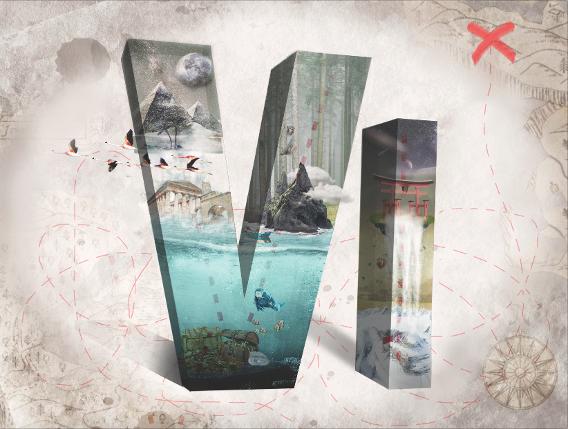
My name is Viena and I want to be a Treasure Hunter
Shirley kindly helped me improved the overall type by added a vignette to focus on the fonts more. Also, the recommended shadings and shadows to heighten the 3D effect. Moving up the cross to the 1/3 creates a more balanced composition (initially, I really did not know where to place it). This is my favourite design out of the 4 and one of the best works I have done so far!!
The dotted lines in the inside of the letters also bring out the theme of “treasure hunter”, which I intentionally did as I was afraid that the jobscope cannot be brought out enough with the different landscapes.
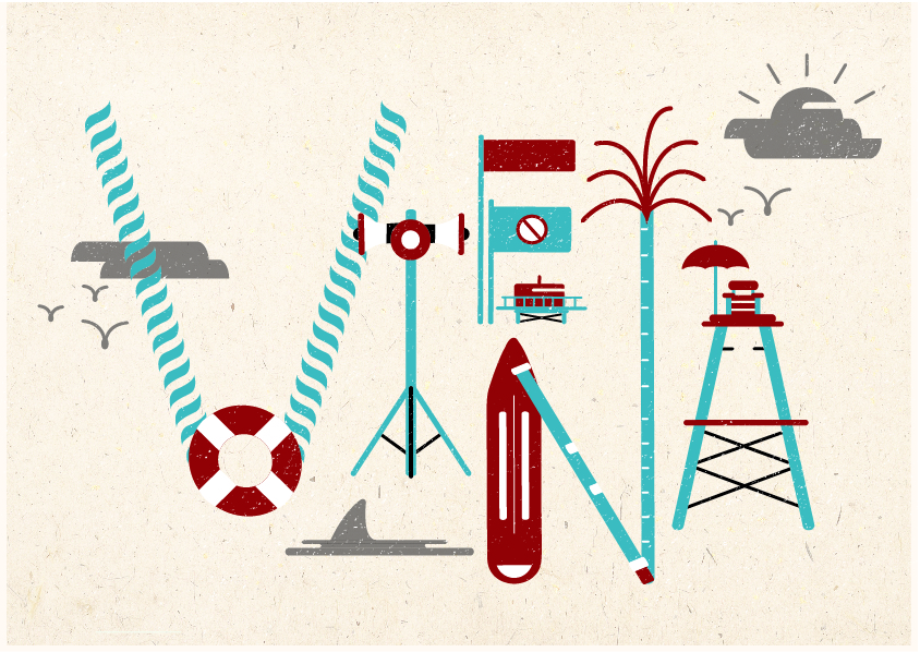
My name is Viena and I want to be a Lifeguard
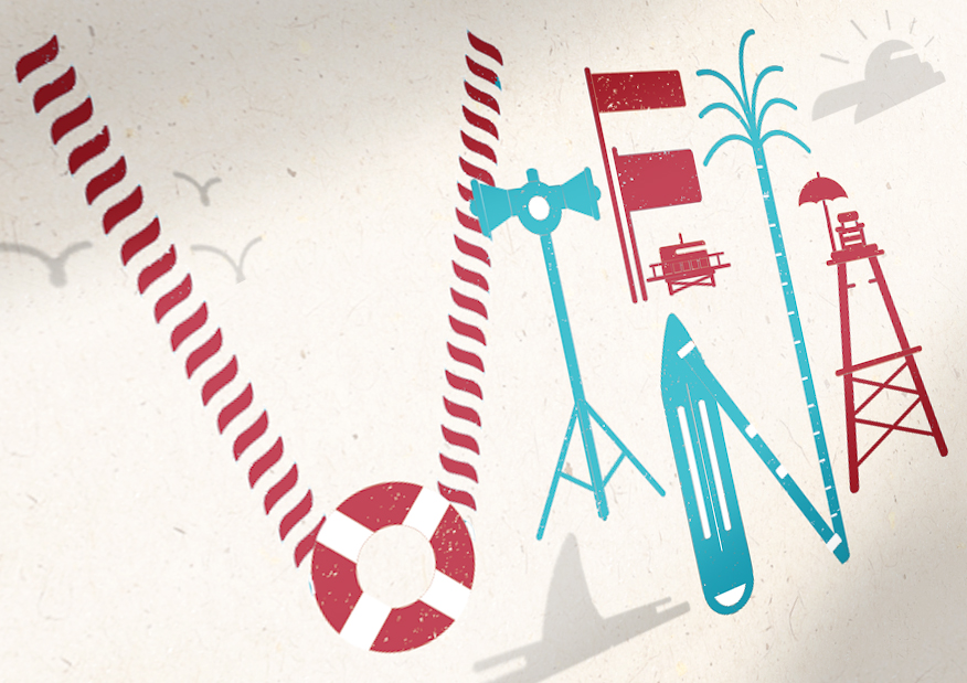
My name is Viena and I want to be a Lifeguard
I chose to present with the first image, incorporating some of the changes Shirley recommended like changing the shading of the other elements to a grey colour. However, I chose to stick with having two colours for each letter, highlighting the distinctive elements with the red colour. Also, the colour play enables to bring out a sense of “fun” to replace the suggested play of perspective.

My name is Viena and I want to be a Fisherman
Cutesy and fun due to the elements that are around the fishes!
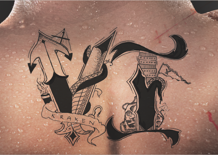
My name is Viena and I want to be a Pirate.
Love it as well! Though somehow I feel that scanning the type in emphasises on the “flaws” of the type more than taking a photo of it. I like the scars, blood and sweat which is subtle but brings out the job scope more!
In conclusion,
I really enjoyed this project and creating these fonts! I learnt many things through this project, like using 3D in photoshop, my first time doing a hand drawn work, and basically exploring so many functions and methods to communicate to my viewers. Hope to continue to improve to be a better designer in time to come!