
The pain of expectation of vs reality strikes closer to our hearts as visual artists.
Fail #1: Every detail is important
So I came across this very cool thing online, and it was done by Charlotte X.C Sullivan. It is called bubble printing.
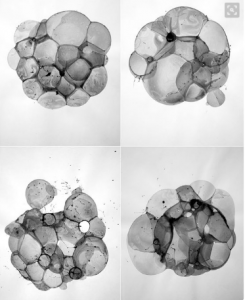
Work done by Charlotte X.C. Sullivan, it is beautiful
Being a #Gobigorgohome kind of gurl, I decided to give it a try.
Here is a video of me doing it:
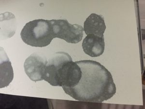
What happened? The end result of my first few tries.
And after many rounds of detergent, ink, and time, this was the end result…
I kept on thinking of where did it go wrong. The very next day, it hit me that it could be because I used watercolour paper, which did not allow the water to seep through the paper *facepalm*
So I changed the paper and yassss it finally worked!

Ink forming around the bubble, unlike with watercolour where the ink runs everywhere around the paper
Yes, I have marks!
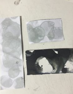
Not as clearly defined as the original work, but I believe with photoshop something would be able to come out

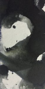
In photoshop I gathered the most prominent marks and inverted the colours to make the prints more obvious. This emotion is perplexed.
Don’t know how those pros manage to do it so beautifully, maybe you should give it a try 🙂
Fail 2: Almost burned down my house
I wanted to try to burn paper to see what kind of effect it will give. So I borrowed by dad’s lighter, went into my room (you can see where it is going) and started to light up newsprint paper.
Newsprint is super flammable due to its thinness, so the entire thing caught on fire almost immediately. I had to quickly dump water on it before the situation got worse. I got wiser and chose watercolour paper which is definitely thicker, thus I have more control.

Emotion – fear
Layered the edges of the paper and inverted the colours to give it a more eerie and dramatic feel.
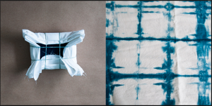
Fail 3: Dying gone wrong
Found this method called the shibori method, a Japanese style of dying fabric:

www.designsponge.com
So pretty and looks easy
Looked simple enough, so I decided to give it a go.
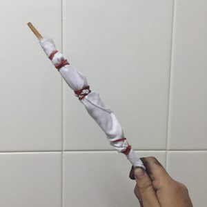
One of my fabric
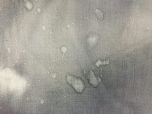
End result??
Again, this was a mystery because I could not identify the main problem. Was it the ink? The cloth? The timing? But after a few tries and letting it sit out for a few days, sadly nothing significant appeared.
Since I wanted to do something with cloth, especially since it can make interesting textures, I decided to go for something else. Simple stitching.

This represents hurt
Wanted to keep it simple and not too extravagant. Also wanted the stitching to be uglier to emphasise on the valleys of emotions one goes through when they are hurt.
Thats all! There are many times where I had to redo and learn from my mistakes from the many techniques I tried, but this is part of the fun for this project as well.
Oh my gosh – these are great..so useful for next year freshman..and for my Final Year students hahah
thank you for resources