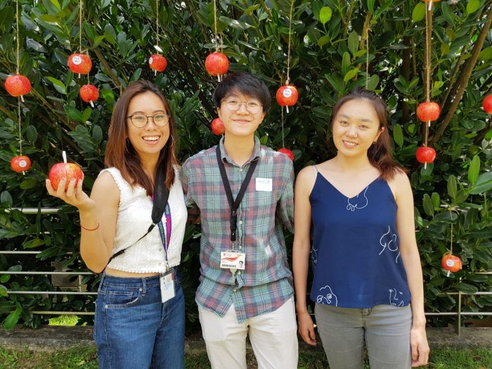
For our experience 2, Bridgel, Mavis and I talked about our concept over here!
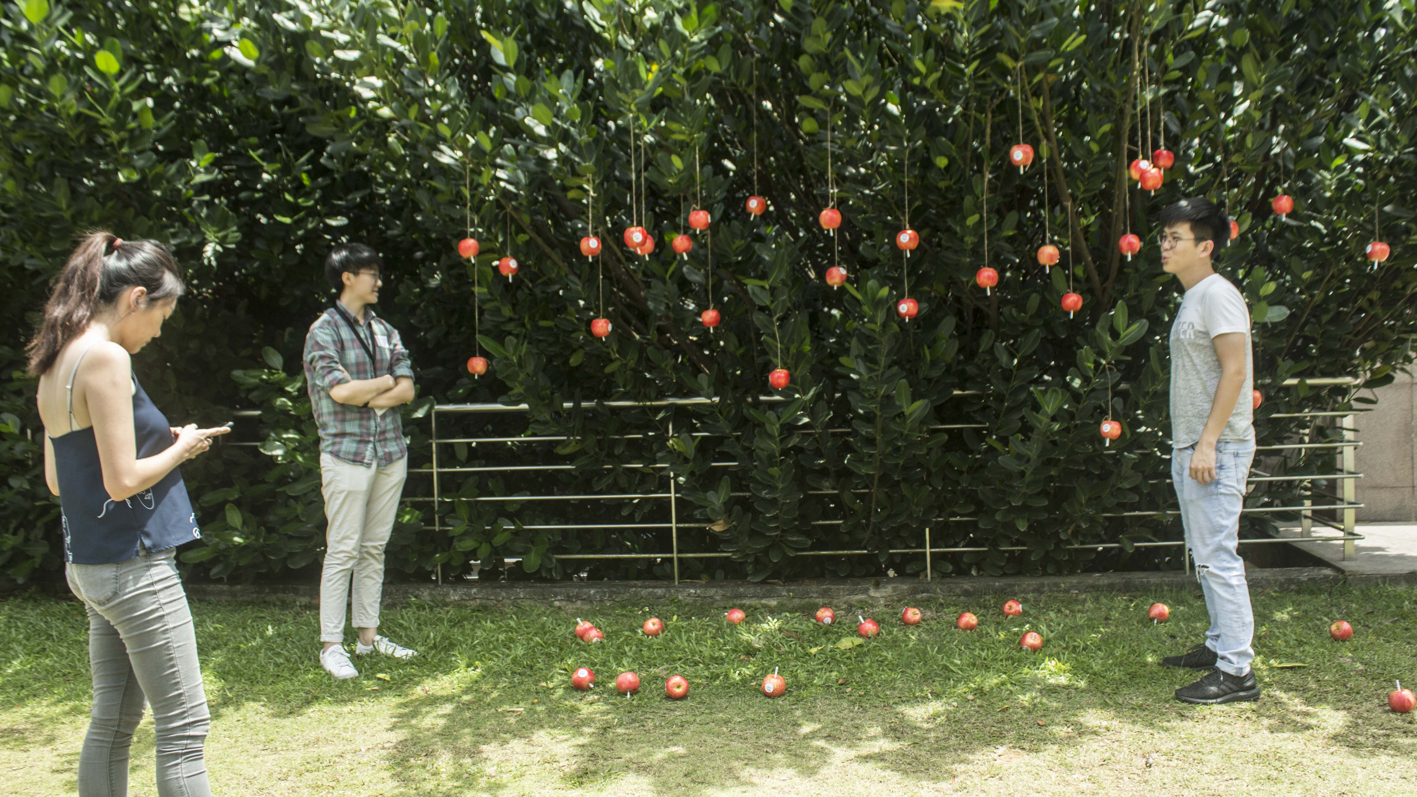
We did it over the week and the video below is our documentation

For our experience 2, Bridgel, Mavis and I talked about our concept over here!
We did it over the week and the video below is our documentation

Compared to the previous readings where we learnt about thoughtful interaction or Social practice art, Minimalism, a movement that kickstarted in the late 1950s is an extension from the abstract idea that art should have its own reality and not be an imitation of some other thing. Tate states that we tend to think of art as representing an aspect of the real world (a landscape, flower, person, etc), or even to reflect an experience such as an emotion or feeling. However according to Frank Stella in the context of minimalism, ‘What you see is what you see’.
With minimalism, no attempt is made to represent an outside reality, the artist wants the viewer to respond only to what is in front of them. The medium, (or material) from which it is made, and the form of the work, is the reality.
- Tate
One aspect which I enjoyed from the exhibition is the inclusion of artists/artworks that utilises the many interesting mediums that can be used in this movement.

An example of such artworks that enjoyed was Milkstone (1980) by Wolfgang Laib
But the artwork that really appeals to me is Blank Paper by Liu Jianhua.

‘Blank Paper’ by Liu Jianhua at Tate
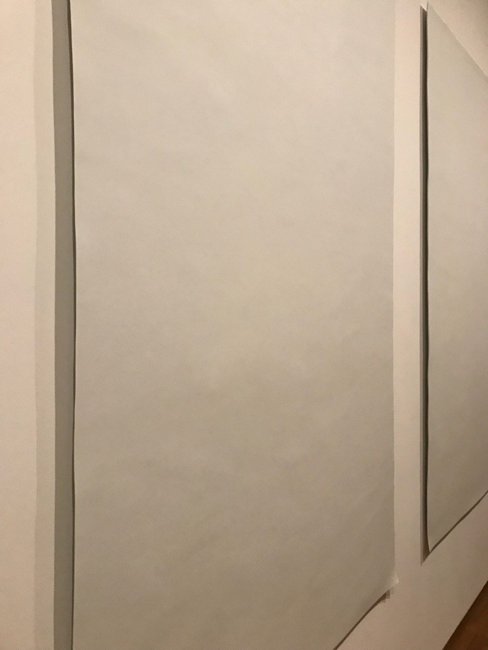
‘Blank Paper’ by Liu Jianhua at National Gallery – the folds at the tip of the “paper” is made intentional. To me, it shows a more paper-like and fragile quality of the work itself.
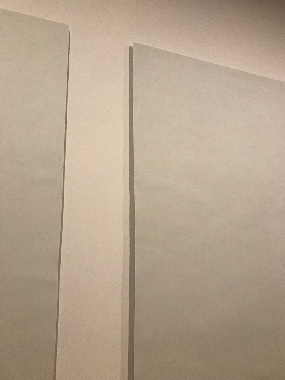
‘Blank Paper’ by Liu Jianhua at National Gallery. One is also able to see the thinness of the porcelain up close
Exhibited at the National Gallery, Liu Jiahua’s ‘Blank Paper’ consists of 3 large porcelain sheets that is thinly crafted to resemble blank pieces of paper, similar to the title of the art piece.
Where do their ideas come from?
Jianhua first learned his craft at the age of 14. He learnt traditional ceramics by his uncle, a ceramicist, in the city, Jingdezhen, the centre of China’s porcelain industry. He then went to the Jingdezhen Ceramic Arts Institute, studying fine art and learning contemporary art styles.
Most of his works involves the usage of porcelain, ceramics, gold, and fiberglass.
I have also read up about galleries explaining that his work has often been interpreted as a comment on China’s rapid economic development and industrialisation and its role in the globalised economy, which to me, is along the same theme that Ai Weiwei explores.
Hence, it can be suggested that his ideas mainly comes from his upbringing and culture. Based on his main choice of materials such as ceramics.
What was their process and methodology for creating their works?
Silke Schmickl, the curator of the gallery roughly explained on the curation and the process of displaying this piece. She said that Jianhua himself created the sheets by rolling it out into thin pieces. I believe that he needed time to experiment with it, as it is quite difficult to find the correct combination of water, clay, heat and etc. Just like baking.
She also explained the difficulty of putting up the artwork due to its fragility. Something along the lines of having to put it onto something, akin to a platform(?) and placing screws onto it so it does not directly stick onto the piece. On other pieces of work, she also explained the steps they took to care and display it. Making the museum come to life, and it is something I appreciate from the experience very much!
Which artworks do you think work well and why?
I believe that this piece, and his artworks in general is inline with the minimalism theme. The following quote by Heini Lehtinen explains how this piece falls into the minimalism category:
“In his work (Liu Jianhua), the Shanghai-based artist places strong emphasis on form and material to the point of standing away from prevailing tendencies in contemporary art, such as social commentary and narrative approaches. With a “no meaning, no content” approach to art, Liu focuses on form and methods of industrial production in making artwork, in which he transforms paper, leaves, bones and ink drops into fragile and at times surreal porcelain sculptures.”
Personally, I this piece appeals to me mainly because of the juxtaposition and play of the material itself, porcelain. I think it is a very smart way to reinvent the usage/concept of materials that we are taught to presume in our society. The blank canvas also makes me think about what I would actually write on this “paper” (probably something very important), as it is extremely fragile and “expensive” due to the craftsmanship that involves into making it. Personally, it is a reminder to be more careful of the words we convey to people.
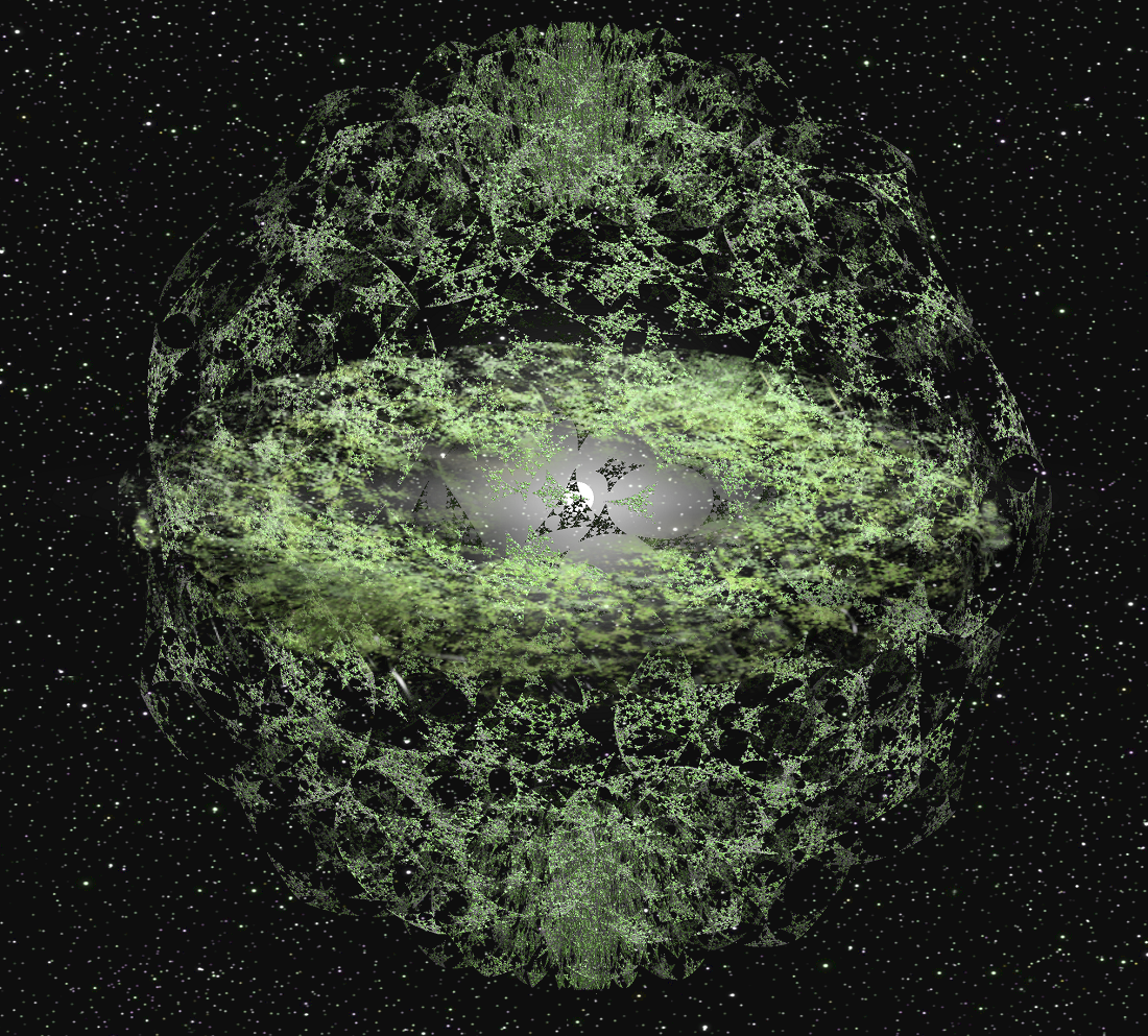
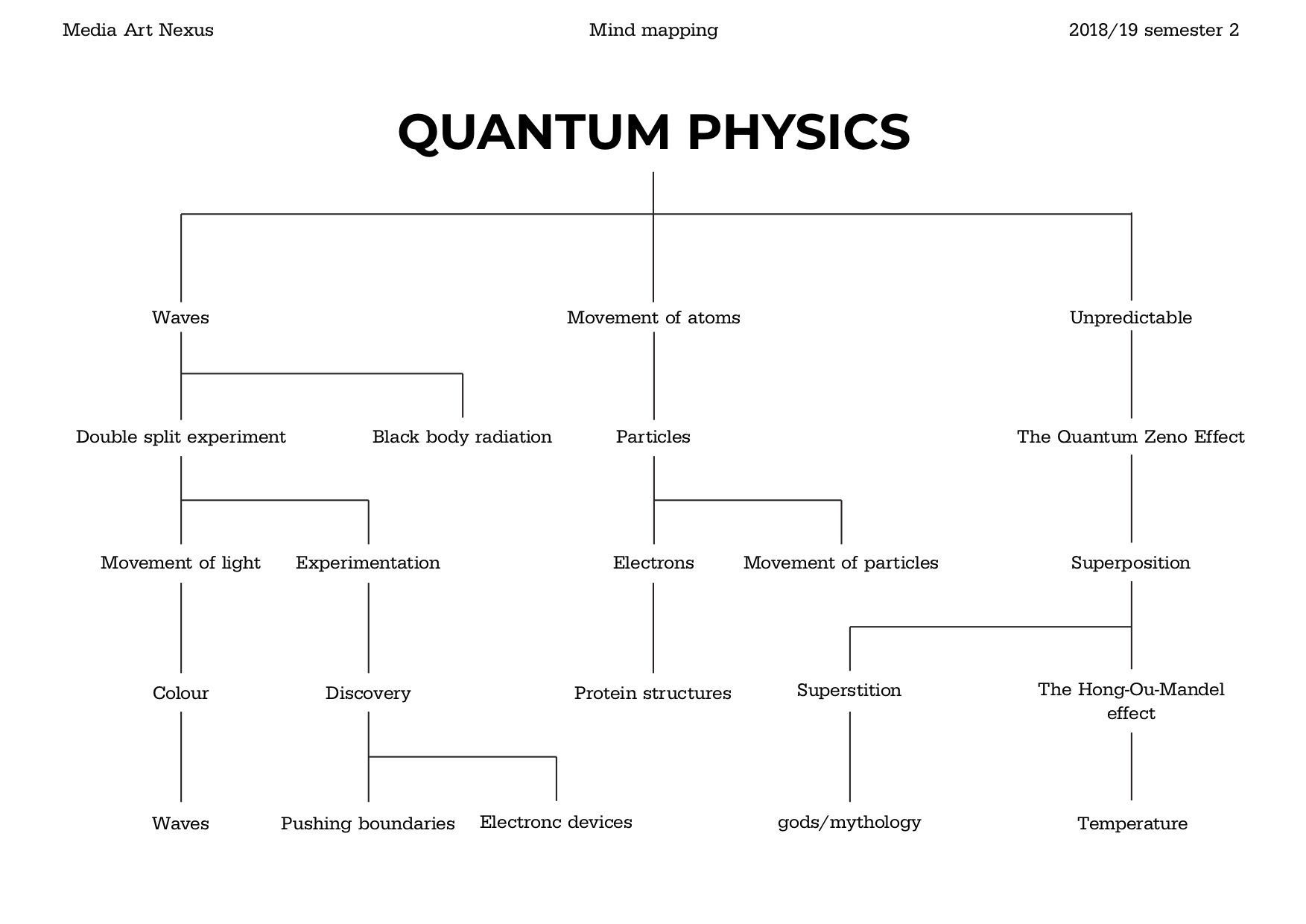
After presenting my previous idea in class and receiving some feedback, I decided to improve on my video concept by adding more focus onto quantum theories instead. The research done then yielded a few concepts really spoke to me, and had potential to be developed into an interesting storyline:
Double slit theory: A demonstration that light and matter can display characteristics of both classically defined waves and particles; moreover, physicists have found that even passive observation of the double slit experiment (by changing the test apparatus and passively ‘ruling out’ all but one possibility), can actually change the measured result. This is called Observer effect.
Simulation hypothesis: Hence, some interpreters have taken these theories to the macro level to say that there are a set of probabilities where there are alternate realities. Another speculation scientists had is one in which we exist both in the present and in the future. At the quantum level, reality does not exist if you are not looking at it. Things do not really exist as we tend to imagine them to exist; they only seem to appear to exist—and they appear to exist only in the presence of an observer. Which brings us to the Simulation hypothesis, which proposes that all of reality, including the Earth and the universe, is in fact an artificial simulation, most likely a computer simulation created by a super computer (e.g: Matrioshka brain)
A matrioshka brain is a hypothetical megastructure proposed by Robert Bradbury, based on the Dyson sphere, of immense computational capacity. It is an example of a Class B stellar engine, employing the entire energy output of a star to drive computer systems.
Therefore, from these two theories it is possible to expand the narrative to a character into an alternative realm.
New concept: The narrative revolves around an apprehensive girl who ran away from home. Throughout her journey, beautiful sights and mysteries greet the young girl. However, her adventure is not a smooth one. Suspicions of the world and dreams of home follow her every step. She eventually finds herself at the edge of the world where the rules of her reality no longer apply. Perhaps her reality is not what it seems. Draws inspiration from the Double Slit theory were it shows that there are possibilities for alternatives in our reality. Hence, the narrative is also based on the Simulation Hypothesis where the protagonist discovers that everything in her life is just a virtual simulation.
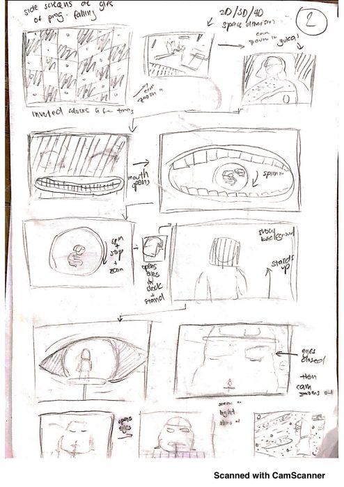
From here, I decided to do more research into executing the final video. Yukai is an artist whom I really admire. She does great animations and illustrations, hence I dug around the internet hoping that she did some tutorials where she explains the process she takes to execute the final product. Thankfully, there actually is!
Hence, I decided take her advice and started to work on a very rough storyboard first. The main focus on this storyboard was to plan out the movements and characters itself, the main environment/visuals required, transitions which is really important to bring the video to the next level, and the visuals of narrative itself.
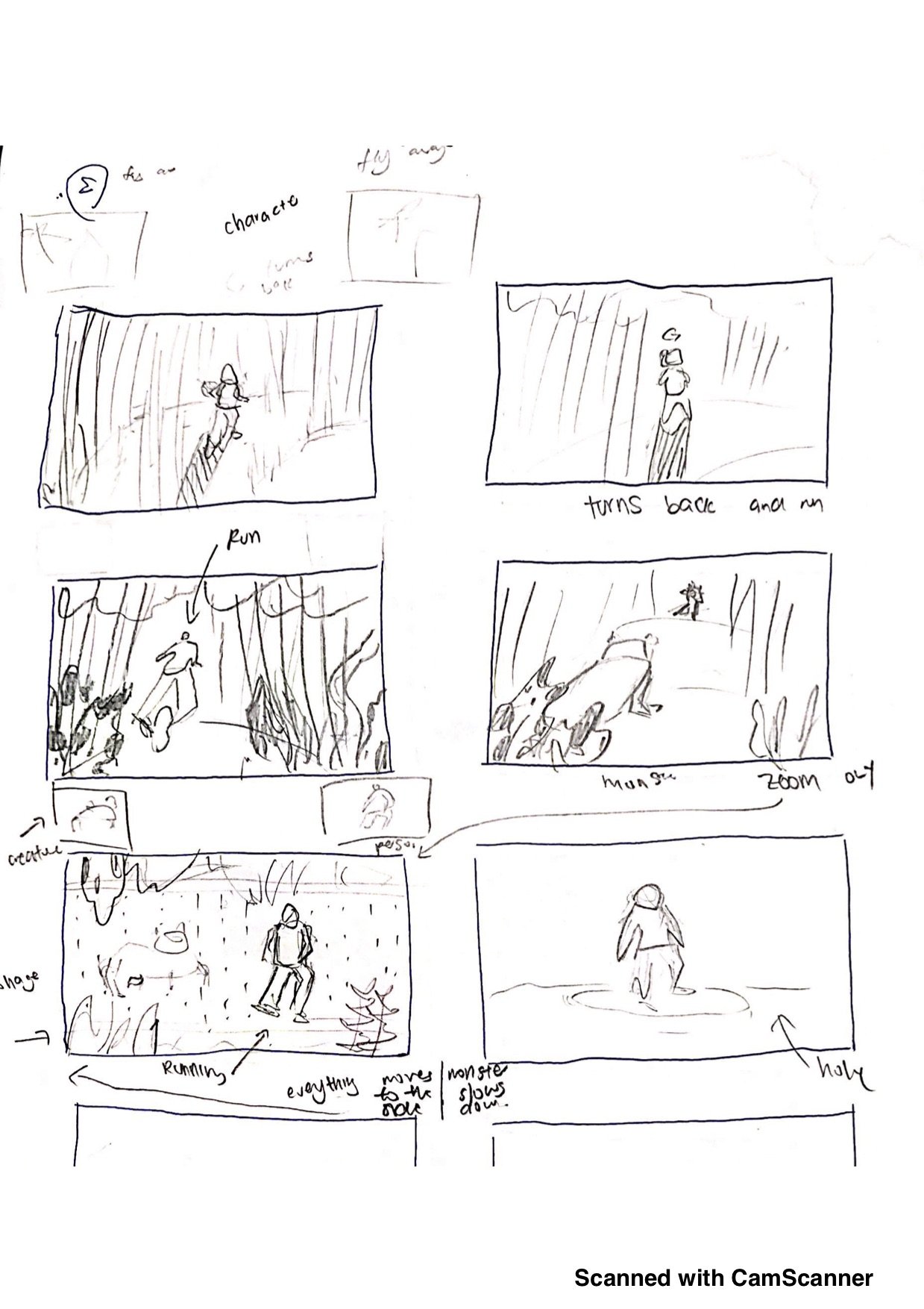


So here is the very first rough storyboard.
The next thing I plan to do is to bring everything digitally and do another more refined storyboard on illustrator. Following Yukai’s workflow, the next step is to actually colour the storyboard to ensure the colour scheme is balanced. From there, I would like to define the main characters of the video, which is:
This is the goal for next week and a half.
Afterwards I would start to draw the environments itself.

Thoughtful Interaction Design: A Design Perspective on Information Technology by Jonas Löwgren and Erik Stolterman was an eye opener for me, mainly because it is one of the few design related books/articles that I have actually read so far. Reminding me of the importance of doing so for there is still so much to learn in this field.
One of which is the intriguing aspect that the role of the designer is important. In fact, far more so than I had previously had recognised. Definitely, I was aware that designers have the ability to shape and influence the public with what we create. But this sentence from the opening paragraph elevates and aptly phrases my feelings towards our job scope:
“We live in an artificial world. It is a world made up of environments, systems, processes, and things that are imagined. formed, and produced by humans…Someone has to decide their function, form, and structure…”
Hence, personally the role of a designer is akin of a gatekeeper. For we have the ability to decide the hierarchy of information, the details that is to be highlighted/hidden, the organisation, structuring or categorisation of the final product and so on. Hence a point that I want to apply in my own working process in the future is to always ask myself what and how I want the user to experience from my works.
Because the book highlights that we do not just create for the sake of meeting a clients brief or to create something beautiful, but instead we ought to be thoughtful designers.
“Being thoughtful is abut caring for your own design ability, the designs you produce, and how the world will be changed by your design ideas and decisions. A thoughtful designer is someone who takes design as a serious and important task and who tries to become a designer with the ability to create something fascinating, authentic and useful digital artefacts”
What are we creating for? It is easy to create something interesting and beautiful on the surface. But personally it is always important to remember the message we want to impart to the viewers.
And what I like the most is the fact that it balances the idealistic role of the designer by underlining the fact that designers does face undesirable restrictions and limitations that might affect our final output. For example, having short deadlines or unreasonable requirements. But the authors aptly says that:
“Blaming poor designs on the preconditions ns the situation is not a way to avoid responsibility…Being successful in design means being able to handle the everyday practicalities, and to deal successfully (or at least adequately) with different technical and social contexts”
Which is basically saying, “Suck it up and keep grinding”.
To me, this book empowers my idea of what a good designer should be. And despite my reluctance to read this piece due to the number of words and pages, I am really glad to have embraced this reading and will definitely keep these information in mind for my future work.
One work that showcases the work of thoughtful design is the Estonian Forest Installation that is created from interior architecture students from the Estonian Academy of Art.
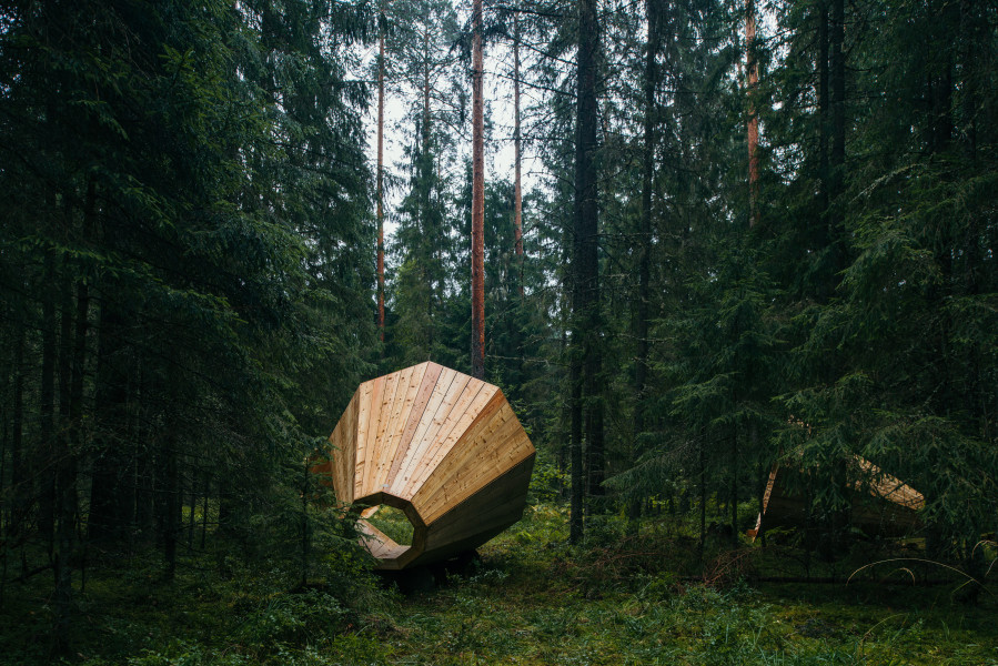
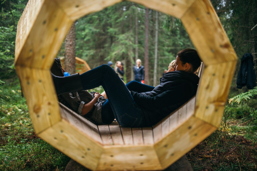
This piece enables users to relax in these megaphone structures that captures and amplifies all the beautiful foresty noise of its surroundings at Võrumaa, near the Latvian border.
Thoughtful design created and executed by students, meaning that we very well have the ability to do so too. It taps on the densely forested areas of Estonia and elevates the people’s experience of the forest. This is not only a spot which locals now enjoy, but one where foreigners flock to as well.
Hence for our very own projects, what are somethings within our environment we can tap on that might be overlooked in our daily lives? What sort of experiences and message can it bring to the people who interact with it? And lastly, this assignment makes me think about the kind of designer I want to be.
Question: Write a 1 page report about the documentary film, ADM installation and the related lecture/event. What artworks and concepts presented did you find engaging? How did this artist (and scientist) develop their work over their career?
Before his work showcased at ADM itself, the name Michelangelo Pistoletto was unfamiliar to me. In fact when upon seeing the three circular shapes on our beloved rooftop, I was dismayed at the marred pastures which is iconic to the ADM building itself. I questioned the purpose of this symbol.

Image of The Third Paradise at ADM’s rooftop from ocula.com
It was only during our class activity did the meaning of this artwork hit me. During the documentary film, Michelangelo Pistoletto explained that the third paradise represents a fusion between the first paradise, in which humans are fully integrated into nature. The second paradise represents an artificial realm developed by humans through science and technology. Lastly, the third paradise is a balance between these two elements. On top of this, the work is akin to the shape of an infinity sign. Making the balance and understanding between the two realms to be in a continuous process.

“The Third Paradise project consists of leading the artifice, that is science, technology, art, culture and politics, to give life back to Earth. The third Paradise means the passage to a new level of planetary civilisation, which is indispensable to ensure the survival of humankind”
- Michelangelo Pistoletto
Personally, the meaning of the artwork was elevated even more when the work is placed on grass or soil. Because now, the work is living and growing organism.
The panel dialogue between Michelangelo Pistoletto whose an artist, and Ben Feringa whose a synthetic organic chemist, discusses the influence of art and science. It is eye opening because both agreed that despite their craft being seen as completely opposing entities in our society today, it actually has some similarities. A thought which was foreign to me.
“The greatest scientists are artists as well,”
- Albert Einstein.
For example, both science and art requires innovation. Meaning that one needs to ideate in order to discover, also it seems like the sky is the limit for both platforms. Also artists, like scientists, often experiment with different approaches toward achieving their goal. A term that came up during the panel discussion was serendipity, which refers to the occurrence and developments of events by chance in a happy/beneficial way.
A question from the floor brought up a conversation which concluded that both crafts needs passion and also appreciation.
This is probably why artists like Leonardo da Vinci were mathematicians or architects despite being great artists themselves.
Lastly, viewing the documentary is actually quite an intriguing experience as we are able to learn more about Michelangelo Pistoletto beginnings and reasonings for being an artist. It is inspiring to see how he developed along the years, and his pieces with mirrors, for example The Present, is interesting to me.
One of the reason is because of the way he experimented with several techniques in order to achieve the final look.
It seems like Michelangelo Pistoletto is not an artist who is only concerned about his craft but instead, more his beliefs and the messages his works have.
“At the crossroads between abstraction and representation, where I think every young painter today has passed or remained, I chose the representation of humans, because I feel it best suited to realizing my need to express particular feelings and situations of the human condition, what for me is the most vital and burning issue of all time.”
- Michelangelo Pistoletto
And this is the kind of artist I aspire to be.
Concept:


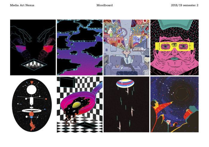
Samples of video inspirations:
I am also a big fan of Yukai Du’s works, which I plan to reference to when it comes to movements and etc
Tutorials:
Moving/Static image: Snowpiercer
In the future, climate-change has caused temperatures to dip to inhabitable levels. Killing all life except for the lucky few who boarded the Snowpiercer, a train that travels around the globe for 365 days. In there, a class system emerges to maintain the system, eventually causing a rebellion from the people within the lower class.

Upon entering into the first few scenes of Snowpeircer, one would be able to take in the tone of the movie just by the visuals of the set. Vast expanses of white snow covers the earth, and a cold steely train zooms past it, empty cities were covered in ice and snow. One is able to tell that it the land outside the train is unforgivable.
This film is very interesting as one would be able to see the difference of caste based from the set that is build, which can be mostly inferred from the colours and costume design of each set.
The first quarter of the movie also takes place in the end of the train where the lower caste are situated. The set there looks akin to a slum, with people packed together like sardines and most of them looking grimy and dirty. The costumes here are drabs which have very minimal colours.

The lower caste
This is a vast difference to the upper classmen, as seen below:

Lower caste people in the upper class area

Lower caste group going to eat sushi, again the difference of colour (red of the sushi chef vs the dull drabs)
One could tell the difference just by the colours alone, which is a stark contrast from each other. This shows us how to the colours can be used to influence one’s perception.
The architecture of each set also sets the tone of the increase of class as they move forward to the train. It gets more developed and high tech after every section. For example, one is able to see meat/vegetable production and education happening, things which were non existent in the section they were living in previously.
Hence this movie is interesting as the architecture and design of each set aids the visual perception of the viewer. Moreover, the plot of the movie was something I really enjoyed as well!
Biography
Viena is an undergraduate from Nanyang Technological University (NTU) in the Art, Design, and Media program. Her interest of immersive spaces leads her to explore different mediums and mechanics for new ways to reach out to her audiences. Viena believes that this platform has the capacity to convey thoughts and influences to individuals in a multi dimensional way. On the side, she also enjoys illustrating and storytelling through videography.
Work
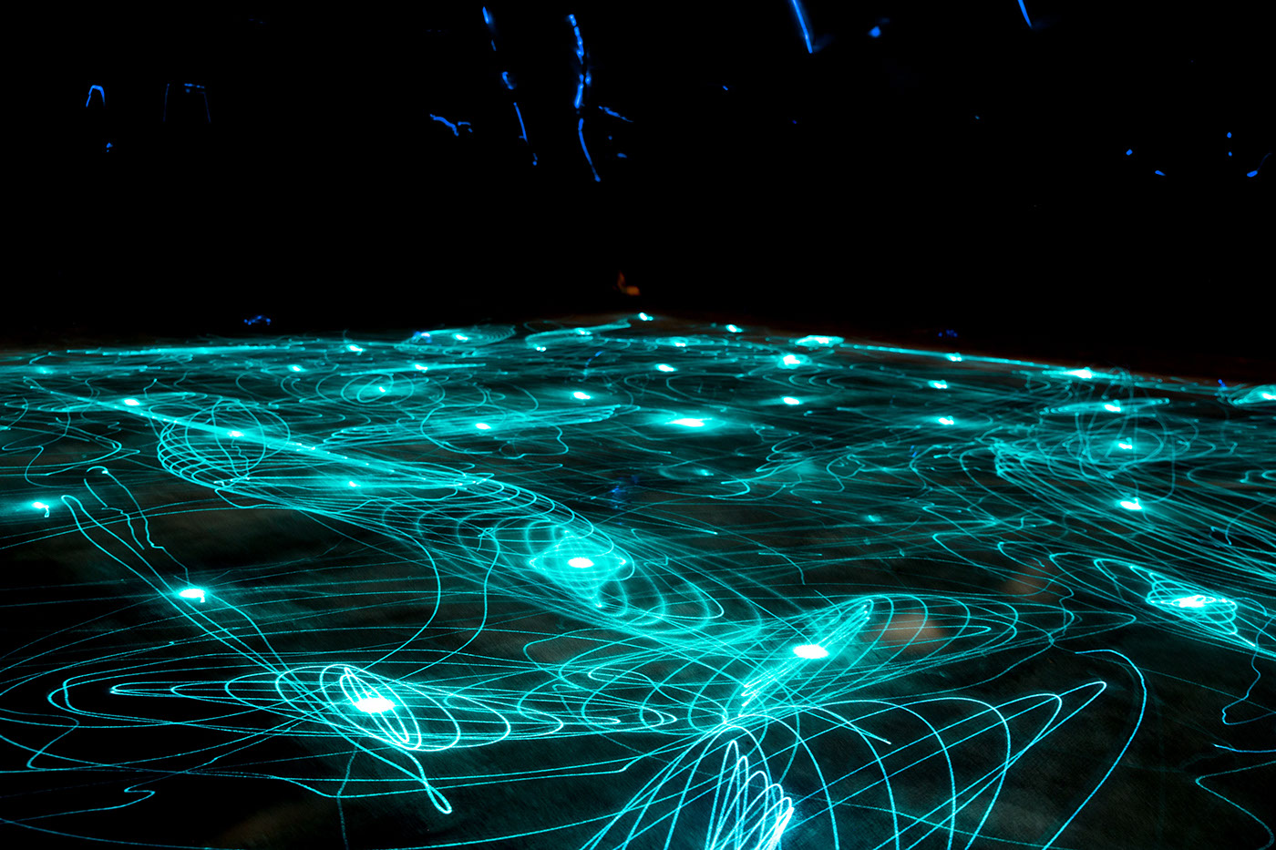
Light|Dark is an interactive light installation consisting of 46 blue lasers suspended in a pitch dark room. The floor is coated in luminous paint which absorbs light emitted by the lasers, allowing viewers to use the lasers to draw patterns on the floor or to simply walk through the installation. The momentum and rhythmic motion caused by moving the lasers creates stunning galaxy-esque patterns on the floor. View more here
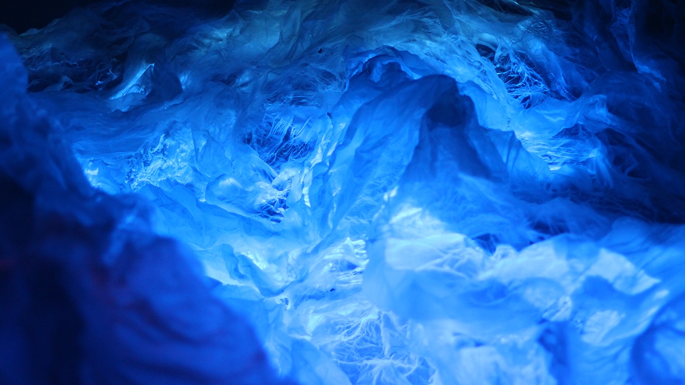
Despite being aware of the destructive effects of the high consumption of our sometimes unnecessary waste that is rapidly diminishing the natural environment, we are often de-sensitized to the magnitude of the issue. The installation integrates data visualisation and interactivity in an attempt to portray these long lasting effects of our “throwaway society”. As the structure captures the beautiful world that we perceive to be living in, viewers are then caught unaware of the sudden hit of reality that is portrayed from the interaction. View more here

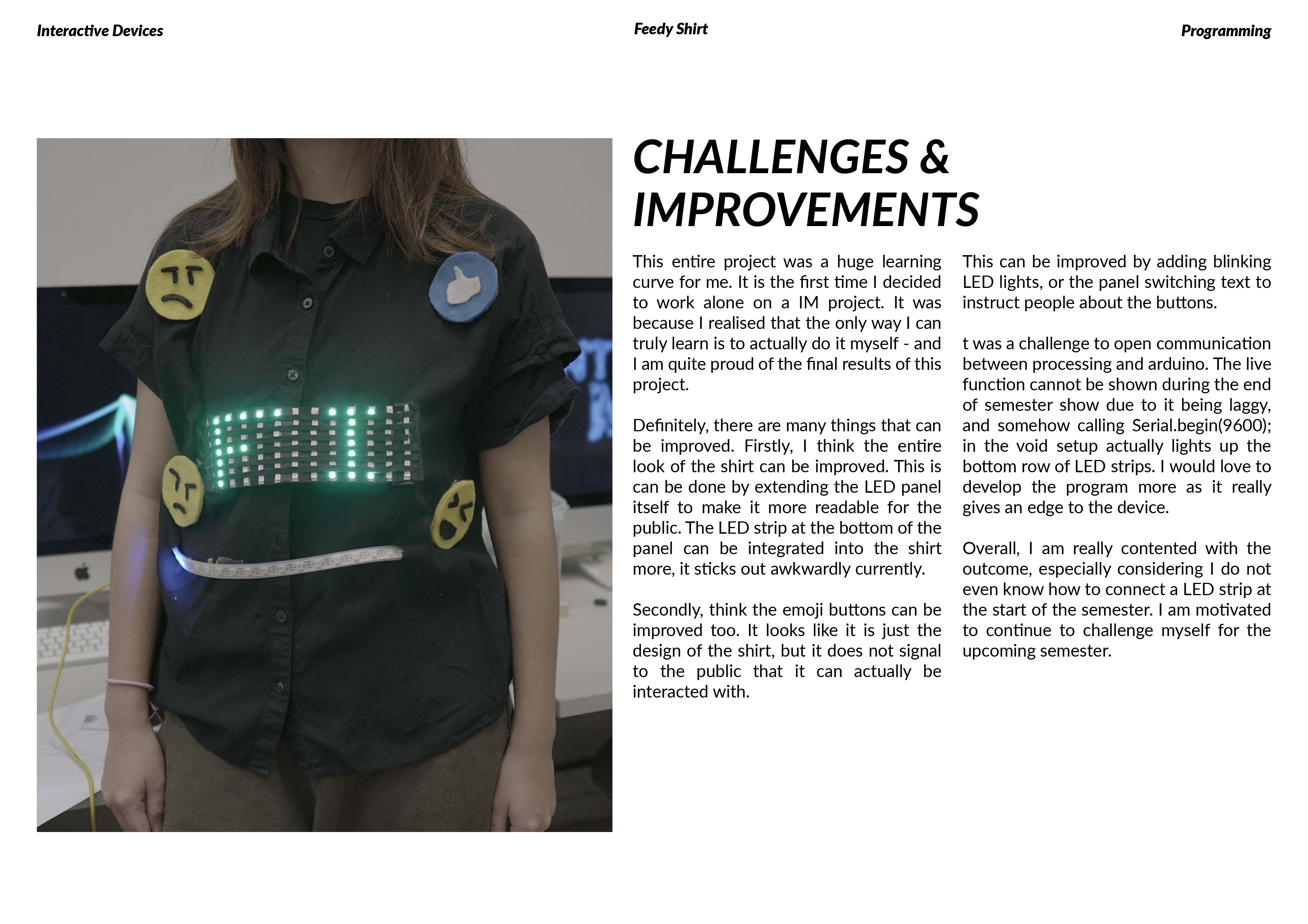
With social media being so integrated into our lives, the things that we voice on the online space sometimes does not seem to have a consequence in real life. Hence, this interactive T-shirt which is connected the users Twitter feed forces the wearer to be much more conscious of what they are posting online. The public can also interact with the shirt by liking or reacting to the tweets, heightening the wearers’ awareness of their posts. View more here
View even more of my works on my Behance account, right here!
Resume
Inspiration:
I really enjoy light and sound installations in general, and besides one of my favourite studios which is Nonotak, I really enjoy the works Satoko Moroi, who is a communication designer hailing from Japan.
What is enjoyable about her works is how it taps into each of our inner child, where the installations are so colourful and simple.
Here are other light and sound installations that I like too: