Presentation link here
Category: Project Development and Planning
FYP Ideation: Food waste part III
Research and more research:
Talks: Food Waste symposium at NTU
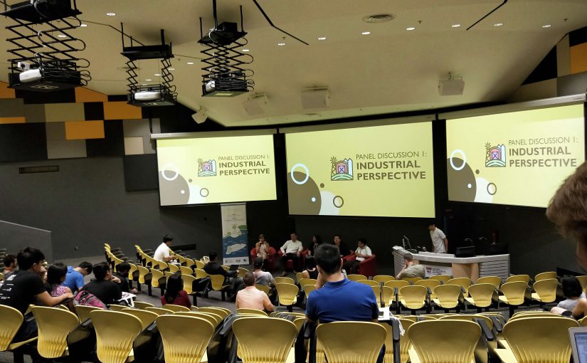
It was great timing that the school actually put together a symposium on food waste last Wednesday that invited social enterprises over for a 3-hour talk to give audiences insights as well as a panel discussion.
It was a public lecture where I found the attendees to be PHD students, bioscience students or groups of students that were interested to tackle Food Waste as an FYP topic.
I looked forward to Ms Nichol Ng’s talk who is a co-founder of Food Bank. She projected some fascinating insights and figures of food donations her organization deals with:
- Two full lorries of onion rings were donated to them because 2 customers complained they found onion skins in them. Therefore, they can’t be sold
- The Food Bank received snacks in huge amount because of minor packaging errors or because the product’s flavour was not selling too well.
- Supermarkets are able to return 90% of their items to the manufacturers. Therefore, its the manufacturers are the ones that are stuck with this food wastage
- Incineration is cheap in Singapore hence it is the easy way out. These incinerated food are perfectly edible but are being burnt because it is the easy way out – do not have to account for food waste
Also, during the Q&A session there was an angsty man that expressed his anger and kept questioning who were the ones that could change policies.
I found it rather funny as if the panel was able to answer that, there would not be food waste anymore.
Hence, it really got me to understand that for this issue to start improving, we have to start with ourselves.
Also I was glad that I managed to have a chat with the founder during the break and realize that the food Bank actually organized worked with artists and organized art competitions. Hence, this serves some possibility of collaborating with them for the FYP
More research!
Documentaries: Channel News Asia – IT Figures on Food Waste
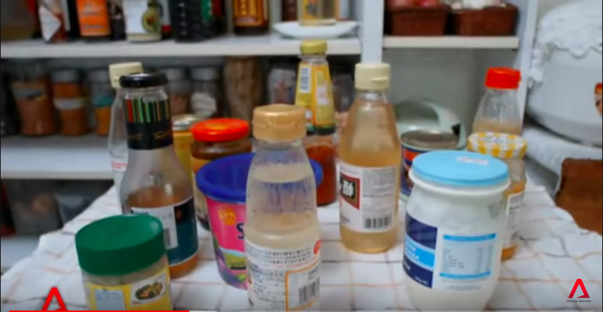
After watching a CNA documentary on how households overbuy, I decided to check out my own stash on the dining table.
Here’s what I found
And indeed, these were all expired. I am feeling so guilty.
In just one container of items, there was already this amount of food waste, because of overbuying. Indeed the figure, 40% of food being produced is never eaten truly struck me.
Would you want to check out your kitchen right now?
Essentially, I would continue to think about what is the best way to get this figures presented to masses. Currently, it is to use its actual multitude to create a voice and show this ‘unseen’.
And on a leaving note, this issue of food waste is too infamous that even the number 1 top hit Shape of You has a parody version about food waste.
FYP ideation progress: Food for thought on food wastage
More research!
Further research on food waste has been rather eye opening on this recurrent issue, as there seem to be quite an effort curbing the issue in Singapore.
Just recently on 28 March 2018, there was a Singapore community food festival ‘Feeding the 5000’ that took place at City Square mall. It aims to raise awareness for the 791,000 tonnes of food that are annually going to waste in Singapore.
Apart from festivals as such, there are also social enterprises and other non-profit organisations such as Food Bank and Food from the Heart that collects donated food to be sent to the needy to name a few.
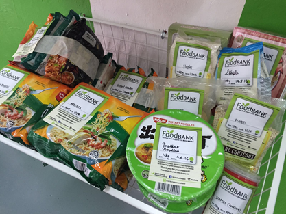
However, the issue of food waste and tackling it seems to have been looked upon in a serious and practical campaign sort of direction. This could a possibility that the issue is known, but not sparked enough to create an eye-opener or topic about it again. Could this be when art or installations come into useful play?
Ultimately, I want to create a channel that makes one realize that we ARE contributing to food waste and the immensity of its scale
Concept generation
1.Use food waste to fight food waste
So, how would you react if you saw this during an FYP show?
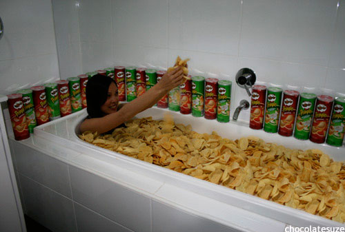
Shocked? Enraged?
Great! Now i got your attention.
2. Element of making it personal
What other way to do it but to make them go through food waste themselves?
Pledging against food waste. Selfie + scan item (team lab)
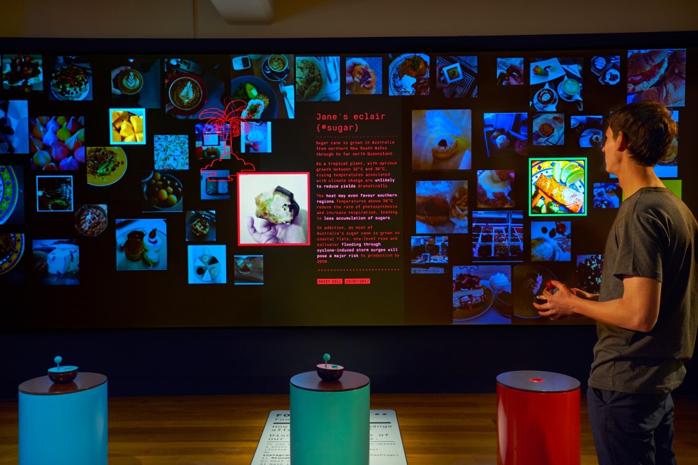
3. Immensity of scale
So there’s a food artist like that: Artist Inspiration
With even further research, I found some photos of this concept of food installation itself. Jennifer Rubell does it playfully well:
![]()


The conceptual form
To put things into perpective, I thought of using our weight as a gauge to the tonnes of food waste generated.
Food-human see-saw.
(refer to notebook)
FYP Ideation progress: Food Wastage
After some serious thought on the topics i’ve presented on previously, I decided to go with tackling the topics of Food Waste.
Give the topic a search and tons of articles start to appear from countries across the globe, indicating the seriousness of this social issue.
One might think of a food getting poured into the bin as their first thought of food waste. But they come in several forms namely
- Untouched by the consumer
- Not bought in the supermarket
- Destroyed in transport
- Inedible caused by bad cooking
Whatever the case, it is estimated that 1/3 of the food in the world goes to waste.
Also, 40% of the average household bin is made up of food.
A social experiment by American youtuber Joey Salads puts things into perspective, when he reveals the amount of food waste in a bin in 1 hour at just 1 eatery.
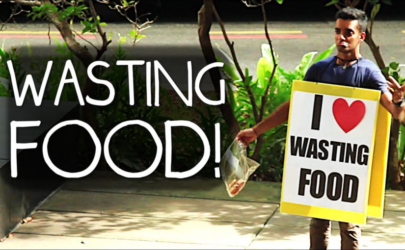
To put things into a local context, i’m glad I actually found this funny video of Singapore comedy channel Ministry of Funny.
Indeed why are people angry when he threw bread on the floor, when actually much more is happening this second?
So, why are only people noticing when one blatantly steps out on the streets of orchard road to throw some bread?
What I would like to achieve out of my project is to allow others to realise the immensity of food wastage happening every moment and perhaps include a shock factor that has an element of participatory or an experience.
In moving forward…
I will continue to keep a food journal of my own food wastage and observe the public in general to find mediums that will best bring the message across.
Keeping track of my food waste has made me more conscious on the food I purchase and partake in general. A good thing?
Emergent Visions: Mobile AR by Tamiko Thiel
Day 2 of symposium after lunch kicked off with a jolly note when Kristy announced that the tour would end at a the Smoke & Mirrors bar that day. I was really tickled that everyone kept mentioning about cocktails after that!
Tamiko, the speaker for the session started off by sharing popular examples of VR before sharing about her work in this area. She touched upon AR works that were commercial and also works of art
The use of Augmented Reality in today’s society – Art vs Commercial
AR in Commercial
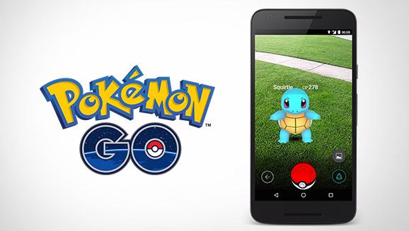


July 2016 – 45 million users per day
Breakthrough for AR – everyone was playing it. Almost
Pokemon Go certainly served its role in interaction, allows users to come together as pokemon trainers instead of an individual player on the mobile phone
AR in Arts
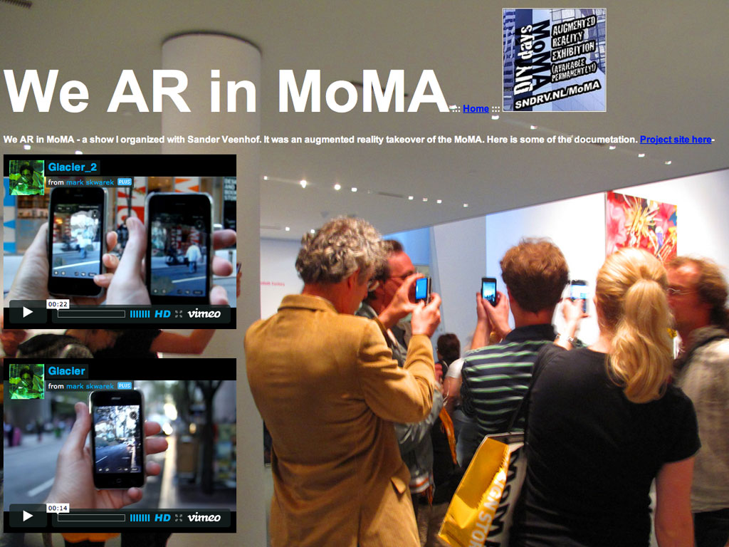
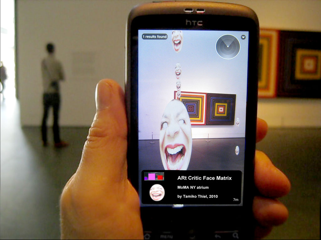
An example of is ARt Critic Face by Tamiko Thiel. One of her playful works where she seems to be using AR in a satirical way – faces that seem to say ‘you call this art???????’ appear all around your mobile screen!
This is geolocative augmented reality installation that only shows up at certain locations, which are mostly museums, art festivals and popular spots.
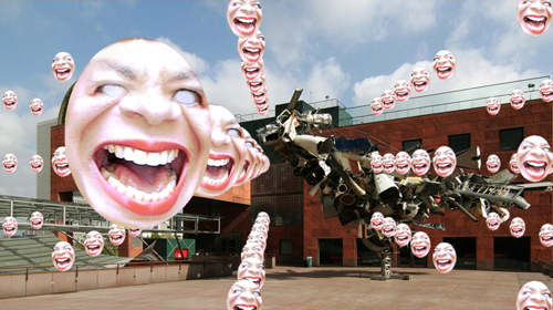
Los Angeles Museum of Contemporary Art (LA MoCA)
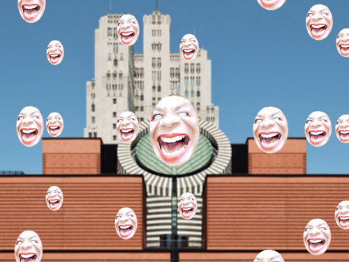
San Francisco Museum of Modern Art (SF MoMA)
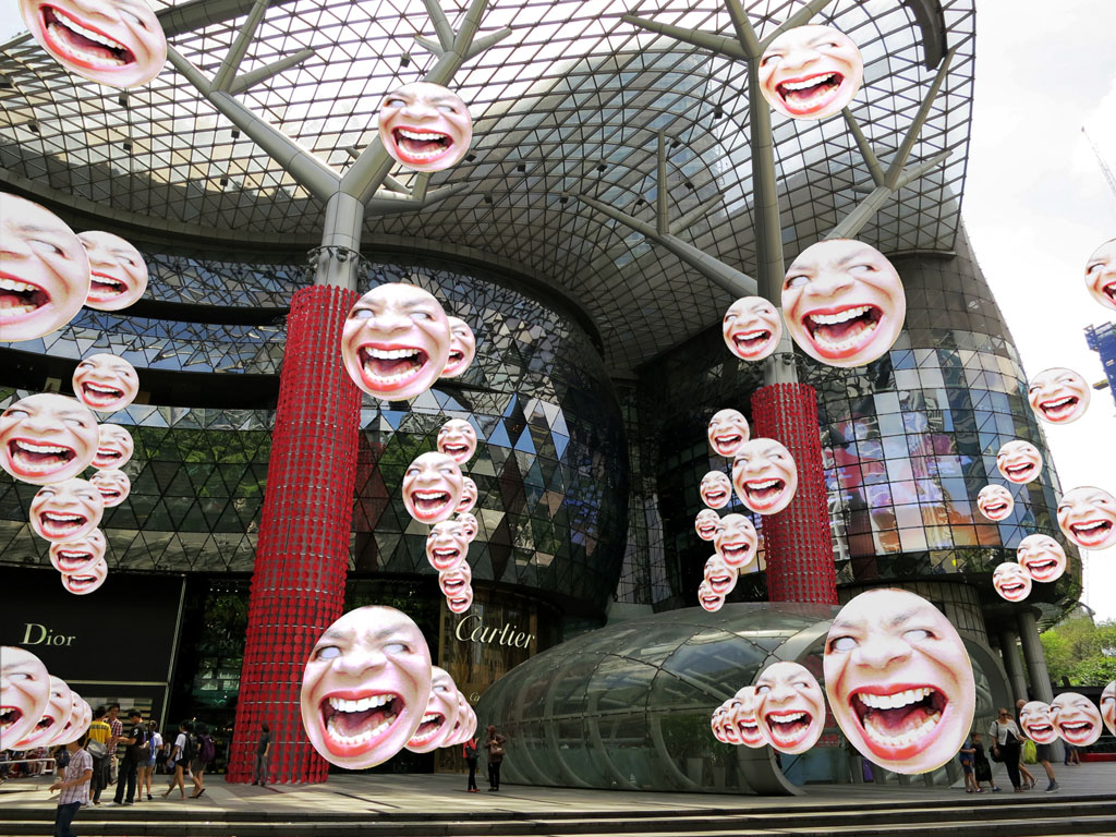
ARt critic faces at Orchard Road
I personally feel that this piece of artwork actually comes off as shocking, abit of a Damien Hirst. The artist seemed to be making use of a new medium of AR to create a shock factor. I mean, getting museum visitors bombarded with countless faces questioning what they see in the biggest museums are really art…..that is one bold move.
The question by the artist:
Will this bring recognition for AR as an artistic medium or commercial medium?
Val’s answer: Do we really need a concrete answer for this? Instead, I would think of it as “Is AR recognised as a useful medium? Be it in arts or commercially”
Examples of AR playing a useful role in arts and commercial scene

Arts: AR used to elevate the museum experience, at the Art Science Museum in Singapore
Commercially: AR aids people in visualization through environmental mapping
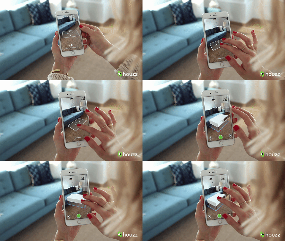
Ikea Mobile App using camera AR map to measure a sense of space
What I noticed in AR trends: VERY popular for VERY short period of time or VERY expensive effort and time VERY little recognition. So why not make good use of it when there’s much effort behind an AR work?
“El Barrio is home!” Augmented reality installation, 2016
The Caribbean Cultural Center and African Diaspora Institute is a cultural center for the world-wide African diaspora based in East Harlem (“Spanish Harlem”) in New York City.
Back in 2012 as AR artistic advisor I helped them get a Rockefeller Foundation Cultural Innovation Award for “Mi Querido Barrio,” a Street Art project to put their art, culture and history on the streets of El Barrio/East Harlem using augmented reality.
I held workshops in AR for CCCADI’s artists, and they invited me to create a work for the exhibit that would trigger off the facade of the new building itself.
For my piece we asked residents to answer the question, “What makes El Barrio feel like home to you?” I took their handwritten and signed answers and transformed them into golden words that swirl around you when you scan the facade.
- Importance on personal voice
During the talk, Tamiko Thiel had a heavy emphasis on using their handwriting as the subject matter. The handwriting evokes the sense of belonging and people can recognise their “voice” in the work.
Another interesting aspect was that AR is technically artificial so perhaps overlaying the “reality” artificially makes it sort of “mixed” reality? Tamiko Thiel also emphasis greatly on that in many of her works, she did not want to depict graphics in a realistic manner. However, in this work it was realistic yet not realistic. The written texts by the people can only be seen using the device hence, the golden words are technically not there in reality however the true personal voice are recorded virtually.
- Importance of AR to capture forgotten culture and bring their own culture back to the people
“It is a great way to not only educate, but preserve and connect. I think that the more people start using it, especially the younger generation, the more they are going to open their eyes and want to reinvent.” As the city develops, some aspects of it gets lost as well. In a few of her works, she tries to record this culture of a community/place before it gets truly lost.
‘Interactive = unfinished’ – Matt Adams
As I sat comfortably in the dimly lit lecture theatre at Laselle that evening, I honestly thought it would be a monotonous session happening right after dinner time. Taking quick glances from the second row, I realised the theatre was pretty packed. That was a sign that Matt was worth a listen.
Indeed, Matt’s opening slide was quick to catch my attention- the template powerpoint flashed the words
‘interactive = unfinished’
He did not go ahead to tell us what that meant, but proceeded to show us using example of his works.
Like most speakers would, Matt did the same by walking through a timeline of his works till the most recent. His works went through a notable evolution in terms of its quality and the works Karen and 2097 personally hooked my attention.
I immediately downloaded Karen and 2097.
I’ve also noticed most people’s attention went up when he shared on Karen, as compared to his older works. The medium itself was intriguing. It reminded me of my own project in year 2 of the POV interactive film, except with more flexibility for the users to input their choices and answers to Karen.
The idea of a personal exchange with a character in POV made the game more unique and of course, interactive. The example walkthrough shown by Matt seemed flawless, simple and fun to play, at least that was what I thought while Karen was downloading on my phone.
However, as Karen is a POV film, there was just so much files to download even to start a game. The download itself got me waiting 45 min and 300 over MB worth of space needed. That is rather unusable to start with. i thought it was just the bandwidth but after trying again, I realised the game itself wasn’t too user friendly with the download hence this is something crucial for the game makers to work on.


2097: We Made Ourselves Over
From what Matt mentioned he and his team managed to carry out, the 300 phone calls ringing city wide, actors appearing, short films played along the streets, the installation set itself, it made me realise that these many layers of a project would still be deemed as ‘unfinished’.
2097 shows us that indeed interactive is unfinished in the sense that it is just the beginning. Something is sparked. A conversation about the issue is sparked.
I was particularly impressed by the amount of research that went behind it, from the research workshops, to the different mediums of output. Most importantly, the participatory element in 2097 could be a contributing factor to the game’s success, or so Matt believes.
I have also downloaded 2097 but similar to Karen, the rate and progress of the game’s download seems too long and draggy to even download. Perhaps their content networks are in the UK.
Deeper thoughts
It would be interesting to have Singapore’s version of 2097: We Made Ourselves over too. Perhaps not totally the same idea as Blast Theory’s but the same concept of an app, a nationwide event happening and most importantly the idea of audience participation to spark conversations about our country’s recurrent issues such as sharing of data or over-reliance on technology etc.
As a whole, it was an eye-opening talk that helps me to think about the different methods and mediums an interactive project can be carried out. Something that makes other think about change, reflect and want to change, invite ideas to be articulated that comes in moments big or small that we would have never thought or spoken about.
Reading: Designing for the Digital Age
I was clapping my hands as I read the first few paragraphs of Kim Goodwin’s chapter of Designing in the Digital Age and was thinking ‘more people need to read this!’ Especially my friends who don’t belong in the field of design – their mentality of ‘design’ is usually cheapened!
Like most readings that start with definitions of a word, the writer did the same and I was intrigued at how the writer defined some terms. As the writer puts it eloquently, she mentions how design is actually a craft because it’s neither science nor art. In my own definition, a craft is a skill that takes time to master. And we as designers, are crafters – where our goal is to actually solve problems.
Aka designers are actually problem-solvers.
This comes in well with the next point the author talks about, where a design should serve human needs and goals. Exactly! To solve the problem of our dedicated audience. It all goes back too the human – the users!
In my resumes or cover letters, I will usually add a point about passionate to create ‘human-centric design’. The word will not just be design but human-centric design. As the job you’re applying states ‘user experience’ or ‘human-computer interaction’, the ‘human’ or the ‘user’ is exactly the one we are reaching out/catering to.
Goal-directed design
Moving on to methods, the writer talks about goal-directed design. Here, personas are mentioned. Although I am unfamiliar with the term goal-directed design, I do hear about the use of personas as part of a design process. Personas help designers to imagine the different types of users of a product or service which encourages them to think even wider on how it could be received.
This method indeed works well and been proven that it works well and achieves qualitative results. Hence in design, yes there is no right or wrong but we follow a set of best practices.
Note: The writer then moves on to talk about best practices. I guess we were on the same page!
Double note: The origin of personas mentioned by the author developed at Cooper, was where she worked at. The Alan Cooper she mentioned, was actually none other than her boss. LOL
More Personas
I realised the writer mentioned about personas once again in the following part. Well, if something is mentioned repeatedly, it sure is something of importance. Very oddly, being in interactive media and in a design school, I have not implemented this method of personas in my work here. Perhaps it’s the type of work that we produce or modules taken. I’ve only ever started using personas during my UX internship.
Initially, I was quite confused about this whole idea of ‘persona thing’. It was the very first time I was putting it into practice. I was called into a meeting with the digital products team to review a product in its high-fidelity mock up state. Print outs of personas were stuck all over the wall and sticky notes and markers became our weapon.
“Val, don’t hold back. Be as critical as possible. Doesn’t matter if you hurt (co-worker’s name)’s feeling” said my boss in a serious tone but with a smile.
As a first-timer I was quite afraid to be blatant about my thoughts. Also, when I first read the scenarios and persona profiles, it actually came off as hilarious as these user archetypes felt very stereotypical. But in actual fact, I found by being really critical of how each group uses your product or service, the things taken into consideration might improve your overall product or service.
Closing thoughts: Design does not stand alone
All in all, I certainly think that design cannot exist just on its own. There are a lot f interrelated factors to make it a successful product. Design should be placed in the central part of the conceiving and development of a product. and from there, we can take different directions. If it’s not ideal, we can always go back to the centrepoint of the design.
Perhaps some questions would be, what about feedback? Which part is it of the design process? How much feedback to take in? How much is enough? Giving the author a benefit of doubt, these questions could have been addressed in another chapter. But essentially, I feel that taking in feedback and asking questions is an important part of the design process.
From experience, I received emails from the innovation lab team where they would send email invites for anyone on-site to come over for a brown bag session and gather feedback. Again, with markers and sticky notes.
Another food for thought would be, how do we actually forge healthy relationships with the other counterparts? Like the engineers or developers. They are important in the development of a tangible product. But, where could we start from building relationships with them?
A reflection on Thoughtful Interaction Design
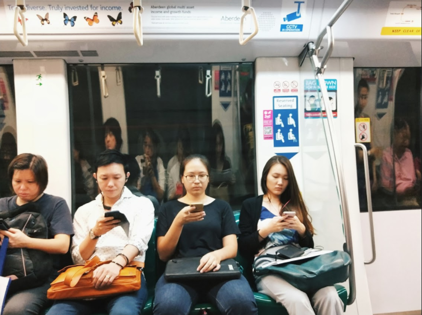
Taken on one of my trips to school on the circle line. Everyone in the cabin is seen consumed in their digital artifacts. Even those beside me as seen in the reflection.
This reading came in really timely as the points mentioned in these chapters are things that I have been reflecting about daily, as I work on building app interfaces. On the daily commute, (which I take around 1.5 hours to reach that gives me a lot of time to time and reflect) I notice an artificial world – an artificial world of people being consumed by digital artifacts. Of any moment, someone is looking into a digital device. This device would commonly be their mobile phone or your laptop like what you are doing right now.
There were many points worth highlighting in this text. But I will narrow down to one or two.
1. Good Design
Jonas touched upon the term ‘good design’. Indeed it is a very vague term. From a UX perspective, I’ve all along defined good interaction design = user intuitive. However, this sentence challenged my definition of it:
“An extremely fast and efficient digital artifact is hardly good design if it is not understood by users”
Going deeper into thoughts, I realised what we’re tackling here is user empathy. The fact of the ‘human’ in human-computer interaction, it still goes back to the user. For thoughtful design, a designer must put themselves into their user’s shoes. Exactly, it’s about being reflective.
Example of thoughtful interaction design
Instead of cracking my head or googling for examples, I’ve realised that very apt examples are apps. They are something that we interact with everyday, in fact the first thing we interact with everyday when we wake up.

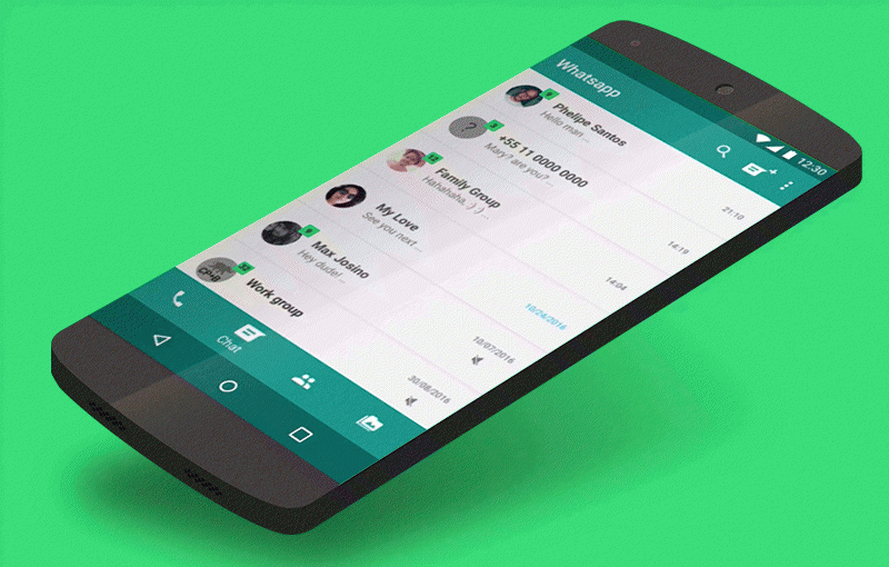
Without saying much, everyone would recognize this popular chat platform.
WhatsApp might not be the prettiest app but majority are using this app platform. We see even the older generation commonly using whatsapp instead of other chat platforms because
- It fulfils the needs of its audiences – to communicate.
- It’s fast – just tap on name of person we want to have a convo with, type message into box, send
- There is order and meaning (design theory)– chats on top, I type something and send, it appears in that field of convo exchange
The designers behind the app had to think about the (very) different age groups using the app.
From the words of a WhatsApp designer himself
“When building a product, having a clear problem to solve for people is half the battle. Having a framework on how to judge the proposed solutions helps make the rest of the process more efficient.” – Charlie Deets, Product Designer at WhatsApp.
Hence, he also highlights the importance of being reflective: taking a step back to understand the user’s problems before diving into a solution.
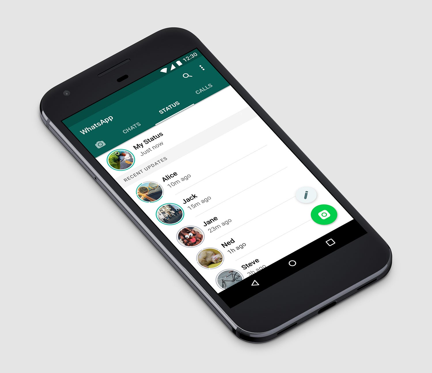
However, how many actually know that there is a whatsapp story feature within the app? Also, how many people actually use it? Do we really need it? How much thought was put into this feature’s usability?
No design is perfect said Jonas. Therefore, the need for the story feature could be thought about again by the designers.
2. Design theory
The author mentioned “As a designer, you might also need help in creating order and meaning in a complex world. This can be done by making the complex less complex by organizing, structuring and categorizing.”
So true, Jonas. This is what we call information architecture and it is really important in thoughtful interaction design.
Here’s a really bad example
Self-check out kiosks


Oh my goodness. These self-check out kiosks. Why so many terminals to scan? Why are there so many buttons?
Once I used it and the security alarm almost went off on me. I wasn’t supposed to lift anything off the holding bask area before I check out on my payment. However there was no indication of that. Since then I hardly used these self-help stations anymore but help myself to hurry away. If this happened to me, what more my folks? What more the senior generation? Will they even attempt to use it?
…and more questions:
How can we make this interface more friendly? Is it possible to further categorize and better structure the information for a more seamless process?
Another thing I would like to add on about achieving interaction design is to always ask questions. Alot of questions. Again, it’s about reflecting, it’s about taking the step back to think and put empathy in it.
Hence in my opinion, good design comes about if the designer takes many steps back to think, plan and put themselves into the shoes of the user. Many atimes we jump straight in to photoshop or the tools that we use to start designing. But here, we learnt that the steps of planning and developing is paramount. We usually overlook the paper and pen stage but this is where the problem solving happens behind a thoughtful design. Only then a designer can achieve human-centric design.
As Google’s Design team’s mantra goes “focus on the user and all else will follow”.
Indeed.
Reflections: The Oceanic Exhibition (+ slides)
About me
Being a city-girl that grew up all her life bustling Singapore, questions about the ocean or anything pertaining to it were hardly ever questioned (or popped up in my thoughts at least.) These questions appear during dinner topics, but I never really thought deeper about them.
About The Exhibit
It was only during this exhibition that issues on conservation and the ocean started to trigger some thoughts. It started mainly by this question I heard from one of the interviews
“We(humans) are land-species so we typically care more about our land.. but what about the oceans? “
As I heard these words playing straight into my ears, I quickly pulled out my phone and googled ‘PERCENTAGE OF OCEAN ON EARTH”
71%.
A figure we probably saw back in elementary school science lesson but forgotten as life went by. But that figure. That was actually a high percentage. The fact dawned upon me so hard. That was when I recalled all the conversations about conservation and understanding that it is an important issue we should be looking at.
About the work that gave me interest
Upon walking into the exhibition, I found myself moving towards the video screen installation OCEANS. Dialogues between ocean floor and water column by Armin Linke. I was drawn by the immersive environment of the space itself. I gazed at the installation from the back as video clips of the sea spilled across four screens. The scale and height of the screen invites an immersive gaze as if you were enveloped into the environment of the ocean itself. Hence, it heightens the experience of the audience as it led me to think about the ‘Anthropocene’. Not sure about the artist’s intention behind the work but it wasn’t too clearly shown unless further researched. Perhaps, his long-term film project would be able to capture and showcase the interconnections of human’s activities and its effects on the climate and environment.
Another thing worth mentioning about Linke’s work was that the footage were edits of video archives of several scientific expeditions. It captivated me with the up-close marine life as it clearly captures form and movement of the underwater species with a depth of more than 5,000 metres . I would say the way the installation was curated really worked to its advantage as I found myself immersed in it on the seats for at least 10-15mins.
While being immersed, I was reminded of the question ‘Who owns the ocean?’
My first thought was..everyone. Then again..no one.
I actually felt very compelled to think. I needed an answer. Or is this one of those unanswered questions?
Anyway, I googled.
So the Law of the Sea states that no one owned the oceans. I see. I guess indeed no one owns it, but everyone is responsible for it. Thoughts?
About the lecture that gave me interest
Dr Cynthia Chou – Orang Suku Laut (Sea Nomads)
As the speaker shared a mini lecture on the indigenous beliefs of the Orang Suku Laut, I immediately got reminded of art history. I also found it rather eye-opening as it was the personal account of the lady speaking to the crowd. During the lecture, she talked about the spirit that resides in things and people, specifically 1) adopted things 2) inalienable possessions 3) non-adopted things.
I was intrigued by the supernatural powers these objects were said to possess. In our modern culture, we easily hand things to people or even adopt ‘pre-loved’ objects but for these communities that lived near the ocean, they are more watchful/careful of objects as they have the idea of ‘taboo’.
With further research, I found that the speaker, Dr Cynthia herself was offered an inalienble possession. Suri, the lady that passed the stone on to her was her ‘adopted mother’ during her field study. She explained that Cynthia had been very good to her hence she is passing the object to her.
As a normal reaction, the researcher was taken aback by the gesture and questioned how is she able to to accept the stone.
Suri’s brother then explained that if someone in their community offers something, they accept. Hence, Cynthia cannot refuse on the object.
It was said that by rubbing the stone given to her on her eyelids, she is able to have a vision of her adopted mother and be one with her no matter the distance.
Furthermore, Cynthia, an outsider was also able to claim descent from an OSL. Through the passing on of the object, the OSL community was drawing her in symbolically.
These items like the stone received by Cynthia were highly treasured by Orang Suku Lauts and also people out of their community as they were said to hold inherent powers and inalienable value. I found this seriously amusing that they are able to maintain a culture like that since the beginning of their time.
A quirky thought I had was also that since they are really careful with the objects and its ownership, would the idea of having ‘Carousell’ be a taboo given their culture?
Carousell is a popular app in Singapore that sells pre-loved items. You can find all sorts of items under the sun in this virtual flea market.
Other questions triggered during the exhibit
What is the role of art in engaging with larger issues around the environment, nature and climate change?
This is really apt – I think it plays a significant role as it makes people reflect. Upon viewing that work, it just made me reflect and actually ponder on what is the state of oceans today, how does culture actually play a part in it, especially on the conservation aspect.
Through public exhibitions, it gets word out to people. It basically serves as a bridge of communication between the issue and the masses
Art is actually a powerful tool as it could engage our five senses. Compare an installation that has a component of scale, sound and visuals, just like the four-screened installation. As compared to reading paragraphs from a newspaper article or a book. In other words, the medium is the message. Art pieces have this powerful aspect – if used well and to its advantage.
About my closing thoughts
Overall, this exhibit sparked a lot of thoughts. However, the bigger problem is in sustaining conservation. How has this exhibit suggested ways we could contribute or play our part in the issue? I also find that the organising team could think more about how the message is being received by its audience. I find some arrangements rather unconventional and subtle, resulting in a lot of question marks and ending up questioning the whole expedition. I am curious to know are exactly are the target audience of this exhibit and if this is the best way to present it for the public to actually have a ‘call to action’.
Peace.
Link to slides: https://docs.google.com/presentation/d/1BLHdYbuVZ-s2GTyRvsGDttB9UyNAwha0IWZCyOpb9q8/edit?usp=sharing
Group members: Anam, Siewhua, Val
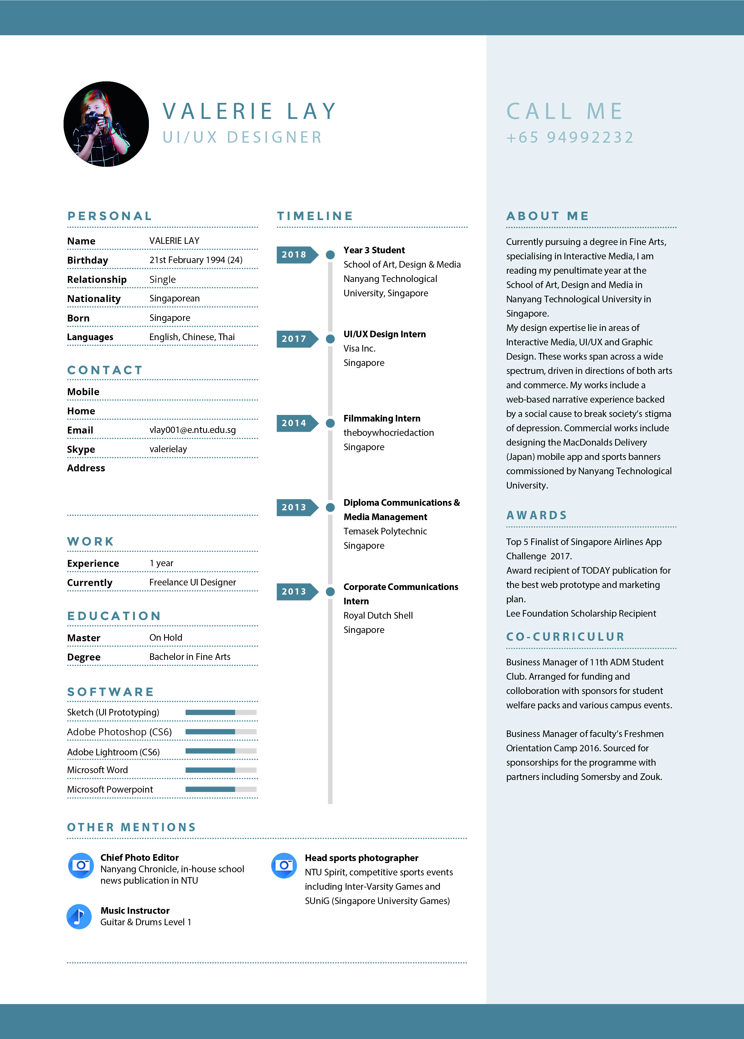
Résumé
Alterations: Removed irrelevant portions and online portfolio links. Added other mentions including my chief roles as a photographer. Also included a line that indicates my other experience in teaching music.

