


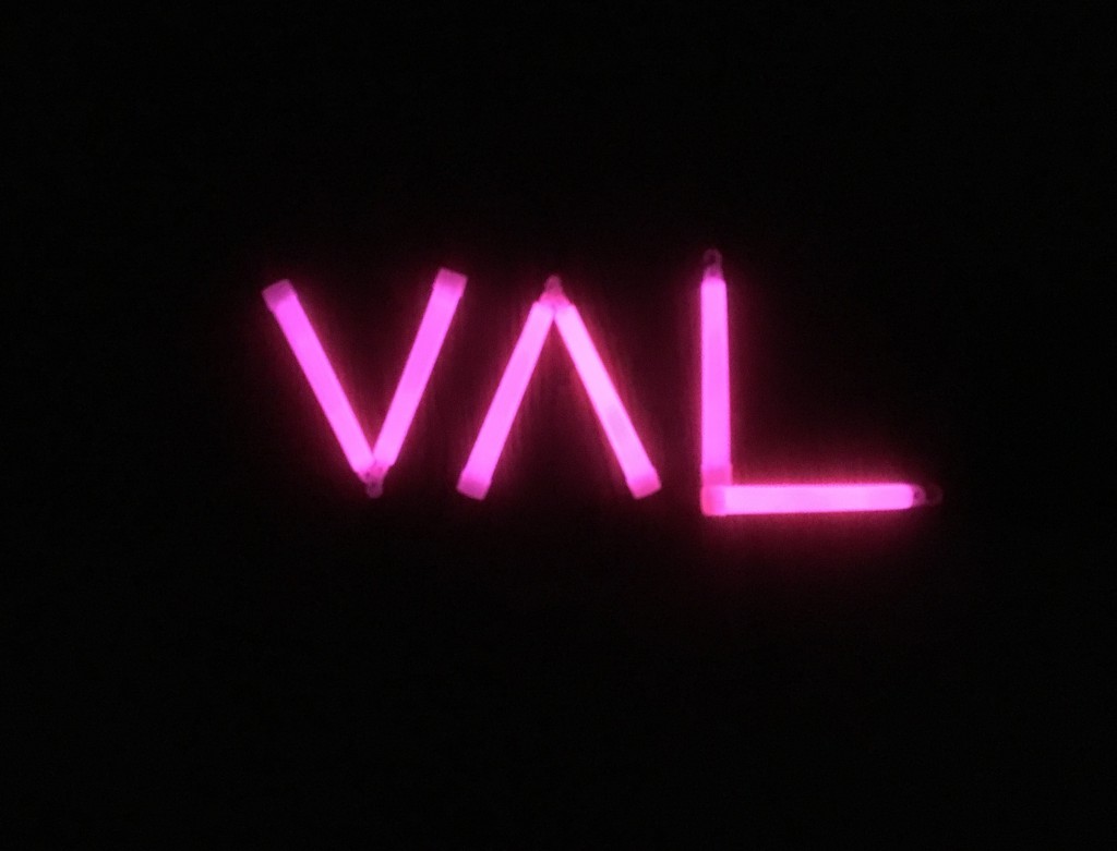
Narcissist me…not
This Zine is a compilation of my previous work from this semester in the form of a catalogue guide. I took a step back and glanced at my works individually and looked for something incommon. I thought that each of them actually suits the idea of an event. Hence the title 6 EVENTS FOR THE SUMMER. It is satirical and narcissistic in a sense that everything is about Val, Val Lay, Lay Val, Val & Lay and Valerie Lay

For example..

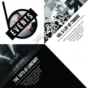
The 1975 at Laneway Festival with opening act Val Lay

Val & Lay gig at Timbre (get the Jack & Rai reference? hurhur)

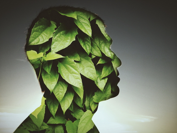
Lay Val @ Art Gallery featuring her life-sized works

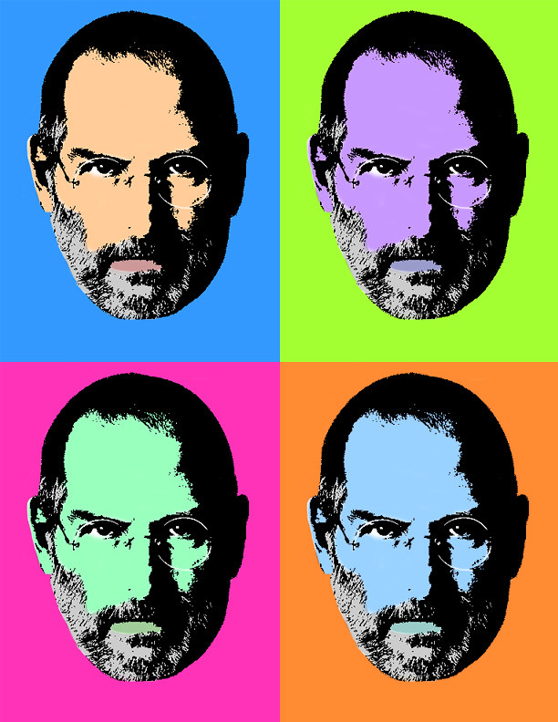
 Qun dian’s outlet launch pop art party

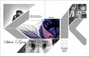
I’ve also taken this opportunity to include some works I didn’t use for my final

And of course simplifying the composition and changing the orientation from portrait to landscape to suit the layout Valerie Lay’s collaboration with Jack Daniels’ Liquor Launch
E x p l o r a t i o n
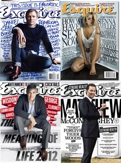
Art Direction & Concept
- Fashion lookbooks
- Sleek and clean look
- Geometric shapes
- Triangles


Drafts
From the references, I had a clear idea of the overall look I wanted and cover page of my zine. I wasn’t too sure of the fold at this point and started with the basic format.

Initially, I pictured a standard format, coupled with a french stitch binding. But meh, so conventional

Continued working on it and cleaned up the sides too look less rectangular-ish which inspired me to go with a non-conventional format/bind for its whole look.
And when you’re stuck, you turn to pinterest.com. Can I hear an amen?
Process #2 – Binding
As I was exploring more on zine binding methods, the not-so-typical ones caught my eye. That’s when I knew I wanted something out of the norm


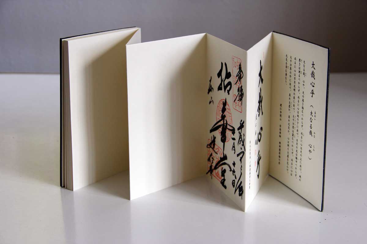

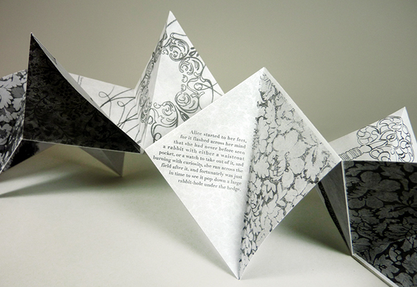
The last image made me recall an interesting fold I came across during some arts event I attended. I managed to find a good demo reference after countless tries with keywords for my searches!

Challenges with this fold – A Tricky Format


Due to its folds and diagonal format, it was important to do a mockup to ensure that its pages are in the right placement. I made a mini mockup to facilitate my digital process on photoshop. The angle of this print is also in 45deg and triangular hence making editing slightly tougher
What helped:
- Additional lines as guides
- Well organized layers according to pages


Text Layout
References: Behance.net
For editorial work, there’re no particular reference artists but certain styles I adopted from various fashion look books and magazines
- Triangular funnel-shaped text
- Thin lines as dividers


Testing out different text layouts


What I discovered: The length of text plays a huge part to form a triangular shaped text box hence I had to cut down on words. I had to focus more on its alignment aesthetics more than the vocabulary and meaning itself
Test Prints

Type of paper plays a huge part in this Zine thing! ![]()
Well, it’s obvious yet I can’t emphasize it enough. We livin’ da hard life with no raining moneh but its the kind of money you have to spend!
I tested on the following:
Matte paper 190gsm
Matte 250gsm
Art Paper 157gsm
And I’m glad I did. Here’s the verdict:
 Matte paper 250gsm – too thick! too many creases, uglyfying my work
 Art Paper 157gsm – a little too thin, making it flimsy. Forms creases too. Nay.

Matte paper 190gsm – not too flimsy nor too stiff, doesn’t cause too much reflection too. Naise, i’m sold.
Takeaways
Other than the typical ‘i’ve learnt a lot and enjoyed this project’, I’d like to specifically mention that its good to start early, plan well, browse more, be open to new styles. Also, dealing with so many layers on photoshop, I’ve learnt to be more organized. I’ve been a really jiapalang person and I thought that needed to change. And I’m glad it actually started with school assignments! All in all, 2D as a whole has helped me to explore styles and directions i’ve never attempted and helped me manage my time well.
Guys, no such thing as overnighters if we plan ahead an pace well.
Really looking forward to printing the final tomorrow and seeing everyone and their hard works at the last critique!


