My concept is on anamorphic art, which requires the viewer to use a specific vantage point to reconstitute the image. So in order to see the full message, you have to physically move your point of view.
Some questions regarding the presentation:
where would it be placed best? on the floor?
or on the wall?
all 6 mounted on a cardboard?
what will the layout be?
I experimented by putting it on the wall while teaching my niece how to catwalk for her auditions (so apt), hoping it well catch her attention.
It really did! Here’s how it went
Camera was planted on a tripod and video was running. These are screenshots taken off the video. Pardon the Britney spear’s poster at the back.
What did Sarah see on the other side?
.
.
.
.
Oh hey Apple.
Bottom line: Compositions must be exhibited at eye level of target audience
Research final will be coming right up! Stay tuned.
People have a fear of darkness. Darkness can be despair, darkness can be the unknown, darkness can be the end, or darkness can just be the absence of light.
Darkness from the point of view of a child is terror
Darkness from the point of view of a teenager is party time
Darkness from the point of view of an exhausted adult is relief
Darkness from the point of view of an old person is the final peace
Darkness from the point of view of bat is day
Darkness from the point of view of a moonflower is beauty
Darkness from the point of view of a frogs and fireflies is le sexy time
Darkness from the point of view of the sun is a curtain call
Darkness from the point of view of a stars and moon is the stage
Darkness from the point of view of a shooting star is a canvas
Darkness from the point of view of the blind is eternal
Oh hello! Is this really written by Val? Issit she feeling poetic and getting the literature feels
WELL, just putting down some ideas while I’m in a “deep” mode and recuperating. (Actually doing this while waiting for my turn at A&E yo. I know right, YOLO right?)
Joy
Alright so stepping out of darkness, let’s move towards the idea of Joy.
The word itself might seem rather mainstream and cliche but let’s see how we all have different point of views of this word!
Joy from the point of view of an ADM student is not having to rush OSS updates
Joy from the point of view of a G6 student is a tutor and a friend
Joy from the point of view of a Ruyi is active participation
Joy from the point of view of a child is candy
Joy from the point of view of a Singaporean is freebies
Joy from the point of view of an Instagrammer is hitting 100 likes in 1 minute
Joy from the point of view of lonely man is a companion
Joy from the point of view of a rich man is a companion
Joy from the point of view of a beggar is finding a place to call home
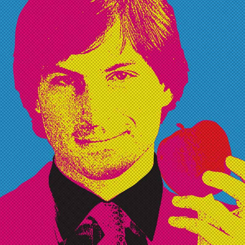
Apple
While I was working on these points, I was chewing on an apple that suddenly dropped me some inspiration. My Apple iphone buzzed at this moment, as if saying “include me, include me too!!”
So, if you hadn’t guessed, this was how my thoughts flowed
Apple from the point of view of a nutritionist is healthy
Apple from the point of view of Snow White is deadly
Apple from the point of view of Isaac Newton is gravity
Apple from the point of view of the 21st century is a gadget
Apple from the point of view of Adam is his apple
Apple from the point of view of Eve is temptation
Apple from the point of view of a kid starts with ‘a’
Apple from the point of view of the masses starts with ‘i’ (iPhone, iPod, iMac, iDonteven)
And Apple I choose you.
Execution
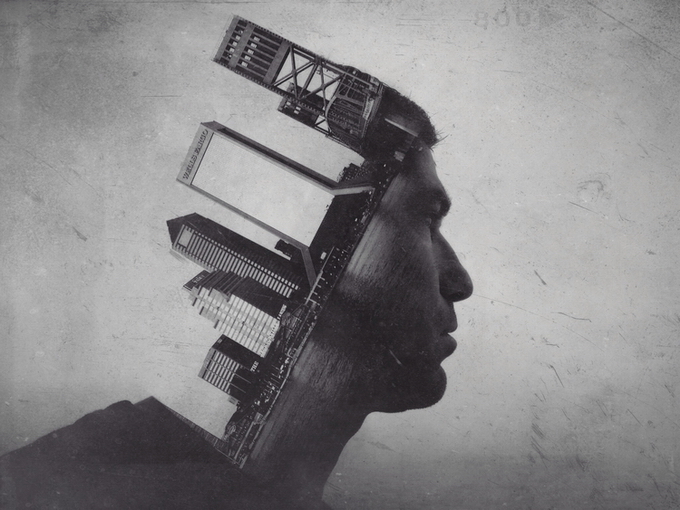
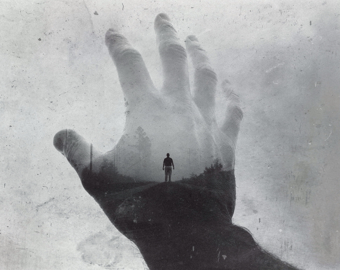
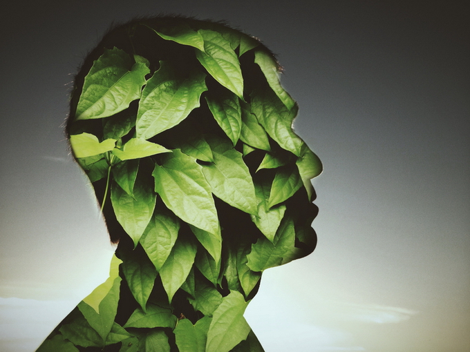
Double exposure
For this project, there are two parts of an idea to communicate. Therefore it’s a good opportunity to mess around and get wacky with double exposure to bring out two objects to create a subject!
Digital Manipulation
I felt that this method will help to convey the irony between the point of view and the topic itself if applicable
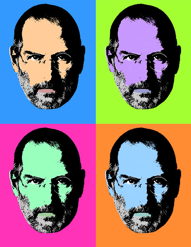
Pop Art
Reference Artist: Andy Warhol
With that said, time to do some experimenting!
Oh oh and enjoy your recess week everyone! If it even feels like one
SEE EVERYONE SOON!
Cheers!
Typography portrait problem was a problem as I had a problem striking a balance between aesthetics and concept. Common thing among designers eh? Yeah, that’s the problem.
Well, we’re sure to face clients in the future that wouldn’t give a heck about concept but just demanding a pretty design. However, I personally do not want to lose touch of holding a meaning behind my piece of work. To me, style should come with substance.
To solve that problem, I took a step back and gave a thought about giving a theme/concept to my work as a whole.
And this is what I came up with:
I separated my traits into two categories
Things that people will be able to tell
I’m a HUGE FAN of the 1975
I make music
2. Things I don’t show ( unless you get to know me better )
My greatest phobia is blood
I want to be inked
Update: I might change these two traits because I almost fainted while editing bloodied half done tattoos (no joke)
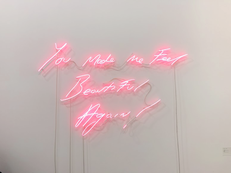
1) // I L O V E T H E 1 9 7 5 //
This is a band I’m really into. I love their music, style, and vibes I get from listening to this band. They recently came up with a new album that had a whole new look – they went neon, pink and a little bit of vintage. They were all black and white and nothing flashy before that.
It’s a really fresh look that I’m lovin’ it.
Check out their typography
Also, here’s a piece of work with an uncanny resemblance to the 1975 font, spotted at Art Stage 2016 at MBS expo hall just recently!
I thought I’d share it as this neon light signs are really getting into my head and as if screaming at me to use this for my typography project
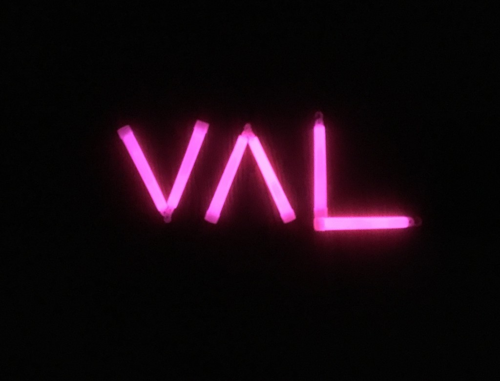
Photo editing
Handmade typography
Unable to afford neon signs but some glow sticks!
2) Music Enthusiast
Methods
Decorative typeface
Russian Constructivism
Bang logo parody
Decorative typeface
I’ve been into music since I was a little toddler because of the influence of my elder siblings – where I was singing to Nirvana (thanks to my brother) and Britney Spears(thanks to my sister) at the age of 5.
I went on to pick up instruments on my own that include the guitar, bass drums and was also on the vocals..and listened to Franz Ferdinand a lot!
The grunge-like style can be apparent in my rough drafts here
Using guitars to form the first letter in my name
Legibility test: My niece came into my room as I was doing my work and went: V…A…..L!
Whew. At least a 6 year old can tell I’m trying to form my name here. Then again, as we’ve discussed during consultations: does it really matter if it could be read or not?
Then I went on to explore with Russian Constructivism
Amp head. Subtly hinting that I could be quite loud at times.
After coming up with that design, it hit me that there are some band posters that has this particular style.
Muse
Asking Alexandra, AA
The Libertines
And er.. well..
Version 2
Well, what’s a Russian Constructivism poster without THE FIST. I began playing with the idea of rockers holding drumsticks.
** SAVE A LIFE, BACK UP YOUR WORK PEOPLE! **
Sad to say the several other versions got wiped out 🙁 Ugh!
Band Logo
Felt it would be a waste if I didnt create a band logo and incorporating my name!
No prizes for guessing which band’s logo i’m imitating.
.
.
3) I prefer seeing things in another perspective
Everything is about perspective. From how we view each others work, to how we think which Instagram photo deserves a double tap, to your opinions about this statement I make.
A few methods I came up with to play around with the idea of ‘perspective’
3D hologram
Ambigram
Typography optical illusion
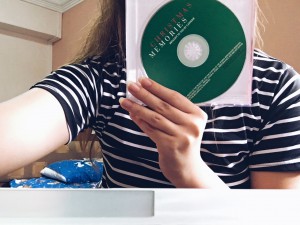
3D hologram
Majoring in interactive media, I used this chance to experiment with projection for the hologram and art installation with the optical illusion typography.
All you need is your not so favourite disc
And cut its casing into four trapeziums
(And I’m sure someone has something to say about my long nails FYI Chinese new year cannot cut)
And here’s the result
Consulted Joy and overwhelmed by her response! Let’s see if i’ll use it in my final..
Ambigram
Work In Progress
Typography optical illusion
The idea is to take a step back and getting to see things in another viewpoint, almost literally
4) I want to be inked
Concept behind this:
One hand is inked and the other clearly isn’t. What i’d like to bring across here is that despite my desire to have ink on me, half of me is still holding on to my beliefs that perhaps I shouldn’t.
Colours used: The background’s yellow was used in contrast with the tattoo’s red. This intentional dissimilarity of the two aims to accentuate the contrasting thoughts I have about getting a tattoo.
Version 2
5) I want to be an entrepreneur / create my own brand
Brand logo parody
I understand we only need 4 compositions but I experimented with a couple more with several brand logos of different industries
Vintage font – Jack Daniels whisky
Heneiken – with a local twist in the lingo
After all that angmoh alcohol, perhaps I could set up an Asian beer company?
Or even a fast food chain
Or a sports brand
Overall final works: 90% done, to be revealed soon!
So to kick start this new semester for 2D, we are moving into T Y P O G R A P H Y!
Typography is something pretty new to me. Coming from a comms & media background, I have little knowledge on this area of graphic design so it’s b a c k t o t h e b a s i c s
Before getting to that, here’s a video on the history of typography put together using stop motion. I thought this would be good to know!
The Basics
During my research, I stumbled upon this question: Is it a font or a typeface? I was also kinda puzzled when I first thought about it.
Well,
Typeface is a family of fonts (E.g Helvetica Regular, Helvetica Italic, Helvetica Black)
A font is one weight or style within the typeface family
(Eg. Helvetica Regular)
whut.jpg
Basically, A font is what you use, a typeface is what you see!
Rules of typography
Bad typography is everywhere. Good typography is invisible.
Learning from mistakes is a good way to learn.
Here are just 3 of the many Typography mistakes to avoid:
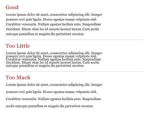
Mis-judged Text Line Lengths
Every reader’s nightmare- a huge chunk of words.
‘sweet spot’ for line length was around 50 or 60 characters – says Emil Ruder, the great Swiss typographer.
Is this also why twitter caps their tweets at 160 characters? Aiyo we’re getting so lazy.
Badly Paired Fonts
When paired or put together haphazardly, the legibility of the text is damaged. The reader would probably not pay the right attention to the paragraph because of the difficulty in understanding the words.
Leading
“Leading” is the vertical distance between two consecutive lines of the text
Many designer fail to give the right importance to that feature and, as result, the lower line gets either overlapped or ends up being too loose, resulting in a hard to read text.
Solution: good rule of thumb to start with is 140% of the font size.
In addition to these rules, I’ve also found a list of typography commandments. Rules and commandments in design, really?? Why so serious?
And then, we are introduced to Dadaism
which breaks ALL THE RULES.
Hello My Name is Val and I am…
So I made a list and picked the ones I wanted to use for this project
6 Traits shortlisted:
Satirical – method?
A Music enthusiast –method?
A Rule breaker –method?
Trying to eat clean –method?
Love Good Vibes – method?
Reference Art
Dada
Trait: Rule-breaker
In conventional typography, we hold on to certain rules depending on the type of work ( formal business letter, magazine layouts etc)
However in Dada, we let it all go.
This movement began in Switzerland where it has a ‘no rule’ rule.
Conventions stick to a maximum of 3 fonts per page but Dada uses as many fonts different fonts.
Sentences and words are punctuated in unconventional ways and random letters are dropped
The idea of Dada uses abstraction to fight against the social, political, and cultural ideas of that time when it first came about.
The idea in this method still remains as we can see from this example here, which i particularly like.
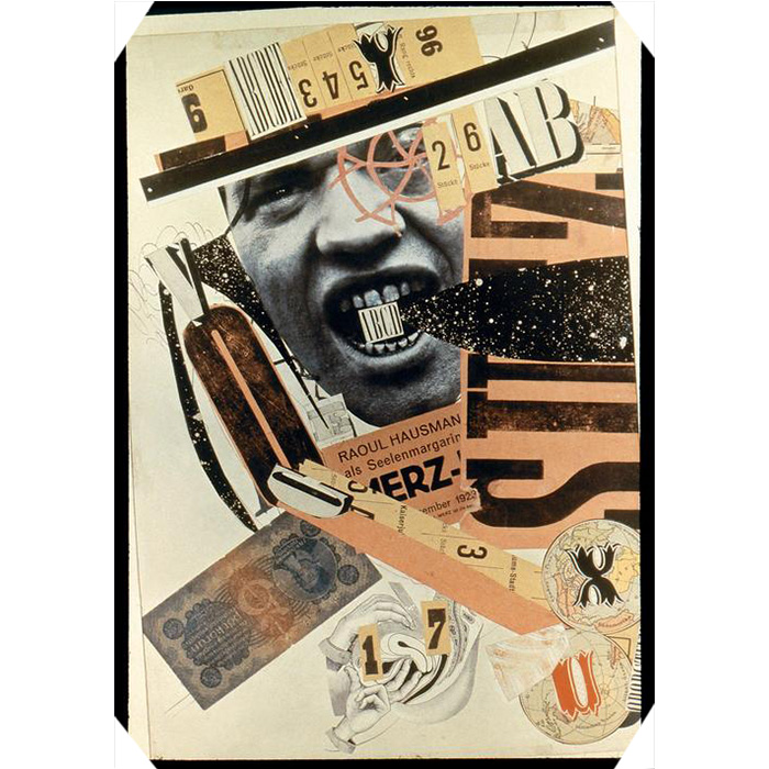
Reference Artist: Raoul Hausmann
Trait: Satirist
Known especially for his satirical photomontages
Uses photomontage to express views of modern life through images presented by the media
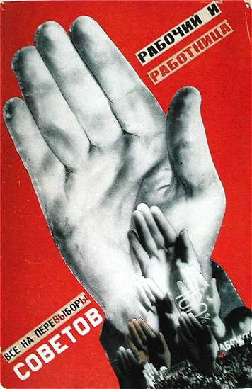
Russian Constructivism
Trait: Music Enthusiast, Good Vibes
Constructivism was the last and most influential modern art movement to flourish in Russia in the 20th century. Ideas were borrowed from Cubism, Suprematism and Futurism
Colours used are red, black or white
Reference Artist: Alexander Rodchenko
I am inspired by Russian Constructivism artist Alexander Rodchenko as his works portrays abstraction with a devotion to modernity.
I’m a fan of geometric art and Russian Constructivism themes are often of such, topped with an experimental kind of look.
Music seems to be a common theme for modern day Russian Constructivists.
More modern day examples featuring some subtle elements
Reference artist 2: Vladimir Mayakovsky
Trait: Want to be part of Advertising
All his designs use black and red colours and his elements are mainly geometric.
The works of Russian Constructivism artists show that objects were not created in order to express beauty but in fact more functional. (To express the idea of construction; experience of modern life – its dynamism, its new and disorientating qualities of space and time)
Handmade Typography
Trait: Trying to Eat Clean
I guess we all love food and I’m also guessing we’ve all tried going on diets. Keyword: tried
I find these figurative meanings more eye-catching as its idea itself just shouts at you.
Possible Methods to try out
Satirical, Wants To Be Part of Advertising – russian constructivism
Music enthusiasts, Good Vibes – russian constructivism
We started the ball rolling during the first lesson with a class activity – by introducing our names and ourselves using typography, abstract and conceptual ways.
Time to squeeze out our creative juices!
Typography
This typography also has concept behind it – I’m trying to bring across that I like things to be seen in more than one perspective.
It really makes you think and changes the way you see something.
Just like how my name here forms a ‘diamond’ if you see it as a whole. Because being able to look and deal with things in another perspective is indeed, a gem!
Coincidentally (or not), there is a term “perspectival”. (which originated from the word perspective itself)
Analyzing further, the letters are in bold as my name itself means valour!
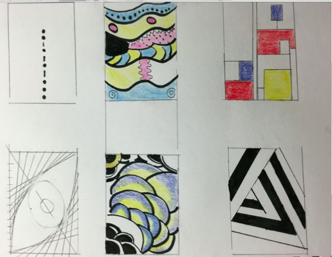
Sketches
Here are some sketches I came up with with the help of dafont.com.
At the same time, I was also churning out ideas for project 1, which also requires us to experiment with various typography.
Abstract
Abstract is so abstract that you just start doodling strokes here and there. However, I thought I’d keep it minimal and stick to a barcode.
Again, it comes with concept behind it – you wouldnt know what am i just by looking at me on the surface, but if you further analyze (scan) me, only then you’ll start to.
Also if you analyzed, the numbers on the barcode spells my name if you typed it on a keypad!
Conceptual
Thought process: things that signify me
Waffles – hard on the outside, soft on the inside. I can be a softie but I dont show it
Onion – many layers of me. The more comfortable I am with you, the more ratchet I get
Sushi – sometimes I feel that my ideas are sushi-ty. Sometimes I feel that it’s su-fresh. And I like to play with puns very matcha. Udon know how punny I can get – until you analyze me like a barcode and then youll change your perspective of me.


