Category Archives: Process

Typography Portrait – Progress #2

There hasn’t been much change conceptually for my designs other than for one of my attributes. Here are my intended attributes:

  1. EXISTENTIAL
  2. SYSTEMATIC
  3. TRAVELER
  4. PRICKLY

The following is a strengthening of my intended methodology with certain reference material.

The attribute that had undergone some change is SYSTEMATIC. Originally, I had intended to build a small model of a conveyor belt out of paper in order to generate the idea of being systematic. I later than toyed with the concept of digital artwork, but neither seemed to really work. I had also considered using negative space for the actual typography as well. Finally after a lot of thinking and a sudden moment of epiphany, I decided to make use of what I already have at home: Lego.

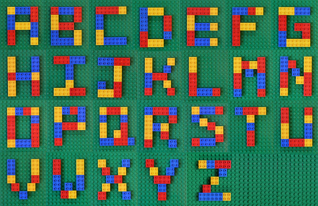
Below are a couple of references I found interesting –

I went ahead with the concept of negative space, and have already formed this piece out of rectilinear lego pieces. It all comes together a little stiff and chaotic, but systematically rectangular as well. This piece will be revealed on the day of the presentation, with both the model and the A5 submission.

For EXISTENTIAL, after a lot of painful experimentation with bright lights in pitch black rooms, I have decided to go with shadow typography, similar to the below:

For the other two, I have decided that I am going to attempt pin and thread typography as well with TRAVELER, as well tactile typography like the examples below:

Pin and Thread –
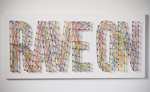
However, instead of coloured thread, I will be using white thread and pins. Perhaps with some other colours to highlight countries, as well as some pictorial aid.

Tactile Typography –

I will be using toothpicks for this piece as it is more inexpensive, though the background material is still being confirmed.

As of yet, I am still acquiring the necessary materials for the above projects so no progress has been made yet. However, I am fairly certain of my methodology and the ways I will be attempting my typography, all of which will taken photographically and submitted in an A5 format.

Hope it all turns out as planned! 🙂
 

Typographic Portrait – Progress

My intention with my pieces is to go with something more interactive that can be viewed from multiple perspectives, even if the ultimate A5 result is single-facing.

I have since settled on four major attributes and ideas:

  1. EXISTENTIAL

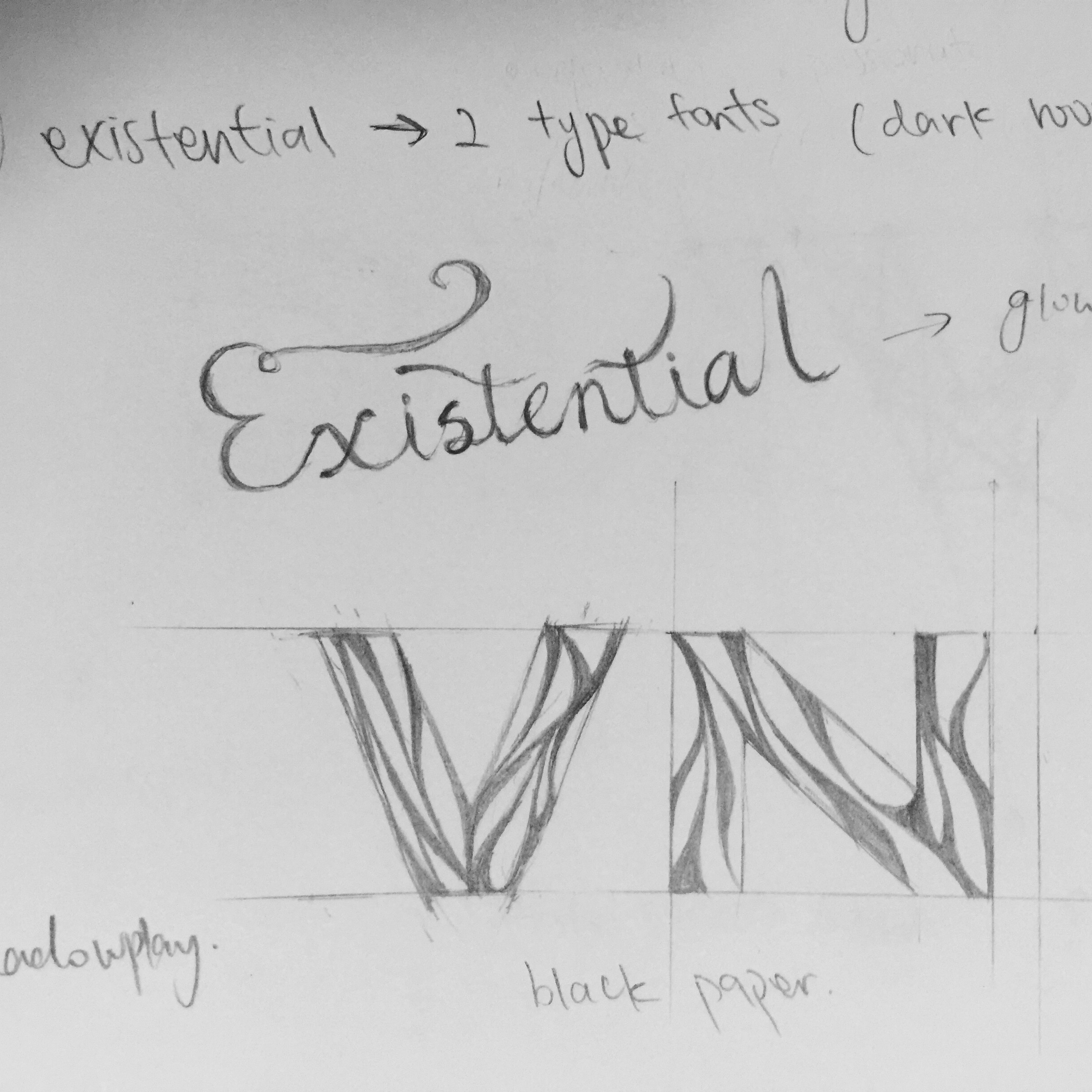
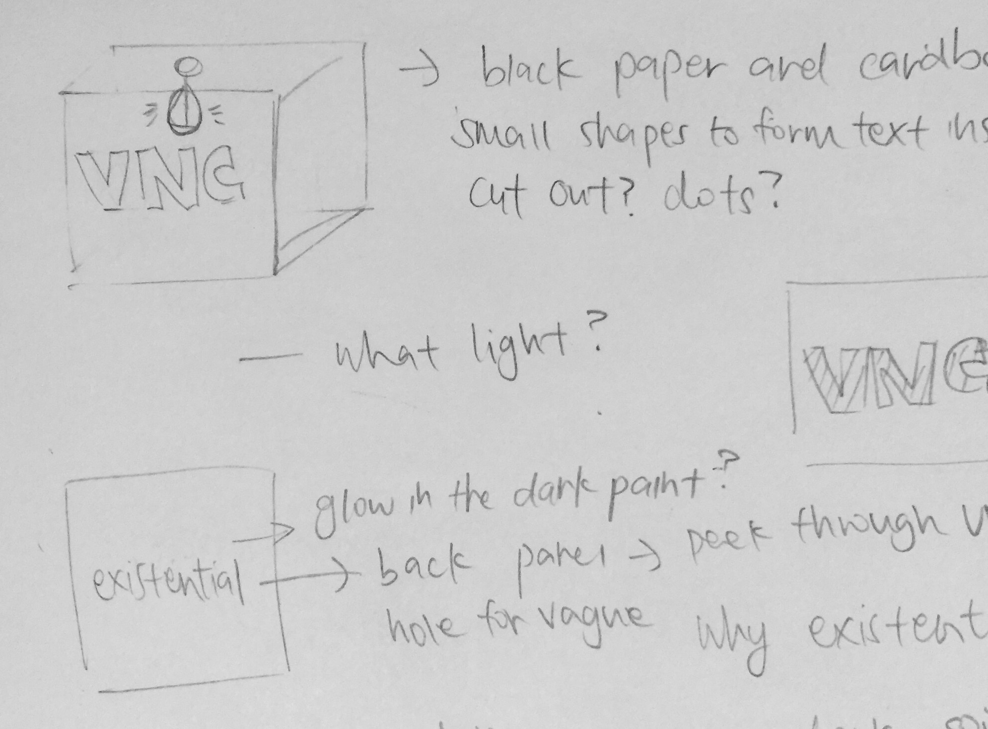
I’m going for a concept where one finds some light in an existential spiral. The idea I’ve crafted is as follows:

FullSizeRender

I intend to build a black box, material yet to be confirmed. On the front face, the syllables of my name will be carved onto the surface in curved strips. The word existential will then be written in glow-in-the-dark ink to stand out in the box as shown below.

FullSizeRender

However, my main issue with this work will be it’s presentation. The idea may or may not undergo some changes. My typographic name may be made out in translucent paper instead. Ideas are still being tossed around as to how to solve this problem.

2. SYSTEMATIC

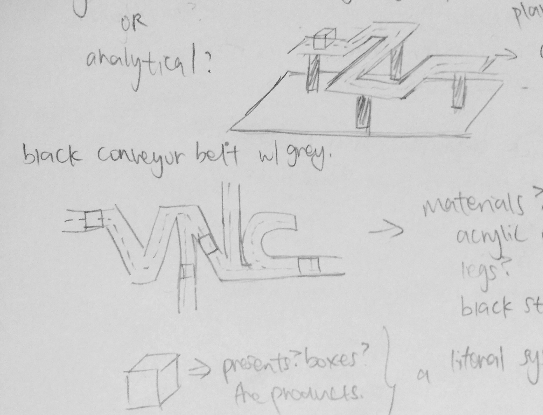
My intention is to make this piece look like a conveyor belt. My initial concept was to make this typographic model out of paper, but after some consideration, the suggestion of negative space became a concept I am intrigued about. My initial sketch model is as shown below:

FullSizeRender_1

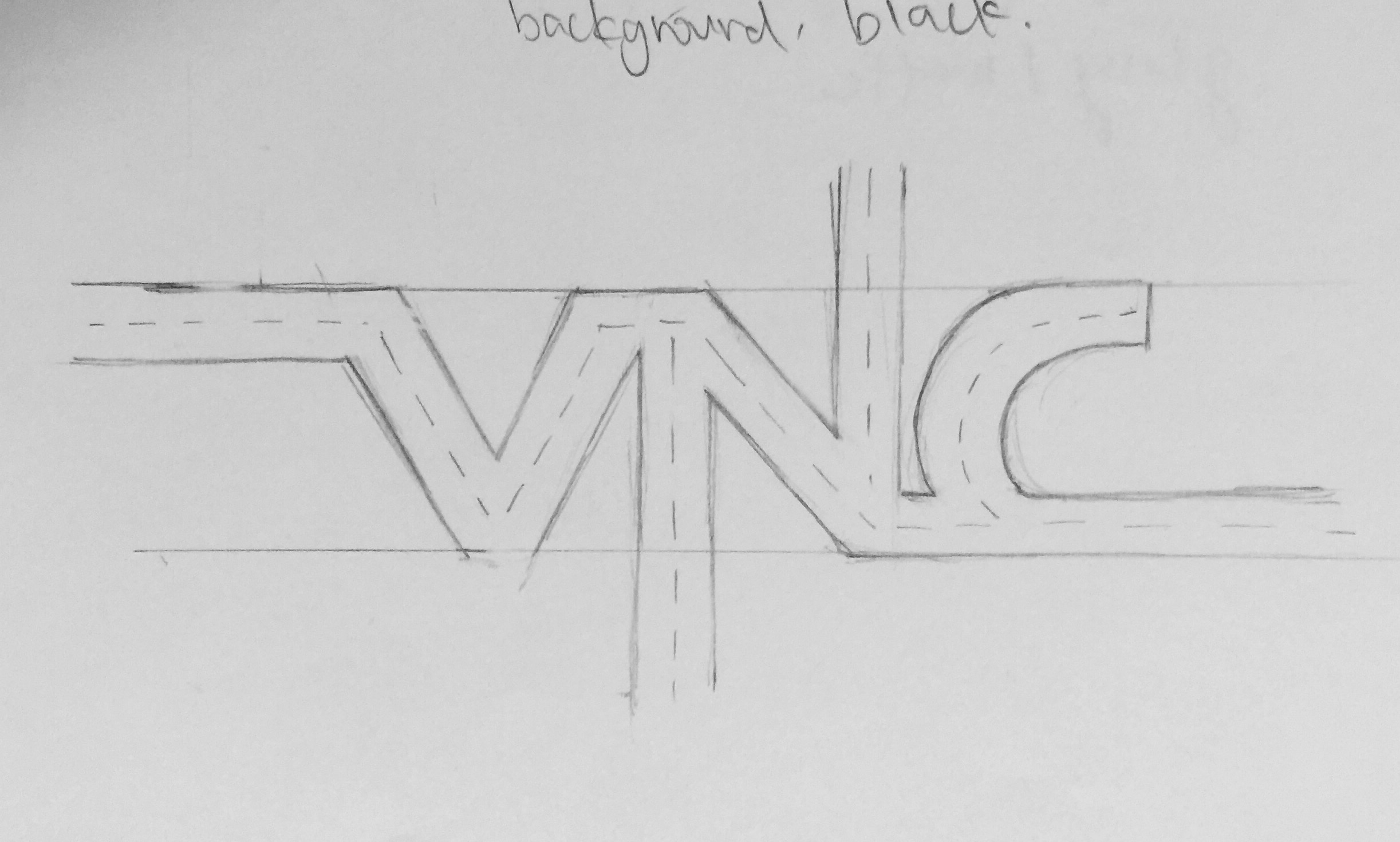
The typographic outline I hope to fulfil:

FullSizeRender_1

The concept I have in my mind is to perhaps outline the silhouette of the word instead of merely forming it out of paper. Initially, I thought of using daily objects to form this figure. However, it’s time-consuming nature is making me reconsider my option. The concept of 2D digital art is interesting as well, and may be able to achieve my desired effect better. Still toying around with ideas for this piece as well.

3. TRAVELER

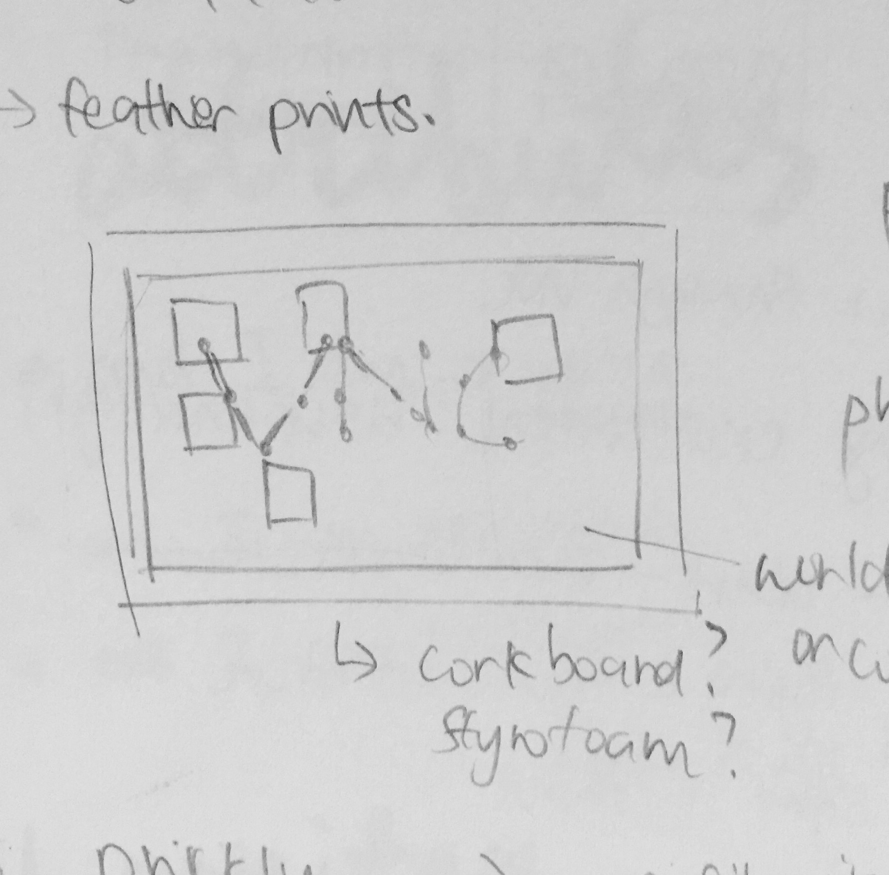
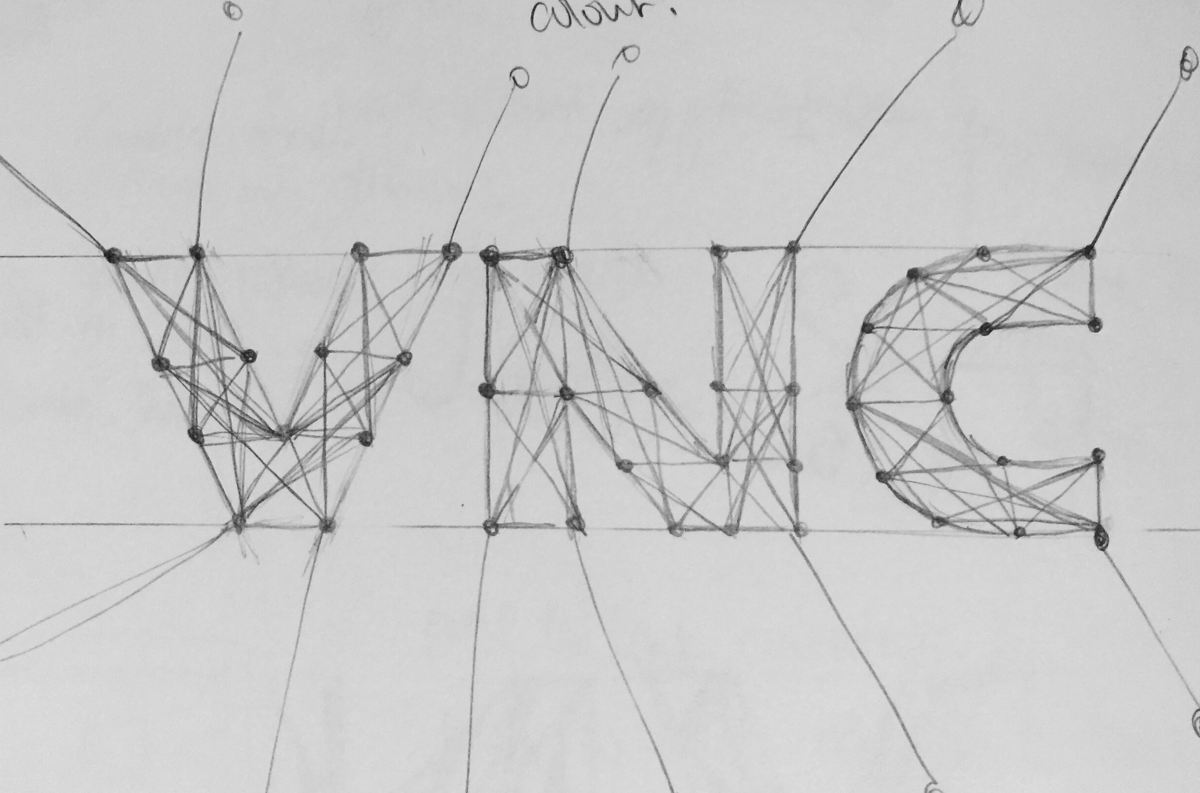
I have always been a traveler, and this 3D typographic piece is meant to showcase this aspect of myself as a physical representation of my dream to travel the world. My intention is to piece my name together using string and pins.

FullSizeRender_2

Certain strings will then branch out towards countries I have and haven’t visited, all in various colours for visual interest and easy identification. This is the only confirmed design that I will very likely proceed with.

FullSizeRender_2

4. PRICKLY

I am easily irritable, even if I don’t always show it. This is something more textured that I’ll attempting to pursue. I intend to form my name with toothpicks on a styrofoam surface. I have considered the use of pins, but I realised that they may be a bit costly and went with the alternative of toothpicks instead. I may consider using a styrofoam board as its base.

FullSizeRender_3

These pieces will all be shot in photos to display its 2D typographic nature, though they are mostly done in a 3D format.