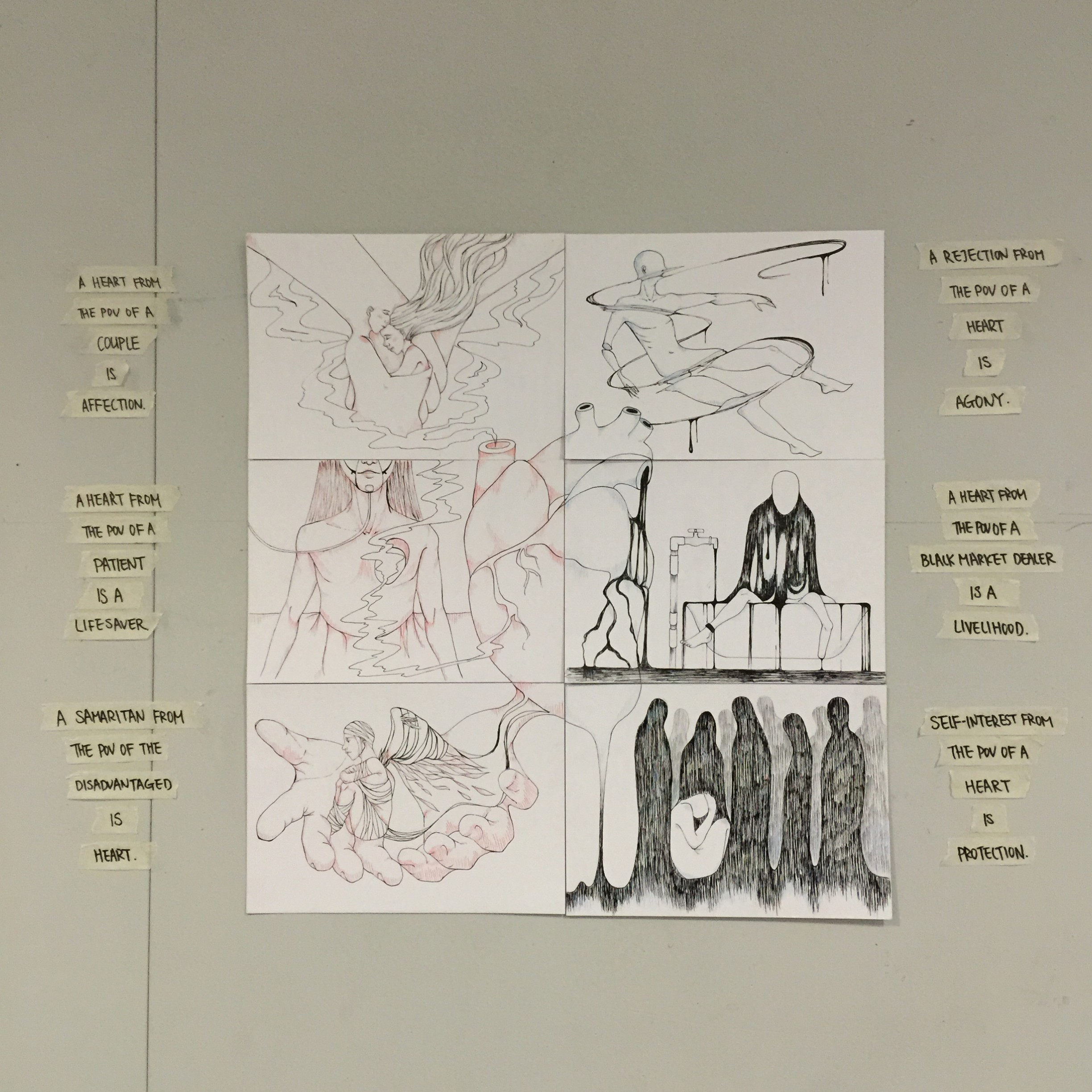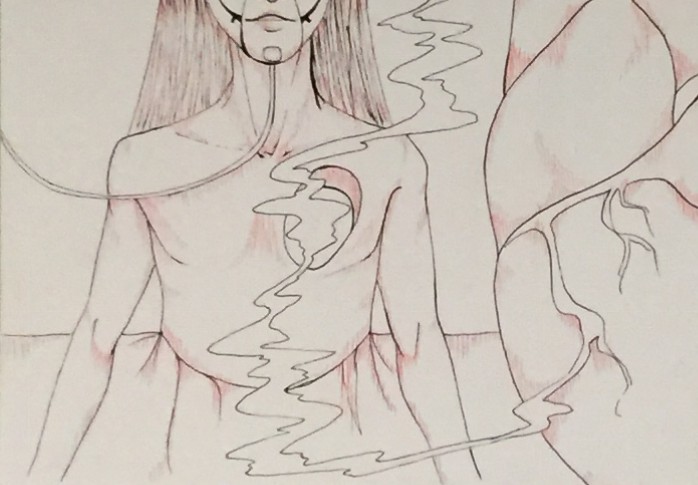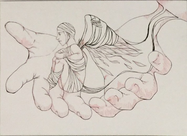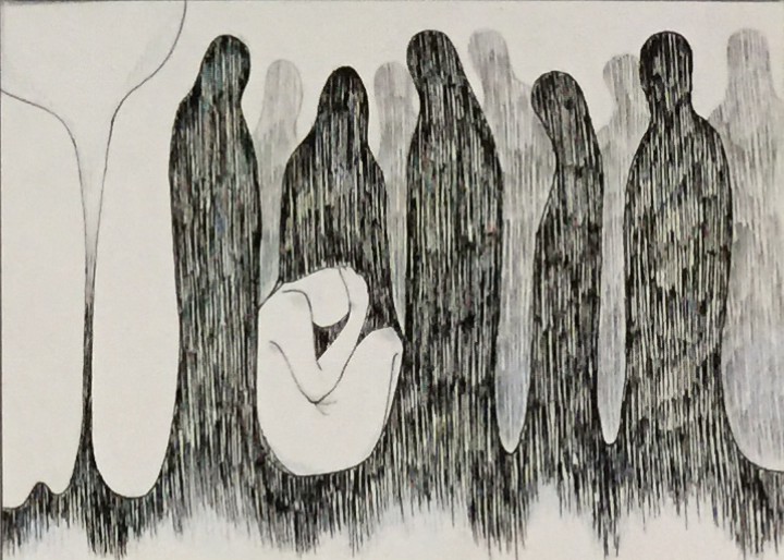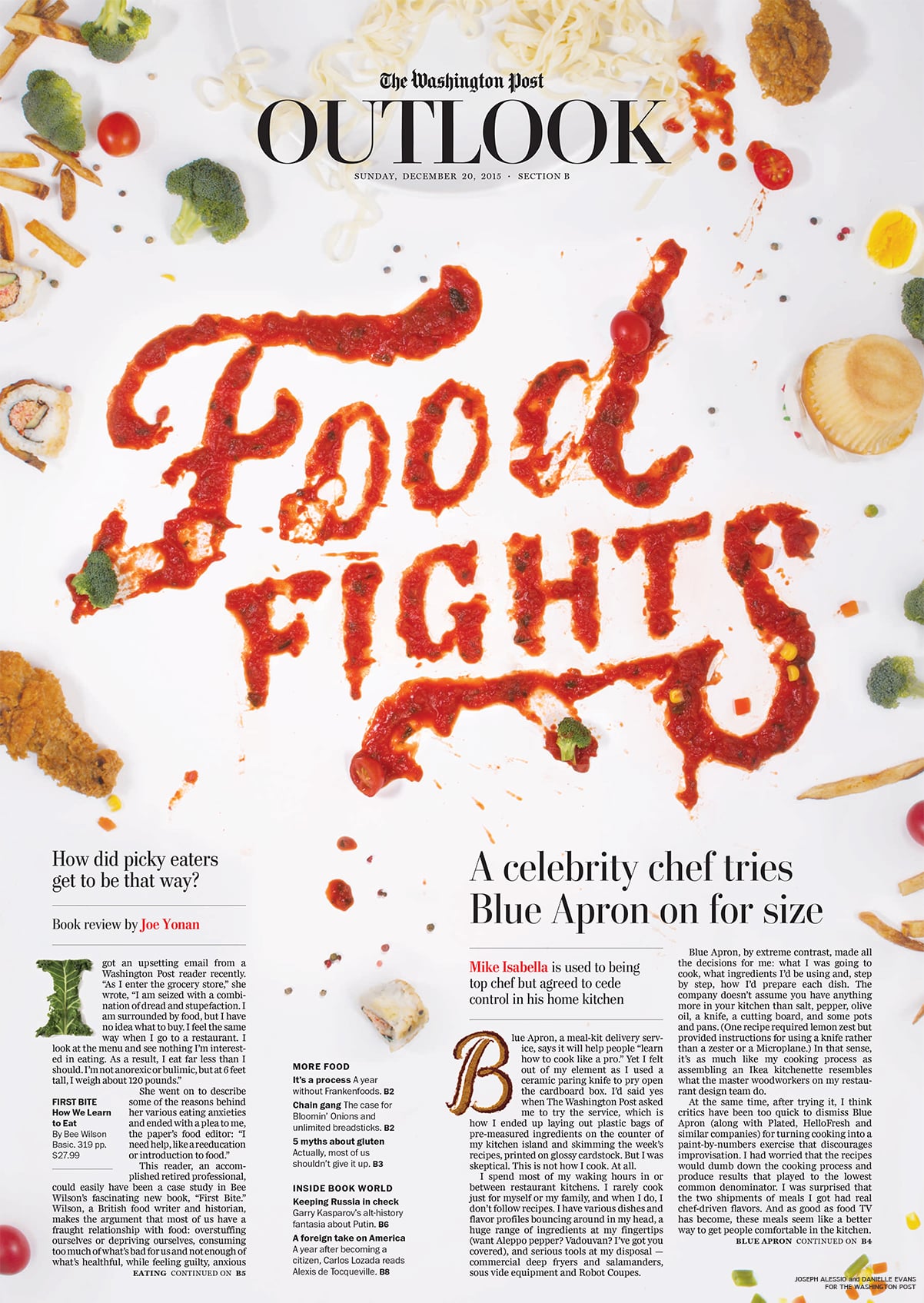
The zine has always had a history of self-expression and social engagement. They were often used by sectors of society that find their content underrepresented in traditional media, and thus decided to create their own content. From my foray into fan culture, I knew zines existed and were very popular, often used for art compilations and fanfiction. Regardless of the content, it was used to bind different committees together. Be it due to popular culture, or through expressing a political message usually overlooked. I decided to do a quick pinterest search, that slowly accumulated during the course of the project.

Full Research/Moodboard here.
That’s what my research informed me, which of course intrigued me immediately. As a someone who may have stronger social opinions than most, I felt that I wanted to produce a work that could represent my opinions. With the rise of the internet, zines went from being handmade to being digital. However, I still wanted to retain the idea of producing a strong social piece. I went on to consider the different social movements that I felt strongly about: the feminist movement, the civil rights movement, and the queer movement.
In the end I decided to go with the feminist movement to narrow the scope of my zine down to something more specific.

Something else I immediately thought of in relation to the disenfranchised and the marginalised was Les Miserables. This musical is famous for discussing the oppression of those of lower social hierarchy, and the subsequent fighting back of society. Other than aligning perfectly with my feminist concept, Les Miserable was also one of my favourite musicals and had shaped my own interest in social and political issues. Before that, I had always been apathetic and uninterested. I thus felt it was particularly apt.
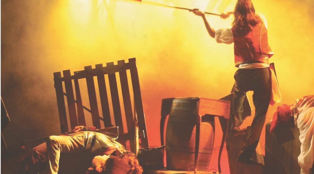
I knew red was going to be something featured heavily in the work, being the colour of passion, and also a flag of the revolution in the musical. But seeing this poster, I knew immediately the colour scheme my work will slant towards.
The poem (sort of) was also inspired by the Finale in Les Miserables, which has always made me very emotional, particularly this segment:
Do you hear the people sing
Lost in the valley of the night?
It is the music of a people
Who are climbing to the light.
For the wretched of the earth
There is a flame that never dies.
Even the darkest night will end
And the sun will rise.
They will live again in freedom
In the garden of the Lord.
They will walk behind the plough-share,
They will put away the sword.
The chain will be broken
And all men will have their reward.
Will you join in our crusade?
Who will be strong and stand with me?
Somewhere beyond the barricade
Is there a world you long to see?
Do you hear the people sing?
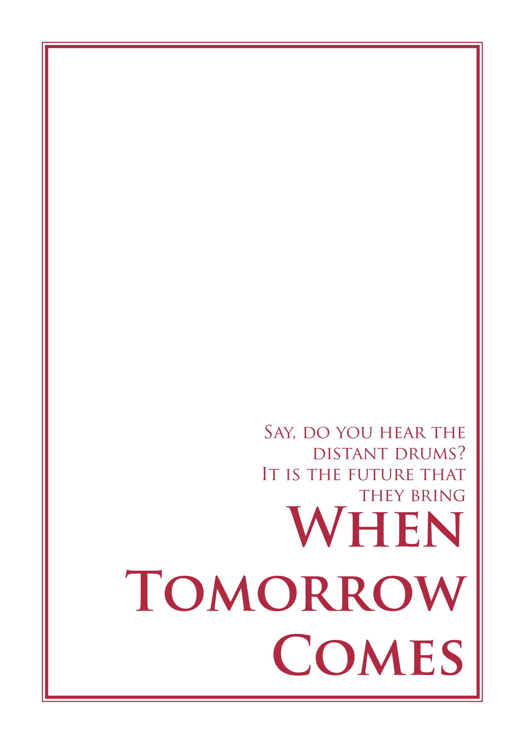
Say, do you hear the distant drums?
It is the future that they bring
When tomorrow comes!
Will you join in our crusade?
Who will be strong and stand with me?
Somewhere beyond the barricade
Is there a world you long to see?
Do you hear the people sing?
Say, do you hear the distant drums?
It is the future that they bring
When tomorrow comes…
Tomorrow comes!
I knew I was going to utilise part of the lyrics in my work. I then furthered my research by going into my own books.

There was a couple of paraphernalia in this book that with the help of consultations, made me realise I could utilise them in my work. Below are the three specific ones.
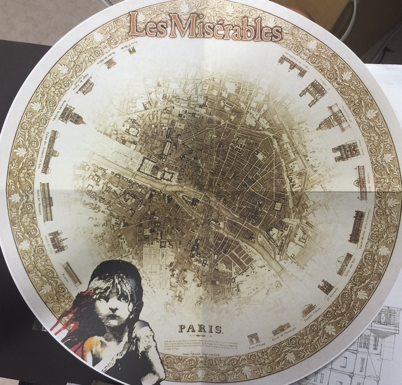
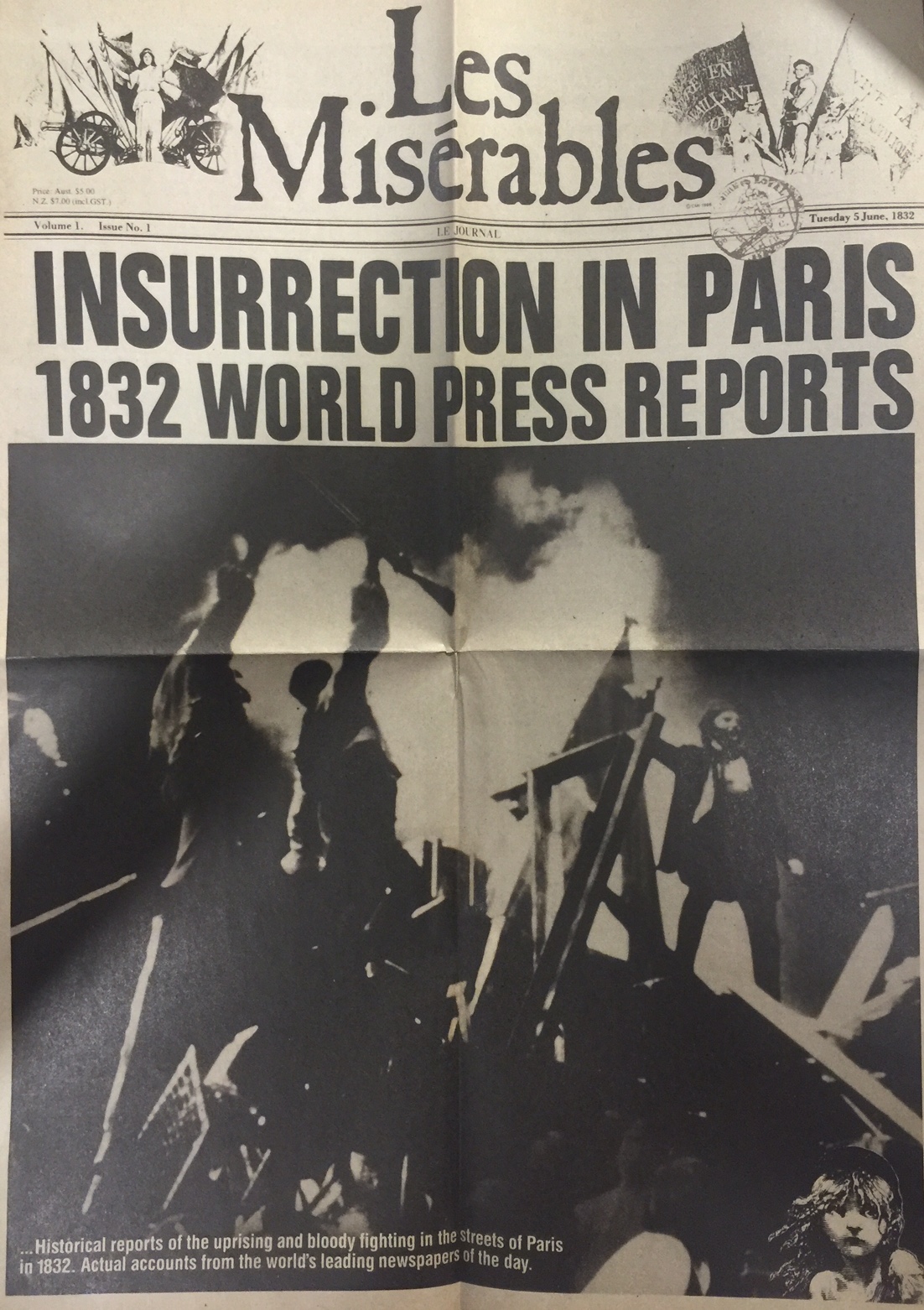
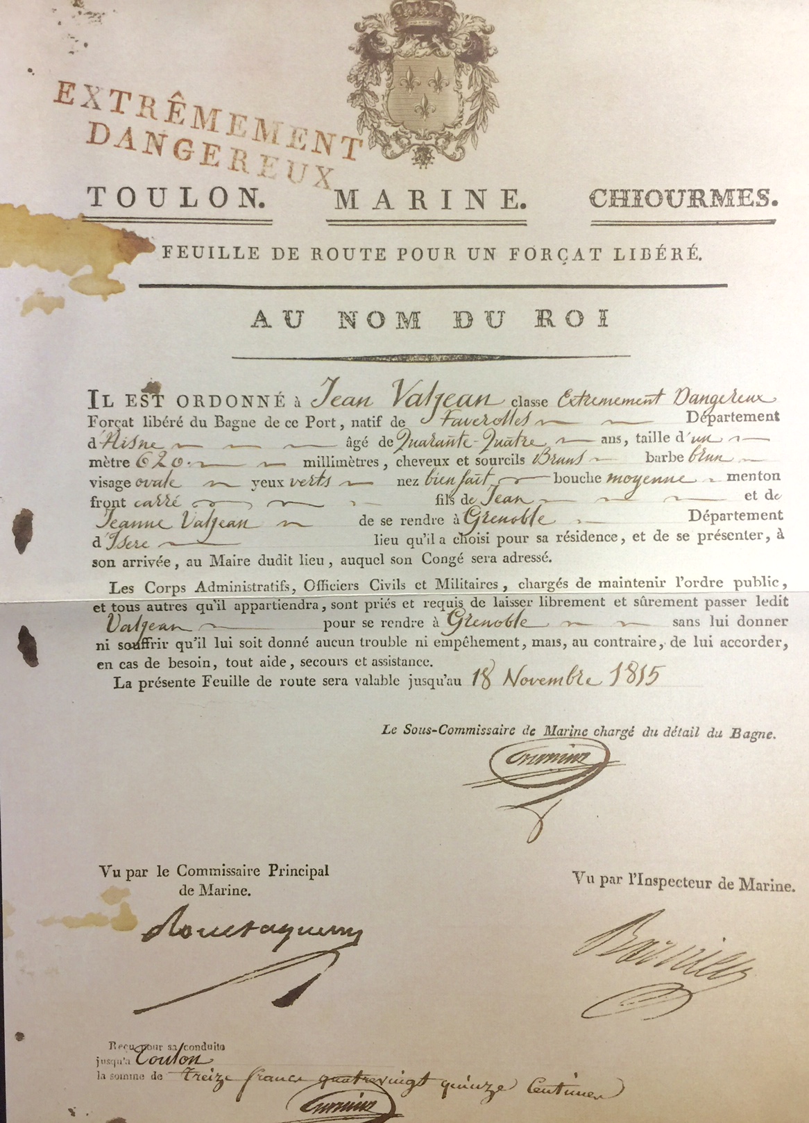
I borrowed the idea of using an aged and yellowed texture as that was what I felt was in common for all three.
Here are the final pages:

I printed the two covers separately on a piece of tracing paper, then bound them all together in a saddle-stitch (the help of the printing shop). The tracing paper was to add a hazy, dreamlike quality to zine, much like the revolution and social movements. A dream for a better world.
Creating the zine was trying and torturous process as I had never worked with Indesign nor did anything design related other than digital painting in photoshop. So this was something completely new to me. Perhaps I went a little safe with my overall design, but I’m still glad I was able to produce a work I am mostly proud of. A good end to a semester in Foundation 2D!