Tag Archives: Project 1

Typography Portrait – Final

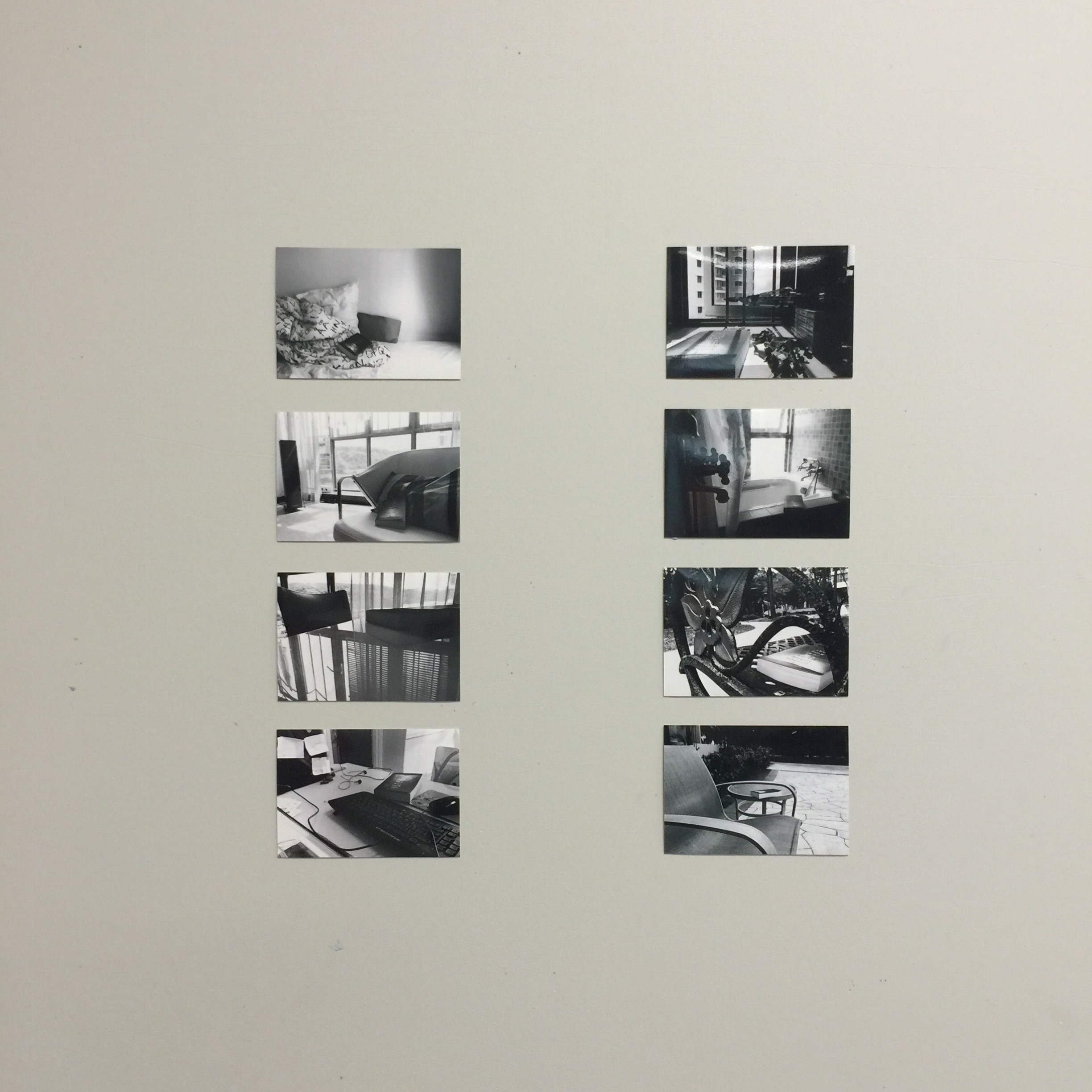
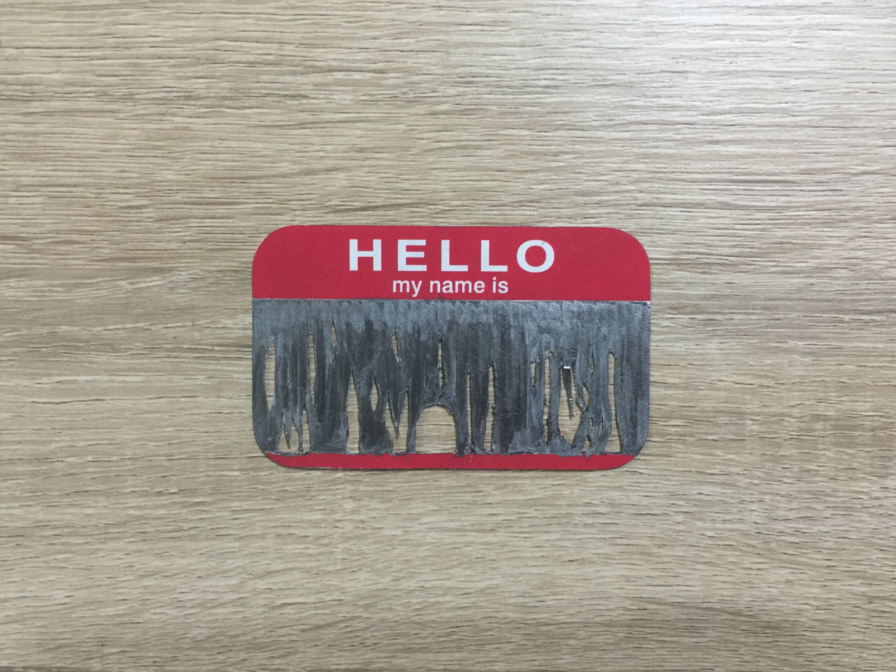
Finally after some long grueling work with research and a lot of painful fingers, my typography portrait has finally been completed. Since I’m more used to traditional 2d mediums and digital art, this time I wanted to step out of my comfort zone and try to build something with my hands instead. Despite my lack of talent in it. This of course meant that during the process of crafting each individual portrait, a lot of challenges were thrown my way but thankfully, I was able to conquer them to produce the final product in the picture below.image

  1. PRICKLY

Meaning: One of my flaws, which I’m still trying to correct is that I have an irritable personality. I get easily ticked off by things I find offensive, and since I tend to keep things to myself, I may start to appear judgmental. I may get easily ticked off but I try to school myself to remember that I will need to be accepting of other people’s quirks and problems. It is getting better now but it’s still something I constantly agonise over. This work is meant to remind me of my prickly nature and to keep myself in check.

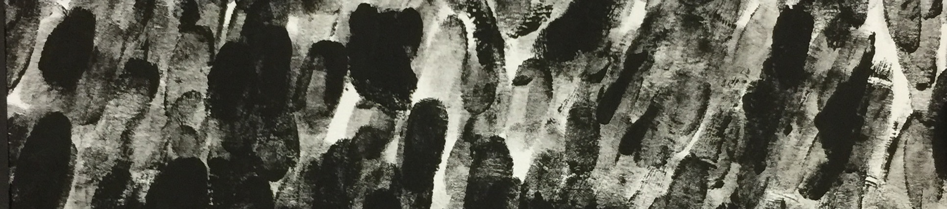
Methodology: I used a Styrofoam board and toothpicks in this work. I painted the white board with many layers of acrylic paint to ensure that I could get it as dark as possible. I then sketched my design onto a piece of paper. Using the sketch as a stencil, I would then poke pins through the paper to generate small holes to mark where I needed my toothpicks.

My first attempt with the toothpicks however was a complete disaster. Since they were too long, sticking them meant I couldn’t control the direction they were pointing in. Instead they formed a jarring mass of formless shapes. I tipped them all over since I obviously couldn’t submit a formless shape. I went on to try and experiment and see if I could lay down the toothpicks, but it felt too flat. So that was also another failure.

In my frustration, I broke a toothpick (highly appropriate considering the attribute the portrait related to) and realised that hey, I could use the short end! I stuck it in the board as a test trial and it worked so well that I went with it in the end. I’m glad that it was able to turn out the way the did considering the problems that arose. The fact that I didn’t get any splinters (or maybe I did but I just couldn’t see them) was a bonus too.
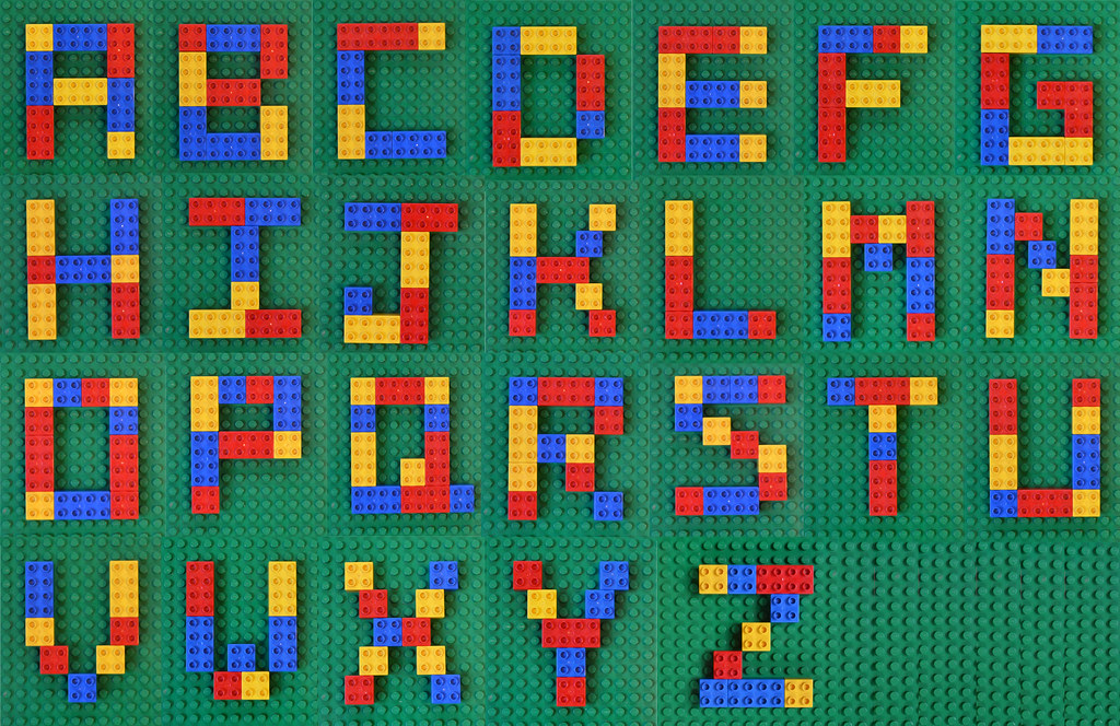
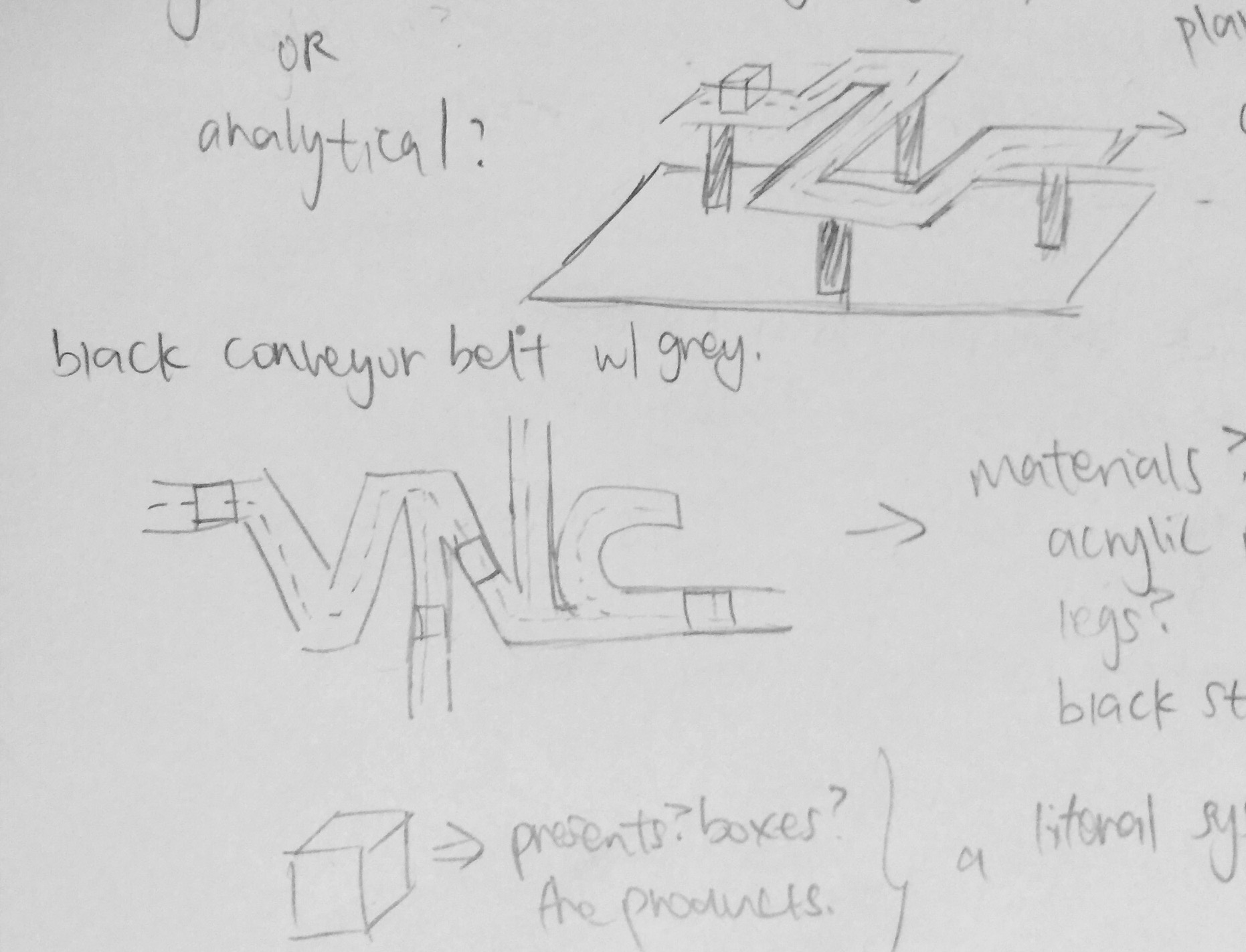
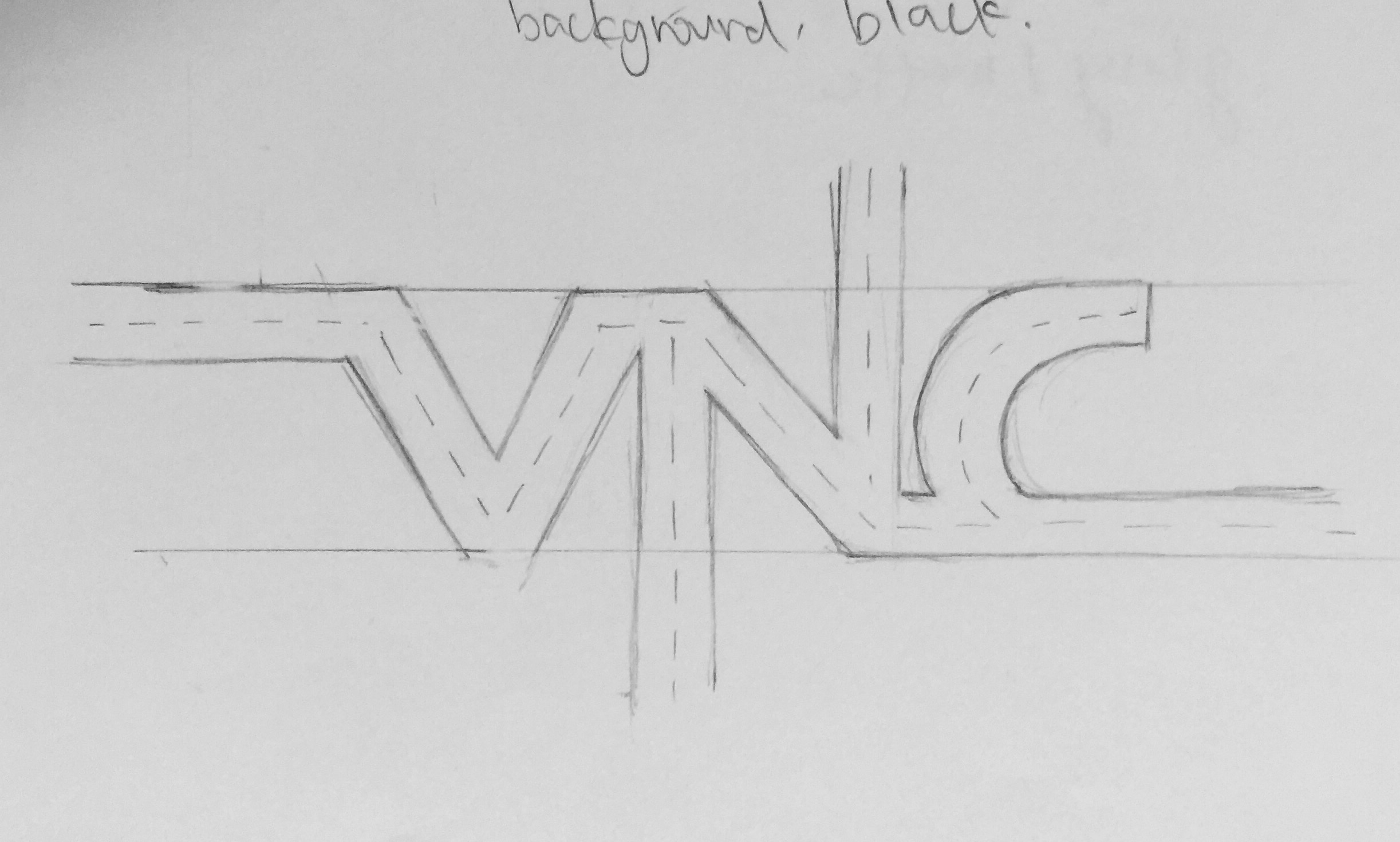
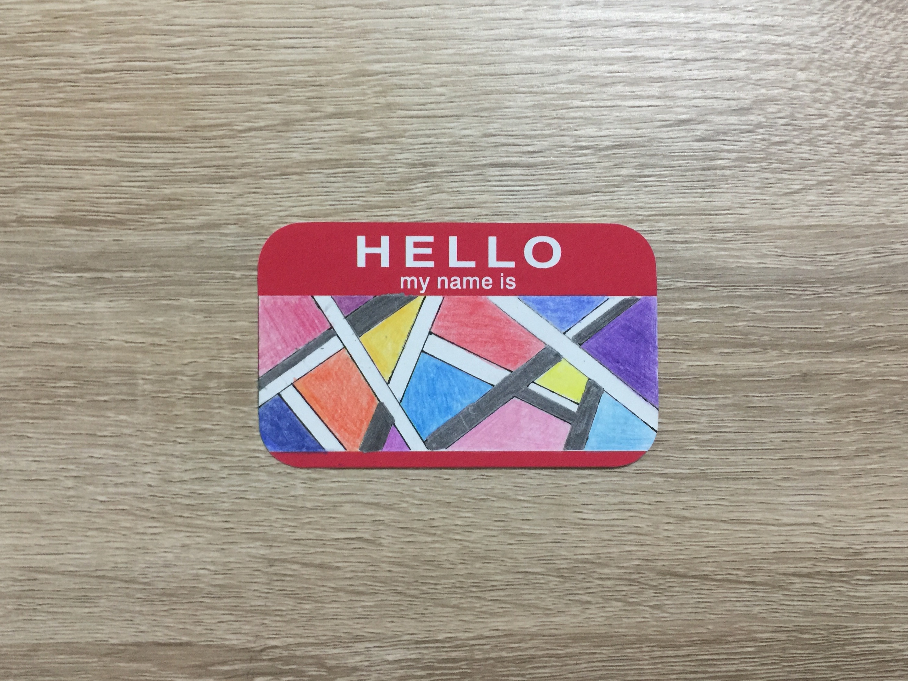
imageimage

2. SYSTEMATIC

Meaning: The ironic thing about this attribute is, I am actually a ridiculously messy person. And yet, one of the things I constantly need to do, is finish things in a systematic way. I am constantly writing lists (one of my guilty pleasures. Guilty because who the hell likes lists?) and doing things by the book. But this makes me feel secure, knowing that I have done everything I need to do. Especially when work starts to pile up, my lists are always my go-to. Sure the increasing length of tasks stresses me out, but at least I have everything I need down.

Methodology: Initially, I had planned a conveyor belt concept, like churning parcels out in a factory. I had intended to build it out of paper but after some consideration I abandoned the idea. This piece underwent a lot of conceptual changes simply because I couldn’t make up my mind on what exactly I wanted. Finally, after hearing the idea of negative space during a consultation sessions, I decided to go with it instead. Paper became Lego because of its strict geometry and hard lines.

I spent more than half a day working on this piece because unlike the first piece it was much harder to generate a stencil and gauge the spaces for the letters. The Legos are mean, unrelenting little bricks that are determined to do damage to my soft, human fingers so I they were really rubbed quite raw by the end of it. Just the thought of those Legos bring back the phantom feeling of pain.

Thankfully though, this piece was more smooth sailing (in some ways) than the others. The only big issues was arranging the letters to make sure, yet again, it wasn’t a formless blank space. Execution wise it was a simple idea. It was only more tedious to actually form the word. However, I’m happy that it now resembles actual typography.
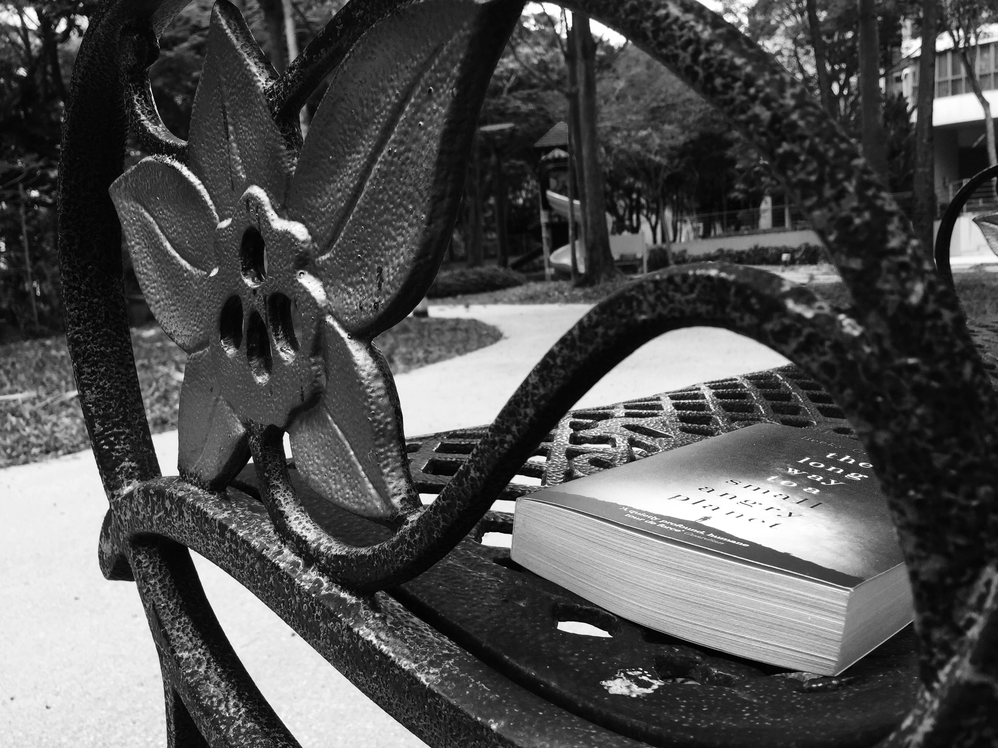
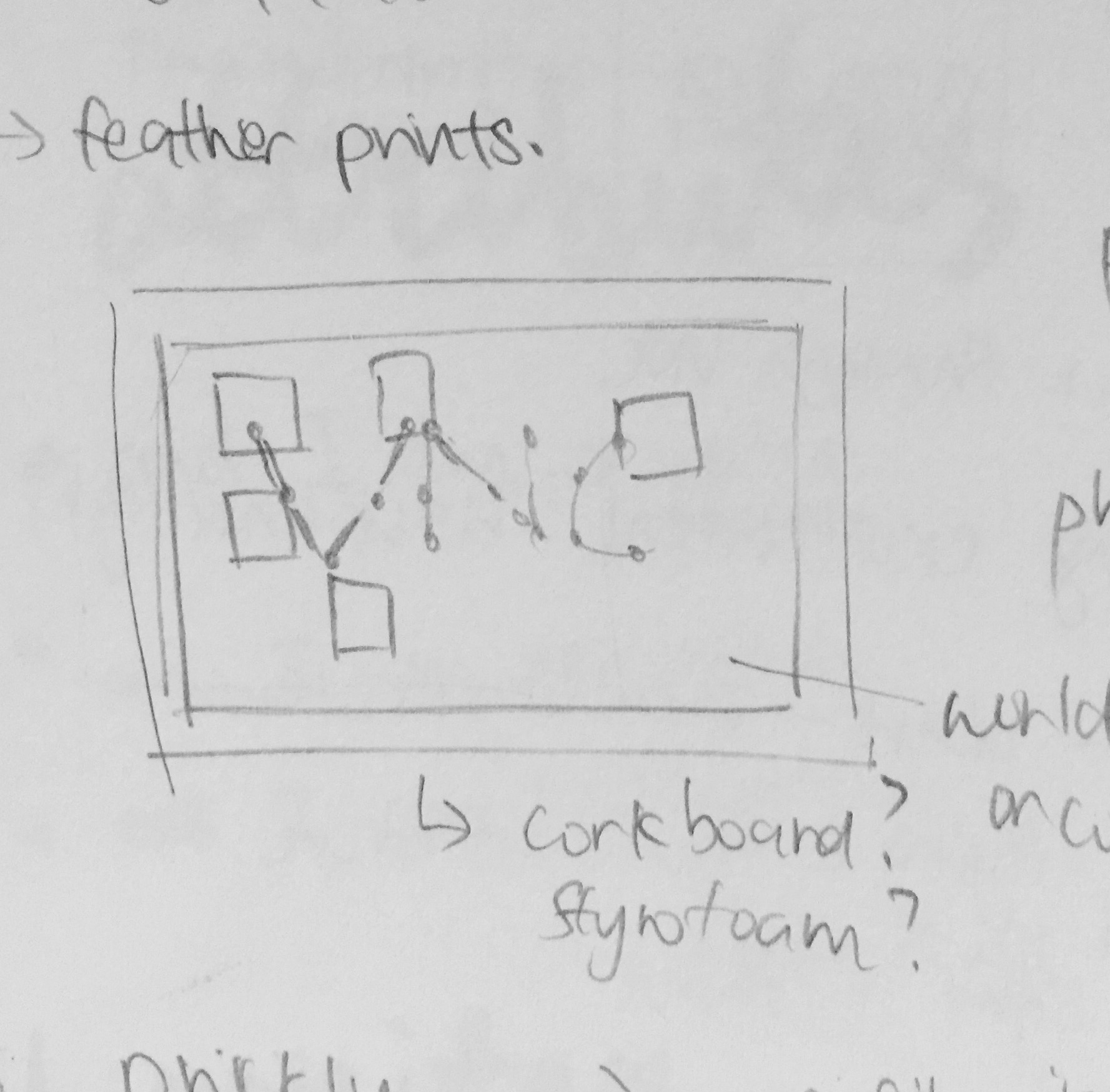
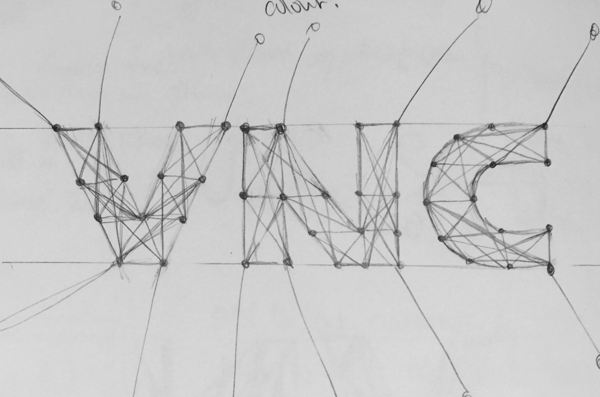
imageimage

3. TRAVELER

https://www.dropbox.com/sc/3yaok6fk5s3cl4a/AADd9sXf4hlPzlL4eRJ4CxAQa

https://www.dropbox.com/sc/45oj12xp82n60wr/AADuqQg4JPQPRdxJ363jXB9na

Meaning: Conceptually, this is probably the simplest of them all. I wanted to represent the traveler in me, and my need to get out there. I love going overseas, even if the places I have visited aren’t many.

Methodology: I use pins and white thread in this one to generate the typography. Initially, I had intended to use pictures to denote the places I have visited as well but as I wanted a cohesiveness to all my designs, I ended up scrapping the idea. Looking back, I realise that perhaps it may not have been the best idea. It now looks a lot plainer and drab, and the meaning doesn’t show itself as strongly than if I could have use pictures to support the typography.

Just like all the others, forming the text was a a grueling and tedious process. My rather lanky form meant that I had to curl up ungracefully on top of my desk, twisting my back and neck in order to properly pin things up. Ensuring everything was straight and aligned with each other added to the physical torture – you didn’t just have to pin, you needed to hold a long metal ruler in place too. By the time I got down from my desk, there was a kink in my neck and an ache in my back, but I was happy. (The sacrifices you make for art.) But hey, at least the typography itself worked out.

Honestly, I was least happy with this piece, as the lighting was undesirable and the concept not as well executed as I wish it had been. However, I am still glad that I was able to complete and produce a finalised work.
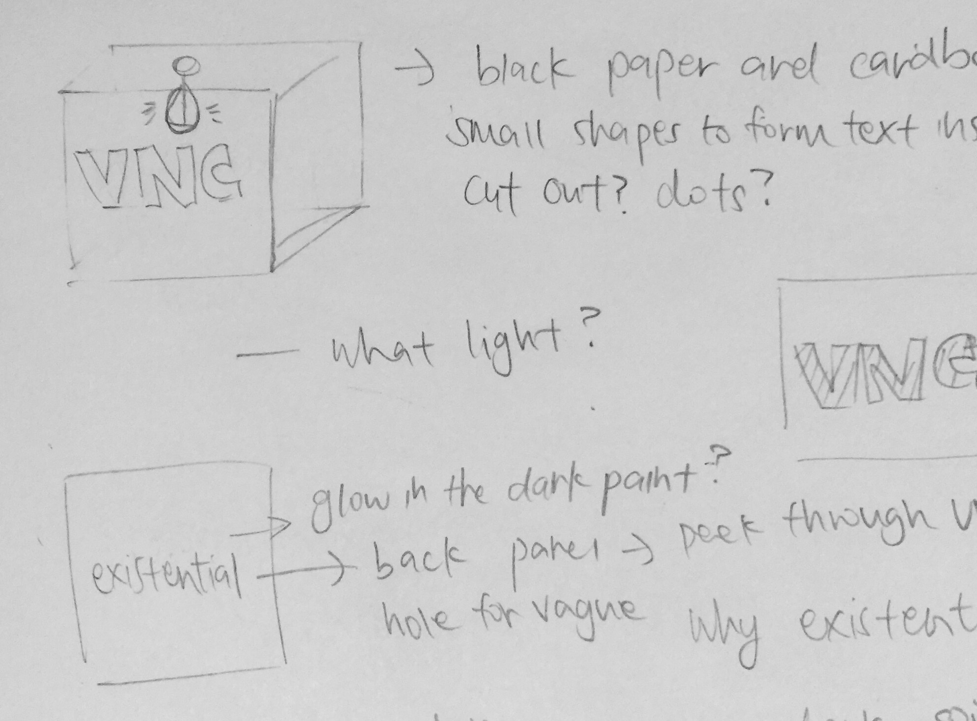
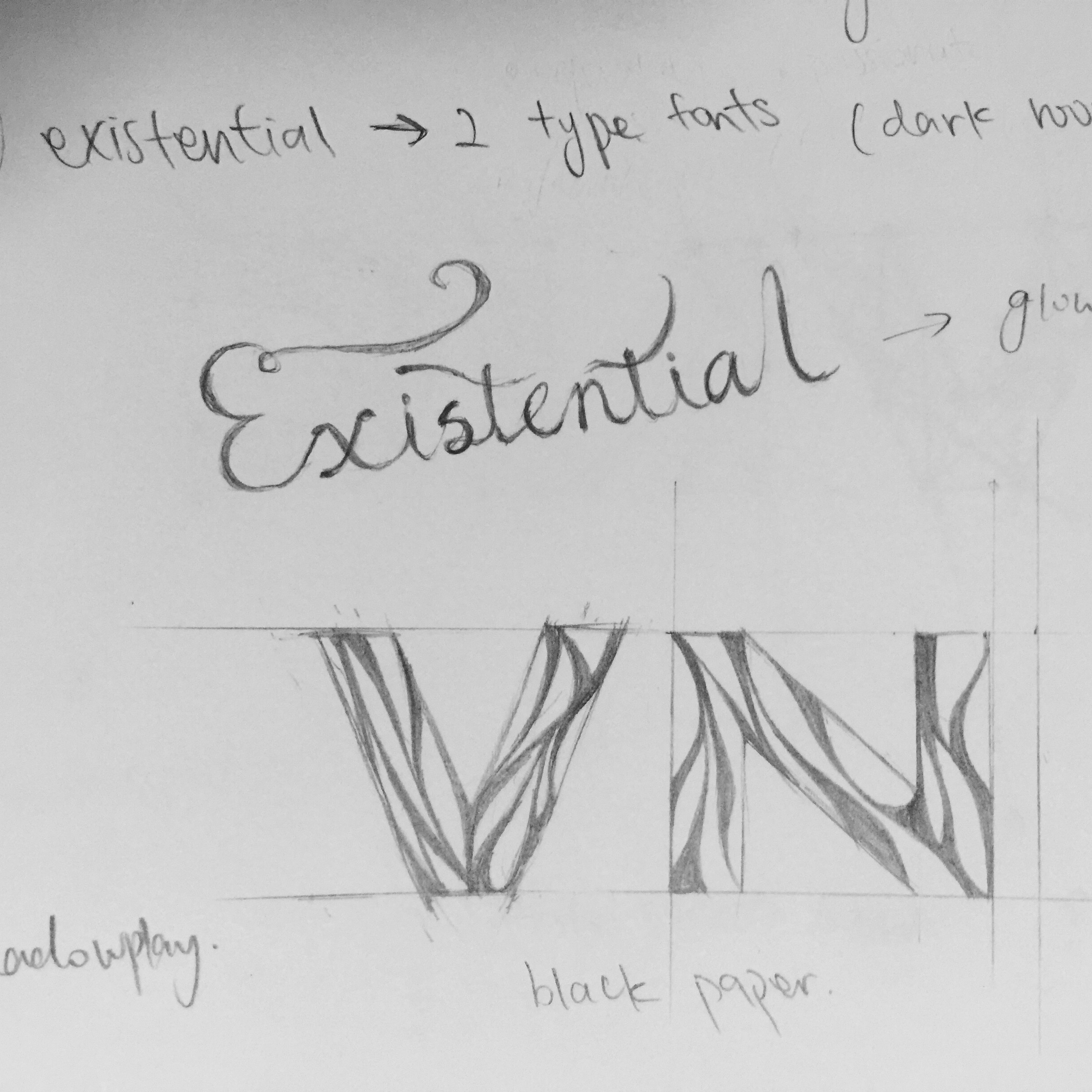
4. EXISTENTIAL

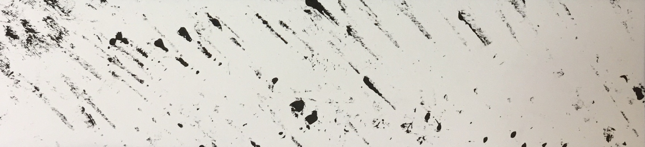
Meaning: This piece has a slightly darker connotation to it. Art will never be complete without some intense introspection. This piece is generated from a place of thought: literally, because existentialism is a downward spiral of thoughts on the human need for purpose in life. Perhaps it comes from me being an introvert, but I find myself getting lost in my head more often than doing anything solid. A flaw as well but that isn’t the point of this piece. This portrait rather, is to remind me that even if my thoughts tend to reach towards less positive places, I can always trust to find light and hope at the end of that tunnel.

Methodology: I first sketch out a meticulously measured design in pencil first before taking a knife to the paper and slowly slicing out the designs. There is some idea of negative space usage as well, as I wanted the letter to be suggested through the curves of the paper. Therefore finding a balance between space and paper was quite challenging as I didn’t want it to be formless (yet again) and I didn’t want to have to re-cut the work. It was a more hesitant process.

The paper cutting was the easy (though tiring part). Now I needed to find a way to take the picture. I know I wanted a semblance of translucency to the picture so I taped tracing paper behind the piece for light to shine through behind. I stuck the piece on my shelf, where my desk lamp was conveniently placed behind it. And due to the translucent nature of the paper, the brownish hue of my note board was able to reveal itself through the paper. So instead of a flat white light within the letters, there is now a soft gradient of colour.

The effect was unexpected but very much satisfactory, and this is one of my favourite pieces, together with Prickly.

imageimage

A lot of thought and consideration was put into this work, something that I haven’t done for a 2D project in a long time. (More due to my reluctance to do anything that wasn’t purely digital/in traditional mediums.) This meant that I had to work harder to manipulate this unconventional, unfamiliar modes of representation and the challenges that arose were much more numerous than any other project I have experienced before. The lighting for some of the pictures weren’t very desirable as well, so learning how to control light would be something I’ll want to tackle in the future. However, the process of creation was definitely enjoyable, and even if they hadn’t turned out as perfectly as I saw them in my mind. they already far exceeded anything I have done in the past. All in all, I am glad that I was able to complete and finish this project, to produce my four works.


Walking Home – Research and Final

Title of the work: Story.

Medium: Photographic Narrative, Stop Motion

Work description: 

“Whenever you read a good book, somewhere in the world a door opens to allow in more light. – Vera Nezarin.”

Home has different meanings for everyone just like no two homes are exactly the same. To me, home is a comfortable sphere of relaxation. I tend to find solace in reading, an activity I constantly engage in when at home. Coming home is to allow myself to recharge in solitude with a book.

Having been inspired by the above quote, this series is in black and white to highlight the contrast between light and dark. The pictures all contain various places one could read. The book itself is the main character, traveling everywhere with me as it goes.

The video itself is a stop motion animation of my figurative self on a journey into the world of fiction and coming through as someone else. With close to three hundred shots, it utilises the same character in the photographic sequence, the book as a device of travel.

Briefly Discuss: 

Advantages: Sequence images are able to suggest instead of tell. A lot of the time, with moving image, a narrative is overtly present in the story. Your interpretation of the series becomes much more limited. The point of sequence images is that they never reveal the whole story, which is what I find quite charming about.

Limitations: If not manipulated correctly, sequence images might find themselves lacking in narrative and instead of connoting, become extremely literal. This is my problem with my series.  Most of it denoting, with quite overt messages present and not enough subtext and internal meaning.

Challenges: There were many pictures to take for the stopmotion that required a lot of maneuvering as I was working with figurines. Despite the large amount of footage, the ultimate product was very short as well.

What might be some of the advantages, limitations and challenges of creating narrative using sequences of still images versus Moving image and the role you see sound play in  your work.

BED LIVING STUDY COM WINDOW BATH BBQ PARK

IMG_6959

Walking Home from Viency Lee on Vimeo.


Typography Portrait – Progress #2

There hasn’t been much change conceptually for my designs other than for one of my attributes. Here are my intended attributes:

  1. EXISTENTIAL
  2. SYSTEMATIC
  3. TRAVELER
  4. PRICKLY

The following is a strengthening of my intended methodology with certain reference material.

The attribute that had undergone some change is SYSTEMATIC. Originally, I had intended to build a small model of a conveyor belt out of paper in order to generate the idea of being systematic. I later than toyed with the concept of digital artwork, but neither seemed to really work. I had also considered using negative space for the actual typography as well. Finally after a lot of thinking and a sudden moment of epiphany, I decided to make use of what I already have at home: Lego.

Below are a couple of references I found interesting –

I went ahead with the concept of negative space, and have already formed this piece out of rectilinear lego pieces. It all comes together a little stiff and chaotic, but systematically rectangular as well. This piece will be revealed on the day of the presentation, with both the model and the A5 submission.

For EXISTENTIAL, after a lot of painful experimentation with bright lights in pitch black rooms, I have decided to go with shadow typography, similar to the below:

For the other two, I have decided that I am going to attempt pin and thread typography as well with TRAVELER, as well tactile typography like the examples below:

Pin and Thread –

However, instead of coloured thread, I will be using white thread and pins. Perhaps with some other colours to highlight countries, as well as some pictorial aid.

Tactile Typography –

I will be using toothpicks for this piece as it is more inexpensive, though the background material is still being confirmed.

As of yet, I am still acquiring the necessary materials for the above projects so no progress has been made yet. However, I am fairly certain of my methodology and the ways I will be attempting my typography, all of which will taken photographically and submitted in an A5 format.

Hope it all turns out as planned! 🙂


Typographic Portrait – Progress

My intention with my pieces is to go with something more interactive that can be viewed from multiple perspectives, even if the ultimate A5 result is single-facing.

I have since settled on four major attributes and ideas:

  1. EXISTENTIAL

I’m going for a concept where one finds some light in an existential spiral. The idea I’ve crafted is as follows:

FullSizeRender

I intend to build a black box, material yet to be confirmed. On the front face, the syllables of my name will be carved onto the surface in curved strips. The word existential will then be written in glow-in-the-dark ink to stand out in the box as shown below.

FullSizeRender

However, my main issue with this work will be it’s presentation. The idea may or may not undergo some changes. My typographic name may be made out in translucent paper instead. Ideas are still being tossed around as to how to solve this problem.

2. SYSTEMATIC

My intention is to make this piece look like a conveyor belt. My initial concept was to make this typographic model out of paper, but after some consideration, the suggestion of negative space became a concept I am intrigued about. My initial sketch model is as shown below:

FullSizeRender_1

The typographic outline I hope to fulfil:

FullSizeRender_1

The concept I have in my mind is to perhaps outline the silhouette of the word instead of merely forming it out of paper. Initially, I thought of using daily objects to form this figure. However, it’s time-consuming nature is making me reconsider my option. The concept of 2D digital art is interesting as well, and may be able to achieve my desired effect better. Still toying around with ideas for this piece as well.

3. TRAVELER

I have always been a traveler, and this 3D typographic piece is meant to showcase this aspect of myself as a physical representation of my dream to travel the world. My intention is to piece my name together using string and pins.

FullSizeRender_2

Certain strings will then branch out towards countries I have and haven’t visited, all in various colours for visual interest and easy identification. This is the only confirmed design that I will very likely proceed with.

FullSizeRender_2

4. PRICKLY

I am easily irritable, even if I don’t always show it. This is something more textured that I’ll attempting to pursue. I intend to form my name with toothpicks on a styrofoam surface. I have considered the use of pins, but I realised that they may be a bit costly and went with the alternative of toothpicks instead. I may consider using a styrofoam board as its base.

FullSizeRender_3

These pieces will all be shot in photos to display its 2D typographic nature, though they are mostly done in a 3D format.

Typographic Portrait – Research

For this project, I decided to focus most of my research towards handmade and interactive typography. I’ve always been more comfortable with 2D and digital design, but I decided that I would do something more organic and more three dimensional this time. With this in mind, the artists I was inspired by tend to borrow more unconventional methods of representation with unusual materials.

Handmade Typography

get-crackin thewonderjam_for_site Washington-Post-cover-web

Daniella Evans – http://marmaladebleue.com/

Her art leans towards more textured, handmade typography using unconventional materials. She has a tendency to depict her art using food materials, though she has used other mediums as well. Other than her lovely calligraphy, her typography emanate a sense of deliciousness, obviously borrowed from how she makes use of food, but lends a three dimensional, interactive quality to the art. It really reaches out of the picture to grasp the attention of the viewer. Thus inspired, I decided to further my research towards 3D typography.

Screen Shot 2016-01-22 at 10.30.11 pm

I was also enchanted by the idea of paper cutting and layering in order to form a three-dimensional quality. Paper is a simple medium, plain when untreated and untouched. But after simple manipulation, the new form it inhabits becomes something visually engaging and interesting. The artist below is a perfect example about how form can be sculpted out of paper into new, hidden perspectives.

Screen Shot 2016-01-22 at 10.30.29 pm

There wasn’t as much focus on the calligraphic style in her work compared Daniella Evans. For Sayer, it’s all about the form and the interactivity between the artwork and her audience. Her sculptures here inhabit a three-dimensional form that never remains still: the exhibit is different no matter where you look at it. What I hope to achieve, after viewing her work, is the idea of interactivity between the artist and the viewer. The work I’ve created previously have always felt static and lifeless to me. This time, I wish to imbue a sense of personality and emotion into my work. Making it participatory for the audience might give it an extra kick as well, if I can pull it off.

Screen Shot 2016-01-22 at 10.31.05 pm

With that in mind, I decided to throw out a couple ideas to start off the creative process by making use of the themes provided in the project brief.

For the above three designs, I was actively attempting to utilise the research I have done, in order to produce handmade, interactive typography. Three dimensional paper sculptures is an option I will definitely be experimenting with in the future so I decided to make use of that in the first design. Being inspired by Daniella Evans as well, I was also thinking to use unconventional materials for the other two designs.  However, as they are only unofficial ideas, I have yet to truly come up with something I can use.

For now, this concept definitely intrigues me and I have great hopes to proceed towards this direction for my project.

Introduction – Hi My Name is…

Coming up with an intricate design under situations that require me to produce things spontaneously is often harder as it’s a bad habit of mine to play things safe. As someone who envisions on becoming an artist, this is something that is often detrimental to the process of creation. These designs weren’t as experimental as they could have been, but I decided to go with these pieces anyway, to understand where my attempts at spontaneity will lead me. Hopefully, with my next project, I may free myself from my creative boundaries to step into unfamiliar territory.

FullSizeRender

My first design is simple and straightforward. It basically reflects my current interest in calligraphy and handmade script. The analogous colour scheme I chose is also one of my favourite  schemes as well, hence utilising it in this piece. I used generic coloured markers overlaid on a pencil sketch to darken the design.

FullSizeRender_1

My second design is meant to show two conflicting sides of my character. I have a tendency to prefer strictly organisation and preparation whenever I attempt to complete something. Barring that, I am actually quite a messy person in real life. The strict stiff lines are meant to showcase the order in my life, while the randomised colours are meant to display a more discordant side to me. I used black sharpie and colour pencils here.

FullSizeRender_2

My final design is meant to be a reminder to myself that there may always be slivers of light no matter how dark something will appear. The doorway is meant to show how even the darkest path could end in a bright exit. I used black sharpie, copic line pens and a metallic calligraphy pen.

Final Product:

In terms of design, not much was changed for the nametags. However, there was a couple of medium changes for a few designs.

FullSizeRender_2

My initial attempt with the coloured markers on the real nametag cause the lines to bleed, roughening up the script. I also underestimated the space I needed for the name, and everything felt too squashed together. Dissatisfied with the result, I decided to start anew on a blank name tag and went with simple colour pencils inside. The outcome turned out slightly better.

FullSizeRender_1

Not much was changed for this design, other than the fact that I had no black sharpies at home and had to make do with black copic liners instead. I wasn’t as happy with the thin lines it produced and it did not generate the stiff and solid effect I wanted my lines to have. Everything else remained the same.

FullSizeRender

Here, I decided to play with the name tag itself and cut slits into it so that real light could seep through. It gave it an eerie feeling, but a more organic, three-dimensional form as well. My initial attempts with slicing it up weren’t as successful, resulting in crude cuts as I was still unused to the detailed ones required of me and my penknife. But I managed to get the hang of it soon enough.

In conclusion, this was an interesting exercise in self-discovery and made me realise how truly lacking I was in terms of spontaneity and experimenting creatively. I am still glad that I was able to produce something vaguely satisfactory but I hope that in time I will be able to produce, better, more original work.


Project 1: A Line is a Dot that went for a Walk.


FINAL PRODUCT

The project itself is done with various experimental monoprinting methods with random available materials. The final product is below:

IMG_4652


TOP THREE:

Of the entire print set, the ones I felt best encapsulate their stipulated emotion is:

ANXIOUS

With this particular emotion I first considered the idea of anxiety and anxious feelings. Inspired by a friend, the idea of social anxiety popped into my mind, and it would be interesting to be able to depict this through the print. I decided to dip my fingers into the ink, and rapidly tapped out this piece, making sure they were as random and arbitrary as possible. I wanted to depict the idea of a constant overlapping of people in one’s life and how too much of it becomes overpowering and terrifying, even dark. When someone with social anxiety is faced with a large group of people, they tend to become fidgety and anxious, and they won’t be able to stop moving. What I wanted to go for is an almost fearful aura, especially because of the numerous fingerprints, but I really wanted to depict that anxious, terrified feeling one would get from social anxiety.


FullSizeRender

PSYCHOTIC

I really wanted to convey the idea of impulsivity here in this piece. What I decided to do then, was take a piece of plastic, crumple it up, unfold it, and dip it in paint. This resulted in varying textures as the plastic wrapper would form different folds and contours. When I then started pressing the wrapper onto the paper, it was able to form a varied texture. Some parts will have thicker paint which therefore leaves a large patch on the paper. It was able to recreate the texture of splattered blood which makes it visually interesting.

FullSizeRender (1)


FRAGILE

I decided to go experimental with this piece and utilised the side of a brush. I dipped it in ink very lightly, and the contours of the brush was able to form this interesting texture that felt like paint lightly running across the paper, but yet with a strange structure to it. I made sure my touch was light so that I could really capture the essence of fragility, and the odd spots of paint only adds to the illusion of fragility.

FullSizeRender (2)