Dadaism
Dadaism is defined as a ‘nihilistic and anti-aesthetic’ arts movement that flourished primarily in Zurich (Switzerland), New York City, Berlin, Cologne, and Hannover (Germany), and Paris in the early 20th century.
It came about amidst the brutality of World War I, where the ‘unprecedented loss of human life was a result of trench warfare and technological advances in weaponry, communications, and transportation systems’. The ‘disillusioned’ Dada artists, on the other hand, saw the war as a confirmation of the ‘degradation of social structures that led to such violence’, namely, ‘corrupt and nationalist politics’, ‘repressive social values’, and an ‘unquestioning conformity of culture and thought’. As a result, from the years 1916 to the mid-1920s, artists ‘declared an all-outassault’ against the ‘conventional definitions of art’, as well as on ‘rational thought’ itself. It is said that the Dadaist movement ‘were not the beginnings of art, but of disgust’.
The Dadaists ‘rejected the modern moral order, the violence of war, and the political constructs that had brought about the war’. They aimed to ‘subvert all convention, including conventional modes of art making’. Photomontage – which relied on mass-produced materials and required no formal art training – was ‘a deliberate repudiation of the prevailing German Expressionist aesthetic’. The Dada movement was however, quickly ‘absorbed into the art world and found appreciation among connoisseurs of fine art in the 1920s’.
Dada Artists

Hannah Hoch
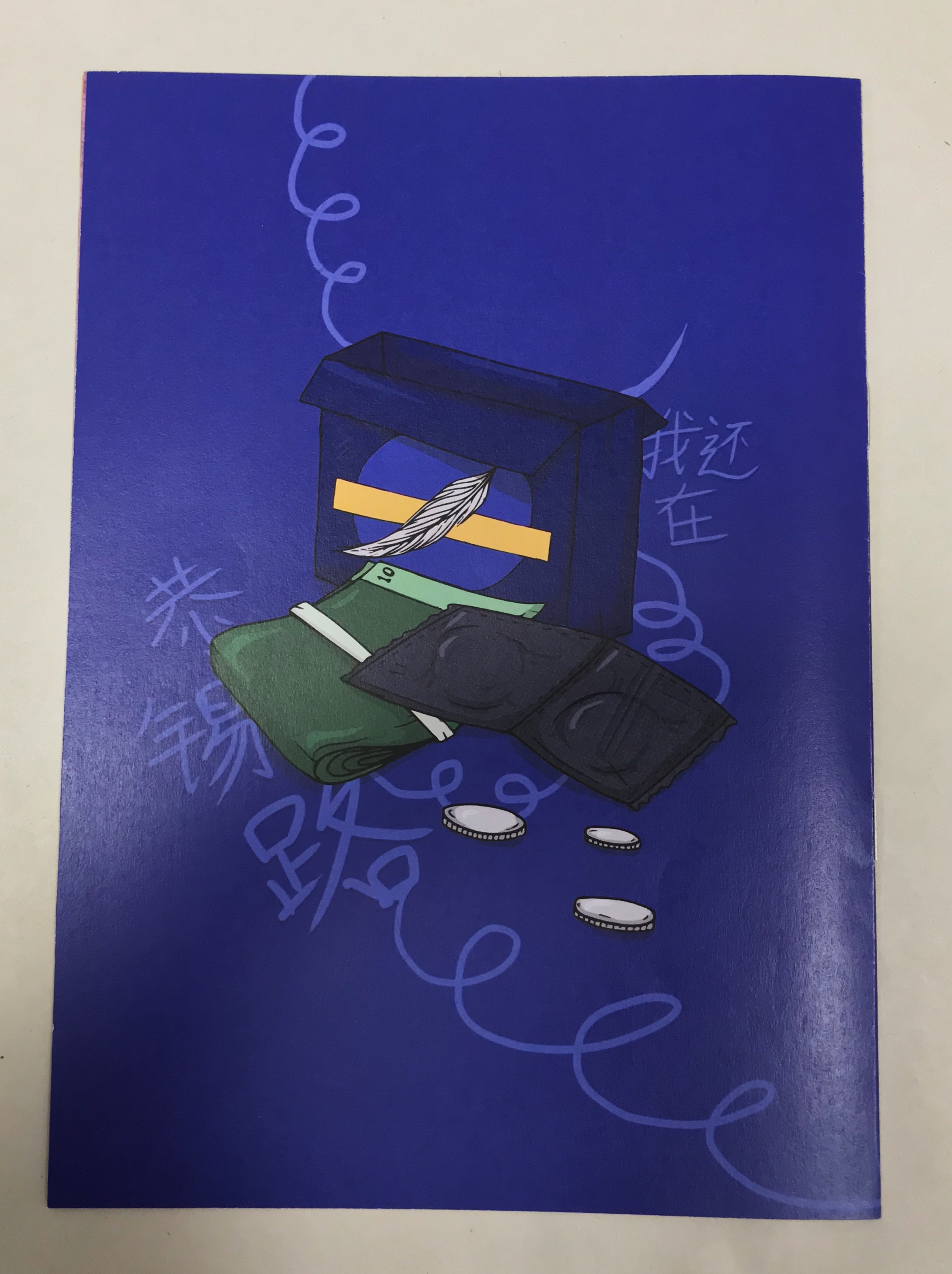
Hannah Hoch was a ‘vital and regular’ part of the Berlin Dadaist circle, and is well-known for her ‘pioneering collage and photomontage (collages consisting of fragments of imagery found in newspapers and magazines) artworks’, as well as ‘consciously and successfully promoting the idea of women working much more creatively in the modern society’. Her works involve ‘appropriating and rearranging images and text’ from the mass media, intended to ‘mock and critique the Weimar German Government’. It is said that she prefers ‘metaphoric imagery to the violent and direct techniques’ commonly found in her contemporary colleagues (e.g. John Heartfield).
Hoch was also considered the ‘lone woman among the Berlin Dada group, stranded within what everyone wanted to describe as a male creative world’. She is ‘responsible for pioneering some of the most important Dada and avant-garde art’, providing us with ‘interesting and evocative reflections on the industrial development and the very concepts of beauty’, making her ‘one of the most important female artists of the 20th century’.
Hoch’s early works consisted of experimenting with ‘nonobjective art – nonrepresentational works that make no reference to the natural world’, using mediums of painting, collage, and photomontage. Although renowned artists such as Picasso and Georges Braque have been credited with employing and elevating collage to a fine art level, Hoch and the Dadaists were the first to ’embrace and develop the photograph as the dominant medium of the montage’, where they ‘cut, overlapped, and juxtaposed (usually) photographic fragments in disorienting but meaningful ways’ ‘to reflect the confusion and chaos of the postwar era’. Her works often represented and embodied the ‘New Woman’, ‘generally ridding herself of the shackles of society’s traditional female roles’. She was also interested in representing women as ‘dolls, mannequins, and puppets and as products for mass consumption’.
- Had constructed and exhibited stuffed dolls that had exaggerated and abstract features, but were clearly identifiable as female
- Used advertisement images of popular children’s dolls in somewhat disturbing photomontages (e.g. The Master (1925) and Love (1926))
Her later works, in addition to the increased use of colour images, became more abstract, where she ‘[rotated] or [inverted] her cut fragments so that they were readable no longer as images from the real world but instead as shapes and colour’, ‘open to many interpretations’. She also reintroduced ‘figural elements’ into her photomontages.
Max Ernst

Max Ernst was another key member of the Dada arts movement as well, where he used a variety of mediums – painting, collage, printmaking, sculpture, and other unconventional drawing methods, ‘to give visual form to both personal memory and collective myth’. He was most known for ‘combining illusionistic technique with a cut-and-paste logic’, making ‘the incredible believable’, and ‘expressing disjunctions of the mind and shocks of societal upheavals with unsettling clarity’. Ernst was considered ‘one of the leading advocates of irrationality in art’ and an ‘originator of the Automatism movement of Surrealism’.
A notable work of his is Here Everything is Still Floating, which reflects ‘a world of rubble of shards’. It followed a traumatised Ernst after serving for four years in World War I, and alongside fellow Dadaists Jean (Hans) Arp and Johannes Baargeld, used ‘mechanically-reproduced fragments’ such as the ‘image of a chemical bomb being released from a military plane’ in the background. Ernst’s paintings often contain the ‘fragmented logic of collage’ (referred to as ‘the culture of systematic displacement’ by him), whose subjects are ‘disjointed even if their surfaces are smooth’. ‘In these foreboding dreamscapes, headless bodies and body-less hands appear incongruously amid lush forests or on deserted beaches’.
In addition to collage, Ernst used techniques such as frottage (‘pencil rubbings of such things as wood grain, fabric, or leaves’) and decalcomania (‘the technique of transferring paint from one surface to another by pressing the two surfaces together’). The ‘accidental patterns and textures’ resulting from these techniques can be seen in drawings such as The Great Forest (1927) and The Temptation of St. Anthony (1945). His activities subsequently increased on sculpture, using improvised techniques. For example in Oedipus (1934), Ernst used ‘a stack of precariously balanced wooden pails to form a belligerent-looking phallic image’.
Man Ray
Man Ray is a photographer, painter, and filmmaker, as well as ‘the only American to play a major role in both the Dada and Surrealist movements’. Upon meeting Marcel Duchamp, they collaborated on many inventions and eventually formed the ‘New York group of Dada artists’, and Ray began to produce ‘ready-mades’, ‘commercially manufactured objects that he designated as works of art’. Although trained as an abstract painter, Ray ‘eventually disregarded the traditional superiority painting held over photography and happily moved between different forms’. He held on to the idea that ‘motivating a work of art was more important than the work of art itself’.
Concerning photography, Ray experimented with different methods such as ‘rediscovering how to make ‘cameraless’ pictures’ (photograms or ‘rayographs’) – he did so by ‘placing objects directly on light-sensitive paper, which he exposed to light and developed’. He also experimented with solarisation, ‘which renders part of a photographic image negative and part positive by exposing a print or negative to a flash of light during development’. Ray then experimented with portraiture; some of his works involved giving one sitter ‘three pairs of eyes’, photographically superimposing ‘sound holes’ onto the photograph of the back of a female nude, resembling that of a violin.
Ray also made films. One such example, Le Retour a la raison (1923), is an indication of the ‘rayograph technique’, where he made patterns with salt, pepper, tacks, and pins.
Dada-Inspired Artists
I. Lola Dupre

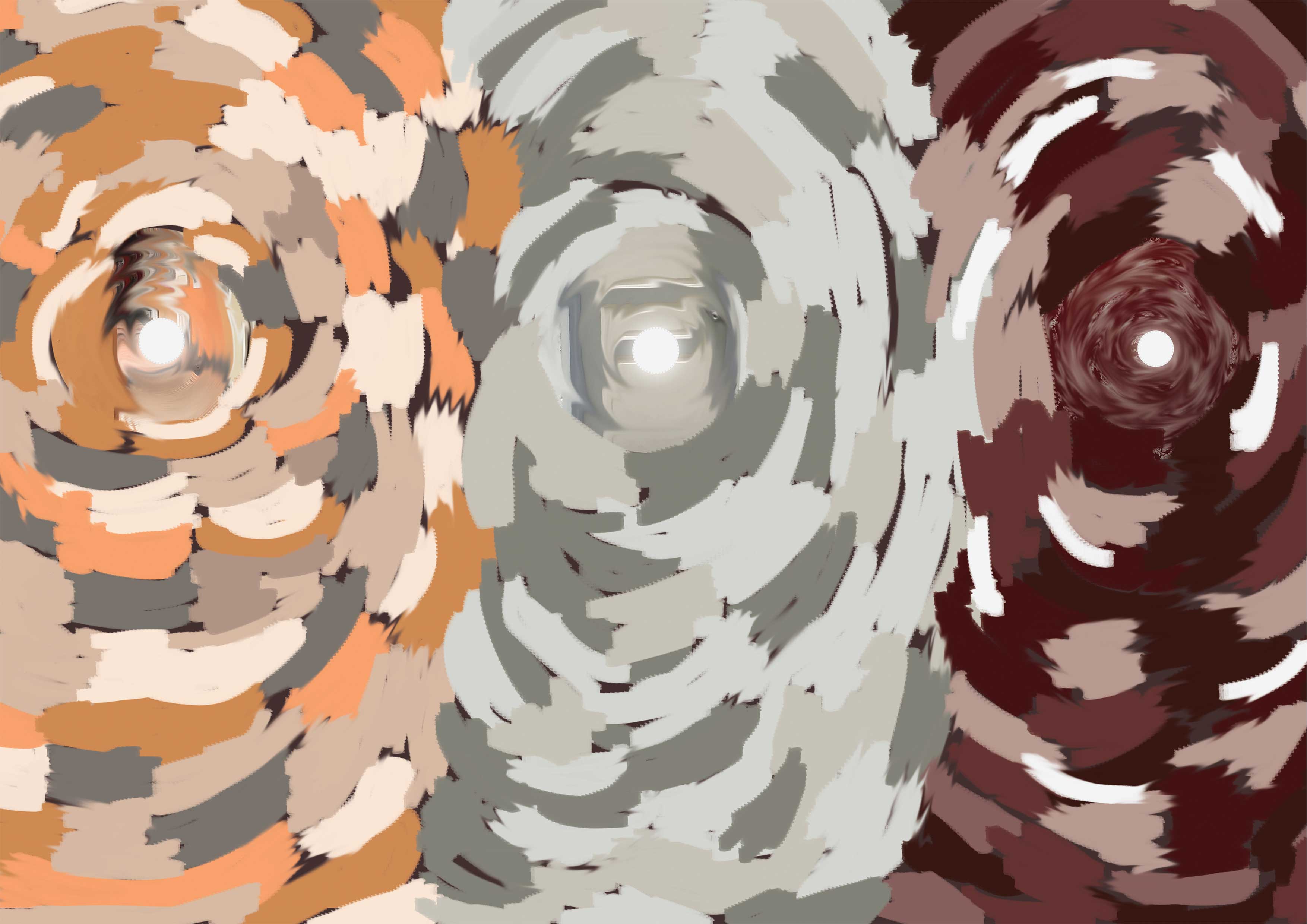
Lola Dupre is a multicultural collage artist and illustrator, creating ‘surreal and fragmented portraits’ with ‘multiple prints of the same image in different sizes’ combined in one piece, portraying ‘beautiful distortions of the human form’. Using paper, scissors, and glue, Dupre’s portraits twists ‘conventional fashion imagery to speak to our fragmented ideas of self’, questions body image issues, and ‘affirms our desire to break free from limiting perceptions around culture and gender’.
'Dada was about juxtapositions of the world... Dada is the background noise, the unavoidable memories that influence many works' - Lola Dupre
Learning Points
- Dadaism: A nihilistic and anti-aesthetic arts movement that flourished in the early 20th century
- Hoch’s use of metaphoric and ambiguous imagery, allowing viewers to form their own interpretations
- Hoch’s use of figural elements, and later focus on shapes and colours
- Ernst’s blending of personal memory and collective myth
- Methods of frottage and decalcomania in creating patterns and textures
- Making patterns using objects – Ray’s use of salt, pepper, tacks, and pins
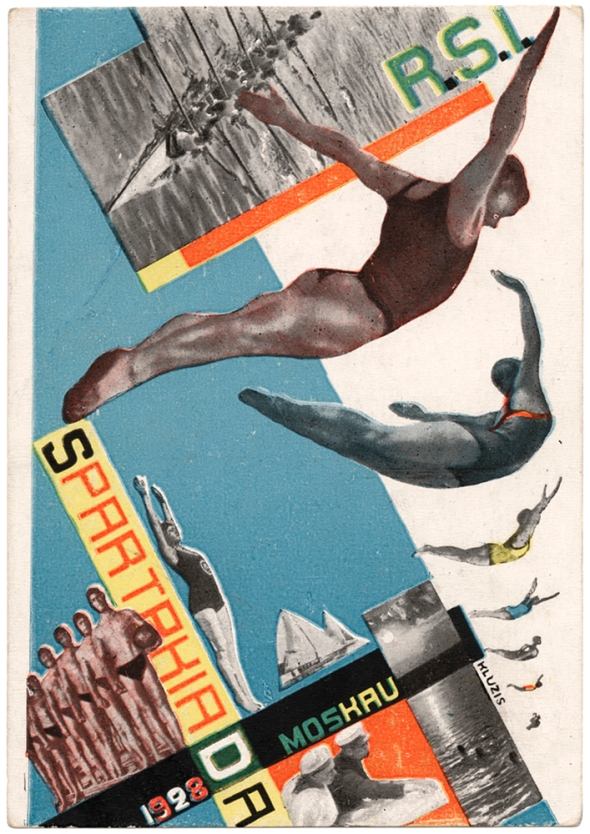
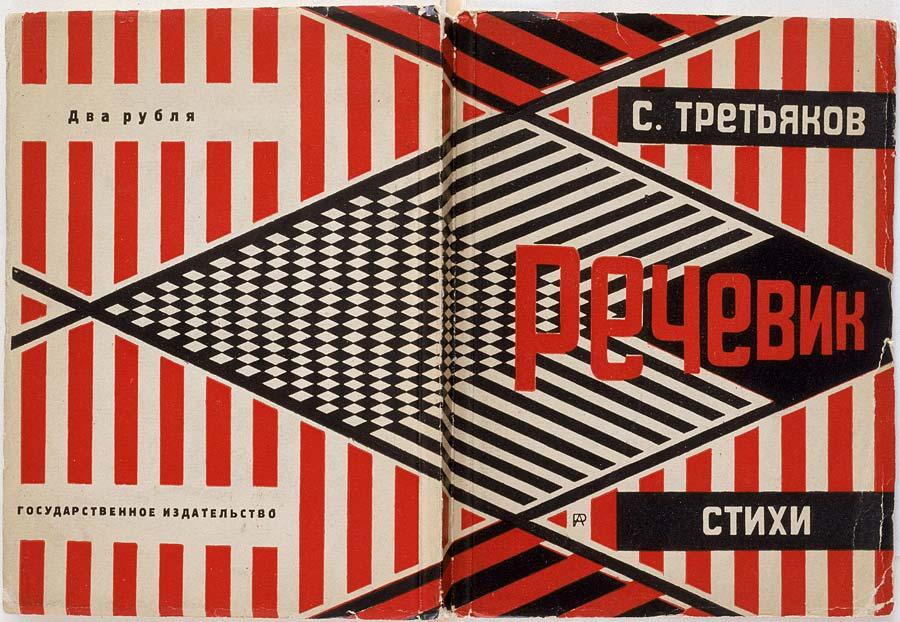
Russian Constructivism
Russian Constructivism ‘was a particularly austere branch of abstract art founded by Vladimir Tatlin and Alexander Rodcehnko’ in Russia around 1915. Although it was suppressed in Russia in the 1920s, it was brought to the West (by Naum Gabo and Antoine Pevsner) and has been ‘a major influence on modern sculpture’. Constructivism was also deemed as ‘the last and most influential modern art movement to flourish in Russia in the 20th century’.
'The material formation of the object is to be substituted for its aesthetic combination. The object is to be treated as a whole and thus will be of no discernible 'style' but simply a product of an industrial order... Constructivism is a purely technical mastery and organisation of materials.' - Russian artists in Lef
The Constructivists believed that ‘art should directly reflect the modern industrial world’. It borrowed ideas from Cubism, Suprematism and Futurism, but ‘was an entirely new approach to making objects, one which sought to abolish the traditional artistic concern with composition, and replace it with ‘construction”. It comprised of ‘careful technical [analyses] of modern materials,’ hoping ‘it would eventually yield ideas that could be put to use in mass production, serving the ends of a modern, Communist society’ – objects were ‘to be created not in order to express beauty, or the artist’s outlook, or to represent the world, but to carry out a fundamental analysis of the materials and forms of art’.
Constructivism ‘firmly embraced the new social and cultural developments that grew out of World War I and the October Revolution of 1917’. ‘Concerned with the use of ‘real materials in real space’,’, it ‘sought to use art as a tool for the common good’. Many of these works involve projects in architecture, interior and fashion design, ceramics, typography, and graphics.
'Focused on the careful technical analysis of modern materials, and the refusal of the idea that art should be produced for the art's sake but as a practice for social purposes...'
In addition to ‘demonstrating how materials behaved’, Constructivism was also ‘a desire to express the experience of modern life – its dynamism’, ‘new and disorienting qualities of space and time’, as well as the desire to develop a form of art ‘more appropriate to the democratic and modernising goals of the Russian Revolution’. Therefore, Constructivists were considered ‘constructors of a new society’, ‘on par with scientists in their search for solutions to modern problems’.
Constructivist Artists
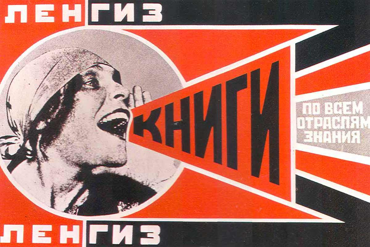
Gustav Klutsis
Gustav Klutsis (or Gustavs Klucis), one of the pioneers of ‘Soviet agitprop graphic design’, was most notable for his ‘revolutionary use of the medium of photomontage’ to create ‘political posters, book designs, newspaper and magazine illustrations’. He also advocated the ‘rejection of painting’ and was actively involved in making production art such as ‘multimedia agitprop kiosks’ installed on Moscow streets, ‘integrating radio-orators, film screens, and newsprint displays’. It was through these constructions that Klutsis developed his own method of ‘combining slogans and functional structures built around simple geometrical figures’.
In 1926, Klutsis started to work specifically on political posters promoting ‘socialist reconstruction’, in accordance with the ideological discourse of the Party at that time. After joining Oktiabr (‘an association that united leftist artists, whose aim was to promote the class-proletarian tendencies in the sphere of three-dimensional art’), his art developed, where his works, during this period, ‘combine[d] methods of posed photography, reportage and double-exposure images’.
By 1931, Klutsis new posters began including huge portraits in photomontages: ‘photographs of marchers, shock workers, and, most commonly, Stalin’. ‘Stylistically these works signalled a move away from Constructivism towards a monumental propaganda approach in glorification of Stalin’.
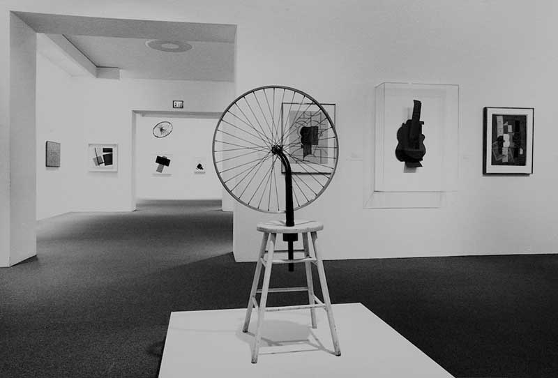
Vladimir Tatlin

Tatlin is often acknowledged as ‘the father of Constructivism’. With his ‘traditional training’ ‘supplemented towards a revolutionary way of thinking’ with Pablo Picasso, Tatlin entered the ‘Moscow avant-garde’. His admiration for ‘unconventional modulation’ in Cubism collages and the three-dimensional constructions and series of Picasso’s still lives (made of scrap materials), ‘challenged him to explore the new approach in his own production’. He then created art and design that ‘furiously emphasised materials, volume, revolution, and construction’. ‘Embracing the industrial materials, such as wood, glass and metal, Russian Constructivism shifted towards industrial design’, and its artists became ‘engineers of the everyday form’.
'The arc of his career has come to define the spirit of avant-gardism in the twentieth century, the attempt to bring art to the service of everyday life'
Tatlin’s approach was ‘shaped by his desire to bring lessons learned in the artist’s studio to the service of the real world’, explaining why his works ‘seem to shift from a preoccupation with the texture and character of materials, to a focus on technology and the machine’. Tatlin’s most famous work, the Monument to the Third International, was ‘one of the first buildings conceived entirely in abstract terms’, signalling ‘an important early stage in the transformation of Russian art, from modernist experiment to practical design’.
Despite its obscurity, Tatlin still remains one of the ‘leading artists of the Russian avant-garde and the creator of the most visionary and influential architectural design to arise from Constructivist ideology’. Tatlin’s constructions seek to ‘revolutionise society by introducing new forms of art’, where he employed ‘craft methods and incorporated everyday objects and materials into their work to expand the boundaries of what could be considered art’, as well as ‘to challenge the notions of ‘high’ and ‘low’ forms of art and culture’.
Alexander Rodchenko
Alexander Rodchenko is said to be perhaps ‘the most important avant-garde artist to have put his art in the service of political revolution’, it is a ‘model of the clash between modern art and radical politics’. His life’s work was an ‘extraordinary array of media’ from painting and sculpture to graphic design and photography.
Beginning as an ‘aesthete’, inspired by Art Nouveau artists, Rodchenko then turned to Futurism, then pioneered Constructivism, where he ’embraced a more functional view of art and of the artist’. Upon a collaboration with poet Vladimir Mayakovsky on a series of advertising campaigns, they introduced ‘modern design into Russian advertising’ and attempted to sell the ‘values of the Revolution along with the products being promoted’ – this union of ‘modern design, politics, and commerce’ inspired advertisers in the West. Photography was important to Rodchenko in his attempt to find ‘new media more appropriate to his goal of serving the revolution’. Viewing it first as a source of ‘preexisting imagery, using it in montages of pictures and text’, he then later began to take pictures himself and ‘evolved an aesthetic of unconventional angles, abruptly cropped compositions, and stark contrasts of light and shadow’.
Rodchenko’s art helped redefine three key visual genres of modernism: painting, photography, and graphic design. In his paintings, he ‘further explored and expanded the essential vocabulary of an abstract composition’. In his photography, he ‘established unprecedented compositional paradigms’, defining the ‘entire notion of modern photographic art’.
Learning Points
- Constructivism: A style or movement in which assorted mechanical objects are combined into abstract mobile structural form, featuring technical masteries and organisations of materials
- In Constructivism, objects are created not in order to express beauty, or the artist’s outlook, or to represent the world, but to carry out a fundamental analysis of materials and forms of art
- Klutsis’ integration of different forms of media in production art
- Klutsis’ combining of slogans and functional structures built around simple geometric figures
- Klutsis’ use of huge portraits to represent glorification
- Tatlin’s emphasis on materials, volume, revolution and construction
- Rodchenko’s incorporation of everyday objects and materials
- Rodchenko’s use of unconventional angles, abruptly cropped compositions, and stark contrasts of light and shadow
References
Dadaism
https://www.britannica.com/art/Dada
-
https://www.widewalls.ch/artist/hannah-hoch/
-
https://www.britannica.com/biography/Hannah-Hoch
https://www.awwwards.com/lola-dupre-surreal-collages.html
-
http://www.hungertv.com/feature/beauty-in-distortion-dada-inspired-collage-art-by-lola-dupre/
- https://www.moma.org/artists/1752
- https://www.britannica.com/biography/Max-Ernst
- https://www.britannica.com/biography/Man-Ray
- http://www.theartstory.org/artist-ray-man.htm
Russian Constructivism
1 http://www.tate.org.uk/art/art-terms/c/constructivism
2 http://www.theartstory.org/movement-constructivism.htm
3 https://www.widewalls.ch/russian-constructivism/
4 https://thecharnelhouse.org/2016/10/12/gustav-klutsis-revolutionary-propagandist-1895-1938/
5 http://www.theartstory.org/artist-rodchenko-alexander.htm